TSLA: Last CHANCE to REACT! - D&W chartsTSLA shares are trying to react today, and this is something that could signal a recovery, which is understandable, given how much the price has fallen in recent weeks and how oversold the stock is at the moment.
Since the last top in December, the stock has plummeted almost 30%, breaking all its medium-term supports, materializing a downtrend. I say the price is oversold because the RSI is at an extremely low level, and the last time we saw an RSI below 20, in December 2022, the stock actually recovered after confirming a bottom in the price.
TSLA’s RSI analysis and comparison to December 2022:
However, the trend is still downwards, and although there is the possibility of a recovery, it won't be easy to reverse the trend. Remember that pullbacks are different from reversals.
For the price to reverse the downtrend, we would need to see HH/Hls again, as well as a break of the 21 EMA, which is clearly pointing downwards.
What's more, TSLA's price is on the verge of triggering a Death Cross when the 50MA crosses the 200MA downwards, one of the most famous bear market signals.
A continuation of the downtrend can be avoided if there is a strong and clear reaction as soon as possible, and now would be a good time, as the price has approached a support region on the weekly chart:
We are close to the support line of a bearish channel. Last week's candle could be a possible Exhaustion Bar, but the price needs to react and reject the last bearish candle by breaking through its high at $217.80. Only then will we see a good reaction that could halt the long-term downtrend, or even reverse it. For now, until such a scenario materializes, any recovery could be just another Dead Cat Bounce.
Remember that I’ll keep you updated on this, so consider supporting this idea if you liked it, and follow me for more analyses like this.
All the best,
Nathan.
Candlestickpattern

Most Powerful Candlestick Patterns Candlestick patterns are like building blocks in understanding how the stock market behaves and how prices might change. Knowing about these patterns can really help you make smarter decisions when trading.
I. Introduction to 35 Candlestick Patterns
Candlestick patterns are visual representations of price movements within a specific time frame. Each candlestick represents the opening, closing, high, and low prices for that period.
The body of the candlestick is the difference between the opening and closing prices, while the wicks or shadows represent the price range.
II. Bullish Candlestick Patterns
A bullish candlestick pattern is essentially a visual signal that appears on a price chart, indicating a potential upward momentum or trend in the market. It’s like a green light for traders, suggesting that the price of the asset is likely to go up.
Traders use these patterns to time their entry into the market with the goal of capitalizing on the anticipated price increase.
Bullish Single Candlestick Patterns:
Hammer: A single candlestick pattern characterized by a small body and a long lower wick, signaling a potential bullish reversal after a downtrend.
Inverted Hammer: Another single candlestick pattern with a small body and a long upper wick, indicating a potential bullish reversal after a downtrend.
Black Marubozu: A single candlestick pattern characterized by a long black body with no shadows, representing a strong bearish sentiment.
White Marubozu: A single candlestick pattern characterized by a long white body with no shadows, representing a strong bullish sentiment
Bullish Double Candle Patterns:
Bullish Engulfing: A two-candle pattern where a small bearish candle is followed by a larger bullish candle that engulfs the previous one, suggesting a potential trend reversal to the upside.
Bullish Piercing Pattern: A two-candle pattern starting with a bearish candle followed by a larger bullish candle that opens below the previous day’s low and closes more than halfway into the prior bearish candle.
Bullish Counterattack: A two-candle pattern starting with a bearish candle, followed by a larger bullish candle that engulfs the entire range of the previous bearish candle.
Tweezer Bottom: A two-candle pattern occurring after a downtrend, characterized by two consecutive bearish candles with similar lows, suggesting potential support and a bullish reversal.
Mat Hold: A five-candle pattern suggesting a continuation of a bullish trend. It begins with a bullish candle followed by a bearish candle, a long bullish candle, a small bullish or bearish candle, and ends with another bullish candle.
Bullish Triple Candle-Sticks Pattern:
Morning Star Pattern: A three-candle pattern starting with a bearish candle, followed by a small indecisive candle (often a doji), and then a bullish candle, indicating a potential bullish reversal.
Three White Soldiers: A bullish formation consisting of three consecutive long bullish candles. Each candle closes higher than the previous one, suggesting a strong potential upward movement.
Rising Three Methods: A five-candle pattern signaling a continuation of the current bullish trend. It starts with a long bullish candle, followed by three smaller bearish candles, and ends with another long bullish candle.
Upside Tasuki Gap: A three-candle pattern involving a bullish candle, a gap up, a bearish candle, and finally another bullish candle that opens within the range of the previous bearish candle.
III. Bearish Candlestick Patterns
A bearish candlestick pattern is a visual cue on a price chart that suggests a potential downward momentum or trend in the market. It’s akin to a red light for traders, indicating that the price of the asset is likely to decrease. Traders pay close attention to these patterns to time their entry into the market, aiming to profit from the expected price decline.
Single Candle Patterns:
Hanging Man: A single candlestick pattern resembling a hanging man, signaling a potential bearish reversal after an uptrend. Learn more about Hanging Man Candlestick
Shooting Star Pattern: A single candlestick pattern characterized by a small body and a long upper wick, suggesting a potential bearish reversal.
Bearish Engulfing: A two-candle pattern where a small bullish candle is followed by a larger bearish candle that engulfs the previous one, indicating a potential trend reversal to the downside.
Black Marubozu: A single candlestick pattern characterized by a long black body with no shadows, representing a strong bearish sentiment.
Double Candle Patterns:
Evening Star Pattern: A three-candle formation indicating a potential bearish reversal. It starts with a bullish candle, followed by a small indecisive candle and ends with a bearish candle.
Dark Cloud Cover: A two-candle pattern starting with a bullish candle followed by a larger bearish candle that opens above the previous day’s high and closes more than halfway into the prior bullish candle.
Bearish Harami: A two-candle pattern. The first candle is a large bullish one, followed by a smaller bearish candle that is entirely within the range of the bullish candle. This pattern indicates a potential bearish reversal.
Bearish Counterattack: A two-candle pattern starting with a bullish candle, followed by a larger bearish candle that engulfs the entire range of the previous bullish candle.
On-Neck Pattern: A two-candle pattern where the first day has a long black body followed by a second day with a small body that closes slightly above the previous day’s low.
Triple Candle Patterns:
Three Black Crows: A bearish formation consisting of three consecutive long bearish candles. Each candle closes lower than the previous one, suggesting a strong potential downward movement.
Three Inside Down: A bearish reversal pattern. It consists of a bullish candle, a smaller bearish candle that is completely within the range of the previous candle, and a larger bearish candle.
Three Outside Down: A three-candle pattern. It starts with a bullish candle, followed by a larger bearish candle that completely engulfs the previous bullish candle, and then another bearish candle.
Neutral Candlestick Pattern
A neutral candlestick pattern doesn’t strongly indicate either a bullish or bearish trend. It’s like a yellow light, suggesting caution and indicating that the market is uncertain or indecisive about its direction. Traders look at these patterns to assess the market’s stability or potential upcoming change in trend.
Single Candle Patterns: [/b
Doji: A single candlestick pattern with a small body, indicating market indecision. It suggests a potential trend reversal, whether bullish or bearish.
Spinning Top: A single candlestick pattern with a small body and long upper and lower wicks, signaling market indecision and potential trend reversal.
High Wave: A single candlestick pattern characterized by a long upper and lower wick relative to the body, suggesting high market volatility and uncertainty.
Double Candle Patterns:
Tweezer Top: A two-candle pattern occurring after an uptrend, characterized by two consecutive bullish candles with similar highs, suggesting potential resistance and a bearish reversal

Buying Opportunity Along Bullish TrendlineGBPUSD is currently experiencing a sideways movement. If you are seeking a buying opportunity, pay attention to the bullish trendline on the 4-hourly chart.
Ensure that the candlestick does not violate the trendline before considering a buying opportunity.
What are your thoughts on this potential buying setup for GBPUSD?

Uninspiring Technical Patterns Ahead of NFLX EarningsLike many others, NASDAQ:NFLX has shifted to a wide sideways trend ahead of its earnings report today after the close. There is no pre-earnings run here. Current volume and price trend are not patterns that inspire a good earnings surprise.
HFTs are always watching news ahead of open on high-profile stocks to get ahead of retail market orders. A gap is likely at tomorrow's open.

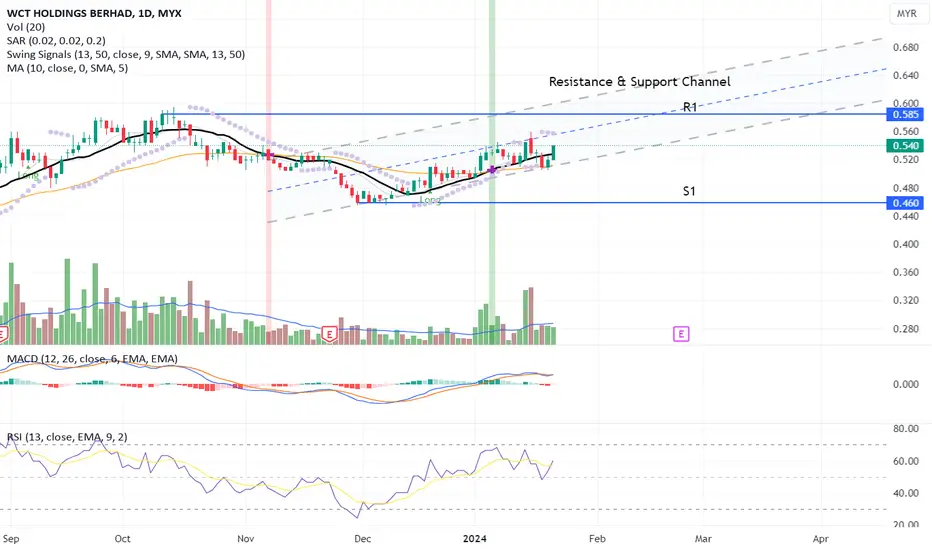
Consistent Uptrend Momentum!The candlestick indicates a price fluctuating between consistent highs and lows as indicated by the resistance and support channel whereas the channel benefits as a guideline to predict price peaks and troughs. The price is within the lower channel and provides a buying opportunity.
From the previous trades, there was no significant result in volume. Where the volume hasn't yet crossed above the MA line although price action is in place.
MACD and RSI indicate a divergence signal that is aligned with the candlestick uptrend toward the next price resistance.
Let's save WCT in WL and watch out for price action with result in volume crossed above the MA line.
R 0.585
S 0.460
GOLD|Supply areas on the way to gold growthHello guys, I hope you are doing well.
Gold moved up from a four-hour demand area with the confirmation of the hammer candle that I told you yesterday, it has now reached a four-hour supply area, which I refined to the 1-hour and 15-minute areas.
-If the four-hour candlestick above the dashed line I drew closes, other sell positions have higher risk.You should look for buying positions in the support areas that I specified by getting confirmation.
-In the same supply area where we are located, you can enter sales positions by observing the candlestick patterns and the necessary confirmations, or if it passes through this area and does not give approval to enter the position, you can enter the next supply area, which is around (2038- 2042) in mind.

The Duality of PatternsEURJPY presents an interesting scenario with a potential combo trade, or is it? Let's break it down:
1. 4-Hourly Bearish ABCD Pattern:
- Retest completion at 161.74.
2. Daily Bearish Bat Pattern:
- Completion at 162.55.
Two patterns, two different starting points. Is it a combo or a dual setup?
Share your thoughts and let's navigate this intriguing trade opportunity together!

Combo Trade: Patience for ConfirmationGBPUSD is setting up for a potential combo trade. Keep an eye on:
Bearish Shark Pattern:
Timeframes: 15 mins and 1-hourly
Completion: 1.2708
What makes this interesting is that both Shark Patterns have different starting points.
Exercise patience and wait for candlestick confirmation. Share your insights and trade plans on GBPUSD!

HD: Finally Patterning Out Post-PandemicNYSE:HD benefited greatly from the pandemic lockdown and the numerous stimulus checks that over-stimulated all nations' economies.
The stock has now moved above its trading range and has sustained, aka held onto, those gains.
This patterns out the excessive revenues and earnings that were inevitably unsustainable for all of the companies that benefited from the brief surge of revenues due to the "over-stimulus checks."
This is the Weekly Chart to show that the Year over Year comparatives that harmed HD for a couple of years is now patterned out.

XAU/USD Short-Term AnalysisHello friends.
Hope yore well.
Lets take a quick look at Gold :
1.we approch a mid-term valid trendline and it can be considered as a pullback to this line.
2.as you can see price bounce from this trendline with a strong engulf candlestick.
3.a short-term trendline breaks too and we saw a pullback to it as well
4.Also we can see a Bullish Divergence in oversold area
5.2030 Support level have seen with overlap with this signs
so gold will rise to the upper band of the longterm Trading range which is about 2060.
Hope this is useful for you.
Have great times.
thanks for reading

#Oil possible more bearish moveThe bearish move that we see in this chart, which started on September 28th, has formed two bearish channels, preventing the price from going higher seven times so far.
As you can see on Friday, January 12th, with the geopolitical news from the Red Sea conflict, the price attempted to form a bullish breakout of the smaller channel but got rejected from the larger channel.
As a result of this rejection, not only did the price form a daily shooting star candlestick pattern , but also the bullish breakout now seems like a false breakout, signaling the potential for further bearish movement in oil.
We can also see that we have a bearish trendline on Stochastic oscillator which also bring more selling pressure on this commodity.
If you've found this analysis helpful, please take a moment to like, comment, or share your thoughts with me.

#Bitcoin bearish breakout of very important trendline
We can clearly see in this chart that the price has reached the upper boundary of a bullish channel, where it would encounter selling pressure.
As a result of this selling pressure, the price on Friday, January 12th, formed a bearish impulsive candle. Following this candle, it managed to break below the short-term bullish trendline that the price had respected in the last few months.
The bearish breakout of this trendline is a second signal, after the rejection from the bullish channel, that we might see further bearish movement in Bitcoin.
If you've found this analysis helpful, please take a moment to like, comment, or share your thoughts with me.

Levels to WatchIn the world of trading, never underestimate the power of key support and resistance levels.
These levels often become the battleground for market movements, forming a Sideway Bounce Trading setup.
On my radar for AUDCAD:
- Buying Opportunity: Watch for potential long entries at 0.8931.
- Shorting Opportunity: Keep an eye on the chance to go short at 0.8982.
This trade strategy remains active as long as the support and resistance levels hold.
Share your insights and trade plans on AUDCAD below!

A Pivot Point for TradesAn essential level on my radar is 0.6669 for AUDUSD.
If the market presents a buying opportunity at this level, I'll be keenly interested.
However, a break and close below this level would shift my focus to a shorting opportunity, waiting for a retest on the resistance level.
Share your trade plans and thoughts on AUDUSD below!

Exploring OpportunitiesGiven the current consolidation phase in the market, I'm open to exploring various trading opportunities this week.
For counter-trend traders eyeing a shorting opportunity, the completion of a Bearish Bat Pattern at 1.2803 is a crucial level to watch.
Alternatively, for those in search of a buying opportunity, a retest on the trendline, conveniently aligned with the 1-hourly chart, could provide an entry point.
What's your strategy for GBPUSD? Share your insights!

Learn Profitable Doji Candle Trading Strategy
In the today's post, I will share my Doji Candle trading strategy.
This strategy combines the elements of multiple time frame analysis, price action and key levels.
Step 1
Analyze key levels on a daily time frame.
Identify vertical and horizontal supports and resistances.
Here are the key structures that I spotted on on AUDUSD.
Step 2
Look for a formation Doji Candle on a key structure.
This rule is crucially important: we will trade only the Doji candles that are formed on key levels.
From key supports, we will look for buying, and we will look for shorting from key resistances.
Look at this Doji Candle that was formed on a key daily support on AUDUSD.
Step 3
Look for a horizontal range on a 4h/1h time frames.
Doji Candle signifies indecision. Quite often, you will notice the horizontal ranges on lower time frames when this candlestick is formed.
Here is a horizontal range that was formed on a 4H time frame on AUDUSD after a formation of Doj i.
Step 4
Look for a breakout of the range.
To sell from a key resistance, we will need a bearish breakout of the support of the range. That will be our bearish confirmation.
To buy from a key support, we will need a bullish breakout of the resistance of the range. It will be our bullish signal.
Here is a confirmed breakout of the resistance of the range with a 4H candle close above. That is our bullish confirmation on AUDUSD.
Step 5
Buy aggressively or on a retest.
After you spotted a confirmed breakout of the range, open a trading position aggressively or on a retest.
Personally, I prefer trading on a retest.
If you sell, a stop loss should be above the high of the range and your target should be the closest key daily support.
If you buy, your stop loss should be below the low of the range and a take profit will be on the closest daily resistance.
On AUDUSD, a long position was opened on a retest. Stop loss is lying below the lows. Take profit is the closest resistance.
Here is how the great strategy works!
Always patiently wait for a confirmation! That is your key to successful trading Doji Candle.
❤️Please, support my work with like, thank you!❤️

Controlled Sideways Trends Ahead of EarningsThe Giant Banks and Credit Card companies benefit the most from the Federal Reserve Board's overnight interest rate hikes. As the FRB increases its lending rate, it allows big banks and credit companies to increase their interest rates to consumers, small businesses, etc. That usually means higher revenues.
NYSE:V is in a sideways trend that is not as consistent as would be ideal ahead of its earnings report in about 3 weeks. However, HFTs are aware of the tendency for credit card companies to prosper during high interest-rate markets.
Study the candlestick patterns: Note the quick reversal back down after a higher price level was reached. Note the rebound the same day when price dropped out of the lows of this sideways trend. There is control in this pattern which is typical of Professional trading activity.

AUDCAD UPDATE 1/8/24 8:17am Central (new york)*
*AUDCAD shor update price is making lower lows and lower highs .
*Trade is going perfectfly as planned
*

GPBUSD SELLGBPUSD head and should and over general technical analysis and why my hypothesis is sells \
* if price pushes above the level and show any signs of bull pressure i will adapt to market conditions

Anticipating a Combo Trade Short OpportunityMy sights are set on a compelling setup for NZDUSD. Both the Weekly and Daily Charts align with a Bearish Shark Pattern, presenting a powerful Combo Trade opportunity.
I'm waiting patiently for the Bearish Shark Pattern completion at 0.6352 on the 4-hourly chart, aiming for a High Profit Factor with reduced initial risk.
What are your thoughts on NZDUSD? Any strategies or insights to share?

Bullish Outlook with Retest OpportunityIf you caught the short opportunity on the previous Fib3 Bat I mentioned months ago, congrats on the 836 pips (~8,360 USD/lot) gain! (Link to related analysis available in post)
My overall stance on USDJPY remains bullish. For those eyeing buying opportunities, keep an eye on the daily chart for a potential market retest at 142.47 (refer to the left chart).
What's your strategy or trade plan for USDJPY? Share your thoughts below!

Anticipating Short Position on Bearish Shark PatternEURUSD recently faltered to secure a close above the Weaker Bull Buy Zone, indicating potential weakness in the bullish momentum. I'm eyeing a short position opportunity as the market unfolds a Bearish Shark Pattern on the 1-hourly chart, aligning with my counter-trend strategy.
What's your strategy or perspective on EURUSD? Feel free to share your insights!

Over-speculated Patterns Heading Into Earnings SeasonNYSE:JPM is the last Bank that has been able to hold onto its Dow 30 component status. It is running up on a combination of buybacks and ETF development for Dow 30 index components.
The stock is over-speculated heading into the earnings season. Volume Oscillators show the extreme pattern clearly. So even minimal weakness in the earnings report could cause an HFT trigger. It might surprise either way.
Some of its growth in 2023 was due to the regional bank debacle when JPM chose certain small banks to target for a silent hostile takeover.
