GBPUSD - bottom out pattern going on? What's next??#GBPUSD - perfect move as per our last couple of ideas regarding #GBPUSD
and now in current situation we have 1.3220 as immediate supporting and below that 1.3140
If market holds that supporting areas then we can expect further bounce towards 1.3500 and after that 1.3700 , 1.3900 n upto 1.4200
So stay sharp and don't be lazy here..
Good luck
Trade wisley
Chartanalysis

For Educational purpose only.The primary objective of the trading strategy is to generate consistent returns while managing risk effectively. Define whether you are trading for short-term profits, long-term growth, or a combination of both.

SILVER 1DA possible scenario for silver on the daily timeframe involves buying from the levels of 30.90-31.00 with further targets at 33.02, 34.8291 and the expected completion of the rounding pattern with a subsequent movement to the zone 40.0251
Everything is clearly depicted on the graph!
Have a good day!

$SHAK at a $80 support, buy areaHello, looking at the Daily and Weekly, the Elliot Wave seems to be finishing up and I think this name got sold off from highs like everything else but a good name nonetheless. Fundamentally and technically name looks good for long setup to the $90s then $100.
WSL

How to Analyze a Technical Chart: Practical Guide (BTC EXAMPLE)Hello, traders! ✍🏻
Understanding a chart isn't about predicting the future — it’s about recognizing what’s already happening. Whether you're evaluating a Bitcoin breakout or watching a new altcoin pump, technical chart analysis is one of the most powerful tools traders use to make sense of price movements. But how exactly do you read a technical analysis chart? What matters most — and what’s just noise?
Let’s break it down.
1. Look at the Big Picture: Price Trends and Structure
Before zooming in, zoom out. Start with the daily or weekly chart to identify the primary trend. Is the asset making higher highs and higher lows (an uptrend)? Or is it stuck in a sideways channel?
In Price Analysis, Market Structure Is Your Anchor:
Uptrend: Higher Highs and Higher Lows
Downtrend: Lower Highs and Lower Lows
Consolidation: Sideways Moves with Clear Support/Resistance
This high-level view helps you avoid common traps, like going long in a downtrend or shorting near long-term support.
2. Use Support and Resistance Like a Map
Support and resistance levels form the backbone of chart technical analysis. They show you where price reacted in the past — and likely will again.
Support: A Price Level Where Buyers Previously Stepped In.
Resistance: A Level Where Sellers Pushed Price Down.
The more times a level is tested, the more important it becomes. These zones can act as entry/exit points or as signals for potential breakouts or reversals.
3. Add Indicators — But Don’t Overload!
Indicators are helpful — if used right. The key is to complement price action, not replace it. Start Simple:
RSI (Relative Strength Index): Detect Overbought/Oversold Conditions
Volume: Confirms Strength Behind Price Moves
Moving Averages: Help Identify Trends and Dynamic Support/Resistance
Avoid piling on too many indicators. If your technical analysis chart looks like a control panel, you might be overcomplicating your decision-making.
4. Timeframes Matter — And So Does Context
Don’t mix signals across timeframes without context. A bullish setup on the 15-minute chart can collapse under a bearish daily trend.
Watch for Multi-Timeframe Analysis:
Weekly: Macro Trend
Daily: Trading Bias
4H/1H: Entry and Exit Planning
This layered approach helps you stay aligned with momentum while avoiding short-term noise.
Full Breakdown: Technical Chart Analysis of BTC/USDT (1W)
The BTC/USDT weekly chart presents a textbook example of how price evolves through well-defined market phases, structural levels, and momentum shifts. Let’s walk through each component in detail — not just what is shown on the chart, but also why it matters and how it’s typically identified in technical analysis.
We begin by examining the market structure. From mid-2020 to late 2021, Bitcoin followed a strong uptrend, consistently printing higher highs and higher lows. This kind of price action is characteristic of bullish expansion phases, where momentum builds gradually and pullbacks are shallow. Technically, an uptrend is confirmed when each new peak surpasses the previous, and support continues to form above former lows. In this case, the trend accelerated rapidly into the $60K–$70K zone before exhaustion set in.
The shift occurred in late 2021, as the market transitioned into a macro correction. From a structural standpoint, the pattern reversed — lower highs began to form, and key support levels were breached. This downtrend, lasting through 2022, is a typical bear phase in a market cycle, where distribution outweighs accumulation. Price made several failed attempts to reclaim previous highs, confirming bearish control and increased selling pressure.
What followed was an extended period of sideways movement between late 2022 and early 2023 — a classical accumulation zone. This phase is often overlooked but is critical in technical chart analysis. Here, price consolidated in a narrow range, with volatility contracting and RSI hovering near oversold territory. This kind of stabilization often signals that selling pressure has subsided and that larger players may be building positions ahead of a breakout. It is identified not just by price flattening, but by volume dropping and the absence of directional follow-through in either direction.
By mid-2023, a recovery structure began to emerge. Bitcoin started printing higher lows and eventually broke above prior resistance zones, indicating the formation of a new trend. As of early 2025, this trend appears to be unfolding, though price is once again facing historical resistance near its all-time highs — the $69K–$74K zone. This region has acted as a ceiling in both the 2021 and 2024 cycles, making it a well-established historical resistance level. In technical terms, the more times a level rejects price, the more significant it becomes, as market participants tend to place orders around such zones in anticipation of repeated behavior.
One of the most important structural zones on the chart lies around the $50K–$53K range. This mid-zone has acted as support during the 2021 bull run, flipped into resistance during the 2022 downtrend, and has once again returned to functioning as a support area in the current recovery. This phenomenon — where old support becomes new resistance and vice versa — is a classic concept in technical chart analysis, signaling that market memory is active and that this level is psychologically and technically significant.
At the lower end, the $30K level has held repeatedly across multiple market phases, establishing itself as a long-term support zone. Its durability, despite heavy corrections, suggests significant accumulation and investor interest at that level. This zone has marked major bottoms and remains a key threshold that, if broken, could signal a structural shift in sentiment.
Momentum analysis further confirms these phases. The Relative Strength Index (RSI), plotted beneath the price chart, hovered in overbought territory during both the 2021 and 2024 peaks, exceeding 70 and signaling potential exhaustion. In contrast, the RSI dipped into the 30s in 2022, aligning with the end of the downtrend and beginning of accumulation. These signals are not to be taken in isolation, but when combined with structure and volume, they add powerful confirmation to trend shifts. At the time of writing, RSI sits around 48 — neutral ground, indicating the market has not yet committed to a new directional move.
This layered approach — combining trend structure, support and resistance zones, and momentum indicators like RSI — is fundamental to technical chart analysis. It enables traders to navigate through market noise and identify phases of expansion, correction, and re-accumulation with greater clarity. Each of these elements, when aligned, increases the probability of high-conviction setups and helps avoid emotionally driven decisions in volatile environments.
Final Thought
Mastering technical chart analysis isn’t about memorizing patterns — it’s about training your eyes to read structure, sentiment, and context. And like any skill, the more charts you read, the sharper you get.
This is only an isolated analysis of the macro trend — a high-level look at Bitcoin’s price structure using weekly timeframes. In reality, technical analysis can be performed across multiple timeframes, combining far more indicators, chart patterns, and volume-based tools depending on your strategy and goals.
Platforms like TradingView offer a wide range of features for deeper technical insight — from advanced oscillators to custom scripting and community-driven indicators. The chart above serves as a historical case study, not a trading signal. It provides a reference point for how sentiment shifts can be visualized over time through structure and momentum.
If you’d like to explore other educational breakdowns or real-time analysis, feel free to check out more content on our TradingView page. This post is not financial advice, but 100% a technical perspective on past price action and market behavior.
💬 What’s your go-to indicator or setup when doing token price analysis?
This analysis is performed on historical data, does not relate to current market conditions, is for educational purposes only, and is not a trading recommendation.

Decentraland: Fake Rally?Decentraland reacted significantly to the low of April 7 and temporarily achieved an increase of over 50%. Still, there is a 33% chance that the current corrective movement is not yet complete, and we will see a final setback to a fresh low of the green wave alt. in the short term. Primarily, however, we assume that a sustainable bullish trend reversal and the start of a magenta uptrend quintet have already succeeded. Via the magenta and the subsequent interim correction of wave , MANA should now gather momentum for the impulsive breakout of the magenta wave above the two resistance levels at $0.59 and $0.85.

US30/ Dow jonesConsidering the high that was hit during London session, I’m waiting to see what happens during the New York session. If that high breaks, I’ll look to buy; if not, I’ll be selling.

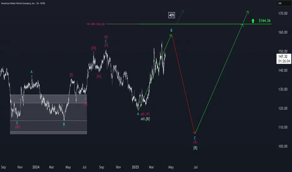
American Water Works: Toward the B-Wave TopPrimarily, American Water Works is still working on the turquoise wave B, which should top out below the resistance at $164.36. The subsequent sell-off of the turquoise wave C should then complete the overarching wave in green. However, in our 40% likely alternative scenario, the stock would directly surpass the $164.36 level, thus confirming an already established low of the green wave alt. . Still, structurally, renewed rises of wave should follow after the wave low in both of these scenarios.
GOLD - single supporting area, holds or not??#GOLD.. now we have 3226 27 as single supporting area and if market hold it in that case we can expect a bounce from here otherwise below that we can expect again range bottom.
Good luck
Trade wisely

Caterpillar: Progress!Caterpillar has successfully fallen below the $318.68 level, marking an important step in our primary scenario. There is a 32% probability that we have already seen the low of wave alt.IV in beige, which would allow the price to move directly above the resistance at $386.48 from here. However, due to the price structure, we assume that the regular wave IV in beige still requires a new low before the next rise is scheduled. Once this important bottom of wave IV is found, there is ample potential on the upside.

Dovish ECB Meets Technical Confluence – EUR/USD at Make-or-BreakEUR/USD has been respecting a clear bearish trend structure, consistently forming lower highs and lower lows across the lower timeframes. The pair is currently in a corrective phase, retracing toward the 1.13600 zone, a critical area where the descending trendline, horizontal resistance, and prior support converge. This level could serve as a strong turning point.
Fundamentally, the euro remains under pressure as markets anticipate a dovish stance from the ECB amid subdued inflation and softening economic data. Meanwhile we should be very cautious about the dollar with the very mixed war tariffs.
A rejection at this level with confirming bearish price action could open the door for a fresh leg lower in line with the prevailing trend. I’m closely monitoring candlestick behavior and momentum signals around 1.13600 for a potential short setup.

Cronos: Bear Market VibesCronos is resisting the persistent selling pressure after last week's low, but it should soon turn sustainably downward again. We anticipate the imminent bottom of the overarching turquoise corrective wave 2 within the green Target Zone between $0.06 and $0.02. According to our primary scenario, once CRO reaches this new bear market low, it can quickly move upward in the next impulse wave, with the resistances at $0.14 and $0.23 serving at most as temporary pauses.

The chart #MANEKIUSDT looks strong📉 LONG BYBIT:MANEKIUSDT.P from $0.002990
🛡 Stop loss: $0.002772
🕒 Timeframe: 1H
📢 Market Overview:
➡️ The token broke out impulsively after consolidating above the Point of Control (POC) at $0.002253 — a strong bullish sign.
➡️ The BYBIT:MANEKIUSDT.P stop-loss is set just below the key accumulation zone, at $0.002772 — a logical support level.
➡️ The volume profile shows heavy interest below current levels, indicating buyer support.
➡️ Current price ($0.002915) is slightly below the entry zone but testing resistance around $0.002944.
➡️ A breakout here could quickly push price to TP1 and TP2.
🎯 TP Targets:
💎 TP 1: $0.003100
💎 TP 2: $0.003210
💎 TP 3: $0.003300
📢 Watch for confirmation above $0.002944 — this would open the way toward TP1.
📢 Weak breakout may trigger a retest of the entry area.
🚀 The chart BYBIT:MANEKIUSDT.P looks strong — bullish momentum could continue!

GBPUSD - its breakout? what's next??#GBPUSD.. as you know guys our area was 1.3035 and in first go market boke that area but then drop towards bottom due to tariff implantation.
now market again break our area in today so if that is clear breakout then we can expect a further bounce towards 3400 and 1.3500
good luck
trade wisely

BTC/USDTbitcoin hit our target of 85k from the 77k entry.
a small correction is expected here to 82k-84k due to resistance from the 200 day and 50 day emas before rise.
next target:95K

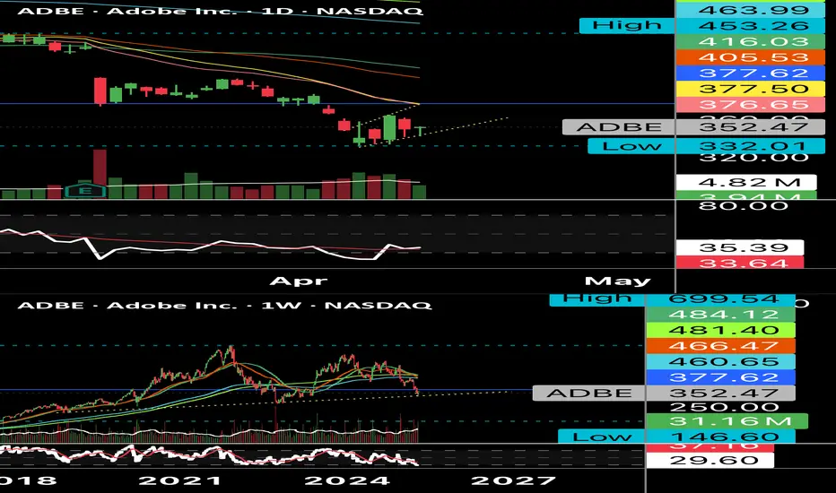
$ADBE $380 Hammer CandleLittle hammer candle on some nicely oversold conditions with my moving average just below the RSI on the Daily. I like this for a $380 test. With a break through you could see $405-$408. Eyeing $380 calls a week or two out.
WSL
USDT.DSecond Point:
The USDT Dominance on the daily timeframe is showing the exact opposite behavior of Bitcoin. It has reached a supportive trendline which, for the past 3 months, has led to a reversal every time the index has touched it — pushing the market one level lower. And now, we're back at that critical zone again.
Will things be different this time?
This current touch appears to be a wave F, and perhaps we could even consider a potential wave G, which would imply one final leg up for USDT Dominance. However, there’s no certainty. There’s also the possibility that the trendline breaks, tether gets deployed, and the market becomes just a little — just a little — more pleasant.
We're literally on the edge right now, and this is where market pumps and dumps tend to occur — right in these key zones.
When will the situation become clear?
We have an important time zone coming up, and it’s likely that within the next couple of days, market makers will show their hand.
What do you think will happen?
Trendline breaks → Market pump
Trendline holds → Market dump ❤️

$SHOP head and shoulders formation 1M?Hmmm, there was a similar looking setup on NASDAQ:NFLX within the last week of a similar slope up with a head and shoulders like this and it tanked. This will be on watch months to come. Could go long for a month to two and then get ready to short.
WSL

$AAPL This is going to burst... $220 target.NASDAQ:AAPL : Expecting a move to $210 easy off the $200 zone then to the target of $220. Lots of testing in that area. I think $210 is a clear "gimme." Not even close to overbought, with the volatility this can ramp up. Technically look great to me. Push up to 200EMA/SMA located above $220 zone ($221 and $228).
wsl.

$IBM $250 retestNYSE:IBM Looking for a resistance zone tap of a retest. Earnings is a week and a half away as well which could score you some premium; wouldn't hold into earnings (craps shoot). Want to see a strong test on $240 then could see a boost to $248-$250 before earnings.
WSL.

BTC/USDT"For Bitcoin, this is what I see on the daily timeframe, and I think there's a good chance it'll make a bullish move. What do you think, buddy?"
Let me know if you want it more formal or more casual!

Canopy Growth: Some Room Left...WEED has continued to move downward within the magenta Target Zone between C$2.96 and C$0.90, and it is now trading in the lower quarter of this range. Currently, the stock should be working on a blue five-wave move and should soon reach the low of wave (v), thus completing this structure and also the large green wave . Primarily, we still grant the stock some more room to fully utilize the Target Zone, but a trend reversal should be initiated with the low. Afterward, the high from April 29, 2024, at C$20.50 should be exceeded during the turquoise wave 1.

XAG/USD Climbs on FOMC WorriesSilver prices climbed above $31 per ounce on Thursday, extending gains for a second straight session as commodities rebounded following President Trump’s rollback of his reciprocal tariff policy. The new measure lowers tariffs on most trade partners to 10% for 90 days to support negotiations. However, China, a key silver consumer, still faces a steep 125% tariff, keeping geopolitical tensions elevated and sustaining safe-haven demand. Meanwhile, FOMC minutes revealed growing concerns about stagflation and the impact of Trump’s trade agenda on the Fed’s dual mandate of price stability and full employment.
Resistance starts at 31.50; if breached, the next levels are 32.15 and 33.30. Support sits at 30.20, with 29.50 and 29.20 below if that level gives way.
