seekho roj kamao trendline indicatorThe Auto Trendline Indicator is a powerful technical analysis tool designed to automatically detect and plot dynamic trendlines based on recent price action. Using pivot-based logic, it identifies significant swing highs and lows and connects them to draw trendlines that visually represent market trends and potential support or resistance areas. The indicator continuously scans the chart for new pivots, updating trendlines in real-time to reflect the latest market structure. This helps traders quickly identify the direction and strength of a trend without manually drawing lines.
The trendlines offer a visual framework for traders to plan entries, exits, and risk management strategies. When price approaches these levels, it often signals a critical point of interest where breakouts, bounces, or reversals may occur. Because it reacts to actual price pivots, the indicator remains responsive to changing market conditions, making it suitable for trending and consolidating markets alike.
Ideal for traders of all levels, this indicator simplifies chart analysis by automating a traditionally manual process. It enhances decision-making by reducing subjectivity and providing clear visual cues. Whether used standalone or in conjunction with other tools, the Auto Trendline Indicator is a reliable assistant for mapping out price structure and market momentum.
Indicators and strategies

✅ 10 Monday's 1H Avg Range + 30-Day Daily RangeThis script is particularly useful for traders who need to measure the range of the first four 15-minute candles of the week . It provides three key values:
🕒 Highlights the First 4 Candles
It marks the first four 15-minute candles of the week and displays the total range between their high and low.
📊 10-Week Average (Yellow Line)
Shows the average range of those candles over the last 10 weeks , allowing you to compare the current week with historical patterns.
📈 30-Day Daily Candle Average (Green Line)
Displays the a verage range of the last 30 daily candles. This is especially useful for defining Stop Loss levels , since a range greater than one-third of the daily average may reduce the likelihood of the trade closing the same day.
Feel free to contact me for upgrades or corrections.
– Bernardo Ramirez
🇵🇹 Versão em Português
Este script é especialmente útil para traders que precisam medir o intervalo das quatro primeiras velas de 15 minutos da semana.
Ele oferece três informações principais :
🕒 Destaque das 4 Primeiras Velas
Marca as primeiras quatro velas de 15 minutos da semana e exibe o intervalo total entre a máxima e a mínima.
📊 Média de 10 Semanas (Linha Amarela)
Mostra a média do intervalo dessas velas nas últimas 10 semanas, permitindo comparar a semana atual com padrões anteriores.
📈 Média dos Últimos 30 Candles Diários (Linha Verde)
Exibe a média do intervalo das últimas 30 velas diárias.
Isso é especialmente útil para definir o Stop Loss, já que um valor maior que 1/3 da média diária pode dificultar que a operação feche no mesmo dia.
Sinta-se à vontade para me contactar para atualizações ou correções.
– Bernardo Ramirez
🇪🇸 Versión en Español
Este script es especialmente útil para traders que necesitan medir el rango de las primeras cuatro velas de 15 minutos de la semana.
Proporciona tres datos clave :
🕒 Resalta las Primeras 4 Velas
Señala las primeras cuatro velas de 15 minutos de la semana y muestra el rango total entre su máximo y mínimo.
📊 Promedio de 10 Semanas (Línea Amarilla)
Muestra el promedio del rango de esas velas durante las últimas 10 semanas, lo que permite comparar la semana actual con patrones anteriores.
📈 Promedio Diario de 30 Días (Línea Verde)
Muestra el rango promedio de las últimas 30 velas diarias.
Esto es especialmente útil al definir un Stop Loss, ya que un rango mayor a un tercio del promedio diario puede dificultar que la operación se cierre el mismo día.
No dudes en contactarme para mejoras o correcciones.
– Bernardo Ramirez

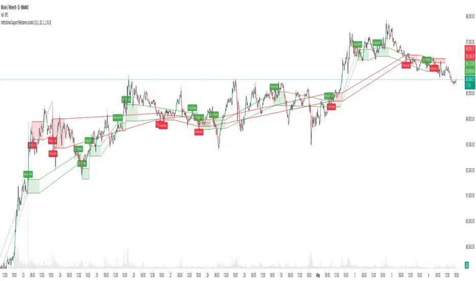
Institutional Support/Resistance Locator🏛️ Institutional Support/Resistance Locator
Overview
The Institutional Support/Resistance Locator identifies high-probability demand and supply zones based on strong price rejection, large candle bodies, and elevated volume . These zones are commonly targeted or defended by institutional participants, helping traders anticipate potential reversal or continuation areas.
⸻
How It Works
The indicator uses a confluence of conditions to detect zones:
• Large Body Candles: Body size must exceed the moving average body size multiplied by a user-defined factor.
• High Volume: Volume must exceed the moving average volume by a configurable multiplier.
• Wick Rejection: Candles must show strong upper or lower wicks indicating aggressive rejection.
• If all criteria are met:
• Bullish candles form a Demand Zone.
• Bearish candles form a Supply Zone.
Each zone is plotted for a customizable number of future bars, representing areas where institutions may re-engage with the market.
⸻
Key Features
• ✅ Highlights institutional demand and supply areas dynamically
• ✅ Customizable sensitivity: body, volume, wick, padding, and zone extension
• ✅ Zones plotted as translucent regions with auto-expiry
• ✅ Works across all timeframes and markets
⸻
How to Use
• Trend Traders: Use demand zones for potential bounce entries in uptrends, and supply zones for pullback short entries in downtrends.
• Range Traders: Use zones as potential reversal points inside sideways market structures.
• Scalpers & Intraday Traders: Combine with volume or price action near zones for refined entries.
Always validate zone reactions with supporting indicators or price behavior.
⸻
Why This Combination?
The combination of wick rejection, volume confirmation, and large candle structure is designed to reflect footprints of smart money. Rather than relying on fixed pivots or subjective zones, this logic adapts to the current market context with statistically grounded conditions.
⸻
Why It’s Worth Using
This tool offers traders a structured way to interpret institutional activity on charts without relying on guesswork. By plotting potential high-impact areas, it helps improve reaction time.
⸻
Note :
• This script is open-source and non-commercial.
• No performance guarantees or unrealistic claims are made.
• It is intended for educational and analytical purposes only.
Bitcoin Monthly Seasonality [Alpha Extract]The Bitcoin Monthly Seasonality indicator analyzes historical Bitcoin price performance across different months of the year, enabling traders to identify seasonal patterns and potential trading opportunities. This tool helps traders:
Visualize which months historically perform best and worst for Bitcoin.
Track average returns and win rates for each month of the year.
Identify seasonal patterns to enhance trading strategies.
Compare cumulative or individual monthly performance.
🔶 CALCULATION
The indicator processes historical Bitcoin price data to calculate monthly performance metrics
Monthly Return Calculation
Inputs:
Monthly open and close prices.
User-defined lookback period (1-15 years).
Return Types:
Percentage: (monthEndPrice / monthStartPrice - 1) × 100
Price: monthEndPrice - monthStartPrice
Statistical Measures
Monthly Averages: ◦ Average return for each month calculated from historical data.
Win Rate: ◦ Percentage of positive returns for each month.
Best/Worst Detection: ◦ Identifies months with highest and lowest average returns.
Cumulative Option
Standard View: Shows discrete monthly performance.
Cumulative View: Shows compounding effect of consecutive months.
Example Calculation (Pine Script):
monthReturn = returnType == "Percentage" ?
(monthEndPrice / monthStartPrice - 1) * 100 :
monthEndPrice - monthStartPrice
calcWinRate(arr) =>
winCount = 0
totalCount = array.size(arr)
if totalCount > 0
for i = 0 to totalCount - 1
if array.get(arr, i) > 0
winCount += 1
(winCount / totalCount) * 100
else
0.0
🔶 DETAILS
Visual Features
Monthly Performance Bars: ◦ Color-coded bars (teal for positive, red for negative returns). ◦ Special highlighting for best (yellow) and worst (fuchsia) months.
Optional Trend Line: ◦ Shows continuous performance across months.
Monthly Axis Labels: ◦ Clear month names for easy reference.
Statistics Table: ◦ Comprehensive view of monthly performance metrics. ◦ Color-coded rows based on performance.
Interpretation
Strong Positive Months: Historically bullish periods for Bitcoin.
Strong Negative Months: Historically bearish periods for Bitcoin.
Win Rate Analysis: Higher win rates indicate more consistently positive months.
Pattern Recognition: Identify recurring seasonal patterns across years.
Best/Worst Identification: Quickly spot the historically strongest and weakest months.
🔶 EXAMPLES
The indicator helps identify key seasonal patterns
Bullish Seasons: Visualize historically strong months where Bitcoin tends to perform well, allowing traders to align long positions with favorable seasonality.
Bearish Seasons: Identify historically weak months where Bitcoin tends to underperform, helping traders avoid unfavorable periods or consider short positions.
Seasonal Strategy Development: Create trading strategies that capitalize on recurring monthly patterns, such as entering positions in historically strong months and reducing exposure during weak months.
Year-to-Year Comparison: Assess how current year performance compares to historical seasonal patterns to identify anomalies or confirmation of trends.
🔶 SETTINGS
Customization Options
Lookback Period: Adjust the number of years (1-15) used for historical analysis.
Return Type: Choose between percentage returns or absolute price changes.
Cumulative Option: Toggle between discrete monthly performance or cumulative effect.
Visual Style Options: Bar Display: Enable/disable and customize colors for positive/negative bars, Line Display: Enable/disable and customize colors for trend line, Axes Display: Show/hide reference axes.
Visual Enhancement: Best/Worst Month Highlighting: Toggle special highlighting of extreme months, Custom highlight colors for best and worst performing months.
The Bitcoin Monthly Seasonality indicator provides traders with valuable insights into Bitcoin's historical performance patterns throughout the year, helping to identify potentially favorable and unfavorable trading periods based on seasonal tendencies.

Advanced EMA's with True Range SignalsThis indicator combines multiple layers of exponential moving averages (EMAs) with a dynamic True Range Filter (TRF) to help traders identify trends and potential entry signals. Designed with clarity and flexibility in mind, the tool features both fixed and adjustable EMAs alongside a custom-built volatility filter.
**Key Features:**
• **Multi-Timeframe Trend Analysis:**
- **Fixed EMAs:**
- **EMA 200 (White):** Serves as the long-term trend indicator, providing overall market context and acting as a dynamic support/resistance level.
- **EMA 9 (Red):** Captures short-term momentum for rapid entry/exit decisions.
These EMAs are hard-coded (with visibility toggles enabled by default) to ensure consistency in trend analysis.
• **Customizable EMAs:**
- Two adjustable EMAs are included for further personalization—one defaulting to a 21-period and the other to a 50-period. Their visibility toggles are off by default, allowing the user to activate them as needed for fine-tuned signal confirmation.
• **Dynamic True Range Filter (TRF):**
- The TRF adapts to market volatility by smoothing price fluctuations using a dual (fast and slow) period approach. This filter generates a dynamic threshold that helps differentiate genuine trend changes from price noise.
- In this version, the TRF is plotted in blue by default, providing a clear visual reference for the trend filter.
• **Signal Generation:**
- **Long Entry:** Occurs when the price is above the TRF combined with upward momentum, with a long signal label (displaying white text) marking potential buying opportunities.
- **Short Entry:** Occurs when the price drops below the TRF with accompanying downward momentum, with a short signal label displayed above the bar.
Alerts for both long and short entries are built in, allowing for timely notifications.
**User Experience:**
The indicator’s Inputs tab is streamlined by grouping all Exponential Moving Averages settings at the top, where fixed EMAs are always active and adjustable EMAs can be toggled on per user preference. The True Range Filter settings follow in their own group, enabling easy customization of its source and smoothing parameters. In the Styles tab, only the fixed EMAs (200 and 9) and the signal labels are enabled by default, while the adjustable EMAs and the TRF line are initially hidden—allowing the user to opt-in to additional overlays as desired.
This sophisticated blend of trend analysis and dynamic volatility filtering offers traders a robust tool for capturing market direction and timing entries. Whether you’re using it as a primary signal generator or a supplemental filter, it provides clarity in fast-moving markets.

Reversal Detector [Apicode]This indicator attempts to represent significant trend changes. While it's not perfect (none are), it does allow you to be prepared for the next trend change. Remember to combine it with other indicators.

Whale Zones (Accumulation & Distribution)Zone d'accumulation - Défendue / Zone de Distribution - Zone d'achat impulsive

Aroon Buy & Sell (5m Trend, 100% Signal on 1m)Purpose of the Script:
This Pine Script creates a buy and sell signal system that:
Tracks trend direction on the 5-minute (5m) chart using Aroon indicators.
Generates buy and sell signals on the 1-minute (1m) chart based on the 5-minute trend and when Aroon Up/Down reaches 100%.
Components of the Script:
1. Aroon Calculation Function (f_aroon):
This function calculates the Aroon Up and Aroon Down values based on the high and low of the last 14 bars:
Aroon Up: Measures how recently the highest high occurred over the last 14 bars.
Aroon Down: Measures how recently the lowest low occurred over the last 14 bars.
Both values are expressed as a percentage:
Aroon Up is calculated by 100 * (14 - barssince(high == highest(high, 14))) / 14
Aroon Down is calculated by 100 * (14 - barssince(low == lowest(low, 14))) / 14
2. Getting Aroon Values for 5m and 1m:
aroonUp_5m, aroonDown_5m: These are the Aroon values calculated from the 5-minute chart (Aroon Up and Aroon Down).
aroonUp_1m, aroonDown_1m: These are the Aroon values calculated for the 1-minute chart, on which we will plot the signals.
3. Trend Detection (5-minute):
Bullish trend: When the Aroon Up crosses above the Aroon Down on the 5-minute chart, indicating a potential upward movement (uptrend).
Bearish trend: When the Aroon Down crosses above the Aroon Up on the 5-minute chart, indicating a potential downward movement (downtrend).
These are detected using ta.crossover() functions:
bullishCross_5m: Detects when Aroon Up crosses above Aroon Down.
bearishCross_5m: Detects when Aroon Down crosses above Aroon Up.
We then track these crossovers using two variables:
inBullishTrend_5m: This is set to true when we are in a bullish trend (Aroon Up crosses above Aroon Down on 5m).
inBearishTrend_5m: This is set to true when we are in a bearish trend (Aroon Down crosses above Aroon Up on 5m).
4. Cooldown Logic:
This prevents the signals from repeating too frequently:
buyCooldown: Ensures that a buy signal is only generated every 20 bars (approx. every 100 minutes).
sellCooldown: Ensures that a sell signal is only generated every 20 bars (approx. every 100 minutes).
We use:
buyCooldown := math.max(buyCooldown - 1, 0) and sellCooldown := math.max(sellCooldown - 1, 0) to decrease the cooldown over time.
5. Buy/Sell Signal Logic:
Buy signal: A buy signal is generated when:
The 5-minute trend is bullish (Aroon Up > Aroon Down on 5m).
Aroon Down on the 1-minute chart reaches 100% (indicating an extreme oversold condition in the context of the current bullish trend).
The signal is only generated if the cooldown (buyCooldown == 0) allows it.
Sell signal: A sell signal is generated when:
The 5-minute trend is bearish (Aroon Down > Aroon Up on 5m).
Aroon Up on the 1-minute chart reaches 100% (indicating an extreme overbought condition in the context of the current bearish trend).
The signal is only generated if the cooldown (sellCooldown == 0) allows it.
6. Plotting the Signals:
Plot Buy Signals: When a buy signal is triggered, a green "BUY" label is plotted below the bar.
Plot Sell Signals: When a sell signal is triggered, a red "SELL" label is plotted above the bar.
The signal conditions are drawn on the 1-minute chart but rely on the trend from the 5-minute chart.
7. Alert Conditions:
Alert for Buy signal: An alert is triggered when the buy signal condition is met.
Alert for Sell signal: An alert is triggered when the sell signal condition is met.
How It Works:
Trend Tracking (5m): The script looks for the trend on the 5-minute chart (bullish or bearish based on Aroon Up/Down crossover).
Signal Generation (1m): The script then checks the 1-minute chart for an Aroon value of 100% (for either Aroon Up or Aroon Down).
Signals: Based on the trend, if the conditions are met, the script plots buy/sell signals and sends an alert.
Key Points:
5-minute trend: The script determines the market trend on the 5-minute chart.
1-minute signal: Signals are plotted on the 1-minute chart based on Aroon values reaching 100%.
Cooldown: Prevents signals from repeating too frequently.

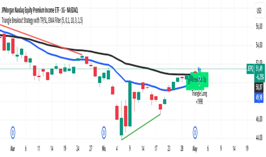
Triangle Breakout Strategy with TP/SL, EMA Filter📌 Triangle Breakout Strategy with TP/SL, EMA Filters, and Backtest – Explained.
✅ 1. Pattern Detection – Triangle Breakout
The script scans for triangle patterns by detecting local pivot highs and pivot lows.
It uses two recent highs and two recent lows to draw converging trendlines (upper and lower boundaries of the triangle).
If the price breaks above the upper trendline, a bullish breakout signal is generated.
🎯 2. TP (Take Profit) & SL (Stop Loss)
When a bullish breakout is detected:
A buy order is placed using strategy.entry.
TP and SL levels are calculated relative to the current close price:
TP = 3% above the entry price
SL = 1.5% below the entry price
These are defined using strategy.exit.
📊 3. EMA Filter
An optional filter checks if:
Price is above both EMA 20 and EMA 50
Only if this condition is met, the strategy allows a long entry.
You can toggle the filter on or off with useEMAFilter.
📈 4. Backtesting with Strategy Tester
This script uses strategy() instead of indicator() to enable TradingView’s built-in backtest engine.
Every buy entry and exit (based on TP or SL) is recorded.
📌 5. Visuals
EMA 20 and EMA 50 lines are plotted on the chart.
A label is shown when a breakout is detected: "Breakout Up"
Results (profit, win rate, drawdown, etc.) can be viewed in the Strategy Tester panel.
StochRSI Strategy with SL/TP updatedSimple StoschiRSi strategy have backtest with input management of stop loss and take profit, have some adjustment to other version the exit the trade..

ORB Strategy w/ Volume Confirmation & EMAsORB breakout within 15 minutes of the NY open. Uses EMA indicators to show strength in trend.

Kassa Eröffnungskerze (z. B. DAX)This Pine Script automatically draws a horizontal line at the 09:00 CET open price every trading day. It’s designed for use on any timeframe – from 1-minute to daily – and is ideal for traders following European indices like the DAX (GER40) or EuroStoxx.
🛠 Features:
• Automatically detects the cash market open (09:00 CET)
• Works on all timeframes
• Uses Europe/Zurich timezone (CET/CEST)
• Draws a new line once per day at 09:00
• No repainting – consistent and reliable behavior
💡 Use Case:
Perfect for intraday and day traders who want to anchor their analysis to the official cash market open price. This level is often critical for observing volume spikes, trend initiations, or mean-reversion behavior during the European session.

X HL RangeOverview:
The X Range indicator is a multi-timeframe visualization tool designed to display the high and low price ranges of previous candles from higher timeframes (HTFs) directly on a lower timeframe chart. It helps traders identify significant price zones and potential support/resistance levels by visually representing the price range of up to three previous candles for each selected timeframe.
Key Features:
Multi-Timeframe Support: The indicator supports three configurable higher timeframes (default: 60 min, 15 min, 5 min) which can be independently toggled on or off.
Custom Candle Range Display: For each enabled timeframe, users can choose to display the range of the most recent 1, 2, or 3 completed candles.
Dynamic Box Drawing: Price ranges are highlighted using rectangular boxes that extend across the chart to show where the highs and lows of each selected HTF candle occurred.
Custom Styling: Each timeframe's boxes can be individually styled with user-defined background and border colors to suit visual preferences or chart themes.
Efficient Redrawing: Boxes update in real-time as new higher timeframe candles complete, and previous boxes are removed to prevent chart clutter.
Use Case:
This indicator is particularly useful for intraday traders who want to align entries and exits with higher timeframe levels. By visualizing previous HTF ranges on a lower timeframe chart, traders gain contextual awareness of where price is likely to react or consolidate, aiding in decision-making for breakouts, reversals, or trend continuation setups.

Smart Range DetectorSmart Range Detector
What It Does
This indicator automatically detects and validates significant trading ranges using pivot point analysis combined with logarithmic fibonacci relationships. It operates by identifying specific pivot patterns (High-Low-High and Low-High-Low) that meet fibonacci validation criteria to filter out noise and highlight only the most reliable trading ranges. Each range is continuously monitored for potential mitigation (breakout) events.
Key Features
Identifies both High-Low-High and Low-High-Low range patterns
Validates each range using logarithmic fibonacci relationships (more accurate than linear fibs)
Detects range mitigations (breakouts) and visually differentiates them
Shows fibonacci levels within ranges (25%, 50%, 75%) for potential reversal points
Visualizes extension levels beyond ranges for breakout targets
Analyzes volume profile with customizable price divisions (default: 60)
Displays Point of Control (POC) and Value Area for traded volume analysis
Implements performance optimization with configurable range limits
Includes user-adjustable safety checks to prevent Pine Script limitations
Offers fully customizable colors, line widths, and transparency settings
How To Use It
Identify Valid Ranges : The indicator automatically detects and highlights trading ranges that meet fibonacci validation criteria
Monitor Fibonacci Levels : Watch for price reactions at internal fib levels (25%, 50%, 75%) for potential reversal opportunities
Track Extension Targets : Use the extension lines as potential targets when price breaks out of a range
Analyze Volume Structure : Enable the volume profile mode to see where most volume was traded within mitigated ranges
Trade Range Boundaries : Look for reactions at range highs/lows combined with volume POC for higher probability entries
Manage Performance : Adjust the maximum displayed ranges and history bars settings for optimal chart performance
Settings Guide
Left/Right Bars Look Back : Controls how far back the indicator looks to identify pivot points (higher values find more ranges but may reduce sensitivity)
Max History Bars : Limits how far back in history the indicator will analyze (stays within Pine Script's 10,000 bar limitation)
Max Ranges to Display : Restricts the total number of ranges kept in memory for improved performance (1-50)
Volume Profile : When enabled, shows volume distribution analysis for mitigated ranges
Volume Profile Divisions : Controls the granularity of the volume analysis (higher values show more detail)
Display Options : Toggle visibility of range lines, fibonacci levels, extension lines, and volume analysis elements
Transparency & Color Settings : Fully customize the visual appearance of all indicator elements
Line Width Settings : Adjust the thickness of lines for better visibility on different timeframes
Technical Details
The indicator uses logarithmic fibonacci calculations for more accurate price relationships
Volume profile analysis creates 60 price divisions by default (adjustable) for detailed volume distribution
All timestamps are properly converted to work with Pine Script's bar limitations
Safety checks prevent "array index out of bounds" errors that plague many complex indicators
Time-based coordinates are used instead of bar indices to prevent "bar index too far" errors
This indicator works well on all timeframes and instruments, but performs best on 5-minute to daily charts. Perfect for swing traders, range traders, and breakout strategists.
What Makes It Different
Most range indicators simply draw boxes based on recent highs and lows. Smart Range Detector validates each potential range using proven fibonacci relationships to filter out noise. It then adds sophisticated volume analysis to help traders identify the most significant price levels within each range. The performance optimization features ensure smooth operation even on lower timeframes and extended history analysis.

MC High/LowMC High/Low is a minimalist precision tool designed to show traders the most critical price levels — the High and Low of the current Day and Week — in real-time, without any visual clutter or historical trails.
It automatically tracks:
🔼 HOD – High of Day
🔽 LOD – Low of Day
📈 HOW – High of Week
📉 LOW – Low of Week
Each level is plotted using simple black horizontal lines, updated dynamically as the session evolves. Labels are clearly marked and positioned to the right of the screen for easy reference.
There’s no trailing history, no background colors, and no distractions — just pure price structure for clean confluence.
Perfect for:
Intraday scalpers
Swing traders
Liquidity & range traders
This is a tool built for sniper-level execution — straight from the MadCharts mindset.
🛠 Created by:
🔒 Version: Public Release
🎯 Use this with your favorite price action, liquidity, or market structure strategies.

UM Dual MA with Price Bar Color change & Fill
Description
This is a dual moving average indicator with colored bars and moving averages. I wrote this indicator to keep myself on the right side of the market and trends. It plots two moving averages, (length and type of MA are user-defined) and colors the MAs green when trending higher or red when trending lower. The price bars are green when both MAs are green, red when both MAs are red, and orange when one MA is green and the other is red. The idea behind the indicator is to be extremely visual. If I am buying a red bar, I ask myself "why?" If I am selling a green bar, again, "why?"
Recommended Usage
Configure your tow favorite Moving averages. Consider long positions when one or both turn green. Scale into a position with a portion upon the first MA turning green, and then more when the second turns green. Consider scaling out when the bars are orange after an up move.
Orange bars are either areas of consolidation or prior to major turns.
You can also look for MA crossovers.
The indicator works on any timeframe and any security. I use it on daily, hourly, 2 day charts.
Default settings
The defaults are the author's preferred settings:
- 8 period WMA and 16 period WMA.
- Bars are green when both MAs are trending higher, red when both MAs are trending lower, and orange when one MA is trending higher and the other is trending lower.
Moving average types, lengths, and colors are user-configurable. Bar colors are also user-configurable.
Alerts
Alerts can be set by right-clicking the indicator and selecting the dropdown:
- Bullish Trend Both MAs turning green
- Bearish Trend Both MAs turning red
- Mixed Trend, 1 green 1 red MA
Helpful Hints:
Look for bullish areas when both MAs turn green after a sustained downtrend
Look for bearish areas when both MAs turn red
Careful in areas of orange bars, this could be a consolidation or a warning to a potential trend direction change.
Switch up your timeframes, I toggle back and forth between 1 and 2 days.
Stretch your timeframe over a lower time frame; for example, I like the 8 and 16 daily WMA. With most securities I get 16 bars with pre and post market. This translates into 128 and 256 MAs on the hourly chart. This slows down moves and color transitions for better manageability.
Author's Subjective Observations
I like the 128/256 WMA on the hourly charts for leveraged and inverse ETFs such as SPXL/SPXS, TQQQ/SQQQ, TNA/TZA. Or even the volatility ETFs/ETNS: UVXY, VXX.
Here is a one-hour chart example:
I have noticed that as volatility increases, I should begin looking at higher timeframes. This seems counterintuitive, but higher volatility increases the level of noise or swings.
I question myself when I short a green bar or buy a red bar; "Why am I doing this?" The colors help me visually stay on the right side of trend. If I am going to speculate on a market turn, at least do it when the bars are orange (MA trends differ)
My last observation is a 2-day chart of leveraged ETFs with the 8 and 16 WMAs. I frequently trade SPXL, FNGA, and TNA. If you are really dissecting this indicator,
look at a few 2-day charts. 2-day charts seem to catch the major swings nicely up and down. They also weed out the daily sudden big swings such as a panic move from economic data
or tweets. When both the MAs turn red on a 2-day chart the same day or same bar, beware; this could be a rough ride or short opportunity. I found weekly charts too long for my style but good
to review for direction. Less decisions on longer charts equate to less brain damage for myself.
These are just my thoughts, of course you do you and what suits your style best! Happy Trading.

Price Flip IndicatorPrice Flip Indicator
Purpose: Visualizes price inversion and moving average crossovers to identify potential buy/sell signals.
Features:
Plots ticker max/min, inverted/original prices, and HLCC4 averages.
Supports multiple MA types (SMA, EMA, WMA, SMMA, VWMA, HMA, TEMA, DEMA, ALMA, JMA).
Displays inverted candles and customizable labels for signals and levels.
Triggers alerts for buy (price > inverted price, bullish MA crossover) and sell signals within a user-defined date range.

Volume Intelligence Suite (VIS) v2📊 Volume Intelligence Suite – Smart Volume, Smart Trading
The Volume Intelligence Suite is a powerful, all-in-one TradingView indicator designed to give traders deeper insight into market activity by visualizing volume behavior with price action context. Whether you're a scalper, day trader, or swing trader, this tool helps uncover hidden momentum, institutional activity, and potential reversals with precision.
🔍 Key Features:
Dynamic Volume Zones – Highlights high and low volume areas to spot accumulation/distribution ranges.
Volume Spikes Detector – Automatically marks abnormal volume bars signaling potential breakout or trap setups.
Smart Delta Highlighting – Compares bullish vs bearish volume in real time to reveal buyer/seller strength shifts.
Session-Based Volume Profiling – Breaks volume into key trading sessions (e.g., London, New York) for clearer context.
Volume Heatmap Overlay – Optional heatmap to show intensity and velocity of volume flow per candle.
Custom Alerts – Built-in alerts for volume surges, divergences, and exhaustion signals.
Optimized for Kill Zone Analysis – Pairs perfectly with ICT-style session strategies and Waqar Asim’s trading methods.
🧠 Why Use Volume Intelligence?
Most traders overlook the story behind each candle. Volume Intelligence Suite helps you "see the why behind the move" — exposing key areas of interest where smart money may be active. Instead of reacting late, this tool puts you in position to anticipate.
Use it to:
Validate breakouts
Detect fakeouts and liquidity grabs
Confirm bias during kill zones
Analyze volume divergence with price swings
⚙️ Fully Customizable:
From volume thresholds to visual styles and session timings, everything is user-adjustable to fit your market, timeframe, and strategy.
✅ Best For:
ICT/Smart Money Concepts (SMC) traders
Breakout & reversal traders
Kill zone session scalpers
Institutional footprint followers
Volume towers by GSK-VIZAG-AP-INDIAVolume Towers by GSK-VIZAG-AP-INDIA
Overview :
This Pine Script visualizes volume activity and provides insights into market sentiment through the display of buying and selling volume, alongside moving averages. It highlights high and low volume candles, enabling traders to make informed decisions based on volume anomalies. The script is designed to identify key volume conditions, such as below-average volume, high-volume candles, and their relationship to price movement.
Script Details:
The script calculates a Simple Moving Average (SMA) of the volume over a user-defined period and categorizes volume into several states:
Below Average Volume: Volume is below the moving average.
High Volume: Volume exceeds the moving average by a multiplier (configurable by the user).
Low Volume: Volume that doesn’t qualify as either high or below average.
Additionally, the script distinguishes between buying volume (when the close is higher than the open) and selling volume (when the close is lower than the open). This categorization is color-coded for better visualization:
Green: Below average buying volume.
Red: Below average selling volume.
Blue: High-volume buying.
Purple: High-volume selling.
Black: Low volume.
The Volume Moving Average (SMA) is plotted as a reference line, helping users identify trends in volume over time.
Features & Customization:
Customizable Inputs:
Volume MA Length: The period for calculating the volume moving average (default is 20).
High Volume Multiplier: A multiplier for defining high volume conditions (default is 2.0).
Color-Coded Volume Histograms:
Different colors are used for buying and selling volume, as well as high and low-volume candles, for quick visual analysis.
Alerts:
Alerts can be set for the following conditions:
Below-average buying volume.
Below-average selling volume.
High-volume conditions.
How It Works:
Volume Moving Average (SMA) is calculated using the user-defined period (length), and it acts as the baseline for categorizing volume.
Volume Conditions:
Below Average Volume: Identifies candles with volume below the SMA.
High Volume: Identifies candles where volume exceeds the SMA by the set multiplier (highVolumeMultiplier).
Low Volume: When volume is neither high nor below average.
Buying and Selling Volume:
The script identifies buying and selling volume based on the closing price relative to the opening price:
Buying Volume: When the close is greater than the open.
Selling Volume: When the close is less than the open.
Volume histograms are then plotted using the respective colors for quick visualization of volume trends.
User Interface & Settings:
Inputs:
Volume MA Length: Adjust the period for the volume moving average.
High Volume Multiplier: Define the multiplier for high volume conditions.
Plots:
Buying Volume: Green bars indicate buying volume.
Selling Volume: Red bars indicate selling volume.
High Volume: Blue or purple bars for high-volume candles.
Low Volume: Black bars for low-volume candles.
Volume Moving Average Line: Displays the moving average line for reference.
Source Code / Authorship:
Author: prowelltraders
Disclaimer:
This script is intended for educational purposes only. While it visualizes important volume data, users are encouraged to perform their own research and testing before applying this script for trading decisions. No guarantees are made regarding the effectiveness of this script for real-world trading.
Contact & Support:
For questions, support, or feedback, please reach out to the author directly through TradingView (prowelltraders).
Signature:
GSK-VIZAG-AP-INDIA

Momentum Pullback ScalpingThis strategy is based solely on the "Momentum Pullback Signals" TradingView indicator. This strategy was developed exclusively for scalping trading in the 1-minute timeframe. For each trade, the level of loss is placed 0.3% above/below the entry price. Each trade has a fixed risk-to-reward ratio of 4:1. That's risk management. If you want to know the technical trading analysis for each trade, you have to look at the corresponding indicator. It will be there. You can look at several markets with this strategy and see which one suits you best.

Dual Stochastic %K(14)+%K(5) / Stocastico Doppio🇬🇧Dual Stochastic %K(14)+%K(5) / Stocastico Doppio) (English version) - La versione italiana è sotto quella inglese
🟦 Indicator Title: Dual Stochastic %K(14)+%K(5) / Stocastico Doppio
🖊️ Author: B&MMNCR (Borsa & Mercati – Metro Manila National Capital Region)
🔍 What is it?
This script combines two stochastic oscillators:
A slow %K(14) acting as a zone filter (detecting overbought/oversold areas)
A fast %K(5) acting as a trigger (generating entry signals via %K/%D crossovers)
Signals (green/red arrows) only appear when a crossover occurs within a confirming zone (e.g. both oscillators under 20 or over 80).
All signals are stored for future analysis or export.
🎯 Ideal for:
Traders working in range-bound or sideways markets
Scalping and intraday strategies with momentum filtering
Visual confirmation of overbought/oversold zones
⚙️ Recommended settings:
Timeframe Use Type Smoothing
1–5 min Scalping 1–2
15m–1H Intraday 2–3
4H–1D Swing 3–5
📌 Full Italian description included in the script.
Let me know in the comments if you'd like a video version or strategy version.
🇮🇹 Versione Italiana (per la community)
📊 Titolo: Stocastico Doppio – %K(14) + %K(5)
✍️ Autore: B&MMNCR (Borsa & Mercati – Metro Manila National Capital Region)
🔎 Cos’è?
Questo indicatore unisce due stocastici:
Uno lento %K(14) come filtro per identificare zone operative (ipercomprato/ipervenduto)
Uno veloce %K(5) come trigger per generare segnali tramite incroci %K/%D
Le frecce compaiono solo se l'incrocio avviene in una zona coerente.
Tutti i segnali sono salvati per analisi o backtest.
✅ Ideale per:
Mercati laterali
Strategia scalping/intraday con conferma visiva
Trading sistematico semplificato
⚙️ Impostazioni consigliate:
Timeframe Tipo Smoothing
1–5 minuti Scalping 1–2
15m–1 ora Intraday 2–3
4H – Daily Swing 3–5

Trendline Break & Retest Strategy + FiltersTrendline break and retest with filters RSI
How It Works – Step-by-Step
1. Swing High & Swing Low Detection
The script looks for pivot points:
A swing high is when a high is higher than surrounding candles.
A swing low is when a low is lower than surrounding candles.
These points act as anchor points for trendlines.
2. Simulated Trendlines
Since Pine Script can’t draw truly dynamic trendlines, it mathematically simulates:
A downward resistance trendline from the last swing high.
An upward support trendline from the last swing low.
These lines estimate where resistance or support would exist if you were manually drawing trendlines.
3. Breakout Detection
The strategy checks:
If price breaks above the resistance trendline (bullish breakout).
If price breaks below the support trendline (bearish breakout).
It looks for a clean break with candle close beyond the line, not just a wick.
4. Retest Confirmation
To avoid chasing breakouts, the strategy waits for a retest:
After a breakout, price must come back close to the broken trendline (within a % tolerance).
This simulates the classic "break → retest → go" pattern.
Only after a valid retest will the strategy consider entering.
5. Technical Filters (for Better Accuracy)
Once a valid breakout + retest is detected, the strategy applies filters:
✅ RSI Filter
Go long only if RSI > 50 (bullish momentum).
Go short only if RSI < 50 (bearish momentum).
✅ Volume Filter
Only enter trades when current volume is greater than the 20-period average, ensuring market participation.
✅ EMA Trend Filter
Long trades only if price is above the 50 EMA (uptrend).
Short trades only if price is below the 50 EMA (downtrend).
This avoids going against the dominant trend.
6. Trade Execution
Entries: After all conditions are met (break, retest, filters).
Exits: Set using:
Take Profit = +2% from entry
Stop Loss = -1% from entry
You can adjust these in the script settings.

Aroon𝑻𝑹𝑨𝑫𝑬𝑹𝑫𝑶 + Oscillator
ENGLISH
Key Differences Between Aroon𝑻𝑹𝑨𝑫𝑬𝑹𝑫𝑶 + Oscillator and Original Aroon Indicator:
Visual and User Experience Enhancements
✅ Colored Background:
Green for uptrends
Orange for downtrends
(Not present in original version)
✅ Signal Markers:
Buy (B): Green triangle ▼ (bottom)
Sell (S): Red triangle ▲ (top)
(Original only shows line crossovers)
✅ Text Color Customization:
"Buy (B) and Sell (S) signals feature selectable white/black text colors to accommodate both dark and light chart themes."
(No such option in original)
Technical Improvements
✅ Added Oscillator Line:
Purple line using upper - lower formula
(Original only shows Up/Down lines)
✅ Advanced Signal Logic:
Crossover + previous candle confirmation (upper < lower )
(Original uses simple crossovers)
Customization Options
✅ User-Friendly Inputs:
Adjustable period (default: 14)
Feature Comparison
Performans Karşılaştırması
Özellik Orijinal Aroon
Up/Down Çizgileri ✔️
Renkli Arka Plan ❌
Al/Sat Sinyalleri ❌
Yazı Rengi Seçimi ❌
Kesişim Filtresi ❌
Özellik Aroon𝑻𝑹𝑨𝑫𝑬𝑹𝑫𝑶+ Oscillator
Up/Down Çizgileri ✔️
Osilatör Çizgisi ✔️ (Mor)
Renkli Arka Plan ✔️
Al/Sat Sinyalleri ✔️ (B/S)
Yazı Rengi Seçimi ✔️
Kesişim Filtresi ✔️ (Önceki Bar)
Conclusion
This indicator preserves the original Aroon's core mechanics while adding:
Enhanced visual feedback
Trend confirmation systems
User customization
Ideal for swing traders seeking clearer signals, though some users may want adjustments to the oscillator calculation (which uses a non-standard formula).
////////////////////////////////////////////////////////////////////////////////
TÜRKÇE AÇIKLAMA:
Aroon𝑻𝑹𝑨𝑫𝑬𝑹𝑫𝑶 + Oscillator göstergesinin orijinal Aroon'a göre temel farklılıkları:
Görsel ve Kullanıcı Deneyimi Geliştirmeleri
✅ Renkli Arka Plan:
Yükseliş trendinde yeşil
Düşüş trendinde turuncu
Bu özellik orijinalinde yok
✅ Sinyal İşaretleri:
Al (B) için yeşil üçgen ▲ (alt kısım)
Sat (S) için kırmızı üçgen ▼ (üst kısım)
Orijinalde sadece çizgi kesişimleri var
✅ Yazı Rengi Seçeneği:
Al için "B" ve sat için "S" sinyalleri beyaz/siyah yazı rengi seçilebilir koyu ve açık tema kullananlar için
Orijinalde böyle bir özellik yok
Teknik Geliştirmeler
✅ Aroon Osilatörü Eklentisi:
upper - lower formülüyle mor renkli ek çizgi
Orijinal Aroon sadece Up/Down çizgilerini gösterir
✅ Gelişmiş Sinyal Mantığı:
Kesişim + önceki mum doğrulaması (upper < lower )
Orijinalde basit kesişimler
Özelleştirme Seçenekleri
✅ Kullanıcı Dostu Inputlar:
Periyot ayarı (varsayılan 14)
Performans Karşılaştırması
Özellik Orijinal Aroon
Up/Down Çizgileri ✔️
Osilatör Çizgisi ❌
Renkli Arka Plan ❌
Al/Sat Sinyalleri ❌
Yazı Rengi Seçimi ❌
Kesişim Filtresi ❌
Özellik Aroon𝑻𝑹𝑨𝑫𝑬𝑹𝑫𝑶+ Oscillator
Up/Down Çizgileri ✔️
Osilatör Çizgisi ✔️ (Mor)
Renkli Arka Plan ✔️
Al/Sat Sinyalleri ✔️ (B/S)
Yazı Rengi Seçimi ✔️
Kesişim Filtresi ✔️ (Önceki Bar)
Sonuç:
Bu gösterge, orijinal Aroon'un teknik temelini korurken daha fazla görsel geri bildirim, trend onay mekanizması ve kullanıcı özelleştirmesi sunar. Özellikle swing trader'lar için sinyal netliği sağlar, ancak osilatör hesaplamasında orijinal formül kullanılmadığı için bazı kullanıcılar ek ayar yapmak isteyebilir.
