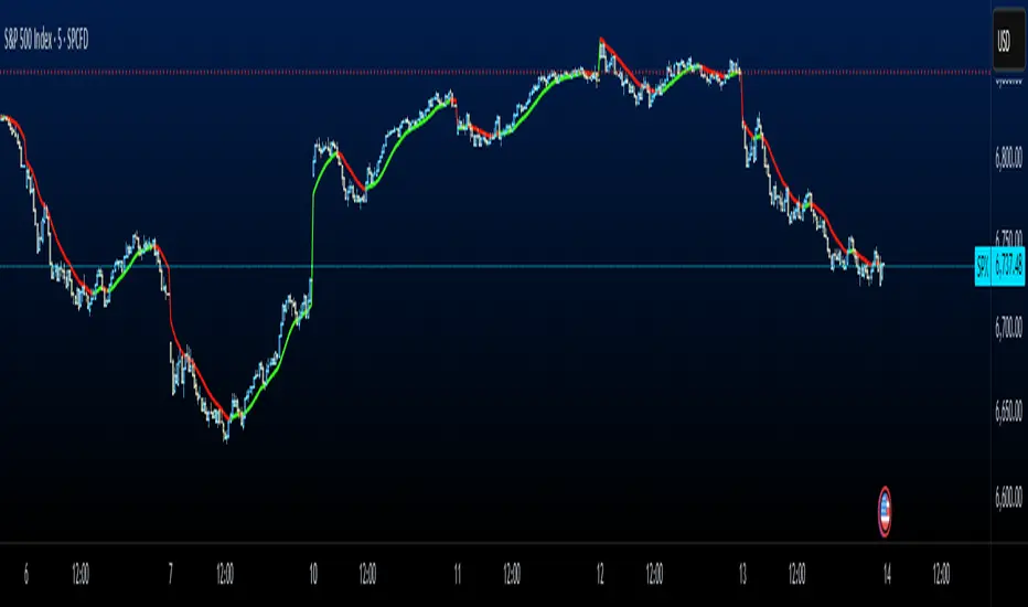
Trend Zone BreakoutsThe HD Trend Zone Breakouts indicator identifies when the market is trending strongly on both your chart timeframe and a higher timeframe, then tracks moments where price becomes stretched inside that trend. When this stretch occurs, the indicator builds a dynamic zone capturing the full high–low range during that extension. Once the stretch ends, the zone is frozen, and the script waits to see how price reacts to it. Breakouts above or below these zones signal whether the trend is likely to continue or fail. This creates a powerful structure-based way to time entries, exits, and reversals without relying on noisy overbought/oversold signals.
How It Works
Confirms trend direction on both lower and higher timeframes using an EMA-based regime.
Detects stretched conditions using RSI only when both timeframes are aligned.
Draws a price zone around candles formed during these extreme trend pushes.
Freezes the zone once the stretch ends, creating a reference area.
Monitors for breakouts above/below the zone to confirm trend continuation or trend failure.
Breakout Logic
Bull continuation → price breaks above the top of a bullish zone.
Bull failure → price breaks below the bottom of a bullish zone.
Bear continuation → price breaks below the bottom of a bearish zone.
Bear failure → price breaks above the top of a bearish zone.
Why It’s Useful
Distinguishes meaningful extensions from ordinary RSI signals.
Provides clear structural levels for timing trades.
Identifies trend continuation early and flags potential reversals.
Works extremely well alongside EMAC Forecast, Trend Exhaustion Lite, and Volatility Squeeze.
Indicators and strategies
RSI (Custom Background) KDMThis code is a custom version of the RSI (Relative Strength Index) indicator.
Its main purpose is to compare recent price gains and losses to determine whether the market is in an overbought or oversold condition.
30–50 zone (purple tone): represents a weak or pullback area.
50–70 zone (green tone): represents a strengthening or dominant buying area.
Additionally, when the RSI line moves above 70, a green gradient background highlights the overbought region; when it moves below 30, a red gradient background emphasizes the oversold region.
Like the classic RSI, this version is a momentum indicator showing whether the price is losing or gaining strength.
The key difference is the colored background, which allows you to visually identify the RSI zones (e.g., 30–50 weak, 50–70 strong) much faster and more clearly.

Exponential Moving Average + ATR MTF [YSFX]Description:
This indicator is a reupload of a previously published EMA + ATR tool, updated and enhanced after a house rule violation to provide additional features and a cleaner, more versatile experience for traders.
It combines trend analysis and volatility measurement into one intuitive tool, allowing traders to visualize market direction, dynamic support and resistance, and adaptive risk levels—all in a clean, minimal interface.
The indicator calculates a customizable moving average (MA) type—EMA, SMA, WMA, HMA, RMA, DEMA, TEMA, VWMA, LSMA, or KAMA—and surrounds it with ATR-based bands that expand and contract with market volatility. This creates a dynamic envelope around price, helping traders identify potential breakouts, pullbacks, or high-probability entry/exit zones.
Advanced Features:
Multiple MA types: Supports all major moving averages, including advanced options like KAMA, DEMA, and TEMA.
KAMA customization: Adjustable fast and slow lengths for precise tuning.
Dual timeframe support: Optionally use separate timeframes for the MA and ATR, or a global timeframe for both.
Dynamic ATR bands: Automatically adjust to market volatility, useful for setting adaptive stop-loss levels.
Optional fill: Shade the area between upper and lower ATR bands for a clear visual representation of volatility.
Flexible for all markets: Works across any timeframe or asset class.
Who It’s For:
This indicator is ideal for trend-following traders, swing traders, and volatility-focused analysts who want to:
Confirm trend direction while accounting for volatility
Identify high-probability trade entries and exits
Implement dynamic, ATR-based stop-loss strategies
Keep charts clean and uncluttered while still capturing key market information
This reuploaded version ensures compliance with platform rules while offering enhanced flexibility and clarity for modern trading workflows.
Monthly, Weekly Open + Daily Pivot (Broken Lines, fixed)monthly open line weekly open and daily pivot
This TradingView indicator plots three key reference levels on your chart:
Monthly Open Line – shows the current month’s opening price.
Weekly Open Line – shows the current week’s opening price.
Daily Pivot Line – shows the pivot level based on the previous day’s high, low, and close.
Each line resets at the start of its new period (month, week, or day), so the lines are broken, not continuous.
You can fully customize visibility, color, and thickness for each line.
It helps traders quickly see market bias and important support/resistance levels for better intraday or swing trading decisions.
Nadaraya-Watson: Rational Quadratic Kernel (Opening Gap Shift)What we did to fix it: We didn't throw out the old data (that made it too jumpy early in the day).
Instead, we "tricked" the kernel by shifting all the previous day's prices up or down by the exact gap amount (e.g., if it gapped up 50 points, add 50 to every old price point). This makes the history "line up" with the new day's starting level.
Created so with a fresh session the Nadaraya-Watson Regression Kernel is relevant from the get go - no catch up on opening gaps.
All credit to jdehorty his full description is below.
What is Nadaraya–Watson Regression?
Nadaraya–Watson Regression is a type of Kernel Regression, which is a non-parametric method for estimating the curve of best fit for a dataset. Unlike Linear Regression or Polynomial Regression, Kernel Regression does not assume any underlying distribution of the data. For estimation, it uses a kernel function, which is a weighting function that assigns a weight to each data point based on how close it is to the current point. The computed weights are then used to calculate the weighted average of the data points.
How is this different from using a Moving Average?
A Simple Moving Average is actually a special type of Kernel Regression that uses a Uniform (Retangular) Kernel function. This means that all data points in the specified lookback window are weighted equally. In contrast, the Rational Quadratic Kernel function used in this indicator assigns a higher weight to data points that are closer to the current point. This means that the indicator will react more quickly to changes in the data.
Why use the Rational Quadratic Kernel over the Gaussian Kernel?
The Gaussian Kernel is one of the most commonly used Kernel functions and is used extensively in many Machine Learning algorithms due to its general applicability across a wide variety of datasets. The Rational Quadratic Kernel can be thought of as a Gaussian Kernel on steroids; it is equivalent to adding together many Gaussian Kernels of differing length scales. This allows the user even more freedom to tune the indicator to their specific needs.
The formula for the Rational Quadratic function is:
K(x, x') = (1 + ||x - x'||^2 / (2 * alpha * h^2))^(-alpha)
where x and x' data are points, alpha is a hyperparameter that controls the smoothness (i.e. overall "wiggle") of the curve, and h is the band length of the kernel.
Does this Indicator Repaint?
No, this indicator has been intentionally designed to NOT repaint. This means that once a bar has closed, the indicator will never change the values in its plot. This is useful for backtesting and for trading strategies that require a non-repainting indicator.
Settings:
Bandwidth. This is the number of bars that the indicator will use as a lookback window.
Relative Weighting Parameter. The alpha parameter for the Rational Quadratic Kernel function. This is a hyperparameter that controls the smoothness of the curve. A lower value of alpha will result in a smoother, more stretched-out curve, while a lower value will result in a more wiggly curve with a tighter fit to the data. As this parameter approaches 0, the longer time frames will exert more influence on the estimation, and as it approaches infinity, the curve will become identical to the one produced by the Gaussian Kernel.
Color Smoothing. Toggles the mechanism for coloring the estimation plot between rate of change and cross over modes.
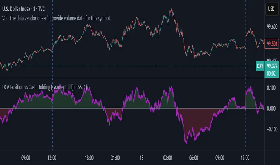
DCA Position vs Cash HoldingThis indicator visualizes the performance of a simulated dollar-cost averaging (DCA) strategy compared to simply holding cash. It models the cumulative position size and value of buying a fixed dollar amount of the asset per candle over a configurable lookback period.
🔍 What It Shows:
Simulates buying $1 (or any amount) of the asset per candle
Tracks the total units accumulated and their current market value
Plots the difference between the DCA position value and total cash spent
Highlights when DCA buyers are underwater — a potential contrarian buy zone
📈 How to Use:
Values above zero indicate DCA outperformance vs cash
Values below zero signal structural drawdown — often a high-conviction bulk-buy opportunity
Use as a sentiment overlay to time discretionary adds or confirm regime shifts
⚙️ Inputs:
Lookback Window: Number of candles used to simulate DCA accumulation
DCA Amount: Dollar value purchased per candle
This tool is ideal for traders seeking to quantify accumulation efficiency, identify cycle inflection points, and visualize sentiment-weighted cost basis dynamics.

TUNEL DOMENEC//@version=6
indicator('TUNEL DOMENEC', shorttitle = 'TUNEL DOMENEC', overlay = true, max_bars_back = 3000)
// Genial Line
// Parámetros
VelasBanda = 20
Desviacio = 3.14159265358979
var SmoothPrice = close
var SmoothRange = 0.0
// Cálculo de valores suavizados
if bar_index > 1
SmoothPrice := (SmoothPrice * (VelasBanda - 1) + close) / VelasBanda
SmoothRange := (SmoothRange * (VelasBanda - 1) + (high - low)) / VelasBanda
Alt1 = (SmoothPrice + SmoothRange * Desviacio)
Baix1 = (SmoothPrice - SmoothRange * Desviacio)
Mitjana = (Alt1 + Baix1) / 2
// Función para calcular DEMA
dema(src, length) =>
ema1 = ta.ema(src, length)
ema2 = ta.ema(ema1, length)
2 * ema1 - ema2
Alt = dema(Alt1, VelasBanda)
Baix = dema(Baix1, VelasBanda)
// Cálculo de c9
c9 = (Mitjana + ta.sma(close, 34)) / 2
color_genial = c9 > c9 ? color.blue : color.red
genialplot = plot(c9 , color = color_genial, style = plot.style_cross, join = false, linewidth = 2, title = 'GENIAL LINE')
// End Genial Line

Emac ForecastEMAC Forecast System
What it measures
The EMAC Forecast measures the speed and persistence of trend movement. Instead of only looking at whether one EMA is above or below another, the forecast quantifies how quickly momentum is building or fading across multiple time horizons.
It captures three things at once:
The direction of the underlying trend
The rate at which the trend is strengthening or weakening
The consistency of that change across several smoothing speeds
This produces a forward leaning view of trend conditions, not a trailing confirmation.
How to read the forecast
The EMAC Forecast is displayed as a scaled oscillator, typically ranging between negative and positive values.
Positive forecast values
Indicate that bullish trend pressure is increasing.
Higher readings mean stronger acceleration, not just price rising.
Negative forecast values
Indicate increasing bearish pressure.
Again, the strength of the negative reading reflects how quickly selling momentum is building.
Rising forecast (slope up)
Shows improving momentum, even if the value is still below zero.
Useful for catching early reversals or transitions from chop to trend.
Falling forecast (slope down)
Shows momentum fading, even when trend direction has not flipped yet.
Helps anticipate exhaustions and pullbacks.
Flat forecast
Indicates low conviction and lack of directional drive.
Often corresponds to chop or range conditions.
Why the EMAC Forecast is different from a regular EMAC
A standard EMAC or EMA crossover follows a simple rule:
When fast EMA crosses above slow EMA, bullish.
When fast EMA crosses below slow EMA, bearish.
This is reactive and only changes after price has already moved.
The EMAC Forecast works differently:
1. Uses multiple EMAs rather than two
Instead of comparing one fast and one slow average, it blends several time constants into a composite signal.
This creates a smoother, more reliable directional read.
2. Measures acceleration, not just position
Traditional crossovers only monitor whether lines have crossed.
EMAC Forecast measures the speed and force behind the movement.
It tells you how strong the trend is becoming, not just whether one line is above the other.
3. Adapts to volatility
Sharp markets increase weighting of fast components.
Calm markets increase influence of slower components.
This reduces whipsaws in low-volatility conditions and improves responsiveness in high-volatility environments.
4. Gives actionable information before a crossover happens
The forecast often turns before the EMAC direction flips, allowing early detection of:
Trend ignition
Trend fade
Momentum squeezes
Impending reversals
It effectively “leans forward” into the trend instead of waiting for a full reversal.
Practical Use Cases
Early trend identification
When the forecast first turns positive or negative, trend acceleration is beginning.
This is often visible before the EMAC lines cross.
Confirming the Combined Forecast System
Use the EMAC Forecast to validate signals from your other forecast models.
If both agree, conviction is notably higher.
Filtering noise
Short-term whipsaws are reduced because the composite structure dilutes erratic fast movements.
Trend aging and exhaustion
A falling forecast during a positive trend suggests reduced conviction and potential exhaustion.

Braid Filter StrategyAnother of TradeIQ's youtube strategies. It looks a little messy but it combines all the indicators into one so there are no extra panes. This strategy is like a sophisticated set of traffic lights and speed limit signs for trading. It only allows a trade when multiple indicators line up to confirm a strong move, giving it its "Braid Filter" name—it weaves together several conditions.
The strategy is set up to use 100% of your account equity (your trading funds) on a trade and does not "pyramid" (it won't add to an existing trade).
1. The Main Trend Check (The Traffic Lights)
The strategy uses three main filters that must agree before it considers a trade.
A. The "Braid Filter" (Direction & Strength)
This is the heart of the strategy, a custom combination of three different Moving Averages
These averages have fast, medium, and slow settings (3, 7, and 14 periods).
Go Green (Buy Signal): The fastest average is higher than the medium average, AND the three averages are sufficiently separated (not tangled up, which indicates a strong move).
Go Red (Sell Signal): The medium average is higher than the fastest average, AND the three averages are sufficiently separated.
Neutral (Wait): If the averages are tangled or the separation isn't strong enough.
Key Trigger: A primary condition for a signal is when the Chad Filter changes color (e.g., from Red/Grey to Green).
B. The EMA Trend Bars (Secondary Confirmation)
This is a simpler, longer-term filter using a 34-period Exponential Moving Average (EMA). It checks if the current candle's average price is above or below this EMA.
Green Bars: The price is above the 34 EMA (Bullish Trend).
Red Bars: The price is below the 34 EMA (Bearish Trend).
Trades only happen if the signal direction matches the bar color. For a Buy, the bar must be Green. For a Sell, the bar must be Red.
C. ADX/DI Filter (The Speed Limit Sign)
This uses the Average Directional Index (ADX) and Directional Movement Indicators (DI) to check if a trend is actually in motion and getting stronger.
Must-Have Conditions:
The ADX value must be above 20 (meaning there is a trend, not just random movement).
The ADX line must be rising (meaning the trend is accelerating/getting stronger).
The strategy will only trade when the trend is strong and building momentum.
2. The Trading Action (Entry and Exit)
When all three filters (Chad Filter color change, EMA Trend Bar color, and ADX strength/slope) align, the strategy issues a signal, but it doesn't enter immediately.
Entry Strategy (The "Wait-for-Confirmation" Approach):
When a Buy Signal appears, the strategy sets a "Buy Stop" order at the signal candle's closing price.
It then waits for up to 3 candles (Candles Valid for Entry). The price must move up and hit that Buy Stop price within those 3 candles to confirm the move and enter the trade.
A Sell Signal works the same way but uses a "Sell Stop" at the closing price, waiting for the price to drop and hit it.
Risk Management (Stop Loss and Take Profit):
Stop Loss: To manage risk, the strategy finds a recent significant low (for a Buy) or high (for a Sell) over the last 20 candles and places the Stop Loss there. This is a logical place where the current move would be considered "broken" if the price reaches it.
Take Profit: It uses a fixed Risk:Reward Ratio (set to 1.5 by default). This means the potential profit (Take Profit distance) is $1.50 for every $1.00 of risk (Stop Loss distance).
3. Additional Controls
Time Filter: You can choose to only allow trades during specific hours of the day.
Visuals: It shows a small triangle on the chart where the signal happens and colors the background to reflect the Chad Filter's trend (Green/Red/Grey) and the candle bars to show the EMA trend (Lime/Red).
🎯 Summary of the Strategy's Goal
This strategy is designed to capture strong, confirmed momentum moves. It uses a fast, custom indicator ("Chad Filter") to detect the start of a new move, confirms that move with a slower trend filter (34 EMA), and then validates the move's strength with the ADX. By waiting a few candles for the price to hit the entry level, it aims to avoid false signals.

Easy [CHE] Easy — Minimalist Pine Script for detecting EMA direction changes to define fixed price zones for simple support and resistance visualization, ideal for manual trading workflows.
Summary
This indicator's programming is kept minimalist and super simple, with core logic in under 20 lines for easy comprehension and modification. It creates fixed price zones based on divergences between a base exponential moving average and its smoother counterpart, helping traders spot potential consolidation or reversal areas without dynamic adjustments. By locking the zone at the high and low of the signal bar, it avoids over-expansion in volatile conditions, offering a stable reference line colored by price position relative to the zone. This approach differs from expanding channels by prioritizing simplicity and persistence until a new qualifying signal, reducing visual clutter while highlighting directional bias through midpoint coloring.
Motivation: Why this design?
Traders often face noisy signals from moving averages that flip frequently in sideways markets or lag during breakouts, leading to premature entries or missed opportunities. This indicator addresses that by focusing on confirmed direction shifts between the base and smoothed averages, then anchoring a non-expanding zone to capture the initial price range of the shift. The result is a cleaner tool for marking equilibrium levels, assuming price respects these bounds in ranging or mildly trending conditions.
What’s different vs. standard approaches?
- Reference baseline: Traditional moving average crossovers or simple channels that update every bar.
- Architecture differences:
- Zones are set only on new divergence signals and remain fixed until reset by a gap from the prior zone.
- No ongoing high-low expansion; relies on persistent variables to hold bounds across bars.
- Midpoint plotting with conditional coloring based on close position, plus a highlight for zone initiations.
- Practical effect: Charts show persistent horizontal references instead of drifting lines, making it easier to gauge if price is rejecting or embracing the zone—useful for avoiding false breaks in low-volatility setups.
How it works (technical)
The indicator first computes a base exponential moving average of closing prices over a user-defined length, then applies a second exponential moving average to smooth that base. It checks if both the base and smoothed values are increasing or decreasing compared to their prior values, indicating aligned direction. A signal triggers when this alignment breaks, marking a potential shift.
On a new signal, if the current bar's high and low fall outside any existing zone (or none exists), the zone bounds update to those extremes and persist via dedicated variables. The midpoint of these bounds becomes the primary plot line, colored green if below the close (bullish lean), red if above (bearish lean), or gray otherwise. A secondary thick line highlights the midpoint briefly when a zone first sets, aiding visual confirmation. No higher timeframe data or external fetches are used, so updates occur on each bar close without lookahead.
Parameter Guide
EMA Length — Sets the period for the base moving average; longer values smooth more, reducing signal frequency but increasing lag. Default: 50. Trade-offs/Tips: Shorter for faster response in intraday charts (risks noise); longer for daily trends (may miss early shifts).
Smoother Length — Defines the period for the secondary smoothing on the base average; higher values dampen minor wiggles for stabler direction checks. Default: 3. Trade-offs/Tips: Keep low (2–5) for sensitivity; increase to 7+ if zones trigger too often in choppy markets, at cost of delayed signals.
Reading & Interpretation
The main circle plot at the zone midpoint serves as a dynamic equilibrium line: green suggests price is above the zone (potential strength), red indicates below (potential weakness), and gray shows containment within bounds (neutral consolidation). A sudden thick foreground line at the midpoint flags a fresh zone start, prompting review of the prior bar's context. Absence of a plot means no active zone, implying reliance on price action alone until the next signal.
Practical Workflows & Combinations
- Trend following: Enter long on green midpoint after a higher low touches the zone lower bound, confirmed by structure like higher highs; filter shorts similarly on red with lower highs.
- Exits/Stops: Use the opposite zone bound as a conservative stop (e.g., below lower for longs); trail aggressively to midpoint on strong moves, tightening near gray neutrality.
- Multi-asset/Multi-TF: Defaults work across forex and stocks on 1H–Daily; for crypto volatility, shorten EMA Length to 20–30. Pair with volume oscillators for confirmation, avoiding isolated use.
Behavior, Constraints & Performance
- Repaint/confirmation: Plots update on bar close using historical closes, so confirmed signals hold; live bars may shift until close but without future references.
- security()/HTF: Not used, eliminating related repaint risks.
- Resources: Minimal overhead—no loops, arrays, or bar limits exceeded; suitable for real-time on any timeframe.
- Known limits: Fixed zones may lag in strong trends (price drifts away without reset); signals skip if no gap from prior zone, potentially missing clustered shifts. Assumes standard OHLC data; untested on non-equity assets.
Sensible Defaults & Quick Tuning
Start with EMA Length at 50 and Smoother Length at 3 for balanced daily charts. If signals fire too frequently (e.g., in ranges), extend EMA Length to 100 for fewer but stabler zones. For sluggish response in trends, drop Smoother Length to 2 and EMA Length to 30, monitoring for added noise. In high-vol setups, widen both to 75/5 to filter extremes, trading speed for reliability.
What this indicator is—and isn’t
This is a lightweight visualization layer for EMA-driven zones, aiding manual chart reading and basic signal spotting. It is not a standalone system, predictive model, or automated alert generator—integrate with broader analysis like market structure and risk rules. (Unknown/Optional: No built-in alerts or multi-timeframe scaling.)
Disclaimer
The content provided, including all code and materials, is strictly for educational and informational purposes only. It is not intended as, and should not be interpreted as, financial advice, a recommendation to buy or sell any financial instrument, or an offer of any financial product or service. All strategies, tools, and examples discussed are provided for illustrative purposes to demonstrate coding techniques and the functionality of Pine Script within a trading context.
Any results from strategies or tools provided are hypothetical, and past performance is not indicative of future results. Trading and investing involve high risk, including the potential loss of principal, and may not be suitable for all individuals. Before making any trading decisions, please consult with a qualified financial professional to understand the risks involved.
By using this script, you acknowledge and agree that any trading decisions are made solely at your discretion and risk.
Do not use this indicator on Heikin-Ashi, Renko, Kagi, Point-and-Figure, or Range charts, as these chart types can produce unrealistic results for signal markers and alerts.
Best regards and happy trading
Chervolino

OPPLIGER SMA Stufen-TP Strategie (200/100/50/25) mit Reentry✔️ 5.- transaction costs
✔️ 7% Stop-Loss
✔️ 3 Take-Profit SMA-levels
✔️ Reentry via SMA100 correction
✔️ Reentry via SMA25/SMA50 crossover
✔️ New REENTRY rule after Stop-Loss
→ only if SMA stack is bullish AND the 3rd & 4th candle after SL are above SMA25

QQQ SR Pro.MARIA VICTORIAthis script is thinking to help traders to avoid false breakdown on resistant or support. try to improve enter en exist trading in any time frame, as well.


QQE MOD — Alerts (Blue <-> Red) SubhamThis modified QQE indicator adds automatic Buy/Sell alerts based on the color change of the secondary QQE histogram.
• Blue = Buy momentum
• Red = Sell momentum
• Alerts trigger exactly when the histogram switches from red → blue or blue → red.
The script also includes QQE trend lines, Bollinger-based filters, and zero-line cross alerts for additional confirmation.

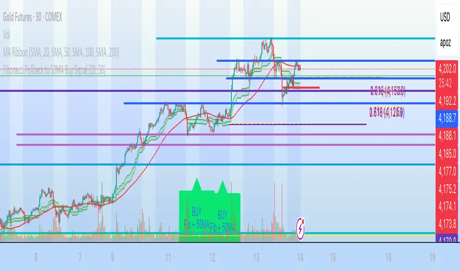
Fibonacci Pullback to 50MA Buy Signal// === CONDITIONS FOR BUY SIGNAL ===
// 1. Price must be inside the fib pullback zone
inFibZone = low <= fib50 and low >= fib618
// 2. Price must touch or approach the 50MA
touchMA = low <= ma50 * 1.002 and low >= ma50 * 0.998 // within 0.2%
// 3. Optional confirmation – bullish candle
reversalCandle = close > open
// FINAL BUY SIGNAL CONDITION
buySignal = inFibZone and touchMA and reversalCandle
// === MARK BUY SIGNAL ===
plotshape(buySignal, style=shape.labelup, color=color.lime, size=size.large,
location=location.belowbar, text="BUY Fib + 50MA")
Distance from EMA (@orel_kakoon)Description (English):
This indicator measures the relative distance between the current price and the 21-period Exponential Moving Average (EMA).
It helps traders visualize when the price is extended above or below its short-term trend, identify potential overbought or oversold conditions, and spot mean-reversion opportunities.
Use it to track momentum shifts and confirm entries or exits based on how far the price deviates from its EMA baseline.


המדריך לבעל זין ענקThis is for nevo only, nobody touch this. This is the dragon money maker, but jsndvlkjznxcvkjnzck;vnbjzkjncvb;zkjdfvbdf

GMH : Tech Bubble Good Morning Holding
Simulating How to Ride the Bubble — and Jump Out Before the Crash
Be careful! Most simulation results show that this strategy sometimes underperforms a simple buy-and-hold, because it gives away positions during deep retracements and buys back at higher thresholds.
Humans often struggle with cutting losses. When the pain becomes too much, they lose the confidence needed to execute even a reasonable strategy.
But in terms of mentality, this approach reduces long-term portfolio volatility. It helps investors feel more at peace, especially during real market crashes like the tech bubble in 2021.
How to use : Select TimeFrame 4HR on trading view

CyberFX Round NumbersThis is a traditional Round Numbers indicators. As all know RND # are psychological levels that represents Support and Resistance. Of course they are not exact science but in general they can give us a possible level where maybe the price move will be rejected.
One other thing I have been using in my strategy is no matter what the time frame I am trading I always check the Daily trend. We know that the banks and financial institutions are always looking for the high TFs trend for long investments so, on my understand, the Daily trend will affect the lower TFs in one way or other so I decided to add this option into this indicator.
Also to avoid an over crowed chart with many lines around I added the option to Show/Hide the RND# so during the analysis I can check the RND# levels.
The Daily Trend is based on a SMA(200).

Multi-TF Volatility Channel DashboardThis tool tracks where price sits inside a volatility channel on two timeframes at once and turns it into a simple trend state.
What it does
Builds a volatility channel around price using a midline and a volatility based band.
Converts the position of price inside that band into an oscillator that moves roughly between -100 and +100.
Calculates this oscillator on:
The current chart timeframe (LTF)
A selected higher timeframe (HTF)
From that it classifies each timeframe as:
Bull: oscillator above zero
Bear: oscillator below zero
Neutral: oscillator near zero
You can then see:
LTF oscillator line
HTF oscillator line
A small table showing LTF state, HTF state, and whether they are aligned
When both LTF and HTF are bullish or both are bearish, the background can highlight that period, and optional alerts fire.
How to use it
Trade in the direction of the higher timeframe when both lines agree.
Avoid taking counter trend trades when LTF and HTF are in strong but opposite states.
Use the LTF line for timing and the HTF line for directional bias.

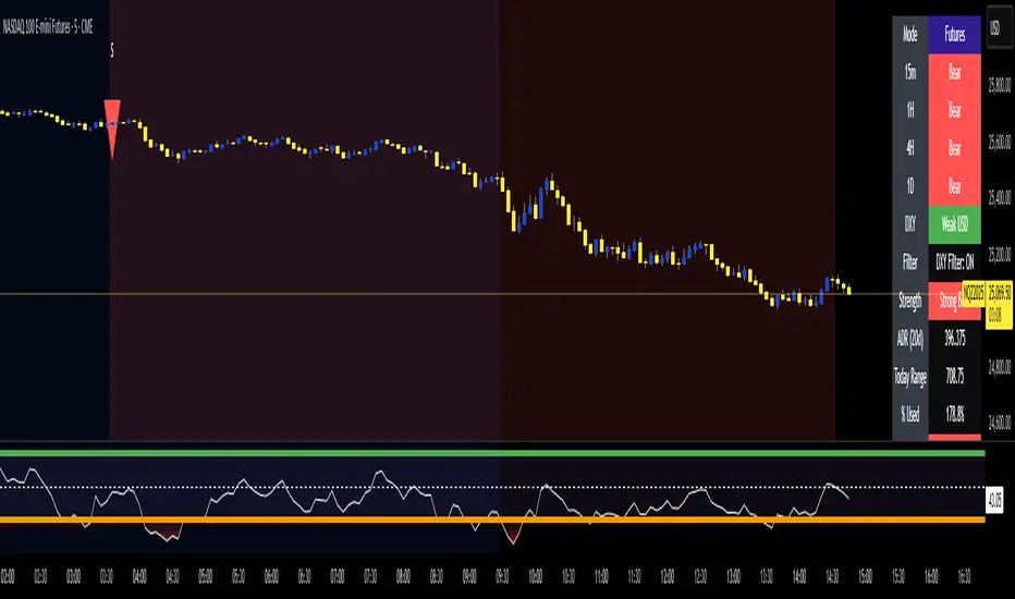
MTF Trend - Gold/XAU with DXY Filter + ADRThis MTF Dashboard has had an addition to it I have added the ADR to the MTF Dashboard this works with all assets but the DXY filter must be turned off If not Trading Gold The Dashboard gives Clarity to the Direction and the Strength of the Trend