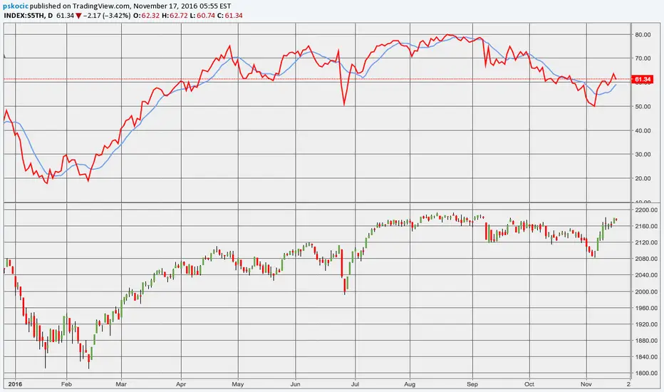
historien säger att det kan bli billigare.Lägger upp en graf här som jag kommer ha koll på när nästa "stora" köp läge kmr,
S5TH trade ideas

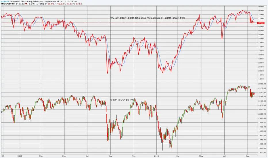
BreadthA look at S&P Breadth via observing % of Stocks Above their respective 20, 50 & 200 Day Moving Averages.


S&P price vs Stocks above 200 day avgJust an idea I was working on to relate the price of the S&P (SPX) to the number of stocks above the 200 day (S5TH). The pattern of 200avg vs price is not always clear. You can see that since Sept 2021 the 200avg has fallen noticably, but the S&P has conintued to climb higher. I general see this as invetors flocking to the big heavy weights like Apple and Amazon that have an oversized influence on the S&P due to their weighting. More often than not, as the 200avg declines the S&P levels off or starts to fall. One thing that does seem very clear is that once it falls down to 40% of the S&P stocks above 200avg, then a sizeable correction is upon us. I marked them in the chart with a vertical line.
It is anyone's guess when the massive bubble will pop, but if the trends hold then I am guessing around May or June of this year.


S&P 500 70% above 200D MA, but fallingS&P 500 vs its stocks above the 200 day MA: Bottom chart shows the S&P since 2008. The recent run up on the chart hides many of the details on this weekly chart. The chart on top, tracks the percentage of stocks above their 200 day Moving average for stocks that make up the S&P 500.
In April of 2021, 96% of the S&P stocks traded above their 200 day MA. Currently the moving average is catching up to the basket of stocks as just over 70% remain above their 200 day MA. Something I watch for is a break below 70% shows a good chance the S&P can see a 5%-10% minimum correction. It has been over a year since we last saw a 10% correction….
September and October can be choppy for all markets. Lets hope that if we get a correction, it respects the 5%-10% move….

S&P 500 stocks above the 200 day - Will we see same pattern?Just something to ponder on. I have no idea if the pattern will hold compared to 2009-2010.
The 1 day looks more like it could bounce


DANGER DANGER HIGH VOLTAGEWith a track record dating back to '09, anytime more than 94% of companies in the S&P trade above their 200-day MA, there is an ensuing sell-off. This doesn't indicate an extreme sell-off but rather a cooling of the coals that have become too hot. But still, look out below. When the VIX goes so low and this indicator goes so high, it is a red flashing signal to put on some protection so you don't lose your hard-earned gains.

Watch 84% as SPX pulls back the most since OctoberCaution on U.S. markets as we get below 84% Some selling could step in. RSI uptrend has broken, MACD turned bearish.
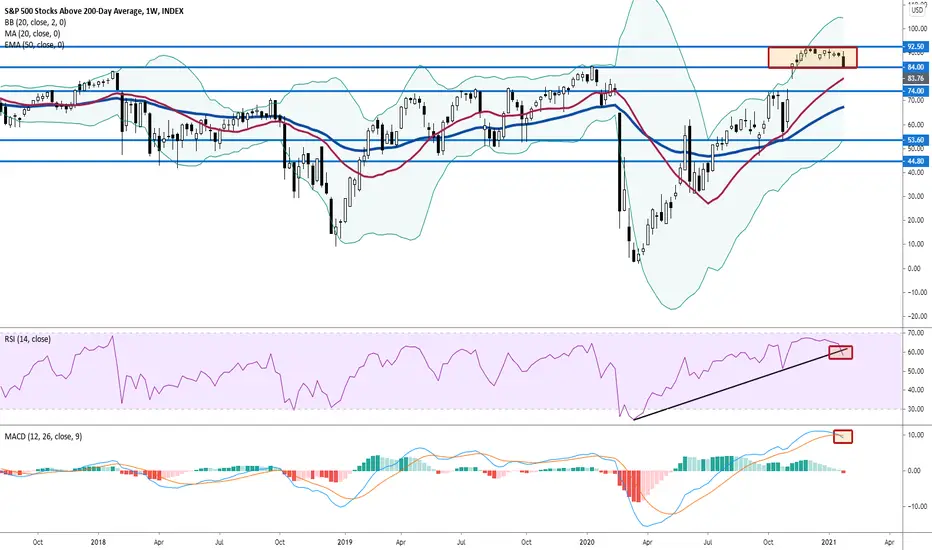
% of stocks above their 200-day cautionA break below 84% would be a warning sign as we remain elevated near historical highs. For now, we remain bullish.

Most of Bottoms of SPX, Most Tops of SPX (Back pine pointing )Nothing out of the usual here. Just a quick illustration about where did the tops and bottoms occurred. Each line represent an index reading either a top of spx of a bottom of spx. We did have a top with 49% reading !!! and a bottom with 81% reading these are the most extremes readings and we've never seen them again!!!
wish you all the best.


caution ahead in SPYSince 2018 most of the times after the 200 moving average exceeded 75%, days after, a correction occurred, is this time going to be different?

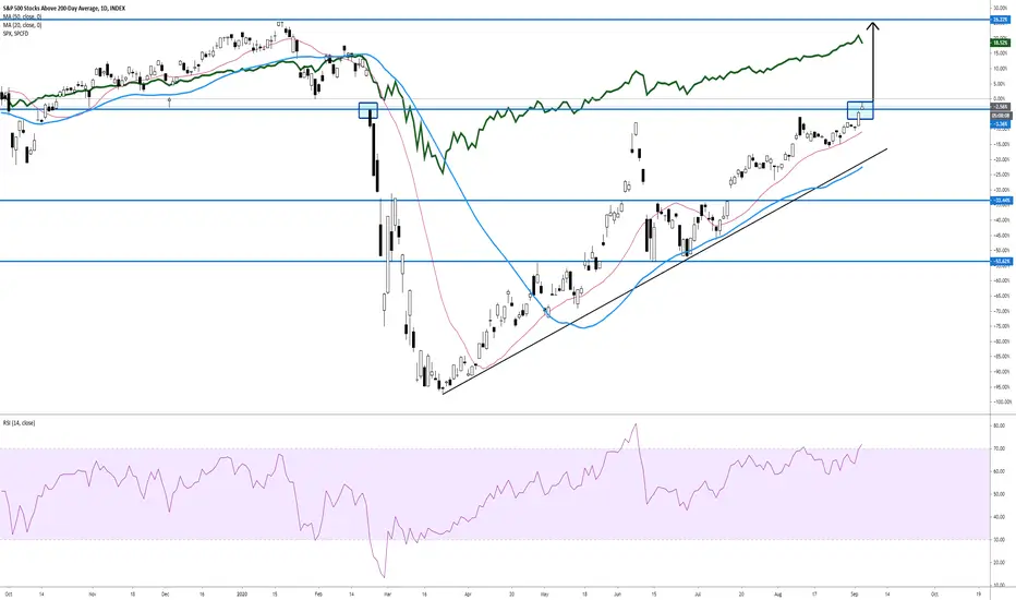
SPX Stocks Above 200MA The S&P 500 Stocks above 200MA is a market breadth indicator that provides information about where the momentum is at the time. The chart shows weakness as there is a bearish RSI divergence after the indicator was rejected from the lower line of the broken channel. A break of the green line might give bears momentum to the downside and achieve a further retracement on the S&P.


Time to start buyingThe amount of stocks in the SPX above their 200 day moving average is around 5% We are at 2009 levels.

S&P 500 STOCKS ABOVE 200-DAY AVERAGE (S5TH) MonthlyDates in the future with the highest probability for price direction reversals

The S&P 500 is struggling to break 75% resistance.Good time to take profits as the S&P 500 has struggled to break past 75% resistance on the % of stocks in the index trading above their 200 day moving average.

Only 17% of S&P 500 stocks are above their 200-day averageThis could be one of the greatest buying opportunities in a long time.