Approaching the 200-Week SMA – AgainHistory doesn’t repeat… but it sure does rhyme.
If all you did was buy the S&P 500 every time it touched the 200-week moving average, you would’ve: ✔️ Bought 2011, 2016, 2018, 2020, 2022… 💰 Absolutely cleaned house.
Now in 2025, we’re approaching the same level again. That SMA has acted like a trampoline for the last 15 years — will it bounce once more?
🧠 Food for thought as fear builds and the market cools.
Let’s see if the buyers step in where they always have. 👀
SP500FT trade ideas

S&P500 Index Intraday Trend Analysis for April 22, 2025Intraday Trend is Bullish with Resistance1 @ 5410 and Resistance2 @ 5507. Market Timing tool is bullish for the day and other indicators are in the green. Overall the S&P500 Index intraday trend is Bullish.
This is my view but not a recommendation to buy or sell. Traders are advised to do their own technical study before entering into the trade with proper risk management.

SP500 US500 update 21.04.2025 My vision until the end of AprilIf someone thinks that the bear market in the US indices has arrived, I want to show you a monthly chart that shows that the trend is still long. We got a reaction of the 0.5 Fibonacci zone. But we entered the monthly accumulation with a gradual test of the Last Structure FVG.
At this timeframe, the price has already broken the ascending structure, which means that in order to regain its ascending status, the structure needs to invert the weekly FVG, in other words, to consolidate above the 5554 level.
So far, there are no long positions, but if we look at the monthly FVG target test, we can try to find short positions when the price reaches 5554 and does not consolidate above this level
1. Trump’s Economic Vision in 2025
Introduced a 10% baseline global tariff starting April 5, 2025.
Over 25% tariffs were imposed on key trade partners like China and Mexico.
Objectives: reduce the $887B trade deficit, combat currency manipulation, and strengthen domestic industry.
Domestically, Trump extended the Tax Cuts & Jobs Act (risking a EUROTLX:4T budget deficit over 10 years) and prioritized deregulation, particularly in fossil fuels.
2. Trump’s Relationship with the Federal Reserve
Resurfaces criticism of Fed Chair Jerome Powell, calling for interest rate cuts.
Pushed a Supreme Court case challenging the Fed’s independence, aiming to give the President authority to remove the Fed Chair.
Analysts warn this threatens central bank credibility, potentially raising long-term inflation expectations.
3. Impact of Tariffs on Economic Stability
Long-term GDP projected to fall by 6%; wages by 5% (Wharton Model).
Households face up to $5,200 in additional annual costs due to price increases.
Investment and exports decline; EU exports could drop 8% to 66%.
While benefiting sectors like steel, tariffs risk broader job losses in supply-chain industries.
4. Federal Reserve’s Challenges
The Fed navigates inflationary pressure while maintaining economic stability.
Only one rate cut expected in 2025 despite political pressure.
Tariffs complicate monetary policy by fueling external inflation and supply disruptions.
5. S&P 500 and Market Outlook
S&P 500 dropped 7% after new tariffs were announced (stagflation fears).
Despite past growth during Trump’s first term (+68%), current policies increase volatility.
Risks include reduced capital inflow, weakened Fed independence, and ongoing global retaliation.
✅ Conclusion
Donald Trump’s 2025 economic strategy hinges on aggressive tariffs and pressure on the Federal Reserve to lower rates. While intended to stimulate domestic growth, these moves contribute to inflation, challenge institutional independence, and heighten market volatility. For investors and policymakers, the path forward demands careful navigation of an economic environment shaped by protectionism, policy conflict, and fragile monetary stability.
So far, everything does not look good. I am waiting for the approval of the BTC reserve for May (next month). This could positively affect the American economy in the SHORT TERM.
Best regards, EXCAVO
_____________________
Disclosure: I am part of Trade Nation's Influencer program and receive a monthly fee for using their TradingView charts in my analysis.

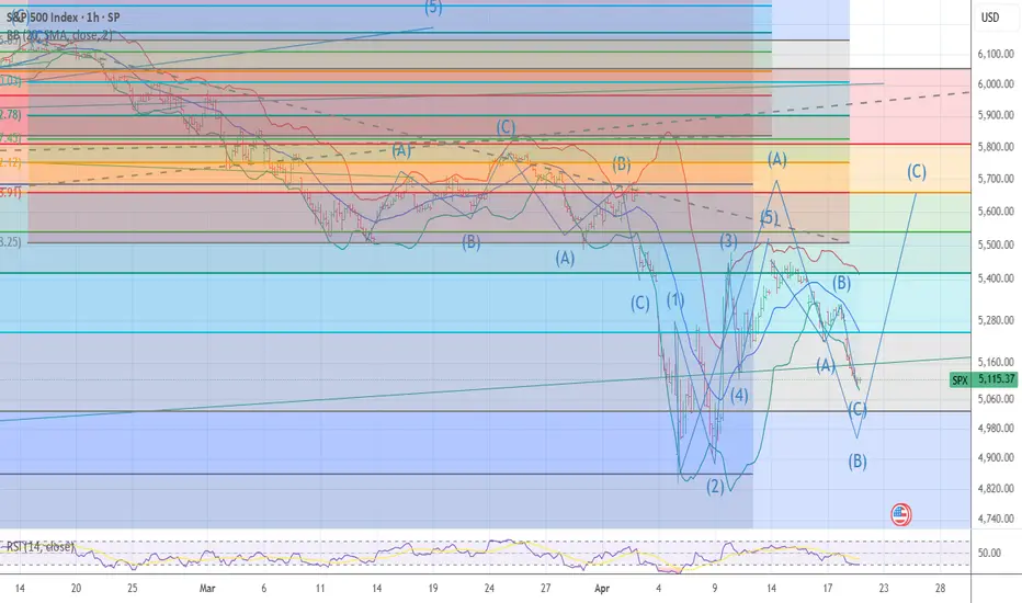
[D] SPX - 22.4.2025 (Scenario 1 & 2)To complement the earlier publish idea, I'm hereby adding another scenario as I'd feel dissatisfied with several candles being displaced. Both tell the same story as I'm fundamentally remain bearish over a prolonged period of time. I expect the things to get moving as soon as mid May for a major move. This year's summer time might hit different.

Arshitecture / 15 Min Long Position SP500Based on the 86.4% reliability of flag patterns and considering all of them within the context of intraday trading, this zone appears to be a favorable area for entering a long position.

S&P500 INTRADAY resistance retest US stock futures are pointing higher after Monday's sharp selloff. Despite the bounce, safe-haven demand remains strong — gold hit a new record, and the yen strengthened past 140/USD for the first time since September.
Donald Trump called for immediate Fed rate cuts, warning that the economy could slow without action. He argued inflation is not a concern, citing falling energy and food prices, and criticized Fed Chair Jerome Powell once again.
The US reported “significant progress” on a trade deal with India after talks between VP JD Vance and PM Modi. The roadmap aims to ease trade tensions and potentially shield India from future US tariffs.
Key Support and Resistance Levels
Resistance Level 1: 5509
Resistance Level 2: 5660
Resistance Level 3: 5787
Support Level 1: 5110
Support Level 2: 4947
Support Level 3: 4816
This communication is for informational purposes only and should not be viewed as any form of recommendation as to a particular course of action or as investment advice. It is not intended as an offer or solicitation for the purchase or sale of any financial instrument or as an official confirmation of any transaction. Opinions, estimates and assumptions expressed herein are made as of the date of this communication and are subject to change without notice. This communication has been prepared based upon information, including market prices, data and other information, believed to be reliable; however, Trade Nation does not warrant its completeness or accuracy. All market prices and market data contained in or attached to this communication are indicative and subject to change without notice.

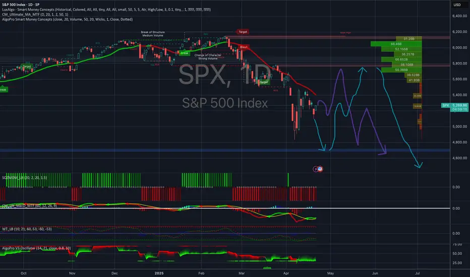
[D] SPX - 22.4.2024I felt like I wanted to post something positive amid the madness, although I remain bearish on SPX and USD since the beginning of 2024 - as my past predictions suggest. So far, the greatest businessman and dealmaker, Donald Trump has successfully outperformed on the time line most of the expectations that I deemed possible in a real-world setting. If that continues to hold true, it is possible that hereby - somewhat optimistic - prediction will again lag behind the reality on the scale of days to a couple of weeks. What I was hoping for, was a much welcomed break during the summer and a full-blown downfall into a recession afterwards. I'm much afraid, things I expected in 2026 might arrive considerably sooner.
[04/22] 𝟬𝗗𝗧𝗘 𝗦𝗣𝗫 𝗚𝗘𝗫 𝗥𝗲𝘃𝗶𝗲𝘄Contextual Thinking:
Yesterday’s sharp drop was fully bought back — for now. We're currently at a call resistance level, so the down move may continue today.
Gameplay:
Below 5205, I lean towards being cautious or outright bearish. A hypothetical selloff could intensify below 5170 (Gamma Flip level).
I'm definitely not targeting below 5100, but based on the current options pricing, the market seems to be pricing in 5100 — yesterday’s low — as the most pessimistic scenario.
Caution:
Given the significant intraday swings over the past 24 hours (both up and down), the market is likely to close somewhere between the high and low of the day due to ongoing uncertainty. This is typical in such volatile conditions, and I see this as the most probable outcome.
So unless strong buying pressure or good news emerges, I expect the market to close between 5100 and 5205.
However, if we break above 5205, we could witness a positive gamma squeeze , with 5250 being the first upside target.

What Is the McClellan Oscillator (NYMO), and How to Use ItWhat Is the McClellan Oscillator (NYMO), and How to Use It in Trading?
The McClellan Oscillator is a widely used market breadth indicator that helps traders analyse momentum and market strength. It focuses on the relationship between advancing and declining stocks, offering unique insights beyond price movements. This article explains how the McClellan Oscillator works, its interpretation, and how it compares to other tools.
What Is the McClellan Oscillator?
The McClellan Oscillator is a market breadth indicator that traders use to measure momentum in stock market indices. It’s calculated based on the Advance/Decline Line, which tracks the net number of advancing stocks (those rising in price) minus declining stocks (those falling in price) over a given period.
The NYSE McClellan Oscillator is the most common variant, often called the NYMO indicator. However, it can also be applied to any other stock index, like the Dow Jones, Nasdaq, or FTSE 100.
Here’s how it works: the indicator uses two exponential moving averages (EMAs) of the advance/decline data—a 19-day EMA for short-term trends and a 39-day EMA for long-term trends. The difference between these two EMAs gives you the oscillator’s value. Positive readings mean more stocks are advancing than declining, pointing to bullish momentum. Negative readings suggest the opposite, with bearish sentiment dominating.
What makes the McClellan indicator particularly useful is its ability to highlight shifts in market momentum that might not be obvious from price movements alone. For example, even if a stock index is rising, a declining indicator could signal that fewer stocks are participating in the rally—a potential warning of weakening breadth.
This indicator is versatile and works well across various timeframes, but it’s particularly popular for analysing daily or weekly market trends. While it’s not designed to provide direct buy or sell signals, it helps traders identify when markets are gaining or losing momentum,
Understanding the Advance/Decline Line
The Advance/Decline (A/D) Line is a market breadth indicator that tracks the difference between the number of advancing stocks and declining stocks. It’s calculated cumulatively, adding each day’s net result to the previous total. This gives a running tally that reflects the broader participation of stocks in a market’s movement, rather than just focusing on a handful of large-cap stocks.
When the A/D Line shows consistent strength or weakness, the McClellan Oscillator amplifies this data, making it potentially easier to spot underlying trends in market breadth. In essence, the A/D Line provides the raw data, while the McClellan refines it into actionable insights.
How to Calculate the McClellan Oscillator
The McClellan Oscillator formula effectively smooths out the daily fluctuations in the A/D data, allowing traders to focus on broader shifts in momentum.
Here’s how it’s calculated:
- Calculate the 19-day EMA of the A/D line (short-term trend).
- Calculate the 39-day EMA of the A/D line (long-term trend).
- Subtract the 39-day EMA from the 19-day EMA. The result is the McClellan Oscillator’s value.
Giving the formula:
- McClellan Oscillator = 19-day EMA of A/D - 39-day EMA of A/D
The result is a line that fluctuates around a midpoint. In practice, a trader might apply the McClellan Oscillator to the S&P 500 on a daily or weekly timeframe, providing insights for trading.
Interpretation of the Oscillator’s Values
- Positive values occur when the 19-day EMA is above the 39-day EMA, indicating that advancing stocks dominate and the market has bullish momentum.
- Negative values occur when the 19-day EMA is below the 39-day EMA, reflecting a bearish trend with declining stocks in control.
- A value near zero suggests balance, where advancing and declining stocks are roughly equal.
Signals Generated
The indicator is popular for identifying shifts in momentum and potential trend changes.
Overbought and Oversold Conditions
- Readings at or above +100 typically indicate an overbought market, where the upward momentum may be overextended.
- Readings at or below -100 suggest an oversold market, with the potential for a recovery.
Crossing Zero
When the indicator crosses above or below zero, it can indicate shifts in market sentiment, with traders often monitoring these transitions closely.
Divergences
- A positive divergence occurs when the indicator rises while the index declines, signalling potential bullish momentum building.
- A negative divergence happens when the indicator falls while the index rises, hinting at weakening momentum.
Using the McClellan Oscillator With Other Indicators
The McClellan Oscillator is a valuable tool for analysing market breadth, but its insights become even more powerful when combined with other indicators. Pairing it with complementary tools can help traders confirm signals, refine their analysis, and better understand overall market conditions.
Relative Strength Index (RSI)
The Relative Strength Index (RSI) measures the strength and speed of price movements, identifying overbought or oversold conditions. While the McClellan Oscillator focuses on market breadth, using RSI along with it can provide confirmation. For example, if both indicators show overbought conditions, it strengthens the case for a potential market pullback.
Moving Averages
Simple or exponential moving averages of price data can help confirm trends identified by the McClellan Oscillator. For instance, if it signals bullish momentum and the index moves above its moving average, this alignment may suggest stronger market conditions.
Volume Indicators (e.g., On-Balance Volume)
Volume is a key component of market analysis. Combining the Oscillator with volume-based indicators can clarify whether breadth signals are supported by strong participation, improving the reliability of momentum shifts.
Bollinger Bands
Bollinger Bands measure volatility and provide insight into price ranges. When combined with the McClellan Oscillator, they can help traders assess whether market breadth signals align with overextended price movements, providing additional context.
VIX (Volatility Index)
The VIX measures market sentiment and fear. Cross-referencing it with the McClellan Oscillator can reveal whether market breadth momentum aligns with changes in risk appetite, offering a deeper understanding of sentiment shifts.
Comparing the McClellan Oscillator With Related Indicators
The McClellan Oscillator, McClellan Summation Index, and Advance/Decline Ratio all provide insights into market breadth, but they differ in focus and application.
McClellan Oscillator vs McClellan Summation Index
While the Oscillator measures short-term momentum using the difference between 19-day and 39-day EMAs of the Advance/Decline (A/D) Line, the McClellan Summation Index takes a longer-term perspective. It is a cumulative total of the Oscillator's daily values, creating a broader view of market trends.
Think of the Summation Index as the "big picture" complement to the Oscillator's granular analysis. Traders often use the Summation Index to track longer-term trends and identify major turning points, while the Oscillator is more popular when monitoring immediate momentum shifts and overbought/oversold conditions.
McClellan Oscillator vs Advance/Decline Ratio
The Advance/Decline Ratio is a simpler calculation, dividing the number of advancing stocks by the number of declining stocks. While it provides a snapshot of market breadth, it lacks the depth of analysis offered by the McClellan Oscillator.
The Oscillator refines raw A/D data with exponential moving averages, smoothing out noise and making it potentially easier to identify meaningful trends and divergences. The A/D Ratio, on the other hand, is more reactive and generally better suited for short-term intraday signals.
Advantages and Limitations of the McClellan Oscillator
The McClellan Oscillator is a powerful tool for analysing market breadth, but like any indicator, it has strengths and weaknesses. Understanding both can help traders decide how best to integrate it into their analysis.
Advantages
- Focus on Market Breadth: By analysing the Advance/Decline data, the indicator provides a clearer picture of how many stocks are participating in a trend, not just the performance of index heavyweights.
- Momentum Insights: Its ability to highlight shifts in short-term momentum allows traders to spot potential turning points before they become evident in price action.
- Identification of Divergences: It excels at identifying divergences between market breadth and price, offering early signals of weakening trends or upcoming reversals.
- Overbought/Oversold Signals: Its range helps traders analyse extreme conditions (+100/-100), which can signal potential market corrections or recoveries.
Limitations
- Not a Standalone Tool: The indicator is combined with other indicators or broader analysis, as it doesn’t provide specific entry or exit signals.
- False Signals in Volatile Markets: During periods of high volatility or low trading volume, the oscillator may generate misleading signals, making context crucial.
- Short-Term Focus: While excellent for momentum analysis, it doesn’t provide the long-term perspective offered by tools like the McClellan Summation Index.
The Bottom Line
The McClellan Oscillator is a powerful tool for analysing market breadth, helping traders gain insights into momentum and potential market shifts. While not a standalone solution, it is often combined with other indicators for a well-rounded approach.
FAQ
What Is a NYMO Oscillator?
The NYMO oscillator, short for the New York McClellan Oscillator, is a market breadth indicator based on the Advance/Decline stock data of the New York Stock Exchange (NYSE). The NYMO index calculates the difference between a 19-day and 39-day exponential moving average (EMA) of the Advance/Decline line, providing insights into stock market momentum and sentiment.
What Does the McClellan Oscillator Show?
The McClellan Oscillator shows the balance of advancing and declining stocks in a market. Positive values indicate bullish momentum, while negative values reflect bearish sentiment. It’s often used to identify potential shifts in momentum or divergences between market breadth and price.
What Is the McClellan Oscillator in MACD?
The McClellan Oscillator and MACD are distinct indicators, but both use moving averages. While MACD measures price momentum, the Oscillator focuses on market breadth by analysing the Advance/Decline Line.
What Is the McClellan Summation Indicator?
The McClellan Summation Index is a cumulative version of the McClellan Oscillator. It provides a broader view of market trends, tracking long-term momentum and overall market strength.
What Is the Nasdaq McClellan Oscillator?
The Nasdaq McClellan Oscillator, sometimes called the NAMO, applies the same calculation as the NYMO but uses Advance/Decline data from the Nasdaq exchange. It helps traders analyse momentum and breadth in technology-heavy markets.
This article represents the opinion of the Companies operating under the FXOpen brand only. It is not to be construed as an offer, solicitation, or recommendation with respect to products and services provided by the Companies operating under the FXOpen brand, nor is it to be considered financial advice.

SPX, NDX, IWM Long: Alternate Count ActivatedI go though why I think that the alternate count (bullish case) is increasingly likely, and using Russell 2000 as a reference.
Using S&P500, I also updated the wave counts down to the minute degree.
Remember to keep your risk tight!
Good luck!

S&P 500: This Pattern Could EmergeThey say recession is imminent...
This is how it can emerge on the S&P 500 chart
in shape of Head & Shoulders
Its visual speculation, so let's leave it here and return in 2026-2032
to check if it played out

Spring Loaded Wedge? Let the setup come to you! $SPXLowkey top watch for the next few weeks!
It was a chop zone last week = consolidation? Now zooming out, it’s looking like a loaded wedge/flag forming. A lot of bearish sentiment, tariff talks and unknown lately but this is looking mighty interesting of a formation. Volume also slowly declining, wondering if we’re setting up for once a decision/mutual agreement is made with US, China + others involved.
Green ray is my ENTRY: 5372.44
*Also eyeing 5329.66*
- For potential upside. We have a few gams above to also fill and can magnet upwards if we get news, volume etc.
Looking for the banger* here - of course, things are still brewing. Note this is the HOURLY timeframe. Wait for the setup to come!
Let me know your thoughts! Appreciate any insight. Do your DD! #NFA AMEX:SPY SP:SPX

S&P 500 Pullback Nearing End? Hammer + Elliott Wave Say Rebound!The S&P 500 Index ( FOREXCOM:SPX500 ) is one of the most important indexes in the financial market these days , with the cryptocurrency market and especially Bitcoin ( BINANCE:BTCUSDT ) having a strong correlation with this index .
After Donald Trump suspended tariffs on 90 countries (except China) , the S&P 500 Index started to rise and seems to have managed to break through the Resistance zone($5,284-$5,094) and is pulling back to this zone .
One of the signs of a reversa l of the S&P 500 Index can be the formation of the Hammer Candlestick Pattern , which announces the end of the pullback .
In terms of Elliott Wave theory , it seems that the S&P 500 Index is completing a corrective wave that could be in the form of a main wave 4 ( it is correcting both in time and price ).
I expect the S&P 500 Index to resume its upward trend in the coming hours, if nothing special is released , and to reach the Resistance zone($5,680-$5,500) and Yearly Pivot Point . If this happens, today's Bitcoin analysis could also be correct .
Note: In the worst case, if the S&P 500 Index touches $5,050, we should expect a further decline in the S&P 500 Index and Bitcoin.
Do you think the S&P 500 Index will return to an upward trend, or is this increase temporary?
Please respect each other's ideas and express them politely if you agree or disagree.
S&P 500 Index Analyze (SPX500USD),1-hour time frame.
Be sure to follow the updated ideas.
Do not forget to put a Stop loss for your positions (For every position you want to open).
Please follow your strategy and updates; this is just my Idea, and I will gladly see your ideas in this post.
Please do not forget the ✅' like '✅ button 🙏😊 & Share it with your friends; thanks, and Trade safe.


Déjà Vu: 2025 Tariffs Mirror 2018 Trade War PlaybookThe economic strategy behind the new wave of tariffs bears an unmistakable resemblance to the 2018–2020 U.S.–China trade conflict. That’s no coincidence. Peter Navarro, the architect of the 2018 tariff playbook under President Trump, has once again stepped into a key role shaping trade policy in Trump’s second term.
In 2018, the Trump administration launched a phased escalation of tariffs, starting with targeted duties on Chinese imports and expanding into broader measures that disrupted global supply chains. By Q4 2018, the S&P 500 had fallen nearly 20%, while tech-heavy names like NVIDIA plunged over 50% amid valuation compression, supply chain fears, and geopolitical stress.
Peter Navarro’s re-emergence signals that this isn’t just about political posturing. Known for his hardline stance on China and focus on economic nationalism, Navarro treats tariffs not as negotiation tools but as long-term policy. In 2018, that posture drove escalation until the market forced a pause.
Now in 2025, we’re watching the same script unfold almost beat for beat:
1. Start with China
2. Expand globally
3. Soften the global rhetoric to isolate China
4. Target key sectors (semiconductors, pharmaceuticals, energy)
5. Start the media misdirection to work behind the scenes with China
6. Set up a “deal” under market pressure
In 2025, the market again entered bear territory but staged a brief recovery after a pause in reciprocal tariffs. As of April 21, 2025, the index sits 16% off its February high and still in a downtrend.
Now, looking at the charts, here where things begin to take shape. Let’s start with the 2018 chart (figure 1). Like previously mentioned, back in 2018, the S&P 500 dropped over 20% between September and December, finding the bottom at a key support from 20 months prior (Q1 2017). The first gray box represents 10 weeks from the 2018 high. The 10 weeks is important because we are currently 10 weeks off the 2025 high, so this first gray box shows historically where we are today relative to the 2018 prices. The second gray box represents the 3 remaining weeks of drawdown, which was roughly 10%.
Figure 1
Now looking at the 2025 chart (figure 2), we have the same 10-week gray box marked up, and the additional 3-week, 10% drawdown, gray box that follows. Coincidentally, or not, the bottom of the second gray box aligns almost perfectly with the 0.618 Fibonacci retracement from the 2022 swing low to the 2025 high (figure 3). Even more interesting, that support level also ties back to the September 2023 high—roughly 20 months prior. Sound familiar?
Figure 2
Figure 3
I will be watching that 4500 level for SPX over the next few weeks as Trump and Navarro are preparing to roll out more sector-specific tariffs in the coming weeks. Meanwhile, Jerome Powell is facing renewed pressure, including calls to step down—again, nearly identical to the rhetoric from late 2018.
Currently, markets are pricing in just a 10% chance of a rate cut, according to Kalshi. But if the market continues to slide, Navarro and Trump may dial up pressure on the Fed to act. A rate cut in early May could mark the market bottom—just like Powell’s dovish pivot did in early 2019.
If the 2018 blueprint holds, we’re in the middle innings. Tariffs are broadening, the market is reacting, and the Fed is being boxed in. The coming weeks may test the 0.618 Fib level on the S&P 500. If Powell pivots and rhetoric softens, we may find a low—and history will have rhymed, if not outright repeated. If Powell stays strong, then Trump and Navarro may publicly pull back and take negotiations behind closed doors.
I don’t see this is being just being coincidental. This seems to be following a very familiar playbook.

here is my Idea I believe the price is still going down. Everything has a 2 way which depends on the probability. Good luck and thank you

Noise, S&P Scenario, Gold BubbleThank you to the tradingview community for engaging and supporting my content.
After another rough start to the week, we have a bit of a crossroads ahead for the S&P
1) We revisit the April 7 lows and poke lower with bear trap opportunities
2) We hold Monday April 21 lows and grind back up to gap fill and revisit 5400-5500 resistance
3) We go nowhere with a lot of intraday volatility and noise (between the April 7 low and the April 9 high)
The markets are on high alert
DXY
Gold
Bitcoin
US Bonds vs Treasuries (yields rising)
Trump is more vocal about threatening the FED or firing Powell and the concern is truly unprecedented
Trade War pause is still ongoing, China is being vocal as well to make sure countries don't simply line up to support the US. For all of this to calm down, US and China have to play nice. China is likely able to hold the line longer than the US in the near-term
Thanks for watching!!!

Global Supply Chains being Undone could be the cause of a (IV)I have been discussing the potential for a Super-Cycle wave (III) top in the US markets for the last couple years. To experience a wave (IV) of SUPERCYCLE PREPORTION, would be a consolidation of price action back to the 1929 stock market crash. The byproduct of this type of price action would be a decline of 50% or more (likely more) in the value of global stock markets. This type of asset price deflation would make anyone who watches the markets be inquisitive as to what would or even COULD cause such an event.
Would the dismantling of global supply chains, that have been in place since the early 1990’s, be the culprit?
I am starting to think the answer to that question is yes. This is not an indictment of the policy, but more an acknowledgement of the disruption and the possible aftermath.
The obvious concern is how do businesses plan? I would venture a guess business leaders will be challenged, and many may not survive. The cost equation becomes so skewed…how does one make money without passing the costs on to the consumer? That means higher inflation.
If this is the case, it’s possible digital assets become more of a safe haven which would be counter intuitive to hard asset value. This would mean that we will have endure a cycle of higher inflation, higher interest rates, and higher unemployment, coupled with lower economic growth. I cannot say this is how the forecasted price action is justified in the future. What I can say is the resulting price action will look very similar to the below.

S&P500 - The Correction Is Over Now!S&P500 ( TVC:SPX ) is retesting massive support:
Click chart above to see the detailed analysis👆🏻
Over the past couple of days, we have been seeing a quite harsh stock market "crash" with an overall correction of about -20%. However, as we are speaking the S&P500 is already retesting a major confluence of support and if we see bullish confirmation, this drop might be over soon.
Levels to watch: $4.900
Keep your long term vision,
Philip (BasicTrading)

S&P500: Bottomed on an Inverse Head and Shoulders.The S&P500 index is bearish on its 1D technical outlook (RSI = 36.973, MACD = -126.240, ADX = 31.007) but long term appears to have bottomed on an Inverse Head and Shoulders pattern. In fact, the Head made a low on the Double Bottom and the bearish outlook is currently due to the Right Shoulder formation. A crossing over the dashed LH trendline and even better the 4H MA200, would aim for the 2.0 Fibonacci extension (TP = 6,280).
## If you like our free content follow our profile to get more daily ideas. ##
## Comments and likes are greatly appreciated. ##

The creeping marketWe are still at support as of now, and the VIX looks like it may be a false breakout. It will be particularly interesting to see if we can hold this level into the close.

I am CALLING A BOTTOM TODAY I MOVED95% long 5109/5079 today The chart posted is the sp 500 I called for a sharp decline back to 5100 it has formed a ABC down I look for a sharp rally back to 5644/5669 Now before the next leg down today is wave Blow ,Best of trades WAVETIMER