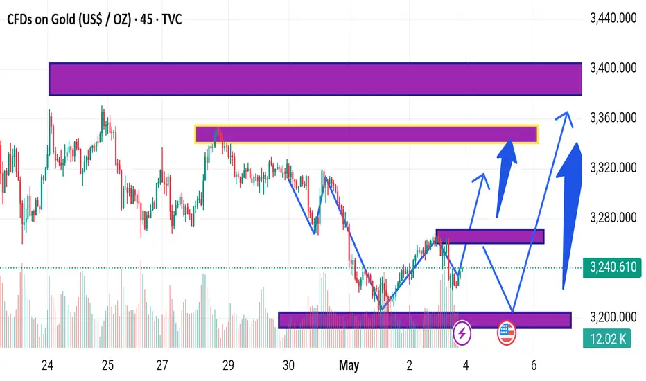
This chart represents a technical analysis of Gold CFDs (in US$/oz) on the 45-minute timeframe, as published on TradingView. Here's a breakdown of the key elements:
Key Levels Highlighted:
1. Support Zone (~3,190 - 3,210):
Marked by a thick purple band near the bottom.
Price bounced from this zone recently, suggesting strong support.
2. Intermediate Resistance (~3,260 - 3,280):
Marked by a thinner purple box around the current price level.
May act as a short-term resistance or consolidation area.
3. Mid-Term Resistance (~3,310 - 3,340):
Yellow-highlighted band within a broader purple resistance zone.
Historically acted as resistance, and could be tested again.
4. Major Resistance (~3,360 - 3,400):
Upper thick purple band, indicating a significant supply zone.
Blue Arrows Indicate:
Bullish Scenarios:
Arrows show potential price movement paths, indicating expected bullish momentum.
Scenarios include:
1. A breakout from the current resistance leading to the mid-term resistance.
2. A possible pullback to support (~3,210), followed by a bullish reversal and breakout toward 3,360 or higher.
General Implication:
The chart suggests a bullish bias with the expectation of price breaking higher after consolidations or minor pullbacks.
Key levels (support and resistance) are crucial for trade entries and exits.
Would you like a trading plan or risk analysis based on this chart?
t.me/+EQ88IkMSUvQwMGJk
Join telegram channel free
t.me/+EQ88IkMSUvQwMGJk
Join telegram channel free
t.me/+EQ88IkMSUvQwMGJk
Disclaimer
The information and publications are not meant to be, and do not constitute, financial, investment, trading, or other types of advice or recommendations supplied or endorsed by TradingView. Read more in the Terms of Use.
t.me/+EQ88IkMSUvQwMGJk
Join telegram channel free
t.me/+EQ88IkMSUvQwMGJk
Join telegram channel free
t.me/+EQ88IkMSUvQwMGJk
Disclaimer
The information and publications are not meant to be, and do not constitute, financial, investment, trading, or other types of advice or recommendations supplied or endorsed by TradingView. Read more in the Terms of Use.