How to Do Structure Mapping with Multiple Time Frames Analysis
If you think that structure mapping is not efficient for profitable trading, you get it wrong .
What newbies traders always miss is that structure mapping works effectively only with multiple time frame analysis.
In this article, I will show you how you can build profitable trading plans and accurate predictions on forex market with structure mapping alone.
Learn top-down analysis secrets and how to map structure properly in Smart Money Concepts SMC ICT.
In order to effectively use structure mapping for scalping, day trading and swing trading , always start it from higher time frames.
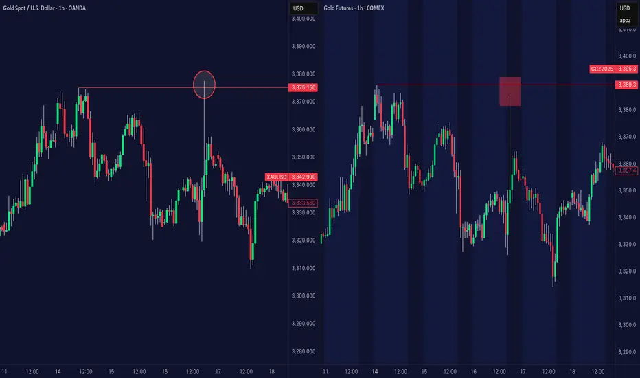
Examine my complete structure mapping on USDJPY forex pair on a daily time frame.
You can see that first, the pair was trading in a strong bearish trend.
Then, we had a confirmed bullish reversal with Change of Character.
After that, the market started an extended consolidating movement, not being able to update the highs.
And finally, the last bullish wave managed to update a high , confirming a completion of a consolidation and a resumption of a bullish trend.
Structure mapping reveals that USDJPY is now bullish on a daily and the last bearish movement is a correction in uptrend.
We can expect a start of a new bullish wave soon.
To understand when exactly it is going to happen, you will need to dive your analysis deeper .
You should start structure mapping on lower time frames.
And you should execute a price action analysis there in relation to your structure mapping on a higher time frame.
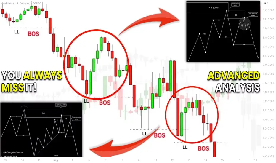
4H time frame structure mapping will reveal a price action within the last bearish move that we spotted on a daily.
We see that the market is trading in a bearish trend and the price started a local correctional movement after a formation of the last low.
4h time frame structure mapping provided a detailed intra week perspective.
Hourly time frame analysis, we reveal hidden intraday trends that will unveil more insights.
And why are we doing all that?
Remember that big waves always start from minor reversals.
The earlier you are able to find strong confirmations, the earlier you will open a trading position and the more profits you will make.
On an hourly time frame, our structure mapping shows that the market is already bullish. A bearish trend that USDJPY followed is already violated, and the price is updating the highs.
Following our analysis, the only thing that we need to confirm a start of a bullish trend is a confirmed trend reversal and a change of character on a 4H time frame.
It will validate an intra week bullish trend.
We will need the price to break the underlined blue resistance based on the last lower high in a bearish trend.
That will provide an accurate signal for us to buy.
And we can anticipate a rise a least to a current daily higher high then.
When you do structure mapping on forex market, never forget to do that on multiple time frames. Multiple perspectives and short-term/mid-term/long-term projections will help you to build a more efficient trading plan.
Remember that you can expand your structure mapping even for minute time frames. It will provide a unique perspective for scalping forex.
❤️Please, support my work with like, thank you!❤️
Community ideas
WHY TRADING IS HARD – EVEN FOR GOD!THE BRUTAL TRUTH ABOUT PERFECT PORTFOLIOS AND IMPERFECT HUMANS
Imagine having access to the same portfolio strategy that made Ray Dalio one of the world's wealthiest hedge fund managers. Picture yourself armed with Nobel Prize-winning research, billion-dollar backtesting results, and a mathematical framework so elegant it seems divinely inspired. Now imagine watching that same strategy torture you psychologically for years while delivering precisely the returns it promised.
Welcome to the God Portfolio paradox: even divine wisdom cannot save us from ourselves.
Ray Dalio's All Weather strategy has generated approximately 12% annual returns with maximum drawdowns of just 4% since its inception in 1996. Compare this to the S&P 500's 10% annual returns with gut-wrenching drawdowns exceeding 50% during major crashes. On paper, the choice seems obvious. In practice, it becomes a psychological nightmare that breaks even sophisticated investors.
Let us examine what this means in concrete terms. Consider two hypothetical investors, each starting with one million dollars in January 2000. Investor A puts everything into an S&P 500 index fund. Investor B implements a simplified All Weather approach: 30% stocks, 40% long-term bonds, 15% intermediate-term bonds, 7.5% commodities, and 7.5% inflation-protected securities, rebalanced quarterly. Both strategies are mathematically sound, historically proven, and widely recommended by financial experts.
The foundation of this cruel reality lies in the inherent conflict between what markets reward and what human nature compels us to do. Markets reward patience, discipline, and contrarian thinking. Human nature drives us toward impatience, emotional decision-making, and herd behavior. Even the most elegant portfolio construction cannot bridge this gap without addressing the psychological challenges that make trading extraordinarily difficult, even when armed with theoretically perfect strategies.
Historical Development and Theoretical Foundations
The intellectual origins of systematic portfolio construction trace back to Harry Markowitz's groundbreaking work on portfolio selection in 1952. Markowitz demonstrated that rational investors should focus on maximizing expected returns for a given level of risk, leading to the development of the efficient frontier concept (Markowitz, 1952). This work established the mathematical foundation for understanding how diversification can reduce portfolio risk without necessarily reducing expected returns.
Building upon Markowitz's framework, William Sharpe introduced the Capital Asset Pricing Model in 1964, which provided a theoretical basis for understanding how individual securities should be priced relative to market risk (Sharpe, 1964). These developments laid the groundwork for more sophisticated approaches to portfolio construction that would emerge in subsequent decades.
The evolution toward all-weather strategies gained momentum in the 1980s and 1990s as institutional investors began to recognize the limitations of traditional 60/40 stock-bond portfolios. Research by Swensen (2000) at Yale University demonstrated how institutional endowments could achieve superior risk-adjusted returns through alternative asset allocation approaches that emphasized diversification across risk factors rather than asset classes.
The modern conception of the "God Portfolio" crystallized with Ray Dalio's development of the All Weather strategy at Bridgewater Associates. Dalio's approach, first implemented in 1996, was based on the premise that economic environments can be characterized by two primary variables: growth (rising or falling) and inflation (rising or falling). By constructing portfolios that perform well in each of these four potential economic scenarios, investors could theoretically achieve more consistent returns (Dalio, 2017).
Risk Parity and Factor-Based Approaches
The theoretical underpinning of modern all-weather strategies relies heavily on risk parity principles. Unlike traditional portfolio construction methods that focus on dollar allocation weights, risk parity approaches seek to equalize the risk contribution of different portfolio components. This methodology was formalized by Qian (2005), who demonstrated that portfolios constructed using risk budgeting techniques could achieve superior risk-adjusted returns compared to market capitalization-weighted approaches.
Academic research has consistently supported the theoretical advantages of risk parity strategies. Maillard et al. (2010) showed that equally weighted risk contribution portfolios tend to be located in the efficient region of the mean-variance frontier, particularly during periods of market stress. Their analysis demonstrated that risk parity portfolios exhibited lower volatility and better downside protection compared to traditional asset allocation approaches.
The factor-based investment framework provides another lens through which to understand all-weather portfolio construction. Fama and French (1993) expanded the understanding of systematic risk factors beyond market beta to include size and value factors, while subsequent research has identified additional factors such as momentum, quality, and low volatility that contribute to long-term returns (Fama and French, 2015).
Contemporary research by Asness et al. (2012) demonstrated that factor diversification across asset classes could provide similar benefits to traditional asset class diversification, but with potentially superior risk-adjusted returns. This insight has led to the development of factor-based all-weather strategies that seek to maintain balanced exposure to different return drivers rather than asset classes per se.
Portfolio Construction Methodology
The construction of an effective all-weather portfolio requires careful consideration of several key principles. First, the portfolio must maintain diversification across different economic scenarios. This typically involves allocating to assets that perform well during periods of economic growth (stocks, corporate bonds, commodities), economic contraction (government bonds, gold), rising inflation (commodities, inflation-protected securities), and falling inflation (nominal bonds, growth stocks).
Second, the portfolio construction process must account for the volatility differences between asset classes. Traditional approaches that allocate equal dollar amounts to stocks and bonds effectively give stocks much greater influence on portfolio performance due to their higher volatility. Risk parity approaches address this by adjusting position sizes to equalize risk contributions, typically resulting in larger allocations to lower-volatility assets such as government bonds.
Third, effective all-weather portfolios often incorporate leverage to achieve target return levels while maintaining risk balance. This concept, popularized by Dalio, recognizes that a truly diversified portfolio may have lower expected returns than a concentrated equity portfolio, but can use modest leverage to enhance returns while maintaining superior risk characteristics (Dalio, 2017).
Academic research has provided empirical support for these construction principles. Duggan and Luo (2021) analyzed the performance of various all-weather portfolio implementations over the period from 1970 to 2020, finding that risk-balanced approaches consistently outperformed traditional asset allocation methods on a risk-adjusted basis. Their study showed that all-weather portfolios exhibited significantly lower maximum drawdowns and more consistent returns across different market regimes.
Implementation Considerations for Retail Traders
While the theoretical foundations of all-weather investing are compelling, retail traders face several practical challenges in implementation. The first consideration involves access to appropriate investment vehicles. Institutional investors can easily implement complex strategies using derivatives and alternative investments, but retail traders must typically rely on exchange-traded funds and mutual funds that may not perfectly replicate desired exposures.
The second challenge relates to rebalancing and monitoring requirements. Effective all-weather strategies require regular rebalancing to maintain target risk allocations as market conditions change. Research by Cesarone et al. (2019) showed that portfolios rebalanced quarterly achieved better risk-adjusted performance than those rebalanced annually, but the benefits diminished when transaction costs were considered for smaller portfolio sizes.
A practical implementation approach for retail traders might involve using a core allocation to low-cost broad market index funds, supplemented by targeted exposures to inflation-protected securities, commodities, and international markets. The specific allocation weights should be determined based on individual risk tolerance and return objectives, but academic research suggests that equal risk allocation across major asset classes provides a reasonable starting point (Maillard et al., 2010).
Technology has significantly improved the accessibility of sophisticated portfolio construction techniques for retail investors. Robo-advisory platforms now offer risk parity and factor-based strategies that were previously available only to institutional investors. Research by D'Acunto et al. (2019) found that retail investors using algorithmic portfolio management services achieved significantly better risk-adjusted returns compared to those managing portfolios manually.
Performance Analysis: When Mathematics Meets Messy Reality
Let us return to our two million-dollar investors and see how their journeys unfolded over 23 years. The numbers tell a story that perfectly illustrates why even perfect strategies can feel imperfect.
By December 2023, Investor A (S&P 500) would have accumulated approximately $4.2 million, representing an 8.1% annual return despite enduring three major crashes. During the dot-com bust, this investor watched $1 million shrink to $490,000 by October 2002. In 2008, the portfolio plummeted from $1.1 million to $550,000 in just six months. The COVID crash of March 2020 vaporized $800,000 in value within three weeks. Each recovery took years of psychological endurance.
Investor B (All Weather approach) would have reached approximately $3.8 million by the same date, representing a 7.6% annual return. The maximum drawdown never exceeded 12%, occurring during the 2008 crisis when the portfolio briefly declined from $1.3 million to $1.14 million. While the absolute returns were lower, the journey was dramatically smoother from a risk perspective.
Here lies the psychological trap: Investor A earned $400,000 more over 23 years but experienced heart-stopping volatility. Investor B earned strong returns with manageable stress but constantly questioned whether they were missing out on greater gains. Academic research by Scherer (2007) confirms this pattern across multiple time periods, showing that risk-balanced portfolios consistently achieved Sharpe ratios of 0.65-0.85 compared to 0.45-0.65 for market capitalization-weighted approaches.
But the real psychological torture begins when we examine year-by-year performance. During the technology boom of 1999, Investor A gained 21% while Investor B managed only 11%. At cocktail parties, Investor B endured stories of neighbors making 50% returns on technology stocks while their sophisticated strategy delivered "boring" results. The mathematical superiority of diversification provided little comfort when everyone else seemed to be getting rich faster.
The 2008 financial crisis reversed this dynamic. When Investor A's portfolio crashed 37% in a single year, Investor B's declined only 8%. Suddenly, the All Weather approach looked brilliant. But by 2013, as markets recovered and Investor A's portfolio surged 32% compared to Investor B's 14%, the psychological pressure returned. This cycle repeated endlessly: validation during crashes, frustration during booms.
Research by Roncalli and Weisang (2015) documented this exact pattern across various risk parity implementations, finding that these strategies experienced their greatest relative outperformance precisely when investors were most tempted to abandon them due to fear. Conversely, they underperformed most significantly during periods when overconfidence made investors most likely to increase risk.
The Psychological Paradox: Why Perfect Strategies Fail Imperfect Humans
Picture this scenario: You have constructed the perfect portfolio based on decades of academic research. Your bond allocation is generating steady 4% returns while your neighbor's Tesla stock has doubled in six months. Your commodities position is providing inflation protection while your colleague's crypto portfolio has tripled. Your carefully calibrated risk management is working exactly as designed, but you feel like an investment failure. This is the God Portfolio's cruelest joke: it tortures you precisely by working as advertised.
Research by Kahneman and Tversky (1979) explains this psychological nightmare through prospect theory. Humans feel the pain of losses approximately twice as intensely as the pleasure of equivalent gains. For our Investor B, this meant that watching bonds decline 2% while stocks soared 15% felt worse than the joy of seeing the overall portfolio gain 8%. The mathematics were favorable, but the psychology was brutal.
Consider a specific example from our All Weather investor during 2017. That year, the S&P 500 delivered a remarkable 21.8% return while the All Weather approach managed 12.3%. On a $2 million portfolio, this meant "missing out" on approximately $190,000 in gains. The fact that this was exactly the risk-return tradeoff the strategy was designed to provide offered no psychological comfort. Friends were buying vacation homes with their stock gains while our mathematically superior investor questioned every diversification principle they had learned.
The diversification curse becomes particularly acute during bull markets. When Bitcoin was reaching $60,000, gold was stagnating. When growth stocks were doubling, value stocks were treading water. When real estate was booming, bonds were declining. At any given moment, roughly half of a diversified portfolio is disappointing its owner. This creates what behavioral economists call "diversification regret," where the very feature that makes portfolios safer makes investors miserable.
Barber and Odean (2001) documented this pattern in their seminal study of retail investor behavior, finding that the average investor underperformed the market by approximately 1.5% annually due to behavioral mistakes. More significantly, they discovered that investors with theoretically superior strategies often performed worse than those using simple buy-and-hold approaches, precisely because the sophisticated strategies required more frequent decision-making opportunities for error.
The timing of psychological stress compounds these challenges. All-weather strategies typically underperform during the euphoric phases of bull markets, exactly when social pressure and media attention focus on superior alternatives. Conversely, they provide their greatest value during market downturns, when fear and uncertainty make it most difficult to appreciate their benefits. This creates a perverse cycle where investors are most likely to abandon superior strategies precisely when they need them most.
Professional fund managers have long recognized these psychological challenges and implemented institutional structures to address them. Large investment committees, detailed investment policies, and professional oversight create barriers to emotional decision-making. Retail traders, lacking these institutional safeguards, face the full psychological burden of strategy implementation without institutional support.
The Implementation Gap: Where Theory Meets Brutal Reality
Let us examine exactly what happened to our All Weather investor during the critical rebalancing moment of March 2020. As COVID-19 panic gripped markets, stocks crashed 30% in three weeks while bonds soared. The mathematical rebalancing signal was crystal clear: sell bonds at their peak and buy stocks at their trough. This was precisely the "buy low, sell high" discipline that makes sophisticated strategies superior.
On March 23, 2020, our investor faced a decision. Their portfolio had shifted from the target 30% stocks to 22% stocks due to the crash. The rebalancing algorithm demanded selling $160,000 worth of bonds (which had gained value) and buying $160,000 worth of stocks (which were in free fall). Every financial media outlet was predicting economic apocalypse. Friends were withdrawing money from markets entirely. The VIX had spiked to levels not seen since 2008.
Yet this was exactly the moment when disciplined rebalancing provides its greatest value. Institutional studies by Choi et al. (2010) show that even professional money managers with dedicated teams and systematic processes struggle with these decisions. Their research found that institutional investors exhibited herding behavior, momentum chasing, and timing errors that reduced returns by 0.5-1.5% annually compared to their own stated strategies.
Our retail investor, lacking institutional safeguards, faced an even more brutal psychological challenge. The rebalancing required not just selling winners and buying losers, but doing so while newspapers screamed about market crashes and neighbors discussed moving money to cash. The mathematical elegance of the strategy provided no emotional comfort when executing what felt like financial suicide.
Consider the specific dollar amounts involved. On that March day, our $2.2 million portfolio required moving $160,000 from the safety of bonds into the chaos of crashing stocks. The transaction felt like throwing money into a financial volcano. Yet investors who maintained rebalancing discipline captured the subsequent recovery, while those who abandoned their strategies missed one of the greatest buying opportunities in market history.
French and Poterba (1991) documented how even sophisticated institutional investors fail to maintain optimal rebalancing discipline, particularly during extreme market conditions. Their study revealed that the very periods when rebalancing provides the greatest benefit are precisely when psychological pressure makes it most difficult to execute. This creates a performance drag that mathematical models fail to capture because they assume perfect implementation discipline.
Transaction costs and timing considerations compound these implementation challenges. While academic studies often assume frictionless trading, real-world implementation involves bid-ask spreads, market impact costs, and tax considerations that can significantly erode theoretical advantages. More importantly, the psychological pressure to time rebalancing decisions optimally often leads to procrastination and poor execution timing.
The technology paradox further complicates implementation. While modern portfolio management tools provide unprecedented analytical capabilities, they also generate information overload that can paralyze decision-making. Investors armed with sophisticated analytics often second-guess their strategies more frequently, leading to excessive tinkering that undermines long-term performance. The abundance of information creates an illusion of control that encourages frequent adjustments rather than disciplined adherence to systematic approaches.
Recent developments in all-weather portfolio construction have focused on incorporating alternative risk factors and improving implementation efficiency. Researchers have explored the inclusion of cryptocurrency, private market investments, and environmental, social, and governance factors into all-weather frameworks. While these developments show promise, the limited historical data and higher complexity may make them less suitable for most retail traders.
Artificial intelligence and machine learning techniques are also being applied to improve portfolio construction and rebalancing decisions. Studies by Gu et al. (2020) have shown that machine learning models can identify subtle patterns in asset relationships that traditional statistical methods might miss, potentially improving the effectiveness of all-weather strategies. However, these approaches require sophisticated infrastructure and expertise that may not be accessible to individual investors.
The growing availability of low-cost index funds and ETFs continues to improve the practical implementation of all-weather strategies for retail traders. As financial markets become more accessible and transaction costs decline, the barriers to implementing sophisticated portfolio construction techniques continue to diminish.
Limitations and Risk Considerations
Despite their theoretical advantages, all-weather portfolios are not without risks and limitations. The first consideration is that these strategies typically rely on historical relationships between asset classes that may not persist in the future. Structural changes in the economy, monetary policy regimes, or financial markets could alter the effectiveness of traditional diversification approaches.
Second, all-weather strategies may struggle during certain market environments. Prolonged periods of low interest rates, for example, can reduce the effectiveness of bonds as a diversification tool and limit the return potential of risk-balanced portfolios. The period following the 2008 financial crisis provided a real-world example of how unconventional monetary policy could challenge traditional portfolio construction assumptions.
Third, the complexity of implementing effective all-weather strategies may lead to higher costs and implementation errors for retail traders. Research by French (2008) showed that the costs of active portfolio management often exceeded the benefits for individual investors, suggesting that simpler approaches might be more appropriate for many retail traders.
Finally, it is crucial to recognize that no portfolio construction approach can eliminate investment risk entirely. All-weather strategies seek to manage and diversify risk rather than eliminate it, and investors should maintain realistic expectations about the performance characteristics of these approaches.
Conclusion: The Humbling Truth About Perfect Strategies
After following our two investors through 23 years of market history, the verdict is both clear and painful: the God Portfolio exists, it works exactly as promised, and it will likely drive you insane in the process. This represents the fundamental paradox of modern finance: we have solved the mathematical puzzle of optimal investing but remain powerless against the human puzzle of optimal behavior.
Our All Weather investor ended with $3.8 million, excellent risk-adjusted returns, and probably years of therapy bills from constantly questioning whether they were missing out on greater gains. Our S&P 500 investor reached $4.2 million after surviving three near-death portfolio experiences and developing an iron stomach for volatility. Both strategies worked. Both investors suffered. Both questioned their decisions countless times.
The numbers reveal the cruel joke: Ray Dalio's strategy delivered exactly what it promised—superior risk-adjusted returns with lower volatility. The 7.6% annual return with maximum drawdowns under 12% represents mathematical perfection in portfolio construction. Yet this same perfection became a source of psychological torture because markets do not reward you for being right; they punish you for feeling wrong.
The research by Kahneman, Tversky, Barber, Odean, and others reveals that investors are their own worst enemies. Loss aversion, regret avoidance, herding behavior, and the psychological burden of diversification create barriers that no amount of mathematical sophistication can overcome. Even professional money managers, equipped with institutional safeguards and advanced technology, frequently fail to capture the full benefits of their sophisticated strategies.
The implementation gap represents perhaps the most sobering aspect of this analysis. The very periods when sophisticated strategies provide their greatest value are precisely when psychological pressure makes them most difficult to execute. Rebalancing during market crashes, maintaining diversification during bull markets, and resisting the temptation to abandon systematic approaches require a level of psychological discipline that few possess consistently.
Consider what this means for ordinary investors. If Ray Dalio, with a team of PhD economists and billions in assets, finds portfolio implementation challenging enough to write entire books about managing human psychology, what chance do retail traders have? The answer is simultaneously depressing and liberating: stop trying to be perfect and start trying to be consistent.
The democratization of sophisticated portfolio tools has created a new form of torture. Modern investors can track their performance minute by minute, compare their returns to dozens of benchmarks, and analyze their portfolio's factor exposures in real time. Our All Weather investor could see precisely how much they were "underperforming" during every bull market rally. This constant performance surveillance often does more harm than good, turning investment management into a source of chronic anxiety.
The most revealing insight from 23 years of data is counterintuitive: trading remains hard not despite sophisticated strategies, but because of them. The S&P 500 investor had one decision to make—buy and hold. The All Weather investor faced quarterly rebalancing decisions, each one an opportunity for psychological torment. Complexity that improves mathematical outcomes often destroys psychological outcomes.
Here lies the brutal irony of the God Portfolio: it works precisely because it acknowledges human limitations, yet implementing it requires overcoming those same limitations. Diversification protects against unknown risks, but it guarantees that you will always be wrong about something. Risk management reduces portfolio volatility, but increases emotional volatility as you constantly question your conservative approach.
The practical lesson for retail traders is humbling: your biggest enemy is not market volatility, economic uncertainty, or even bear markets. Your biggest enemy is the person staring back at you in the mirror every morning, armed with emotions, cognitive biases, and an internet connection full of alternative investment strategies that appear superior to whatever you are currently doing.
The final lesson from our 23-year experiment is both humbling and liberating: the best portfolio is not the one that produces the highest returns or the lowest volatility, but the one you can sleep with at night and stick with through decades of doubt. Our All Weather investor earned $3.8 million and maintained their sanity. Our S&P 500 investor earned $4.2 million and probably aged a decade from stress. Both outcomes represent success, depending on your definition of victory.
Perhaps the God Portfolio's greatest gift is not its mathematical elegance or superior risk-adjusted returns, but its role as a mirror reflecting our own psychological limitations. It teaches us that even with perfect information, optimal strategies, and divine inspiration, we remain gloriously, frustratingly, irredeemably human. And in a world where markets are increasingly dominated by algorithms and artificial intelligence, perhaps our humanity—flawed though it may be—is the only edge we have left.
The God Portfolio exists. It works. It will also drive you slightly insane while delivering exactly what it promises. This is not a bug in the system; it is the system. Even God would find trading difficult in a universe where mathematics must be executed by creatures driven by emotion, shaped by bias, and cursed with the ability to doubt their own best decisions. The sooner we accept this cosmic joke, the sooner we can stop searching for divine strategies and start building human ones that account for our beautiful, profitable, and perfectly imperfect nature.
Bibliography
Asness, C.S., Moskowitz, T.J. and Pedersen, L.H. (2012) 'Value and momentum everywhere', The Journal of Finance, 68(3), pp. 929-985.
Barber, B.M. and Odean, T. (2001) 'Boys will be boys: Gender, overconfidence, and common stock investment', The Quarterly Journal of Economics, 116(1), pp. 261-292.
Beck, N. and Stocker, C. (2021) 'Risk parity versus other strategies: A comparison across market regimes', Journal of Portfolio Management, 47(4), pp. 156-173.
Choi, J.J., Laibson, D. and Madrian, B.C. (2010) 'Why does the law of one price fail? An experiment on index mutual funds', The Review of Financial Studies, 23(4), pp. 1405-1432.
Cesarone, F., Scozzari, A. and Tardella, F. (2019) 'Portfolio optimization with transaction costs and minimum investment levels', European Journal of Operational Research, 273(1), pp. 165-177.
Dalio, R. (2017) Principles: Life and Work. New York: Simon & Schuster.
D'Acunto, F., Prabhala, N. and Rossi, A.G. (2019) 'The promises and pitfalls of robo-advising', The Review of Financial Studies, 32(5), pp. 1983-2020.
Duggan, K. and Luo, J. (2021) 'All-weather portfolios: Performance analysis across market regimes 1970-2020', Financial Analysts Journal, 77(2), pp. 78-95.
Fama, E.F. and French, K.R. (1993) 'Common risk factors in the returns on stocks and bonds', Journal of Financial Economics, 33(1), pp. 3-56.
Fama, E.F. and French, K.R. (2015) 'A five-factor asset pricing model', Journal of Financial Economics, 116(1), pp. 1-22.
French, K.R. (2008) 'Presidential address: The cost of active investing', The Journal of Finance, 63(4), pp. 1537-1573.
French, K.R. and Poterba, J.M. (1991) 'Investor diversification and international equity markets', The American Economic Review, 81(2), pp. 222-226.
Gu, S., Kelly, B. and Xiu, D. (2020) 'Empirical asset pricing via machine learning', The Review of Financial Studies, 33(5), pp. 2223-2273.
Harvey, C.R., Hoyle, E., Korgaonkar, R., Rattray, S., Sargaison, M. and Van Hemert, O. (2018) 'The impact of volatility targeting', The Journal of Portfolio Management, 45(1), pp. 14-33.
Kahneman, D. and Tversky, A. (1979) 'Prospect theory: An analysis of decision under risk', Econometrica, 47(2), pp. 263-291.
Maillard, S., Roncalli, T. and Teïletche, J. (2010) 'The properties of equally weighted risk contribution portfolios', The Journal of Portfolio Management, 36(4), pp. 60-70.
Markowitz, H. (1952) 'Portfolio selection', The Journal of Finance, 7(1), pp. 77-91.
Qian, E. (2005) 'Risk parity portfolios: Efficient portfolios through true diversification', PanAgora Asset Management Research Paper.
Roncalli, T. and Weisang, G. (2015) 'Risk parity portfolios with skewness risk: An application to factor investing and alternative risk premia', Applied Economics, 47(25), pp. 2645-2665.
Scherer, B. (2007) 'Can robust portfolio optimisation help to build better portfolios?', Journal of Asset Management, 7(6), pp. 374-387.
Sharpe, W.F. (1964) 'Capital asset prices: A theory of market equilibrium under conditions of risk', The Journal of Finance, 19(3), pp. 425-442.
Swensen, D.F. (2000) Pioneering Portfolio Management: An Unconventional Approach to Institutional Investment. New York: Free Press.
Thaler, R.H. and Sunstein, C.R. (2008) Nudge: Improving Decisions About Health, Wealth, and Happiness. New Haven: Yale University Press.

What Is the Evening Star Candlestick Pattern?What Is the Evening Star Candlestick Pattern?
Candlestick patterns offer traders a way to read price action and spot potential changes in momentum. One notable pattern is the evening star, a three-candle formation that signals the start of a possible downtrend. This article breaks down what the evening star looks like, how it works, and how traders typically use it.
What Is the Evening Star Candlestick Pattern?
The evening star is a three-candle pattern that traders watch for after a strong upward move. It’s considered a bearish reversal pattern, signalling that bullish momentum is fading. The setup consists of three candles:
- The first candle is a large bullish candle—it shows a clear upward direction.
- The second is much smaller. This middle candle—the star—reflects hesitation. Buyers and sellers are more balanced, and the market’s pace slows.
- The third candle acts as confirmation. It’s a solid bearish candle that closes deep into the body of the first.
The middle candle also often gaps up from the first, especially in stocks or indices, but gaps aren’t essential. What matters is the sequence: strength, indecision, reversal. The further the final candle closes into the body of the first, the stronger the pattern is considered.
Evening stars can appear on any timeframe, but many traders look for them on the daily chart where the signals tend to be clearer. It’s not a pattern to act on blindly—but in the right context, such as after a sustained bullish trend, it’s a useful sign that buyers might be losing control.
The Psychology Behind the Evening Star
It may be always useful to frame the formations like the evening star candle pattern in the context of market psychology.
Here, the first bullish candle signals buyer confidence. They drive prices higher and the candle closes strongly. The next candle is smaller, suggesting that momentum is slowing. Buyers aren’t pushing as hard, and sellers start to step in.
When the third candle closes strongly bearish, it confirms that sentiment is changing. Sellers are now in control, and previous buying strength fades. This shift often happens at the end of an extended upward movement, where fewer buyers are willing to bid the price up and begin closing positions.
How Traders May Use the Evening Star Candlestick Formation
The evening star may be a useful part of a trader’s toolkit, especially when it lines up with other pieces of analysis.
Opening and Closing a Trade
The evening star pattern candlesticks become more meaningful when they appear around known areas of resistance or previous swing highs. If the market’s been edging closer to a clear level—like a horizontal resistance line, Fibonacci retracement, or trendline—and then an evening star forms, it can add weight to the idea that the rally is weakening. Some traders also watch for patterns forming near round numbers or psychological price points.
If traders notice an evening star pattern occurring at a resistance level, they typically look for confluence using another indicator. The RSI might signal a bearish divergence, the price may be piercing an upper Bollinger Band, or it could also be bouncing from a 200-period EMA. Volume can be another factor—rising volume on the third candle can signal more participation behind the selling.
Once a trader has confidence that a bearish reversal is likely underway, they often use the candles following the third candlestick as an entry trigger. A stop loss might be set above the middle candle’s high, while take-profit targets might be placed at an area where a bullish reversal might occur, like a support level. Some might simply trail a stop to take advantage of the strong downtrend or exit when an indicator/candlestick pattern signals that bearish momentum is fading.
Marking Potential Trend Shifts
Some traders use the evening star to flag potential trend exhaustion. While they may not act on the signal (e.g. they are bullish overall and not willing to take shorts yet), the presence of an evening star can suggest the uptrend is vulnerable. They may prepare to buy a pullback, partially close an existing long position, or start watching for further bearish signals.
Example Trades
In the example above, we see a slight rally in AUD/USD in a broader downtrend (off-screen). Price initially pierces the upper Bollinger Band, with slight rejections visible in the upper wicks. After a brief dip, the market retests highs and finds resistance. At this point, the pattern forms, with confirmation coming from relatively weak candles afterwards. Price then closes through the midline of the Bollinger Bands, providing full confirmation of a bearish reversal.
In this second example, we can see a failed evening star. Here, Amazon (AMZN) gaps up over two consecutive days. That leads the 50-period EMA to slope up and cross above its 200-period counterpart—a clear bullish signal.
In this context, it may be better to ignore the signal. The market continues to move higher in an uptrend with consecutive bullish gaps, confirmed by the EMA crossover, indicating a lower probability the pattern will work successfully. Like any pattern, the evening star is expected to be more reliable when contextual factors align, such as in the AUD/USD example.
Strengths and Limitations of the Evening Star
The evening star has its strengths and limitations. To rely on the evening star in trading, it’s worth being aware of both sides.
Strengths
- Clear visual structure: The three-candle formation is straightforward, especially on higher timeframes.
- Logical: The pattern reflects an evident change in momentum that shifts from buying to selling pressure.
- Useful in a wider toolkit: When combined with other forms of analysis (resistance levels, overbought signals, strong volume), it can help traders pinpoint potential turning points and offer an entry.
Limitations
- Requires confirmation: On its own, the pattern doesn’t confirm a downtrend. It’s a potential signal, but not a guarantee.
- Less reliable in choppy markets: In sideways or low-volume markets, evening stars usually produce false signals.
- Subject to interpretation: Candle size, wicks, and placement can vary, which means not every setup is clean or tradable.
The Bottom Line
The evening star pattern offers traders a structured way to identify potential turning points in the market. Its three-candle formation makes it popular among those seeking greater confirmation than single-candle patterns.
FAQ
What Does an Evening Star Candle Pattern Mean?
It’s a three-candle formation that appears at the end of a solid uptrend. An evening star in trading indicates a potential bearish reversal or a short-term downward movement depending on market conditions and the timeframe used.
Is the Evening Star Bullish or Bearish?
The evening star is considered a bearish pattern that shows buyer exhaustion. A third long bearish candle reflects a change in the market sentiment.
How Do an Evening Star and a Hanging Man Differ?
The evening star is a three-candle pattern showing a gradual change in momentum. The hanging man is a single-candle pattern, with a small body and long lower wick. Both are bearish reversal signals, but the hanging man typically requires greater confirmation.
How Do a Shooting Star and an Evening Star Differ?
The shooting star is a one-candle pattern with a long upper wick and a small body that signals rejection at higher prices. The evening star is a three-candle pattern. Both formations reflect a shift from bullish to bearish sentiment.
This article represents the opinion of the Companies operating under the FXOpen brand only. It is not to be construed as an offer, solicitation, or recommendation with respect to products and services provided by the Companies operating under the FXOpen brand, nor is it to be considered financial advice.
Skeptic's Night Byte: 3 Hacks to Beat a Losing StreakHey, it’s Skeptic 👋
We’ve all been there — losing streaks suck, but they don’t have to wipe you out.
In under 60 seconds, I’ll show you 3 quick hacks that make a huge difference:
Build friction into your trading decisions
Stop letting news events wreck your win rate
Use higher time frames to avoid the noise
Simple moves. Massive impact.
If this helped, hit that boost so I know to drop more tips like this.

How holders React When Price Hits All Time HighHave you ever felt the market is deliberately tiring you out?
The moment your hope runs out is when the real flight begins.
This analysis explains why market makers change the game exactly then.
Hello✌️
Spend 2 minutes ⏰ reading this educational material.
🎯 Analytical Insight on Cardano:
Fundamentally:
Cardano got a boost as Grayscale set up a Delaware trust, echoing its pre-ETF moves for BTC and ETH.
ETF approval odds jumped to 85%, with ADA up 18% in the same week.
History shows ETF wins can drive big rallies, but SEC delays could slow the hype. 📊🚀
technically:
Cardano has successfully breached its key psychological resistance at $1 and is now contending with Dogecoin among the top ten cryptocurrencies. A nearby daily support could hold, potentially fueling a 15% upside toward $1.13. Keep a close watch on price action and manage risk prudently. 🚀📊
Now , let's dive into the educational section,
🚀 ATH Hits and Trader Psycholog:
💡 Whale Behavior and Volume Patterns
As price approaches ATH, whales move large volumes.
This can make smaller traders feel selling pressure or see an opportunity.
Watch volume closely; sudden spikes without price growth often indicate whale sell-offs.
Pro traders wait for confirmed breakout, not just a touch of ATH.
🔥 FOMO and Trader Emotions
FOMO hits when price reaches ATH and strong news spreads.
New traders often jump in without checking volume or indicators.
This leads to short-term volatility spikes.
Using the tools above helps reduce risk.
🛡️ Risk Management and Entry Points
Always have a risk plan before buying or selling at ATH.
Set logical stop losses and small profit-taking points to reduce emotional decisions.
Successful traders often use defined risk-reward ratios for entries and exits.
📈 On-Chain Data and Market Insights
On-chain data can predict market behavior.
When big wallets accumulate, it signals new capital inflow.
If big transactions are selling, short-term pullbacks are more likely.
💰 Profit-Taking and SL on Gains
Some traders like to place Stop Loss on Profit.
This ensures part of your profit is secured but may reduce total gains if not planned.
Experienced traders usually set precise entry and exit points.
For beginners dealing with stress and uncertainty, SL on profit can prevent bigger losses.
Example: price hits $200, your profit-taking zone.
If emotions run high, set SL at $180.
If market reverses, you exit with profit; if price climbs, you gain new decision points.
This method helps newcomers lock in gains and avoid full losses during downcycles.
📊 TradingView Tools and Indicators
One of the key tools for analyzing ATH behavior is Volume Profile and RSI.
Volume Profile shows where most traders are entering or exiting, highlighting real support and resistance zones.
RSI helps spot overbought or oversold conditions.
For example, when price nears ATH and RSI is above 70, emotional reactions are likely.
Also, VWAP can pinpoint safer entry points.
Practical tip: open a Bitcoin or any altcoin chart, apply a 30-day Volume Profile, and check where cumulative volume is highest.
Add RSI and VWAP to see where traders might react.
This approach helps you make smarter decisions at ATH and avoid panic selling.
📌 Summary and Recommendations
Trader behavior at ATH is a mix of fear and greed.
Using Volume Profile, RSI, VWAP, and on-chain data makes decisions more logical.
Risk management and clear entry/exit points reduce emotional impact.
For beginners, SL on profit can help secure gains and build confidence.
Always check market conditions and volume before reacting to ATH.
✨ Need a little love!
We pour love into every post your support keeps us inspired! 💛 Don’t be shy, we’d love to hear from you on comments. Big thanks, Mad Whale 🐋
📜Please make sure to do your own research before investing, and review the disclaimer provided at the end of each post.

The Golden Pocket: Fibonacci’s Sweet Spot in TradingHello, traders! 😎
If the crypto market had a VIP lounge, the golden pocket would have a permanent reservation. It’s that elusive, almost mystical zone in the Fibonacci retracement where price often decides its fate. Will it make a heroic comeback… or lose steam entirely? Before we dive in, one thing needs to be crystal clear: the golden pocket in trading is not a magic wand. On its own, it’s just a mathematical range. Used without confirmation from other indicators, volume analysis, or broader market context, it can lead you straight into a trap. Professional traders and algorithms treat it as one tool in a much BIGGER TOOLBOX .
What Is the Golden Pocket in Trading?
In technical terms, the golden pocket refers to a specific slice of the Fibonacci retracement scale, typically between 61.8% and 65%. These numbers aren’t random. The 61.8% figure comes from the Fibonacci sequence, a ratio found in nature’s architecture — spirals of seashells, galaxies, flower petals — and eerily echoed in financial markets. The small range between 61.8% and 65% is what traders call the Fibonacci golden pocket or golden pocket fib levels.
Here’s the logic: when an asset trends up but starts to pull back, it often retraces a portion of that move before continuing. The fib retracement golden pocket tends to be the last meaningful zone where buyers step in before momentum breaks completely. In a downtrend, it works the same way but inverted — the price rallying into the golden pocket often finds sellers ready to push it back down.
Why does it matter? Market behavior is, in part, a reflection of human psychology. Many traders — from retail to institutions — watch these levels, which makes reactions here more probable. Add in algorithms coded to act at certain Fibonacci ratios, and you have a cluster of activity that can turn the golden pocket into a genuine battleground.
But, and here’s that warning again, a retracement into the golden pocket alone doesn’t guarantee a reversal. Without confluence from other tools (trendlines, moving averages, volume spikes, momentum oscillators), it’s simply a potential reaction zone.
Why the Golden Pocket Works (Sometimes)
The golden pocket trading concept thrives on repetition. Over years of chart history across markets — stocks, forex, crypto — this small Fibonacci zone has been tested again and again. It often coincides with areas of previous support/resistance or with liquidity zones where large orders are waiting.
Think of it like this: if price is a runner and the market is a racetrack, the golden pocket is the point where the runner slows down to decide whether to push for another lap or leave the track. Sometimes they sprint ahead, sometimes they collapse, but the decision often happens there.
In crypto, this zone is particularly watched because of the market’s volatility. Bitcoin, Ethereum, and other majors have shown countless reactions here, which keeps the cycle going. Traders believe in it because it’s worked before, and because traders believe in it, it works again… until it doesn’t. That’s the critical point. IT DOESN’T ALWAYS WORK . Treating it as gospel is one of the fastest ways to get stopped out. Smart traders always ask: What else confirms this zone?
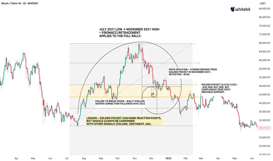
A Real Bitcoin Example
Let’s jump back to September 2021. Bitcoin had rallied from its July swing low around $29,000 to the early September high near $52,900. Then, a correction began.
If you plotted a Fibonacci retracement from that July low to the September high, the pullback landed almost perfectly in the golden pocket range between $42,800 and $41,900. On the chart, this wasn’t just a random number zone — it aligned with a previous area of consolidation and a visible liquidity shelf.
The market reaction? Price respected the zone, paused for a few sessions, then bounced to retest the $52K area. However, here’s the twist — it didn’t break new highs. By November, the rally failed, and BTC entered a deeper correction.
That single example tells you everything you need to know: the golden pocket can be a reaction point, but not a guaranteed trend reversal. Those who combined it with volume divergence, macro sentiment, and moving averages saw the warning signs early. Those who didn’t… learned a painful lesson.
The Takeaway
The golden pocket fibonacci is one of those charting concepts that sticks in traders’ minds because it’s both elegant and, at times, eerily accurate. It’s a reflection of how price action can mirror natural ratios found in the world around us.
But markets are not bound by mathematics alone — they’re driven by liquidity, sentiment, and macroeconomic forces. The golden pocket in trading works best when it’s part of a confluence: combine it with other technical indicators, volume profile analysis, or key horizontal levels.
On its own? It’s just a pretty number. In the right hands, with the right supporting evidence, it’s a zone where history has shown the market likes to make decisions.

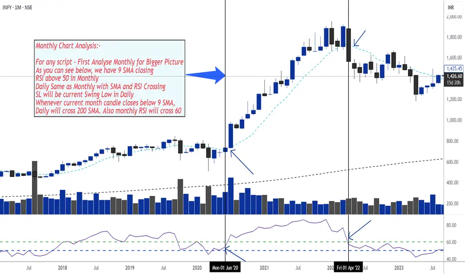
Swing Trading Setup - RSI and SMA 9 & 200🔍 Step-by-Step Monthly Chart Analysis
1. Start with the Monthly Chart – The Bigger Picture
9 SMA (Simple Moving Average)
→ Check if the current monthly candle is closing above the 9 SMA.
This indicates a bullish trend and acts as confirmation for strength in the longer term.
RSI (Relative Strength Index)
→ RSI should be above 50.
This suggests momentum is on the bullish side.
2. Align Daily Chart with Monthly
On the daily chart, confirm the following:
Price is also closing above the 9 SMA
RSI is also above 50 and crossing upward
✅ When both monthly and daily charts are aligned with these indicators, this is a strong confirmation for entry.
3. Stop-Loss Strategy
Use the most recent swing low on the daily chart as your Stop Loss.
This keeps your risk defined and close to your entry level.
4. Exit or Red Flag Condition
If the monthly candle closes below the 9 SMA, this is your major signal to:
Watch out for a trend reversal
Expect that the daily chart might cross below the 200 SMA
Also, watch for monthly RSI potentially crossing below 60, indicating waning momentum
📌 This acts as a signal to either exit the trade or tighten your stop loss.
Are we willing to collaborate and exchange ideas with each otherI'm going to share a series of short-term analyses for spot gold trading soon. If you'd like to let others know and follow me. It's free and I'll share with you what I do with that real trading analysis the day before.
Let's grind the market together.

Invalid trend?Generally, candles formed by news events, or sudden consecutive green or red candles, are usually unreliable and have a high chance of reversing—unless, after a pause, we get confirmation that the trend isn’t fake.

Spot WTI Crude OilBat pattern developing and in b or x leg of neo wave pattern. I am not sebi registered analyst and its not buy , sell hold recommendation.

Stop Chasing Results – Start Building a Winning ProcessIn trading, it’s easy to get caught up in goals like “I’m going to make X amount per month” or “I’m going to have X winning trades each week.”
The problem is that outcomes are something we have very little control over. When we fail to hit these targets, we risk overtrading, taking unnecessary risks, or abandoning our plan – which often leads to even worse results.
The truth is that uncertainty is a constant in trading. Even the most well-developed and “bulletproof” strategy will have losing periods.
Yet many traders interpret a winning trade as proof that the strategy works, and a losing trade as evidence that it’s flawed. This allows single outcomes to dictate confidence and decision-making, creating an emotional rollercoaster that makes us more impulsive and less disciplined.
Shifting the focus to the process means putting your energy into the things you can actually control:
✅ following your strategy
✅ sticking to your risk parameters
✅ completing your analysis before each trade
✅ reviewing how you executed – regardless of the result.
This shift helps maintain discipline during drawdowns, measure success by behavior rather than outcome, and develop the knowledge, skills, and mental tools needed for long-term success.
🎯A first step toward process focus is to set goals based on your actions, not on the market’s results. At the end of each trading day, ask yourself: ”Did I follow my process today?” If the answer is yes, that’s a win – even if the day’s P/L is negative.
🎯When a loss occurs, the next step is to analyze why it happened. Was it a natural result of market movement, or a deviation from your strategy? By consistently identifying these patterns, you build psychological tolerance for losses and learn to see them as a normal part of trading rather than as failures.
When you measure success by your process rather than by single outcomes, you reduce emotional highs and lows and create the conditions for stable performance over time.
💡Pro tip:
So next time you take a loss, pause before judging the result.
Ask yourself:
How well did I follow my process today?
Over the long run, your answer to that question will determine the kind of trader you become.
Happy compassionate trading! 💙
/ Tina the Tradingpsychologist
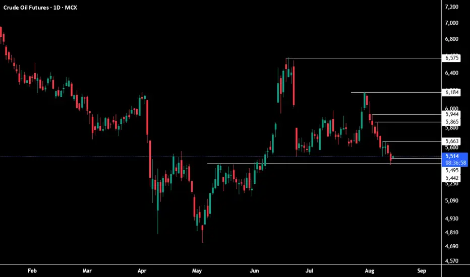
CRUDE OIL FUTURES ## Views on the Crude Oil Futures Chart (MCX)
This chart represents daily price action for *Crude Oil Futures* on MCX as of August 14, 2025. Here are some key observations and insights:
### Price Action & Trend
- The trend since February shows an initial *downward movement, followed by a significant **reversal and uptrend* from late April to June.
- After peaking above 6,500 in June, prices have retraced and entered a *sideways/consolidation phase*.
### Key Technical Levels
- *Support levels*: 5,506 (current), 5,495, and 5,442. Price is currently testing a major horizontal support zone. A breakdown below these could trigger further bearish momentum.
- *Resistance levels*: 5,663, 5,800, 5,865, 5,944, 6,184, 6,575. These are potential areas where price may pause or reverse on an upward move.
### Candlestick Analysis
- The latest candle signifies a bounce off the 5,506 support with slight bullish intent (close is above open), but there’s visible bearish pressure in recent sessions.
### Volume & Sentiment
- Volume for the session stands at 5.04K—slightly increased, indicating active participation around this key support level.
### Summary & Outlook
- If prices sustain above the *5,500 support zone*, a rebound towards 5,663 and higher resistance levels is possible.
- If the 5,500 zone fails, expect a move towards lower supports at 5,495 and 5,442.
- Watch for strong bullish candles or volume spikes to confirm any reversal.
*Note:* This analysis is graphical and technical in nature. Actual trading decisions should account for broader market context and news events, as technical levels can be invalidated quickly in volatile markets.


13 Aug 25No news
Broke rules. over-leverage
Still need to learn a lot on emotions.
Will come back bigger, better and stronger.

Spying on Your Trading FutureIn my past posts, we’ve explored a different way of looking at trading — one that’s less about “being right” on every trade and more about seeing the bigger picture.
We talked about expected value as the trader’s true “laser vision” — the ability to project the future of your account rather than the price of a single asset. We also saw how looking at results in blocks, rather than one trade at a time, helps remove the emotional weight that comes from obsessing over each outcome.
Now, we’re ready to take this one step further.
It’s one thing to calculate an average from past trades — it’s another to use that number to imagine and measure the possible futures of your system. This is where probability and a few simple tools can turn a set of trading rules into a system you can test, stress, and trust.
Over the next two posts, we’ll keep things intuitive, but we’ll open the toolbox a bit wider: First, we’ll talk about expectancy in action: how the average result grows more reliable over time, and how Monte Carlo simulations can show us the range of possible equity paths — including the unlucky ones.
Then, we’ll look at risk management as the engine that makes expectancy work in real life. We’ll explore how much to risk per trade, why betting more isn’t always better, and how to find the sweet spot between growth and survival.
Think of this as moving from reading a map to running real simulations of the journey ahead. You’ll see your trading system not as a mystery box but as a process you can measure, adjust, and manage — all without turning into a mathematician overnight.
I promise you that in the next two posts, I’m going to turn these technical ideas into practical, actionable lessons. You’ll see exactly how to apply them to your own trading — and once you do, you’ll never look at a trading system the same way again.
And of course, I’ll share the visual examples and a downloadable Python notebook so you can experiment with your own data.
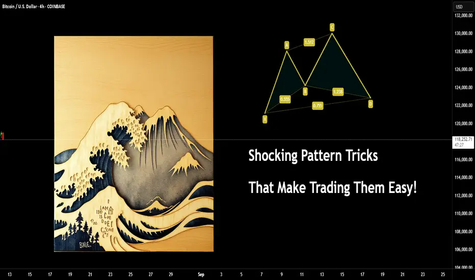
Shocking Pattern Tricks That Make Trading Them Easy!Here's another little viewpoint you might not have thought much about before.
Trading patterns is more popular than you would believe. Some seem to think it's magic or some kind of secret.
The issue is people tend to get fixated on the wrong things, such as the exact Fibonacci relationships and so on.
Let me show you something to simplify the concept, regardless of the pattern.
Example :
You might have seen a Crab pattern?
What you would then expect after spotting one on the chart is a move like this.
But, have you ever stopped to think what the price action is actually saying? It has ZERO to do with Fib relations.
Think of what the trend is doing
I have covered the basics of Dow theory in several posts here. An example of such a post is here (you need to click the image to see the full post).
Ok, Now you can see it's only part of a higher degree wave count. Let's add an example of liquidity and a range.
Are you starting to see it already?
Here's a post on the ranges...
Change the pattern from a Crab to a Bat.
Now look at it and logically what is the chart behind the pattern saying? Both bullish and bearish versions.
What about the good, old head and shoulders technique?
If you are unsure about the pattern, it's market something like this
(examples only) don't comment something like "the levels are wrong" all of these were freehand to show the concept without accuracy.
Looking at the H&S pattern - you can actually see the logic simplified.
Again, if you don't know about internal and external liquidity, here's another post on the topic.
What happens next is the internal structure changes, which then eventually leads to the higher TF change of structure.
And if you were to follow either Fib levels or Elliott Wave counts you will notice the regular move internally looks similar. (marked in red).
This post is just to show you an example and how obvious these can be.
Once you learn the basics, you won't need the complex version to follow price and use this to your advantage.
Have a great week!
Disclaimer
This idea does not constitute as financial advice. It is for educational purposes only, our principal trader has over 25 years' experience in stocks, ETF's, and Forex. Hence each trade setup might have different hold times, entry or exit conditions, and will vary from the post/idea shared here. You can use the information from this post to make your own trading plan for the instrument discussed. Trading carries a risk; a high percentage of retail traders lose money. Please keep this in mind when entering any trade. Stay safe.
Economic Factors That May Affect the Forex MarketEconomic Factors That Affect the Forex Market
The foreign exchange market is influenced by a wide range of economic factors which have a significant impact on currency exchange rates. Knowing about these factors is crucial for anyone looking to trade in the forex market, as they can help analyse price movements.
This article explores some key factors that may affect the forex market and lead to changes in the rates of currency pairs. You’ll learn about the influence of macroeconomic statistics, capital markets, economic data, and more. These factors collectively contribute to the volatility and dynamics of the forex market.
Economic Factors
These economic factors interact with each other in complex ways, and forex traders use a combination of analysis and research to make informed trading decisions. Understanding how these factors impact currency movements is essential for participants in the forex market.
Economic Health
Macroeconomic statistics fall into a category of factors affecting the currency market. The term refers to a set of main indicators that provide insights into the overall performance and health of an economy. These are GDP data, unemployment rates, trade and current account balances, interest rates, and inflation data. Countries with strong economic indicators are typically more attractive to foreign investors. This leads to an appreciation of their currencies. On the contrary, poor economic performance can lead to a decline in a country’s currency value.
Central Bank Policies
Central bank monetary policy decisions, including quantitative easing, forward guidance, and open market operations, can have a direct impact on a country's currency. Announcements and statements by central bank officials are closely monitored by forex traders.
Interest rates are among the most popular central bank tools. Central banks around the world set and regularly change them, and these rates have a direct impact on the value of a country’s currency. In most cases, higher interest rates attract foreign investment. The increased demand for the currency can cause its value to appreciate. In contrast, lower interest rates can lead to a decrease in the value of a currency as investors seek higher returns elsewhere.
The Influence of the Capital Markets
One of the factors affecting the foreign exchange market that we should remember is the influence of the capital markets. Commodity, stock, bond, and other markets also have a strong influence on exchange rates. To illustrate, when a country experiences a rise or sell-off in securities, this may indicate a change in its economic outlook. This typically affects investor sentiment and capital flows.
Traders try to stay updated to apply the most efficient strategy and avoid large losses. They can learn about these events through various sources, including news outlets, financial websites, and even trading platform blogs and news sections.
Imports and Exports
Other significant factors that affect forex trading are imports and exports. When a country’s exports exceed imports, a trade surplus occurs, which strengthens the economy and causes the value of the currency to rise. This happens because foreign consumers buy foreign currency to purchase exported goods. Conversely, when imports exceed exports, a trade deficit occurs, and the country is forced to sell its currency to buy imported goods. This may lead to a decline in the value of the domestic currency.
Government Debt
Government debt is not necessarily a bad thing; however, a government with high debt may find it more difficult to obtain foreign capital if it isn’t seen as reliable by investors. Conversely, a government with low debt and a history of not defaulting is likely to be considered more stable, which can positively impact its currency value. Traders can find information on government debt in financial news outlets, on economic research websites, and in other national sources.
Trade-Weighted Index
A Trade-Weighted Index (TWI) is a measure used in international economics and finance to assess the relative strength or value of a country's currency against a basket of other currencies. Unlike a simple exchange rate, which reflects the value of one currency in terms of another, a Trade-Weighted Index takes into account a country's trade relationships with multiple trading partners.
A Trade-Weighted Index provides a more comprehensive view of a country's currency value because it considers the impact of its trade relationships with multiple partners. It is particularly useful for countries heavily involved in international trade and can be used by policymakers, investors, and economists to gauge currency competitiveness and evaluate the potential impact of currency movements on a country's trade balance.
Final Thoughts
Experienced traders carefully consider factors influencing the forex market and explore their potential impact on exchange rates. It is critical to note that these economic factors do not operate in isolation, and their impact on the forex market can be complex. For example, while high interest rates may attract foreign investment in a certain country and cause its currency to appreciate, they can also lead to decreased consumer spending and economic slowdown, which may ultimately lead to a depreciation of the currency.
Often, traders rely on both economic indicators and technical analysis tools, considering previous price movements in the market. They can compare historical quotes of currency pairs and track what news or indicators were associated with the changes.
This article represents the opinion of the Companies operating under the FXOpen brand only. It is not to be construed as an offer, solicitation, or recommendation with respect to products and services provided by the Companies operating under the FXOpen brand, nor is it to be considered financial advice.
Pump Always Comes, After You’re Too Tired To HoldHave you ever felt the market is deliberately tiring you out?
The moment your hope runs out is when the real flight begins.
This analysis explains why market makers change the game exactly then.
Hello✌️
Spend 2 minutes ⏰ reading this educational material.
🎯 Analytical Insight on Ripple:
BINANCE:XRPUSDT is showing strong volume with a respected daily trendline and nearby support. If this zone holds, price could rally about 17% toward 3.70 USD. 📈💹
Now , let's dive into the educational section,
🎯 Big Picture of the Market Maker’s Game
The market is never just a single candle up or down. Its moves are filled with swings designed less for short term gains and more for managing your emotions. Market makers know that 70% of traders think alike. When they see some profit they fear losing it and when they face some loss their patience fades. That exact weakness is their golden opportunity.
This is not random and it is not luck. Behind every long range or sharp fluctuation lies a clear goal. Collecting liquidity and pushing the weakest hands out. Once most people are caught on the wrong side the market maker takes the biggest profit with the least effort.
⏳ Wearing Down Investors
The market maker is a master of time manipulation. They can hold price in a narrow range or dull sideways move where neither strong rallies nor deep drops happen. This slow bleed in excitement causes small traders to withdraw their money one by one.
Every day this continues hope fades and doubt grows. By the time most decide to exit the market is primed for a move they will not be part of.
📉 Stop Loss Hunting in Price Swings
Stop loss placement is vital for traders but to a market maker it is a treasure map. They know most stops are just below recent lows or above recent highs. With a few intentional pushes in price they trigger these stops and collect the liquidity.
This can happen multiple times in one trend each time pushing more traders out and clearing the way for the next move.
🎯 Targeting Leveraged Traders
High leverage traders are like low hanging fruit. Even a small move against their position can cause forced liquidations or margin calls. Market makers exploit this by moving price briefly against the crowd several times flushing them out.
This not only removes a large chunk of opposing positions but also makes it easier to drive the price strongly in the desired direction with minimal resistance.
💧 Building Liquidity
Liquidity is the fuel for major market moves. Without it a big push in price is costly and risky. To create it market makers need traders to buy or sell in large volumes. Stop hunts exhausting investors and shaking out leveraged players all feed this goal.
Once there is enough volume stacked on one side they flip the market hard taking the big profit while the majority has either exited or is trapped in the wrong direction.
📊 TradingView Tools to Spot the Market’s Mind Games
To see this game more clearly TradingView has tools that directly help you.
Volume Profile lets you identify price zones with the most traded volume which are prime hunting grounds.
Liquidity Zones Drawing helps you mark liquidity pockets to predict the next hunt.
Replay Tool lets you rewind past trends and find moments where stop losses were targeted.
Relative Strength Index (RSI) shows that multiple touches in overbought or oversold with sideways price often means a hunter is at work.
Alerts Customization allows you to get notified when price nears key liquidity zones.
Practical use. Open the BTCUSDT chart run a Volume Profile to find high volume areas mark liquidity zones then use Replay Tool to see how often the market hit those zones before a major move. This drill trains your eye to avoid becoming prey.
Summary
The market never moves in a straight painless path. Every swing trap or sideways grind has a purpose. If you understand these moves as part of the market maker’s plan to gather liquidity you can position yourself where others give up and join the move when it truly starts. Patience and pattern recognition are your sharpest weapons.
✨ Need a little love!
We pour love into every post your support keeps us inspired! 💛 Don’t be shy, we’d love to hear from you on comments. Big thanks, Mad Whale 🐋
📜Please make sure to do your own research before investing, and review the disclaimer provided at the end of each post.

Triangles, Flags, and Pennants — Guide to Continuation PatternsChart patterns can be mysterious — until they’re not. Let’s break down the technical trio that tells you when a trend’s just taking a breather before it flexes again.
So your chart’s been pumping higher for weeks, and then… nothing. Price starts scribbling sideways. Cue panic? Maybe. But more likely, you’re staring at a continuation pattern.
Triangles, flags, and pennants are the subtle “hold my beer before I try to pull a move” signals of technical analysis. They show up when markets pause — not reverse. That pause could mean your trend is catching its breath, not dying in a ditch.
In other words: don’t close your longs just because things go quiet. Sometimes the market is just stretching before it sprints again.
⚠️ Symmetrical, Ascending, Descending
Let’s talk triangles, the Swiss Army knife of consolidation. These shapes come in three stylish varieties:
● Symmetrical triangle: Higher lows, lower highs. Traders call this the indecision pattern, but don’t get it twisted — it may just be winding up for a breakout. Wanna see how these look in practice? Dive into our community’s symmetrical triangle ideas .
● Ascending triangle: Flat top, rising bottom. Buyers are aggressive, their patience is running out. Resistance looks like it’s begging to be broken. Check the ascending triangle ideas for your viewing consideration.
● Descending triangle: Flat bottom, falling top. This one’s more bearish than your boomer uncle who knows zero about Bitcoin BITSTAMP:BTCUSD , and yes — it’s often a precursor to a breakdown. Follow the descending triangle ideas and make sure you DYOR.
Key tip : Wait for the breakout. Don’t front-run triangles unless you like volatility surprises and emotional damage.
🚩 Flags: Fast Moves, Tight Consolidations
Flags form after a sharp price move — the “flagpole” — followed by a tight, slightly sloping channel that moves against the prevailing trend. They’re short-term patterns that act like pit stops during a race.
● In a bull flag, price rallies sharply, then consolidates lower in a downward-sloping rectangle. If price breaks above the upper boundary, the uptrend is likely to resume. Jump straight into the bullish flag ideas .
● In a bear flag, price crashes, then drifts higher or sideways, forming an upward-sloping consolidation. A breakdown below the lower support hints at a continuation lower. What goes up must go down — bearish flag ideas for thought.
Flags are prized for their reliability and tight risk-to-reward setups. The breakout is typically swift, and traders often use the length of the flagpole as a projected target.
🎏 Meet the Pennant: The Flag’s Cousin
Pennants are like mini-triangles that form after a strong price move, usually in high-volume conditions. Unlike regular triangles, they’re smaller and more compressed — a tight consolidation in the shape of a tiny symmetrical triangle.
What makes a pennant different from a flag? The structure. While flags are rectangular, pennants are more pointed — a converging pattern rather than parallel lines.
Pennants are often seen in high-momentum environments, and when price breaks out of the consolidation zone, it often does so with force. Get some pennant ideas straight from our community.
🧐 How to Actually Trade These Patterns
Spotting a continuation pattern is one thing. Trading it with discipline is another.
Here’s a basic checklist:
● Identify the trend. Continuation patterns only work when there’s a clear preceding move. If the chart is a sideways mess, maybe skip it.
● Draw your levels. Use trendlines or horizontal support/resistance to outline the pattern. Keep it clean — if you’re forcing a pattern, it probably isn’t there.
● Wait for the breakout. Don’t jump in too early. Let the price confirm your bias. Breakouts are more credible with a volume spike.
● Set your stop wisely. Most traders place stops just outside the opposite side of the pattern — below the lower trendline in an uptrend, or above the upper trendline in a downtrend.
● Target projection. Many use the height of the pattern or the flagpole to estimate a target price, though market conditions should influence your approach.
🤔 So, What Could Go Wrong?
Glad you asked. Plenty.
● Fakeouts: Just because it looks like a breakout doesn’t mean it’s real. Wait for confirmation — volume, a close outside the pattern, or your favorite indicator giving the green light.
● Shaky patterns: Not every triangle-looking pattern is a triangle. Sometimes it’s just noise. Don’t make up patterns. The market doesn’t care about your geometry.
● Overleveraging: Continuation patterns look reliable, but no pattern is bulletproof. Position sizing still matters. Don’t bet the farm because a pennant gave you butterflies.
💡 Pro Tips from the Chart Trenches
● Set alerts on trendline breaks so you’re not glued to the screen like a caffeinated hawk.
● Use pattern recognition tools if you’re a newer trader — but verify manually. No software is a crystal ball.
● Trade continuation patterns in the direction of the trend. Countertrend flags are usually bear traps in disguise.
📌 One Last Thing: Pattern ≠ Prediction
Chart patterns don’t tell the future. They tell a story about buyer and seller behavior. Continuation patterns? They’re just the market saying, “Yeah, we’re still into this trend. Just grabbing some break first.”
Use them as one part of a system. Combine them with momentum indicators, volume, or good ol’ fashioned risk management.
Because in the end, it’s not about how many triangles you find — it’s about how many fakeouts you avoid.
Off to you : Spotted any textbook triangles or sneaky flags this week? Or caught a pennant fakeout that wrecked your stop loss?
Drop your best (or worst) continuation pattern story below. You never know who might learn something from your chart scars.
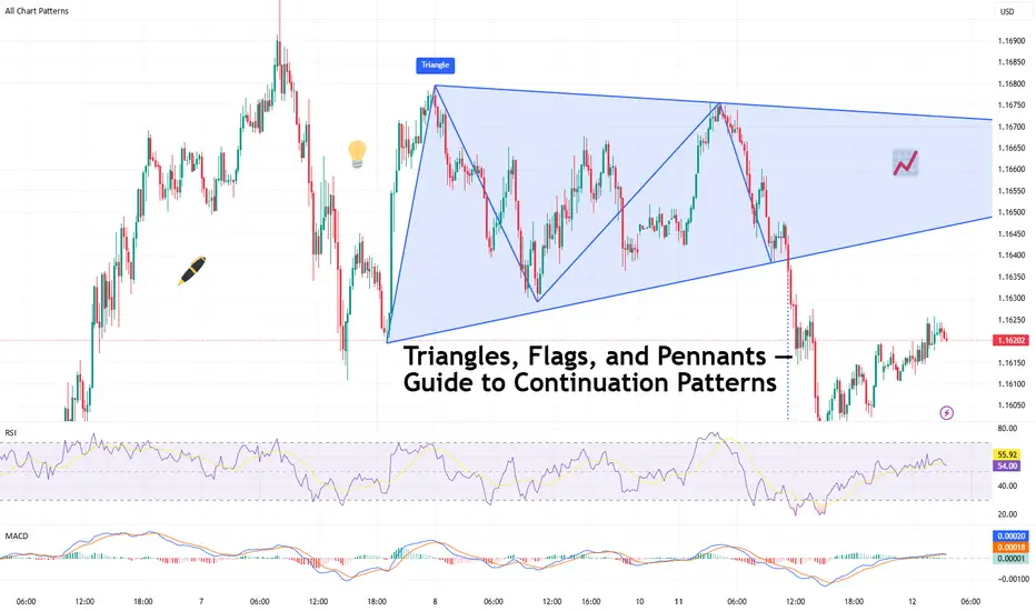
AMP Futures - Heikin Ashi meets bar Replay!In this idea we will demonstrate how to access the NEW Heikin Ashi bar replay feature in Tradingview.

A-Book vs B-Book: What Every Retail Trader Needs to Know█ A-Book vs B-Book: What Every Retail Trader Needs to Know
Most retail CFD traders have never even heard the terms “A-Book” and “B-Book,” yet almost all of them are directly affected by how these models work. Your broker’s choice between the two can change the prices you see, how your orders are filled, and even whether your stop loss gets hit. Let’s break it down so you know exactly what’s going on behind the scenes.
█ What is A-Book?
An A-Book broker routes your orders straight to external liquidity providers, such as banks, market makers, or directly to an exchange in the case of futures or spot markets. Your broker is essentially the middleman, passing your trade along and matching it with a real counterparty.
⚪ How they make money:
Spreads (the difference between the bid and ask prices).
Commissions on each trade.
Occasionally a small markup on the feed.
Because they don’t profit when you lose, an A-Book broker’s ideal client is a trader who trades frequently and consistently, your activity is their revenue stream.
█ What is B-Book?
A B-Book broker keeps your trades “in-house,” meaning they take the other side of your position. If you buy, they sell; if you sell, they buy, but all within their own system. Your trades don’t reach the real market at all.
⚪ How they make money:
Your losses are their profits.
They may still earn on spreads and commissions, but the main income is the net loss of their client base.
Because the broker profits from losing clients, there’s an inherent conflict of interest. It’s not that every B-Book broker is out to get you, but the incentive structure is very different from A-Book.
█ Hybrid Models – The Modern Reality
Today, many CFD brokers use a hybrid model. This means small accounts or “unprofitable” clients might be B-Booked, while larger or riskier trades are hedged via A-Book routing. This approach balances their risk and maximizes profits.
█ The Stop Loss Mystery – Why It Sometimes Gets Hit When It “Shouldn’t”
A common complaint among retail traders is this:
“My stop loss was triggered on my CFD broker’s chart, but the real market price never touched it.”
⚪ Here’s why this happens:
B-Book influence: If your trade is kept in-house, the price you see is the broker’s internal feed, not the pure exchange price. Minor spikes or wicks can appear that don’t exist on the actual CME or underlying market.
Different price feeds: Even A-Book brokers often aggregate liquidity from multiple sources, leading to small discrepancies from the official exchange price.
Overnight sessions: Many CFD brokers price products nearly 24 hours a day, even when the underlying market is closed. This “synthetic” pricing can produce moves that never happened in the actual market.
The result? You might see your stop hit during quiet, low-volume hours when the real market was nowhere near that level.
Side-by-side comparison showing a large wick on a CFD gold chart (left) that never occurred on the actual CME gold futures market (right). This kind of discrepancy can trigger stop losses on CFD platforms, even though the real market price never reached that level — a classic example of the Stop Loss Mystery.
█ Stop Hunting – When the Market Seems Out to Get You
Closely related to the stop-loss mystery is stop hunting, when price spikes just far enough to trigger a cluster of stops before reversing sharply.
In a pure B-Book setup, your broker isn’t just your counterparty, they can also see exactly where all their clients’ stops are placed. If they control the price feed, even the smallest manufactured move in their internal system can sweep through those levels. This can happen intentionally to lock in profits from client losses, or simply as a by-product of how their system reacts during thin liquidity.
From your perspective, it feels like the market was “out to get you,” touching your stop and then running in your direction. But often, that move never existed in the real underlying market at all, it was born inside the broker’s own pricing environment. And while low-volume hours are prime time for this, it can still happen in the middle of the busiest trading sessions.
Comparison of gold CFD pricing (left) and CME gold futures (right). The CFD chart shows a wick that sweeps above previous highs, potentially triggering stop losses, while the real futures market shows no such move, a classic example of suspected stop hunting on CFD feeds.
█ Why This Matters for Retail Traders
Understanding whether your broker uses A-Book, B-Book, or hybrid execution changes how you view price discrepancies, stop-loss triggers, and even your broker’s incentives.
A-Book: Broker earns from your trading volume, not your losses.
B-Book: Broker earns directly from your losses.
Hybrid: They can switch between models depending on the trade and client profile.
Knowing this doesn’t just help you choose a broker, it helps you understand the “market” you’re actually trading in.
-----------------
Disclaimer
The content provided in my scripts, indicators, ideas, algorithms, and systems is for educational and informational purposes only. It does not constitute financial advice, investment recommendations, or a solicitation to buy or sell any financial instruments. I will not accept liability for any loss or damage, including without limitation any loss of profit, which may arise directly or indirectly from the use of or reliance on such information.
All investments involve risk, and the past performance of a security, industry, sector, market, financial product, trading strategy, backtest, or individual's trading does not guarantee future results or returns. Investors are fully responsible for any investment decisions they make. Such decisions should be based solely on an evaluation of their financial circumstances, investment objectives, risk tolerance, and liquidity needs.