Tesla (TSLA) Extend Rally to new High, Pullback Should supportedTesla (TSLA) recently advanced to a new all‑time high, underscoring the strength of bullish momentum in the market. The short‑term Elliott Wave analysis indicates that the cycle from the November 14, 2025 low has concluded as a clear impulse structure. From that low, wave 1 terminated at $423.69, followed by a corrective decline in wave 2 that ended at $383.76. The upward progression then resumed, with wave 3 extending to $458.87. A modest pullback in wave 4 concluded at $435.
The final advance in wave 5 reached $496.16, as illustrated on the 45‑minute chart. This marked the completion of wave (1) at a higher degree and simultaneously closed the cycle that began on November 14. After this peak, the stock entered a corrective phase in wave (2), unfolding internally as a zigzag pattern. From the termination of wave (1), wave A of the zigzag is expected to finish soon. A rebound in wave B should follow, setting the stage for another decline in wave C, which would complete the corrective sequence of wave (2). As long as the pivot at $496.16 remains intact, rallies are likely to fail. The broader expectation is for Tesla to extend lower, thereby correcting the entire cycle that originated from the November 14 low.
Economic Cycles

Gold Eyes New ATH: Bullish Move from Current LevelsGold has the potential for a bullish move from the current price range toward 4,321.88 and onwards to a new ATH. However, the 4,308.66 level remains critical. CMCMARKETS:GOLD

XAUUSD Currently on Gold price is bullish on the 4hr,2hr &1hr
Looking at the structures on the 1hr chart I can see that price put in a higher high at 4,334 and a higher low at 4,315 price ,went further to put in a new higher high at 4,342 .I'm banking to the buy sell as I believe price is likely to continue the uptrend

GBPUSD Analysis: Potential Sell-Off Near 1.34365The 1.34365 area offers a good setup for a short move on Cable (GBP/USD). However, watch out for 1.34464 as it is a crucial level. CMCMARKETS:GBPUSD

DXY bullishDXY resumed upwards monday and tuesday, but fell again wednesday and thursday, into another a deeper level of horizontal supoort, then consolidated friday and is now bullish again, dxy resuming back up again. Next strong move up is still to come...

GBPUSD: Potential Correction from 1.34087 AheadWe might see the start of a downside correction for the Pound from 1.34087. Keep in mind that 1.34473 remains a highly critical level. CMCMARKETS:GBPUSD

Gold UpdateGold Update: Potential upside from $4,314.9 targeting $4,349.2. Watch the critical support at $4,305.93. As always, stick to your risk management for safety. CMCMARKETS:GOLD

Investment Grade VS High Yield AMEX:LQD is meeting the demand zone here. Looks like risk appetite will start to cool down from here. Flight to safety is starting to show signs.
With all the private credit out there I don´t think AI is the go to at this point in time. Gold is likely to be benefiting from this aswell as creditworthy companies.
High beta stocks is at a danger zone from my perspective.
BOJ´s rate hike could be the trigger on friday.
As always. This is not a financial advise. Always do your own research and investment decisions.

$GRWG - GrowGeneration Weekly ZoneCurrently back near 2017 opening levels, this may be primed for a nice bounce. Chart looks really interesting for the long-term when looking at the monthly... Looks like a great zone to accumulate and hold ;)
www.growgeneration.com
www.sec.gov

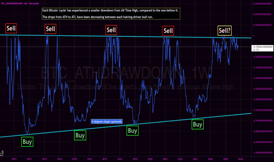
Bitcoin All Time High Drawdown - Bottom nowhere in sight?We revisit the Bitcoin All Time High Drawdown chart originally published in March 2023.
The core thesis of the BTC_ATHDRAWDOWN chart remains intact: each subsequent market cycle has exhibited a diminishing drawdown from its prior All-Time High, with generational cycle bottoms resting squarely on a discernible upward-sloping diagonal support (the 'Buy' line). The 2022-2023 bear market bottomed perfectly on this structural trendline, confirming the '4 degree slope upwards' trend.
Current Cycle Progress: The Sawtooth Fractal
Following the decisive breakthrough of the 2021 All-Time High, price action has entered an unprecedented and structurally complex phase. We are currently witnessing a prolonged high-frequency sawtooth waveform of continuous All-Time Highs.
This action represents the longest sawtooth fractal near ATH of any cycle prior.
This is a stark deviation from the swift, parabolic ascents that characterized previous blow-off tops:
Contrasting the 2017 Pattern: The 2017 bull run culminated in a sharp, almost vertical run-up to $20,000, immediately followed by a steep and rapid crash. That was a classic V-top.
The 2024/2025 Pattern: Instead of a quick V-top, the market is engaged in an extended, messy distribution/consolidation phase right at the very peak. The continuous setting of new, marginal ATHs followed by sharp, shallow pullbacks creates a dense, high-frequency signal in the ATH Drawdown chart.
This structural evolution—a prolonged struggle to hold and marginally exceed previous peaks—suggests that the market is either building a much larger, more resilient base for an extended super-cycle, or undergoing a slow, drawn-out distribution that fundamentally alters the historical BTC cycle cadence.
This is not financial advice, and presented merely as conjectural musing.
Ethereum looks good for a small long position.Ethereum looks good for a small long position. From the $2,927 range, it could rally toward $3,120. Keep a close eye on the critical level at $2,871.57. BINANCE:ETHUSDT

How to trade every smart money concept: HTF tutorialI talk about trading HTF concepts inside of the smart money world not chasing minutia but paying attention to the larger levels

USDJPY Shorting IdeaThis Trade idea is inspired by Wyckoff Heuristics
& Common Smart Money Knowledge.
My prediction with JPY Rates ahead of time, beginning to gather strength
we will first begin with a campaign that requires the build up to drop
The floor to lower prices as mentioned in the format of the chart.
Updates soon as time developes toward Thurdays Japanese Yen Interest
Rate Decisions

Dow Jones Faces Potential Downside Correction“The Dow Jones may start a bearish correction from the current price range toward 47,423. The level at 48,916.77 is critical.” CMCMARKETS:US30

LONG OPPORTUNITY LOOMING ON SILVER!Will silver retest 60 before another rally to the upside?
N.B!
- XAGUSD price might not follow the drawn lines . Actual price movements may likely differ from the forecast.
- Let emotions and sentiments work for you
- ALWAYS Use Proper Risk Management In Your Trades
#silver
#xagusd


Altcoin's OutlookAltcoins have historically tended to overtake Bitcoin. We can see that the dominance of the top 10 altcoins correlates with the price of Bitcoin. It used to generally outperform it, but today it still has plenty of room to recover even in a pessimistic view. Altcoins will increase 10-50x depending on their distance from the all-time high (ATH).

Major correctionI'm targetting a drop to 11 000 around Aug to Dec next year and back to more reasonable valuations than currently. This would also arrive at the very long term lower trend line on the log chart. The area around 11 000 looks to me like it need retesting. And it would need to be in this sort of time frame, before we run out of time to get back to such levels on this lower log trend line.
Ok possible, but far fetched, so it still needs a reason.
So why should that happen?
A confluence of factors:
- I believe inflation will stay elevated for some time and even potentially resurge. Trumps tariffs are not helping with disruptions and inefficiency on supply chains.
- I think its unavoidable that AI will destroy jobs. Long term it will balance out, as it always does. But in the interim this will be faster than the labour market can adapt. So a lot of job losses
- Due to the inflation backdrop, the fed's hands will be tied, regarding dropping rates. So they wont be able to rescue markets on this occasion with their Ponzi scheme. THAT will be a big problem. Or if that's not the case, the job losses may still be too much anyway, for their fiddling to prevent.
My only reservation with this analysis, is that the jobs losses may be a bit slower to start showing up, than the this time frame will allow. If so, then it may not make it as far down as11 000, due to missing the window of opportunity to reach this level before it becomes below the lower log trend line. Although if it gets near, i cant believe it will not target it. If it misses by this date, its still possible to break the trend line to reach this area, if conditions became bad enough. But that would be quite extreme. But maybe it will be so.
The final factor is contracting money supply. This could cause the above scenario alone anyway. As ballooning supply is mostly how we got where we are. But certainly if combined with any of the others, it could be nasty. So be very vigilant on this.
Note, that the chart posted is a monthly chart. So this is a longer term view. So dont expect this to happen imminently or on a particular day/week/month. But keep an eye out for the signs.
Lastly, potential labels for the 3 up waves of an elliot wave. The first and third are similar in terms of % gain. Less do in terms of time duration, but still more similar to each other than compared to the middle wave. Elliot waves are extremely discretional however and vary according to time frame. So much variation in delineation is possible. And it could still continue for some time. Mentioned more as a possible point of interest than a useful tool.

Why This 2022 Bitcoin Fractal Might Fail The 2022 bear‑market fractal 📉
The fractal taken from the 2022 bear market. Back then Bitcoin built a rising wedge pattern and then dropped about 60% in value from the breakdown.
What “everyone” expects now 😱
Many traders now expect Bitcoin to repeat that same pattern crash.
Social media, bears and even cautious bulls keep pointing to the old wedge and saying “this dump is next.”
Why this time can be different 💡
Markets rarely give the majority the easy trade; when everyone leans to one side, that scenario often gets crowded and fails.
If most traders are positioned for a huge crash, any sustained bid or positive macro surprise can squeeze them and send price higher instead.
My view based on the chart 📊🚀
I consider an alternative path: a choppy but upward trend, driven by forced short covering and new buyers stepping in as the crash fails to appear.
Key takeaway ✅
Yes, the 2022 fractal shows what could happen.
But because almost everyone already sees and trades that same pattern, the higher probability play now is that Bitcoin does not repeat the exact 60% wipeout and instead grinds higher while late bears get trapped.

TOP 5 Low Cap ALTCOINS 2026Here's a quick glance at my TOP 5 alts of choice for 2026, and why.
💭 Injective (INJ)
Fast, interoperable DeFi infrastructure. Active development and a clear use-case in scaling decentralized trading.
BINANCE:INJUSDT
💭 Theta Fuel (TFUEL)
Utility token for Theta’s decentralized streaming network, with demand linked directly to real network usage.
MEXC:TFUELUSDT
💭 Illuvium (ILV)
Prioritizes high-quality gameplay and steady development, backed by a solid revenue model.
BINANCE:ILVUSDT
💭 Origin Protocol (OGN)
Focuses on tokenized commerce and NFT marketplaces, making it easy for creators and brands to build decentralized storefronts.
BITGET:OGNUSDT
💭 Audius (AUDIO)
Decentralized music-streaming platform giving artists more control and growing consistently in real-world adoption.
BINANCE:AUDIOUSDT
Which alts are you watching in 2026?

Benner Cycle 2026 Crash - Has It Started on NQ & SPX?On this chart I’m lining up the Benner Cycle’s 2026 “crash window” with NQ’s fixed volume profile from April’s low to October’s high.
The top orange line is VAH, the second orange line is VAL, and the green line is POC. As long as price holds above POC, we’re just rotating in value. A clean break and daily close below POC opens the door to HVN 1, then VAL & HVN 2 as the next major support shelves. If HVN 1 and HVN 2 both fail, that lines up almost perfectly with Benner’s 2026 panic leg and raises the odds that this isn’t just a pullback, but the start of a larger cycle top in NQ (and likely SPX as well).
My short bias holds while we’re below VAH.
Invalidation: Strong daily close back above VAH.
First downside objective: POC, then HVN 1 and HVN 2 if value breaks and the selling accelerates.
Not financial advice – just my roadmap if the Benner 2026 window is starting to play out.

Gold BuyPrice is still bullish so im looking for continuation to the upsdie and price has sweeped a low during open of NY, an inducement(LG) to buy.

Selena | BTCUSD – Bullish Structure Holding Above TrendlineBITSTAMP:BTCUSD
Price continues to respect the ascending trend structure formed after the breakout from the descending channel.
The current pullback into 91,400–91,850 support aligns with rising trendline confluence, making this the critical continuation zone for the next bullish leg.
🔹 Bullish Setup
A confirmed rejection from support + breakout above 93,600–94,000 will open the next expansion leg.
🎯 TP1 → 94,800
🎯 TP2 → 95,600
🎯 Final Target → 96,300–96,800 liquidity zone
🔸 Invalidation
❌ Break & close below 91,300 weakens continuation potential.
Next demand is far lower — deeper retracement may unfold.
⚠️ Educational-analysis only — not financial advice.
