A Bitcoin Prediction (2025)In this chart, we continue the journey of testing whether Bitcoin can live up to the expectations as published in my previous Bitcoin prediction chart (2024). Since we had technically hit my ATH cycle top for 2024–25, we are now gambling with the possibility that we might not have hit the highest cycle top targets and may just extend that little bit more. I think 2025 has most people asking, "Are we done yet?" or are we on the verge of something else? We'll just have to wait and see....
Upside:
As you can see in ATHs, there are several targets, and I've mentioned this in my previous chart. Ultimately, the high side of what this chart can expect from a cycle high is a 2-week close of $131k. Wicks can extend beyond this price, but I expect a close below (according to this chart). A close above will invalidate this chart. All prices within the lows and highs are acceptable.
Downside:
In my previous chart, I hadn't posted any projected targets during a bear market; I only highlighted the lows, as generally that is what most may consider important enough to know—when can we resume the bull market again? Well, in this chart, I have labeled two additional downside targets. Although these do not follow the same pattern as other targets, they do have a significant similarity to previous cycle lows. Expect bounces from these levels, but if the pattern holds true, they will fail and continue to lower prices. In the short term, resistance sits at $98,511, and again this is on a 2-week close. So this next week, we can wick above, which might be the path we are on.
Summary: I'll be posting updates close to each 2 week close, if I see something I'll be sure to post and update.
2024 Chart linked below.
Phases

A Bitcoin Prediction (2024)In this chart, I uncover price levels across an identified cyclical pattern hidden within Bitcoin.
I was initially hesitant to publish this, as I had been pondering the theory for a few days. However, as the price approaches the Phase 2 level, I believe the timing cannot be ignored, and a reaction may be imminent as Bitcoin could be on the verge of breaking out into Phase 2... I've posted a screenshot prior to where BTC is now (below)
My discovery in finding this was not intentional nor was it believable. However, after identifying some familiar projective price targets deriving from Bitcoin's first cycle the compelling results left me intrigued and were enough for me to continue. Whilst continuously applying my method more and more results seemed to match with key pivotable phases. Once I hit 2020, I was sure to expect some variances, but to my surprise, there was not, and price levels were again matched to pivotable levels. It is to that point I followed through into 2024 and beyond. As stated in the chart there is no trickery rather, there is logic and reason. It appears, these predictions beyond 2024 are realistic and do not point to crazy moon boy levels. So with that, I leave this here to revisit and pay my respects.
Some Observational and Key Points:
I base some findings on a 2 x 8-year cycle rather than the conventional 4-year cycle. However, it may appear shorter than expected. Just as there are diminishing returns, there too is an aspect of diminishing cycle timing.
While cycles are often recognised by their low and high targets, not many observe the time it takes to surpass a previous all-time high (ATH) or low. This is interesting because Bitcoin does not exhibit this repetitive behaviour in its history.
I observed the peaks and troughs while noting the counts and periods across cycle phases and took a visual snapshot towards 2022-24 playing into more likely that of 2013-16.
I've projected 2 ATHs as a range due to the nature of placement. The first target is primary, and wicks above could stretch into the second. Projections are also based on a 2-week (close) timeframe.
Final comments:
This is not an indication to be mega bullish and is NFA. The chart merely highlights developments I've identified and is not certain to play out, although quite probable. It is more of a "let's look back and indulge" - at least for me.
Thanks and Enjoy!

Will the 3/21 new moon swing momentum in favor Will the 3/21 new moon swing momentum in favor of the bears? Or can this bullish move push us to 30k before a correction?


The Bitcoin Treasure MapThis is an updated idea from the one last night.
This idea aims to smooth out some of the points in the phases with new labels minus my consumption induced ramblings.
PHASE A - ACCUMULATION
----------------------------------
PSY - Preliminary Supply
The first peak is the Preliminary Supply or PSY, which is where some retail traders start to sell
BC - Buying Climax
Around this time inexperienced investors start to come in and this causes the Buying Climax or BC shortly after the PSY
AR - Automatic Reaction
This is where institutions start to sell their assets to the newcomers, and this is the Automatic Reaction or AR price tip.
ST - Secondary Retes
After some time, the institutions will ease off some of the sell pressure and the market will spike back up to form the Secondary Retest or ST, which is usually just below the BC retail rally.
PHASE B - MARKUP
----------------------------------
As with Phase A of the accumulation, pattern institutions will occasionally push up the price to keep retail interest and confidence high while they secretly sell.
SOW - Sign of Weakness
UT - Up Thrust
PHASE C - DISTRIBUTION
----------------------------------
In Phase C of the distribution pattern, we see something called the Upthrust After Distribution or UTAD.
UTAD - Upthrust After Distribution
Whereas the spring is meant to shake out the retail investors, the UTAD is meant to get as many retail investors to buy in as possible through the fomo it causes.
Institutions start to aggressively sell to these investors causing the price to fall. This price collapse continues in Phase D of the distribution pattern.
PHASE D - MARKDOWN
----------------------------------
The brief pause in the drop is marked by the Last Point Pf Supply or LPSY and is followed by a Sign Of Weakness or SOW, which falls below the support line drawn by the automatic reaction.
LPSY - Last Point of Supply
SOW - Sign of Weakness
PHASE E - END/START
-----------
Phase E of the distribution pattern usually blends with phase a of the accumulation pattern, which readies the market for another run-up.

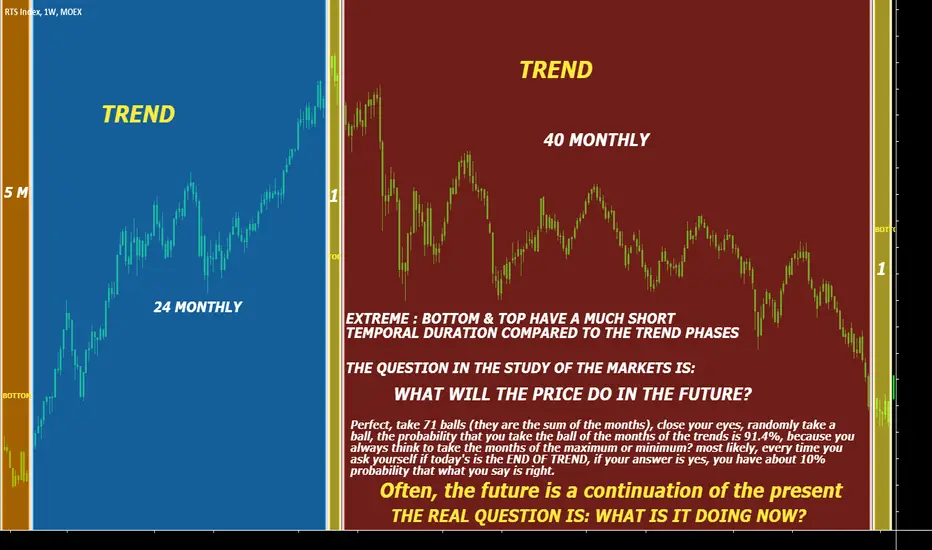
BTC market cycles...Anger or Depression Stage 4? Look up that infamous "Wall Street Cheat Sheet, psychology of a market cycle" diagram
The 4th stage is the markdown and downtrend. In the very first cycle it looks pretty textbook where stage 1 is a consolidation box but crypto does crypto things...by the time COVID came the stage 4 into stage 1 is a WIDE and volatile type of consolidation which lead to the 2nd markup to ATHs.
This year we have inflation, another macro event! Stage 4 into a theoretical stage 1 could end up doing the same, it's definitely not clear cut or this stage extends further down first before a basing type of consolidation. But...the clue is to watch the 40 ma cross/rejection and what happens on this broadening pattern. A clear cross on the ma and pattern break could signal a new stage 1 (can have intermediate steps) in which a new set of unpredictable and volatile patterns form!
Btw this is speculative. I could redraw this as well and this could very well still be gigantic top on stage 3 (like cycle 1 pattern breakdown, this entire top here could also be a larger broadening pattern with a failed breakout) But I am looking at it in terms of smaller cycles and patterns but I will keep updating this analysis on it.
*** currently ***
1. bear flag
2. 3rd touch on broadening support bounce
3. price moving towards the 40ma
4. will it swing up to test resistance?
5. what/when/if will the next stage 1 base look like?
6. the last cycle just take notice the wide and sideways 1a/1b I pointed out.
7. last cycle lasted 700d, I duplicated that period of time to current cycle.
What if it repeats and it lines up right to where the bear flag could hit (channel upwards) the resistance?
8. the 40 ma cross/reject will be something interesting to watch.
...past performance is not indicative of future results...but sure lines up nice!

We are in accumulation. Here is when it ends.1. 1st high volume indicates consensus on Accumulation phase.
2. Accumulation continues.
3. 2nd High volume indicates consensus on the Expansion phase.
4. Accumulation resistance flips into Reaccumulation support.
5. Repeat.

ETH 2 phases and why we need it?Hi friends
today i want to explain ETH 2.0 phases in short.
like you see in picture above it explain our need to ETH 2.0 so
i will summarize phases below:
Phase 0 : Beacon Chain
Phase 0 is the name given to the launch of the Beacon Chain.
The Beacon Chain will manage the Proof of Stake protocol for itself and all of the shard chains.
Once Phase 0 is complete, there will be two active Ethereum chains.
For the sake of clarity let’s call them the Eth1 chain (current, PoW main chain) and the Eth2 chain (new Beacon Chain)
During this phase, users will be able to send their ETH from the Eth1 chain to the Eth2 chain and become validators.
(They will NOT be able to migrate this ETH back to Eth1)
Phase 1 : Shard Chains
Shard chains are the key to future scalability as they allow parallel transaction throughput
and there will be 64 of them deployed in Phase 1 (with the possibility of adding more over time as hardware scales).
Shard validators, who are randomly selected by the Beacon Chain for each shard at each slot,
merely come to agreement on each block’s content.
Phase 2 : State Execution
Phase 2 is where the functionality of the entire system will start to come together.
Shard chains transition from simple data containers to a structured chain state and Smart Contracts will be reintroduced.
Phase 2 also introduces the concept of 'Execution Environments (EEs).
Every shard has access to all execution environments and has the ability
to make transactions within them as well as run and interact with smart contracts
hope this article is useful for you.
thank you all for your supports.

GBPJPY BREAKDOWNOn a monthly timeframe, we are in a good trending market (Bearish). Currently in a correction phase after the long impulse move which occurred or started around 2007 and ended around 2011. We are in a beautiful ABC correction. Patiently waiting for wave C completion before looking for impulse move to the down side though continuation of the whole bearish movement. we might encounter a flat correction or a running correction but to gain confidence, wait for trend line break.
WAVE A = 3 WAVES
WAVE B = 3 WAVES
WAVE C = 5 WAVES
To enter, as a patient trader, wait or look for trend line break, a retracement of about 50% or 61.8% fibs level before entering a position.

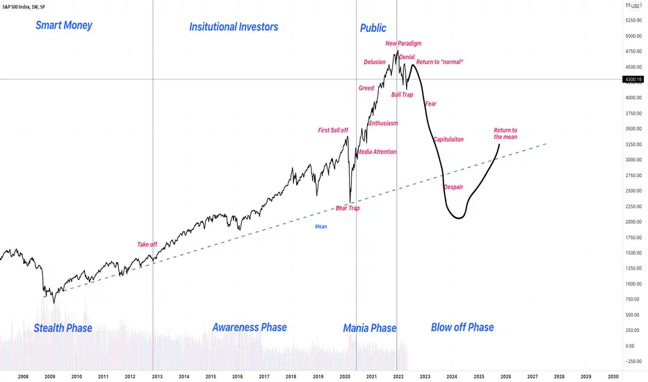
OMG, why it feels so right? 4 phases of market cyclesS&P 500 looks so similar to 4 phases of market cycles
Candlesticks basically and Occurrence phase (P.1)Candlesticks basically and Occurrence phase (P.1)
Each combination pattern of candlesticks basically occurs in the above-mentioned situations (1) to (5).
List of each combination pattern
① Bottoming out
.Hitting the three skies
.Three-handed Yinxian
.The last hugging line
.Lucifer
.Abandoned bottom
.Large shadow line
.Takuri line
.Power line
.Shade skirt steak
.Unleashed five-handed black one bottom
.Yagura bottom
.A small black line
.The changing bottom of the seven hands
.Continuously lowered three stars
.Counterattack line
.Hugging sun line
.Close-up positive line
② Early rise
.Chi Sanping
.Five lower positive lines
.Press-in wire
.Raised insertion line
.Raise Sanho
.Breakthrough of Kabuse
.Continuous tasuki on the way up
.Top-off tasuki
.Cross on the way up
.Raised three stars
③Maturity
.Lined red
.Two consecutive hidden lines
.Higher continuous Taiyo line
.Wave high line
④ Ceiling
.Stepping up in the sky
.New price eight-handed profit line
.Three-handed throw-away line
.Deadline
.Three-winged glass
.Hanging line
.High-ranking hidden line
.Evening Venus
.Sun skirt steak
.The last hugging sun line
.Hugging shadow line
.Strike back the tsutai line
.One red five-handed
.Unleashed seven hands Daikoku
⑤Early fall
.Plug line
.Three hands
.Three methods of lowering
.Three-handed
.Continuous sash on the way down
.Haunted line
.Lower leg cross
.Two blacks
.Three stars down
.Five high-ranking hidden lines
.Close-up hidden line

3 Stages of Trading 🚨Every trader goes through these stages.
I remember starting out on demo thinking this would be the easiest way to make money quickly.
Oh, how I was wrong.
It seems like sunshine and rainbows on a demo account but when you move onto a live account, the real problems begin.
Your expectations of quick money quickly vanish due to the psychological aspects of trading.
This usually results in big losses.
Excitement is followed by pain, this is where most traders quit.
If you make it past the pain and develop, you will reach your trading goals.
Do these stages seem similar to your trading? 💬

ICICI BANK From past few days, it showed downtrend then went to consolidation phase,
Now given a good breakout and sustained, showing bullish pressure.
Can reach the targets in coming days.

$130 entry on solanaall the L1's look heavy, complacency bounce on SOL pretty clear, hoping for $130 entry

BTC - LONG MONEY (MOONY) Do what you wantWe're always looking at different ways to view the market.
Here' is one different way to look at the market today.
How you do one thing, is how you do everything!
Happy Trading.
Stay Focused
No Pish Posh
Maximum Effort
Keep Stacking IT

choo choo next stop 87k before 187kmaintain that anything below 100k is cheap
people though that was a joke?

Buying vs Selling Pt1- COLOR, Most have it completely backwardsI'm making a little educational series of tutorials to put some of my trading philosophies into writing for myself but also to help teach anyone interested or provide a fresh perspective to others.
Let's start with COLOR .
From indicator lines, fill regions, background colors, arrows, to barcolors (be it from an indicator or just the basic candle), most traders are looking at a green candle and a red candle in reverse. Novice traders see a big fat candle and think, "Wow, lots of BUYING" then see a huge red candle and think, "Lots of SELLING". I think we inherently associate green with money and like to see lots of green when we have long positions. And then we associate red with emotions of fear and panic, bad things.
Let's have a look at a chart of SPY using the "Ehlers Instantaneous Trend" with ribbon and barcolor to help identify trends and paint them the color we are accustomed to seeing-
Very quickly I'm sure a lot of people think the coloring makes sense and might be looking up the Ehler indicator right now (it is a really cool one so go ahead). What we're seeing is this-
Most of the time the green candles have been when SPY has been rising
Most of the time the red candles have been when SPY has been falling
Seems natural to buy when you see these green candles going up and sell/avoid buying when you see red candles going down.
The problem is that that's what dumb money does! They buy when smart money is SELLING. Those green candles are actually the result of a smart buyer who timed things correctly and bought at the lows and is now 1) holding onto their shares, 2) waiting for sell signals. And when those red candles start showing up, dumb money gets all panicky and starts selling their shares. They might wait for closing cost to fall beneath a moving average or some other indicator, then they start selling and voila- capitulation. The price those sellers get is probably not great and when it's all said and done was not very much above what their entry price was.
But as people are selling, smart money is BUYING. They are fishing for a bottom to start accumulating shares. They look for really 'red' days with lots of volume, a perfect cocktail of emotion that gets weak hands to tremble and chase the price down before capitulating and selling for whatever price they can get. And usually when this is occurring, the bottom forms.
Let's reverse the colors of the bars and start seeing things through the lens of smart money-
Now if you are still associating green with buying and red with selling, the world should make much more sense. When the candles turn green here you're a buyer and when they turn red you're a seller. That doesn't mean buy the first candle and every candle, all the time, every time. It means that is when you are waiting patiently for the most opportune moment to buy. And when these candles are red you aren't freaking out and selling, you tell yourself "I am looking for moments when I can take some profits off the board when we get really crazy moves up, and maybe replace some of those shares with a few new shares I purchase at lows or on some bad days". The point is that this is a selling phase. I will go into depth as to why selling phases go up*, because I know that's a concept that people struggle with psychologically. (* there's two kinds of selling, as well as buying, which we'll get into).
Here are some close-ups on candles and their default colors-
Same chart, colors flipped -

DFT - Daily Mapping - Gold retests the trend before go North3 long target:
- Top of demand area
- Ascending daily medium term investors trend support
- Ascending weekly medium term investors trend support
Safety first: Set up a Sl as per chart
Gl

DFT - Break and seeIf we close above this rope, two targets are easily reachable.
-TP1 on building rope.
-TP2 on at the end of the supply predictive area for the next rope.

DFT - Matic - No brainer entry-TP1 above at the top of the cloud
Can't really determine a higher target even in EW as the actif had been hardly manipulated in the previous big cycle. But in term of R/R it's a no risk entry, with nice cycles turning green catalysing the volume (ideal for sceptical ppl ;) )
gl

ETH vs USD FFT & dephasing waves resultant Still have time.
We are most likely going to test the bottom of the red cloud above the current rope then retest the rope. If the rope doesn't broke up we are going to the next rope above (careful the gap is big ;) ).

The big shake is coming?Monthly closed at-last, and to me it looks bearish.. but I already showed why on monthly I see same bearish (Correction) patterns like from previous parabolic run:
Today I wanted to zoom in to weekly and show you why I see same bearish (Correction) patterns:
1. Just like in any market, when fear holding their assets they are panicking, and this is why usually crashes are much much stronger then rises... as you can see I drew the falling momentum, first the yellow lines which formed a descending triangle (The are between blue and ground yellow is area of interest which usually acts as strong support by previous candles), then came the fear (red line) which broke below the support levels, then came the panic sells (crush with last candle that used the support level as strong resist)...
2. Bearish candles are much more active (And I bet that the next one is going to be bigger then the last green one)..
3. Many indicators show bearish (if we check weekly/monthly), but I wanted to focus on my favorite 3:
* OBV (I usually call it "buying power volume" as some of you noticed, because with this I can confirm if the buyers have enough power to hold higher levels) -
- What is interesting is that many times when OBV goes below last higher highs it usually falls harder because bulls losing momentum (fuel), so just like we passed below higher high on the previous parabolic run, we now seem to pass below the higher high from the previous parabolic run - means we gonna fall harder towards the last OBV support.
- Accumulation/distribution - Just like on previous bull run we can see that distribution is taking stronger effect (usually happens after we see that the accumulation is distorted at top, just like before we can see the same going on now)
- Macd - As I mentioned before I don't like to see these "over sold" indicators that every one are talking about - on small TFs, I love to watch these on bigger TFs.... and guess what we see? exactly, reversal, EXACTLY THE SAME as on the previous parabolic run....
So tell me? on bigger picture, what do you guys see?
* PS1: I don't say that BTC is dead, I just say that it is going through a normal correction like we had on every bull run ever.... I'm still a 100k-1m BTC vision-er like always.. but as always I do say that FA and SA sux nowdays (Just like when I said they were when we got to 14-20k last time)....
* PS2: As I always say, TA's are just probabilities out of endless possibilities, but as we are human beings we can sometimes be wrong, why? because markets work on emotions, and emotions change fast, I see bearish, but it doesn't mean that it is absolute... let's see where we go :)
****************************************************************************************************************************************************************************************************************
* If you like what I do, and want to see more then don't forget to push that "follow" and "like".
* Also if you want live time signals and learn with the community then you are welcome to join here: t.me
* If you want to appreciate my work with spare BTCs then you are welcome to send them to: bc1q8kzn0x8j4dmws00ntuhyma8p4c9jwyj0gzxua9
Cheers, love <3
Hedgehog King!
****************************************************************************************************************************************************************************************************************
