Introduction to Renko-ChartsShort introduction to renko charts. Renko charts are a time-independant alternative to traditional candlestick-charts.
Renko

RENKO Set and Forget Trading for Big market moovesThis system combined with the tools available on Trading view
ie Renko Charts , the correct EMAs and Alerts make the Ultimate set and forget proven Trading System
This system will have you on the right side of the market
Where to enter and where to get out
Make the most of your Trading view features

How to set up alerts for renko reversalsI show you, how you can create server-side alerts for renko reversals.

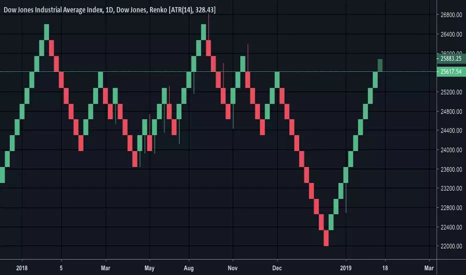
DJI 100pt Renko- follow the green brick roadRenko shows the momentum, needs a daily close below 25800 to put in the first red bricks. Until then, stay on the green road!

Dow 100Pt Renko with S+R100pt renko chart with support and resistance zones highlighted. Clear up to 26100 and then 26600. Don't short until you at least see some red on the daily renko!!

DJI- Simple Renko chart puts things in perspective.Strong uptrend, another green brick in the process of being added too. Why would you short something that looks like that? Refer to Renko charts every few days and after good sized moves to keep you on the straight and narrow.
Look at the gains you would have made by going long on the first sight of a red or green brick....
BTC Daily - Renko, MA (20,50,100,200) & DMIOverall Summary:
Overall I am bearish.
Bitcoin is trading in the $3600 to $4200 range during the last week, 81.5% down from the ATHs, with a market cap of $63 billion. The chart indicates a continuation/consolidation/reversal of the current X trend. The price is closest to the 50 MA with a trend towards the 50 MA. The volume has decreased over the last week, which is supporting the current price action. During the period the ‘dominant’ DMI switched over and it is now the -DMI and a weak trend strength ADX of 19.
Detailed Summary:
This chart uses weekly Renko Candlesticks with 4 MAs (20, 50, 100 & 200) & DMI.
Renko candlesticks are great for trend trading. Renko means ‘brick’ in Japanese because the candlesticks represents only price movements. Although some price action is missed, Renko makes it very easy to identify key trends and support and resistance areas. This chart style is often used along with Heikin Ashi candlestick charts for greater confluence. As you can see, there is very little ‘noise’ in this style of chart, allowing traders to ignore short term trends. I set the security at $50 per block so that every block represents a $50 price move. During the last week the price has ranged by $500, opening at $4100 and closing at $3600. The price has decreased over the period which is a continuation of the long term price trend.
Moving Average are also used on this chart to help identify major areas of S&R and general price trend action. I prefer to use simple Moving Averages on the daily time frame. The 200 MA is red, the 100 MA is orange, the 50 MA is yellow and the 20 MA is green. The choice of colours helps me to read the chart and see if price action is bullish or bearish. For example, if the red is on top and the green is on the bottom, it is clearly bullish. It is also important to note that the longer the Moving Average period, the stronger the support and resistance. During the last week the price is closest to the 50 Moving Average and during this period it has trended towards/around the 50 Moving Average. The 50 Moving Average is currently acting as resistance while there is no MA acting as support. The key Support area is $3300 and key Resistance areas is $4200. I forecast in the next week that price will test the next support area.
Volume is a key indicator that I use to understand past, current and possibly future price action. Unfortunately a majority of the exchange volume is fake ‘wash’ trading so it is important to rely on data from reliable exchanges like Binance and BitFinex. Volume that supports price recent action helps strengthen my belief in a specific trend. During this period volume has decreased in convergence with the recent price action. On a longer term time frame, the volume is in convergence with the long term trends. I forecast in the next week that volume will decrease and this will support a decrease of price.
DMI (Directional Movement Index) is a popular trend trading momentum indicator that measures Moving Averages and is able to identify trends while ignoring ‘noise’. It is used on combination with other trend indicators to build confidence about price actions and trends. Look for divergence and convergence between these three lines: Green is the +DMI or +DI, represents bullish action, Red is the -DMI or -DI, represent bearish action and Yellow is the ADX , is an average of the above two and sums up the MA trend. At the start of the period, the ‘dominant’ DMI was the + DMI, at 41 while the ADX was at 18. During the period the ‘dominant’ DMI switched over and it is now -DMI and the ADX is 18. This indicates a convergence with the long term price trend and a weak trend. I forecast in the next week that the that ‘dominant’ DMI will increase and this will support a decrease of price.
References:
Renko summary - www.investopedia.com
Moving Average summary - www.investopedia.com
Support and Resistance summary - www.investopedia.com
Fake exchange volume summary - www.blockchaintransparency.org
DMI summary - www.investopedia.com

NEUTRAL 1D Renko Chart with CM_Trendbars, EMAs and a custom DMIThis is a 1D BTCUSD (BitFinex) chart using Renko Candlesticks along with a CM_Trendbars (add on), 4 EMAs (9,15,21,55) and a custom DMI - with a focus on the last month of price action.
Renko Candlesticks patterns come from Japan and Renko means ‘brick’. They are a cousin to the Heiken Ashi candlestick patterns, using weighted calculations of the OHLC (Open High Low Close) but without the time. So in simpler terms, they focus on price trend expressed in price blocks ($50 USD for BTC), rather than time and volume. As a result, Renko charts are great at reducing noise and allowing for only the strong trends to be clearly visible on the chart. Trend traders often use this chart style in conjunction with other charts styles and indicators, to clarify the strength and direction of a trend.
BTC hit a 2018 low on the 14th of December, ending a year long bear market that has shredded the market’s confidence (and wallets). The current bottom, which may or may not go lower in 2019, came ironically a week before Xmas. A gift of not, there are two ways to look at it. We then saw a weak bounce of around 3300 with a price trend that grew in strength as it broke through the 3600 S&R level. Two days later on the 20th of December, price had hit the next major S&R area of around 4100 and clearly got rejected. Since then we have seen three tests (rejections) of the same price level, on the 22nd, and 28th and now on the 2nd of January. Three tests in under two weeks demonstrates that there is clear indecision ATM in the market. It is worth noting that Christmas and New Year typically affects the market, as trader's go on holiday and take out money to spend. A clean bullish break could see prices quickly reach around 4450 area and increasing confidence that the market has bottomed out. A weak rejection and further sideways movement would strengthen the case for the bulls, and we could return to ATL of 3300 fairly quickly.
Looking at the CM Trendbars, which is an indicator added on top of the Renko candlesticks that 'colour's the bars depending on the strength of the price action, I read them as slightly bullish in the short term but clearly we need confluence from other indicators.
Moving Average are also used on this chart to help identify major areas of S&R and general price trend action. I prefer to use EMA (Exponential MA), over the non-weighted (Simple MA) because it adds more significance to recent price action over older price action. This provides a more responsive indicator, telling me when a significant trend change is occurring earlier. I have for EMA, 4 based on the Fibonacci numbers; 9 (green), 15 (yellow), 21 (orange) and 55 (red) day time frames. And a 200 day MA (purple). The choice of colours helps me to read the chart and see if price action is bullish or bearish, for example when the green line is at the bottom, followed by the yellow, orange, red (and then purple) it is clearly bearish. Not that the 200 EMA is essentially for identifying long term trends, but I focus on the 9-55 period for trend trading, especially the 21-55 day for multiple week trades.
The last time price crossed the 200 EMA was on the 2nd of September and the 55 EMA on the 18th of October. So the market was expecting a price retrenchment in December. Whether this is just a retracement, before we see the downtrend continue, is not yet clear. What is clear is that we saw a bullish bounce since December 14th with the 9, 15, and 21 crossing over within a week. The 9 day then approached and briefly breached the 55 EMA before dropping below it again since the 25th of December. The MA have since continued to consolidate as we have seen price action tighten around the 4100 S&R levels. This types of MA consolidation is another indicator that the price direction and strength is undecided by the market.
The final indicator is a custom DMI, which is a suitable tool to add alongside the Renko chart and 5 MAs, as it measures the MA of a price change over a given period of time. It is therefore another great tool for identifying trends, and helps to build confidence about price action and trends. We are looking for divergence and convergence between these three lines:
- Green is the +DMI or +DI, represents bullish action
- Red is the -DMI or -DI, represent bearish action
- Yellow is the ADX, is an average of the above two and sums up the MA trend.
The ‘dominate’ DMI has been the -DMI since the start of November, reaching a strength peak of 94 on the 24th of November. Since then we have seen a sharp decline in the strength of the -DMI with a cross over of the ADX on 3rd of December. Although we saw the -DMI ‘dominate’ again a week later it crossed over at 49. In the last month the market’s indecision has been clearly demonstrated by six ‘dominate’ crossovers. At the same time all three lines continue to decline with the ADX now well below 25, at 16. When the market is moving sideways and below 25, it is risky to trend trade. On the flip side, the longer the market continues to consolidate in this range, the larger the price action will be once it breaks out (either up or down).
In combination, the above indicators tell me we have experienced significant bullish price action in December and now the market is consolidating and moving sideways at the 4100 level, below the 55 MA, and with a declining ADX. In the current market, trend trading is unattractive, so I have to wait for a clear breakout either on the up or downside. I am inclined to remain a little bearish ATM and believe we could see price move back down again to the low 3000s range if the bulls are unable to gain more momentum soon.

Etherum midterm outlookWere just about at the bottom of the bearish channel that we entered into in January of this year. That being said we now have the potential upside of seeing Etherum hit around the 520 price region in the next coming months!

AAPL fire sale coming soon!we should begin to see AAPL make a slight push up to the 156 region.
afterwards we should see price consolidate around low 120's.

AMZ Long then ShortWe should be at our short term bottom now, a potential bounce to the 1580 region is in the books, however once that is reached we should begin making our way towards 1280.
A nice scalp trade is available, just make sure to sell off 1500+
Those looking for a long term entry should wait until a opportunity around 1280 presents itself.

BTCUSD 1D Renko Chart with CM_Trendbars, EMAs and a custom DMIThis 1D BTCUSD chart is based on Renko Candlesticks, the CM_Trendbars, 4 EMA (9,15,21,55) and a custom DMI.
Renko Chart patterns come from Japan, and they apparently mean 'brick'. They are a cousin of the Heikin Ashi candlestick patterns, using weighted calculations of the OHLC (open, high, low, close) but without the time. Renko candlesticks are now well know but there are sections of the trading community that strongly believe in them. The candlesticks are built using price only, rather than time and volume. This design helps filter out minor price movements to make it easier for traders to focuso on the important trends. Renko charts are not for the day trader, they are really suitable for longer term trend traders that have patience and are waiting for the right types of setups. Each bar represents a set change in price, for example I have set BTC at $50 USD. Renko can be used to add confluence to other indicators and enter into less risky trend trades.
The Renko chart has clearly bearish since the 9th of November, with BTC breaking below the long held resistance line at 6484 and rapidly dropping to 3900 before finally bouncing off 3300's. This has clearly been rejected on the 17th of December when we moved from 3382 to 3938 in two days with a forecasted target of 4416 representing the next area of resistance. I conservative trader would wait for a line of resistance to be broken, and then enter the trade with more confidence, so if 4100 area
Moving Averages, are widely used and one of the most important technical indicators. There are two commonly used MAs, SMA and EMA. SMA (Simple MA) simply takes adds up the closing price over a given period say, 5 days, and divides that number by the number of periods. Eg, 10,12,14,16,18 = 70/5 = 14. The EMA (Exponential) then weights those numbers to place greater significance on the more recent price data points. I use the EMA as it tends to provide a more relevant indicator of recent/current and therefore possible future price actions. I use 5 EMA's on this chart, based on Fibonacci numbers (9,15,21,55,200).
The EMA's have been clearly bullish since the 9th of November, with a good spread between the difference EMA, until the 9,15 and touch the candlestick bodies early in December. They then continued down, although more weakly then the previous move until we hit the 3300 level of resistance. With little price movement and contracting price bands the EMA were gradually leveling off. Then on the 17-19th we have seen the price clearly cross the 9,15 and 21 day EMA with the 55EMA in ear shot. The 200 EMA is at 5200, so we are still 1000+ clear of that target.
THE DMI (Directional Movement Index/Indicator) measures the MA of a price change over a given period of time, 15 days in my case. The DMI is popular with trend traders because it provides clarity on the strength and direction of a trend. There are three lines, the +DMI or +DI in green, the -DMI or -DI which is in the red, and the ADX which is an weighted average of the two that tells up are we trending down/up. Basically when the green crosses over the red, and also the yellow, with conviction we have a strong bullish trend in play. Vice versa. The line on the top, is referred to as the 'dominate DMI'. The long the the MA has remained in a tight price band, the more likely an outbreak will be substantial.
The DMI presented a very clear signal from since the crossover on the 7th of November to it's peak in divergence on the 24th of November. The -DMI and the ADX were clearly trending bearish. What could be interpreted a false bounce/price reversal occurred from the crossover bullish on the 25th of November to the bearish cross over on the 3rd of December. The bearish trend continued until the 7th of November then we started to see some divergence between price (that continued to drop) and the -DMI that weakened in strength. This was a signal that the strength of the bull trend was weakening. Since the 17th of December we have seen both the -DMI and the ADX weaken rapidly, finally crossing the +DMI on the 19th of December. This is set up represents a low risk entry, as the -DMI has managed to go from below the 25 level, confidently cross the -DMI/ADX and also the price has broken a major S&R level.

AUDCAD 30M RENKO TRADING STRATEGY #2Renko Trading Strategy #2
Another profitable Renko strategy you can use is to focus only on the bricks.
No additional technical tool is required for this system.
We’re going to explore a very simple and yet very powerful Renko chart pattern that incorporates the wicks. This Renko price pattern looks for two consecutive bricks of the same color and both bricks have wicks.
The location of this Renko pattern doesn’t really matter. It can be at the end of a trend or it can be in the middle of the trend. This pattern has a very high rate of success if traded in the right context. You have to look around this two brick pattern and make sure the blocks are not moving back and forth within a trading range.
If that’s not the case then you have a green light to take the signal generate by this trade setup.

RENKO TRADING STRATEGY 1 AUDCAD 4HRenko Trading Strategy #1
For this Renko trading strategy we only need to use the RSI indicator. We like to use a 20-period RSI indicator. So, the period is the same as the ATR Renko brick size.
After we spot the momentum divergence an entry signal is triggered once we get a reversal. On the Renko chart, a trend reversal is set in motion once the brick changes color. In this case, when we spot a bearish divergence, enter a short position after the brick turns red.
For bearish divergence, wait for the brick to turn red.
We exit our profitable trade once another reversal pattern is formed in the opposite direction of our trade. As a method to protect our account balance and not lose too much, you can place your SL above and below the swing point developed after your entry.
A lot of the noise inherent in regular time based charts is eradicated. So, if you trade with Renko charts, spotting divergence and trend reversals is a lot easier. The RSI is the best indicator to use with Renko.
PM me if you would like to read the complete pdf of this profitable renko trading strategy.

NZDCAD Renko Reversal Waiting for a double top at 0.91700. Pitchfork is active working great. higher timeframe is down fib extension 127.20 is only 10 pips from the last major top. simple but clear and easy to understand.


Renko charts on TradingviewIncredible - watch how easy it is to load and switch time frames on renko charts using the Tradingview platform.
Powerful stuff! Use renko charts to clean up your view and trade off key levels...

Daily Renko[500] I'll catch my bottom -> possible 76% profitI think we have a bottom (i smell it :))
my trading setup:
entry positions (ledgers):
L1: ~6'000 (double bottom + support from November) -> fill 70% position
L2: ~5'500 (wedge bottom + average between .382 and .236 by fibonacci) -> fill 20% position
L3: ~5'000 (wedge bottom + resistance from 09.2017) -> fill 10% positions
stop loss @4'690 (below .236 fibonacci + above VPVR VA + below wedge)
targets: 8'232 and 9'685
first, we go little bit down:
MACD:
RSI:
Stochastic:

Bitcoin Renko + Hull + RSI Delta Map Signals viewQuick update with signals produce by RSI Delta on Renko chart. Lookin neutral leaning bearish.

Renko Support / ResistanceI didnt know the drawings would stay if i had switched to candles, thought it was cool

CADJPY LOWER HIGH SHORTYou can see price turns with ease using RENKO. This chart shows a 1-2-3 setup, with a lower high which is so easy to spot using a 8pip brick size. If you look on the 30 min time frame from the 14th September we have already had a double top. Fores after all is get rich slow..... no need to rush.

Using Renko to get support/resistance levelsThis is practicing IchimokuScholar's strategy of using Renko to get SR levels. AFAIK, you may get the following settings for it:
* Traditional, 1% of first day's closing value
* ATR, 0.5 (can set ATR value to whatever you like—I'm still reading on this)
* Red line, weekly SR
* Greens, HH... possible levels for counter trend confirmation or confidence gainer

