MACD 4H Cross Above Zero AlertMACD 4H Cross the signal line to screen for stocks across a wide demo list
Chart patterns

Round Numbers (Plotter) v2The *Round Numbers (Plotter) v2* indicator highlights key psychological price levels on the chart — the so-called *round numbers* (e.g. 1.1000 on EURUSD or23,000 on NASDAQ).
These levels often act as **natural support or resistance zones**, where price tends to react, consolidate, or reverse.
Version 2 introduces the concept of **gravitational zones**, which define a price range surrounding each round level — visualizing how price “gravitates” around these equilibrium areas.
---
### 🧩 **Main Features**
* 🔹 **Dynamic round levels:** plotted automatically based on user-defined *step size* (in points or pips).
* 🔹 **Custom step mode:** switch between “Points” (for indices, commodities, crypto) and “Pips” (for Forex pairs).
* 🔹 **Configurable appearance:** color, width, and line style (solid, dashed, dotted).
* 🔹 **Gravitation zones:** optional secondary lines plotted above and below each round level.
* Distance adjustable as a **percentage of the step size** (default = 25%).
* Help visualize “magnet areas” where price tends to slow down or oscillate before crossing a level.
* 🔹 **Optional fill:** softly shaded area between the upper and lower gravitation lines for clearer visualization of each zone.
* You can enable or disable this with the *“Show gravitation fill”* toggle.
* Fill color and transparency fully customizable.
---
### 📈 **Use Cases**
* Identify **psychological support/resistance** levels on any instrument or timeframe.
* Observe **market equilibrium zones** where price tends to cluster or hesitate before continuing.
* Combine with oscillators or volume indicators to confirm reaction strength near round numbers.
* Use the **gravitational zones** to refine stop-loss or take-profit placement near high-impact levels.
---
### 💡 **Notes**
* The indicator does **not repaint** and updates levels dynamically based on the latest price.
* Works on all asset classes: **Forex, Indices, Crypto, Commodities, Stocks.**
* Designed to be **lightweight** — no accumulation of historical objects.
* Combine this with *Round Number Analyzer* for complete analysis of round numbers level
Session Gap Fill [LuxAlgo]The Session Gap Fill tool detects and highlights filled and unfilled price gaps between regular sessions. It features a dashboard with key statistics about the detected gaps.
The tool is highly customizable, allowing users to filter by different types of gaps and customize how they are displayed on the chart.
🔶 USAGE
By default, the tool detects all price gaps between sessions. A price gap is defined as a difference between the opening price of one session and the closing price of the previous session. In this case, the tool uses the opening price of the first bar of the session against the closing price of the previous bar.
A bullish gap is detected when the session open price is higher than the last close, and a bearish gap is detected when the session open price is lower than the last close.
Gaps represent a change in market sentiment, a difference in what market participants think between the close of one trading session and the open of the next.
What is useful to traders is not the gap itself, but how the market reacts to it.
Unfilled gaps occur when prices do not return to the previous session's closing price.
Filled gaps occur when prices come back to the previous session's close price.
By analyzing how markets react to gaps, traders can understand market sentiment, whether different prices are accepted or rejected, and take advantage of this information to position themselves in favor of bullish or bearish market sentiment.
Next, we will cover the Gap Type Filter and Statistics Dashboard.
🔹 Gap Type Filter
Traders can choose from three options: display all gaps, display only overlapping gaps, or display only non-overlapping gaps. All gaps are displayed by default.
An overlapping gap is defined when the first bar of the session has any price in common with the previous bar. No overlapping gap is defined when the two bars do not share any price levels.
As we will see in the next section, there are clear differences in market behavior around these types of gaps.
🔹 Statistics Dashboard
The Statistics Dashboard displays key metrics that help traders understand market behavior around each type of gap.
Gaps: The percentage of bullish and bearish gaps.
Filled: The percentage of filled bullish and bearish gaps.
Reversed: The percentage of filled gaps that move in favor of the gap
Bars Avg.: The average number of bars for a gap to be filled.
Now, let's analyze the chart on the left of the image to understand those stats. These are the stats for all gaps, both overlapping and non-overlapping.
Of the total, bullish gaps represent 55%, and bearish ones represent 44%. The gap bias is pretty balanced in this market.
The second statistic, Filled, shows that 63% of gaps are filled, both bullish and bearish. Therefore, there is a higher probability that a gap will be filled than not.
The third statistic is reversed. This is the percentage of filled gaps where prices move in favor of the gap. This applies to filled bullish gaps when the close of the session is above the open, and to filled bearish gaps when the close of the session is below the open. In other words, first there is a gap, then it fills, and finally it reverses. As we can see in the chart, this only happens 35% of the time for bullish gaps and 29% of the time for bearish gaps.
The last statistic is Bars Avg., which is the average number of bars for a gap to be filled. On average, it takes between one and two bars for both bullish and bearish gaps. On average, gaps fill quickly.
As we can see on the chart, selecting different types of gaps yields different statistics and market behavior. For example, overlapping gaps have a greater than 90% chance of being filled, whereas non-overlapping gaps have a less than 40% chance.
🔶 SETTINGS
Gap Type: Select the type of gap to display.
🔹 Dashboard
Dashboard: Enable or disable the dashboard.
Position: Select the location of the dashboard.
Size: Select the dashboard size.
🔹 Style
Filled Bullish Gap: Enable or disable this gap and choose the color.
Filled Bearish Gap: Enable or disable this gap and choose the color.
Unfilled Gap: Enable or disable this gap and choose the color.
Max Deviation Level: Enable or disable this level and choose the color.
Open Price Level: Enable or disable this level and choose the color.

Institutional Activity DetectorInstitutional Activity Detector - Complete Tutorial
Table of Contents
Installation
Understanding the Indicator
Signal Interpretation
Settings Configuration
Trading Strategies
Best Practices
Common Mistakes to Avoid
1. Installation {#installation}
Step-by-Step Setup:
Step 1: Access TradingView
Go to TradingView.com
Log in to your account (free account works fine)
Step 2: Open Pine Editor
Click on "Pine Editor" at the bottom of the chart
If you don't see it, go to the top menu and select "Pine Editor"
Step 3: Add the Script
Click "New" to create a new indicator
Delete any default code
Copy the entire Institutional Activity Detector code
Paste it into the editor
Step 4: Save and Apply
Click "Save" (give it a name like "Inst Detector")
Click "Add to Chart"
The indicator will now appear on your chart
2. Understanding the Indicator {#understanding}
What It Detects:
This indicator identifies institutional traders (banks, hedge funds, market makers) by analyzing:
Volume Analysis
Detects unusual volume spikes that indicate large players entering
Compares current volume to 20-period average
Institutional trades create volume 2-5x normal levels
Order Flow
Delta: Difference between buying and selling volume
Positive delta = More buying pressure
Negative delta = More selling pressure
Institutions leave "footprints" in order flow
Price Action Patterns
Bullish Rejection Wicks:
| <- Small upper wick
|
███ <- Small body
███
|
|
| <- Large lower wick (rejection)
Indicates institutions bought aggressively at lower prices
Bearish Rejection Wicks:
|
|
| <- Large upper wick (rejection)
|
███ <- Small body
███
| <- Small lower wick
Indicates institutions sold aggressively at higher prices
Liquidity Grabs
Institutions often:
Push price above resistance or below support
Trigger stop losses (grab liquidity)
Reverse direction and trade the other way
Dark Pool Activity
Large block trades executed off-exchange:
High volume with minimal price movement
Indicates institutional accumulation/distribution without moving price
3. Signal Interpretation {#signals}
Signal Types:
🟢 INSTITUTIONAL BUY Signal
Appears as green triangle below candle with strength number (2-5)
What it means:
Institutions are actively accumulating (buying)
Higher strength = More confirmation factors
Strength Levels:
2-3: Moderate confidence - Wait for confirmation
4: High confidence - Strong institutional interest
5: Maximum confidence - Multiple factors aligned
🔴 INSTITUTIONAL SELL Signal
Appears as red triangle above candle with strength number (2-5)
What it means:
Institutions are actively distributing (selling)
Higher strength = More confirmation factors
🟠 Dark Pool (DP) Marker
Small orange diamond
What it means:
Large block trade executed
Accumulation/distribution happening quietly
Often precedes significant moves
Liquidity Zones
Red boxes above price = Resistance/sell liquidity
Green boxes below price = Support/buy liquidity
Institutions target these zones to trigger stops
4. Settings Configuration {#settings}
Recommended Settings by Asset Type:
For Stocks (SPY, AAPL, TSLA):
Volume Spike Multiplier: 2.0
Volume Average Period: 20
Delta Threshold: 70%
Minimum Signal Strength: 3
Timeframe: 5m, 15m, 1H
For Forex (EUR/USD, GBP/USD):
Volume Spike Multiplier: 1.5
Volume Average Period: 30
Delta Threshold: 65%
Minimum Signal Strength: 3
Timeframe: 15m, 1H, 4H
For Crypto (BTC, ETH):
Volume Spike Multiplier: 2.5
Volume Average Period: 20
Delta Threshold: 70%
Minimum Signal Strength: 4
Timeframe: 15m, 1H, 4H
For Futures (ES, NQ):
Volume Spike Multiplier: 2.0
Volume Average Period: 20
Delta Threshold: 75%
Minimum Signal Strength: 3
Timeframe: 5m, 15m, 30m
Parameter Explanations:
Volume Spike Multiplier (1.0 - 10.0)
Lower = More sensitive (more signals, some false)
Higher = Less sensitive (fewer signals, more reliable)
Start with 2.0 and adjust based on your asset's volatility
Delta Threshold % (50 - 100)
Measures buying vs selling pressure
70% = Strong institutional bias required
Lower for ranging markets, higher for trending
Minimum Signal Strength (2 - 5)
Number of factors that must align for a signal
2 = Very sensitive (many signals)
5 = Very conservative (rare signals)
Recommended: 3-4 for balance
5. Trading Strategies {#strategies}
Strategy 1: Liquidity Grab Reversal
Setup:
Price approaches a liquidity zone (green/red box)
Price penetrates the zone briefly
Institutional BUY/SELL signal appears
Price reverses away from the zone
Entry:
Enter on the signal candle close
Or wait for next candle confirmation
Stop Loss:
Below the liquidity grab low (for buys)
Above the liquidity grab high (for sells)
Take Profit:
2:1 or 3:1 risk/reward ratio
Or next opposing liquidity zone
Example:
Price drops below support → Triggers stops →
Institutional BUY signal (4-5 strength) →
Enter LONG → Price rallies
Strategy 2: Trend Continuation
Setup:
Identify the trend (higher highs/higher lows for uptrend)
Wait for pullback to support in uptrend
Institutional BUY signal appears during pullback
Confirms institutions are adding to positions
Entry:
Enter on signal with strength ≥ 4
Or next candle after signal
Stop Loss:
Below the pullback low + small buffer
Take Profit:
Previous swing high
Or trailing stop using ATR
Strategy 3: Dark Pool Accumulation
Setup:
Dark Pool (DP) markers appear multiple times
Price consolidates in tight range
Institutional BUY signal with high strength appears
Breakout occurs
Entry:
Enter on breakout candle after signal
Or on retest of breakout level
Stop Loss:
Below consolidation range
Take Profit:
Measured move (height of consolidation projected)
Strategy 4: Divergence Play
Setup:
Price makes lower low
MFI/RSI makes higher low (bullish divergence)
Institutional BUY signal appears
Volume confirms with spike
Entry:
Enter on signal candle or next
Stop Loss:
Below the divergence low
Take Profit:
Previous swing high or resistance
6. Best Practices {#best-practices}
✅ DO's:
1. Use Multiple Timeframes
Check higher timeframe for trend direction
Trade signals that align with higher timeframe
Example: 15m signals in direction of 1H trend
2. Combine with Key Levels
Support/resistance
Supply/demand zones
Previous day high/low
Round numbers (psychological levels)
3. Wait for Confirmation
Don't rush into trades
Let the signal candle close
Watch next candle for follow-through
4. Check the Metrics Table
Look at Relative Volume (should be >2.0)
Check Delta % (should be strong positive/negative)
Verify Order Flow aligns with signal
5. Consider Market Context
News events can override signals
Low liquidity times (lunch, overnight) less reliable
Major economic releases need caution
6. Paper Trade First
Test the indicator for 2-4 weeks
Learn how it behaves on your chosen assets
Develop confidence before using real money
Best Times to Trade:
Stock Market Hours:
9:30-11:30 AM EST (high volume, strong moves)
2:00-4:00 PM EST (institutional positioning)
Avoid: 11:30 AM-2:00 PM (lunch, low volume)
Forex:
London Open: 3:00-6:00 AM EST
New York Open: 8:00-11:00 AM EST
London/NY Overlap: 8:00 AM-12:00 PM EST
Crypto:
24/7 market, but highest volume during US/European hours
Watch for weekend low liquidity
7. Common Mistakes to Avoid {#mistakes}
❌ DON'T:
1. Trade Every Signal
Not all signals are equal
Focus on strength 4-5 signals
Wait for optimal setups
2. Ignore Market Structure
Don't buy into strong downtrends (catch falling knife)
Don't sell into strong uptrends (fight the tape)
Respect major support/resistance
3. Use Too Small Timeframes
1m and 2m charts are too noisy
Minimum recommended: 5m for scalping
Better: 15m, 30m, 1H for reliability
4. Overtrade
Quality over quantity
2-5 good trades per day is excellent
Forcing trades leads to losses
5. Ignore Risk Management
Always use stop losses
Risk only 1-2% per trade
Don't revenge trade after losses
6. Trade During Low Volume
Signals less reliable with low volume
Check Relative Volume metric (should be >1.5)
Avoid pre-market/after-hours for stocks
7. Misread Liquidity Grabs
Not every wick is a liquidity grab
Need volume confirmation
Must have institutional signal
Advanced Tips:
Filtering False Signals:
Use Signal Strength Filter:
Minimum strength 3 = Balanced
Minimum strength 4 = Conservative (recommended)
Minimum strength 5 = Ultra conservative
Confluence Checklist:
Signal strength ≥ 4
Relative volume > 2.0
At key support/resistance
Aligns with higher timeframe trend
Delta % strongly positive/negative
Clean price action setup
If 4+ boxes checked = High probability trade
Setting Up Alerts:
Click the three dots on the indicator
Select "Create Alert"
Choose condition:
"Institutional Buy Signal"
"Institutional Sell Signal"
"Dark Pool Activity"
Set up notification (email, SMS, app)
Save alert
Alert Strategy:
Set minimum strength to 4 for fewer, better alerts
Use for assets you can't watch constantly
Don't rely solely on alerts - check chart context
Practice Exercise:
Week 1-2: Observation
Add indicator to your favorite assets
Watch how signals develop
Note which ones lead to profitable moves
Don't trade yet - just observe
Week 3-4: Paper Trading
Use TradingView's paper trading
Trade only strength 4-5 signals
Record results in a journal
Note: entry, exit, profit/loss, what worked/didn't
Week 5+: Small Live Positions
Start with smallest position size
Trade only your best setups
Gradually increase size as you gain confidence
Keep detailed journal
Quick Reference Card:
Signal Quality Ranking:
🔥 Best Setups (Take These):
Strength 5 + Liquidity grab + Key level
Strength 4-5 + Volume >3.0 + Trend alignment
Dark Pool markers + Strength 4+ signal
✅ Good Setups:
Strength 4 at support/resistance
Strength 3-4 with strong delta
Liquidity grab + Strength 3+
⚠️ Caution (Wait for More):
Strength 2-3 in middle of nowhere
Against higher timeframe trend
Low volume (Rel Vol <1.5)
❌ Avoid:
Strength 2 only
During major news
Low liquidity hours
Against strong trend
Troubleshooting:
"Too many signals"
→ Increase Minimum Signal Strength to 4
→ Increase Volume Spike Multiplier to 2.5-3.0
"Too few signals"
→ Decrease Minimum Signal Strength to 2-3
→ Decrease Volume Spike Multiplier to 1.5
"Signals not working"
→ Check if you're trading during low volume hours
→ Verify you're using recommended timeframes
→ Make sure signals align with market structure
"Can't see liquidity zones"
→ Enable "Show Liquidity Zones" in settings
→ Adjust Swing Detection Length (try 7-15)
Resources for Further Learning:
Concepts to Study:
Order Flow Trading
Market Profile / Volume Profile
Smart Money Concepts (SMC)
Liquidity Sweeps and Stop Hunts
Institutional Order Flow
Wyckoff Method
Volume Spread Analysis (VSA)
Recommended Practice:
Study past signals on chart
Replay market using TradingView's bar replay feature
Join trading communities to share setups
Keep a detailed trading journal
Final Thoughts:
This indicator is a tool, not a crystal ball. It identifies high-probability setups where institutions are active, but still requires:
Proper risk management
Market context understanding
Patience and discipline
Continuous learning
Success Formula:
Right Tool + Proper Training + Risk Management + Discipline = Consistent Profits
Start slow, master the basics, and gradually increase complexity as you gain experience.
Good luck and trade smart! 📊📈

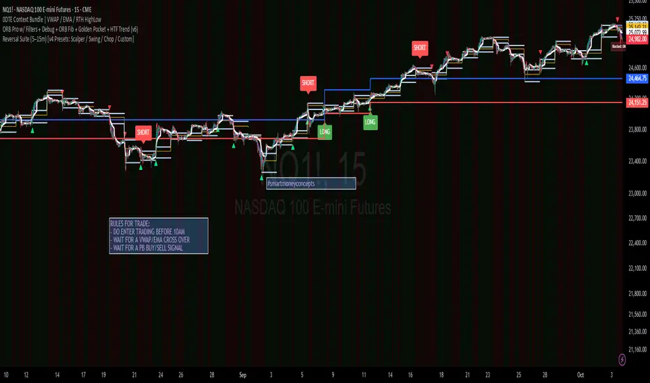
Camarilla Pivots + 20 EMA StrategyThis is an intraday volatility and trend-following system for commodities like Natural Gas, combining dynamic pivot levels (Camarilla) with a trend filter (20-period EMA) to improve risk-reward and reduce false breakouts.
Core Components
1. Camarilla Pivots:
These are special support and resistance levels (H3, H4, L3, L4) calculated each day based on the previous day's high, low, and close.
The pivots adapt to daily volatility, giving more relevant breakout and bounce zones than static lines.
H4: Aggressive resistance (used for breakout LONG entry)
H3: Moderate resistance/support (used for bounce or stoploss)
L4: Aggressive support (used for breakout SHORT entry)
L3: Moderate support/resistance (used for bounce or stoploss)
2. 20 EMA (Exponential Moving Average):
Plotted on the 30-minute chart, this acts as a trend filter.
If the price is above 20 EMA: Only look for long trades (bullish bias).
If below 20 EMA: Only look for short trades (bearish bias).
How the Strategy Works
Setup (30-Min Chart):
Camarilla pivots for the day are drawn on the chart.
20 EMA is also plotted.
Trade Filter:
Bullish: Trade ONLY if price is above 20 EMA.
Bearish: Trade ONLY if price is below 20 EMA.
Entry:
LONG: Enter when price breaks and closes above the H4 pivot AND is above 20 EMA.
SHORT: Enter when price breaks and closes below the L4 pivot AND is below 20 EMA.
Stop Loss:
LONG: Place stoploss at H3 (the next lower Camarilla resistance).
SHORT: Place stoploss at L3 (the next higher Camarilla support).
Target:
Always set a profit target at 2x the distance (risk) between entry and stoploss (strict R:R 2).
For example, if your entry is at H4 and stoploss at H3, your target is entry + 2*(entry - stoploss).
Alerts & Visuals:
The strategy plots entry arrows, stoploss and target lines for immediate visual reference.
Alerts trigger on breakout signals so you never miss a trade.
Why This Works Well for Natural Gas
Adapts to volatility: The pivots change daily, handling wide-ranging and choppy price moves better than fixed breakouts.
Trend filter: EMA prevents counter-trend whipsaws, only trades with market momentum.
Risk control: Every trade must meet strict risk-reward criteria, so losses are contained and winners can outweigh losers.

HTF & PD/PM LevelsTired of mapping your own levels every morning? Look no further! This script automatically maps out and updates HTF & PD/PM Levels along with ATH. I personally use these as confirmation zones with EMA & VWAP, RSI, and Volume... but alone, these levels mark major support and resistances.
What are they?
🏰 HTF Levels — “Big Grown-Up Lines”
HTF = Higher Time Frame
Think of your price chart like a big map. HTF levels are the important lines from bigger chunks of time:
>Daily (yesterday’s close, high, low)
>Weekly (this week’s open, high, low, close)
>Monthly (this month’s open/close)
Why they matter:
These are like big walls and floors that price often bounces off or stops at. Big traders (institutions) watch them because they show where a lot of buying or selling happened before.
⏰ PD & PM Levels — “Yesterday & Morning Clues”
PD = Previous Day
>PDH = Previous Day’s High
>PDL = Previous Day’s Low
>PDC = Previous Day’s Close
PM = Pre-Market
>PMH = Pre-Market High
>PML = Pre-Market Low
>ATH = All-Time High
Why they matter:
These tell you where price moved when most regular traders weren’t awake yet (pre-market) and where it ended up yesterday. Price often revisits or reacts to these spots.
⚡ How Options Traders Use Them
Support & Resistance:
If price is near an HTF or PD/PM level, it might stop and turn around there (like a ball hitting a wall) or it might use it as a launchpad to the next level if it breaks.
Entry & Exit Spots:
Traders might buy calls (bet price goes up) if it breaks above an important level, or puts (bet price goes down) if it breaks below.
Risk Management:
These levels give clear spots to set stops and targets — “If price breaks this level, I’m out.”
Super Simple Picture:
HTF = big important levels from days, weeks, months.
PD/PM = yesterday’s and morning’s clues where price already moved.
Traders use them to guess where price might bounce or break to plan option trades safely.
ULTIMATE Smart Trading Pro 🔥
## 🇬🇧 ENGLISH
### 📊 The Most Complete All-in-One Trading Indicator
**ULTIMATE Smart Trading Pro** combines the best technical analysis tools and Smart Money Concepts into a single powerful and intelligent indicator. Designed for serious traders who want a real edge in the markets.
---
### ✨ KEY FEATURES
#### 💰 **SMART MONEY CONCEPTS**
- **Order Blocks**: Automatically detects institutional zones where "smart money" enters positions
- **Break of Structure (BOS)**: Identifies structure breaks to confirm trend changes
- **Liquidity Zones**: Spots equal highs/lows areas where institutions hunt stops
- **Market Structure**: Visually displays bullish (green background) or bearish (red background) structure
#### 📈 **ADVANCED TECHNICAL INDICATORS**
- **RSI with Auto Divergences**: Classic RSI + automatic detection of bullish and bearish divergences
- **MACD with Signals**: Identifies bullish and bearish crossovers in real-time
- **Dynamic Support & Resistance**: Adaptive zones with intelligent scoring based on volume, multiple touches, and ATR
- **Fair Value Gaps (FVG)**: Detects unfilled price gaps (imbalance zones)
#### 📐 **AUTOMATIC TOOLS**
- **Auto Fibonacci**: Automatically calculates Fibonacci retracement levels on the last major trend
- **Pivot Points**: Daily, Weekly, or Monthly pivot points (PP, R1, R2, S1, S2)
- **Pattern Finder**: Automatically detects candlestick patterns (Hammer, Shooting Star, Engulfing, Morning/Evening Star) and chart patterns (Double Top/Bottom)
---
### 🎯 HOW TO USE IT
#### Quick Setup:
1. **Add the indicator** to your chart
2. **Open Settings** and enable/disable modules as needed
3. **Adjust parameters** for your trading style (scalping, swing, day trading)
#### Optimal Trading Setup:
🔥 **ULTRA STRONG Signal** when you have:
- An institutional **Order Block**
- Aligned with a **Support/Resistance** tested 3+ times
- An unfilled **FVG** nearby
- An **RSI divergence** confirming the reversal
- On a key **Fibonacci** level (50%, 61.8%, or 78.6%)
- Favorable market structure (green background for buys, red for sells)
---
### 💡 UNIQUE ADVANTAGES
✅ **Adaptive Intelligence**: Automatically adjusts to market volatility (ATR)
✅ **Volume Filters**: Validates important levels with volume confirmation
✅ **Multi-Timeframe Ready**: Works on all timeframes (1m to 1M)
✅ **Complete Alerts**: Notifications for all important signals
✅ **Clear Interface**: Emojis and colored labels for quick identification
✅ **Intelligent Scoring**: Levels ranked by importance (🔴🔴🔴 = very strong)
✅ **100% Customizable**: Enable only what you need
---
### 🎨 SYMBOL LEGEND
**Smart Money:**
- 🟢 OB = Bullish Order Block
- 🔴 OB = Bearish Order Block
- BOS ↑/↓ = Break of Structure
- 💧 LIQ = Liquidity Zone
**Candlestick Patterns:**
- 🔨 = Hammer (bullish signal)
- ⭐ = Shooting Star (bearish signal)
- 📈 = Bullish Engulfing
- 📉 = Bearish Engulfing
- 🌅 = Morning Star (bullish reversal)
- 🌆 = Evening Star (bearish reversal)
**Indicators:**
- 🚀 MACD ↑ = Bullish crossover
- 📉 MACD ↓ = Bearish crossover
- ⚠️ DIV = Bearish RSI divergence
- ✅ DIV = Bullish RSI divergence
**Support & Resistance:**
- 🟢/🔴 S1, R1 = Support/Resistance
- 🟢🟢🟢/🔴🔴🔴 = VERY strong level (3+ touches)
- (×N) = Number of times touched
---
### ⚙️ RECOMMENDED SETTINGS
**For Scalping (1m - 5m):**
- SR Lookback: 15
- Structure Strength: 3
- RSI: 14
- Volume Filter: ON
**For Day Trading (15m - 1H):**
- SR Lookback: 20
- Structure Strength: 5
- RSI: 14
- All filters: ON
**For Swing Trading (4H - Daily):**
- SR Lookback: 30
- Structure Strength: 7
- Pattern Lookback: 100
- Fibonacci: ON
---
### 🚨 DISCLAIMER
This indicator is a decision support tool. It does not guarantee profits and does not constitute financial advice. Always test on a demo account before real use. Trading involves significant risks.
---
## 📞 SUPPORT & UPDATES
For questions, suggestions, or bug reports, please comment below or contact the author.
**Version:** 1.0
**Last Updated:** October 2025
**Compatible:** TradingView Pine Script v6
---
### 🌟 If you find this indicator useful, please give it a 👍 and share it with other traders!
**Happy Trading! 🚀📈**

XAUUSD/SPX with SMA(48)📊 Gold vs S&P 500 | XAUUSD/SPX Ratio with SMA (48) – Full Pine Script Breakdown
In this video, we build and explain a custom Pine Script that plots the Gold to S&P 500 ratio (XAUUSD/SPX) along with a 48-period Simple Moving Average (SMA).
This ratio helps us analyze how Gold is performing against equities and whether smart money is shifting from risk assets (stocks) to safe haven (gold).
🔧 What’s Included in the Script:
✅ Live ratio of XAUUSD (Gold) / SPX (S&P 500)
✅ 48-period SMA for trend analysis
✅ Clean visual chart in a separate pane
✅ Pine Script v5 compatible
🧠 Why This Matters:
Tracking the XAUUSD/SPX ratio gives deeper insight into macro trends, inflation hedge behavior, and market sentiment.
A rising ratio can signal weakness in equities and strength in precious metals — a key trend for long-term investors and macro traders.

FMA Pro v1.0Foxbrady Moving Average Pro - uses EMA for tick based charts and SMA for time based charts, automatically.
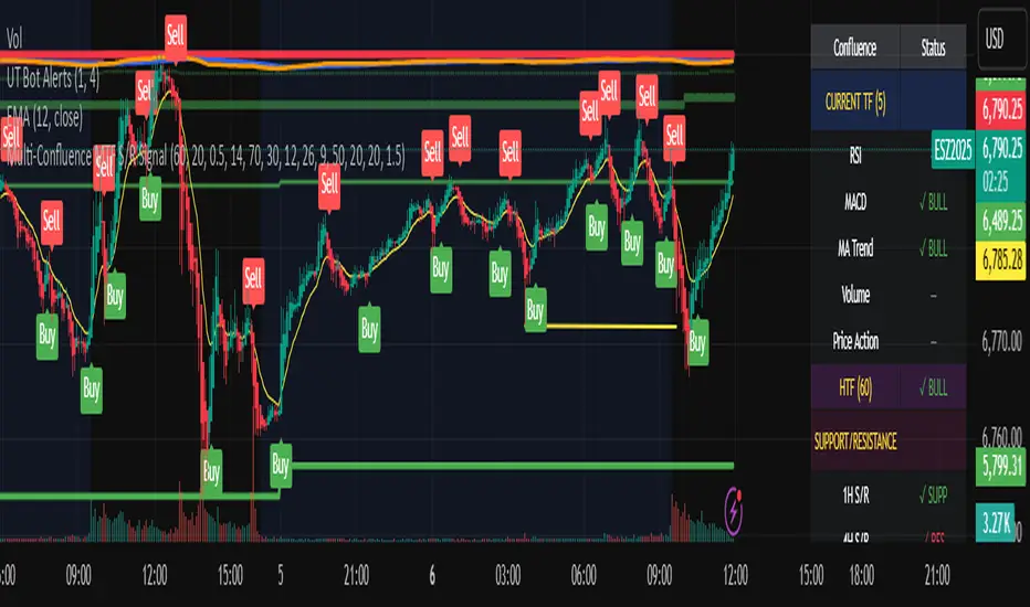
Multi-Confluence MTF S/R Signal5 Confluences:
RSI - Detects oversold/overbought conditions with momentum
MACD - Confirms trend direction and momentum shifts
Moving Average Trend - Validates price position relative to 50 SMA and 20 EMA
Volume - Ensures strong participation (1.5x average volume)
Price Action - Confirms breakout (higher high for buys, lower low for sells)
Features:
Green triangles below bars = BUY signal (all 5 confluences bullish)
Red triangles above bars = SELL signal (all 5 confluences bearish)
Background coloring when signals occur
Real-time dashboard showing each confluence status
Built-in alerts you can enable
Customizable parameters for all indicators
Multi-Timeframe Features:
Higher Timeframe Analysis (Default: 60 min)
HTF Trend - Checks if price is above/below moving averages on higher timeframe
HTF MACD - Confirms momentum direction
HTF RSI - Validates not overbought/oversold
Signal Types:
Strong Signals (Full triangles with text)
✅ All 5 current timeframe confluences aligned
✅ Higher timeframe confirmation (2 of 3 HTF conditions)
GREEN "BUY" or RED "SELL" labels
Weak Signals (Small transparent triangles with "?")
✅ All 5 current timeframe confluences aligned
❌ NO higher timeframe confirmation
Use with caution - may signal counter-trend trades
Dashboard Updates:
Shows Current Timeframe section (all 5 confluences)
Shows HTF status (your chosen higher timeframe)
Displays final signal strength
Customizable Settings:
Enable/Disable MTF - Toggle multi-timeframe confirmation
Higher Timeframe - Choose any timeframe (15m, 60m, 4H, D, etc.)
Require HTF - Force HTF confirmation or allow weak signals
Alerts:
Strong Buy/Sell - Full confirmation
Weak Buy/Sell - No HTF confirmation
Daily Pivot Points - Fixed Until Next Day(GeorgeFutures)We have a pivot point s1,s2,s3 and r1,r2,r3 base on calcul matematics

Aggression Bulbs v3.1 (Sessions + Bias, fixed)EYLONAggression Bulbs v3.2 (Sessions + Bias + Volume Surge)
This indicator highlights aggressive buy and sell activity during the London and New York sessions, using volume spikes and candle body dominance to detect institutional momentum.
⚙️ Main Logic
Compares each candle’s volume vs average volume (Volume Surge).
Checks body size vs full candle range to detect strong directional moves.
Uses an EMA bias filter to align signals with the current trend.
Displays green bubbles for aggressive buyers and red bubbles for aggressive sellers.
🕐 Sessions
London: 08:00–12:59 UTC+1
New York: 14:00–18:59 UTC+1
(Backgrounds: Yellow = London, Orange = New York)
📊 How to Read
🟢 Green bubble below bar → Aggressive BUY candle (strong demand).
🔴 Red bubble above bar → Aggressive SELL candle (strong supply).
Bubble size = relative strength (volume × candle dominance).
Use in confluence with key POI zones, volume profile, or delta clusters.
⚠️ Tips
Use on 1m–15m charts for scalping or intraday analysis.
Combine with your session bias or FVG zones for higher accuracy.
Set alerts when score ≥ threshold to catch early momentum.

geminiNiftyhi it gives buy sell signal this is using price action with cpr indicator
works well on trending day

Fib Retrace + Extensions (v6– safe version) v 1🌀 Fib Extension Plus Retracement Strategy: Complete Overview
📊 Purpose and Core Idea
The Fib Extension Plus Retracement Strategy is a hybrid price-action methodology that blends Fibonacci Retracement and Fibonacci Extension tools to map high-probability entry, exit, and target zones within trending markets.
It is designed for precision timing, measured risk exposure, and trend-continuation trading.
By uniting both retracement and extension logic, traders can capture the entire lifecycle of a move — from the pullback phase to the breakout and projected expansion wave.


HPZ — 4H Sell Zones (Ultra High Quality)Only finds sell setups.
Only shows overlaps between 4H Fair Value Gaps and Bearish Order Blocks.
Filters out small gaps or candles with too little momentum.
Displays a red box(HPZ) only when overlap is valid.
Optionally shows a “HPZ sell” label when price enters the zone.
Includes tiny swing markers for visual reference.

Micro SuiteWhat it is: One Pine v5 indicator that stacks several tools: EMA ribbon + a color-flipping 11/34 EMA trend line, multi-timeframe RSI pressure arrows, and a Bollinger Band re-entry system that marks Top/Bottom triggers (T/B) and later “r” confirmations. It also sprinkles in 3-Line Strike, Leledc exhaustion dots, and a small “Micro Dots” engine (ATR regime + VMA filter). Alerts for all of it.
TradingView
The core signals you’ll actually use:
RSI arrows: Up arrow when current RSI(6) < 30 and selected higher-TF RSIs are also < 30; down arrow when > 70 cluster cools. Idea = stacked OB/OS “pressure.”
TradingView
Bollinger re-entry (T/B + r):
T = first close back inside upper band; B = first close back inside lower band.
r = confirmation within N bars (price takes out the trigger bar’s high/low). These bars tint so they’re easy to see.
TradingView
Trend filter: EMA-11 vs EMA-34 color flip + optional VMA trend line; helps you ignore counter-trend stabs.
TradingView
Quick playbook (how to read it):
Reversal short: See a T near the top band → get the r within your window → bonus if a down RSI arrow or a Leledc high dot shows up.
Reversal long: Mirror that with B → r, plus an up RSI arrow/Leledc low dot.
Continuation: If Micro Dot stays green (or red) and 11>34 EMA holds, ignore isolated T/B traps.
TradingView
Inputs that matter:
confirmBars for the T/B “r” window.
Which higher-TF RSIs must agree for arrows.
Show/hide and lengths for EMAs and BB.
Micro block: show dots, VMA line, and speed (Fast/Med/Slow).
TradingView
Why people like it: You get trend, momentum, and mean-revert cues on one pane with ready-made alerts, so it’s easier to build a ruleset (e.g., “only take B→r longs when 11>34 and there’s an RSI up arrow”).
TradingView
Caveats: It’s still just TA—OB/OS clusters can persist in trends; confirmations can miss V-shaped turns; and stacking signals can be late in fast markets. Pair it with risk rules (fixed R, ATR stops) and a higher-TF bias.
One-liner cheat sheet:
Longs: B → r + RSI up arrow + 11>34 (optional Micro Dot green).
Shorts: T → r + RSI down arrow + 11<34 (optional Micro Dot red).
TradingView

HPZ — 4H Buy Zones (Ultra High Quality)Only finds BUY setups.
Only shows overlaps between 4H Fair Value Gaps and Bullish Order Blocks.
Filters out small gaps or candles with too little momentum.
Displays a green box (HPZ) only when overlap is valid.
Optionally shows a “HPZ BUY” label when price enters the zone.
Includes tiny swing markers for visual reference.
“VWAP Precision Suite — EMA Cloud + RTH Anchored Zones”🧠 “VWAP Precision Suite — EMA Cloud + RTH Anchored Zones”
(Alternative titles for testing engagement)
“VWAP Zone Pro — EMA Cloud + RTH Levels”
“VWAP Fusion System — EMA Bias & Daily Anchors”
“Session Flow Pro — VWAP + EMA Trend Matrix”
📜 Description
🔹 Overview
The VWAP Precision Suite is an all-in-one market structure indicator built for intra-day precision and trend confirmation.
It combines institutional-grade tools — VWAP bands, EMA trend zones, and RTH high/low anchors — to help traders identify momentum shifts, session extremes, and volume-weighted fair value zones in real time.
Whether you’re a scalper, swing trader, or futures/day trader, this tool adapts to any trading style with fully customizable inputs.
⚙️ Core Features
✅ Dynamic VWAP Bands — plots ±1/2 ATR deviation zones around the VWAP for intraday fair-value mean reversion and trend extension tracking.
✅ EMA Cloud Zone (9/21 by default) — identifies short-term bias shifts using a color-coded cloud between EMAs.
✅ RTH High/Low Mapping — tracks live session high/low levels plus the previous day’s anchors.
✅ Anchored VWAP (Daily Reset) — plots rolling session VWAP using volume-weighted price action for precision mean tracking.
✅ Trend Color Background — visually highlights bias direction for quick momentum reads.
✅ Customizable Everything — modify EMA lengths, VWAP ATR multipliers, visibility toggles, and background colors to fit your playbook.
🧩 Suggested Starter Settings
Use these settings to begin, then fine-tune to your strategy:
Setting Recommended Description
VWAP Bands ✅ On ±1×ATR for precision zones
EMA Zone ✅ On Fast EMA: 9 / Slow EMA: 21
Anchored VWAP ✅ On Daily reset for new session
RTH High/Low ✅ On Shows live and prior session levels
Trend Background ✅ On Visual bias filter
Color Scheme Green = Bullish Bias / Red = Bearish Bias
💡 Tip:
Scalpers can tighten ATR multipliers (0.8–1.2).
Swing traders can widen ATR multipliers (1.5–2.0).
Adjust EMA 9/21 to faster (5/13) or slower (20/50) based on volatility.
📊 Use Case Examples
📈 Fade the VWAP deviation band and ride back to mean.
🔁 Trade reversals using EMA cloud color flips.
🕒 Mark confluence between Anchored VWAP + RTH highs/lows for breakout zones.
💹 Combine with order-flow or volume profile for higher conviction.
⚠️ Disclaimer
This indicator is for educational purposes only and does not constitute financial advice.
Trading involves risk and may result in losses.
The author is not responsible for any financial decisions made using this tool.
Always use sound risk management and back test before trading live.
© 2025. All rights reserved. Redistribution or resale of this indicator, in full or in part, is strictly prohibited without the author’s written consent.
Reversal Nexus Pro Suite — Smart Scalper/Swing Trader/Hybrid 📝 Description
The Reversal Suite (5–15m) is a dynamic price-action-driven indicator built for scalpers and intraday traders who want to catch high-probability reversals with precision.
This system combines SFP (Swing Failure Patterns), Volume Climax filters, EMA bias, and momentum confirmation logic — all customizable to match your personal trading style.
The default configuration is tuned for NASDAQ futures (NQ1!) and similar indices on 5–15-minute charts, but it can adapt seamlessly to crypto, forex, and equities.
⚙️ How It Works
The indicator looks for exhaustion points in price where:
Volume Climax confirms liquidity sweeps,
EMA bias determines directional filters (single or dual-EMA),
Reclaim and rejection mechanics confirm structure shifts,
Momentum thrust ensures strength on reversal confirmation.
Each setup requires multi-factor alignment to reduce noise and increase signal precision.
🧩 Default Custom Settings (Recommended Start)
Setting Value Description
Mode Custom Enables full manual control
Signals must align within N bars 6 Forces confluence across recent bars
TP1 / TP2 (R-Multiples) 1.5 / 2.5 Default reward zones
RSI Divergence Enabled Adds secondary reversal confirmation
Volume Climax Enabled Detects high-volume exhaustion
Vol SMA Length 21 Volume baseline calculation
Climax ≥ k × SMA 7 Strength multiplier for volume spikes
EMA Length 200 Trend bias reference
Bias Both Allows both long and short setups
Dual EMA Bias Enabled Uses fast (21) vs slow (100) bias tracking
Min Distance from EMA Bias 2.55% Filter to avoid signals too close to MAs
Reclaim Buffer After Sweep 0.22% Ensures valid break-and-reclaim setups
Max Bars for Retest 1 Tight retest condition
Momentum Thrust Confirm Enabled Ensures volume and price thrust
Body ≥ ATR -6 Controls candle thrust sizing
TR SMA Length 20 Measures dynamic volatility
Body ≥ k × TR-SMA -4.4 Confirms structure-based rejection
Opposite-Signal Exit Enabled Auto-clears opposite signals
Opposite Signal Window 5 bars Short-term conflict filter
Swing Lookback (SFP) 2 Finds recent liquidity highs/lows
Cooldown Bars After Signal 8 Prevents over-triggering
🟢 Inputs are fully adjustable, so traders can optimize for:
Scalping (lower EMA, smaller swing lookback)
Swing trading (higher EMA, larger retest window)
Aggressive vs conservative confirmations
🧭 Recommended Use
Works best on 5m–15m timeframes
Pair with VWAP or EMA cloud overlays for directional context
Use Trend Guard to align only with higher-timeframe trend
Ideal for indices, forex majors, and large-cap stocks
🚀 Highlights
✅ Smart confluence-based reversal detection
✅ Built-in retest and rejection logic
✅ Dual EMA and volume climax filters
✅ Customizable momentum thrust confirmation
✅ Optimized for scalpers and intraday swing traders
🧱 Suggested Layout
Chart type: Candlestick
Timeframe: 5m or 15m
Overlay: VWAP / EMA Cloud / ORB Zone
Optional filters: ATR Bands, Volume Profile (VPVR), Session Boxes
⚠️ Disclaimer
The Reversal Nexus Pro indicator is provided for educational and informational purposes only. It is not financial advice and should not be interpreted as a recommendation to buy, sell, or trade any financial instrument.
Trading involves significant risk and may not be suitable for all investors. Past performance does not guarantee future results. Always perform your own analysis and use proper risk management before placing any trades.
The author of this script is not responsible for any financial losses or decisions made based on the use of this tool.
By using this indicator, you acknowledge that you understand these terms and accept full responsibility for your own trading results.
© 2025. All rights reserved. Redistribution or resale of this indicator, in full or in part, is strictly prohibited without the author’s written consent.

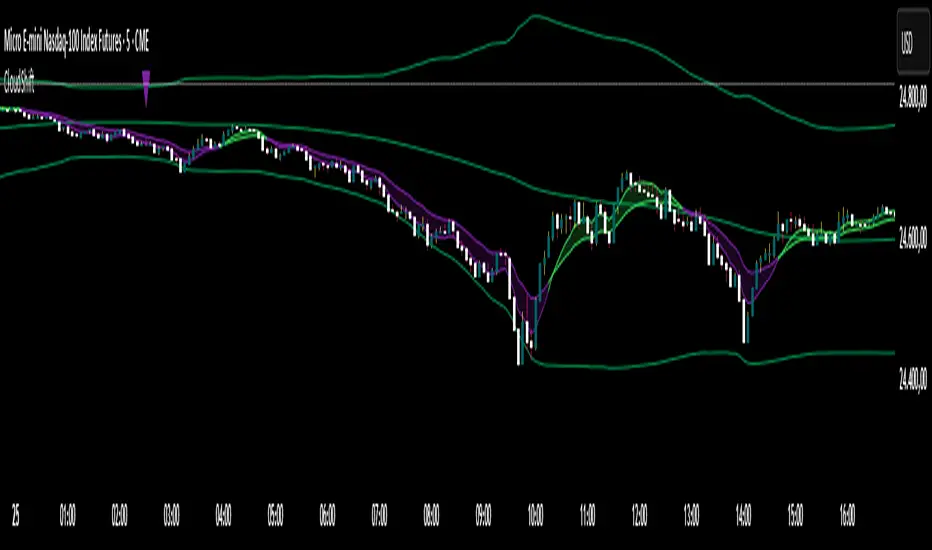
CloudShiftCloudShift + Bollinger Bands
This version of CloudShift now includes fully optimized Bollinger Bands with all three dynamic lines:
Upper Band: Highlights expansion during volatility spikes.
Lower Band: Identifies compression and accumulation zones.
Centerline (Basis): A smooth reference of the moving average, providing better visual balance and directional context.
The bands are drawn with thin, clean lime lines, designed to integrate perfectly with the cloud logic — keeping your chart minimalist yet powerful.
This update enhances the CloudShift indicator by providing a clear visual framework of market volatility and structure without altering its original logic.
Recommended for use on: NASDAQ, S&P 500, and other high-volatility futures.
Recommended timeframe: 5–15 minutes.
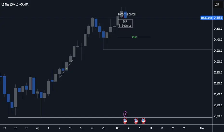
4H + 15m Sell Signals It shows sell positions on the 15 min based on 4 hour ,imbalance, order block and swing high and low frameworks.