Session Markers (UTC-4)This marker has been made to show london session open, NY session open and Asian session open using a dotted coloured line for each one!
Indicators and strategies

Data Monitoring TableThis is a visual data dashboard specifically designed for users engaged in quantitative trading and technical analysis. It is equipped with two data tables that can dynamically display key market technical indicators and cryptocurrency price fluctuation data, supporting customizable column configurations and trading mode filtering.
✅ Core Features:
Intuitive display of critical technical indicators, including the Relative Strength Index (RSI), K-line entity gain, upper/lower shadow ratio, trading volume level, and change rate.
Multi-timeframe tracking of price fluctuations for BTC/ETH/SOL/XRP/DOGE (1-day, 6-hour, 3-hour).
Selectable trading modes: "long-only", "short-only", or "both".
Customizable number of columns to adapt to analysis needs across different timeframes.
All data is visualized in tables with color-coded prompts for market conditions (overbought, oversold, high volatility, low volatility, etc.).
📈 Target Audience:
Investors seeking systematic access to technical data.
Quantitative strategy developers aiming to capture market structural changes.
Intermediate and beginner traders looking to enhance market intuition and decision-making.
New Feature:
We have added a trading volume monitoring grade setting feature. Users can set the monitoring grade by themselves. When the market trading volume reaches this grade, the system will trigger an alarm. The default setting is level 5. This setting is designed to filter out trades with small fluctuations, helping users to capture key trading signals more accurately and improve the efficiency of trading decisions.
中文介绍
这是一款专为量化交易和技术分析用户设计的可视化数据仪表盘。它配备两个数据表格,可动态展示关键市场技术指标与加密货币价格波动数据,支持自定义列配置和交易模式筛选。
✅ 核心功能:
直观展示相对强弱指标(RSI)、K 线实体涨幅、上下影线比例、成交量水平及变化率等关键技术指标。
多时间框架追踪 BTC/ETH/SOL/XRP/DOGE 价格波动(1 日、6 小时、3 小时)。
可选交易模式:“仅做多”“仅做空” 或 “多空双向”。
可自定义列数,适配不同时间框架的分析需求。
所有数据以表格可视化呈现,通过颜色标注提示市场状况(超买、超卖、高波动、低波动等)。
📈 目标用户:
寻求系统获取技术数据的投资者。
旨在捕捉市场结构变化的量化策略开发者。
希望提升市场洞察力和决策能力的初、中级交易者。
新增功能:
我们新增了成交量监控等级设置功能。用户可自行设定监控等级,当市场成交量达到该等级时,系统将触发警报。默认设置为 5 级,此设置旨在过滤掉小幅波动的交易,帮助用户更精准地捕捉关键交易信号,提升交易决策效率。

Sessions BrockJavaThis script is a flexible, timezone-aware Session High/Low indicator for TradingView. It is based on the original work of kurtsmock (Mozilla Public License 2.0) and includes enhancements for UTC offset handling and autoscale compatibility.
Features:
Tracks and plots the highest and lowest prices within user-defined trading sessions.
Session times default to UTC, but you can set a custom UTC offset (e.g., -4 for New York, 0 for London, +8 for Singapore).
Reset modes: by session, by a set number of hours, or daily.
Backtesting support: specify a date range to limit indicator activity to historical periods.
Session constraint: restricts operation to specific sessions, with optional weekend inclusion for crypto or 24/7 markets.
Visual customization: choose to display session high/low as lines, background color, or filled regions. All colors and transparencies are user-configurable.
Efficient plotting: session levels are always included in TradingView’s autoscale, so you never lose sight of key levels.
Technical details:
Session definition uses TradingView’s session string format (e.g., 1800-1500).
Timezone handling is automatic and accurate, even with custom offsets.
Designed for high efficiency, supporting up to 5000 bars back and 500 lines.
Credit:
Major credit to kurtsmock, the original author. This version adds UTC offset and improved autoscale support.
License: Mozilla Public License 2.0
If you need session-based high/low levels that always fit your chart and your trading hours, this script is for you.

Lagged M2 Money SupplyDescription:
This indicator plots the U.S. M2 Money Supply (FRED:M2SL) with an optional time lag applied, enabling macroeconomic correlation analysis with lagging assets such as Bitcoin (BTC) or equities.
Source: Federal Reserve Economic Data (FRED)
Update Frequency: Weekly (as per FRED:M2SL data)
Lag Control: Default lag is 12 weeks; this can be modified in the script
Visualization:
Original M2 plotted in gray
Lagged M2 plotted in orange
Use Case: Identify delayed correlations between monetary expansion and asset performance (e.g., BTC price reactions to liquidity growth)
Note: As the M2 dataset is macroeconomic and updates infrequently, this indicator is best used on weekly timeframes or higher.

EMA x4📌 Indicator: EMA x4
Author:
Script Type: Overlay (draws on price chart)
Language: Pine Script™ v6
License: Mozilla Public License 2.0
📖 Overview
EMA x4 is a minimalist technical indicator designed to display four customizable Exponential Moving Averages (EMAs) directly on the chart. It offers a clear view of short-, medium-, long-, and extra-long-term trends to support trend-following and momentum-based trading strategies.
This tool is ideal for traders who rely on moving average crossovers, dynamic support/resistance, or need to confirm market bias with multiple time-frame alignment.
⚙️ Input Parameters
Users can modify each EMA's length to match their strategy preferences:
Short EMA: Fastest EMA for short-term by default its value is 35
Middle EMA: Medium-term EMA by default its value is 75
Large EMA: Long-term EMA by default its value is 100
XL - EMA: Extra-long-term trend filter by default its value is 200
📊 Visual Representation
The script plots each EMA using distinct colors and consistent line thickness:
EMA1: Color Blue Short-term EMA (35)
EMA2: Color Orange Mid-term EMA (75)
EMA3: Color Green Long-term EMA (100)
EMA4: Color Red Extra-long-term EMA (200)
All lines are rendered with a linewidth of 2 for enhanced visibility on any chart.
🧠 Typical Use Cases
Trend Identification: Watch for the EMAs stacking in order (e.g., EMA1 above EMA2, etc.) to confirm bullish or bearish trends.
Crossover Signals: Look for EMA crossovers to generate entry/exit signals.
Support & Resistance: EMAs often act as dynamic zones of support/resistance during trending markets.
Multi-timeframe Confirmation: Combine this overlay with higher timeframe charts to confirm trend alignment.
✅ Key Benefits
Fully customizable EMA lengths for all trading styles.
Clean design, ideal for visually-driven traders.
Lightweight code – no lag or performance impact.
Can be used in confluence with other indicators or strategies.
🚀 How to Use
Add the indicator to any TradingView chart.
Configure the EMA lengths based on your preference (swing, day trading, long-term).
Analyze price interactions with the EMAs and look for confluences or crossovers.

Open = High or LowThis indicator highlights potential intraday reversal points by detecting when a candle's opening price is equal to its high or low.


Supply/Demand Zones (Synthetic SMA Candles)Supply/Demand Zones (Synthetic SMA Candles)
Created by The_Forex_Steward
This indicator highlights institutional-style supply and demand zones using synthetic SMA-based candles rather than raw price data. It provides a smoother, more refined view of price action to help identify key imbalance areas where price is likely to react.
Features:
- Uses SMA-smoothed synthetic candles to detect bullish and bearish engulfing structures
- Draws demand zones after bullish breakouts and supply zones after bearish breakouts
- Zones are persistent for a customizable number of bars
- Mitigated zones can optionally be removed from the chart
- Includes alerts for breakout and mitigation events
- Optional plotting of synthetic candles over price for visual clarity
How It Works:
When a synthetic candle closes above the high of a previous bearish candle, a bullish engulfing is detected, and a demand zone is created from that bearish candle’s high and low. Conversely, when price closes below the low of a previous bullish candle, a supply zone is formed. These zones stay on the chart for the user-defined duration or until they are mitigated by price, at which point they can be removed automatically.
How to Use:
- Adjust the SMA Length to control how smooth the synthetic candles appear
- Enable or disable Show Supply Zones and Show Demand Zones as needed
- Set the Zone Duration to control how long each zone persists
- Use Delete Mitigated Zones to automatically remove zones when price returns to them
- Optionally enable Show Synthetic SMA Candles to see the candle logic used in detection
- Use the built-in alerts to stay notified of new zone creation or mitigation
Note: This tool is most effective when combined with structure or trend-based strategies for confirmation.

TAO Sweep + Full Bottom DetectionTao liquidity sweep detector. Uses analysis of btc dominance PA and eth/btc PA as confluences. Uses volume moving average to catch sweeps of the lows.

First EMA 9 & 21 Breakout SignalThis will give indiacation on the bars that close below and above 9 and 21

RedAndBlue Indicator LightsRedAndBlue Indicator Lights — RSI, MFI, and Bollinger Band Sentiment Table
This indicator provides a multi-timeframe sentiment dashboard using RSI , MFI , and Bollinger Bands , visualized in a compact color-coded table.
What it does:
Evaluates RSI and MFI values across multiple timeframes: 5m, 15m, 30m, 1h, 2h, 4h, and 1D
Analyzes Bollinger Bands in two ways:
BB = compares candle body position relative to Bollinger Bands
BBw = checks whether candle wicks pierce above or below the bands
Each cell displays the indicator value or a symbolic label (↓↓, ↓, –, ↑, ↑↑)
Color-coded backgrounds reflect overbought/oversold zones
All thresholds and colors are fully customizable in the input settings
Color meanings:
Green : Strong oversold (value < low1)
Light blue : Slightly oversold (value < low2)
White : Neutral zone (between low2 and high2)
Yellow : Slightly overbought (value > high2)
Red : Strong overbought (value > high1)
BB and BBw label meanings:
↓↓ = Price (or wick) pierced below the lower Bollinger Band
↓ = Candle body is between lower band and midline
– = Candle body crosses the midline (neutral)
↑ = Candle body is between midline and upper band
↑↑ = Price (or wick) pierced above the upper Bollinger Band
How to use it effectively:
If RSI, MFI, BB, and BBw all show oversold signals (green or light blue) across multiple timeframes, especially on 1h, 4h, or 1D, it may signal a good buying opportunity
If the indicators all show overbought signals (red or yellow), it may indicate a potential exit or short zone
BBw shows wick-based signals and can act as an early warning; BB confirms with the candle body
Use this table to spot sentiment confluence across timeframes before entering a trade
If most cells are white, the market is likely in a sideways or neutral state
This indicator helps you quickly identify multi-timeframe sentiment shifts and potential reversal points through a clean, structured visual layout.

MACD with Colored HistogramA script specifying the difference between convergence and divergence indicated with an icon.

Supertrend Indicator with AlertsSupertrend updated with Heikin Ashi
This indicator is a modified version of the traditional Supertrend, recalculated using Heikin Ashi candles for smoother trend detection. It includes built-in alert functions and is optimized for use on Heikin Ashi charts.
自带提醒,适用于平均K线图

Unified Sentiment Candles Overlay (SMA)Unified Sentiment Candles (SMA) Indicator
The Unified Sentiment Candles (SMA) is a custom overlay indicator designed to provide a smoothed visualization of market sentiment by plotting synthetic candles based on the Simple Moving Average (SMA) of open, high, low, and close prices. It helps traders identify trend direction and potential reversals more clearly.
How to Use:
- Observe Candle Colors: Green candles indicate bullish sentiment (close ≥ open), while red candles suggest bearish sentiment (close < open).
- Trend Identification: Consistent green candles point to an uptrend, whereas consistent red candles may signal a downtrend.
- Support & Resistance Zones: The SMA-based candles smooth out short-term volatility, assisting in spotting key support and resistance levels.
- Entry & Exit Signals: Look for color changes or candle pattern formations within the synthetic candles to time entries and exits more effectively.
Settings:
SMA Length : Adjust this parameter to control the smoothing period. A shorter length makes the indicator more responsive, while a longer length smooths out more noise.
This indicator is best used in conjunction with other technical analysis tools to confirm signals and improve trading accuracy.
This script is open-source and licensed under the Mozilla Public License 2.0. Use and modify it at your own discretion.

DR SessionsDR/IDR concept sessions with multiple ways to view the session to best suit your needs.
Each session, ADR, ODR, RDR can be turned on/off, and displayed 3 different ways. Lines, will highlight each DR and IDR line, and will color the side that breaks out. Zones, will fill in the gap between the DR and the IDR lines and will color the breakout side. Finally range will fill the entire range from DR to DR with a single color that will change to the breakout color once price closes outside of the range.

Greer Free Cash Flow Yield✅ Title
Greer Free Cash Flow Yield (FCF%) — Long-Term Value Signal
📝 Description
The Greer Free Cash Flow Yield indicator is part of the Greer Financial Toolkit, designed to help long-term investors identify fundamentally strong and potentially undervalued companies.
📊 What It Does
Calculates Free Cash Flow Per Share (FY) from official financial reports
Divides by the current stock price to produce Free Cash Flow Yield %
Tracks a static average across all available financial years
Color-codes the yield line:
🟩 Green when above average (stronger value signal)
🟥 Red when below average (weaker value signal)
💼 Why It Matters
FCF Yield is a powerful metric that reveals how efficiently a company turns revenue into usable cash. This can be a better long-term value indicator than earnings yield or P/E ratios, especially in capital-intensive industries.
✅ Best used in combination with:
📘 Greer Value (fundamental growth score)
🟢 Greer BuyZone (technical buy zone detection)
🔍 Designed for:
Fundamental investors
Value screeners
Dividend and FCF-focused strategies
📌 This tool is for informational and educational use only. Always do your own research before investing.

📊 Cumulative Portfolio TrackerHi all, first time poster here
I just figured I'd share a script that I wrote for portfolio buy and hold backtesting purposes.
Basically what it does is compares the performance of a group of stocks combined as a portfolio vs a benchmark. In this case I have a portfolio of 20 companies vs SPY set as the default but it's pretty easy to change them in the code. Also it starts in January 2022 because one of my chosen companies only started trading at that date. Again, easy to change.
Alright, so how do we interpret the data?
The script tracks the two values to be compared with a base value of 100 and then that number rises and falls from there showing their relative performance. The orange will be the user defined portfolio and the blue will be the benchmark.
Some caveats - the user defined portfolio will start exactly when the newest ticker began trading unless specified to start past that date. This means for example if you compare SPY to SPYI, SPY will be showing years of compounding compared to SPYI's performance.
I'm a pretty novice coder for Pinecode as I usually use Python for my projects but anyway.
Potential future features -
- Swapping the baseline 100 for a % gain or $ gain from the starting point(giving the option to choose which one). This one would probably be pretty easy to do. To be honest this code isn't exactly complex. I really do not know Pinescript that well.
- Adding in returns from dividends. I don't know if this one is possible. Will need to look into it.
- The ability to overlay indicators on both the portfolio and the benchmark. This might already be possible with this code, I haven't tried because I just finished managing to get it to compile and I'm frankly tired.
-Custom weighting.
As of now it's all equal weight.
Questions I assume you will be asking -
- "Can we display the user profile as candlesticks instead of a line?"
I really don't think so. I have to assume it's hardcoded. My first idea was to just have a blank chart with no ticker and then do some fiddling to use the user profile's combined high/low/open/close display on the chart but couldn't figure that one out.
-Doesn't Portfoliovisualizer already do this but better?
It sure does. However the features I include here are going to be more flexible compared to their free version if you can't be bothered to pay for it(number of tickers, length of time, etc.).
-The benchmark line doesn't perfectly match the ticker I have on screen!
You're right it doesn't. I've turned off candles in my screenshot for that exact purpose. This goes back to what I mentioned about how you have to carefully pick the timespan that you're going to be looking at. At least I think that's what causes it. Further research needed. For now it was just easier to use a couple of lines only.
- *other scripter* already did this idea but better!
It's not exactly that complex of an idea so I wouldn't doubt it but I didn't look. I wanted to make a tool that would both be useful to me and also help me get better with Pinescript. That's pretty much the whole thing.
-How many tickers can I add?
Not a clue. 100? 1000? That would be tedious to test. 20 seemed like a good baseline.
Anyway, if anyone has feedback on what to add or anything I'm all ears. This is just the stuff that came to me over the last few hours while I was working my way through the documentation. If you find this useful, awesome! If not, no hard feelings. Still new!
Thanks folks,
Steve

Simple MA AI Strategy + All Pattern Recognition (Reversed)just try m1 chart only 111111111111111111111111111111111111111111111111111111111111111111111111111111111111111111111111111111111111111111111111111111111111111111111111111111111111111111111111111111111111111111111111111111111111111111111111111111111111111111111111111111111111111111111111111111111111111111111111111111111111111111111111111111111111111111111

Bollinger Bands Highlight [Custom TF]
Highlights the blocks where the chart is outside upper or lower Bollinger Band.
Customizable timeframe.

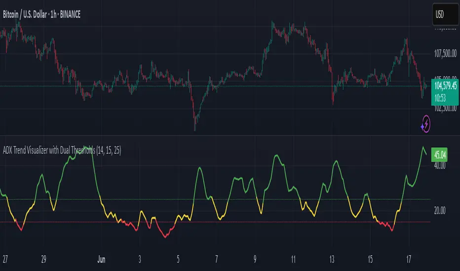
ADX Trend Visualizer with Dual ThresholdsADX Trend Visualizer with Dual Thresholds
A minimal, color coded ADX indicator designed to filter market conditions into weak, moderate, or strong trend phases.
Uses a dual threshold system for separating weak, moderate, and strong trend conditions.
Color coded ADX line:
Green– Strong trend (above upper threshold)
Yellow – Moderate trend (between thresholds)
Red – Weak or no trend (below lower threshold)
Two horizontal reference lines plotted at threshold levels
Optional +DI and -DI lines (Style tab)
Recommended Use:
Use on higher time frames (1h and above) as a trend filter
Combine with entry/exit signals from other indicators or strategies
Avoid possible false entries when ADX is below the weak threshold
This trend validator helps highlight strong directional moves and avoid weak market conditions
Volume + Price Reversal SignalTesting so not sure if it works, using volume and candlesticks to determine reversals

Average volume yearlyI noticed that there is no Average Volume for 7 days, 180 days, and 365 days, which is sometimes badly needed.
I have decided to add the Average volume for the week, 180 days, and a year.

SPX MACD + EMA Crossover Option AlertsFeatures Included:
MACD Golden Cross (bullish) and Death Cross (bearish) detection
EMA Crossovers as confirmation (you can set fast & slow EMAs)
Optimal trading time filters (e.g., 10:00–11:30 AM, 2:00–3:30 PM ET)
Alerts for CALLs (bullish) and PUTs (bearish) only within trade hours
Visual signals on the chart for easier trading
