Gold Killzone Bias Suite🟡 Gold Killzone Bias Suite
The Gold Killzone Bias Suite is an advanced institutional-grade tool designed to generate high-confidence directional bias for XAU/USD (Gold) during the London and New York killzones.
Built for traders using a structured, confluence-driven approach, this tool blends price action, smart money principles, momentum, and volume into a real-time bias engine with a clean, easy-to-read dashboard.
🔧 Key Features
🕰️ Session-Based Bias (London / New York)
Independent bias calculation per session
Killzone times customizable with timezone support
Background highlighting (blue/red) for each session
📊 VWAP Engine
Reclaim & rejection detection
VWAP deviation alerts
Daily HTF VWAP integration
Score impact based on VWAP behaviour
📉 Market Structure (CHoCH / BOS)
Detects swing highs/lows
Labels bullish/bearish CHoCHs
Structure score contributes to session bias
💧 Liquidity Grabs
Detects stop hunts above highs / below lows
Confirms with candle rejection (body % filter)
Plots labels and adds to bias scoring
⚡ Momentum Filters
RSI: Bullish >55, Bearish <45
MACD: Histogram + Signal Line crossovers
Combined momentum score used in bias
🧠 Smart Money Proximity
Optional FVG/OB score toggle (placeholder for custom logic)
Adds static confluence for proximity-based setups
⏫ Higher Time Frame Context
Daily VWAP comparison
4H high/low structure breaks
Adds trend score to current session bias
🧠 How Bias Works
The suite uses a scoring model. Each confluence adds or subtracts points:
VWAP reclaim/reject: ±30
CHoCH/BOS: ±30
Liquidity grab: ±20
RSI/MACD: ±10
FVG/OB Proximity: +10
Daily VWAP trend: ±10
H4 Trend Break: ±10
Final Bias:
Bullish if score ≥ +20
Bearish if score ≤ -20
Neutral if between -19 and +19
A confidence % (capped at 100) is also shown, along with the contributing confluences (VWAP, Structure, Liquidity, etc.).
📋 Dashboard
A real-time dashboard shows for each session:
Session name and time
Bias (Bullish / Bearish / Neutral)
Confidence (%)
Confluences used
Position can be moved (Top Left, Top Right, etc.). Designed to be unobtrusive yet informative.
🧪 Best Practices
Use on 15m / 5m charts for intraday setups
Confirm with D1 or H4 structure for directional context
Combine with OB/FVG zones or SMT for entries
Use Trading View alerts for bias flips or liquidity grabs (custom logic can be added)
Bar Replay compatible for back testing and journaling bias shifts
🔐 Notes
Does not generate trade signals or alerts by default
Focused on bias generation and confluence stacking
Compatible with funded account trading models
📈 Built for traders who want a systematic, score-based approach to identifying directional edge in high-volume gold sessions.
Indicators and strategies

Trend Zones & ATR Targets[CongTrader]TrendZones ATR is a dynamic trend and support/resistance indicator that combines Hull Moving Average (HMA) smoothing, mid-price analysis, and ATR-based targets to identify precise trading zones and risk levels.
Key Features:
Adaptive Trend Zones — Calculates upper, midline (CoG), and lower borders from smoothed mid-price, adapting to market volatility.
Trend Classification — Detects uptrend, downtrend, or sideways conditions using slope-based logic.
Safe Level & Logical Stop — Automatically sets risk levels according to price zone classification.
Flexible TP Methods — Choose between %-based or ATR-based take-profit targets.
Optional ATR Support Zone — Adds an ATR-based support level for stronger confluence.
Risk & Zone Width Table — Displays real-time risk and channel width data on the chart.
How to Use:
Apply the indicator to any symbol and timeframe.
Identify market zones with color-coded fills.
Align trades with the detected trend direction.
Use Safe Level or Logical Stop for stop-loss placement.
Set TP targets using either % or ATR multiplier.
Combine with your own trade confirmation method for optimal results.
Acknowledgment:
Thanks to the TradingView community for inspiration and feedback. This script is original work by CongTrader.
Disclaimer:
This script is for educational purposes only and does not constitute financial advice. Trading carries risk and may not be suitable for all investors. Do your own research before making any trading decisions. The author is not responsible for any losses resulting from the use of this script.
#trendzones #atr #supportresistance #tradingview #forex #crypto #stocks #daytrading #swingtrading #riskmanagement #chartanalysis .

Dynamic 50% Line [Daily and Weekly Range]This indicator automatically plots the 50% retracement level (midpoint) of the daily and weekly trading ranges. It helps traders identify key support/resistance zones where price may react, offering insights into potential reversal or continuation areas.
Auction Market Theory & the 50% Level
At its core, this indicator is built on Auction Market Theory (AMT), which views price movement as an ongoing auction process where buyers and sellers compete to establish value. The 50% midpoint represents fair value—the equilibrium where price is most likely to balance before continuing its trend or reversing.
When price deviates too far from this level, it often returns to balance (mean reversion) or accepts new value (breakout). By tracking the daily and weekly 50% lines, traders can:
Identify high-probability reversal zones (where price may reject fair value).
Spot trend continuation areas (where price accepts higher/lower value).
Align with institutional order flow, as large players often use these levels for execution.
This makes the indicator particularly powerful for traders who follow volume profile, order flow, or ICT concepts, as it visually maps the market’s ongoing auction process.
Features:
✅ Automated Daily & Weekly Midpoints – Calculates the 50% level from the high/low of each session.
✅ Customizable Line Styles – Choose between solid, dotted, or dashed lines for better visibility.
✅ Clear Labeling – Optional text labels show "50% Level" or custom text at your preferred position (left, middle, or right).
✅ Flexible Styling – Adjust line colors, thickness, and text size to match your chart theme.
How It Works:
Daily 50% Line: Resets at 6 PM NY time (new trading day).
Weekly 50% Line: Resets on Sunday at 6 PM NY time (new trading week).
The midpoint is calculated as:
(High + Low) / 2
Lines extend 500 bars forward for easy visibility.
Why Use This Indicator?
Unlike static Fibonacci tools, this dynamic indicator auto-updates the 50% level as new highs/lows form, saving time and improving accuracy. Whether you trade forex, stocks, or crypto, these levels often act as strong magnets for price action.
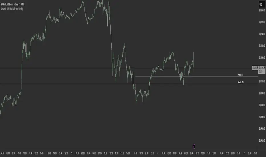
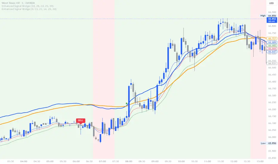
Table ATH and DayQuotes in the middle of a chartJust important things at a glance ..
AlltimeHigh and Daily High/Low

Enhanced Signal Bridge V1For the trading Careers members only base script for any pair on any time frame ( please double check as still a new script)
TSD Quantum [Moeinudin Montazerfaraj] 🔸 "TSD" stands for **Trend 1-2-3 and Supply & Demand**, which is the foundation of the trading style this indicator is built upon.
🔹 TSD Quantum is a specialized indicator designed exclusively for day traders who trade EURUSD, XAUUSD (Gold), and DAX40 on the 1H, 15M, and 5M timeframes using a Supply & Demand-based strategy.
This indicator is **not suitable for other symbols** and has been tailored specifically for these three assets to ensure high precision and effectiveness.
---
### 🔍 Key Features:
✅ **Trading Checklist Panel**
A built-in checklist helps you track every rule in your trading plan. If even one condition is left unchecked, the system highlights it in red and marks the trade as "Not Allowed." This feature enhances trading discipline.
✅ **Spread & ATR Control Panel**
Supports both auto-calculated and fixed values for spread and ATR. This is especially helpful when placing stop-losses quickly and accurately.
✅ **Inside & Outside Candle Detection**
A dedicated panel highlights whether the last candle is inside or outside. Hovering your mouse over the chart elements automatically colorizes the candles:
🔵 Blue = Outside candle
🔴 Red = Inside candle
Also displays the high/low of the latest outside bar.
✅ **Weekly Trade Stats Panel**
Custom-built for the mentioned three assets. You can enter your trades using either fixed risk or floating risk models.
✅ **Performance Metrics**
Helps you build and adjust a floating risk model—so you don’t have to enter every trade with the same lot size. Improves risk management across multiple trades.
✅ **Base Candles Display**
Grey and white base candles are marked based on supply and demand zones.
✅ **EOT Candles**
Candles with a green dot underneath indicate valid EOT opportunities for potential move-outs.
✅ **RC (Rejection Candle) Detection**
RC candles are automatically detected to alert you of potential traps or weaknesses during Supply/Demand formations.
---
### ⚠️ Disclaimer
This indicator does **not** issue buy/sell signals and **cannot guarantee profit or prevent loss**. It is a **tool for discretionary trading**, not an automated expert advisor.
All decisions must be made by the trader based on their own strategy and risk tolerance.
This is the **latest tested version** of TSD Quantum. All features have been validated and function as intended. Future updates will be provided if needed.
---
🙏 Thank you for reviewing this script. We hope it becomes a valuable addition to your day trading toolkit!

Traderei Sessions v.1This Indicator shows the daily open, the last 24h daily highs & lows and the last highs & lows of the asia session.
you can increase the lenght of the line manually !
Custom 2 EMA Crossover Candle ColorIn this indicator you can change the moving averages according to you usage.

Cumulative Gain-Loss Ratio This Pine Script indicator is called "Cumulative Gain-Loss Ratio" - a technical analysis tool. Here's what it does for you:
How the Indicator Works:
1. Calculates percentage change for each bar:
It finds how much the closing price changed compared to the previous candle in percentage terms
2. Separates gains and losses:
Positive changes = Gains
Negative changes = Losses (converts to positive values)
3. Takes cumulative totals:
Sums up all gains from the beginning
Sums up all losses from the beginning
4. Calculates the ratio:
Cumulative Gains ÷ Cumulative Losses
What It Tells You:
Ratio > 1: Your total gains exceed losses (good performance)
Ratio < 1: Your total losses exceed gains (poor performance)
Ratio = 1: Gains and losses are equal (break-even)
Practical Usage:
Evaluating long-term performance of a stock or cryptocurrency
Measuring trend strength
Sustained movement above 1.0 line = strong uptrend
Sustained movement below 1.0 line = weak performance
This indicator helps you understand the overall health and momentum strength of an asset by showing the cumulative balance between gains and losses over time.

ORB M15 EarThRiseRAcest indicator trasează automat liniile de high și low pentru candela de 15 minute de la London Open, cu posibilitatea de a schimba culoarea și grosimea liniilor din setări. Ideal pentru strategii de tip opening range breakout. Compatibil cu orice instrument și funcționează pe timeframe de 15 minute.
HARSI Cross Only by G.I.N.e TradingHARSI + SMA Indicator – Description
Indicator Name: HARSI + SMA
Type: Trend/momentum crossover
Displays: Column bars only when a crossover occurs
🧠 What is HARSI?
HARSI stands for Heikin-Ashi RSI.
It is a smoothed version of the traditional Relative Strength Index (RSI), enhanced by applying Heikin-Ashi-style smoothing to both:
The price (using smoothed open/close values), and
The RSI itself (via additional EMA smoothing).
This helps reduce noise, smooth out choppy movements, and highlight more reliable trend reversals.
⚙️ How the indicator works
This version of the indicator:
Calculates a smoothed HARSI value
Calculates a Simple Moving Average (SMA) of the HARSI (period configurable, typically 3 or 5)
Plots a column only when a crossover occurs:
Green column (+1): HARSI crosses above its SMA → potential long signal
Red column (-1): HARSI crosses below its SMA → potential short signal
Nothing is displayed between signals — making this a clean and non-distracting visual trigger tool.


Trend Magic - Modulo Antirumore by G.I.N.e TradingTrend Magic – Description and Optimization
Trend Magic is a trend-following indicator designed to filter out noise and avoid trades during sideways or choppy market conditions. It combines two elements:
CCI (Commodity Channel Index) – used to determine market momentum and direction.
ATR (Average True Range) – used to adjust sensitivity to volatility.
The indicator plots a dynamic line (often color-coded) that changes based on the CCI value:
If CCI is above 0, the line is set to Lower Band (suggesting a bullish environment).
If CCI is below 0, the line is set to Upper Band (suggesting a bearish environment).
This line acts as a trend confirmation filter, helping to ignore signals in non-trending or uncertain conditions.

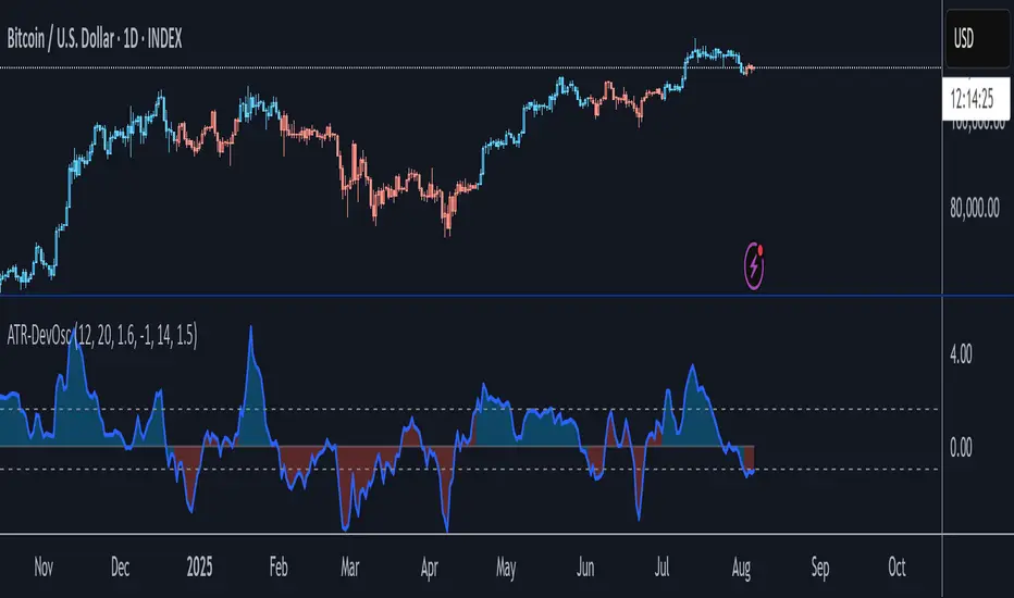
ATR-Scaled Deviation OscillatorATR-DevOsc is a custom momentum-and-volatility adaptive oscillator that scales N-bar price momentum by its rolling deviation and then reacts dynamically to sudden ATR spikes. By shrinking the deviation window when true volatility surges, it amplifies extreme moves—making medium-term trend shifts and deep drawdowns far more likely to breach your predefined thresholds.
Key features include:
• configurable momentum length and separate deviation length for precise control over look-back periods
• ATR Reaction Multiplier to tune how strongly sudden volatility spikes contract the deviation, boosting oscillator amplitude during extreme moves
• independent upper and lower threshold inputs for clear long/short signal definitions
• integrated candle-coloring overlay to immediately visualize trend state on your price chart
• built-in alert conditions for both oscillator-threshold crossovers and ATR-reactive triggers
This indicator is particularly useful for swing traders seeking medium-term entry and exit points in highly volatile markets like BTC. It combines normalized momentum readings with true volatility feedback, so large drawdowns or breakouts generate unmistakable signal events while routine noise stays filtered.
Note: ATR-DevOsc is provided “as is” without formal robustness or optimization testing. Past performance is not indicative of future results; use in live trading only after sufficient back-testing and validation.
Intraday High/Low BandPlots an intraday high low band showing when the stock hits a new daily high/low.
Band can be defined as percentage of the daily range.

Holy Grail Signal op EMA + ADXHolygrail + adx indicator with buy signals so you can buy at the yellow arrow

Year Dividers with LabelsDraws year start markers due visually show start of a year. Useful when looking at year seasonality and related factors

Price Line Indicator
This indicator plots evenly spaced horizontal lines on the price chart starting from a user-defined price. You can customize:
Starting Price
Price Spacing (supports decimals)
Number of Lines
Line Color & Width
Each line is extended across the chart with a label showing its precise price level (up to 4 decimal places). Ideal for marking psychological levels, support/resistance zones, or custom grid setups.

Consolidation Box1. Overview & Purpose
The "Faithful Box" is a powerful TradingView indicator designed to automatically identify and visualize high-quality price consolidation zones, often known as 'trading ranges' or 'boxes'.
This tool is a direct Pine Script translation of a specific, robust Python-based analysis strategy. Its primary goal is not just to find any sideways movement, but to qualify it based on a strict set of rules, ensuring that only meaningful and tradable consolidation patterns are highlighted on the chart.
2. Core Logic: How It Works
The indicator's intelligence is based on several key rules translated from the original Python script:
Box Definition (Based on Closing Prices): The most crucial rule is how the box is defined. Unlike many tools that use candle wicks (highs and lows), this indicator establishes the Ceiling (Resistance) and the Floor (Support) of the box using the highest Close price and the lowest Close price over the specified analysis period. This provides a more stable and representative view of the true consolidation zone, ignoring outlier price spikes.
Quality Filters: A consolidation is only considered valid and drawn on the chart if it meets two strict criteria:
Minimum Touches: The price must "test" the ceiling and floor a minimum number of times. A "touch" is counted with a tolerance — the High of a candle only needs to get close to the ceiling, and the Low close to the floor. This simulates how price interacts with support and resistance zones in the real world.
Maximum Height: The consolidation range cannot be excessively wide or volatile. The box will only be drawn if its total height, as a percentage of its price, is below a user-defined limit.
3. Visual Features on the Chart
When a valid consolidation pattern is detected, the indicator draws a semi-transparent box over the analysis period. The most powerful visual feature is its dynamic coloring, which functions as a built-in alert system:
🟥 Red Box: The box turns red when the price enters the upper "Action Zone" (e.g., the top 30% of the range). This visually signals that the price is near a key resistance level, alerting the trader to a potential reversal or breakout opportunity.
🟩 Green Box: The box turns green when the price enters the lower "Action Zone" (e.g., the bottom 30% of the range). This highlights that the price is testing a key support level.
⬜ Gray Box: The box remains a neutral gray when the price is trading in the middle of the range, which can often be considered a "no-trade" or "wait-and-see" zone.
4. Configuration (Indicator Inputs)
You have full control over the indicator's sensitivity through its inputs:
Analysis Period (days): Defines the lookback window (in trading days) to search for a consolidation pattern. Common values are 42 (approx. 2 months) or 63 (approx. 3 months).
Maximum Box Height (%): Filters out consolidations that are too volatile or wide. A lower percentage will find tighter, more compressed consolidations.
Minimum Ceiling/Floor Touches: Defines the "strength" of the support and resistance levels. Requiring more touches will result in fewer detected patterns, but likely of higher quality.
Touch Tolerance (%): Defines how close the High/Low needs to get to the edge of the box to be counted as a touch. A value of 2% means a touch is registered if the price comes within 2% of the box's total height from the edge.
Action Zone (%): Customizes the size of the red (resistance) and green (support) zones. A value of 30% means the top 30% of the box will be the red zone, and the bottom 30% will be the green zone.

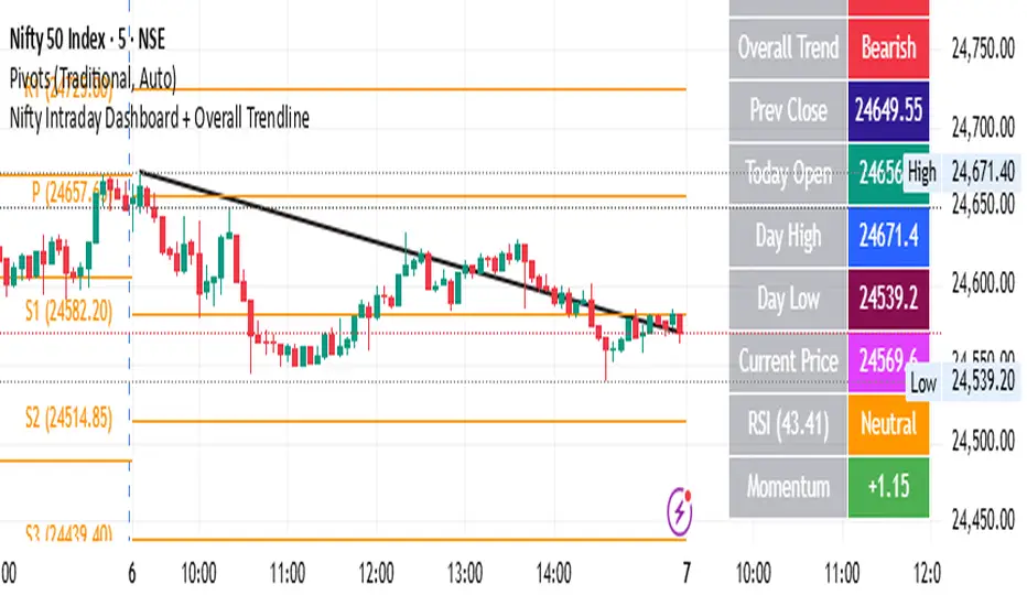
Nifty Intraday Dashboard + Overall TrendlineThis is for educational purpose only. it will show trend line with dashbord
HMA Slope Colorata by G.I.N.e TradingDescription – HMA with Directional Color (Green/Red)
This indicator plots a Hull Moving Average (HMA) on the main chart and dynamically changes its color based on the slope of the line:
🟢 Green: When the HMA is rising (current value is greater than the previous one), indicating bullish momentum
🔴 Red: When the HMA is falling (current value is less than the previous one), indicating bearish momentum
💡 How it works:
The slope is calculated as the difference between the current and previous HMA value:
slope = HMA - HMA
The color change provides instant visual confirmation of the trend direction
It helps traders filter entries by aligning with the prevailing trend
📈 Use case:
Entry filter: Go long only when HMA is green, or short only when HMA is red
Trend confirmation: Combine with momentum or volume indicators for enhanced signal reliability
Works well in trending markets, especially when used with strategies that follow price direction

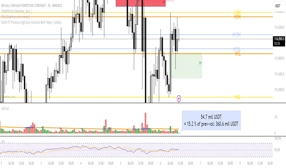
Multi‑TF Previous High/Low (Extends Both Ways + Labels)Use this indicator if you want to automate Support and Resistance levels.
Previous Day High and Low - Green Lines
Previous 4 Hour High and Low - Yellow Lines
Previous 1 Hour High and Low - Orange Lines
Previous 15 Minute High and Low - Light Blue Lines
Follow me on X-
@ADHDTRDR