📅 Non-Euclidean Fib Gibbonaci📅 *Non-Euclidean Fib Gibbonaci**
This indicator dynamically identifies high-probability liquidity zones using a combination of **weekly market structure**, **asymmetric Fibonacci geometry**, and **volume clustering**.
### 🔍 **What It Does:**
* **Detects Weekly Structure Shifts:**
Automatically checks each new week for a break in weekly highs or lows. If a structural change is detected, all liquidity levels are recalculated.
* **Builds Non-Euclidean Fibonacci Ranges:**
Instead of traditional swing-based Fibs, this indicator creates a **distorted Fibonacci zone** around the weekly close using the Golden Ratio (φ ≈ 1.618). This generates asymmetric, forward-projected Fib levels.
* **Volume-Based Liquidity Zones:**
For each projected level, volume is accumulated from the past 50 bars when the price closed near that level. These volumes are then **tiered dynamically based on the previous week’s total volume**.
* **5 Dynamic Volume Tiers:**
Liquidity levels are color-coded based on volume interaction:
* 🔴 **Very High**
* 🟠 **High**
* 🟡 **Mid**
* 🔵 **Low**
* ⚪ **Very Low**
(Thresholds are based on **percentage of last week’s volume**, fully adjustable via settings.)
* **Smart Drawing Engine:**
* Only draws when structure changes.
* Includes inverse bands (bottom-up projections), midlines (optional), and clean auto-clearing of old levels.
* Optional labels show Fib level and volume tier.
* **Predictive Liquidity Zones:**
High-volume extension levels (e.g. Fib 1.272 or above) trigger **"🔺 Potential Top"** and **"🔻 Potential Bottom"** labels, helping to forecast potential exhaustion zones.
---
### ⚙️ **Customizable Settings:**
* Enable/disable:
* Inverse Fibonacci bands
* Midlines between bands
* Volume-based labels
* Adjust:
* Volume tier thresholds (% of prior weekly volume)
* Label display filtering (only show top tiers)
---
### ✅ **Best Used For:**
* Traders who want to identify **key liquidity zones** based on structural shifts.
* Spotting **volume-backed Fib confluences** that may act as magnets or reversal zones.
* Forecasting **potential tops/bottoms** using historical price/volume behavior — dynamically, and in context.
---
### 🚫 No Repainting:
Once weekly structure is established, levels do not repaint. Volume clustering is based on actual historic bar closes.
---
Let me know if you want a shorter version or a version with emojis minimized for a more formal audience.
Indicators and strategies

Yelober - Intraday ETF Dashboard# How to Read the Yelober Intraday ETF Dashboard
The Intraday ETF Dashboard provides a powerful at-a-glance view of sector performance and trading opportunities. Here's how to interpret and use the information:
## Basic Dashboard Reading
### Color-Coding System
- **Green values**: Positive performance or bullish signals
- **Red values**: Negative performance or bearish signals
- **Symbol colors**: Green = buy signal, Red = sell signal, Gray = neutral
### Example 1: Identifying Strong Sectors
If you see XLF (Financials) with:
- Day % showing +2.65% (green background)
- Symbol in green color
- RSI of 58 (not overbought)
**Interpretation**: Financial sector is showing strength and momentum without being overextended. Consider long positions in top financial stocks like JPM or BAC.
### Example 2: Spotting Weakness
If you see XLK (Technology) with:
- Day % showing -1.20% (red background)
- Week % showing -3.50% (red background)
- Symbol in red color
- RSI of 35 (approaching oversold)
**Interpretation**: Technology sector is showing weakness across multiple timeframes. Consider avoiding tech stocks or taking short positions in names like MSFT or AAPL, but be cautious as the low RSI suggests a bounce may be coming.
## Advanced Interpretations
### Example 3: Sector Rotation Detection
If you observe:
- XLE (Energy) showing +2.10% while XLK (Technology) showing -1.50%
- Both sectors' Week % values showing the opposite trend
**Interpretation**: This suggests money is rotating out of technology into energy stocks. This rotation pattern is actionable - consider reducing tech exposure and increasing energy positions (look at XOM, CVX in the Top Stocks column).
### Example 4: RSI Divergences
If you see XLU (Utilities) with:
- Day % showing +0.50% (small positive)
- RSI showing 72 (overbought, red background)
**Interpretation**: Despite positive performance, the high RSI suggests the sector is overextended. This divergence between price and indicator suggests caution - the rally in utilities may be running out of steam.
### Example 5: Relative Strength in Weak Markets
If SPY shows -1.20% but XLP (Consumer Staples) shows +0.30%:
**Interpretation**: Consumer staples are showing defensive strength during market weakness. This is typical risk-off behavior. Consider defensive positions in stocks like PG, KO, or PEP for protection.
## Practical Application Scenarios
### Day Trading Setup
1. **Morning Market Assessment**:
- Check which sectors are green pre-market
- Focus on sectors with Day % > 1% and RSI between 40-70
- Identify 2-3 stocks from the Top Stocks column of the strongest sector
2. **Midday Reversal Hunting**:
- Look for sectors with symbol color changing from red to green
- Confirm with RSI moving away from extremes
- Trade stocks from that sector showing similar pattern changes
### Swing Trading Application
1. **Trend Following**:
- Identify sectors with positive Day % and Week %
- Look for RSI values in uptrend but not overbought (45-65)
- Enter positions in top stocks from these sectors, using daily charts for confirmation
2. **Contrarian Setups**:
- Find sectors with deeply negative Day % but RSI < 30
- Look for divergence (price making new lows but RSI rising)
- Consider counter-trend positions in the stronger stocks within these oversold sectors
## Reading Special Conditions
### Example 6: Risk-Off Environment
If you observe:
- XLP (Consumer Staples) and XLU (Utilities) both green
- XLK (Technology) and XLY (Consumer Disc) both red
- SPY slightly negative
**Interpretation**: Classic risk-off rotation. Investors are moving to safety. Consider defensive positioning and reducing exposure to growth sectors.
### Example 7: Market Breadth Analysis
Count the number of sectors in green vs. red:
- If 7+ sectors are green: Strong bullish breadth, consider aggressive long positioning
- If 7+ sectors are red: Weak market breadth, consider defensive positioning or shorts
- If evenly split: Market is indecisive, focus on specific sector strength instead of broad market exposure
Remember that this dashboard is most effective when combined with broader market analysis and appropriate risk management strategies.

Mariam Smart FlipPurpose
This tool identifies high-probability intraday reversals by detecting when price flips through the daily open after strong early-session commitment.
How It Works
A valid flip occurs when:
The previous daily candle is bullish or bearish
The first hour today continues in the same direction
Then, the price flips back through the daily open with a minimum break threshold (user-defined)
This setup is designed to catch liquidity grabs or fakeouts near the daily open, where early buyers or sellers get trapped after showing commitment
Signal Logic
Buy Flip
Previous day bearish → first hour bearish → price flips above open
Sell Flip
Previous day bullish → first hour bullish → price flips below open
Features
Configurable flip threshold in percentage
Signals only activate after the first hour ends
Daily open line displayed on chart
Simple triangle markers with no visual clutter
Alerts ready to use for automation or notifications
Usage Tips
Use "Once Per Bar" alert mode to get notified immediately when the flip happens
Works best in active markets like FX, indices, or crypto
Adjust threshold based on asset volatility
Suggested stop loss: use the previous daily high for sell flips or the previous daily low for buy flips
Suggested take profit: secure at least 30 pips to aim for a 1:3 risk-to-reward ratio on average

Murrey Math Lines v6Murrey Math Lines v6
This is not just another Murrey Math indicator. It's a complete, ground-up modernization of the classic concept, rebuilt with the latest Pine Script features for unparalleled performance, accuracy, and usability. While preserving the core mathematical genius of T.H. Murrey's system, this version introduces a suite of modern tools designed for today's trader.
What are Murrey Math Lines?
Murrey Math Lines (MML) are a powerful system of support and resistance based on geometric formulas developed by T.H. Murrey. As a derivation of W.D. Gann's observations, Murrey's geometry simplifies Gann's theories into a more accessible application. The core principle is that price action tends to trend and retrace in 1/8th intervals.
These intervals create a "trading octave" with distinct levels, each having its own characteristic behavior:
& - Ultimate Resistance & Support: These lines are the hardest to break. They represent the top and bottom of the expected price range and are prime areas for reversals.
- Major Pivot: This is the most significant level, offering the strongest support and resistance within the octave. Price has a high probability of stopping and reversing here.
& - Strong Pivot/Reversal: These are strong, secondary pivot points where price often struggles to pass through.
& - The Trading Range: The price tends to consolidate between these two lines about 50% of the time. A decisive break outside this range often signals the start of a new trend.
& - Weak Support/Resistance: These levels are weaker, but when price moves too quickly towards them, they can act as initial stopping points or areas for a minor reversal.
& - Extended Octave: These lines show extreme overbought and oversold conditions beyond the primary 0/8 to 8/8 octave.
Modern Enhancements in This Version
Session-Locked Precision: Anchor the Murrey Lines to the start of a specific trading session (e.g., NYSE open). The levels remain constant for the entire session, providing a stable and reliable framework for your daily analysis.
Visual Trading & Reversal Zones: Instead of just lines, this indicator can fill the key trading range (3/8 to 5/8) and reversal zones (0/8-1/8 & 7/8-8/8) with color, giving you an instant visual reference of market sentiment.
Dynamic "Closest Price" Labels: Declutter your chart! The indicator can intelligently display only the label for the Murrey level closest to the current price, keeping your view clean while providing critical information at a glance.
Integrated Alert System: Never miss a key level touch again. Set up alerts for when the price approaches major lines, the trading range, or all lines, customized to your trading style.
Advanced Pine Script Engine: Built on a modern codebase using User-Defined Types and dynamic drawing objects (line, box, label). This ensures the indicator is fast, efficient, and non-repainting, even on lower timeframes.
Intuitive User Interface: Settings are neatly organized into collapsible groups with clear tooltips, making it incredibly easy to customize every aspect of the indicator, from calculation parameters to colors.
A Note on Accuracy
Some of the other Murrey Math indicators on TradingView use different formulas and therefore produce varying results. This version has been carefully checked against MML indicators on other professional platforms to ensure its calculations are accurate and reliable.
Credits
This indicator is a complete overhaul and modernization of the original "MM Lines " script. Full credit for the original calculation logic and concept goes to its author, JRL_6.

Smart Pro Strategy – Buy/Sell + Elliott + Squeeze + Dashboard📊 Smart Momentum Pro – Complete Intraday Strategy for Stocks, Crypto, and Indices
✅ What’s Included:
• Buy/Sell signals based on price action, volume, and momentum
• Elliott Wave detection (1, 3, 5, A, B, C)
• Live market summary table with trend direction and volatility
• Fibonacci-based reversal zone
• Squeeze alert system with visual chart notifications
• Smart EMA 8/21/50/200 tracking
• Fully designed for black charts and red/green candles
• Perfect for BTC, ETH, SPY, HIMS, and more
🧠 Timeframes: Ideal for 5min, 15min, 1h, and Daily charts.

GK Accounting - Gold Trading Signalhi this is new indicator for trading anytime frame any market its work really good

Spaghetti 2.0 - Multi-Asset Performance [By Barbell_Fi]This is an updated and more opinionated take on the original Spaghetti indicator.
Multi Asset Performance indicator (also called “Spaghetti”) makes it easy to monitor the changes in Price, Open Interest, and On Balance Volume across multiple assets simultaneously, distinguish assets that are overperforming or underperforming, observe the relative strength of different assets or currencies, use it as a tool for identifying mean reversion opportunities and even for constructing pairs trading strategies, detect "risk-on" or "risk-off" periods, evaluate statistical relationships between assets through metrics like correlation and beta, construct hedging strategies, trade rotations and much more.
Start by selecting a time period (e.g., 1 DAY) to set the interval for when data is reset. This will provide insight into how price, open interest, and on-balance volume change over your chosen period. In the settings, asset selection is fully customizable, allowing you to create three groups of up to 30 tickers each. These tickers can be displayed in a variety of styles and colors. Additional script settings offer a range of options, including smoothing values with a Simple Moving Average (SMA), highlighting the top or bottom performers, plotting the group mean, applying heatmap/gradient coloring, generating a table with calculations like beta, correlation, and RSI, creating a profile to show asset distribution around the mean, and much more.
One of the most important script tools is the screener table, which can display:
🔸 Percentage Change (Represents the return or the percentage increase or decrease in Price/OI/OBV over the current selected period)
🔸 Beta (Represents the sensitivity or responsiveness of asset's returns to the returns of a benchmark/mean. A beta of 1 means the asset moves in tandem with the market. A beta greater than 1 indicates the asset is more volatile than the market, while a beta less than 1 indicates the asset is less volatile. For example, a beta of 1.5 means the asset typically moves 150% as much as the benchmark. If the benchmark goes up 1%, the asset is expected to go up 1.5%, and vice versa.)
🔸 Correlation (Describes the strength and direction of a linear relationship between the asset and the mean. Correlation coefficients range from -1 to +1. A correlation of +1 means that two variables are perfectly positively correlated; as one goes up, the other will go up in exact proportion. A correlation of -1 means they are perfectly negatively correlated; as one goes up, the other will go down in exact proportion. A correlation of 0 means that there is no linear relationship between the variables. For example, a correlation of 0.5 between Asset A and Asset B would suggest that when Asset A moves, Asset B tends to move in the same direction, but not perfectly in tandem.)
🔸 RSI (Measures the speed and change of price movements and is used to identify overbought or oversold conditions of each asset. The RSI ranges from 0 to 100 and is typically used with a time period of 14. Generally, an RSI above 70 indicates that an asset may be overbought, while RSI below 30 signals that an asset may be oversold.)
⚙️ Settings Overview:
◽️ Period
Periodic inputs (e.g. daily, monthly, etc.) determine when the values are reset to zero and begin accumulating again until the period is over. This visualizes the net change in the data over each period. The input "Visible Range" is auto-adjustable as it starts the accumulation at the leftmost bar on your chart, displaying the net change in your chart's visible range. There's also the "Timestamp" option, which allows you to select a specific point in time from where the values are accumulated. The timestamp anchor can be dragged to a desired bar via Tradingview's interactive option. Timestamp is particularly useful when looking for outperformers/underperformers after a market-wide move. The input positioned next to the period selection determines the timeframe on which the data is based. It's best to leave it at default (Chart Timeframe) unless you want to check the higher timeframe structure of the data.
◽️ Data
The first input in this section determines the data that will be displayed. You can choose between Price, OI, and OBV. The second input lets you select which one out of the three asset groups should be displayed. The symbols in the asset group can be modified in the bottom section of the indicator settings.
◽️ Appearance
You can choose to plot the data in the form of lines, circles, areas, and columns. The colors can be selected by choosing one of the six pre-prepared color palettes.
◽️ Labeling
This input allows you to show/hide the labels and select their appearance and size. You can choose between Label (colored pointed label), Label and Line (colored pointed label with a line that connects it to the plot), or Text Label (colored text).
◽️ Smoothing
If selected, this option will smooth the values using a Simple Moving Average (SMA) with a custom length. This is used to reduce noise and improve the visibility of plotted data.
◽️ Highlight
If selected, this option will highlight the top and bottom N (custom number) plots, while shading the others. This makes the symbols with extreme values stand out from the rest.
◽️ Group Mean
This input allows you to select the data that will be considered as the group mean. You can choose between Group Average (the average value of all assets in the group) or First Ticker (the value of the ticker that is positioned first on the group's list). The mean is then used in calculations such as correlation (as the second variable) and beta (as a benchmark). You can also choose to plot the mean by clicking on the checkbox.
◽️ Profile
If selected, the script will generate a vertical volume profile-like display with 10 zones/nodes, visualizing the distribution of assets below and above the mean. This makes it easy to see how many or what percentage of assets are outperforming or underperforming the mean.
◽️ Gradient
If selected, this option will color the plots with a gradient based on the proximity of the value to the upper extreme, zero, and lower extreme.
◽️ Table
This section includes several settings for the table's appearance and the data displayed in it. The "Reference Length" input determines the number of bars back that are used for calculating correlation and beta, while "RSI Length" determines the length used for calculating the Relative Strength Index. You can choose the data that should be displayed in the table by using the checkboxes.
◽️ Asset Groups
This section allows you to modify the symbols that have been selected to be a part of the 3 asset groups. If you want to change a symbol, you can simply click on the field and type the ticker of another one. You can also show/hide a specific asset by using the checkbox next to the field.

BOS mark-out (by Lumiere)Advanced BOS Detection with Strict Swing Confirmation
This indicator implements BOS detection with several unique features:
🔹 Dual-Candle Swing Validation - Unlike most BOS indicators that use single candle swings, this uses a two-candle confirmation for swing highs/lows, analyzing both the candle wicks and body transitions.
🔹 Directional Lock System - Implements a state machine that prevents duplicate signals until an opposite-direction BOS occurs, reducing noise.
🔹 Precision Wick Analysis - Compares wicks between the reversal candle and confirmation candle to identify the true swing point.
🔹 Real-Time Update & Live Market Adaptation – The indicator continuously monitors price action and instantly updates BOS signals as new candles form, ensuring you never miss a BOS.
How It Differs From Other BOS Indicators:
Most public BOS indicators use simple HH/HL or LH/LL detection.
Many don't implement the directional locking mechanism.
Few use the two-candle wick comparison approach.
Wick-Based Precision uses the extreme wicks of two candles (not just the body).
Strict Confirmation requires a close beyond the swing point (no "wick breaks" counted).
Usage Examples:
🟦 Bullish BOS:
A green candle closes, followed by a red candle. This will be the new high, and if the next candle closes above the highest wick of those two, it will be a BOS (only if we had a bearish BOS before)
🟥 Bearish BOS:
A red candle closes, followed by a green candle. This will be the new low, and if the next candle closes below the lowest wick of those two, it will be a BOS (only if we had a Bullish BOS before)

EMAZoner+ 0.5EMAZoner – Your new perspective on trends!
Want to always know where a trend starts and ends? Looking for a simple yet visually powerful tool to help you instantly spot key moments for entries and exits? EMAZoner is here for you!
This indicator is designed for anyone who wants to:
- Instantly see where a trend begins and ends (whether you trade short or long term)
- Have clear BUY/SELL signals and trend peaks marked directly on the chart
- Quickly distinguish strong and weak trends thanks to colored backgrounds and a clear info table
- Track current trends not only on your timeframe, but also on higher ones (M15, M30, H1) – perfect for multi-timeframe analysis
- Keep your chart clean with minimalist labels and dotted lines that guide you straight to the right candle
- Get market and trend strength stats without complicated setup
EMAZoner is suitable for everyone – from beginners to experienced traders. It helps you avoid unnecessary noise, quickly find key zones, and make decisions with more confidence.
Try EMAZoner and take your analysis to the next level!

TimeframeToStringToolLibrary "TimeframeToStringTool"
Maps a worded string for timeframes useful when working with the input.timeframe input. Use like timeframeToString("120") and the output will be "2 hour"
timeframeToString(timeframeString)
Converts timeframe strings e.g. 60" will return Day
Parameters:
timeframeString (string)
Returns: returns a map

BK AK-SILENCER (P8N)🧩 BK AK-SILENCER (P8N)
CVD Bollinger Band Engine | Dynamic Flash | Structure Zones | Divergence Panel
🧠 Introduction
This is the second half of the AK-SILENCER system: BK AK-SILENCER (P8N) — a standalone CVD panel that amplifies stealth detection with volatility-based bands, dynamic flash alerts, and smart structural analysis.
This panel works on its own, but was engineered to pair perfectly with BK AK-SILENCER overlay.
🔎 What “P8N” Means
P8N = Precision. 8 Dimensions. Noise-filtered.
8 represents balance, cycles, infinite feedback, and control — all concepts deeply tied to Gann, geometry, and institutional rhythm.
This engine reads volume through volatility — not price. It detects shifts where real moves begin — quietly.
⚙️ Core Weapon Systems
✅ CVD Line + MA + Fill Logic
See the cumulative volume delta with trend tracking and real-time color fills.
✅ Bollinger Bands
Standard deviation bands built around the signal line — not price. Shows real overbought/oversold based on volume movement.
✅ Dynamic Flash Backgrounds
When CVD pressure reaches extremes, the background flashes — silently warning of potential pivots or continuation.
✅ Divergence Detection
Automatic structural divergence plotted between price and CVD — with configurable pivot logic.
✅ Structure Lines (optional)
Visual anchors: session opens, POC, deviation bands, value zones, and structural support/resistance pivots.
🎯 How to Use It
Flash + CVD breaches upper band = momentum continuation
Flash + divergence = prepare for mean-reversion
Divergence + POC/value area = sniper entry
Combine with BK AK-SILENCER overlay bar colors = full market read
💡 Perfect For
Momentum traders who wait for pressure confirmation
Reversal traders looking for structure + volume misalignment
Pattern and time traders syncing Gann, Elliott, and Fib setups
Swing traders seeking multi-layered confirmation
🔧 Customize It. Share It. Grow It.
No tool is perfect out of the box — it must fit your flow.
🛠️ Test your BB deviation values. Adjust dynamic flash settings. Tune pivot logic.
💬 Then share your favorite combos in the comments.
What worked for you might unlock clarity for someone else.
If this helped you — return the favor. Drop your blueprint.
🔗 Works Best With
➡️ BK AK-SILENCER
Together, they detect what price alone cannot. One sees aggression. One sees intent.
Overlay + Panel = Total Edge.
🙏 Pay It Forward
This was built through the lessons of a mentor who gave selflessly — and the blessing of Gd who gave structure to the chaos.
If this gave you insight:
🔹 Teach someone
🔹 Post your best settings
🔹 Share what you've learned
🔹 Help the next person trade with discipline
We’re not here just to win. We’re here to evolve — and bring others with us.
To my mentor — A.K. — this is yours.
To Gd — the source of wisdom — this is for Your glory.
—
Silent. Steady. Strategic.
🎯 BK AK-SILENCER (P8N) — See what others miss.
Gd bless your precision, purpose, and patience. 🙏

Standard Deviation + Z-scoreThis indicator calculates the standard deviation of close prices over the last N periods, where N is a user-defined input. Three rays above and below the current price indicate three standard deviations. The summary in the top right corner shows the number of bars N, the mean value over the period, standard deviation as percentage and Z-score of the current price.

BK AK-SILENCER🔊 BK AK-SILENCER
Volume Footprint Overlay | CVD Divergence | VWAP Sync | Extreme Volume Alerts
🧠 Introduction
With discipline and humility, I present the BK AK-SILENCER — a tactical overlay tool built for real-time bar decoding, smart divergence detection, and stealth-level volume aggression tracking.
This indicator is one half of a two-system stealth engine — the other being BK AK-SILENCER (P8N) — together forming a fully integrated divergence and structure-mapping weapon.
🔫 The Meaning Behind “SILENCER”
Just like a true silencer functions — quiet, deadly, and undetected — this tool operates beneath the surface, filtering out noise and revealing the real power behind the candles.
Institutions move in silence.
They don’t chase price. They build, shift, load, and unload with surgical stealth.
This tool is designed to catch the footprints of giants — to detect where volume spikes silently, where divergence whispers truth, and where smart money leaves behind subtle clues.
The initials “AK” honor my mentor — the man who taught me to trade with purpose, clarity, and discipline.
This tool is part of his legacy.
⚙️ What It Does
✅ Volume Bar Coloring
Reveals bullish, bearish, and neutral aggression with real-time coloring — based on spike logic, closing strength, and volatility-adjusted thresholds.
✅ CVD Divergence Detection
Automatically detects price vs volume divergence using pivot logic — mapped clearly with visual markers.
✅ Extreme Volume ‘$’ Alerts
When volume goes silent, this system waits. But when volume spikes abnormally — it marks it.
✅ VWAP Overlay
Anchored VWAP to sync trades with liquidity zones and institutional behavior.
🎯 How to Use It
Bullish divergence + accumulation color = sniper long entry.
Bearish divergence + weakness color = fade or reversal opportunity.
Extreme volume spike + structure = momentum entry or exit zone.
Use with BK AK-SILENCER (P8N) for complete stealth confirmation.
💡 Perfect For
Breakout traders confirming momentum with smart volume
Swing traders aligning VWAP and aggression
Mean-reversion setups catching divergence extremes
Gann, Elliott, Harmonic traders syncing pattern + pressure
🔧 Customize It. Share It. Grow It.
This isn’t a one-size-fits-all tool.
Your timeframe, instrument, and rhythm are yours. Play with the settings. Tune them to your strategy.
🛠️ Experiment with volume thresholds, pivot lookbacks, and spike logic.
💬 Then share your results in the comments — help someone sharpen their edge.
This is a community for precision traders. If this helped you — leave something behind for the next sniper.
🔗 Works Best With
➡️ BK AK-SILENCER (P8N)
A standalone CVD panel with volatility bands, dynamic flash alerts, and divergence recognition.
Together, they form a complete silent detection system. Radar + Scope.
🙏 A Final Word: Pay It Forward
This tool exists because someone once taught me — with time, patience, and love.
If it brings you clarity or consistency:
🔹 Share a chart
🔹 Answer a question
🔹 Drop your best settings
🔹 Help someone who's learning
We rise by lifting others.
And we build true edge by honoring those who helped us build ours.
Above all — praise to Gd, who gives structure to chaos and wisdom to those who ask.
—
Stay calm. Stay silent. Stay precise.
💥 BK AK-SILENCER — Locked. Zeroed. Silent.
Gd bless. 🙏

Path of Least ResistancePath of Least Resistance (PLR)
Concept Overview
The Path of Least Resistance indicator identifies key zones on your chart that act like "muddy" or "sticky" areas where price tends to get bogged down, creating choppy and unpredictable price action. Between these zones lie the "empty spaces" - clear paths where price can move freely with momentum and direction.
The Analogy: Muddy Fields vs Open Roads
Think of your chart like a landscape:
🟫 ZONES (Muddy/Sticky Areas)
Fair Value Gaps (FVGs) from higher timeframes
Pivot wick zones from higher timeframe pivots
Areas where price gets "stuck" and churns
Like walking through thick mud - slow, choppy, unpredictable movement
Price action becomes erratic and difficult to trade
🟢 EMPTY SPACES (Open Roads)
The clear areas between zones
Where price can move freely with momentum
Like driving on an open highway - smooth, directional movement
The "Path of Least Resistance" for price movement
Trading Philosophy
AVOID Trading Within Zones:
Price action is typically choppy and unpredictable
Higher probability of false signals and whipsaws
Like trying to drive through mud - you'll get stuck
TRADE Through the Empty Spaces:
Look for moves that travel between zones
Price tends to move with momentum and direction
Higher probability setups with cleaner price action
Like taking the highway instead of back roads
Zone Types Detected
Fair Value Gaps (FVGs)
Imbalances from higher timeframe candles
Areas where price "owes" a return visit
Often act as magnets, creating choppy price action
Pivot Wick Zones
Upper and lower wicks from higher timeframe pivots
Rejection areas where price previously struggled
Often create resistance/support that leads to choppy movement
Color Coding System
The zones dynamically change color based on current price position:
🔴 RED ZONES : Price is below the zone (bearish context)
🟢 GREEN ZONES : Price is above the zone (bullish context)
🔘 GRAY ZONES : Price is within the zone (neutral/choppy area)
The "Mum Trades" Strategy
The best trades - what we call "Mum trades" (trades so obvious even your mum could spot them) - happen in the empty spaces between zones:
✅ High Probability Characteristics:
Clear directional movement between zones
Less noise and false signals
Higher momentum and follow-through
Cleaner technical patterns
❌ Avoid These Areas:
Trading within the muddy zones
Expecting clean moves through sticky areas
Fighting against the natural flow of price
Key Features
Auto Timeframe Detection : Automatically selects appropriate higher timeframe
Dynamic Zone Management : Overlapping zones are automatically cleaned up
Real-time Alerts : Get notified when price enters/exits zones
Visual Clarity : Clean zone display with extending boundaries
How to Use
Identify the Zones : Let the indicator mark the muddy areas
Find the Paths : Look for clear spaces between zones
Plan Your Trades : Target moves that travel through empty space
Avoid the Mud : Stay away from trading within the zones
Follow the Flow : Trade with the path of least resistance
Remember
Price, like water, always seeks the path of least resistance. By identifying where that path is clear (empty spaces) versus where it's obstructed (zones), you can align your trading with the natural flow of the market rather than fighting against it.
The goal is simple: Trade the highways, avoid the mud.

Dynamic Laguerre Filter Bands | OttoThis indicator combines trend-following and volatility analysis by enhancing the traditional Laguerre filter with a dynamic, volatility-adjusted band system. Instead of using fixed thresholds, the bands adapt in real-time to changing market conditions by applying smoothed standard deviation calculations. This design keeps the indicator responsive to significant price movements while effectively filtering out short-term market noise, resulting in more accurate trend identification and breakout signals.
Core Concept
The indicator is built around the following key components:
Laguerre Filter:
The Laguerre filter is designed to smooth out price data by reducing market noise while still being quick enough to detect real changes in price direction. Its goal is to create a clear, smooth trend line that helps traders/investors focus on the overall market trend without getting distracted by small, random price swings.
It uses a parameter called gamma to control how it balances smoothness and responsiveness:
A lower gamma gives more weight to recent price data, making the filter react faster to new price changes. This means the trend line is more sensitive but may also be less smooth and more prone to small fluctuations.
A higher gamma gives more weight to past price data, making the filter smoother and less sensitive to quick changes. This helps reduce noise and produces a steadier trend line, but it also introduces more lag, meaning the filter reacts slower to new price moves.
By adjusting gamma, the Laguerre filter lets you choose the balance between following price changes quickly and having a stable, noise-free trend signal.
Standard Deviation:
shows how much price varies from the mean. In this indicator, it’s used to measure market volatility.
Volatility Bands: The upper and lower bands are based on an EMA-smoothed standard deviation of price. The EMA reduces sudden jumps in volatility, creating smoother and more stable bands that still respond to changing market conditions. These bands are plotted around the Laguerre filter line, expanding and contracting in a controlled way to stay aligned with real market movement while avoiding short-term noise.
Signal Logic:
A long signal is triggered when the close price crosses above the upper band.
A short signal occurs when the close price falls below the lower band.
⚙️ Inputs
Source: Price source used in calculations
Gamma: Adjusts how much the Laguerre filter responds to price changes. Lower gamma values make the filter react more to recent prices, while higher values give more influence to older data, making the line smoother but slower to respond.
Volatility Length: Period used to calculate standard deviation
Volatility Smoothing Length: EMA smoothing length for standard deviation
Multiplier: Scales the width of the bands based on volatility
📈 Visual Output
Laguerre Filter Line: Plots the laguerre filter line, colored dynamically based on signal direction (green for bullish, purple for bearish)
Upper & Lower Bands: Volatility-based bands that adjust with market conditions. (green for bullish, purple for bearish)
Glow Effect: Optional glow layer to enhance visibility of the laguerre filter trend line (green for bullish, purple for bearish)
Bar Coloring: Candlesticks and bar colors reflect the active signal state for fast visual interpretation (green for bullish, purple for bearish)
How to Use
Apply the indicator to your chart and monitor for signal events:
Long Signal: When price closes above the upper band
Short Signal: When price closes below the lower band
🔔 Alerts
This indicator supports optional alert conditions you can enable for:
Long Signal: Close price crossing above the upper band
Short Signal: Close price crossing below the lower band
⚠️ Disclaimer:
This indicator is intended for educational and informational purposes only. Trading/investing involves risk, and past performance does not guarantee future results. Always test and evaluate indicators/strategies before applying them in live markets. Use at your own risk.

PRO Investing - LevelPRO Investing - Level
📊 Dynamic Support/Resistance
This indicator plots the PRO Investing Level, defined as the midpoint between the highest high and lowest low over the past 252 trading days (default lookback period, equivalent to ~1 year). It acts as a key mean-reversion reference level, useful for identifying potential support/resistance zones or market equilibrium levels.
Features:
🕰️ Option to display only today’s level or historical levels.
⚙️ Customizable lookback period for flexibility across timeframes and strategies.
📉 Teal line plotted directly on the chart, highlighting this institutional-grade level.
Ideal for traders looking to anchor price action to significant historical ranges—particularly useful in mean-reversion, breakout, or volatility compression strategies.

ΔPrecio/Vol + EMA NetVol Escalada RJF V1Indicator Manual: ΔPrice/Vol + EMA NetVolume (Scaled)
1. Introduction
This indicator combines the histogram of (Close – Open) divided by volume with a dynamically scaled EMA of net volume. It helps identify the strength of price movements tied to buying vs. selling volume.
2. Input Parameters
Show Histogram (ΔPrice/Vol): Enable or disable the (Close - Open) / Volume histogram.
Histogram Up Color: Color for positive histogram bars.
Histogram Down Color: Color for negative histogram bars.
Histogram Zero Color: Color for zero-value histogram bars.
Show EMA NetVolume: Enable or disable the net volume EMA line.
EMA NetVolume Period: Number of bars for the net volume EMA calculation.
EMA Up Color: Color for the EMA when net volume is positive.
EMA Down Color: Color for the EMA when net volume is negative.
EMA Line Width: Thickness of the EMA line.
Dynamic Scale Window: Number of bars for calculating the EMA scaling factor.
3. Visualization and Interpretation
• The histogram displays (Close – Open) / Volume, colored by candle direction.
• The net volume EMA shows accumulated buying vs. selling volume.
• EMA above zero indicates buying dominance; below zero indicates selling dominance.
• Both series share the same zero line for easy comparison.
4. Examples of Use
• During a strong uptrend, expect large green histogram bars and the EMA in positive territory.
• In a retracement, red histogram bars appear more frequently and the EMA may cross below zero.
• Adjust the dynamic scale window to fine-tune EMA sensitivity.
5. Troubleshooting
• If you do not see the histogram, ensure "Show Histogram" is enabled.
• If the EMA overshadows the histogram, tweak the dynamic scale window.
• Customize colors for better visibility on different chart backgrounds

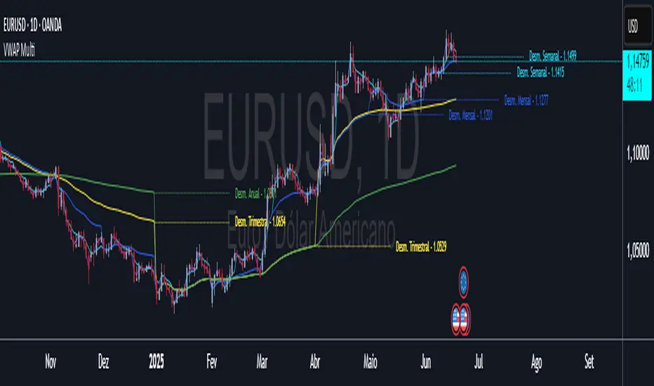
VWAP Multi-Timeframe VWAP Multi-Timeframe - Complete Professional Indicator
🚀 WHAT IS IT?
The VWAP Multi-Timeframe is an advanced indicator that combines 5 different VWAP periods in a single tool, providing a complete view of market fair value levels across multiple time scales.
⭐ KEY FEATURES
📊 5 Configurable VWAPs:
🟡 Daily VWAP - Ideal for day trading and intraday operations
🟠 Weekly VWAP - Perfect for swing trading
🔵 Monthly VWAP - Excellent for medium-term analysis
🔴 Quarterly VWAP - Essential for quarterly strategies
🟢 Yearly VWAP - Fundamental for long-term investments
🎯 Multiple Price Sources:
Choose the source that best fits your strategy:
Close - Closing price (most common)
OHLC4 - Complete average (smoother)
HLC3 - Typical price (default)
HL2 - Period midpoint
Open/High/Low - Specific prices
💡 HOW TO USE
For Day Traders:
Use Daily VWAP as main fair value reference
Prices above = buying pressure / Prices below = selling pressure
For Swing Traders:
Combine Weekly and Monthly VWAP to identify trends
Look for confluences between different timeframes
For Investors:
Quarterly and Yearly VWAP show long-term value levels
Excellent for identifying entry points in investments
🔧 TECHNICAL FEATURES
✅ Pine Script v6 - Latest and optimized version
✅ Clean Interface - User-friendly design

Initial Balance (London Session) - UTC+1 (Box Only)Initial balance for the new day
first two hours of the London session for UTC+1

RSI Distance & BB Width OnlyThis indicator shows the Relative Strength Index Distance Bollinger Bands Width

SMA 20/50 Crossover Strategy - Peter GangmeiSMA 20/50 Crossover Strategy – Peter Gangmei
This indicator visualizes a classic moving average crossover strategy using Simple Moving Averages (SMA). It plots the 20, 50, and 200 period SMAs and generates clear Buy and Sell signals based on the crossover between the 20 and 50 SMAs:
✅ Buy Signal: When the 20 SMA crosses above the 50 SMA
🔻 Sell Signal: When the 20 SMA crosses below the 50 SMA
📈 The 200 SMA is also plotted for long-term trend context.
Visual cues are displayed on the chart using up/down triangles to indicate entry opportunities. The script also includes built-in alerts so you never miss a trading signal.
Ideal for traders who want a simple, visually intuitive way to follow trend shifts and momentum.

TASC 2025.07 Laguerre Filters█ OVERVIEW
This script implements the Laguerre filter and oscillator described by John F. Ehlers in the article "A Tool For Trend Trading, Laguerre Filters" from the July 2025 edition of TASC's Traders' Tips . The new Laguerre filter utilizes the UltimateSmoother filter in place of an exponential moving average (EMA) in its calculation, offering improved responsiveness and reduced lag.
█ CONCEPTS
As Ehlers explains in his article, the Laguerre filter is a form of transversal filter . A transversal filter calculates an output signal using a tapped delay line . It creates multiple delayed versions of an input signal, applies weight to each delay, and then calculates their sum to generate the filtered result.
The Laguerre filter's structure relies on Laguerre polynomials — solutions to a differential equation solved by Edmond Laguerre in the 1800s. When Ehlers analyzed the formula for these polynomials on discrete systems (e.g., financial time series), he found that the first term's expression corresponds to an EMA response, and all subsequent terms correspond to an all-pass response. In contrast to other filter types, an all-pass filter produces phase shift (i.e., delay) in an input signal's components without affecting its amplitude.
Ehlers observed that these characteristics of Laguerre polynomials make them suitable for use in a transversal filter structure, and thus the Laguerre filter was born. However, he notes that EMAs are not great filters in general. As such, to improve on the Laguerre filter's design, Ehlers modified it by replacing the EMA term with his UltimateSmoother filter. The resulting Laguerre filter has significantly reduced lag, achieving a tighter response to market fluctuations while maintaining smoothness. Ehlers suggests that traders can analyze crossings between the UltimateSmoother and this Laguerre filter, or those between two Laguerre filters of different order, for helpful buy and sell signals.
In addition to the Laguerre filter, Ehlers derived a smooth, low-lag oscillator based on the difference between the first and second terms in the modified filter structure, scaled by the root mean square (RMS). The resulting oscillator provides an alternative filtered representation of market data, which can help traders identify swing and mean-reversion signals.
█ USAGE
This indicator calculates both the Laguerre filter and the Laguerre oscillator described in Ehlers' article. It displays the Laguerre filter on the main chart pane and the oscillator in a separate pane.
Users can control the behavior of the filter and oscillator with the inputs in the "Settings/Inputs" tab:
The "Period" input defines the critical period of the UltimateSmoother used in the Laguerre filter and oscillator calculations. Its default value is 30.
The "Gamma" input determines the weighting behavior of the Laguerre filter and oscillator. It accepts a positive value between 0 and 1. Use a lower value for quicker responsiveness to market changes, and a higher value for trends. The default value is 0.5.
The "RMS length" input determines the length of the RMS calculation for oscillator normalization. The default value is 100 bars.
