TopChartPatterns
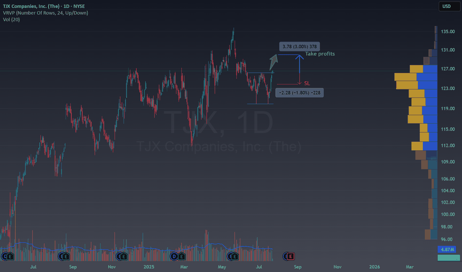
PremiumTechnical Overview NYSE:TJX is currently trading around $126.72 and is forming a double bottom. Breaking the 126$ activates the double bottom in the middle of a bull trend , which is a bull pattern inside another bull pattern, could you imagine a better moment to buy? Fundamental Arguments Consistent Growth: TJX has delivered steady revenue and earnings...
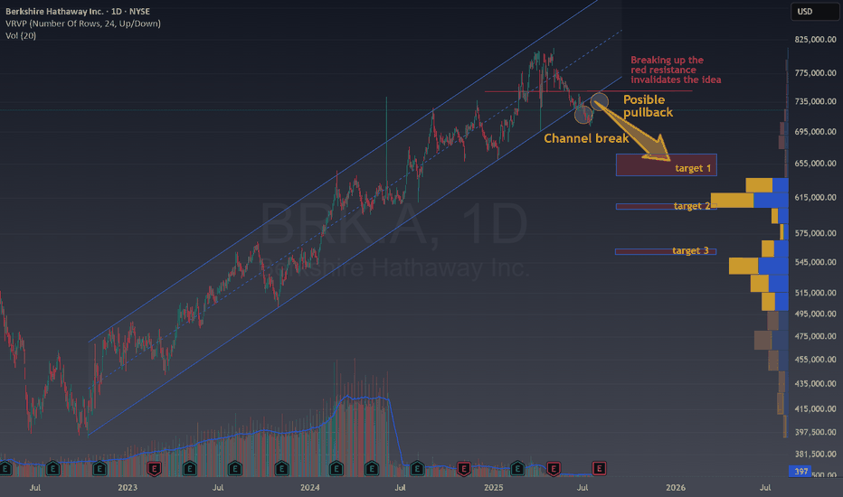
Technical Overview Looking at the current NYSE:BRK.A chart, several signals suggest a potential shift from the prior bullish trend: Channel Break : Price has broken down from a long-standing ascending channel, which often marks the end of an uptrend and the start of a consolidation or a bearish phase. Possible Pullback: After the channel break, the...
In the right bottom you can see the Daily chart for EUR/USD: The chart shows the EUR/USD on a daily timeframe. There was an initial strong rise of 1,700 pips, marked as a 100% move. After this, the price corrected downward by 1,084 pips, which is 61.8% of the previous rise. The 61.8% retracement is a common Fibonacci level, often signaling a reversal...
Losing such a large trendline is always a bad signal for a company. The price can easily fall from 15 to 25% in the upcoming weeks or months, take care with this stock unless you are shorting. This is especially significant while we are seeing Indexs, BTC and more doing new all time highs. A SL in the -5% zone is enough to be protected from volatility.
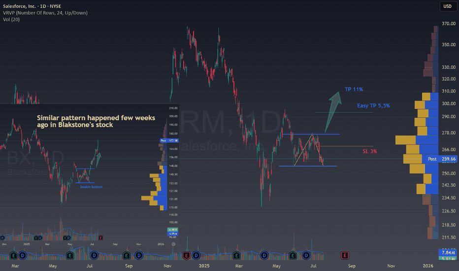
🚀 CRM Bullish Double bottom unfolding Ticker : Salesforce, Inc. (CRM) Timeframe : 1D (Daily Chart) Setup Type : Potential Double Bottom / Range Breakout Bias : Bullish Reversal Technical Breakdown CRM is showing signs of forming a potential bottoming structure after a sharp decline and a period of sideways consolidation. We're currently sitting near the...
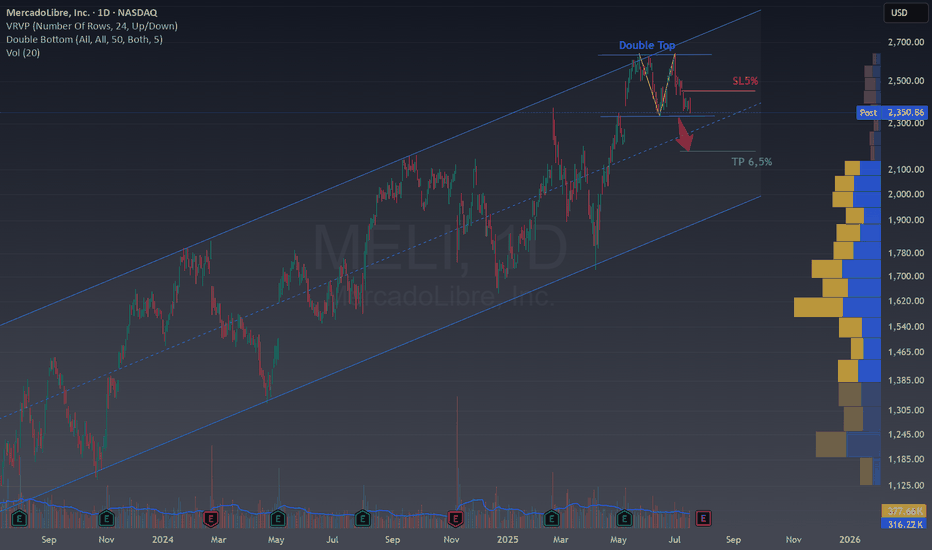
🧠 Double Top in MELI – Potential Reversal Inside a Channel Ticker : MercadoLibre, Inc. (MELI) Timeframe : 1D (Daily Chart) Pattern : Double Top Bias : Bearish Reversal within a Bullish Channel Technical Breakdown We're spotting a clean Double Top at the upper boundary of a long-term ascending channel , a key zone where price has struggled multiple...
🧠 Double Top Breakdown on NYSE:AER Ticker : AerCap Holdings N.V. (AER) Timeframe : 1D (Daily Chart) Pattern : Double Top Strategy : Bearish Reversal ✍️ Analysis We’ve got a textbook Double Top forming after a strong bullish rally. Price failed to break above the $118 resistance twice, forming the classic M-shape. The neckline is around $113.50,...
BITSTAMP:BTCUSD Today: Momentum Builds Toward the Next Breakout Previously on BTC... 1. Double Top Pattern and Target Hit The chart shows a classic double top (early 2025), a bearish reversal pattern. Once the neckline broke, the price plunged and nailed the technical target (red arrow)—as if Bitcoin had read the textbook. 2. Trendline Break = Game...
✅ 1. Buy Zone Identified The “Buy zone” is a green area where the price has recently been consolidating (moving sideways). 💡 If the price breaks above this level or shows strength here, it could be a good opportunity to enter a long (buy) trade. 🎯 2. Take Profit Target: +11% The “Take Profits” line above the buy zone suggests a potential 11% upside....
Dollar Tree NASDAQ:DLTR is bringing us an historical buy opportunity. The $60 zone has been a major support since 2016 and now we have tested it twice. When this happens there are 2 scenarios: 1. A very big rally demonstrating that this support level is still strong (+40% minimum opportunity) . 2. A fast break downwards facing a very bad situation and a...
Even though I post Chart patterns that have finished or are almost finished, let met share with you an unfolding pattern in EUR/JPY so you can easily follow it. EUR/JPY has been rallying lately after a sharp decline this summer and this is forming a HEAD AND SHOULDERS pattern. This kind of patterns work over 90% of the time and the returns in the first 20 days...
🟢 BRENT has no choice!! VELOCITY:BRENT is trading calmly amid the international volatility, this is a rare situation and the market is narrowing more and more. ✅ What pattern is unfolding in FANG? Many patterns are unfolding together, but the most inmediate is a small triangle that will bring us some volatility once it is broken. 💰 How to trade this chart...
🔴 EIX is presenting a fantastic second chance for traders. A new opportunity has appeared on the NYSE:EIX chart. A few days ago, we had the breakout of a double top, which has already set a risk-free trade in motion. Now, it offers a chance for those who missed out to enter a new trade by taking advantage of a pull-back. The last pull-back offered by EIX in...
🟢 Where is Bitcoin and why will hit $200.000 In the chart, you can see all halvings marked by blue vertical lines. The analysis is as simple but strong. After each halving, there is a bull period of 1 to 1.5 years. The last halving was in April 2024, so the maximum price should be reached in April 2025 or during the summer of 2025. Taking a step back to see the...
Life360 helps families stay connected and safe. It lets you share your location in real-time with loved ones, get alerts when someone arrives or leaves a specific spot, and even warns you if there's a car accident. Plus, it offers roadside assistance and identity theft protection. This could also have several applications in the industry and location of important...
After a period of sideways trading, 3M has clearly shown where its resistance levels are—and this is dynamite for traders. If the price breaks above the current resistance, we could be in for a very interesting rally, especially if it also surpasses the previous all-time high at 165. This offers a great opportunity to enter a position in 3M with the potential for...
🧱 1. Pattern: Triple Top At the top of the chart, you’ll notice the label “Triple top pattern”. This is a bearish pattern that appears when the price hits the same resistance level three times but fails to break above it. 💡 It usually means the buyers are getting weaker, and the price might start going down. 📉 2. Sell Signal (Breakdown) The price has...
Apple’s stock has clearly lost its bullish momentum this year, and the chart you shared sums it up perfectly. Let’s break down what’s happening and why investors are shifting focus to companies like Nvidia and Microsoft. Chart Says : Weak Rebounds (green), Bearish Pressure (blue channels are now more agresive) Downtrend Channels: The chart shows Apple...


