How to Use the TradingView Search Bar Efficiently 01. Introduction to the TradingView Search Bar
The TradingView Search Bar is one of the most essential tools in your charting journey. Located at the top-left corner of the interface, this feature allows you to instantly switch between stocks, indices, crypto assets, forex pairs, futures, and more — without leaving your current chart tab.
Whether you're a day trader looking for high-volume movers or an investor monitoring global indices, the search bar makes it effortless to pull up symbols with lightning speed.
One of the best parts? You don’t even need to click anything — just start typing on your keyboard while a chart is open, and the search bar automatically activates.
Pro Tip: The TradingView Search Bar supports symbol auto-suggestions with exchange suffixes (like .NS for NSE stocks), making it ultra-fast for Indian markets too.
02. How to Open the Symbol Search Bar
Opening the symbol search bar in TradingView is incredibly intuitive — and can be done in multiple ways depending on how fast you want to move.
Here are the top 3 ways to launch the search bar:
• 🔘 Click the Symbol: Go to the top-left corner of your chart and click the current symbol (e.g., NIFTY or BTCUSD) to open the search panel.
• ⌨️ Start Typing: When your chart is focused, just begin typing any symbol directly — the search window pops up instantly.
• 📚 Use the Watchlist: Open a saved symbol from your Watchlist using a simple click, and it automatically replaces the current chart.
Shortcut Key:
Just press your keyboard and type RELIANCE or NIFTY without clicking anywhere — TradingView immediately opens the search popup.
Works on both Windows and Mac.
03. Extended: Exploring the Search Interface (Tab-by-Tab Breakdown)
The TradingView Symbol Search Interface is more than just a place to look up stock names. It’s a powerful filtering system designed to help traders and investors access any instrument—globally and across asset classes—in just a few clicks. Let’s break down each tab and filter in detail:
🔍 1. Asset Type Tabs
Located at the top of the search panel, these tabs let you narrow down by instrument type:
• All – View all available instruments.
• Stocks – Equity shares from global exchanges (e.g., NSE, NASDAQ, BSE, etc.).
• Funds – Includes ETFs, mutual funds, and index funds.
• Futures – Derivative contracts across commodities, indices, etc.
• Forex – Currency pairs like USDINR, EURUSD, GBPJPY, etc.
• Crypto – Popular cryptocurrencies like BTC, ETH, and exchange pairs.
• Indices – Market indices like NIFTY50, S&P 500, NASDAQ100.
• Bonds – Government and corporate bond listings.
• Economy – Macro-economic indicators like GDP, unemployment, CPI.
• Options – Derivative instruments based on options chain availability.
💡 Pro Tip: Use these tabs before typing a symbol to narrow down your focus instantly.
🌍 2. All Countries Filter
You can choose to see instruments only from specific countries. Selecting this opens a country-wise list showing all supported exchanges under each country.
• USA: NASDAQ, NYSE, CBOE, OTC
• India: NSE, BSE
• UK: LSE
• Germany: XETRA, FWB
🔎 Use Case: If you only want Indian stocks, choose India to limit the results to NSE/BSE only.
🧾 3. All Types Filter (Only under Stocks Tab)
This filter lets you refine your equity instrument type, such as:
• Common Stock
• Preferred Stock
• Depository Receipt (like ADR/GDR)
• Warrant
🔍 Use Case: Great for global investors looking specifically for ADRs or warrants.
🧭 4. All Sectors Filter (Only under Stocks Tab)
This is one of the most powerful tools for equity screening. You can filter stocks based on their sector like:
• Finance
• Technology Services
• Health Technology
• Consumer Durables
• Electronic Technology
• ... and 20+ more industry segments
💼 Use Case: Perfect for sector-based trading or thematic investing.
⚙️ Power Feature: All filters can be used in combination. Example: You can search only Technology sector stocks from India, of Common Stock type — all in seconds.
05: Using the Flag to Add Symbols to Watchlist
The 🚩 flag icon in TradingView allows you to tag symbols with color-coded labels for easy watchlist management. You can organize your stocks by strategy, sector, volatility, or timeframe using these flags.
🎯 What Does the Flag Icon Do?
• Click the 🚩 icon next to any symbol in the search panel.
• Choose from 7 different colors to group stocks by theme.
• Flagged stocks immediately appear under that color in your Watchlist.
You can create multiple groups — like F&O, Crypto, Sectors, Swing Picks — all visually organized.
🔍 06: Smart Search Tricks (Symbol Syntax, Exchanges, Shortcuts)
The TradingView Symbol Search bar supports intelligent filters, shortcuts, and exchange-based syntax to save time and improve accuracy. Mastering these tricks will allow you to switch charts and find instruments faster than ever.
🧠 1. Use Exchange Prefixes
You can directly use exchange prefixes to narrow your search:
NSE: – National Stock Exchange of India
BSE: – Bombay Stock Exchange
NASDAQ: – U.S. Nasdaq-listed stocks
NYSE: – New York Stock Exchange
👉 Example: NSE:RELIANCE shows Reliance on NSE instantly.
💡 2. Partial Name Works Too
You can type partial symbols after the exchange code and TradingView will auto-suggest:
🔎 Example: Typing NSE:REL shows Reliance Industries and others.
⚡ 3. Avoid Full Company Names
Typing full company names like “Reliance Industries Ltd” might not show accurate results quickly. Instead, use ticker codes or shortcuts with exchange prefixes for better precision.
🎯 4. Type Directly to Open Search
No need to click the 🔍 icon! Just start typing on the chart:
Windows/Mac: Type any symbol (e.g. INFY)
Use Arrows: ⬆️ ⬇️ to move between results
Press Enter: to select symbol instantly
🌐 5. Use Filter Tabs Above Search
TradingView lets you filter across:
Markets: All / India / US / Global
Types: Stocks / Crypto / Forex / Futures
Sectors: Banks / Tech / Pharma / Energy
💡 Pro Tip: Combine NSE: + partial ticker + filters to drill down fast without leaving the chart screen
Community ideas

Blueprint for Becoming a Successful Forex Trader in 2025🚀 Blueprint to Becoming a Successful Forex Trader in 2025: Leveraging ICT, Automation, and Prop Funding
Here’s a detailed, actionable blueprint designed to position you for success by carefully navigating broker selection, adopting advanced trading strategies, obtaining prop funding, and integrating automation and AI technologies into your trading.
🏦 Broker Selection (Actionable Steps)
🔍 Choose brokers with true ECN/STP execution
⚡ Ensure brokers offer low spreads (0.0-0.2 pip average) and fast execution to maximize ICT precision entries.
🛡️ Prioritize brokers regulated by ASIC, FCA, or FSCA with verified Myfxbook execution reports.
📊 Confirm broker compatibility with MetaTrader 4 (MT4) to seamlessly integrate Expert Advisors (EAs).
💳 Check for flexible withdrawal/deposit methods and swift payouts (Crypto, Wise, Revolut).
🎯 Trading Strategy (ICT Concepts & Supply-Demand Zones)
🧠 Master ICT Concepts: Liquidity sweeps, Order Blocks (OB), Fair Value Gaps (FVG), Market Structure Breaks (MSB).
📍 Combine ICT with Supply-Demand: Identify institutional supply-demand zones aligning with ICT Order Blocks & liquidity areas.
📐 Execute High-Probability Setups: Trade only after liquidity grabs at key daily/weekly ICT points, avoiding retail traps.
📈 Time & Price Theory: Trade London Kill Zones and New York Open exclusively, exploiting predictable ICT volatility.
📆 Weekly Preparation: Annotate D1/H4 charts on weekends marking liquidity points, order blocks, and premium/discount zones clearly.
💰 Getting Prop Funding (Actionable Approach)
🥇 Target reputable prop firms (FTMO, MyForexFunds, The Funded Trader, 8cap, etc) with clear and attainable evaluation objectives.
📑 Use ICT trading style for evaluation: lower-frequency, high-probability trades with clearly defined risks.
🎯 Implement strict risk management rules: never exceed 1% risk per trade, aiming for steady account growth (5-10% monthly target).
📊 Monitor performance closely using provided analytics dashboards (e.g., FTMO Metrics App) and adapt accordingly.
📚 Diversify funded accounts across multiple firms, compounding total available trading capital while reducing firm-specific risk.
⚙️ Automating & Executing Trades (MT4 EA & Bots)
🛠️ Hire experienced MQL4 developers to code custom ICT-based MT4 Expert Advisors
🤖 Develop EAs specifically around ICT logic (Order Block detection, liquidity grabs, market structure shifts) and or supply/demand logic
🤖 use advanced algo based breakout EAs for automation
📌 Automate trade management: EAs should handle entry precision, partial exits, break-even stops, and trail stops.
📡 Set EAs on VPS Hosting (NY4, LD4) for optimal latency and consistent execution (ForexVPS, AccuWeb Hosting).
📈 Regularly perform forward-testing and optimization of EAs on demo accounts before live deployment (at least quarterly optimization).
📲 Integrating Advanced Bots and Technology in 2025
📊 Combine your MT4 EAs with third-party analytics platforms for detailed trade performance insights.
🔮 Incorporate AI-based forecasting tools to refine ICT setups and trade signals.
🔔 Use automated bots for real-time alerts on ICT-based setups via Telegram or Discord channels.
🧑💻 Maintain manual oversight for discretionary ICT decisions—use automation for entry efficiency, not blind reliance.
🔄 Continuously retrain and update your bot’s logic monthly using the most recent trade data, ensuring adaptive execution.
🗓️ Daily Routine for Success
🌅 Pre-session (30 mins): Review annotated charts, ICT concepts (liquidity, OB, FVG), and supply-demand levels.
💻 During trading session: Monitor EA execution, manually adjust positions based on real-time ICT setups.
📝 Post-session (15 mins): Journal trades meticulously in detail, noting ICT reasoning behind wins and losses.
📆 Weekly review: Assess overall ICT & EA performance—adjust EA parameters as needed to match evolving market conditions.
📚 Continuous learning: Keep updated on advanced ICT framework,
supply demand zone trading.
📌 Final Actionable Advice for 2025
🔍 Specialize intensely on ICT & supply-demand concepts rather than multiple strategies—depth over breadth.
🚩 Always adapt and evolve your trading algorithms to ICT methodology—market dynamics continually change.
🧘 Maintain emotional discipline and patience, relying on high-probability setups to steadily compound your account.
💡 Stay ahead by embracing technology: automation, AI-driven forecasting, and custom ICT tools will provide a significant edge in 2025.

Could Bitcoin Crash 60%—But Only 20% of Traders Lose?Analyzing the current BTC/USDT chart, we see that Bitcoin is hanging just above a critical support zone—what many traders recognize as “the most important support level” from a volume perspective on Binance. The chart illustrates a potential 60.37% drop, which would pull BTC down nearly $49,000, back toward the high-volume range near $30K.
This sounds catastrophic, right? But here’s the twist...
🔍 Why Only 20% of Traders Might Actually Lose
According to Binance's volume profile data:
The majority of buying activity and position accumulation happened below $35,000.
Most long-term holders and smart money entered during the 2022-2023 accumulation range.
The Volume Profile Visible Range (VPVR) shows significant support below the current price, with minimal trading volume at higher levels.
💡 That means only a minority (approx. 20%) of traders bought BTC during its late-stage bull run above $70K. These are the traders most at risk if a drop occurs.
In contrast, the majority are still sitting in profit—or near break-even—even if Bitcoin retraces back to its base.
📊 So while the price could drop 60%, 80% of holders might remain safe, having entered at lower levels.
🧠 What This Means for You:
If you're a late bull, it’s time to assess risk.
If you're a smart accumulator, the pullback could offer another golden entry.
If you're a bear, this chart supports your thesis—but don't forget the whales are watching this zone closely.
Stay sharp. Stay informed.

Example of how to draw a trend line using the StochRSI indicator
Hello, traders.
If you "Follow", you can always get new information quickly.
Please click "Boost" as well.
Have a nice day today.
-------------------------------------
I have explained how to draw a trend line before, but I will take the time to explain it again so that it is easier to understand.
-
When drawing a trend line, it must be drawn on the 1M, 1W, and 1D charts.
However, since I focused on understanding the concept of drawing a trend line and the volatility period that can be seen with a trend line, I will explain it only with a trend line drawn on the 1D chart.
Please note that in order to calculate a somewhat accurate volatility period, support and resistance points drawn on the 1M, 1W, and 1D charts are required.
I hope this was helpful for understanding my thoughts on the concept of drawing trend lines and how to interpret them.
The main reason for drawing trend lines like this is so that anyone who sees it can immediately understand why such a trend line was drawn.
Then, there will be no unnecessary disagreements about the drawing, and each person will be able to share their opinions on the interpretation.
--------------------------
When drawing trend lines, the StochRSI indicator is used.
The reason is to secure objectivity.
When the StochRSI indicator touches the oversold zone and rises, the low corresponding to the peak is connected to draw a trend line between low points.
And, when the StochRSI indicator touches the overbought zone and falls, the Open of the downward candle corresponding to the peak is connected to draw a trend line between high points.
If the peak is not a downward candle, it moves to the right and is drawn with the Open of the first downward candle.
If you refer to the candlesticks of the arrows in the chart above, you will understand.
The trend line drawn as a dot is a high-point trend line, but it is a proper trend line because it does not touch the overbought zone between highs.
Therefore, you can draw a trend line corresponding to trend line 1.
Accordingly, around March 25-29, around April 8, and around April 14 correspond to the volatility period.
-
You can see how important the low-point trend line (2) is.
If the high-point trend line is properly created this time and the low-point trend line and the high-point trend line are displayed in the same direction, the trend is likely to continue along that channel.
If the StochRSI indicator rises and a peak is created in the overbought zone, you will draw a high-point trend line that connects to point A.
-
Thank you for reading to the end. I hope your transaction will be successful.
--------------------------------------------------

How to Trade After Major News Events – The 15-Min Trap SetupHello Traders!
We all get excited when major news hits the market — whether it’s budget day, RBI policy, US inflation data, or company results . But jumping in too early can be a trap. Smart money often creates fake moves in the first few minutes. That’s where the 15-Min Trap Setup becomes a powerful tool for intraday traders.
Let me show you how to avoid traps and catch real moves after news events.
Why the First 15 Minutes Matter
Emotions are high: Retail traders often react instantly without confirmation. This creates liquidity for big players.
Fake breakouts happen often: Price breaks key levels in the first candle — then reverses and traps traders.
Volume is misleading: The biggest volume often comes early, but the real direction is seen later.
The 15-Min Trap Setup – How It Works
Step 1: Wait for the first 15-minute candle to close after a big news event — don’t trade before that.
Step 2: Mark the high and low of this 15-minute candle.
Step 3: Wait for a fake breakout above or below that range — if price breaks out but quickly comes back inside, it’s a trap.
Step 4: Enter in the opposite direction of the breakout after confirmation — ride the real move.
When to Use This Strategy
Major economic events – like Fed decisions, budget day, inflation data, RBI policies.
Company results – high-impact earnings or news releases.
Gap up/gap down openings after big global cues.
Rahul’s Tip
Don’t react — observe. Let the market show its trap. Big players love early overconfidence. Use their game to your advantage by planning around the 15-min candle.
Conclusion
The 15-Min Trap Setup helps you avoid emotional trades and catch the real move after major news. Be patient, mark your zones, and strike when the trap is confirmed. This simple rule can completely change your intraday game.
Have you ever been trapped in the first candle after news? Let’s share experiences below and grow together!

Mastering Market Trends: Your Guide to Clearer Trading DecisionsTrends shape every decision you make in the markets, even if you’re unaware of it. Understanding how to identify and adapt to these market phases is your foundational skill - one that separates successful traders from the rest.
Today, let’s simplify and clarify the three essential types of market trends. By mastering this, you’ll approach trading decisions with more confidence and clarity.
⸻
📈 1. Uptrend – Riding the Bull
• What is it?
An uptrend is like climbing stairs upward. Each step (low) is higher than the previous one, and every leap (high) sets a new peak.
• What drives it?
Buyers dominate, optimism rules, and demand pushes prices upward.
• Trading tip:
Identify support levels and look for retracements as potential entry points. Be cautious about chasing prices that have moved too far without a pullback.
⸻
📉 2. Downtrend – Navigating the Bearish Territory
• What is it?
Visualize going down a staircase. Each step down (low) surpasses the previous one, and every upward bounce (high) falls short of the prior peak.
• What drives it?
Sellers control the market, bearish sentiment takes over, and supply outweighs demand.
• Trading tip:
Look for resistance areas to identify potential short entries or wait patiently for signs of a reversal if you’re bullish.
⸻
➡️ 3. Sideways Market – The Calm Before the Storm
• What is it?
Imagine a tug-of-war with evenly matched teams. The price moves back and forth in a narrow range without breaking decisively higher or lower.
• What drives it?
Uncertainty, indecision, or equilibrium between buyers and sellers.
• Trading tip:
Stay patient! Either look to trade range extremes (buying support and selling resistance) or wait for clear breakout signals to catch the next big move.
⸻
🔍 Pro Tip for Trend Analysis:
• Multi-timeframe analysis is key: Always check higher timeframes (weekly, daily, or hourly) to confirm the primary trend. Don’t let short-term noise mislead your trading decisions.
⸻
🚀 Why It Matters:
Aligning your strategies with the correct market trend significantly improves your odds. It’s like sailing with the wind at your back instead of battling against it.
Now, tell us in the comments: Which trend type do you find most challenging to trade?
Trade smarter. Trade clearer.

Clear DayTrading strategy video. The "Inside Bar"🔉Sound on!🔉
📣Make sure to watch fullscreen!📣
Thank you as always for watching my videos. I hope that you learned something very educational! Please feel free to like, share, and comment on this post. Remember only risk what you are willing to lose. Trading is very risky but it can change your life!

DCA Buy Alert Script for Long-Term InvestorsHello, TradingView traders!
I'm sharing a simple Pine Script for cautious DCA (Dollar-Cost Averaging) entries.
This script helps accumulate only on weakness — no buying blindly. (Use only on high volatility altcoins!)
🔍 Strategy logic:
• RSI < 40 → market is oversold
• Price below EMA 21 → short-term trend is down
• Price below SMA 200 → long-term trend is weak
Only when ALL three conditions are met, the script triggers a BUY alert.
✅ How to use:
1. Add the script to your chart
2. Create an alert: choose “Cautious DCA Buy Signal”
3. You’ll get notified when the market dips into a DCA zone
//@version=6
indicator("Cautious DCA on Dips", overlay=true)
rsi = ta.rsi(close, 14)
sma = ta.sma(close, 200)
ema = ta.ema(close, 21)
buySignal = rsi < 40 and close < sma and close < ema
plotshape(buySignal, title="Buy Signal", location=location.belowbar, style=shape.labelup, size=size.normal, color=color.green, text="Buy", textcolor=color.white)
plot(sma, title="SMA 200", color=color.orange)
plot(ema, title="EMA 21", color=color.blue)
alertcondition(buySignal, title="Buy Alert", message="DCA Buy Signal: RSI is low and price is below EMA and SMA")
🔔 This script reduces noise and waits patiently for real dips.
Useful for long-term investors who want to buy with discipline.
Let me know how it works for your strategy!
#DCA #LongTerm

China: 34% Tariffs Against US, Impact on Forex Market
Hello, I am Forex Trader Andrea Russo and today I want to talk to you about China's response to US Tariffs. China's recent decision to impose 34% counter-tariffs on US products represents a significant development in trade tensions between the world's two largest economies. This move, which will take effect on April 10, is a direct response to the 10% tariffs imposed by the United States. The announcement has already had repercussions on global markets, with stocks recording sharp declines. In this article, we will analyze the motivations behind this decision, its economic implications and the impact on the Forex market.
Motivations Behind the Counter-Tariffs
China's decision to impose counter-tariffs is a strategic response to the aggressive trade policies of the United States. The 10% tariffs imposed by the US are aimed at correcting what is perceived as an unfair trade deficit and protecting domestic industries. However, China sees these tariffs as a threat to its economic growth and the stability of its exports. The 34% counter-tariffs are therefore an attempt to rebalance the trade balance and put pressure on the United States to review its policies.
Global Economic Implications
The imposition of counter-tariffs has economic implications that go far beyond the two nations involved. Trade tensions can trigger a series of chain reactions that affect the global economy in various ways:
Increased Production Costs: Companies that rely on imports of raw materials and components from the United States will see an increase in production costs, which could be passed on to consumers in the form of higher prices.
Slower Economic Growth: Trade tensions can lead to a slowdown in global economic growth, as companies may reduce investment due to economic uncertainty.
Inflation: Rising prices of imported goods can contribute to inflation, reducing the purchasing power of consumers and increasing costs for businesses.
Forex Market Impact
The Forex market, known for its sensitivity to geopolitical and economic events, is not immune to the effects of the trade tensions between China and the United States. Here are some of the main impacts:
US Dollar Volatility: The increase in tariffs could weaken the US dollar, as trade tensions tend to reduce investor confidence. Demand for US goods could decrease, negatively impacting the value of the dollar.
Strengthening of the Chinese Yuan: China could see a strengthening of the yuan, as its economy could be perceived as more stable than that of the United States in this context of trade tensions.
Federal Reserve Monetary Policy: The Federal Reserve could be forced to review its monetary policy, with possible interest rate cuts to mitigate the economic impact of the tariffs. This could further impact the Forex market, increasing volatility.
Conclusion
China's decision to impose counter-tariffs of 34% on US products represents a significant development in the trade tensions between the world's two largest economies. The economic implications of this move are vast and complex, affecting not only national economies but also the global Forex market. Investors and analysts will need to monitor these developments closely to fully understand their implications and adjust their strategies accordingly.

Your Best Trading Signal Formula Revealed (Forex, Gold)
If you are looking for a way to increase the accuracy of your trades, I prepared for you a simple yet powerful checklist that you can apply to validate your trades.
✔️ - The trades fit my trading plan
When you are planning to open a trade, make sure that it is strictly based on your rules and your entry reasons match your trading plan.
For example, imagine you found some good reasons to buy USDJPY pair, and you decide to open a long trade. However, checking your trading plan, you have an important rule there - the market should strictly lie on a key level.
The current market conditions do not fit your trading plan, so you skip that trade.
✔️ - The trade is in the direction with the trend
That condition is mainly addressed to the newbie traders.
Trading against the trend is much more complicated and riskier than trend-following trading, for that reason, I always recommend my students sticking with the trend.
Even though USDCHF formed a cute double bottom pattern after a strong bearish trend, and it is appealing to buy the oversold market, it is better to skip that trade because it is the position against the current trend.
✔️ - The trade has stop loss and target level
Know in advance where will be your goal for the trade and where you will close the position in a loss.
If you think that it is a good idea to buy gold now, but you have no clue how far it will go and where can be the target, do not take such a trade.
You should know your tp/sl before you open the trade.
✔️ - The trade has a good risk to reward ratio
Planning the trade, your potential reward should outweigh the potential risks. And of course, there are always the speculations about the optimal risk to reward ratio, however, try to have at least 1.3 R/R ratio.
Planning a long trade on EURNZD with a safe stop loss being below the current support and target - the local high, you can see that you get a negative r/r ratio, meaning that the potential risk is bigger than the potential reward. Such a trade is better to skip.
✔️ - I am ok with losing this trade if the market goes against me
Remember that even the best trading setups may occasionally fail. You should always be prepared for losses, and always keep in mind that 100% winning setups do not exist.
If you are not ready to lose, do not even open the position then.
✔️ - There are no important news events ahead
That rule is again primarily addressed to newbies because ahead and during the important news releases we have sudden volatility spikes.
Planning the trade, check the economic calendar, filtering top important news.
If important fundamentals are expected in the coming hours, it's better to wait until the news release first.
Taking a long trade on Gold, you should check the fundamentals first. Only after you confirm, that there are no fundamentals coming soon, you can open the position.
What I like about that checklist is that it is very simple, but you can use it whether you are a complete newbie or an experienced trader.
Try it and let me know if it helps you to improve your trading performance.
❤️Please, support my work with like, thank you!❤️
I am part of Trade Nation's Influencer program and receive a monthly fee for using their TradingView charts in my analysis.

Tariffs Didn’t Cause the Correction — It Was Coming Anyway🚩 Intro: Markets Correct — They Don’t Need Permission
Every time the market drops hard, the headlines rush in to explain it. This time, it was President Trump’s dramatic tariff announcement on April 2nd. The media called it a shock.
I didn’t.
I’ve been calling for S&P 500 to drop to 5,200, and NASDAQ-100 to 17,500, since early January.
Not because I predicted tariffs. But because the charts told the story.
The market didn’t fall because of politics — it fell because it had to.
________________________________________
🔥 The Spark: Trump’s “Liberation Day” Tariffs
On April 2, 2025, Trump rolled out an aggressive trade agenda:
• 10% blanket tariff on all imports
• Up to 54% tariffs on Chinese goods
• 25% tariffs on imported cars and parts
• With limited exemptions for USMCA-aligned countries
Markets reacted instantly:
• S&P 500 dropped 4.8% — worst day since 2020
• NASDAQ-100 plunged over 6%
• Tech mega caps lost 5–14% in a day
Sounds like cause and effect, right?
Wrong.
________________________________________
🧠 The Real Cause: A Market That Was Ready to Fall
Let’s talk technicals:
• S&P 500 had printed a textbook double top at the 6100–6150 zone
• NASDAQ-100 had formed a rising wedge, with volume divergence and momentum fading
• RSI divergence was in place since February
• MACD had crossed bearish and also deverging
• Breadth was weakening while indices were still pushing highs
• Sentiment was euphoric, volatility crushed — a classic setup
You didn’t need to guess the news. The structure was screaming reversal.
SP500 CHART:
NASDAQ CHART:
________________________________________
🧩 Why Tariffs Made a Convenient Narrative
Markets love clean stories. And Trump’s tariffs offered everything:
• Emotional trigger
• Economic fear factor
• Political drama
• Global implications
But smart traders know better: markets correct based on positioning, not politics.
As soon as the wedge broke on NAS100 and SPX broke the double top's neck line the path was clear — risk off.
________________________________________
📉 I Was Calling This Since Q1
The targets were public:
SPX = 5,200. NAS100 = 17,500.
And the logic was simple:
• Overextension in AI-led tech
• Complacent VIX environment
• Crowded long positioning
• Bearish divergences and fading momentum
Double Top and Rising Wedge on SPX and Nas100
We didn’t need a reason to drop. The market had been levitating without support. All we needed was a trigger — and we got one.
________________________________________
🧭 Lesson: Trade the Structure, Not the Story
Here’s what I hope you take away:
✅ Setups come first. News comes later.
✅ If it wasn’t tariffs, it would’ve been CPI, earnings, Fed minutes, or a bird on a wire
✅ Don’t chase headlines. Anticipate setups.
The best trades aren’t reactive. They’re built on structure, sentiment, and timing — not waiting for CNBC to tell them what’s happening.
________________________________________
🔚 Conclusion: It Was Never About Tariffs
Tariffs were the match.
But the market was already soaked in gasoline.
This correction was technical, predictable, and clean.
📝 Post Scriptum — The Setup Shapes the Narrative
Let me be clear:
I’m not a Trump fan. Hoho — not by far.
But I’ll swear this on any chart:
If the setup had been the opposite — double bottom, falling wedge, positive divergences, and improving momentum — these exact same tariffs would’ve been interpreted as “bold leadership,” “pro-growth protectionism,” or “markets pricing in a stronger America.”
That’s how it works.
Price action leads. Narrative follows.
When structure is bullish, traders celebrate even bad news.
When structure is bearish, even good news becomes a reason to sell.
So no — it wasn’t about Trump. It never is. It’s about where the market wants to go. The rest is storytelling.
Disclosure: I am part of Trade Nation's Influencer program and receive a monthly fee for using their TradingView charts in my analyses and educational articles.

Understanding the ICT Venom ModelIn this video I break down the ICT Venom Model as recently described by the man himself on his YouTube channel. I am sure he has more details on the model he has not released, but I basically attempt to give my two cents on NQ and the model itself.
I hope you find the video useful in your endeavours regarding learning ICT concepts as well as trading in general.
- R2F Trading

Real Reason Most Strategies Fail–“Overfitting” Explained Simply!Hello Traders!
Have you ever seen a strategy work amazingly on historical charts, but fail badly in live markets? You’re not alone. One of the biggest reasons this happens is due to something called Overfitting . Today, let’s understand this concept in the simplest way — so you can avoid falling into this trap and build smarter strategies.
What is Overfitting in Trading?
Overfitting means your strategy is too perfect for past data:
It works great on old charts, but only because it was made to match that exact data.
It fails in real-time because the market changes:
The strategy doesn’t adapt well to new price behavior — it’s not flexible.
Example:
A strategy with 10 indicators giving perfect backtest results may be too specific and only fits that period — not future ones.
Signs Your Strategy Might Be Overfitted
Too many rules or filters:
If your strategy has too many conditions just to improve past results, that’s a red flag.
Works only on one stock or timeframe:
A good strategy should work on different stocks and market conditions.
Great backtest, bad live performance:
If your real trades don’t match the backtest, it might be too customized to the past.
How to Avoid Overfitting in Trading
Keep it simple:
Use fewer indicators and rules. Focus on clean price action and proven setups.
Test on different stocks/timeframes:
See if your setup works across Nifty, Bank Nifty, stocks, or different timeframes.
Use forward testing:
Try the strategy on live charts (paper trade) before putting real money into it.
Rahul’s Tip
A perfect backtest doesn’t mean a perfect future. Build your strategy to be reliable — not just impressive on history.
Conclusion
Overfitting is like memorizing old exam answers and failing the new paper. Don’t build strategies that only look good on past data. Make them strong, simple, and adaptable to real market conditions.
Have you faced this issue before? Let’s discuss in the comments and help each other improve!

401(k)s: A Safe Bet or a Rigged Game?In 2008, the S&P 500 dropped 57% at its lowest, wiping out decades of savings for millions of Americans. People who were 5–10 years from retirement lost everything overnight—and they had no way out.
And here’s the problem:
• 401(k)s are heavily stock-weighted, especially those “target-date” funds that adjust based on age—but not fast enough in a crash.
• No active protection. These funds don’t hedge, use stop-losses, or rotate into cash. If the market dumps, you’re just riding it down.
• No control or transparency. Most people don’t even know what they’re invested in unless they dig deep into fund holdings.
It’s no coincidence that the same Wall Street firms managing 401(k)s make money shorting crashes or getting bailouts, while regular people are told to “just wait it out.” Sure, that might work over decades, but what if you’re close to retirement? Or just don’t want to wait 10 years for a recovery?
The Harsh Reality
• 401(k)s aren’t really optional. They’re the main retirement plan in the U.S., so most people are forced into them with few alternatives.
• Most people don’t actively manage them. They pick a default option, get put into a target-date fund, and hope for the best. That’s where the “sheep” feeling comes in.
• You can’t easily exit. There are penalties for withdrawing early, so in a crash, you’re locked in like a prisoner or financial refugee, while the “big boys” cash out first.
It’s not a scam in a legal sense—but it is a system that favors the knowledgeable and punishes the passive. Those who don’t study markets, adjust their portfolios, or take active control end up paying the price. And sadly, that’s the majority.

What are Tariffs? How They Work and Why They Matter to You?For centuries, tariffs have played a crucial role in global trade, safeguarding domestic industries, shaping international relations, and influencing economic policies. While they often dominate headlines during trade wars and economic policy debates, many people still don’t fully understand what tariffs are, why they are used, and how they impact the economy.
This comprehensive guide covers:
⦿ What tariffs are and how they work
⦿ Different types of tariffs
⦿ Why governments impose tariffs
⦿ The economic, political, and social effects of tariffs.
⦿ Historical and modern examples
⦿ The debate between protectionism and free trade
⦿ Tariffs in different economic systems
⦿ The future of tariffs in a globalized world
By the end of this article, you’ll have a decent understanding of tariffs and their role in the global economy.
🤔 What Are Tariffs?
A tariff is a tax imposed by a government on imported goods and services. The primary purpose of tariffs is to increase the cost of foreign products, making domestically produced goods more attractive to consumers. This serves several economic and political functions, such as protecting domestic industries, generating government revenue, and addressing trade imbalances.
👍 How Do Tariffs Work?
A government sets a tariff rate on imported goods (e.g., 25% on foreign cars).
Importers must pay this tax when bringing goods into the country.
This increases the cost of imported goods, enhancing the competitiveness of domestic alternatives.
Domestic industries benefit from reduced foreign competition.
The government collects revenue from the tariff.
🦸♂ Who Pays the Tariff?
Importers: These businesses or individuals directly pay the tariff when they bring goods into the country. This increases their costs.
Businesses: Since importers face higher costs, businesses that rely on imported goods often pass these costs onto consumers by increasing prices.
Consumers: Ultimately, the general public bears the cost as they pay higher prices for goods affected by tariffs.
🔎 Types of Tariffs
Governments employ various tariffs depending on their economic goals and trade policies. Some of these are:
1️⃣ Ad Valorem Tariffs
An ad valorem tariff is a percentage-based tariff calculated on the value of the imported goods. The tax amount increases or decreases with the price of the product.
Example: A 10% tariff on imported TVs means a $1,000 TV incurs a $100 tariff.
Usage: Commonly used for luxury goods, automobiles, and consumer electronics.
2️⃣ Specific Tariffs
A specific tariff is a fixed fee charged per unit of imported goods, regardless of price.
Example: $3 per barrel of imported oil.
Usage: Often used for commodities like oil, wheat, and alcohol.
3️⃣ Compound Tariffs
A compound tariff includes both a percentage-based tax (Ad valorem) and a fixed fee on imports (Specific). This means importers pay a fixed fee per unit as well as a percentage of the item’s value.
Example: A 5% tax plus $2 per imported cheese wheel.
Usage: Applied to goods where both quantity and value affect the market, such as food products and industrial materials.
4️⃣ Tariff-Rate Quotas (TRQs)
A TRQ allows a limited quantity of an imported good to enter at a lower tariff rate. After the quota is reached, extra imports are taxed at a higher rate.
Example: One of the most well-known examples of a TRQ is the U.S. Sugar Tariff-Rate Quota. The United States allows a certain quantity of sugar to be imported each year at a lower tariff rate. Any sugar imports within the quota limit are subject to a low tariff (e.g., 5%).
However, once the quota is exceeded, any additional sugar imports face a much higher tariff (e.g., 20%). This system ensures that domestic sugar producers remain competitive while still allowing controlled imports to meet demand.
Another example is the European Union's TRQ on Beef Imports. The EU permits a specific amount of high-quality beef imports (e.g., from the U.S. and Canada) at a lower tariff. Once this quota is filled, any additional beef imports are taxed at a significantly higher rate. This policy helps protect EU cattle farmers while maintaining trade agreements with international suppliers.
5️⃣ Protective Tariffs
A protective tariff helps local industries by making imported goods more costly, reducing foreign competition.
Example: The U.S. imposed a 25% tariff on Chinese steel to protect domestic steel manufacturers.
Usage: Commonly used in industries facing strong foreign competition, such as steel, automotive, and textiles.
6️⃣ Revenue Tariffs
A revenue tariff is mainly designed to raise money for the government, not to shield local industries.
Example: In the 19th century, tariffs were the main source of revenue for the U.S. government before income taxes were introduced.
Usage: Often applied to goods that do not have strong domestic competition but are widely consumed, such as alcohol and tobacco.
❓ Why Do Governments Impose Tariffs?
1️⃣ Protecting Domestic Industries
Tariffs shield local businesses from cheaper foreign competitors, helping domestic industries grow.
Example: U.S. steel tariffs in 2018 benefited domestic steel manufacturers.
2️⃣ Generating Government Revenue
Before modern taxation systems, tariffs were a key source of revenue for governments.
Example: In the 1800s, tariffs accounted for 90% of U.S. federal revenue.
3️⃣ National Security Concerns
Some industries, like defense and technology, are crucial for national security, and governments impose tariffs to reduce reliance on foreign suppliers.
Example: The U.S. limits imports of rare earth minerals to ensure a domestic supply chain for defense technologies.
4️⃣ Retaliation in Trade Wars
Countries impose tariffs to address unfair trade practices or economic conflicts.
For instance, during the trade war between the United States and China, both countries imposed taxes on each other's goods
5️⃣ Preventing Dumping
Dumping occurs when a country exports goods at below-market prices to eliminate competition.
Example: The U.S. imposed tariffs on Chinese solar panels due to concerns about dumping.
⚖️ Pros and Cons of Tariffs
Pros
✅ Protects local jobs and industries
✅ Encourages domestic production
✅ Generates government revenue
✅ Enhances national security by reducing reliance on foreign goods
Cons
❌ Increases prices for consumers
❌ Can lead to trade wars and economic retaliation
❌ Encourages inefficiency in domestic industries
❌ Disrupts global supply chains
📕 Historical and Modern Examples of Tariffs
1. The Smoot-Hawley Tariff Act (1930)
The U.S. imposed tariffs on over 20k imported goods.
Result: Other countries retaliated, global trade dropped by 66%, and the Great Depression worsened.
2. Trump’s Tariffs on China (2018-2020)
The United States levied tariffs on $360 billion worth of Chinese goods.
China retaliated, affecting U.S. agriculture exports.
Result: Some U.S. industries benefited, but consumers faced higher prices.
3. The European Union’s Tariffs on U.S. Goods (2021)
The EU imposed tariffs on American whiskey, motorcycles, and jeans in response to U.S. steel tariffs.
Result: Brands like Harley-Davidson saw reduced sales in Europe.
⚙️ Tariffs vs. Free Trade: The Big Debate
The debate between tariffs and free trade is a fundamental discussion in global economics and trade policy. This debate revolves around whether governments should impose tariffs (taxes on imported goods) or embrace free trade (minimal to no restrictions on imports and exports).
◉ Free Trade (No Tariffs)
Free trade is the unrestricted movement of goods and services across borders without tariffs or other trade barriers. Advocates argue that it fosters economic efficiency and global cooperation.
✅✅ Advantages of Free Trade
Lower Prices for Consumers – Without tariffs, imported goods are cheaper, leading to more affordable products.
Increased Economic Growth – When countries trade freely, they specialize in what they do best, leading to higher productivity and economic expansion.
More Competition = Better Products – Companies must compete on quality and innovation rather than relying on government protection.
Stronger Global Relations – Open markets encourage cooperation between nations, reducing the risk of economic conflicts.
Access to More Goods and Services – Consumers enjoy a greater variety of products at lower costs.
❌❌ Disadvantages of Free Trade
Job Losses in Unprotected Industries – Domestic industries that can't compete with cheaper imports may shrink or shut down.
Dependence on Foreign Suppliers – A country may become overly reliant on other nations for essential goods (e.g., medical supplies, electronics).
Potential Trade Deficits – Countries that import more than they export may struggle with imbalances in trade.
◉ Protectionism (Using Tariffs)
Protectionism refers to economic policies that restrict imports through tariffs, quotas, or other barriers to shield domestic industries from foreign competition.
✅✅ Advantages of Tariffs
Protects Local Jobs and Industries – Domestic businesses have a better chance to compete without being undercut by cheaper imports.
Reduces Dependence on Foreign Competitors – A country can maintain its own manufacturing and production capabilities, especially in critical industries like steel, energy, and food.
Generates Government Revenue – Tariffs provide a source of income for governments, which can be reinvested in public services.
Prevents Dumping – Tariffs discourage foreign companies from flooding the market with artificially cheap goods to destroy domestic competition.
❌❌ Disadvantages of Tariffs
Higher Prices for Consumers – Since imported goods are taxed, businesses pass the extra costs to customers.
Risk of Trade Wars – When one country imposes tariffs, others retaliate, leading to economic conflicts that hurt all parties involved.
Encourages Inefficiency – Without foreign competition, domestic companies may become complacent and innovate less.
Disrupts Global Supply Chains – Many industries rely on international suppliers; tariffs can increase production costs and delays.
❇️ The Future of Tariffs in a Globalized World
As economies become more interconnected, tariffs are often seen as barriers to global trade.
Emerging industries, such as digital services, face new trade policy challenges that traditional tariffs do not cover.
With globalization, many nations favor free trade agreements (FTAs) like USMCA and the EU single market to reduce trade barriers.
Climate-related tariffs, such as carbon border taxes, may become more common as nations try to incentivize environmentally friendly trade practices.
📌 Closing Thoughts
Tariffs remain one of the most powerful - and controversial - tools in economic policy. Like a thermostat for trade, they can be adjusted to protect domestic industries, but risk overheating the economy with unintended consequences.
History shows that while tariffs can provide temporary relief for specific sectors, they often create ripple effects across the entire economy. The steel tariffs of 2018 helped some American mills reopen, but made cars and appliances more expensive for everyone.
Neither free trade nor tariffs are perfect solutions. A balanced approach, where tariffs are selectively used for strategic industries while promoting open markets in others, is often the best path.
Each country must decide based on its economic strengths and priorities. For example, developed nations might push for free trade, while developing nations use tariffs to protect growing industries.
As trade policies continue evolving, understanding tariffs gives citizens and businesses crucial insight into how globalization affects prices, jobs, and economic security. The debate isn't about whether tariffs are "good" or "bad," but rather when and how they should be used strategically.
What are your thoughts on the ongoing U.S. tariff war? Share your opinions in the comments! 📩

Using Fibonacci/Measured Moves To Understand Price TargetThis video is really an answer to a question from a subscriber.
Can the SPY/QQQ move downward to touch COVID levels (pre-COVID High or COVID Low).
The answer is YES, it could move down far enough to touch the pre-COVID highs or COVID lows, but that would represent a very big BREAKDOWN of Fibonacci/ElliotWave price structure.
In other words, a breakdown of that magnitude would mean the markets have moved into a decidedly BEARISH trend and have broken the opportunity to potentially move substantially higher in 2025-2026 and beyond (at least for a while).
Price structure if very important to understand.
Measured moves happen all the time. They are part of Fibonacci Price Theory, Elliot Wave, and many of my proprietary price patterns.
Think of Measured Moves like waves on a beach. There are bigger waves, middle waves, smaller waves, and minute waves. They are all waves. But their size, magnitude, strength vary.
That is kind of what we are trying to measure using Fibonacci and Measured Move structures.
Watch this video. Tell me if you can see how these Measured Moves work and how to apply Fibonacci structure to them.
This is really the BASICS of price structure.
Get Some.
#trading #research #investing #tradingalgos #tradingsignals #cycles #fibonacci #elliotwave #modelingsystems #stocks #bitcoin #btcusd #cryptos #spy #gold #nq #investing #trading #spytrading #spymarket #tradingmarket #stockmarket #silver

The Power of Technical Indicators: ETH 4H Chart Breakdown📈 In this analysis, I demonstrate how a combination of key technical indicators can provide high-probability trade setups. By using Auto Fibonacci Gauge, Quantum Moving Average, Momentum Charge Theory, and Smart Money Concept, we can decode market movements with precision.
🔹 Auto Fibonacci Gauge: The Perfect Retracement
The Auto Fib Gauge shows a textbook retracement, respecting key levels like 23.6% & 61.8%.
These levels act as potential reversal zones where price reacts based on trader sentiment.
🔹 Quantum Moving Average & Momentum Charge Theory: Trend Confirmation
The Quantum Moving Average aligns perfectly with the momentum shift, confirming trend direction.
The Momentum Charge Theory further validates entry & exit signals, showing confluence with the Fib levels.
🔹 Smart Money Concept: Tracking Institutional Moves
The SMC method helps identify where large institutional orders (aka smart money) are likely placed.
Key structure points like BOS (Break of Structure) & CHoCH (Change of Character) signal potential trend shifts.
📊 Why is this important?
Combining these indicators enhances probability of successful trades.
Understanding retracements, momentum, and institutional order flows helps traders avoid weak setups and trade with confidence.
🚀 What’s your take? Do you use similar confluences in your trading? Let me know in the comments!

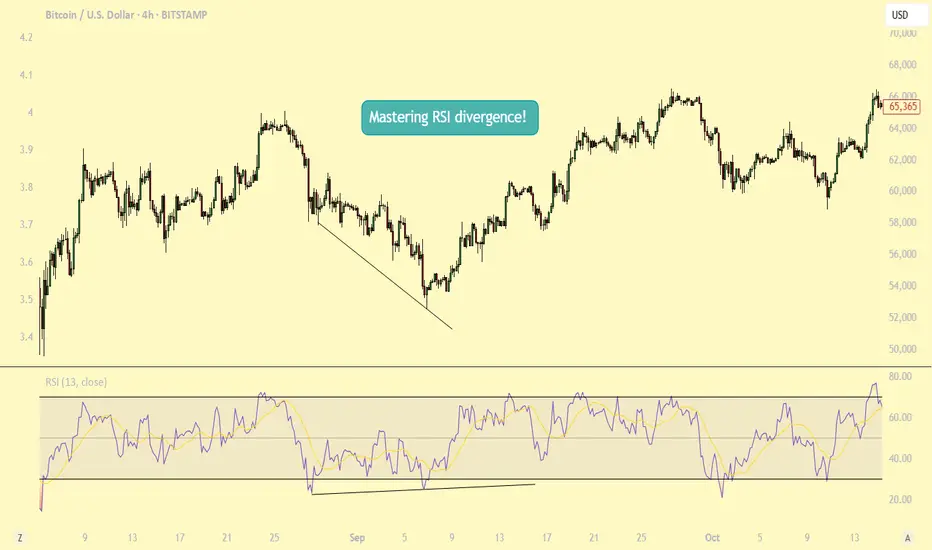
Mastering RSI Divergence: A Complete Guide to Trend ReversalsWhat Are Divergences?
In this guide, we will explore the concept of divergence and how it can be effectively utilized alongside the Relative Strength Index (RSI), one of the most popular momentum indicators in technical analysis. Divergence occurs when the price of an asset moves in the opposite direction of an indicator, such as the RSI. Understanding RSI divergence can be a powerful tool for identifying potential trend reversals or continuations. In this guide, we'll delve into the various types of divergence that can occur with the RSI and how to incorporate them into your trading strategy.
Types of Divergences?
There are three primary types of divergence: bullish, bearish, and hidden divergence. Each signals a distinct market condition and potential outcome, and understanding these nuances is key to using divergence effectively in your trading.
1. Bullish Divergence Bullish divergence happens when the price of an asset makes a lower low, while the RSI forms a higher low. This indicates that although the price is declining, momentum is weakening. The failure of the RSI to confirm the new low in price suggests that selling pressure is diminishing, potentially signaling that a reversal to the upside could occur. Essentially, the market is losing its downward momentum, setting the stage for a potential bullish move.
2. Bearish Divergence Bearish divergence occurs when the price forms a higher high, but the RSI forms a lower high. This indicates that although the price is rising, momentum is weakening. It suggests that the uptrend may be losing steam, signaling that a potential reversal to the downside could be on the horizon. As the price continues higher, but the RSI fails to confirm the new highs, it may indicate that the market is becoming overextended and ready for a correction.
3. Hidden Divergence Hidden divergence differs from regular divergence in that it signals a continuation of the existing trend, rather than a reversal. It typically occurs during pullbacks or retracements in a strong trend. Hidden divergence can appear in both uptrends and downtrends, providing traders with an indication that the prevailing trend is likely to continue after the short-term retracement is over. This type of divergence serves as a confirmation of trend strength and helps traders stay in profitable positions during market pullbacks.
Why Are RSI Divergences a Powerful Tool?
RSI divergence is a powerful tool in trading because it offers early insights into potential trend reversals or shifts in momentum before these changes are fully reflected in price movements. By recognizing divergence, traders can anticipate shifts in market sentiment and make timely decisions. One of the main reasons RSI divergence is so effective is that it serves as an early warning system. It signals when the momentum behind a price trend, whether up or down, is starting to weaken.
For example, in a strong uptrend, if prices continue to make new highs, but the RSI fails to reach new highs, this could signal that the buying momentum is losing strength, even though the price is still rising. This divergence indicates that a reversal or pullback might be imminent, allowing traders to exit their positions or prepare for a potential shift in market direction. Understanding this early warning can provide traders with an edge, helping them avoid being caught in the late stages of a trend and positioning themselves ahead of a change.
How to Trade RSI Divergences?
When the price makes a higher high but the RSI fails to confirm with a higher high, this is known as bearish divergence. While this situation suggests weakening momentum, it doesn’t necessarily mean a correction is imminent. The price may continue to rise for some time, and eventually, the RSI could catch up and make a higher high in line with the price action. Essentially, the market could remain in an uptrend, and the RSI could still align with the price over time.
This highlights the importance of not jumping to conclusions solely based on RSI divergence. Divergence can act as a useful warning, but it should not be relied upon as a definitive signal of a trend reversal. To increase the reliability of the signal, traders should wait for additional confirmation, such as a candlestick pattern indicating a potential trend reversal. Candlestick patterns like engulfing patterns, doji candles, or shooting stars at key support or resistance levels can provide stronger evidence that the trend may be about to change.
Therefore, it’s wise to wait for a more comprehensive confirmation from price action before making a move, rather than acting on divergence alone. Combining RSI divergence with other technical tools, such as candlestick patterns or chart patterns, can help increase the accuracy of your trade decisions.
Conclusion:
Divergence is a powerful tool that provides valuable insights into potential trend reversals or continuations. By understanding the different types of divergence and knowing how to identify them, traders can make more informed decisions. However, divergence should always be used in conjunction with other technical analysis tools to enhance the accuracy of your strategy. With practice, patience, and proper risk management, divergence trading can become a profitable strategy for identifying key market turning points. Whether you are seeking trend reversals or confirming ongoing trends, RSI divergence can be an essential component of your trading toolkit.
Thanks for your support.
- Make sure to follow me so you don't miss out on the next analysis!
- Drop a like and leave a comment!
PL Dot Shapes (Detailed Summary)This idea shall focus on the behavior and structure of PL Dot Shapes, which are crucial in identifying market trends, congestion phases, and potential reversals. Let's deep dive on how to interpret PL Dot formations and recognize patterns that signal market movements.
1. Understanding PL Dot Behavior
- Trend:
PL Dots form a straight line, indicating a clear market direction. A trend stops when the market enters congestion.
- Congestion:
PL Dots move horizontally or “snake” sideways, signaling indecision or balance between buyers and sellers.
- Higher Time Period (HTP) Influence:
PL Dots from the HTP influence those in the Lower Time Period (LTP). Inconsistencies between them may indicate no clear pattern.
- Dot Distance:
Refers to the vertical price difference between consecutive PL Dots.
- Increasing Dot Distance: Indicates trend continuation or strength.
- Decreasing Dot Distance: Suggests trend exhaustion or potential reversal.
2. Key PL Dot Patterns
✅ Yes Pattern (Energy Termination Pattern)
Indicates the end of a trend and potential reversal. This pattern is characterized by signs of exhaustion:
1. PL Dot Pullback: PL Dot moves off the main trend channel, and the angle starts sloping down.
2. Decreasing Dot Distance: Dots get closer together, signaling waning momentum.
3. Exhaustion Signs: The dot pulls within range, with closes moving towards the PL Dot, causing congestion entrance.
4. Block Occurrence: Price likely returns to the area of 2-3 dots back.
5. Crest Formation: A PL Dot crest forms, indicating a potential market top.
6. Directional Shift: Dot directions begin turning downward.
7. Challenges: Be alert to price challenging PL Dot crests and valleys.
---
❌ No Pattern (Non-Termination Pattern)
Indicates that the trend is likely to continue without exhaustion:
1. Similar early behavior to the Yes Pattern but lacks signs of exhaustion.
2. No Significant Pullback: PL Dot may pull within range, but no congestion entrance signs appear (bullish).
3. Price Holds: Prices do not return to the 2-3 dots back area.
4. Weak Crests: No strong crest formation, or it's shallow.
5. Stable Direction: Dot direction struggles to turn down.
6. No Challenges: No challenges to PL Dot crests or valleys, confirming trend strength.
---
3. Trend Pattern (Trend Continuation Pattern)
Describes the start or continuation of a trend, especially in the LTP:
1. Dot Opening: PL Dot opens up, with increasing distance between dots, signaling strong momentum.
2. No Exhaustion: Continuation without signs of exhaustion.
3. Energy Refresh: If price reaches the area of 2-3 dots back, expect high energy on any PL Dot refresh.
4. Dots Out of Range: PL Dots move outside the prior bar’s range, confirming a strong trend.
5. Strong Challenges: Challenges to crests only add momentum to the trend.
6. Stable Direction: Dot direction maintains strength with minimal reversals.
---
4. PL Dot Shapes in Congestion
When the market is in congestion, expect the following:
1. Sideways Dots: PL Dots snake sideways, indicating market indecision.
2. Support/Resistance Holding: The 6-1 lines hold both sides of the congestion area.
3. Congestion Exit Signs: Look for signs indicating the market is ready to break out of congestion.
---
Key Takeaways:
- Trend Continuation: Increasing dot distance and out-of-range dots suggest a strong trend.
- Trend Exhaustion (Yes Pattern): Decreasing dot distance, dot pullbacks, and crest formation signal potential reversals.
- No Pattern: Indicates no exhaustion, suggesting the trend will continue.
- Congestion Behavior: PL Dots snake sideways with key support/resistance levels holding firm.
Understanding these patterns helps traders anticipate market behavior, identify trend reversals early, and manage trades effectively.

FXAN & Heikin Ashi TradeOANDA:AUDCHF
In this video, I’ll be sharing my analysis of AUDCHF, using FXAN's proprietary algo indicators with my unique Heikin Ashi strategy. I’ll walk you through the reasoning behind my trade setup and highlight key areas where I’m anticipating potential opportunities.
I’m always happy to receive any feedback.
Like, share and comment! ❤️
Thank you for watching my videos! 🙏

Roto PumpStage Analysis is a technical analysis method developed by Stan Weinstein, which categorizes a stock's lifecycle into four distinct phases

stage analysis of KEIStage Analysis is a technical analysis method developed by Stan Weinstein, which categorizes a stock's lifecycle into four distinct phases

Triangle Chart Patterns: How to Identify and Trade ThemTriangle Chart Patterns: How to Identify and Trade Them
Triangle chart patterns are essential tools in technical analysis, helping traders identify potential trend continuations. These formations build as the price consolidates between converging trendlines, signalling an upcoming move in the market. In this article, we’ll explore the three types of triangle patterns—symmetrical, ascending, and descending—and how traders use them to analyse price movements.
What Are Triangle Chart Patterns?
Triangle chart patterns are a common tool used to understand price movements in the market. These patterns form when the price of an asset moves within two converging trendlines, creating a triangle shape on a chart. The lines represent support and resistance levels, and as they get closer together, it signals a potential breakout in one direction.
Symmetrical, ascending, and descending are three types of triangle patterns. Each of these patterns reflects a different market sentiment, with symmetrical triangles showing indecision, ascending triangles suggesting a bullish bias, and descending triangles hinting at bearish momentum. These formations are useful because they help traders spot potential breakouts, where the price might move sharply up or down after a period of consolidation.
It’s important to note that triangles and wedge patterns are similar but not the same. Both patterns involve converging trendlines, but wedges tend to slope upward or downward. Triangles, on the other hand, either feature one horizontal trendline and a sloping trendline or two sloping trendlines at roughly the same angle.
Below, we’ll cover the three triangle types. If you’d like to follow along, head over to FXOpen and TradingView to get started with real-time charts.
Symmetrical Triangle
The symmetrical triangle is a popular chart pattern that shows up when the price of an asset starts consolidating within a tighter range. Unlike other triangle patterns, it doesn’t lean heavily in either direction—bullish or bearish—making it a neutral signal. It forms when buyers and sellers are in a bit of a standoff, with no clear trend in sight. However, this period of indecision often leads to a significant move once the price breaks out of the pattern.
What Does It Look Like?
- Two converging trendlines;
- One sloping down from the highs (resistance);
- One sloping up from the lows (support);
- The price oscillates between these two lines, forming lower highs and higher lows;
- The formation narrows as the lines get closer together, creating a point of breakout.
What Does It Indicate?
A symmetrical triangle pattern indicates a period of indecision in the market. Buyers and sellers are evenly matched, causing the price to move within a narrowing range. As it gets smaller, the pressure builds, and the price is likely to break out either up or down. Since the formation is neutral, the breakout could occur in either direction, and traders wait for this moment to see where the market is heading.
How Do Traders Use It?
Traders typically watch for a breakout from the symmetrical triangle to signal the next significant price movement. They often look for an increase in trading volume alongside the breakout, as this can confirm the strength of the move. In most cases, it’s used as a signal for potential price continuation. However, some traders see it as a reversal indicator, depending on what the preceding trend looks like.
Ascending Triangle
An ascending triangle is a bullish triangle pattern that’s often looked for when analysing potential price breakouts. It usually forms during an uptrend but may also appear in a downtrend. It suggests that buyers are becoming more aggressive, while sellers are struggling to push the price lower, creating a situation where the market might break upwards.
What Does It Look Like?
- A horizontal resistance line at the top (price struggles to break above this level);
A rising trendline at the bottom, connecting higher lows (buyers are stepping in earlier each time);
- The price moves between these two lines, creating a triangle shape;
- The formation narrows over time, putting pressure on the resistance level.
What Does It Indicate?
An ascending triangle pattern signals that buyers are gaining control. While the price keeps hitting a ceiling (resistance), the higher lows show that the market’s buying pressure is increasing. This often leads to a breakout above the resistance level, where the price can make a significant upward move. Traders usually see this formation as a sign that the market is primed for a continuation of the current uptrend. However, sometimes it can appear in a downtrend and signal a trend reversal.
How Do Traders Use It?
Traders typically use the ascending triangle to spot potential breakouts above the resistance level. When the price finally moves and closes above this line, it’s seen as confirmation that the upward trend is continuing. Many also pay close attention to the trading volume during this breakout—rising volume can confirm that the breakout is genuine.
In some cases, the price may break through the resistance quickly, while in others, it could take time before the upward move happens. There may also be false breakouts before the true bullish move occurs, with the price typically closing below resistance.
Descending Triangle
A descending triangle is a bearish chart pattern that signals potential downward movement in the market. It typically forms during a downtrend but can also appear in an uptrend. It shows that sellers are becoming more dominant, while buyers are struggling to push the price higher, which could lead to a breakdown below a key support level.
What Does It Look Like?
- A horizontal support line at the bottom (price struggles to break below this level);
- A descending trendline at the top, connecting lower highs (sellers are pushing the price down);
- The price moves between these two lines, creating a triangle shape;
- The formation narrows over time, with the pressure building on the support level.
What Does It Indicate?
A descending triangle chart pattern suggests that sellers are in control. While the price holds at the support level, the series of lower highs shows that selling pressure is increasing. This often leads to a breakdown below the support line, where the price might experience a sharp decline. Traders see the formation as a bearish signal, indicating that the market could continue its downward trend.
How Do Traders Use It?
Traders typically use the descending triangle to identify potential breakdowns below the support level. When the price falls and closes below this line, it’s considered confirmation that the sellers have taken over and that further downside movement could follow.
Similar to other triangle patterns, it’s common to watch for a rise in trading volume during the breakdown, as it can confirm the strength of the move. It’s also possible to see false breakouts below the support level when the price closes back inside the pattern almost immediately.
How Traders Use Triangle Patterns in Technical Analysis
These patterns are just one piece of the puzzle in technical analysis, but they can offer us valuable insights when used correctly.
Triangle Pattern Trading: Entry, Stop-Loss, and Profit Targets
Entry Points
Traders typically wait for a confirmed breakout from the triangle formation’s boundaries before entering a trade. For ascending triangles, this means watching for the price to break above the upper trendline (resistance), while for descending triangles, they look for a breakdown below the lower trendline (support). In a symmetrical triangle, the breakout may be in either direction, usually informed by the broader market trend.
The entry is often confirmed by a closing candle above or below these key levels to reduce the risk of false breakouts.
Stop-Loss Placement
Stop-loss orders are crucial here. For ascending triangles, stop losses might be placed just below the last swing low, while for descending triangles, they might be set just above the recent swing high. In the case of symmetrical triangles, traders often place the stop-loss just outside the formation’s apex.
Profit Targets
To set profit targets, traders typically use the triangle's height (the distance between the highest and lowest points). This height is then projected from the breakout point, offering a realistic target for the trade. For example, if a triangle stock pattern’s height is $10 and the breakout occurs at $50, the target would be $60 for a bullish move.
Combining with Market Context
Triangles may become more reliable when considered in the context of the broader market environment. Traders don’t just look at the pattern in isolation—they analyse the prevailing trend, market sentiment, and even macroeconomic factors to gauge whether a breakout aligns with the larger market movement. For instance, an ascending formation in a strong uptrend adds confidence to the idea of a bullish breakout.
Using Other Indicators for Confirmation
While triangles provide a useful framework, they’re usually combined with other technical indicators for confirmation. Traders often align triangles with volumes, moving averages, or momentum indicators to assess whether the breakout has strong support behind it. For instance, a breakout confirmed by high volume or a moving average crossover might add confluence to the trade.
Limitations and Considerations of Triangle Patterns
Triangles are useful tools in technical analysis, but they come with limitations and important considerations. While they can signal potential breakouts, it’s essential to approach them cautiously.
- False Breakouts: Triangles often experience false breakouts, where the price briefly moves beyond the trendline but quickly reverses. This may trap traders in unfavourable positions.
- Subjectivity: These formations are open to interpretation. Different people may draw trendlines slightly differently, leading to varying conclusions about where the breakout occurs.
- Need for Confirmation: Relying solely on patterns can be risky. They may work better when combined with other indicators, such as volume or moving averages, to confirm the trend direction.
- Market Conditions: In volatile or news-driven markets, chart patterns may not behave as expected, reducing their reliability. They may provide false signals or lose significance in these situations.
The Bottom Line
Triangle chart patterns are popular tools among those looking to analyse market movements and potential breakouts. Whether it’s a symmetrical, ascending, or descending triangle, these patterns provide valuable insights into price consolidation and future trends. While no pattern guarantees a winning trade, combining triangles with other indicators may improve market analysis.
Ready to apply your knowledge? Open an FXOpen account to explore chart patterns in more than 700 live markets and take advantage of our low-cost, high-speed trading environment backed by advanced trading platforms.
FAQ
What Is a Triangle Chart Pattern?
A triangle chart is a pattern in technical analysis that forms when the price of an asset moves between converging trendlines, creating a triangle shape on a price chart. They typically signal a period of consolidation before a strong potential breakout in price.
What Are the Patterns of Triangles?
There are three main types of triangles in chart patterns: symmetrical, ascending, and descending. Symmetrical triangles indicate indecision in the market while ascending triangles are often bullish, and descending triangles tend to be bearish.
How to Trade a Triangle?
Traders typically wait for a confirmed breakout from the triangle’s trendlines. According to theory, entry points are based on a breakout above resistance or below support, with stop-loss orders placed just outside the triangle. Profit targets are often set based on the height (the distance between the highest and lowest points) of the pattern.
What Is the Triangle Pattern Strategy?
The triangle pattern strategy involves waiting for a breakout and using the formation’s height to set profit targets. It’s combined with tools like volume, moving averages, and momentum indicators to confirm the move and avoid false breakouts.
Is the Triangle Pattern Bullish or Bearish?
They can be both bullish and bearish. Ascending triangles are generally seen before a bullish movement, descending triangles are bearish, and symmetrical triangles can be either.
This article represents the opinion of the Companies operating under the FXOpen brand only. It is not to be construed as an offer, solicitation, or recommendation with respect to products and services provided by the Companies operating under the FXOpen brand, nor is it to be considered financial advice.
