understanding how technical workson btc move and learning, we firstly need to view back starting from the week 1 timeframe down to D1 H4 H1 M30 M15 and M5 to understand how the chart move and view. without understanding the past candle knowing the current market wont be easy because the current and past works together so we focus firstly on both, then by checking the move its show to determine what the next movement will give.
Community ideas

Trading Education: Understanding Liquidity (IRL & ERL)In technical analysis (especially SMC/ICT), most price movements are attempts to reach liquidity. This liquidity is what fuels major moves.
* IRL (Internal Range Liquidity): Liquidity located within a defined trading range. This is often represented by Order Blocks, Fair Value Gaps (FVG), or liquidity pools inside the range.
* ERL (External Range Liquidity): Liquidity located outside the trading range, usually represented by Swing Highs and Swing Lows which act as Stop-Loss Pools.
🔄 The Philosophy of Price Movement
Price generally moves from IRL \to ERL or vice versa:
* IRL \to ERL (External Clearance): 🧹 After hitting/mitigating an imbalance or Order Block (IRL) within the range, the price will accelerate outwards to sweep (clear) the Stop-Losses located at the Swing Highs/Lows (ERL).
* ERL \to IRL (Internal Refill): ⛽ Once the ERL is cleared (liquidity sweep), the price tends to reverse to target and refill unmitigated imbalances or Order Blocks inside the range (IRL).
The takeaway: ERL acts as the primary target for liquidity clearance, while IRL is the area where "Smart Money" looks for entry points or reactions to continue the move.
#Trading #TechnicalAnalysis #SMC #ICT #Liquidity #IRL #ERL

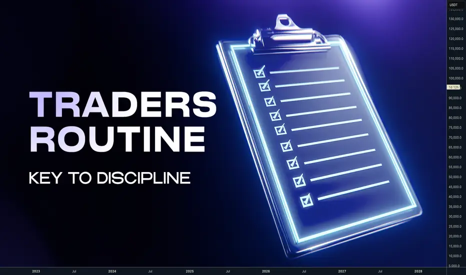
Trading Success Starts With How You Live, Not How Much You TradeHey whats up guys, today I wanna share trading routines which has helped me to bet back my life and saved me from the false trap and from possible disaster.
Trading is reflection of our life. Literally how you live, will reflect in your trading results.
When I was starting I had a 9 - 5 job and learning trading as a hobby. I was in shape, doing the gym 4 times a week, running, swimming in the sea every day, Kitesurfing, Eating healthy, reading self development books. I was in perfect position to simply acquire another skill.
But, after some time as most of us, I wanted to get into full time trading. I thought that having more time for trading and working harder than everyone else will mean more money.
Which could allow me to being my own boss and live the life in my terms and have some unnecessary material things in my live.
So I did exactly that, I went full time (with only $10K ) and started to literally live behind the charts for 14 hours a day. Trying to catch every move up and down and with 28 FX pairs on my watchlist. All of that without any structure or fixed schedule. Plan was just to trade.
This is will kill you 👇 Here is what has happened
- I slowly socially disconnected from friends
- I was visiting the gym less often, because I didn't want to miss anything on markets
- When I woke up, I immediately sit to the charts
- Some days I forgot to drink water and eat
- Instead of eating healthy, fast food delivery became the choice
- I was even eating by the PC and still switching between the pairs
- Sometimes I didn't leave the flat for few days
- My sleep was ruined. I went from regular 8 hours to 5 hours
- I stopped reading books
- I gained almost 10kg and my physique was overall bad
- Developed back pain from sitting and shoulder pain from mouse
Did I made more money ? In the end I made pretty much same as when I was trading part time. Only instead of having a few good winning trades in a week. I had 100 trades a month but was totally exhausted and my health was completely destroyed. overall result was similar in terms of %. But the cost I payed with my health , time and stress didn't worth
What has happened later is unbelievable story and I will share it the one of the next planned posts. Follow me if you don't want to miss them. I speak from own experiences. And yeah I made every possible mistake. 📍 One year later I realized:
- Life out of the charts is most important
- Trading is a tool for our desired freedom and life, not a goal
- Without strong body, health and good sleep you will not trade well
- Discipline in the trading starts in the disciplined life
- More time spent on charts and more traders doesn't equal more profits
- 10K for full time trading is not enough
Trading is lifestyle - Build your life around it
Being disciplined is easier when you run on autopilot. Routine beats discipline. You have to create habits which repeats on the daily basis. So you eliminate hesitations of what to do next and just focus just on executing your daily schedule. And mainly not multitasking and focusing on one thing you planed to do at specific time.
🧪 This is my current weekly schedule
These are activities and times which keeps my balance between work / life and Digital worlds. It keeps me Fit, Mentally strong, Continuously improving myself and not being overtrained or burned out from any of these. 📝 Weekly Preparation - Sundays (2 Hours)
Every successful week and trading week starts with planing in advance. Hence every Sunday I spent 2 with planing. 1 Hour charts, checking news calendar, COT data etc...I do HTF top down analysis and mark out Monthly, Weekly, Daily levels. At this stage Im not looking for a trades, just updating the charts. I trade 4 FX pairs, 4 crypto. I don't spend more than 8 minutes with each chat. Goal is to project highest probability and direction of the next weekly candle. I got this tabs in my journal with the plan for each pair Second hour I plan my business tasks and family stuff for the week. Everything is planed so I do not have to overthink when Im going to sleep.
💤 Sleep time 21:30 (7 Hours)
Every successful day start with good sleep. Make sure you have down window from your business & charts. Put your brain to calm mode and mainly put your phone away at least 1,5 hour before you go sleep to avoid blue light. Always go sleep at the same time. You should aim for 8 hours. I sleep just 7 but it's enough for me.
🧘♂️ Meditation(20 minutes)
Waking up at 4:30 (without alarm). Quickly check my daily plan and immediately start with meditation. I project and visualize my day. It sets my intentions and I start the day strongly. Never touch your phone as first thing on the morning. Short content and news are programed to distract you. Try meditate and visualize your plan. You will see difference in a focus. When you meditate thoughts will be coming, just try to come back to present moment. You will become better and better when you practice this improve your focus and sleep.
🚶♂️➡️ Morning Walk(1 Hour)
Once I finish meditation and hygiene. Before the breakfast. Im going out for the 1 hour walk. Yes before the breakfast. Because if you are walking fasted your body takes energy from fats. So it's kind of fat burning walk. On a work out field I do a bit calisthenic few pull ups, pushups , squats, dips etc and a bit of stretching. I don't take Phone and No music, Nothing. Just me conscious absorbing waves of nature. It's also kind of meditation and again improving my focus.
✍️ Book / Notes(45 minutes)
When I come back home. I make breakfast it's mostly eggs or oats with protein and I read books and manually take some notes of what I found interesting. 📈 4x Backtests (30 minutes)
Backtesting is not optional and it's not only for developing and testing a new strategy. It's training for traders same as training for UFC fighters. There is no point when you should stop your training even when you are profitable. But I don't want to spend 2 hours on the weekend backtesting. So I do 4 backtested hindsight trades in day. It takes less than 30 minutes and Im building my library of trade examples and mainly my Risk reward and Win ration statistical data which keeps me confident on what Im doing. And practicing market context
🇬🇧 London Session (2 Hours)
This is my main trading time. I update the charts every day and look for the setups. Im swing trader so it doesn't mean Im actively entering and exiting many positions. It's a time when Im fully focus on trading and price action. I don't go below M15 TF. But it doesn't mean that I have opened another Tabs or multitask with other things. Full focus just to charts. I simply follow my mechanical strategy . Click the picture bellow to learn more 👇https://www.tradingview.com/chart/BTCUSDT.P/PkQJvVm4-Complete-system-for-Day-Swing-Traders/
My setups occurs often on Tuesdays , Wednesdays, Thursdays. I often skip trading on Mondays and not opening new trades on Fridays. Friday NY session Im not even by PC.
💪 GYM / SAUNA (80 min)
Every weekday after London Session I take a break form the PC and I leave the house to the Gym. Focusing on strength and mobility training a bit cardio also. Im not trading every day as in my 40s recovery is not so fast as it was in my 20s. So every second day I do Sauna which has many health benefits.
🫁 Breath-work (15 min)
before the NY session. Im doing a Breath-work. You can find these guided breath works on the YouTube. Perfect training for your parasympathetic system it switches you from reactive to a strategic thinking. It's basically a small ritual that empower you and again increase your focus.
🇺🇸 New York Session
I always have charts updated from the London and got set alarms n the price levels. So just some final updates and being focused on price action. If I have trades from the London. Im looking to other pairs, but I never want to have trades on more than 4 instruments at the time. So NY session is kind optional for me, sometimes Im not even by PC and as I got Tradingview notifications if the levels are hit. I execute from the phone, while Im outside with the family or friends or doing some other activities. I don't trade NY session at Fridays.
💊 Social Media (30 min)
You might thinking why I have social media in my plan. Well at 5PM when Im done with trading and business It's the first time I go to check social media for some time. I scroll a bit to feed my dopamine, look what new on X etc... and thats it. Social media are big distraction and checking them multiple times a day is bad. Hence I got plan for them for 30 minutes a day and thats it. All notifications are turned off and I don't let myself bother and interrupt during the day.
✍️ Journaling / Daily Planing (30 min)
Every day at 7:30 PM. I do journal with pen and paper. Writing down what Im grateful for , what I have achieved, where I can improve and planing next day. Since Im done with this. I don't think about a business and charts anymore. It used to be difficult when you have running positions, but I got stop loss and risk under control . I know how much I can loose if Im wrong. So no need to check anything anymore. I can live present evening with family.
🧩 Weekly Review (2 Hours)
I mostly stop trading at Fridays London session. Then gym and massage and thats when my weekend starts. But on the Saturdays early mornings before my family wakes up. I do My Weekly review. Going thru my trades and charts and comparing it with the plan. Doing the self reflections, noticing what I did right so I can repeat it next time but also what I did wrong and trying to find where I can improve. I also review my week from personal development side and checking if Im still on the right path with my longterm goals.
⁉️ This is questions Im asking myself when going thru past trades.
- Was there a type of trade that did/didn’t work well?
- Was there a particular market that I did/didn’t trade well?
- Was there a particular day/time that I did/didn’t trade well?
- Did I enter trades too soon?
- Did I enter trades too late?
- Did I take profits too soon?
- Did I take profits too late?
- Did I put my stops loss too tight?
- Did I use an unnecessarily big stop loss?
- Did I take take any trades with poor Risk:Reward ratio?
- Did I risk too much?
- Did I risk too little?
- Did I deviate from my trading model?
- Did I deviate from my plan?
Since I live balanced life for past few years not only that my trading has exponentially improved but Im also more healthy , less stressed and overall happy and enjoy the life.
‼️Note : Life happens and not every time it goes as you plan. There will be things, people or situations which will take you away from your journey. If that happens come back to schedulle as soon as possible.
Learn to say No, without explaining yourself. Prioritize your time and goals. If it's not within your long term journey say NO. No-one except your kids or family and your health is more important than your mission.
Adapt, useful , reject useless and add something specifically your own - Bruce Lee
David Perk and Dave FX Hunter
Cup with Handle Cup with Handle is a call continuetion pattern so go long with your fevorite OIL and gas stock with helf of some technical and fundamental analysys
(Make your trading is easy with help of some simple step)
Emotional Control 101 **Emotional Control 101:
Hello Traders 🐺
How to Stop Fear, Greed, and Impulse from Destroying Your Trades**
Welcome back to another post.
In this article, we will dive deep into one of the most overlooked yet defining skills in trading: Emotional Control.
This is not just a topic — it is the psychological foundation that decides whether you rise as a trader or fall like the rest.
Let’s break it down step-by-step.
1) What is Emotional Control in Trading?
Emotional Control is the ability to stay balanced, objective, and disciplined regardless of what the market is doing.
It is the skill of thinking clearly when everything inside you wants to react impulsively.
Every trader brings emotions into the chart:
fear, greed, impatience, overconfidence, revenge, hope.
These emotions influence your decision-making process more than any indicator or strategy ever could.
Your emotional state determines:
when you enter,
when you exit,
how you manage losses,
how you react to wins,
and how consistent you can remain during uncertainty.
A controlled mind protects you.
An uncontrolled mind destroys you.
Both are fully in your hands.
2) The Hidden Enemies: Fear, Greed, Impulse
Let’s break down the 3 psychological forces that ruin most traders:
Fear
Fear makes you exit early, skip valid setups, hesitate, doubt your edge, and anticipate danger even when your analysis is correct.
Greed
Greed makes you chase price, hold too long, ignore your plan, and believe that every pump will continue forever.
Impulse
Impulse is the silent killer.
It pushes you into trades without confirmation, without analysis, without structure — simply because your brain demands a dopamine hit.
These emotional forces show up fast, and if you do not control them, they will take over.
3) Why Emotional Control Matters More Than Strategy
You can have the best strategy in the world, but if you cannot control your reactions?
You will fail.
Without emotional structure, trading becomes gambling.
You become reactive, not strategic.
You chase, you force, you hope — instead of plan, execute, and review.
A trader with average strategy but strong emotional control will always outperform a trader with a perfect system but no discipline.
Emotional mastery is the filter that protects your capital and aligns you with high-quality setups ONLY.
4) How to Build Emotional Control (Step by Step)
Just because it is difficult does not mean it is impossible.
Here is the practical framework:
Step 1 — Build Discipline Through Consistency
Create a clear trading plan.
Define your edge.
Commit to following it whether the market is pumping, dumping, or consolidating.
Consistency creates internal strength.
Strength creates emotional stability.
Step 2 — Develop Emotional Awareness
Become conscious of how you react during trades.
Ask yourself:
When do I feel fear?
When do I feel FOMO?
When do I feel reckless confidence?
Which emotions pull me away from my edge?
Awareness is the first step to control.
Step 3 — Journal Everything
You cannot control what you cannot see.
Log:
every loss,
every win,
every emotional trigger,
every setup you forced,
and every setup you skipped.
Be brutally honest.
Your journal is your mirror, not your trophy case.
Patterns will appear.
Identify them.
Correct them.
Step 4 — Build Trust in Your System
You must trust two things:
your strategy,
yourself.
Backtest.
Forward test.
Refine your criteria.
The more proof you collect, the less emotions will dominate your decisions.
Confidence must come from data, not hope.
Step 5 — Master Patience
The most important psychological skill.
Only take A++ setups.
The ones with multiple confluences lining up — not the setups that “feel right,” but the ones that are right.
Patience protects you from impulsive trades.
Patience separates traders from gamblers.
5) How Your Daily Life Affects Your Emotional Control in Trading
Your psychology outside the chart becomes your psychology inside the chart.
If your life is chaotic, emotional, stressed, or unstable —
your trading will mirror it.
A breakup, an argument, a bad day at work, fatigue, stress…
All of these push the mind to seek dopamine.
And where does it run for that dopamine?
The charts.
But emotional trading is destructive.
It leads to revenge trades, overleveraging, forcing setups, and chasing losses.
If you cannot regulate your emotions in daily life,
you cannot expect to regulate them in a high-stress environment like the market.
Control your life → control your trades.
KEY POINTS
1) What is Emotional Control:
Your ability to remain balanced under pressure. Master the mind → master the trade.
2) Hidden Enemies:
Fear, greed, and impulse destroy discipline and clarity.
3) Why It Matters:
Without emotional control, trading becomes gambling. With it, you gain structure, patience, and objectivity.
4) How to Build It:
Consistency, emotional awareness, journaling, trust in your system, and patience.
5) Daily Life Impact:
Your external emotions directly influence your performance in the market.
Strengthen your mind outside → strengthen your mindset inside.
Thank you all for reading —
I hope this post brings clarity and value to your trading journey.
Emotional control is only one of the 3 psychological pillars that lead to trading success.
If you would like a deep dive into the remaining two keys, let me know —
I’d be glad to share more with the community.

DON'T TRADE THESE SUPPORTS AND RESISTANCES (FOREX GOLD)
When it comes to technical analysis,
the understanding of which support and resistance levels to not trade can be as important as knowing which ones to trade.
In this article, I will show you the structure levels that professional traders avoid to maximize their profits and minimize losses.
Invalidated support and resistance
Invalidated support/resistance is the structure that has a clear historical significance, but that lost its strength and was neglected by the market during the last 2 tests.
Have a look at that key horizontal support.
We can see that in the recent past, the price bounced from that multiple times, confirming its significance.
Then, the price suddenly broke and closed below that support.
According to the rules, that structure should turn into a resistance after a violation.
However, after its test, the price bounced and violated that to the upside.
The structure became invalid , and you should not trade that in future.
Resistance in a Bullish Trend
If the market is trading in a bullish trend, according to the rules its last higher high composes a key horizontal resistance.
USDJPY is trading in a strong bullish trend.
The price dropped once it set a new higher high higher close.
It composes a key horizontal resistance.
Always remember, that in a bullish trend, the price tends to set new higher highs and higher lows over time.
Quite often, the test of the level of the last high leads to a further bullish continuation and a formation of a new higher high.
For that reason, it is better not to trade such resistances.
Support in a Bearish Trend
In a bearish trend, the last lower low is always considered to be a key horizontal support.
Above is a price action on USDCHF.
The pair is bearish and recently set a new lower low.
It is a key horizontal support now.
However, in a bearish trend, the price tends to set a new low after a retracement. Most of the time, it does not respect the support based on the last lower low.
I recommend you not to trade such supports.
I always repeat to my students that key levels work, but they are not equal in their significance. While some of them are very strong, some are better to be avoided.
❤️Please, support my work with like, thank you!❤️
I am part of Trade Nation's Influencer program and receive a monthly fee for using their TradingView charts in my analysis.

Where traders tend to failAfter 25 years playing this game, it is incredible to see the same issues today for new traders as there have always been.
In a nutshell, OVERCOMPLICATION!!!
New traders will often go looking for as much information as possible, adding instruments, screens, indicators, timeframes, news feeds. Anything looking for an edge.
Go back over 100 years and Charles Dow - yes, the same Dow behind the #DJI (The industrial average) laid down a very simple framework for understanding the markets.
I have written several posts here on @TradingView about Dow Theory here's one of them.
Inside this post, you will see this image.
For some of you familiar with either Elliott Wave principles or Wyckoff Techniques, you might recognise some elements of an image like this.
Both Richard Wyckoff and Ralph Elliott were onto something. But over the years these techniques have been "added to" creating hybrids and then assumptions are often made. Complex is key... Or so they think.
When you try and trade an Elliott wave cycle on a 5-minute chart on some instrument that has not been fully adopted by institutional players, you are asking for trouble.
Psychology is more important in trading than, quite possibly 99.9% of other aspects of trading. So whilst people tend to add to the technical analysis part of trading, they often ignore the psychology controlling the market.
I am not talking about psychology in terms of simple risk management and high probability moves. I am talking about the piece of the psychology studies that controls the masses.
Sentiment is one thing, the psychology that drives sentiment is where the failing and struggling traders simply ignore.
I wrote a post - trying to add some humour. Here's a Simpson's post.
=========================================
Let me give you an example;
People tend to use simple off the shelf indicators; now when millions use the same tools. Why is it that 90% + of traders still lose money?
Here is a snapshot of the MACD and RSI side by side.
Now look closely at the price action. What additional info are you getting from these lagging indicators (rhetorical question).
.
Let's look at this in a simple way; no indicators, clean chart, Dow Theory in focus.
When price moves up you will often see accumulation, then as price reaches it's next area of interest and starts to pullback (oversimplified) you will see, even on smaller timeframes as this is not always obvious on the same timeframe. a distribution pattern.
Overall, the price action has created a simple Elliott Wave move from a zero point, up to one and pushing down for a two.
Where this gets interesting, and simple...
Is the psychology behind it, The momentum up is often created by early buyers (yes, state the obvious) these buyers have been accumulating. Then, as retail jumps in because RSI says so. The price pulls back. This is often deep into the zone it just left, retail often using small timeframes and tight stops - 5 pips, 10 pips. So you often see a PB of 11 pips (example) and you get that feeling of "why does it always hit my stop and then go in my desired direction"?
The momentum from taking these stops, then goes on to create an impulsive 2-3 move in EW terms. This is stops becoming opposing orders. Thus creating momentum to break the high of the 1 move. New stops from shorts get triggered and momentum traders enter positions. All of which fuels a larger rally.
Now, when you break this down. You can draw ranges and operate inside these ranges to know the general bias. And just like that, you are on the right side of the market more often than not.
Here's a more detailed post on this aspect.
To give an example here:
The larger swing creates a range. An obvious high and low as marked in this image.
Then as the move inside happens; Think Dow Theory;
The market is giving a very clear clue. We just took out a fresh high and the market is seeking liquidity.
That internal move will have a fractal move inside; let's call that a trigger move.
Keep in mind, the larger trend does not change it's directional bias until it breaks the old low or the fresh high.
Now, although the price does not have to. The price can pull all the way back to the low and not change the larger trend.
Once you get to grips with this, you will stop trying to predict the market and instead work with price action.
Less, really, is more!
Have a great weekend!!!
Disclaimer
This idea does not constitute as financial advice. It is for educational purposes only, our principal trader has over 25 years' experience in stocks, ETF's, and Forex. Hence each trade setup might have different hold times, entry or exit conditions, and will vary from the post/idea shared here. You can use the information from this post to make your own trading plan for the instrument discussed. Trading carries a risk; a high percentage of retail traders lose money. Please keep this in mind when entering any trade. Stay safe.


Cybersecurity Risks in the Global Trading System1. The Expanding Digital Surface in Global Trade
Global trading relies on a complex chain of platforms—financial exchanges, trading terminals, cloud infrastructures, payment gateways, supply chain networks, and digital customs systems. Every connection in this chain increases the vulnerability of the whole system.
More digital touchpoints mean more entry points for cybercriminals. For example:
Online brokerage accounts
Automated trading algorithms
Cross-border settlement systems
Mobile trading apps
Global supply chain tracking portals
Cloud-based trade documentation
Attackers know that if they can disrupt even one part of this ecosystem, they can trigger large-scale consequences across multiple industries and countries.
2. Market Manipulation Through Cyber Attacks
One of the biggest risks in global trading is market manipulation through cyber intrusions. Hackers can exploit vulnerabilities in trading platforms or exchange servers to influence market movements.
Examples include:
Placing fake orders (spoofing or layering) using hacked accounts to create artificial price movements.
Manipulating trading algorithms by feeding them false data.
Attacks on stock exchanges causing temporary shutdowns, leading to panic selling.
Tampering with price feeds from data vendors like Bloomberg or Reuters.
Even a short disruption can shake investor confidence, trigger flash crashes, or give attackers time to profit from insider-like information.
3. Threat of Data Theft and Espionage
Data is the new currency of global trade. Everything—from corporate strategies to trading volumes to supply chain details—is stored digitally. Cybercriminals and even nation-state actors target this information for espionage or financial advantage.
High-value targets include:
M&A details
Commodity shipment data
Pricing algorithms used by HFT firms
Trade secrets of manufacturing companies
Customer KYC and financial data
If such confidential information is stolen, it can be sold on dark markets, used for insider trading, or exploited to influence global business negotiations.
4. Ransomware Attacks on Enterprises and Exchanges
Ransomware has become one of the most destructive cyber threats in global trading. Hackers encrypt an organization’s entire system, demanding huge payments in cryptocurrencies.
Global commodity firms, logistics companies, and even national stock exchanges have been hit in recent years.
Ransomware can:
Halt clearing and settlement operations
Freeze trading terminals
Interrupt shipping and customs documentation
Shut down entire global supply chains
Cause billions in losses within hours
Even after systems are restored, trust in the institution often takes months to recover.
5. Risks in High-Frequency and Algorithmic Trading
High-frequency trading (HFT) systems operate at millisecond speeds, making them particularly vulnerable to cyber attacks.
Key risks include:
Algorithm hijacking – attackers modify trading logic to place harmful trades.
Latency attacks – slowing down competitor networks to gain advantage.
Fake signals – injecting misleading market data to trigger trades.
Because HFT systems can execute thousands of trades per second, a small tampering can cause huge financial losses or create market instability.
6. Vulnerabilities in Cross-Border Payments
International settlements rely heavily on platforms such as SWIFT. Although secure, they are not immune.
Cybercriminals have previously:
Sent fraudulent cross-border payment instructions
Manipulated bank records
Used malware to hide traces of transactions
If critical global payment systems are compromised, it could cause massive disruptions in global trade flows, affecting everything from currency markets to commodity exports.
7. Weak Security in Developing Countries
Not all countries have the same level of cybersecurity readiness. Many developing economies lack strong technological infrastructure, making them the weakest links in global trade networks.
Attackers often target:
Ports
Customs systems
Small banks
Logistics companies
Local trading platforms
Once inside, they pivot into larger international systems. Thus, global trade security is only as strong as its most vulnerable participant.
8. The Rise of Deepfakes and Digital Fraud
AI-driven deepfakes are creating a new category of risks. Attackers can impersonate:
CEOs giving fake instructions
Traders approving unauthorized transfers
Brokers sending fraudulent trade confirmations
Customs officials clearing illegal shipments
These scams can lead to multimillion-dollar losses and disrupt trust across trading partners.
9. Supply Chain Cyber Attacks
Modern supply chains rely heavily on digital systems to track shipments, verify documents, and streamline logistics. Cyber attacks on supply chains are rising sharply.
Forms of supply chain attacks:
Compromising software updates
Inserting malicious code into logistics platforms
Altering shipment data or container numbers
Shutting down port operations with malware
The 2021 global container backlog was partially worsened by cyber attacks on major ports and freight companies, showing how digital risks can directly impact physical trade.
10. Cyber Risks in Cryptocurrency and Blockchain-Based Trading
Global trade is slowly integrating blockchain for settlement and documentation. While blockchain is secure, the surrounding ecosystem—wallets, exchanges, smart contracts—remains vulnerable.
Risks include:
Smart contract hacks
Theft of crypto reserves
Manipulation of cross-chain bridges
Attacks on decentralized trading platforms
These attacks threaten the trust required for blockchain-based global trade systems.
11. Insider Threats
Not all cyber threats come from outside. Insiders—employees, disgruntled staff, or contractors—may:
Leak sensitive data
Install malware
Disable cybersecurity systems
Facilitate unauthorized trades
Insider attacks are highly dangerous because insiders already have access privileges.
12. Lack of Global Regulation and Standardization
Cybersecurity laws differ widely across countries. Some nations have strict guidelines; others have none. This lack of uniformity creates gaps that attackers exploit.
Global trading involves hundreds of jurisdictions, making it difficult to track:
Cross-border cyber criminals
Illegal digital trading operations
Data breaches occurring across multiple markets
Without global cooperation, cybercrime in trading continues to rise.
Conclusion
Cybersecurity risks in the global trading system are growing in scale, sophistication, and potential impact. As markets move toward algorithmic trading, real-time settlements, digital documentation, and borderless financial connectivity, attackers gain more opportunities to exploit weak points. The consequences are not limited to financial loss—they include geopolitical tensions, supply chain disruptions, loss of investor confidence, and instability across global markets.
To protect the global trading ecosystem, organizations must invest in advanced cybersecurity frameworks, AI-powered threat detection, multi-layer authentication, secure supply chain software, and international cooperation. Ultimately, cybersecurity is no longer just an IT requirement—it is a core pillar of global economic resilience.
Master Correlation Strategies: Types, Tools and Strategies1. What is Correlation and Why It Matters?
Correlation measures how two instruments move relative to each other.
It ranges from –1 to +1:
+1 (Perfect Positive Correlation): Both move in the same direction consistently.
–1 (Perfect Negative Correlation): They move in opposite directions consistently.
0 (No Correlation): Movements are unrelated.
Traders use correlation for:
Predicting asset behavior
Avoiding overexposure
Finding intermarket confirmation
Enhancing risk-reward
Detecting market sentiment shifts
Building multi-asset strategies
If you’re a short-term, positional, or intraday trader, correlation can help filter false signals and improve decision accuracy.
2. Types of Correlation Used in Trading
A) Direct Correlation
Two assets move together.
Example: Nifty and Bank Nifty, Crude Oil and Oil & Gas stocks, US Dollar vs USDINR.
This helps in confirmation:
If Nifty is bullish but Bank Nifty lags, the market may be weak.
B) Inverse Correlation
Assets move opposite.
Example:
Gold vs Equity markets
Bond yields vs Stock indices
VIX vs Nifty
Useful for hedging and identifying risk-off sentiments.
C) Rolling Correlation
Correlation changes over time.
Markets evolve, so a dynamic (rolling) view helps traders understand whether relationships are strengthening or weakening.
D) Lead-Lag Correlation
One asset moves first, another follows.
Example:
US markets lead Indian markets
Dollar Index moves before major commodities
US 10-year bond yields lead global risk sentiment
This helps predict future price behavior.
3. Tools to Measure and Apply Correlation
1. Correlation Matrix
Used to check correlations among multiple instruments.
Especially handy for portfolio traders and sector-based strategies.
2. Scatter Plots
Used to visualize relationships and identify the strength and slope of correlation.
3. Rolling Correlation Charts
Shows how correlation changes over time.
4. Heat Maps
Popular in institutional trading to track multi-asset relationships quickly.
5. Market Internals Data
Such as advance-decline ratio, VIX, bond yields, and sector performance.
4. Master Correlation Strategies for Traders
Strategy 1: Multi-Index Confirmation Strategy
Before entering a trade on Nifty, check:
Bank Nifty
FINNIFTY
India VIX
USDINR
If Nifty gives a breakout but Bank Nifty and FINNIFTY remain weak, avoid the trade.
This reduces false breakouts dramatically.
How it works:
Strong correlation improves accuracy
Weak/negative correlation signals uncertainty
VIX acts as a sentiment filter
Great for positional and intraday index traders.
Strategy 2: Sector-Based Correlation Mapping
Most big moves in indices come from sector rotation.
Check:
IT Sector correlation with NASDAQ
Bank Nifty correlation with bond yields
Energy stocks with global crude oil
Pharma with USDINR
Example:
If crude oil falls, OMC stocks like IOC/HPCL/BPCL tend to rise.
If NASDAQ is weak, Indian IT stocks generally face pressure.
Sector correlation helps traders anticipate moves before they appear on charts.
Strategy 3: Risk-On vs Risk-Off Correlation Strategy
Use inverse correlations to identify sentiment shifts.
Risk-On Indicators:
Nifty up
USDINR down
VIX down
Crude oil stable
Bond yields stable
Risk-Off Indicators:
Gold up
Dollar index up
Bond yields up
Equities fall
VIX spikes
When 3–4 indicators align, the market enters a clear sentiment phase.
Traders use this to:
Avoid contra-trend trades
Catch early reversal signals
Manage position sizing
Strategy 4: Pair Trading with Correlated Assets
Pairs trading works best when you find strongly correlated instruments.
Example:
HDFC Bank vs ICICI Bank
TCS vs Infosys
SBI vs Bank Baroda
If correlation is 0.85+, and one stock rises while the other lags, traders take:
Long position in the undervalued one
Short position in the overvalued one
Profit comes when correlation returns to normal.
This is a favorite hedge-fund strategy because:
Low risk
Market-neutral
Works in all market conditions
Strategy 5: Currency-Commodity Correlation Strategy
Many commodities move based on currency trends.
Key correlations:
USDINR vs Gold
DXY vs Crude Oil
DXY vs Metals (Copper, Silver, Aluminium)
If DXY rises sharply, commodities generally fall.
Traders use this to create multi-market confirmation:
If DXY is bullish → Crude sells off → OMC stocks rise
If USDINR spikes → IT stocks gain strength
This strategy links currency, commodities, and equities in one structure.
Strategy 6: Global Market Correlation Strategy
Indian markets follow global cues.
Check:
US Futures (Dow, S&P, Nasdaq)
Asian Markets (Nikkei, HSI, Shanghai)
European Futures (DAX, FTSE)
US Bond Yields
Dollar Index
If global sentiment is aligned (e.g., all red), avoid long trades even if Nifty supports.
This strategy prevents trading against the global flow, reducing risk significantly.
Strategy 7: Time-Frame Correlation Strategy
Correlations differ across timeframes.
For example:
Intraday correlation between Nifty and Bank Nifty is strong
Weekly/monthly correlation may differ
Traders use multi-timeframe correlation to confirm:
Trend
Volume flow
Breakout strength
Retracement quality
If daily correlation is strong but intraday weak, market may be choppy.
5. Advantages of Master Correlation Strategies
✔ Improved accuracy in signals
✔ Prevents overexposure
✔ Filters out false breakouts
✔ Better understanding of market sentiment
✔ Identifies leading indicators early
✔ Helps in constructing diversified portfolios
✔ Offers hedge-based safety during volatile times
6. Common Mistakes Traders Make
Relying on static correlation values
Ignoring rolling correlation changes
Overtrading based on correlation alone
Assuming correlation means causation
Ignoring news events that break correlations temporarily
Always combine correlation with price action, volume profile, and market structure.
7. Final Conclusion
Master correlation strategies allow traders to see the market as a connected ecosystem instead of isolated assets. By studying how indices, sectors, currencies, commodities, and global markets move together, you gain a powerful advantage. Correlation is not about predicting the future but understanding context, filtering noise, and increasing conviction. When correlation aligns with market structure analysis and volume behavior, you unlock the highest probability trades with lower emotional stress.
Market Noise That Traps Retail Traders1. What Is News Trading?
News trading is a strategy where traders take positions based on the expected market reaction to economic events or announcements. These events can be:
Economic data (GDP, inflation, interest rates, unemployment)
Central bank decisions (RBI, Fed, ECB meetings)
Corporate earnings and guidance
Mergers, acquisitions, buybacks
Global geopolitical developments
Commodity reports (OPEC meetings, inventory data)
Government policies and regulations
News changes market expectations, and markets move on expectations — that’s the core idea behind news trading.
2. What Is “Noise” and Why Is It Dangerous?
Noise is any information that creates confusion without adding value.
Examples of noise:
Clickbait headlines (“Market to crash 20%?”)
Social media hype (Twitter/X rumors)
WhatsApp university “insider news”
Delayed news after the market has already reacted
TV channel opinions that change every minute
Over-analysis without data
Emotional panic or euphoria from retail traders
Noise causes wrong decisions, late entries, and over-trading.
Professional traders avoid it by sticking to verified, timely, and market-moving information.
3. Why Most Retail Traders Fail in News Trading
Retail traders often:
React after the move has already happened
Trade based on emotions, not data
Follow misleading social media posts
Don’t understand whether news is actually important
Lack a prepared plan before events
Cannot interpret the deviation between expected and actual data
Professional traders, on the other hand, plan days ahead and execute in seconds.
4. How to Trade News Without Noise – The Clean Process
The core idea is: Be prepared before the news, respond instantly to real numbers, avoid emotional reactions.
Here’s the step-by-step process:
Step 1: Know Which News Actually Matters
Not all news moves markets. Learn to classify news into:
High Impact News
RBI policy meetings
US Federal Reserve meetings
Inflation data (CPI, WPI)
GDP growth numbers
Employment data
Major earnings announcements
Geopolitical tensions (war, sanctions, oil shocks)
Medium Impact News
Industrial production
Services PMI, Manufacturing PMI
Consumer sentiment
Smaller corporate updates
Low Impact News
Minister speeches
General opinions
Minor announcements
Over-analyzed TV commentary
Rule: Focus only on news with real economic consequences.
Step 2: Prepare a News Calendar
Before the week starts, create a watchlist of events:
Date
Time
Expected numbers
Previous numbers
Expected market reaction
Tools to use:
Economic calendars
Earnings calendars
OPEC & inventory calendars
RBI/Fed meeting schedules
Preparation removes confusion and reduces noise.
Step 3: Understand “Expectations vs Reality”
Markets don’t react to news itself; they react to the difference between expected and actual results.
Example:
If inflation is expected at 5% but comes at 5.4%, markets fall.
If it comes at 4.7%, markets rise.
This deviation is called “surprise factor.”
Professional traders instantly measure this deviation and take positions.
Step 4: Use the 10-Second Rule During News
During major announcements:
Avoid trading in the first 10 seconds
Let the initial volatility settle
Watch the direction that forms after the first burst
This protects you from:
Whipsaws
False breakouts
High spreads
Stop-loss hunting
Clean news trading happens when you allow the dust to settle.
Step 5: Read Market Reaction, Not Headlines
Instead of reacting to headlines, look at:
Price action
Volume
Market structure
Order flow
Option chain (PCR, IV crush, delta shift)
Markets sometimes reverse the initial move when the news is already priced in.
Price is the real truth.
Step 6: Have a Pre-Defined Plan
Before the news releases, decide:
If number is better → buy or go long
If number is worse → sell or go short
If number meets expectations → avoid trading
This clarity eliminates emotional decisions.
Step 7: Avoid Social Media & TV Noise
Once news is released, social feeds explode with:
Panic
Rumors
Emotional reactions
Incorrect interpretations
Professionals ignore all this and stick to data and price.
5. Tools and Indicators to Reduce Noise in News Trading
These tools help you filter real movements from noise:
1. Volume Profile
Shows if the move has real institutional participation or just retail panic.
2. Market Structure
Identifies:
break of structure (BOS)
change of character (CHOCH)
real trend direction
3. Volatility Indicators
ATR (Average True Range)
Implied volatility (IV)
They help you avoid fake spikes.
4. Liquidity Zones
News often sweeps liquidity before moving in the real direction.
5. Option Chain Analysis
IV Crush
Rapid delta movement
Change in OI
PCR shift
This gives instant information on institutional positioning.
6. Best Markets for News Trading
Forex Market
Most sensitive to:
interest rate decisions
inflation
employment data
Stock Market
Most sensitive to:
earnings
M&A news
regulatory changes
Commodity Market
React to:
crude oil inventory
OPEC decisions
weather reports (for agri commodities)
Index Futures (Nifty, Bank Nifty)
React strongly to:
RBI policy
global cues
geopolitical risk
These markets give clean opportunities during news.
7. Common Mistakes to Avoid
Trading BEFORE the news – high risk
Entering too late AFTER the move – trap
Following hype and rumors
Not using stop-loss
Taking too large position sizes
Over-trading due to excitement
Ignoring the bigger trend
Avoiding these mistakes helps you trade news without getting caught in noise.
8. Risk Management for News Trading
News trading is profitable only with strict risk rules:
Keep position size small (1–2%)
Use stop-loss every time
Avoid averaging losers
Take profits quickly
Never hold weak trades through big events
News moves fast; your risk control must be even faster.
9. How Professionals Maintain Clarity
Top traders follow this checklist:
They prepare for news
They track expectations, not opinions
They avoid emotions
They follow price action
They execute as per plan
They ignore noisy sources
They use data, not predictions
This is why their entries are clean and exits are disciplined.
Conclusion
Trading news without noise is all about clarity, preparation, discipline, and data-based decisions.
Instead of reacting to hype, you follow a structured process:
Identify high-impact news
Study expectations
Wait for real numbers
Confirm with price action
Execute clean trades
Manage risk tightly
When done properly, news trading can give some of the best and fastest profits in the market. When done emotionally, it becomes the fastest way to lose money.

Global Equity Under Pressure1. The Macroeconomic Storm: Growth and Inflation Cycles
One of the strongest forces behind equity pressure is the macroeconomic environment. Stocks are nothing but claims on future earnings; when global growth slows, those earnings come under threat. Economic cycles typically rotate between expansion, peak, contraction, and recovery. During the contraction phase, investors re-price risk assets.
Key macro triggers
Slowing GDP growth
When multiple major economies — especially the US, China, and the EU — show signs of slower economic output, it signals weaker corporate revenues and profits. Global markets respond with defensive positioning.
High inflation
Persistently high inflation reduces corporate margins, forces central banks to hike interest rates, and raises the cost of money. This tightens financial conditions and automatically compresses valuations, especially in growth and tech sectors.
Interest rate hikes
Rising rates change everything in equity markets. Higher rates mean:
more expensive borrowing for companies
slower consumer spending
lower discounted cash-flow valuations
higher returns in bonds, drawing capital away from equities
As a result, global indexes like the S&P 500, STOXX 600, Nikkei, and emerging market indices face systematic selling.
2. Liquidity Tightening: The Silent Market Killer
Liquidity is the oxygen of markets. When central banks tighten liquidity, equities suffocate.
How liquidity tightening pressures markets
Quantitative tightening (QT) reduces overall money supply.
Lower liquidity increases volatility because fewer buyers are available when sellers rush out.
Global funds reduce leverage when liquidity shrinks.
Dollar strengthening — a classic result of tightening — creates pressure on emerging markets and commodities.
In simple terms: when money becomes expensive or scarce, equities fall.
3. Geopolitical Tensions: The Fear Premium
Markets hate uncertainty. Geopolitical risks push traders into safe-haven assets like gold, bonds, and the US dollar.
Major geopolitical pressure points
War or military conflicts
Oil supply disruptions
Trade wars or sanctions
Political instability in major economies
Global supply-chain disruptions
Even the threat of geopolitical escalation can trigger volatility across global equities. When investors believe global stability is at risk, they rush out of equities, especially cyclical sectors like financials, manufacturing, shipping, and industrials.
4. Corporate Earnings Stress
Equity valuations depend on future earnings. When earnings weaken, markets correct sharply.
Earnings-related triggers
Lower revenue due to weak global demand
Shrinking profit margins due to inflation or rising input costs
Missed quarterly earnings
Downward revisions of future guidance
Sector-specific slowdowns (tech, banking, energy, manufacturing)
When multiple sectors report earnings pressure simultaneously, the market interprets it as a systemic problem rather than a company-specific one.
5. Technology and High-Growth Stocks Lose Momentum
Global equities often rely heavily on tech giants and high-growth sectors. When these leaders correct, it drags entire indices down.
Why tech comes under pressure
High valuation sensitivity to interest rates
Regulatory scrutiny
Slowing innovation cycles
Reduced consumer spending
Competition pressures (AI, chips, software)
A sell-off in large-cap tech — such as FAANG, semiconductor majors, or Asian tech conglomerates — triggers a global ripple effect. Emerging markets with tech exposure (Taiwan, South Korea, China) feel this impact even more.
6. Strong US Dollar: A Global Headwind
A strengthening dollar is one of the most powerful negative forces for global equities.
Why a strong USD hurts global markets
Commodities become expensive for non-US countries
Emerging market currencies weaken
Dollar-denominated debt becomes costlier
Foreign institutional investors pull money out of global equities
A strong USD often signals risk-off sentiment, and historically, global equities perform poorly during prolonged dollar strength cycles.
7. Institutional Behaviour & Algorithmic Selling
Modern financial markets are largely driven by:
hedge funds
proprietary trading desks
pension funds
algorithmic and high-frequency traders
passive index funds
When selling begins, algorithms accelerate the move by triggering:
stop-loss levels
momentum-based sell signals
volatility-linked de-risking
risk-parity adjustments
This creates a self-reinforcing cycle where selling attracts more selling.
8. Bond Market Signals: The Macro Warning System
The bond market is often the first to flash warning signals.
When the bond market pressures equities
Yield curve inversion signals recession
Rising bond yields compete with equity returns
Credit spreads widen, indicating risk stress
Corporate borrowing costs rise
If the bond market is stressed, equities react almost instantly.
9. Investor Sentiment & Fear Cycles
Markets are emotional systems. Fear, panic, and crowd psychology can push equities under pressure, even without major fundamental triggers.
Sentiment indicators that fall during pressure
VIX volatility index spikes
Put–call ratios rise
Consumer confidence falls
Fund managers cut equity exposure
Retail traders reduce risk
Periods of high fear create sharp, fast sell-offs across all global markets, especially in high-beta and emerging sectors.
10. Global Interlinkages: When One Market Sneezes, Others Catch a Cold
In today's hyper-connected markets:
US markets influence Asian and European markets
China’s slowdown affects commodities and emerging markets
European banking stress impacts global financials
Oil price shocks impact energy-heavy economies
This interconnectedness amplifies pressure. If one major region weakens, it often triggers a chain reaction across global equities.
Conclusion: Understanding Pressure Helps You Trade Better
Global equity pressure is rarely caused by one factor. It’s usually a convergence of macroeconomic stress, liquidity tightening, geopolitical fears, corporate earnings challenges, and behavioural shifts. For traders and investors, the key is not to fear pressure but to understand it.
Periods of global equity pressure often create:
attractive long-term buying opportunities
sharp volatility for short-term traders
rotations into safer or value-driven sectors
reduced liquidity but increased mispricing
By understanding the macro drivers, sentiment indicators, sectoral behaviour, and global linkages, traders can navigate pressure periods with more clarity and confidence.

Quantitative and Algorithmic Trading1. What Is Quantitative Trading?
Quantitative trading, often called quant trading, is a method of making trading decisions using mathematical models, statistical techniques, and historical data analysis. Instead of relying on gut feeling, quant traders rely on:
Patterns in price movements
Probability models
Market microstructure data
Statistical relationships between assets
Economic indicators
Machine learning models
The core idea is simple:
Identify predictable, repeatable patterns in financial data and build trading rules around them.
Quantitative trading strategies can range from extremely short-term (like high-frequency mean reversion lasting seconds) to long-term (such as factor investing over months).
Some popular quantitative strategies include:
Statistical Arbitrage
Exploits pricing inefficiencies between correlated assets.
Mean Reversion
Assumes that prices move back toward an average.
Momentum Trading
Buys strong markets and sells weak markets based on trend continuation.
Factor Investing
Uses long-term factors like value, size, momentum, or quality.
Pairs Trading
Trades price divergence between two historically related instruments.
In quant trading, the key inputs are data and models. Traders continuously test hypotheses using historical price data to see whether a pattern exists. If the pattern seems consistent, statistically significant, and robust, it becomes a trading strategy.
2. What Is Algorithmic Trading?
Algorithmic trading—often shortened to algo trading—is the automated execution of trading decisions using computer programs. Once a strategy is designed, an algorithm handles the operational part:
When to enter a trade
When to exit
How much quantity to buy or sell
How to minimize the impact on market prices
How to handle slippage and transaction costs
How to manage order speed and execution
Algo trading makes markets more efficient because computers can react quicker than humans and execute complex rules without emotional bias.
Some algorithmic trading systems operate on microsecond-level decision making, especially in markets like equities, currencies, and futures.
3. How Quantitative Trading and Algorithmic Trading Work Together
A powerful trading system combines both:
Quantitative = Strategy Design
Finding patterns → building models → testing → optimizing.
Algorithmic = Automated Execution
Turning strategy rules into code → placing trades → real-time monitoring.
Modern prop firms, hedge funds, and HFT firms rely on this combination. A quant may design a statistical arbitrage model, while an algorithm engineer builds a low-latency system to execute the model automatically.
4. Components of a Quantitative Trading System
A. Data Collection
Quant traders use massive datasets, such as:
Price data (tick, minute, hour, daily)
Order-book data (depth, bids, offers)
Fundamental data (balance sheets, cash flows)
Alternative data (satellite imagery, web traffic, sentiment)
Macroeconomic data
The quality of data often determines the quality of the strategy.
B. Data Cleaning
Data errors—like missing values, wrong timestamps, corporate actions—must be cleaned. A small error can destroy a strategy.
C. Feature Engineering
Quant traders transform raw data into useful indicators:
Moving averages
Volatility bands
RSI, MACD
Custom statistical signals
Machine learning features
D. Model Development
Models can range from:
Simple regressions
Probability models
Bayesian models
Machine learning models (Random Forests, XGBoost, Neural Networks)
Reinforcement learning
E. Backtesting
This is the backbone of quant trading:
Testing the strategy on historical data to see how it might have performed.
Good backtesting requires:
Realistic assumptions
Handling slippage
Considering trade costs
Avoiding overfitting
Out-of-sample testing
F. Risk Management
Every model must account for risks:
Maximum drawdown
Position sizing
Portfolio diversification
Stop-loss and target rules
Correlation of strategies
G. Live Deployment
Once ready, the strategy is coded into an algorithm and executed live in the market. Continuous monitoring ensures the strategy behaves correctly.
5. Types of Algorithmic Trading Strategies
1. High-Frequency Trading (HFT)
Trades executed in microseconds to capture tiny inefficiencies.
2. Arbitrage Algorithms
Exploiting price differences between exchanges or instruments.
3. Trend-Following Algorithms
Based on moving averages, breakouts, or momentum.
4. Market-Making Algorithms
Providing continuous bid-ask quotes, profiting from spreads.
5. Execution Algorithms
Designed to reduce market impact:
VWAP, TWAP, POV (percent of volume).
6. Machine Learning Algorithms
Use AI models to detect patterns humans cannot see.
6. Advantages of Quant & Algo Trading
1. Higher Speed
Computers analyze thousands of data points in real time.
2. Zero Emotion
Algorithms never feel fear, greed, stress, or hesitation.
3. Better Accuracy
Rules execute exactly as programmed—no human errors.
4. Backtested Confidence
You know how a strategy performed historically.
5. Scalability
A single system can run hundreds of strategies simultaneously.
6. Lower Costs
Automated systems reduce manpower and execution cost.
7. Risks and Challenges
Despite the advantages, quant and algorithmic trading have risks:
A. Overfitting
When a model fits the past too perfectly but fails in the future.
B. Market Regime Changes
Strategies stop working when market behavior shifts.
C. Technical Failures
Bugs, hardware failures, internet outages can cause huge losses.
D. Liquidity Risk
Algorithms may fail in low-volume markets.
E. Flash Crashes
Excessive automation can cause sudden, extreme price moves.
Risk control and continuous monitoring are essential for survival.
8. Real-Life Examples
1. Renaissance Technologies
A legendary quant fund using statistical patterns to deliver unmatched returns.
2. Two Sigma & Citadel
Use machine learning, massive compute power, and big data to build sophisticated trading models.
3. HFT Firms like Jump Trading & Virtu
Specialize in high-speed arbitrage and market making.
These firms prove that data + math + automation = powerful trading edge.
9. The Future of Quant and Algorithmic Trading
The future will see:
More use of AI and deep learning
Alternative datasets (credit card data, GPS data, social sentiment)
Faster execution speeds with improved technology
More retail access to algo tools
Blockchain-based decentralized trading algorithms
Better risk models to manage market volatility
Quant trading is becoming more democratized, with platforms allowing even retail traders to run automated strategies.
Conclusion
Quantitative and algorithmic trading represent the modern foundation of global markets. Quantitative trading focuses on discovering patterns using mathematics, statistics, and data, while algorithmic trading focuses on executing those strategies automatically with speed and precision. Together, they remove emotional biases, increase efficiency, and allow traders to compete in markets that operate at lightning speed. As technology advances—through AI, big data, and automation—the future of trading will continue to shift toward more sophisticated, data-driven, and algorithmic systems.
Carbon Credit Secrets: Market Opportunity, Gobal Economic Shift1. What Carbon Credits Actually Represent (The Real Meaning)
A carbon credit is 1 metric ton of CO₂ (or equivalent greenhouse gas) reduced, captured, or avoided.
But the secret is: it’s not just a certificate—it’s a transferable promise of environmental impact.
Industries that produce high emissions (oil, steel, cement, power) must offset their pollution by purchasing these credits from companies that reduce emissions (solar farms, reforestation projects, biogas plants, green tech).
This creates a supply–demand tension, which becomes the heart of the carbon market.
2. The Two Carbon Markets (Most People Don’t Know the Difference)
Carbon credits exist in two major forms, and understanding them is crucial:
(A) Compliance Market (Regulated Market)
Managed by governments.
Mandatory for polluting industries.
Prices are higher because companies have no choice but to buy.
Examples:
EU ETS (European Union Emissions Trading System)
California Cap-and-Trade
China National ETS
This market is worth hundreds of billions of dollars globally.
(B) Voluntary Carbon Market (VCM)
Companies buy credits voluntarily to appear green.
Tech companies, airlines, luxury brands often participate.
Price varies widely (₹200 to ₹2,000 per credit).
The secret here is: the voluntary market is expected to grow 15x–20x in the next decade because nearly every large corporation has signed a "Net Zero by 2050" pledge.
This massive corporate pressure will create explosive demand.
3. How Carbon Credits Are Created (The Hidden Engine Behind Supply)
A carbon credit is not just printed—it must be generated, verified, and issued based on real climate impact.
There are four main sources:
1. Nature-Based Solutions
Reforestation
Mangrove restoration
Soil carbon storage
Avoided deforestation
These projects create long-term, high-quality credits.
2. Renewable Energy
Solar farms
Wind farms
Hydro projects
Earlier common, but now some countries limit renewable credits because it’s becoming the norm.
3. Waste & Methane Reduction
Landfill methane capture
Biogas projects
Improved cookstoves
These are cheap to generate and highly scalable.
4. Technology-Based Solutions
Carbon capture & storage (CCS)
Direct air capture (DAC)
Low-carbon manufacturing
This is the future of premium credits.
4. The Secret Behind Carbon Credit Prices (Why They Vary So Much)
Carbon credit prices depend on:
Project type
Country
Verification body
Demand pressures
Market perception
Co-benefits (biodiversity, community development)
But the biggest secret:
High-quality credits can sell for 5x–20x the price of low-quality credits.
Example:
A basic renewable credit may sell at ₹200–₹500
A genuine rainforest preservation credit can sell at ₹2,000–₹10,000
The market rewards authenticity and long-term climate impact.
5. The Verification Game (Where the Real Power Lies)
Carbon credits are only valuable if verified by third-party bodies:
Verra
Gold Standard
ACR
CAR
GCC
These agencies act like credit rating agencies in financial markets.
Their approval means a project is legitimate.
Secret:
In carbon markets, verification = value.
Without verification, the credit is worthless.
This creates a competitive advantage for projects that follow strict rules.
6. Why Carbon Credits Are Becoming a Trading Market
Carbon credits are now:
Tokenized
Traded on exchanges
Stored on blockchain
Sold in futures & forwards
Bundled into ETFs
This financialisation of carbon credits is transforming them from environmental tools to investable commodities, similar to oil, gold, or energy futures.
Even large financial institutions like JPMorgan, BlackRock, and Standard Chartered are entering the carbon markets.
Hidden secret:
Companies hoard carbon credits today expecting prices to rise sharply in the future.
This creates scarcity.
7. The Global Push That Will Explode Carbon Credit Demand
There are six megatrends driving the carbon boom:
1. Over 5,000 companies have net-zero commitments.
They must buy credits.
2. International aviation (CORSIA) mandates offsetting.
Airlines are huge buyers.
3. Countries are adding carbon taxes.
Businesses pay if they don’t reduce emissions.
4. ESG investing pressures all listed companies.
Investors prefer greener companies.
5. More countries joining Emissions Trading Schemes (ETS).
China, India, Brazil, Middle East expanding systems.
6. Public pressure forces companies to go green.
Brand image depends on carbon neutrality.
Demand will outpace supply, causing prices to rise.
8. India’s Role – The Quiet Giant
India is becoming one of the world’s biggest carbon credit suppliers because of:
Massive renewable energy growth
Agriculture-based carbon projects
Biogas & waste management projects
Reforestation potential
Low project development cost
In 2023, India restarted its voluntary carbon market, and soon a regulated national ETS will launch.
Secret:
India may become the Saudi Arabia of carbon credits
due to its high-volume, low-cost production capability.
9. Carbon Credits as a Trading Opportunity (The Insider View)
Carbon trading is becoming a hot space for:
Hedge funds
Commodity traders
Energy companies
Environmental firms
Retail investors (via funds or platforms)
The real trading profits come from:
1. Forward contracts (pre-purchase deals)
Buying credits early at low price and selling once verified.
2. Vintage trading
Older credits often sell cheaper; traders buy and resell.
3. Quality arbitrage
Spotting underpriced premium credits.
4. Tokenized credits
Blockchain carbon projects allow fractional ownership.
5. Exchange-traded carbon allowances
Like EU ETS futures.
10. The Biggest Secret – Carbon Credits Will Become Scarcer
Global climate goals require:
45% emission reduction by 2030
Net zero by 2050
But current carbon credit supply covers less than 5% of the needed reduction.
This gap is the biggest secret opportunity:
**Carbon credits will get more valuable every year.
Scarcity will drive long-term price appreciation.**
Some experts predict a 500%–1000% rise in premium credit prices within a decade.
11. The Dark Side – Fraud & Low-Quality Credits
Yes, carbon markets have flaws:
Overestimated emission reduction
Fake tree plantations
Double counting
Poor verification standards
Greenwashing by big brands
This is why transparency, digital MRV (monitoring-reporting-verification), and blockchain solutions are becoming essential.
Smart investors focus only on:
Verified
Transparent
High-quality
Long-term
Durable carbon removal credits
Final Takeaway
Carbon credits are not just an environmental tool—they are becoming:
A global commodity
A future trading instrument
A corporate necessity
An economic climate currency
Understanding carbon credits today gives you a powerful advantage in:
Trading
Investing
Business strategy
Sustainability consulting
The biggest secret is simple:
As carbon limits tighten, the value of every real carbon credit will rise sharply.

Green Energy Trading🔋 1. What is Green Energy Trading?
Green energy trading involves a system where renewable electricity is produced, tracked, valued, and sold. Unlike traditional energy trading, green energy trading requires verifying that the electricity comes from renewable sources. This is done through certificates, audits, and digital tracking systems.
In simple terms:
A solar or wind plant generates electricity.
That electricity is sent into the grid.
A certificate is issued verifying that this electricity came from renewable resources.
Traders, companies, or utilities buy this certificate or the actual power to meet sustainability goals or sell further in the market.
This creates a transparent pipeline where clean power can be monetized and traded like any commodity.
🔄 2. Key Components of Green Energy Trading
(A) Renewable Energy Certificates (RECs)
One of the most important trading instruments.
A REC represents proof that 1 megawatt-hour (MWh) of electricity was produced from a renewable source.
There are two main types of RECs:
Solar RECs (S-RECs) – generated from solar projects
Non-Solar RECs (N-SRECs) – generated from wind, hydro, biomass, etc.
Corporates and institutions buy RECs to meet renewable purchase obligations (RPOs) or sustainability targets.
(B) Green Power Exchanges
Countries now have dedicated trading markets for renewable energy. For example:
India operates green energy segments on IEX and PXIL.
Europe trades green power on EPEX, Nord Pool, and others.
At these exchanges, renewable energy is bought and sold through:
Day-ahead markets
Term-ahead markets
Real-time markets
Green day-ahead markets (GDAM)
Green term-ahead markets (GTAM)
This ensures transparent price discovery and fair competition.
(C) Power Purchase Agreements (PPAs)
A PPA is a long-term contract between a green power generator and a buyer.
Large companies like Google, Amazon, Meta, Reliance, and Tata Steel use PPAs to directly procure renewable energy at fixed prices for many years.
This helps companies reduce electricity cost volatility and carbon footprint.
(D) Carbon Credits & Emission Trading
Although not the same as green energy trading, carbon credit trading supports the green energy ecosystem.
Every ton of CO₂ emission reduced can be converted into a credit and sold to polluting industries.
This system incentivizes renewable projects financially.
⚙️ 3. How Green Energy Trading Works (Step-by-Step)
Step 1: Generation
A renewable energy plant (solar park, wind farm, hydro station) produces electricity and injects it into the power grid.
Step 2: Certification
An agency verifies the energy source and issues RECs or other green certificates.
Step 3: Listing on Exchanges
Producers list their green power or certificates on:
Indian Energy Exchange (IEX)
Power Exchange India Limited (PXIL)
European or American energy markets
Step 4: Bidding & Trading
Buyers such as:
Utility companies
Industries
Corporates
Traders
Distribution companies (DISCOMs)
place bids to purchase renewable energy or certificates.
Step 5: Settlement
Traded units are delivered based on contract type — real-time, day-ahead, or long-term.
🧩 4. Why Green Energy Trading Is Growing
(A) Climate Change Awareness
Countries have committed to reducing carbon emissions under the Paris Agreement.
Green energy trading supports clean energy targets.
(B) Corporate Sustainability (ESG Goals)
Companies now have strict Environmental, Social, and Governance reporting mandates.
Purchasing green energy helps them meet ESG scores.
(C) Falling Renewable Energy Costs
Solar and wind generation costs have dropped drastically in the past decade.
This makes green energy competitive with fossil-based electricity.
(D) Government Regulations
Governments worldwide mandate renewable purchase obligations (RPOs).
Industries must buy a certain percentage of energy from renewable sources.
📉 5. Price Dynamics in Green Energy Trading
Green energy prices depend on:
Seasonal variations (wind peaks in monsoon, solar peaks in summer)
Grid congestion
Demand–supply imbalances
Policy changes
REC market demand
Fuel costs for backup systems
In markets like India, green prices sometimes fall below conventional electricity prices due to oversupply during peak renewable generation hours.
📈 6. Opportunities for Traders
Green energy markets offer multiple trading opportunities:
(A) Volatility-Based Trading
Prices fluctuate across day-ahead, real-time, and intraday markets.
(B) Arbitrage Opportunities
Traders capitalize on:
Time-based price difference
Region-based differences
Certificate value fluctuations
(C) PPA Trading
Some economies allow secondary trading of PPAs.
(D) REC Speculation
RECs can be bought low and sold high as demand increases.
🏭 7. Opportunities for Businesses
Industries Benefit Through:
Lower energy costs
Reduced carbon footprint
Compliance with RPO
Long-term price stability via PPAs
Improved corporate sustainability ratings
Many companies adopt green energy to reduce electricity bills by 20–40%.
🌍 8. Global Growth of Green Energy Trading
Countries leading the growth are:
India
Germany
USA
China
UK
Nordic countries
India’s green day-ahead market (GDAM) and green term-ahead market (GTAM) are among the fastest-growing segments in the energy space.
🤖 9. Digital Transformation in Green Energy Trading
Modern green energy trading uses:
AI-based forecasting
Blockchain for energy certificates
IoT-based smart meters
Cloud-based energy management systems
Virtual power plants (VPPs)
Blockchain ensures transparency, preventing fraud in RECs and PPAs.
🔮 10. Future of Green Energy Trading
(A) Green Hydrogen Trading
Hydrogen produced using renewable energy will form a major trading market.
(B) Battery Energy Storage (BESS) Integration
Stored renewable energy will be traded during peak demand.
(C) Peer-to-Peer Energy Trading
Consumers will directly buy and sell energy through digital platforms.
(D) Carbon-Free 24/7 Markets
Companies will match energy consumption with renewable generation every hour.
🧠 Conclusion
Green energy trading is transforming the global energy landscape. It enables renewable energy producers to monetize their power, provides companies a way to meet sustainability goals, and offers traders new opportunities through certificates, markets, and contracts. As renewable energy grows, green energy trading will continue to expand, becoming one of the most important components of the future energy economy.

The Future of the Global Trading Market1. Technology Will Drive Every Aspect of Global Markets
a) Artificial Intelligence & Algorithmic Trading Dominate
The rise of AI is set to completely redefine market participation. In today’s markets, more than 65–70% of global trades are already executed by automated algorithms. As AI improves, algorithms will:
Process massive data sets in real time
Identify micro-opportunities across markets
Execute trades within microseconds
Predict market sentiment using machine learning models
Human traders will increasingly shift toward strategic decision-making, leaving execution and calculations to machines. The future trader will be more like a “data analyst + financial strategist.”
b) Quantum Computing Will Accelerate Market Speed
Quantum computing—still in its early phase—promises to handle calculations millions of times faster than current computers. When applied to trading:
Risk modelling will become extremely accurate
Portfolio optimization will happen instantly
Predictive analytics will become far more reliable
This will change how large institutions like hedge funds, sovereign wealth funds, and investment banks compete globally.
c) Blockchain & Digital Ledgers Transform Settlement
The current global settlement system (T+1 or T+2) will likely become T+0, meaning instant clearing and settlement of trades.
Blockchain enables:
Real-time settlement
Reduced brokerage and clearing fees
Lower fraud or manipulation
Transparent trade history
Stock exchanges across the world—from NASDAQ to NSE—are already testing blockchain-based clearing mechanisms.
2. The Rise of Digital and Tokenized Assets
a) Tokenization of Real Assets
In the future, almost anything can become tradable through digital tokens on blockchain:
Real estate
Gold and commodities
Art and collectables
Carbon credits
Infrastructure projects
This will open investment opportunities to small investors globally. Imagine buying a ₹500 token of a $10 million building in Dubai. That will be normal.
b) CBDCs (Central Bank Digital Currencies) Become Mainstream
More than 100 countries are experimenting with CBDCs. They will:
Make cross-border transactions instant
Reduce currency conversion costs
Improve global liquidity flows
Control inflation and monetary policy more efficiently
The digital yuan, digital euro, and digital rupee will play a major role in reshaping forex markets.
c) Crypto Markets Become Regulated & Institutionalized
While cryptocurrencies are volatile, institutional investors are adopting them slowly. In the future:
Crypto ETFs will become normal
Regulated crypto exchanges will emerge in major countries
Stablecoins will be used for cross-border trade
Crypto will not replace traditional markets, but it will become a key asset class.
3. Globalization Will Evolve into “Smart Regionalization”
Global trade is not disappearing—but changing form. Instead of full globalization, we are moving towards regional trading blocs.
a) Asia Will Become the New Global Growth Engine
Asia, led by India, China, Indonesia, Vietnam, and the Gulf nations, will dominate:
Manufacturing
Technology
Energy production
Consumer demand
This shift will reshape global stock markets and trading volumes. India and Southeast Asia will attract record FDI and become top investment destinations.
b) Supply Chains Will Become Decentralized
COVID-19 taught the world that over-dependence on one nation is risky. Global companies now adopt:
China+1 strategy (India, Vietnam, Mexico, Indonesia)
Multi-country supply chains
Local production for regional markets
This will create new trading hubs and new opportunities in logistics, shipping, and commodity markets.
c) Geopolitics Will Influence Markets More Than Ever
Tensions between major powers—US-China, Russia-Europe, Middle-East conflicts—will create:
Commodity price swings
Currency volatility
Defensive investment themes
New strategic alliances
Markets of the future will react to geopolitics as fast as they react to earnings reports.
4. ESG, Green Energy, and Sustainability Will Drive Trade
a) Carbon Emission Trading Will Become a Major Market
Countries will trade carbon credits globally to meet climate commitments. Carbon markets could become:
A trillion-dollar opportunity
A new asset class
A driver of corporate sustainability strategies
b) Renewable Energy Will Redefine Commodity Markets
Solar, hydrogen, EV batteries, and wind power will reduce dependence on oil. As renewable energy scales:
Oil demand will plateau
Lithium, cobalt, and rare earth metals will rise in value
Energy trading will shift toward green sources
Energy trading systems will evolve to include renewable energy credits and green bonds.
5. Retail Participation Will Surge Worldwide
a) Democratization of Trading
Thanks to low-cost brokers and mobile apps, millions of new traders are joining markets globally. In the future:
More people will invest in global stocks
International diversification will become common
Retail trading volumes will cross institutional volumes in some markets
This will bring greater liquidity and volatility.
b) Social Trading & Community-Based Investing
Platforms that enable copy-trading and collective strategies will emerge. AI will offer personalized trading assistants for every user.
6. Global Derivatives and Commodity Markets Will Expand
a) More Hedging Tools for Every Industry
As supply chains get more complex, companies will need advanced futures, options, and hedging tools to protect themselves from price movements in:
Oil
Agricultural commodities
Electricity
Shipping costs
Interest rates
Currency fluctuations
b) New Exotic Derivatives Will Emerge
Risk-based products tied to climate, geopolitical events, and global logistics will create entirely new markets.
7. The Future Market Will Be Faster, Smarter, and More Inclusive
The next decade of global trading will be defined by:
Speed (AI, automation, instant settlement)
Transparency (blockchain, regulatory oversight)
Global access (retail investors joining across borders)
New assets (tokenization, crypto, carbon credits)
Regional balance (Asia rising, diversified supply chains)
In summary, the global trading market is moving toward a world where capital flows seamlessly across borders, assets are digitized, systems are automated, and decisions are increasingly data-driven. The future belongs to investors and traders who adapt to technology, understand global shifts, and stay ahead of innovation.
The 3 Pillars of Dow Theory – Break One and the Trend FailsMost traders hear about Dow Theory but don’t truly understand that:
A trend only truly exists when all three pillars agree.
Break just one pillar, and the “trend” you see on the chart may be nothing more than an illusion.
Here are the three “holy pillars” that determine every trend:
1. First Pillar: Price Trend – Price Action as the Foundation
Dow made it very clear:
“The market discounts everything.”
Meaning every piece of news, expectation, fear, and sentiment is already reflected in price action.
To identify the trend:
Uptrend when: Higher Highs – Higher Lows (HH–HL)
Downtrend when: Lower Highs – Lower Lows (LH–LL)
If there’s no HH–HL or LH–LL?
→ No trend exists.
→ Any buy/sell decision is basically guessing.
2. Second Pillar: Volume – The Confirmation of a “Real” Trend
A rising trend with weak volume → fake rally, pushed by “echoes,” not real money.
A falling trend with exhausted volume → high risk of an aggressive reversal.
Volume is the fingerprint of real capital flow.
Strong uptrend → volume must rise
Strong downtrend → volume must expand
Weak trend → volume gradually decreases → early reversal warning
If price moves one way but volume moves another → One of them is lying. And price usually ends up turning around.
3. Third Pillar: Inter-Market Confirmation – “No Market Moves Alone”
This is the part most traders ignore.
Dow believed:
A trend is only valid when confirmed from multiple perspectives.
In Dow’s era, this meant:
– Transportation Index
– Industrial Index
Today, we interpret it more broadly:
BTC rising? → Midcap altcoins or on-chain metrics must confirm.
SP500 rising? → Nasdaq or the Dow Jones should move in the same direction.
XAUUSD rising? → DXY or yields must show weakness.
If one index rises while its “siblings” stay flat or move opposite →The trend is unreliable.
WHY ALL 3 PILLARS MUST ALIGN
Think of a trend as a house:
- Price Action → the foundation
- Volume → the steel structure
- Cross-index confirmation → the supporting walls
Missing 1 element → the house stands, but very weakly.
Missing 2 → it collapses for sure.
Have all 3 → the trend becomes strong, durable, and hard to break.

Equilibrium Zones: The Power of the 50% (Part 1)An equilibrium zone is a price level or range where supply and demand are momentarily balanced. These zones create big price swings while acting like magnets in the market, drawing investors' attention.
Today I'm sharing one of the most useful equilibrium zones for spotting and capitalizing on major opportunities: the 50% of large-body candles.
What are large-body candles?
Large-body candles (or those with a long real body) feature a significant distance between open and close compared to the preceding candles. These patterns show strong directional momentum from bulls or bears.
As Steve Nison—who brought Japanese candlestick patterns to the West—notes, some Japanese traders consider the real body meaningful only if it's at least three times longer than the previous day's body.
The 50% of large-body candles
When a large-body candle forms, price has made a fast, impulsive move. In lower timeframes, this leads to overbought (bullish candle) or oversold (bearish candle) conditions. This imbalance often triggers a natural reaction: a pullback or profit-taking by early participants.
The midpoint of the large candle's body serves as a value or psychological equilibrium point in the momentum. The pullback lets investors join the strong impulse at a much better price than the candle's close, maximizing risk-reward.
In higher timeframes like daily or weekly, the pattern is more reliable due to greater institutional presence and consistent data.
Practical examples
To boost entry effectiveness, I recommend aligning the zone near the 50% (it's a zone, not a precise line) of impulse candles with other equilibrium zones or price action structures.
In figure 1, you'll see how the 50% zone of an engulfing candle on a 4-hour chart lines up with the EMA 20—a key moving average for investors in strong trends. You can explore new applications in my article: Double Pressure: The Key to Good Breakout Trading (El Especulador magazine, issue 01).
Figure 1
BTCUSDT (4-hour chart)
In figures 2 and 2.1, check out how multi-timeframe alignment of equilibrium zones can deliver excellent setups. Here, the 50% of a large-body candle on weekly is a spot to watch closely—especially if lower-timeframe price action confirms investor entry.
Figure 2
BTCUSDT (Weekly chart)
Figure 2.1
BTCUSDT (Daily chart)
A similar example in figures 3 and 3.1: the 50% of a large-body candle on weekly clearly coincided with a daily equilibrium point (EMA 20). Price action, backed by a large gap and an island gap reversal, would have justified a long entry.
Figure 3
Tesla (Weekly chart)
Figure 3.1
Tesla (Daily chart)
Additional note
Some modern educators have popularized concepts based on phenomena like the one described here. The standout case is Michael Huddleston and his Inner Circle Trader (ICT) methodology.
I recommend caution with narratives inspired by classic knowledge—studying investor psychology should stay free of biases and beliefs without solid evidence.
Long before heated debates on the reliability of Fair Value Gaps (FVG) , classic price action already viewed the 50% of impulse or large-body candles as opportunity zones.
The phenomenon was popularized by Steve Nison in the early 90s through his book, Japanese Candlestick Charting Techniques .

Order Blocks Simplified — How Institutions Control Price🔥 Order Blocks Simplified — How Institutions Control Price
Order Blocks are one of the most important concepts in modern trading — because they show where institutions place REAL positions, not where retail traders guess. 🏦📊
When you understand Order Blocks, you stop chasing random candles and start reading the footprints of smart money. Let’s simplify it. 👇✨
📌 What Is an Order Block? 🧱💰
An Order Block (OB) is a price zone where big institutions (banks, hedge funds, market makers) place massive orders.
These zones often appear before strong market moves — because that’s where smart money builds positions.
Think of an Order Block as:
🔹 The origin of a powerful move
🔹 A zone where price reacts repeatedly
🔹 A region that creates imbalance and momentum
🔹 A point where institutional orders remain unfilled
Once price returns to that zone, institutions fill the rest of their orders, causing another strong reaction. ⚡📈📉
📌 Why Do Order Blocks Matter? 🧠🔥
Because institutions control 80%+ of market volume — not retail.
So when they accumulate or distribute positions:
📈 Trends are born
📉 Reversals appear
🌊 Momentum shifts
💥 Big candles print
Order Blocks give you insight into:
✔️ Where big players enter
✔️ Where real support/resistance exists
✔️ Why price reverses at specific zones
✔️ Where high-probability trades form
It’s the closest thing to tracking the “big money blueprint.”
📌 How Order Blocks Form 🛠️📊
Order Blocks are created during periods of:
🔸 Accumulation (smart money buys quietly)
🔸 Distribution (smart money sells quietly)
Then price explodes away from that zone, showing that a major order cluster was executed.
This explosive move creates:
🔥 Imbalance (FVG)
🔥 Break of structure (BOS)
🔥 A directional trend
These are all signs of institutional activity.
📌 Types of Order Blocks 🟥🟩
🟥 Bearish Order Block (B-OB)
The last bullish candle before a strong bearish move.
It marks institutional selling.
🟩 Bullish Order Block (B-OB)
The last bearish candle before a strong bullish move.
It marks institutional buying.
Both act as high-probability reaction zones.
📌 How Institutions Use Order Blocks 🎯🏦
Institutions don’t enter all at once — their orders are too large.
So they:
1️⃣ Place part of their order
2️⃣ Push price away
3️⃣ Wait for retracement
4️⃣ Fill the rest at the same zone
That zone = the Order Block.
Price returning to an OB is not random — it’s smart money completing their business. 💼✨
📌 How You Trade Order Blocks 🧘♂️📈
✔️ Identify the strong move
Big displacement = institutional interest. 🚀
✔️ Mark the Order Block candle
The last opposite candle before the move. 🔍
✔️ Wait for price to return
Smart money loves to rebalance orders. 🔁
✔️ Enter with confirmation
Candles + structure + reaction = high probability. 🎯
Order Blocks are not predictions — they are reaction zones with a smart-money edge.
📌 Why Order Blocks Work So Well 🌟
Because they are built on:
💧 Liquidity
🧠 Smart Money Behavior
📊 Market Structure
⚡ Supply & Demand
🔥 Institutional Order Flow
This is why OBs outperform classic support/resistance.
They show institutional reality, not retail imagination.
✨ Final Thoughts: The Power of Order Blocks 🚀
Once you learn Order Blocks, everything becomes clearer:
✔️ You know where big money enters
✔️ You know where to wait for price
✔️ You stop chasing bad trades
✔️ You trade WITH smart money
✔️ You catch cleaner, stronger moves
Order Blocks are the foundation of modern price action — simple, powerful, and deeply effective. 🔥📈
Don’t Miss the Wave: Navigating the Markup & Acceleration PhasesEvery strong rally begins with a period of quiet buildup. The price moves sideways, creating a base, while smart money quietly accumulates. Then, at a certain point, something shifts. The Markup Phase begins, and soon after, the market enters the Acceleration Phase — a fast-paced, FOMO-driven surge that catches everyone’s attention. Understanding these phases is key to riding the wave before it crashes.
How to Trade the Markup and Acceleration Phases?
During the Markup Phase, many traders look for opportunities to enter positions gradually, avoiding the temptation to chase after the rapid price movement. A more strategic approach is to scale in on retests of breakout zones or key support levels, which can provide better entry points with lower risk.
As the market moves into the Acceleration Phase, the price tends to surge rapidly, often with little to no pullback. At this stage, it's crucial to protect profits and manage risk. Traders often trail stop-loss orders to lock in gains or take partial profits as the price continues to climb. Parabolic moves are thrilling, but they don't last forever — it's important to stay alert and ready for a reversal or correction when the momentum starts to fade.
🔑 Key Indicators to Watch
During the markup phase, technical signals can help confirm that the move is real. Look for:
Rising volume — confirms genuine interest behind the breakout;
Higher highs and higher lows — a clear sign of trend formation;
Moving averages (20/50-day) — the price staying above these lines often signals trend strength;
RSI and MACD — momentum indicators showing acceleration or potential exhaustion;
Open interest and funding rates — rising figures suggest growing trader participation and leverage.
As the rally gains traction, the market enters the Acceleration Phase. This is where hype replaces logic — the charts go parabolic, social media buzzes, and new traders rush in driven by FOMO. Price action becomes almost vertical, and corrections get instantly bought up. Typical signs of this stage include overbought RSI, spiking volumes, and extreme funding rates — all pointing to overheated market sentiment. Find out what drives the market in our article here .
🪤Common Traps to Avoid
The biggest mistake traders make during these phases is confusing momentum with sustainability. Entering too late, ignoring overheated sentiment, or overleveraging during acceleration can quickly turn profits into losses. Always check whether volume supports the move and watch for sudden spikes in funding rates — they often signal that the trend is near exhaustion.
🏁Final Thoughts
Understanding where the market stands in this cycle helps traders make smarter decisions. The markup and acceleration phases can bring big opportunities, but also major risks for those entering too late. Always rely on your own analysis and use proper risk management. The market doesn’t reward emotions; it rewards patience and discipline.

#AN029: USA, Shutdown Ended, Trump Signs the Deal.
After 43 days of total federal government shutdown, the longest shutdown in US history, the government is officially back in business. Hello, I'm Forex Trader Andrea Russo, an independent trader and prop trader, as well as the author of "The Institutional Code of Forex, 14 Steps to Read the Markets Like a Bank," with over $200,000 in capital under management. Thank you in advance for your time.
Donald Trump signed the funding bill approved by Congress, restoring temporary funding for federal agencies and guaranteeing back pay for federal employees.
But the market knows: this isn't a solution, it's a truce.
🔍 What was actually approved?
The package signed by Trump is a continuing resolution that funds the government only until the end of January.
No solution to the central issue—the Affordable Care Act subsidies—just the promise of a future vote.
In other words: the shutdown is over, but the uncertainty is not.
📉 Short-term economic impact
Initial estimates suggest a cost of between $10 and $15 billion in lost productivity, lower consumption, and frozen contracts.
In the short term, we will see:
- Technical rebound in consumption: wages, arrears, and federal contracts are resuming.
- Resumption of public services: TSA, USDA, CDC, and NIH are fully operational again.
- Distorted macro data: Many economic releases have been postponed and will now be released in a concentrated form, making it difficult to accurately assess real economic momentum.
The risk?
Another shutdown in a few weeks, if Congress doesn't find a real compromise.

Copper/Gold: The Economic Cycle Ratio1) Understanding stock ratios: a relative performance indicator
In finance, a stock ratio is a simple yet powerful tool to compare the relative performance of two assets, indices, or securities. It is calculated by dividing the price or value of asset A by that of asset B. The main advantage of a ratio is its ability to show which component is outperforming the other.
When the ratio curve is rising, the numerator outperforms the denominator: asset A gains value faster or loses less during a downturn. Conversely, a falling curve indicates the denominator is taking the lead. This analysis helps investors choose between asset classes, sectors, or regions and identify market rotations.
2) Focus on the Copper/Gold ratio: a barometer of the economic cycle
The Copper/Gold ratio is widely followed as an advanced indicator of the economic cycle and risk appetite. Copper, a key industrial metal, reflects global demand and economic growth: the stronger the economy, the higher copper prices. Gold, in contrast, is a safe haven and tends to rise during economic or financial uncertainty.
Thus, a rising Copper/Gold ratio indicates copper is outperforming gold, signaling market confidence and economic growth. A falling ratio signals caution and rising risks. This ratio allows analysts to anticipate expansion or contraction phases in the global economic cycle and adjust risk exposure.
3) Current situation: a low point with a bullish divergence forming
The Copper/Gold ratio is near cyclical lows, but a bullish price/momentum divergence is forming. If confirmed, it could be a positive signal for risky assets in the stock market.
DISCLAIMER:
This content is intended for individuals who are familiar with financial markets and instruments and is for information purposes only. The presented idea (including market commentary, market data and observations) is not a work product of any research department of Swissquote or its affiliates. This material is intended to highlight market action and does not constitute investment, legal or tax advice. If you are a retail investor or lack experience in trading complex financial products, it is advisable to seek professional advice from licensed advisor before making any financial decisions.
This content is not intended to manipulate the market or encourage any specific financial behavior.
Swissquote makes no representation or warranty as to the quality, completeness, accuracy, comprehensiveness or non-infringement of such content. The views expressed are those of the consultant and are provided for educational purposes only. Any information provided relating to a product or market should not be construed as recommending an investment strategy or transaction. Past performance is not a guarantee of future results.
Swissquote and its employees and representatives shall in no event be held liable for any damages or losses arising directly or indirectly from decisions made on the basis of this content.
The use of any third-party brands or trademarks is for information only and does not imply endorsement by Swissquote, or that the trademark owner has authorised Swissquote to promote its products or services.
Swissquote is the marketing brand for the activities of Swissquote Bank Ltd (Switzerland) regulated by FINMA, Swissquote Capital Markets Limited regulated by CySEC (Cyprus), Swissquote Bank Europe SA (Luxembourg) regulated by the CSSF, Swissquote Ltd (UK) regulated by the FCA, Swissquote Financial Services (Malta) Ltd regulated by the Malta Financial Services Authority, Swissquote MEA Ltd. (UAE) regulated by the Dubai Financial Services Authority, Swissquote Pte Ltd (Singapore) regulated by the Monetary Authority of Singapore, Swissquote Asia Limited (Hong Kong) licensed by the Hong Kong Securities and Futures Commission (SFC) and Swissquote South Africa (Pty) Ltd supervised by the FSCA.
Products and services of Swissquote are only intended for those permitted to receive them under local law.
All investments carry a degree of risk. The risk of loss in trading or holding financial instruments can be substantial. The value of financial instruments, including but not limited to stocks, bonds, cryptocurrencies, and other assets, can fluctuate both upwards and downwards. There is a significant risk of financial loss when buying, selling, holding, staking, or investing in these instruments. SQBE makes no recommendations regarding any specific investment, transaction, or the use of any particular investment strategy.
CFDs are complex instruments and come with a high risk of losing money rapidly due to leverage. The vast majority of retail client accounts suffer capital losses when trading in CFDs. You should consider whether you understand how CFDs work and whether you can afford to take the high risk of losing your money.
Digital Assets are unregulated in most countries and consumer protection rules may not apply. As highly volatile speculative investments, Digital Assets are not suitable for investors without a high-risk tolerance. Make sure you understand each Digital Asset before you trade.
Cryptocurrencies are not considered legal tender in some jurisdictions and are subject to regulatory uncertainties.
The use of Internet-based systems can involve high risks, including, but not limited to, fraud, cyber-attacks, network and communication failures, as well as identity theft and phishing attacks related to crypto-assets.

Global Soft Commodity Trading1. What Are Soft Commodities?
Soft commodities are agricultural goods used for food, textiles, beverages, and biofuels. They are classified into several broad segments:
a) Grains and Cereals
Wheat
Corn (maize)
Rice
Barley
These form the backbone of global food security and are traded extensively via futures contracts.
b) Oilseeds and Edible Oils
Soybeans
Palm oil
Sunflower oil
Rapeseed
These commodities are vital for cooking oil, animal feed, and industrial applications.
c) Tropical Products
Coffee
Cocoa
Sugar
Spices
Produced mostly in tropical regions, they are influenced by regional climate and weather events like El Niño and La Niña.
d) Fiber Commodities
Cotton
Rubber
Jute
Used primarily in textiles, manufacturing, and industrial processes.
e) Livestock and Dairy
Cattle
Hogs
Milk derivatives
These are essential for the food processing and meat industries.
2. Structure of Global Soft Commodity Trading
Soft commodity trading operates through two primary channels:
a) Physical (Spot) Trading
Involves buying and selling the actual agricultural product.
Participants include:
Farmers and cooperatives
Exporters and importers
Commodity merchants (e.g., Cargill, ADM, Bunge)
Food processing companies
Textile manufacturers
Physical trading focuses on logistics, shipping, storage, warehousing, and quality inspection.
b) Derivatives Trading
Soft commodities are widely traded on futures exchanges such as:
Chicago Board of Trade (CBOT)
Intercontinental Exchange (ICE)
NYMEX
Dalian Commodity Exchange (DCE)
Multi Commodity Exchange (MCX India)
Derivatives allow traders, corporations, and governments to hedge price risks or speculate on future price movements.
3. Key Players in the Soft Commodity Market
a) Producers
Countries in Latin America, Africa, India, China, and Southeast Asia dominate production. For example:
Brazil: coffee, soybeans, sugar
Ivory Coast & Ghana: cocoa
India: cotton, sugar, spices, wheat
China: soybeans, rice
b) Traders and Merchants
Large multinational firms manage procurement, logistics, and distribution networks.
c) Commodity Exchanges
Provide transparent pricing and risk-management tools for global participants.
d) Financial Institutions
Banks, hedge funds, and investment firms trade soft commodities for portfolio diversification and speculation.
e) End-Users
Food manufacturers, textile mills, beverage companies, and energy producers rely on stable supply.
4. Factors Influencing Soft Commodity Prices
Soft commodities are highly volatile because they depend on natural events and global economic fluctuations. Major price-moving factors include:
a) Weather and Climate
Extreme weather—droughts, floods, cyclones—can sharply reduce production.
Events like El Niño often disrupt supply chains worldwide.
b) Seasonal Cycles
Planting and harvesting seasons create predictable demand and supply patterns.
c) Geopolitics
Trade restrictions, sanctions, export bans, and conflict zones (like in the Black Sea region) significantly influence grain and oilseed prices.
d) Currency Movements
Most commodities are priced in USD, so a stronger dollar makes them more expensive for importing nations.
e) Supply Chain Disruptions
Port delays, shipping shortages, or logistical failures create shortages.
f) Global Demand Trends
Rising middle-class consumption boosts demand for:
Protein (livestock feed demand increases soy and corn usage)
Coffee and cocoa
Biofuels (palm oil, corn ethanol, sugar ethanol)
g) Government Policies
Minimum support prices, export taxes, and subsidies influence domestic and global markets.
5. Trading Strategies in Soft Commodities
Soft commodity traders use multiple strategies in derivatives and physical markets:
a) Hedging
Producers lock in prices to protect against volatility.
Example: a coffee farmer hedges future production by selling coffee futures.
b) Arbitrage
Traders exploit price differences:
Between markets (inter-market arbitrage)
Between expiration months (calendar spreads)
Between commodity grades (quality spreads)
c) Speculation
Traders take directional bets on future price movements based on:
Weather forecasts
Supply-demand data
Economic indicators
d) Spread Trading
Buying and selling correlated commodities:
Corn vs. wheat
Soybeans vs. soybean oil
e) Algorithmic and High-Frequency Trading
Increasingly used for short-term price anomalies.
6. Importance of Soft Commodity Trading in the Global Economy
a) Food Security and Stability
Soft commodities ensure availability of food grains and edible oils.
Their pricing impacts inflation, especially in developing countries.
b) Industrial and Manufacturing Input
Cotton, rubber, and other fibers support the textile and automotive sectors.
c) Employment Generation
Millions of farmers, traders, and logistics workers depend on agriculture.
d) Global Trade Balances
Major exporters—Brazil, Argentina, India, US—earn significant foreign exchange through soft commodity exports.
e) Price Discovery
Futures markets provide transparent global benchmarks that help governments and industries plan production and inventory.
7. Emerging Trends in Soft Commodity Trading
a) Sustainable and Ethical Sourcing
Consumers demand ethically sourced coffee, cocoa, and palm oil.
Traceability and ESG compliance are becoming mandatory.
b) Digital Farming and Smart Agriculture
Technologies like:
AI-based weather prediction
Drones and satellite imaging
Precision farming
These improve crop quality and supply forecasting.
c) Climate-Resilient Commodities
Investment is rising in drought-resistant seeds, alternative proteins, and regenerative agriculture.
d) Rise of Biofuels
Biofuel policies increase demand for:
Corn (ethanol)
Sugarcane (ethanol)
Soy/palm oil (biodiesel)
e) E-Trading Platforms
Digital trade platforms reduce intermediaries and streamline global trade.
8. Challenges in Soft Commodity Trading
a) High Volatility
Weather and geopolitics create unpredictable price swings.
b) Supply Chain Complexities
Quality inconsistencies, delays, and transportation losses can impact pricing.
c) Regulatory Changes
Sudden export bans (as seen with wheat, sugar, or rice) disrupt global markets.
d) Climate Change
Rising temperatures threaten yields and increase production risks.
e) Financial Constraints for Farmers
Small farmers in developing nations lack access to credit and hedging tools.
Conclusion
Global soft commodity trading plays a vital role in ensuring global food availability, supporting manufacturing industries, and stabilizing economic systems. It connects farmers to international markets, provides effective price discovery mechanisms, and helps manage risk through futures trading. However, the market is highly sensitive to weather, geopolitics, and global economic shifts.
With rising concerns around sustainability, digital transformation, and climate impacts, soft commodity trading is evolving rapidly. Countries and corporations that adapt to these changes—through better risk management, technology adoption, and sustainable practices—will shape the future of global agricultural trade.
