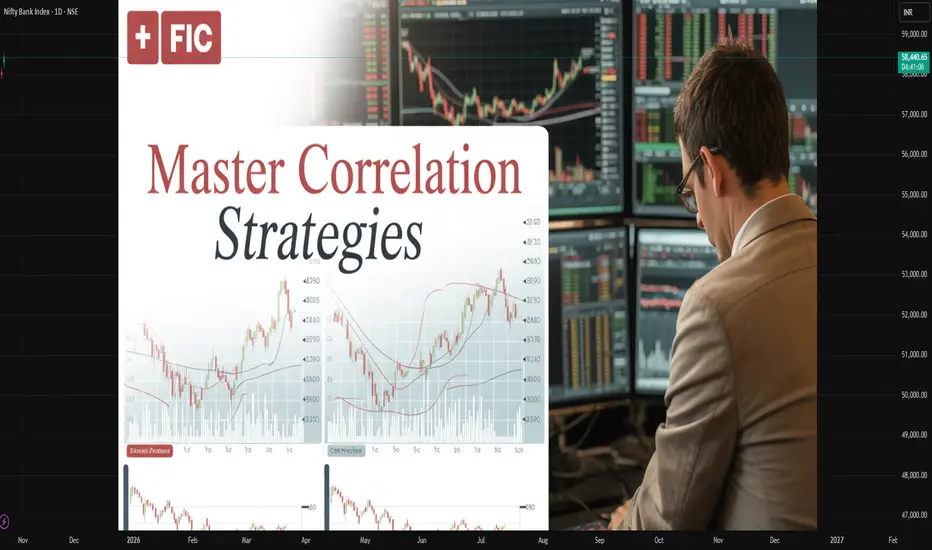
Master Correlation Strategies in Financial MarketsIntroduction
In the dynamic world of financial trading and global markets, mastering correlation strategies is a cornerstone of risk management, portfolio diversification, and strategic profit-making. Correlation — the statistical relationship between two or more assets — reveals how price movements are interconnected. Understanding these relationships enables traders, investors, and portfolio managers to forecast market behavior, hedge risks, and enhance returns. In an era dominated by algorithmic trading, quantitative analysis, and global interdependence, mastering correlation strategies has become an indispensable skill for professionals in finance.
1. The Concept of Correlation in Financial Markets
Correlation measures the degree to which two securities move in relation to one another. It is expressed as a correlation coefficient ranging from -1 to +1:
+1 (Perfect Positive Correlation): The two assets move in the same direction. For example, the S&P 500 Index and a major U.S. technology ETF often exhibit a high positive correlation.
-1 (Perfect Negative Correlation): The two assets move in opposite directions. For instance, gold and the U.S. dollar often show a negative correlation.
0 (No Correlation): The movements of the two assets are unrelated.
By analyzing correlations, traders can understand how assets behave under varying market conditions — bullish, bearish, or volatile.
2. Importance of Correlation in Trading and Investment
Mastering correlation allows investors to build robust portfolios that can withstand market shocks. The importance of correlation can be summarized as follows:
Risk Management:
Correlation analysis helps identify how portfolio components interact. High correlations among holdings increase risk exposure, while low correlations enhance stability.
Diversification:
Diversification reduces unsystematic risk. By combining assets that are not highly correlated, investors minimize losses if one segment of the portfolio declines.
Hedging:
Traders can use negatively correlated assets as hedges. For example, when equity markets fall, investors may shift funds to bonds or gold.
Macro Market Analysis:
Correlation helps identify inter-market relationships — such as between currencies, commodities, and equities — offering insights into global economic trends.
Algorithmic Strategy Development:
Quantitative traders use correlation matrices to design algorithmic models that exploit patterns and mean-reversion opportunities between correlated assets.
3. Types of Correlation in Financial Markets
There are multiple forms of correlation that traders must understand:
Static Correlation:
The traditional correlation coefficient that remains constant over a fixed time period.
Dynamic or Rolling Correlation:
Correlations are not stable; they change over time due to macroeconomic events, liquidity shifts, and investor sentiment. Rolling correlation examines relationships across moving time windows (e.g., 30-day or 90-day).
Cross-Asset Correlation:
Measures how different asset classes — such as equities, bonds, and commodities — interact. For example, bond yields often have an inverse correlation with stock prices.
Intermarket Correlation:
Tracks relationships across international markets. For example, the performance of the U.S. dollar influences emerging market equities and commodities.
Sectoral Correlation:
Within equities, correlations can vary by sector. Technology and consumer discretionary sectors may rise together during economic booms but diverge in recessions.
Lagged Correlation:
Sometimes one asset’s price movement precedes another. For instance, movements in crude oil prices often precede those in airline stocks due to cost impacts.
4. Building Correlation-Based Strategies
Mastering correlation requires applying the concept in strategic, data-driven ways. Below are several powerful correlation-based trading and investment approaches.
A. Pair Trading (Statistical Arbitrage)
Pair trading is one of the most common correlation strategies. It involves identifying two historically correlated assets. When their correlation temporarily diverges — one asset becomes undervalued while the other is overvalued — traders short the outperforming asset and go long on the underperforming one, betting that prices will converge again.
Example:
Suppose Coca-Cola (KO) and PepsiCo (PEP) typically move together.
If KO rises 5% while PEP remains flat, traders might buy PEP and short KO, expecting their prices to realign.
This strategy is market-neutral, meaning profits can be generated regardless of market direction, as long as the correlation reverts.
B. Cross-Asset Hedging
Traders often hedge exposure by using correlated assets. For instance:
A trader long on the NASDAQ 100 might short S&P 500 futures to offset systemic risk.
Commodity traders hedge oil exposure through correlated instruments like energy-sector ETFs or refining stocks.
This technique reduces portfolio volatility by offsetting correlated risks.
C. Intermarket Analysis
Correlation helps traders interpret how different markets influence each other. Examples:
A strengthening U.S. dollar often leads to falling commodity prices.
Rising Treasury yields may indicate future stock market corrections.
Increasing oil prices can signal inflationary pressures affecting currency values.
By monitoring these correlations, traders anticipate market moves before they occur.
D. Portfolio Diversification Optimization
Portfolio managers use correlation matrices to identify assets that provide maximum diversification benefits.
For instance, combining U.S. equities with gold, real estate, and bonds reduces overall portfolio variance because these assets have historically low or negative correlations with one another.
E. Volatility and Correlation Trading
In derivative markets, correlation strategies are applied using correlation swaps or dispersion trades:
A correlation swap allows traders to speculate directly on the average correlation between assets in an index.
Dispersion trading involves buying options on individual stocks while selling options on an index, profiting from the difference between implied and realized correlation.
These advanced techniques are primarily used by institutional traders and hedge funds.
5. Tools and Methods to Measure Correlation
Mastering correlation requires analytical tools and quantitative methods:
Correlation Coefficient (Pearson’s r):
A standard measure ranging from -1 to +1, used to identify the strength and direction of a linear relationship.
Spearman Rank Correlation:
Measures monotonic relationships (useful when data is not normally distributed).
Rolling Correlation Analysis:
Using statistical software or trading platforms, traders compute rolling correlations to observe how relationships evolve.
Heatmaps and Correlation Matrices:
Visual tools that show correlations between multiple assets simultaneously, allowing easy identification of diversification opportunities.
Regression Analysis:
Used to model dependencies and predict how one asset’s returns affect another’s.
Machine Learning Techniques:
Advanced models like Principal Component Analysis (PCA) or clustering algorithms help detect non-linear correlations across large datasets.
6. Challenges in Applying Correlation Strategies
While correlation is a powerful concept, it is not without limitations:
Correlation is Not Causation:
A high correlation doesn’t necessarily imply one asset influences another. Spurious correlations may lead to false signals.
Dynamic Market Behavior:
Correlations fluctuate due to macroeconomic shifts, policy changes, or crises. For example, during global recessions, correlations across assets tend to rise sharply, reducing diversification benefits.
Tail Risk and Black Swan Events:
Extreme market events often break historical correlations. During the 2008 financial crisis, previously uncorrelated assets suddenly moved together.
Overfitting in Quant Models:
Excessive reliance on historical data can lead to models that fail under real-world conditions.
Liquidity and Execution Risks:
In pair or correlation trades, slippage and liquidity constraints can erode profitability.
7. Correlation Dynamics in Different Market Environments
Understanding how correlations evolve under various conditions is key to mastering this strategy.
Bull Markets:
Equity correlations tend to decrease as investors pursue diverse risk assets.
Diversification benefits are more visible, and pair trading strategies perform well.
Bear Markets:
Correlations across asset classes often increase as investors move to safe havens.
Portfolio diversification becomes less effective, and hedging becomes essential.
Volatile or Uncertain Markets:
Dynamic correlation tracking helps traders detect sudden changes in market relationships.
Correlation-based hedging and volatility arbitrage strategies become valuable.
8. Role of Correlation in Algorithmic and Quantitative Trading
Quantitative funds and algorithmic trading systems rely heavily on correlation analysis:
High-Frequency Trading (HFT): Algorithms detect microsecond-level correlation changes to exploit arbitrage opportunities.
Machine Learning Models: Predictive models use multi-asset correlation patterns to forecast market direction.
Portfolio Optimization Algorithms: Quant funds use correlation matrices to rebalance holdings dynamically.
Correlation Arbitrage: Institutional players identify mispriced assets using multi-dimensional correlation structures.
9. Case Studies: Correlation in Action
A. Gold and U.S. Dollar
Historically, gold and the U.S. dollar exhibit strong inverse correlation. When the dollar weakens due to inflation or monetary easing, gold tends to rise as investors seek protection against currency devaluation.
B. Crude Oil and Equity Markets
Oil prices often move in tandem with equity markets in growth periods but diverge during inflationary shocks or geopolitical disruptions.
C. Bitcoin and Tech Stocks
Recent data show Bitcoin increasingly correlated with technology equities, reflecting its risk-on asset behavior in global liquidity cycles.
10. The Future of Correlation Strategies
The future of correlation strategies is shaped by technology, globalization, and behavioral finance.
Machine learning, big data analytics, and artificial intelligence are enabling real-time correlation tracking across vast datasets, enhancing predictive power. Cross-asset and inter-market relationships are becoming increasingly complex due to algorithmic participation and geopolitical dynamics.
Moreover, deglobalization trends, supply chain shifts, and digital assets are creating new correlation structures that traders must monitor closely. As financial systems evolve, mastering dynamic, adaptive correlation strategies will remain a decisive advantage.
Conclusion
Mastering correlation strategies is not merely a technical skill; it is a comprehensive approach to understanding market interconnectivity, risk, and opportunity. By studying how assets move in relation to one another, traders and investors can craft resilient portfolios, design profitable arbitrage models, and navigate volatility with confidence.
In essence, correlation is the language of relationships within global finance. The true mastery lies in not only recognizing those relationships but also anticipating when they will shift — turning statistical insight into strategic foresight.
Community ideas
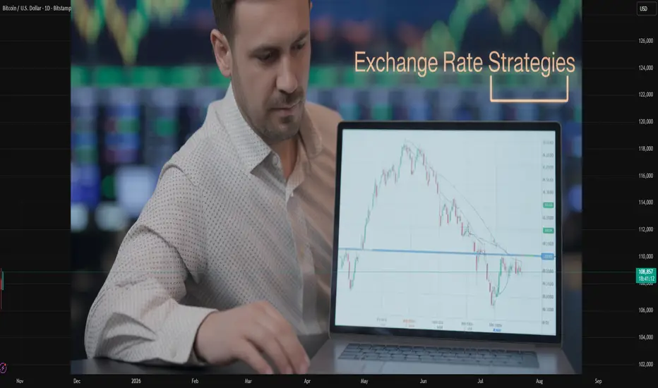
Exchange Rate Strategies in the Global Trading MarketIntroduction
Exchange rates—the prices of one country’s currency in terms of another—are at the heart of the global trading system. They play a decisive role in determining international competitiveness, investment flows, and macroeconomic stability. As globalization intensifies, managing exchange rates effectively has become a strategic priority for governments, central banks, and multinational corporations. The strategies adopted to manage exchange rates are known as exchange rate strategies or exchange rate regimes. These strategies influence trade balances, inflation, foreign investment, and the overall growth trajectory of nations. Understanding how these strategies operate and interact within the global trading market is essential to grasping modern international economics.
1. Understanding Exchange Rates
An exchange rate is the value of one currency relative to another. For example, if 1 U.S. dollar equals 83 Indian rupees, the exchange rate is 1 USD = ₹83. Exchange rates fluctuate constantly due to various factors such as interest rates, inflation, trade balances, capital flows, and market speculation.
There are two primary types of exchange rates:
Nominal Exchange Rate – the rate at which one currency can be exchanged for another.
Real Exchange Rate – adjusted for inflation differences between countries, reflecting the true purchasing power of currencies.
Exchange rates affect all major areas of the global economy—from trade and tourism to investment and government policy. Hence, countries design exchange rate strategies to align currency values with economic goals.
2. Types of Exchange Rate Strategies
Exchange rate strategies can broadly be divided into three major regimes: fixed, floating, and hybrid (managed float) systems. Each comes with its own advantages, challenges, and implications for the global market.
A. Fixed Exchange Rate Strategy
A fixed exchange rate system—also called a pegged system—is one in which a country’s currency value is tied to another major currency (such as the U.S. dollar or euro) or to a basket of currencies. Under this strategy, the central bank commits to maintaining the exchange rate at a predetermined level.
Examples:
The Saudi Arabian riyal is pegged to the U.S. dollar.
The Hong Kong dollar has been pegged to the U.S. dollar since 1983.
Advantages:
Promotes stability and predictability in international trade.
Reduces exchange rate risk for exporters and importers.
Helps control inflation by linking the domestic currency to a stable foreign currency.
Disadvantages:
Limits a country’s monetary policy independence.
May lead to currency overvaluation or undervaluation, distorting trade balances.
Requires large foreign exchange reserves to maintain the peg.
A fixed exchange rate is often adopted by countries seeking to build investor confidence or stabilize a volatile economy.
B. Floating Exchange Rate Strategy
In a floating exchange rate system, the value of the currency is determined entirely by market forces—supply and demand in the foreign exchange (forex) market. Governments and central banks may intervene occasionally, but they do not set a specific target rate.
Examples:
The U.S. dollar, euro, British pound, and Japanese yen are floating currencies.
Advantages:
Provides monetary policy flexibility; central banks can adjust interest rates freely.
Automatically adjusts to economic shocks and trade imbalances.
Reduces the need for massive foreign reserves.
Disadvantages:
Creates volatility and uncertainty in exchange rates.
May lead to short-term speculation and rapid currency movements.
Can increase risks for exporters and importers.
Floating exchange rates are best suited for large, diversified, and financially mature economies that can absorb currency fluctuations.
C. Managed Float or Hybrid Exchange Rate Strategy
Most countries today follow a managed float or hybrid strategy, combining elements of both fixed and floating systems. Here, the exchange rate is primarily determined by the market, but the central bank intervenes occasionally to stabilize the currency or guide it toward a preferred level.
Examples:
India follows a managed float system where the Reserve Bank of India (RBI) intervenes to curb excessive volatility.
China manages the yuan’s value within a controlled band around a reference rate.
Advantages:
Offers a balance between stability and flexibility.
Enables selective intervention during volatility.
Protects against speculative attacks.
Disadvantages:
May lead to uncertainty if market participants do not understand the central bank’s policies.
Requires effective management and transparent communication to build credibility.
3. Determinants of Exchange Rate Movements
Exchange rates are influenced by a combination of economic fundamentals and market psychology. The major determinants include:
Interest Rate Differentials – Higher interest rates attract foreign capital, strengthening the currency.
Inflation Rates – Low inflation boosts currency value; high inflation weakens it.
Trade Balances – Countries with trade surpluses usually have stronger currencies.
Political Stability – Stable governments attract foreign investment, enhancing currency strength.
Market Expectations – Traders’ perceptions about future policies and performance drive short-term fluctuations.
Speculation and Capital Flows – Large capital inflows or outflows can cause sharp currency movements.
Understanding these determinants helps policymakers and businesses craft appropriate exchange rate strategies.
4. Role of Central Banks and Monetary Authorities
Central banks are the key architects and executors of exchange rate strategies. Their responsibilities include:
Intervention in Forex Markets: Buying or selling foreign currency to influence the domestic currency’s value.
Setting Interest Rates: Adjusting rates to attract or repel foreign investment.
Maintaining Foreign Reserves: Ensuring adequate reserves for interventions.
Communicating Policy Stance: Providing guidance to stabilize market expectations.
For instance, the U.S. Federal Reserve, European Central Bank (ECB), and Bank of Japan manage their exchange rate impacts indirectly through monetary policy, while emerging markets like India or Brazil often intervene directly.
5. Exchange Rate Strategies and Global Trade
Exchange rate policies profoundly affect global trade patterns:
Export Competitiveness: A weaker currency makes exports cheaper and more competitive, stimulating demand.
Import Costs: A stronger currency reduces import prices, benefiting consumers and lowering inflation.
Trade Balances: Persistent misalignments can lead to deficits or surpluses.
Foreign Investment: Stable and predictable exchange rate systems attract long-term foreign direct investment (FDI).
For example, China’s managed currency policy during its early growth phase kept exports competitively priced, driving its manufacturing boom. Conversely, countries with overvalued currencies often experience declining exports and rising imports, widening trade deficits.
6. Exchange Rate Strategies and Economic Stability
The exchange rate regime influences not just trade, but also economic stability:
Fixed regimes provide stability but may collapse under speculative pressure if reserves are inadequate.
Floating regimes absorb shocks automatically but can amplify volatility.
Hybrid regimes offer flexibility but require strong institutional capacity to manage interventions.
During the Asian Financial Crisis (1997), several economies with semi-fixed systems (like Thailand and Indonesia) faced collapse after speculative attacks, illustrating the risks of maintaining unsustainable pegs. Conversely, countries with flexible systems (like Australia) weathered the crisis better.
7. Exchange Rate Strategies and Global Capital Flows
Global investors constantly evaluate currency risks when making cross-border investments. Exchange rate strategies therefore influence capital flows:
Fixed systems often attract short-term speculative flows, seeking stability.
Floating systems attract long-term investments, offering transparency.
Managed systems strike a balance but must maintain credibility to prevent capital flight.
For instance, when the U.S. Federal Reserve raises interest rates, capital flows out of emerging markets, causing currency depreciation and policy challenges. Managing such spillovers requires coherent exchange rate and monetary coordination.
8. Exchange Rate Strategies and International Cooperation
In today’s interconnected world, exchange rate strategies are not purely domestic choices. They affect trading partners and global markets, necessitating international cooperation through institutions like the International Monetary Fund (IMF), World Bank, and World Trade Organization (WTO).
The IMF monitors global currency movements, advises on sustainable policies, and provides financial assistance during crises. The G20 also coordinates policies to prevent “currency wars,” where nations competitively devalue currencies to boost exports.
9. Challenges in Modern Exchange Rate Management
Despite technological advances and policy coordination, several challenges persist:
Globalization of Finance: Rapid capital flows make exchange rates volatile.
Speculative Attacks: Investors can quickly move billions, pressuring currencies.
Geopolitical Uncertainty: Wars, sanctions, and political events cause abrupt shifts.
Digital Currencies: The rise of cryptocurrencies and central bank digital currencies (CBDCs) complicates traditional currency management.
Balancing Growth and Stability: Policymakers often face trade-offs between stimulating growth and maintaining currency stability.
10. Future of Exchange Rate Strategies
The future of exchange rate management will be shaped by technological, geopolitical, and environmental changes:
Digital Transformation: Blockchain-based payment systems and CBDCs may reduce dependency on the U.S. dollar and alter traditional exchange mechanisms.
Regional Currency Integration: Efforts like the Eurozone or proposed Asian Currency Unit may promote regional stability.
Sustainable Finance: As economies transition to green energy, exchange rate policies will adapt to new trade dynamics.
Data-Driven Policy: Artificial intelligence and real-time analytics will enhance central banks’ ability to predict and manage currency movements.
Overall, the future points toward greater flexibility, digital integration, and international cooperation.
Conclusion
Exchange rate strategies form the backbone of the global trading market. Whether fixed, floating, or managed, these strategies determine how nations engage in trade, manage capital flows, and maintain economic stability. Each approach carries distinct trade-offs—between stability and flexibility, autonomy and discipline. In a world increasingly connected by finance and technology, the effectiveness of an exchange rate strategy depends not merely on policy design but on institutional credibility, international coordination, and adaptive management. As global trade evolves, so too must the strategies that govern the value of money itself—ensuring that currencies continue to facilitate, rather than hinder, the smooth functioning of the global economy.
AMP Futures - Volume Footprint charts table summary upgradeIn this idea we will demonstrate how to enable the new table summary feature for Volume footprint charts using Tradingview.

TradeCityPro Academy | Support & Resistance Part 2👋 Welcome to TradeCityPro Channel
🎓 Educational Section Technical Analysis Training Series
Welcome to the Educational Content Section of our channel!
Here, we aim to teach you technical analysis from A to Z through structured playlists.
We’ll cover everything from risk and capital management, Dow Theory, support and resistance, trends, and market cycles, to more advanced concepts.
Our lessons are based on both real market experience and The Handbook of Technical Analysis.
🎨 What is Technical Analysis?
Technical Analysis (TA) is a method used to forecast price movements in financial markets by analyzing historical data, especially price and volume.
It’s based on the idea that history tends to repeat itself, and that recurring patterns can reveal profitable trading opportunities.
📚 Complete Guide to Support and Resistance in Technical Analysis
🧩 Introduction
In technical analysis, two key concepts form the foundation of nearly every trading strategy: Support and Resistance.
These levels represent areas on the chart where the price is likely to change direction, as buyers or sellers regain control.
But to truly understand them, you must go beyond the chart — because their origin lies in human psychology and collective behavior.
🟢 What Is Support?
A support level is an area where buying pressure increases and prevents the price from falling further.
It acts like a floor where buyers believe the asset has become cheap enough to buy.
As a result, the market tends to bounce upward from that area.
For example, if Bitcoin has repeatedly reversed near $55,000, that zone is considered a support level.
🔴 What Is Resistance?
A resistance level is an area where selling pressure increases and stops the price from rising higher.
When the price approaches this level, traders often feel the asset is “too expensive” and start selling.
For example, if Ethereum has failed multiple times to break above $3,800, that area is considered resistance.
💭 Why Do Support and Resistance Form?
Markets are not just numbers — they’re the reflection of human emotion and crowd behavior.
When large groups of traders make similar decisions (to buy or sell) around the same price zone, it creates a psychological memory in the market.
If price has reacted there before, traders remember it — and react the same way next time.
This repetition forms the backbone of how support and resistance levels develop and strengthen over time.
🧠 The Role of Emotion and Crowd Psychology
Emotions drive markets.
When prices rise quickly, people experience FOMO (Fear of Missing Out) and rush to buy — until demand runs out and price reverses (resistance).
When prices fall, fear of losing money triggers panic selling — until sellers dry up and price rebounds (support).
This constant emotional cycle repeats endlessly, creating recurring support and resistance zones on every chart.
⚙️ The Structure Behind the Levels
From a technical perspective, these levels form because large clusters of orders are placed around them.
Traders typically set buy orders below the current price (near support) and sell orders above it (near resistance).
So when the market reaches those areas, there’s a strong battle between buyers and sellers.
That’s why these zones are not just psychological — they’re also built into the order flow and liquidity structure of the market.
📈 Reactions and Breakouts
When price approaches a key level, two outcomes are possible: Reaction or Breakout.
In a reaction, price touches the level and reverses — meaning buyers or sellers defend it successfully.
In a breakout, price pushes through with strong momentum and high volume, breaking the market’s previous belief.
After a breakout, the level often changes its role:
A broken resistance becomes new support.
A broken support becomes new resistance.
This behavior is known as Role Reversal, one of the most powerful principles in chart analysis.
⚖️ The Professional Mindset
Support and resistance are zones, not exact numbers.
The market may slightly move above or below them before reacting — this is known as a fake breakout.
Professional traders look for confirmation such as reversal candles, volume spikes, or RSI divergences before acting.
The key is not to memorize lines but to read crowd behavior.
Once you understand why people buy or sell at certain points, you gain a true edge over the average trader.
🧩 Conclusion
Support and resistance are not just lines on a chart; they are the visible footprints of fear, greed, and collective memory in the market.
By understanding their psychological and structural roots, you can identify better entry and exit zones,
predict reactions more accurately, and avoid emotional mistakes.
Learn to read the emotions behind the candles — because at its core, the market is simply a crowd of human minds trying to win.

The Silent War Between Traditional Finance and Crypto!Hello Traders!
Whether you realize it or not, there’s a silent war happening in the financial world, a battle between Traditional Finance and Crypto .
On one side are banks, regulators, and old financial systems built over centuries.
On the other, a decentralized movement that aims to replace them with blockchain and digital assets.
This war isn’t fought with weapons, it’s fought with innovation, control, and trust.
1. The Old Guard, Traditional Finance
Traditional finance relies on intermediaries, banks, brokers, and central banks.
Transactions are slow, heavily regulated, and full of middlemen fees.
The system gives stability but limits freedom. Every transfer, loan, or investment must pass through institutions that hold the power.
2. The New Challenger, Crypto & Decentralization
Crypto removes the middleman by allowing peer-to-peer value exchange through blockchain.
It offers transparency, speed, and global access, anyone with an internet connection can participate.
For the first time, individuals can control their money without asking permission from financial authorities.
3. Why It’s a “Silent War”
Traditional finance sees crypto as a threat to its control.
Regulators tighten policies to limit crypto adoption, while institutions secretly invest behind the scenes.
At the same time, crypto needs traditional finance for liquidity, fiat conversions, and institutional trust.
So both depend on each other, even as they compete.
4. The Future, Integration, Not Elimination
Over time, the war may end in balance, not destruction.
Banks and funds are already entering blockchain through tokenization, ETFs, and digital custody.
The final version of finance may be a hybrid, traditional systems powered by crypto infrastructure.
Rahul’s Tip:
Don’t think of TradFi vs Crypto as enemies, think of them as two forces shaping the next generation of money.
The real winners will be those who understand both worlds and can adapt as they merge.
Conclusion:
The silent war between traditional finance and crypto is not about who wins, it’s about how finance evolves.
Crypto challenges the old system, but also inspires it to improve.
In the end, innovation always wins, and the world moves one step closer to financial freedom.
If this post gave you a new perspective on the battle between TradFi and Crypto, like it, share your view in comments, and follow for more deep market insights!

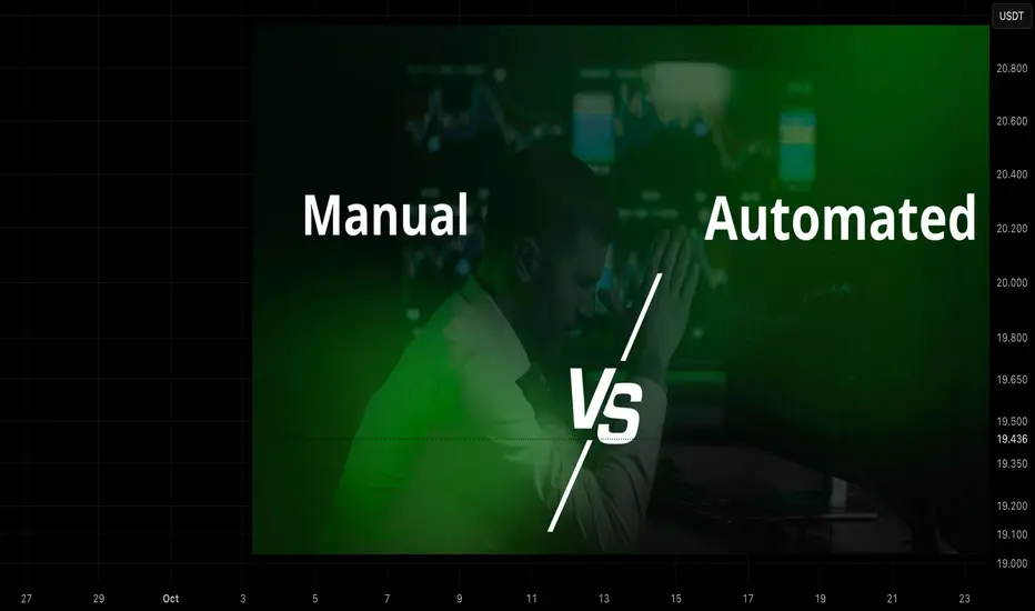
Automated vs Manual Trading — Which One Really Wins?Most traders start out manually, staring at charts for hours, hunting for that perfect setup, trying to outsmart the market.
It feels alive. You’re in control.
But after a while, you realize something brutal:
the real opponent isn’t the market, it’s you.
Fear, greed, hesitation, fatigue. The emotions that ruin good trades. That’s when automation steps in.
Manual Trading
Manual trading builds skill, but it also exposes every weakness you’ve got.
If this sounds familiar, you’re not alone:
Entering late because you hesitated.
Moving your stop loss “just one more time.”
Doubling down after a loss.
Missing setups because you needed sleep.
Manual trading gives flexibility, sure.
But it also gives you the freedom to sabotage your own plan.
Automated Trading
Benefits
Consistency: trades follow predefined rules, eliminating impulsive deviations from the plan.
Scale: automation handles higher frequency and 24/7 market coverage beyond human capacity.
Speed and precision: orders execute with lower latency and exact risk parameters.
Backtest + deploy: strategies validated historically can be deployed reliably across multiple markets.
Operational leverage: frees human time for strategy development, risk oversight, and portfolio decisions.
Disadvantages and risks
Model risk: historical backtests do not guarantee future performance; edge can decay.
Overfitting and brittle rules: overly specific parameters may break under regime changes.
Misaligned incentives: automated systems execute mechanically; they cannot judge rare macro events or qualitative news.
Monitoring burden: automation reduces manual trading work but increases need for robust monitoring, alerts, and contingency plans beforehand.
⚔️ Two Traders, One Market
Here’s the truth: two traders can run the same strategy and get completely different results.
Trader A trades manually, emotional, inconsistent.
Trader B runs automation, same logic, perfect execution.
Same system. Different outcome.
Guess which one ends up consistent?
700% XRP Trade — The Exact Strategy I UsedThe XRP Trade That Made 700% — Full ICT Breakdown!
In this video, I break down my 700% XRP trade that I called out on the channel — exactly how I entered, why I entered, and how I managed the position.
I also explain why you don’t need to overcomplicate trading by drilling down to the 15-minute or 5-minute charts — sometimes, the cleanest ICT setups are right on the higher timeframes.
If you’ve been struggling to find consistency, this video will show you how powerful HTF liquidity plays can be when combined with patience and clear structure.
📈 Covered in the video:
Full breakdown of my XRP 700% trade
The exact HTF setup I used
How I manage risk and secure profits
Why ICT trading doesn’t need to be complicated

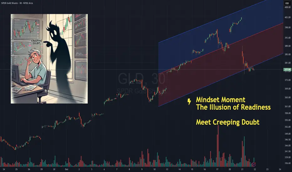
The Illusion of Readiness - Creeping DoubtNOTE – This is a post on mindset and emotion. It is not a trade idea or strategy designed to make you money. My intention is to help you preserve your capital, energy, and focus - so you can trade your own system with calm and confidence.
You know that feeling before you click buy or sell .
You pause…
You check your levels again.
Re-measure your stop.
Recalculate your size.
Zoom in, zoom out.
Add one more confirmation just to be sure.
You tell yourself it’s discipline.
That you’re waiting for the “perfect” setup.
But there's no denying it…
You can feel it
Creeping doubt entering your trading room
Listen. The truth is you already know your plan.
You’ve tested it.
You’ve seen it work.
You are ready.
But your mind doesn’t trust that yet.
So it creates the illusion of readiness
a loop of micro-adjustments and checks that feel productive…
when really, they keep you safely on the sidelines.
It’s control in its most subtle form.
A way of saying,
“I’ll act when I feel completely certain.”
Except in trading that feeling never comes.
Every tweak strengthens the belief that you’re not ready.
Every delay tells your system,
“Not yet… not safe.”
The work isn’t in waiting for confidence.
It’s in acting through the uncertainty
and building trust in motion.
Next time you find yourself double-checking for the fifth time, pause and ask:
“Who is in the driving seat here?”
Take a deep steadying breath and then follow your plan.
Until You Fix This, You’ll Never Be a Successful TraderHey what’s up guys,
today’s post is not going to be technical, and neither some AI-generated piece. But more important than some technical ones. This one is about trading enemies that were holding me back for some time, hope you can learn from my mistakes.
Looking for the secrets which will solve my trading and protect me from losses. Jumping from strategy to strategy and still thinking I need to learn more to avoid losses and find confidence. But than I realized its not in the strategy, but about being realistic and backed by statistical data.
🧠 Without a doubt, trading is 80% psychology and 20% trading.
I’ll show you 3 main problems and give you solution for the inspiration to move to the next level faster.
1️⃣ False Expectations – Getting Rich Quick
First of all avoid 20 years old instagram billionaires with cars, watches and yachts. Its mostly rented and if they cant show 3rd party verified 5 years live track record run aways. Yes, you can get rich from trading, but it’s not gonna be in a month. And most likely not even in a year. Be realistic. A doctor or a lawyer must study at least 4 years, and then practice for a few more years before they earn any money from their professions. They have clean scripts about what to learn, in what order, and how to apply it.
In trading, you don’t know what to learn. You don't know yourself yet. You’ll probably waste time finding out what works and what doesn’t. You’ll also waste time trying shortcuts like signals, expert advisors, and mainly jumping from strategy to strategy thinking it's a solution.
💊 Solution:
Stop believing someone has a magic secret formula to be 100% right on the markets. Strategy that makes you rich in a week and solve all your financial problems? No one has it.
Learning to trade takes time — realistically 1–2 years minimum.
It depends on your commitment and how much focused work you put in.
Don’t expect to watch 20 hours of YouTube videos and become profitable. Doctor also cant do surgery after just reading scripts. Experienced practice and consistent work is needed. Can some mentor help you ? Yes, but you need to check them before buying any course.
Lastly trading is not a solution to a miserable financial situation, if you are broke. Learn trading but don't trade live yet or it will destroy you.
-----------------------------------------------------------------
2️⃣ Trading Random Patterns – Price Action Overfitting
If you’re trading random patterns and every trade has different logic, then you don’t have an edge. Random trading logic = random results.
‼️Knowing all these 👇 and fitting them to the chart is not trading edge. Im not saying, these patterns cant work, but you must focus to the one and become a master. Not randomly choosing what fits to the chart today and taking trade on different logic tomorrow.
‼️ If your strategy is trading random patterns you know,
You can’t measure strategy performance. ⏩ What you can’t measure — you can’t improve or backtest. ⏩ And that means you’re don't have statistical data - its core of all problems.
💊 Solution:
Whatever pattern you like - Head and Shoulders, Triangle, Wedge, Channels, Cup and handle. Whatever but pic one, defined step by step process how you will be trading it. And always use mechanical aprocah how you will be trading it. Narrow criteria for every element of a trade to eliminate subjective decisions.
🛡️ You should have :
• Defined your pattern
• Method to define key levels
• Fixed method how to define a trend
• Fixed method how to trade continuation with your pattern
• Fixed method how to trade reversal by using your pattern
Define one trading pattern ( 1 kick ) Practice it 10 000 times become master 👇 For your inspiration, you can check this strategy, its eliminating subjective decisions.
🔗 Click the picture below to learn more. 👇 Approach information I gave above as Bruce Lee : Adapt useful, Reject useless and something specifically your own.
-----------------------------------------------------------------
3️⃣ Psychological Influence
Trading is 20% strategy and 80% psychology.
It’s you vs. you. You need to master your emotions.
It’s modern to say “fix your mindset,” but how?
There’s no way to stop fearing losses, being greedy, or overtrading by just magically “fixing your mindset.”
🧪 Fear – Not executing your setup when it appears because the last two trades were losses. Closing trades early because you fear it will come back to entry or hit SL — which leads to doubting your strategy and jumping to another one.
🧪 Greed – Setting unrealistic targets and not taking profits at the right time.
Trading sizes so big that you check your phone every 3 minutes. Gambling. Trying to pass prop firm challenges in a few trades instead of consistent work.
🧪 Revenge Trading – Trying to make your money back quickly in bad trading conditions. Trying to prove to the market that you’re right. Fighting with your ego.
🧪 Overtrading – Forcing trades just for the sake of doing something. Feeling like you need to trade every day — a mindset from normal jobs where we’re paid for effort.
💊 Solution:
Mechanical Strategy + Statistical Data = EDGE
Sounds like it has nothing to do with psychology, right? You will see step-by-step, following the same process and trading plan, can be backtested on hundreds of examples.
If you run at least 300 trade backtests on any trade pattern, this is what happen to you:
• No pattern guessing or fitting to price action
• No overthinking — you just follow the same setup you know works
• Fixed SL and TP, fixed RR — no guesswork
• You know your win rate %
• You know your risk-reward %
• Repetitiveness builds confidence and clarity
• Confidence and clarity lead to improvements
• Improvements lead to mastery over time
‼️ Again a statistical edge is only possible through a mechanical trading approach and proper backtesting. If you’ve done your backtests and have statistical data on a large sample, let’s say:
Win Rate: 65%
That means out of 100 trades, you’ll win 75 — but there can still be 25 losses.
You never know the distribution of wins and losses, you only know that you’ll win over a series of trades.
Average RR: 2.3
That means for every $100 you risk, you’ll win $230 if you’re right, and lose $100 if you’re wrong.
The reality is always different than backtest, in reality you will perform worse. Here is what you should at least achieve Having these stats is key — it’s the solution to psychological influence How?
🧠 Final Solutions - Just think about it
🧪 Fear
Why would you fear opening the next trade after a loss or closing early, if you know that on average you win 65 out of 100 trades? Distribution is random, but with a positive win rate, you win over time. Why would you close early if you know that your TP was hit in 75 out of 100 ?
🧪 Greed
Why would you set unrealistic targets when your statistics already show what RR is most profitable for you? And why would you gamble big lot sizes if you know you can lose 35 trades out of 100? It doesn't make sense to gambler right?
🧪 Revenge Trading
Why do it, if you know losses are part of the process and that if you just stick to the plan, you’ll win long-term? Why your statistics says so. You know how your A+ Setup looks like, when stopped out why re-entering again if setup is not valid.
🧪 Overtrading
Why trade every day if your A+ setup doesn’t occur every day?
If your data says the best setups occur 3 times per week, why force it?
Why risk extra trades if you already made profit or if you didn’t perform well this week, why gamble it all on Friday?
See ? Having a fixed mechanical solution backed by backtested statistical data is solution to everything?
David Perk aka Dave Fx Hunter

3 Cognitive Traps That Prevent You from Closing Losses!Hello, friends 😊
Today I want to talk not about indicators or patterns, but about why, even if we know everything "correctly", we still hold unprofitable positions longer than we should. Even when the price doesn't go according to plan and the situation becomes more obvious, we still convince ourselves that " is about to turn around "
Honestly? I sometimes struggle with it myself , but now it's not as panicky as it used to be.
🤔 And yes, I also had moments when I looked at the graph and realized that "that's it, the hypothesis didn't work," but I still thought, "Well, I'll wait a little longer... what if?"
It's not a matter of weak will. The fact is that our brain is designed in such a way that it literally prevents us from making rational decisions at a loss . And today we will analyze 3 such cognitive traps , and see how to work with them.
Let's start, 🚩 Trap #1: The Concorde effect or the error of non-refundable costs (literally "sunk costs") - Costs that have no alternative use: costs incurred as a result of decisions made in the past and which cannot be changed by a subsequent decision in the future. When so much effort and resources have been invested in something that you don't want to stop. But it should be.
For example: "I've already invested so much time/money/nerves - now I have to wait for everything to come back!"
Does it sound logical in principle? But in reality, is an illusion . Because the market absolutely doesn't care how much you have invested. He doesn't have to return anything to you.
🔎 There was a moment when I just joined the market, I held a losing position on ETH for almost a week, because "I've been waiting so long, I'll wait some more." As a result, the loss tripled, and then, when I finally closed, the price went in my direction (classic) 😁
The most annoying thing was not the loss, but the fact that I violated my own rule (ignored the stop)
🔋 How to live with it?
A simple trick: before each trade (or even at the moment of loss) ask yourself : "If I wasn't in a position right now, would I open it under these conditions?"
If the answer is "no", exit. All. Point. Past losses cannot be returned . But you can stop the future ones and return to the market (albeit with a smaller amount)
🚩 Trap #2: The illusion of control is a cognitive distortion in which a person overestimates their ability to influence events that actually depend on chance or external circumstances
For example: "I feel like it's about to unfold. I know this pattern. I have the situation under control."
I feel ... we all use this phrase in our thoughts as a basis, especially when the market is going against us and we cling to hope.
But the truth is that the market is not controlled by anyone . Neither you, nor smart money, nor even those who trade billions. We are all participants in the same probability game .
And when you say, "I feel," what you're really saying is, "I really don't want to admit that I was wrong."
🔋 What can be done about it?
Remind yourself more often: we are not predicting the market - we are betting on probability.
If the price violates your risk level, it is not a "temporary drawdown." This is a refutation of your idea . And respect for the market begins with respect for your plan.
🚩 Trap #3: The Confirmation effect is a cognitive error that manifests itself in a person's tendency to seek, interpret, and remember information that confirms their pre-existing beliefs, and ignore data that contradicts these beliefs
For example: "Look, here's a bullish pattern! The volume is growing! The RSI has bounced back!"*
(and the divergence on the day, the fundamental news and the structure are negative ... but this is "not important", etc.)
Our brain is a master at filtering reality . He automatically searches for everything that confirms our point of view, and ignores everything that contradicts it. This is not stupidity, it is an evolutionary mechanism. But in trading, he's working against us.
🔋What should I do?
Before entering into a transaction, write it down in your diary:
- under what conditions will you leave?
- what signals will mean that you made a mistake?
And when there is already a loss, ask yourself: "What data am I not seeing right now because I don't like it?"
This question is like a cold shower for the ego, but it brings you back to reality .
We're not perfect 🔆 I also have days when emotions take over.
But over time, I realized that stability in trading is not about "never making mistakes." It's about making mistakes with respect for yourself and the market and drawing conclusions based on your mistakes.
💡 A loss is not a failure . This is part of the process .
But the inability to control it is what really slows down growth .
📌 So if you closed the loss on time today, even if it hurt, you won.
Because we have saved not only capital, but also the most valuable thing: our trust in ourselves as a trader .
If this post made you nod😉, please rate🚀
And in the comments, write: which of these traps most often "catches" you?
(I still have the illusion of control sometimes. But now I recognize her and gently release her)
Gold’s recent rollercoaster- A Lifetime of LessonsThere are plenty of lessons to take from Gold’s recent rollercoaster — lessons about volatility, psychology, and how easily conviction can turn into chaos.
But before we get into technicalities, let’s look at what really happened… and what it means for us as traders.
________________________________________
1️⃣ The Illusion of Strength
When Gold went straight from 4000 to 4400 in just a few days, the move looked unstoppable.
Social media was full of confidence — “China is buying”, “5k incoming”, “This is the new era for Gold.”
But markets don’t move in straight lines forever.
Every parabolic rise eventually collapses under its own weight.
And when it does, it doesn’t just destroy buy positions — it destroys false convictions.
The first lesson?
Moves that look too strong to fade are usually too weak to sustain.
________________________________________
2️⃣ Confidence Can Be Expensive
Believing too much in one direction — especially when price already exploded (see the rise from 3300 to 4k in one month) — is one of the fastest ways to lose money.
A trader who bought at 4350 because he was “sure” China would keep buying quickly learned how expensive “sure” can be.
The market doesn’t reward conviction.
It rewards discipline, flexibility, and risk control.
Confidence without control is just another form of gambling.
________________________________________
3️⃣ Trading ≠ Investing
This move also reminded everyone of a fundamental truth:
You are not China.
China buys Gold as a store of value, not as a speculative trade.
They bought at 2500, 3k, 3.5k and 4400 — not to take profit in two days, but to build long-term reserves.
You, as a trader, operate in a completely different universe.
Mixing trading logic with investment narratives is a silent killer.
You might tell yourself, “If China buys, I’m safe.”
But China doesn’t use a stop loss and don't trade in margin (use laverage),— YOU DO.
If you don’t understand the difference, better stay on the sidelines and watch.
At least you won’t lose money while learning the hard way.
And if you want a more down-to-earth comparison — my mother started buying Gold in the early ’70s, as a store of value through the communist period.
She bought through the gold bubble of the late 1970s, bought at the bottom afterward, continued through the 1990s, and kept doing it until she retired in 2005.
She wasn’t trading — she was preserving value.
That’s what investing is.
What we do here, every day, is something entirely different.
________________________________________
4️⃣ Right vs. Wrong? It’s Not About That
And now that we’ve made the distinction between investing and trading clear,we must also understand something even more important:
Trading is not about being right or wrong — it’s about timing, money management, and perspective.
Let’s take a few real examples from last few day's chaos:
• On Friday, if you bought at 4275 and the price spiked overnight, you could’ve closed with 1000 pips profit — you were “right.”
• But if someone else sold at 4370 during that same night, they were also “right,” catching the drop.
• If you had bought the dip from the all-time high, around 4300, you’d likely be down 1000 pips in drawdown quickly same Friday — and let’s be honest, who really holds that?
• If you sold at 4300 on Monday near resistance, you would have been stopped out as price revisited the ATH — even though your direction was correct eventually.
• Likewise, if you bought yesterday at 4200 during the drop, you’d have been liquidated on the next 2000-pip fall. And if Gold now rises again to 4400 or even 5000 — how does that help you?
Obviously, these are illustrative examples, just to express the point — not literal trades.
And for those who commented under previous posts — either out of boredom or the need to contradict — I have two things to say:
1️⃣ If you don’t understand what I just explained, you have no business being in trading.
2️⃣ If you do understand but still feel the urge to argue, your comment is nothing more than trolling and emotional projection.
Because this isn’t about numbers or ego — it’s about understanding how the market really works, beyond the noise and the narratives.
________________________________________
5️⃣ The Real Lesson
The 4000–4400 move wasn’t just a chart pattern.
It was a psychological test — a reminder that the market exists to expose overconfidence.
When something looks “certain,” that’s usually when it’s most dangerous.
In trading, survival matters more than prediction.
And sometimes, the smartest trade is no trade at all.
________________________________________
6️⃣ Final Thoughts
Gold’s rollercoaster taught more than a dozen books on trading psychology ever could.
It reminded us that:
• Parabolic moves end violently.
• Overconfidence without a stop loss is suicide.
• You’re not an investor — you’re a trader.
• Being “right” means nothing without timing.
• And sometimes, the best position is to stay out.
The market didn’t just move from 4000 to 4400 and back.
It moved through the hearts and minds of every trader watching it —and left behind a few lessons worth remembering for a lifetime.

Embracing Failure: The Key to Unlocking Trading SuccessIn the pursuit of trading mastery, the path is often littered with setbacks and failures. However, it's essential to recognize that these hurdles are not just obstacles but invaluable learning opportunities. Learning how to fail – and more importantly, learning from failure – is a critical step towards enhancing your trading success. This article explores the significance of embracing failure as a vital component of your trading education.
➡️The Role of Failure in Trading
Trading, by nature, involves uncertainty and risk. Even the most seasoned traders face losses; it's an inherent part of the game. However, the difference between successful traders and those who struggle lies in their response to failure. Successful traders view failures as feedback, using them as a springboard to refine strategies, hone skills, and fortify mental resilience.
➡️Failing Forward
The concept of "failing forward" means using setbacks as a catalyst for growth. Instead of letting failure deter your progress, it involves analyzing what went wrong, understanding the factors at play, and adjusting your approach accordingly. This mindset shift is crucial in trading, where the same mistake can be costly if repeated.
➡️Lessons from Losses
Every loss carries a lesson. It could be a flaw in your strategy, a gap in your market knowledge, or even an insight into your psychological biases. By meticulously reviewing your failed trades, you can uncover these lessons and apply them to avoid similar pitfalls in the future. Remember, in trading, experience is measured not just by your wins but also by how you navigate and learn from losses.
➡️Some famous quotes
Thomas A. Edison: "I have not failed. I've just found 10,000 ways that won't work."
Winston Churchill: "Success is stumbling from failure to failure with no loss of enthusiasm."
Michael Jordan: "I've failed over and over and over again in my life and that is why I succeed."
Henry Ford: "Failure is simply the opportunity to begin again, this time more intelligently."
J.K. Rowling: "It is impossible to live without failing at something, unless you live so cautiously that you might as well not have lived at all—in which case, you fail by default."
Oprah Winfrey: "Failure is another stepping stone to greatness."
Theodore Roosevelt: "The only man who never makes mistakes is the man who never does anything."
Albert Einstein: "A person who never made a mistake never tried anything new."
Coco Chanel: "Success is most often achieved by those who don't know that failure is inevitable."
Johnny Cash: "You build on failure. You use it as a stepping stone."
James Joyce: "Mistakes are the portals of discovery."
Samuel Beckett: "Ever tried. Ever failed. No matter. Try again. Fail again. Fail better."
Robert F. Kennedy: "Only those who dare to fail greatly can ever achieve greatly."
John C. Maxwell: "Fail early, fail often, but always fail forward."
Arianna Huffington: "Failure is not the opposite of success; it's part of success."
Abraham Lincoln: "My great concern is not whether you have failed, but whether you are content with your failure."
Dale Carnegie: "Develop success from failures. Discouragement and failure are two of the surest stepping stones to success."
Mary Kay Ash: "When you fail, you have to be able to say, 'I believe in myself enough to try again.'"
Steve Jobs: "Remembering that I'll be dead soon is the most important tool I've ever encountered to help me make the big choices in life. Because almost everything — all external expectations, all pride, all fear of embarrassment or failure — these things just fall away in the face of death, leaving only what is truly important."
Richard Branson: "Do not be embarrassed by your failures, learn from them and start again."
As you can see, you're not the only one who fails, the famous people quoted all had their fair share of fails. The fact that they did not give up is testimony to their eventual success.
➡️Building Resilience
Repeated exposure to failure, coupled with a constructive response, builds resilience. This mental toughness is invaluable in trading, helping you maintain composure and clarity in the face of market volatility. Resilient traders are better equipped to stick to their strategies, manage risks effectively, and seize opportunities without being swayed by emotional extremes.
➡️Practical Steps to Learn from Failure
☝🏽Keep a Trading Journal: Document every trade, including the rationale, outcome, and any emotions felt. Review this journal regularly to identify patterns in your failures.
☝🏽Seek Feedback: Engage with a trading community or mentor. External perspectives can offer insights you might overlook.
☝🏽Educate Continuously: Use failures as a cue to fill knowledge gaps. Whether it's technical analysis, market fundamentals, or trading psychology, there's always more to learn.
☝🏽Develop a Growth Mindset: Cultivate the belief that your abilities and intelligence can grow with effort. This mindset encourages resilience and a positive attitude towards learning from failure.
➡️Conclusion
In trading, failure is not the opposite of success; it's part of the journey to success. By embracing your failures, analyzing them, and extracting lessons, you can continually improve your trading performance. Remember, every great trader has faced setbacks; what sets them apart is their ability to learn, adapt, and evolve from those experiences. So, next time you encounter a setback, see it as an opportunity to grow and inch closer to your trading goals.
❓How do you deal with failure? Do you let it get the best of you or do you dust yourself off and continue with renewed drive and energy?
Thanks for reading.

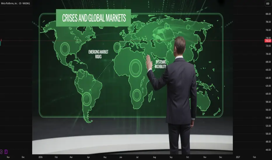
Global Market Crises, Emerging Market, and Systemic InvisibilityIntroduction
The global financial landscape is an intricate web of interdependence, where economies—both developed and emerging—are bound together through trade, capital flows, and investment channels. When a crisis erupts in one segment of this system, the ripple effects can destabilize the entire network. Global market crises, therefore, are not isolated events but collective shocks that reveal deep structural vulnerabilities in international finance. Emerging markets, which often serve as both beneficiaries and victims of globalization, find themselves particularly exposed to such turmoil. An underlying aspect of these crises is systemic invisibility—the inability to perceive, predict, or regulate risks that accumulate beneath the surface of financial and economic systems.
This essay explores the nature of global market crises, the role and vulnerability of emerging markets, and the concept of systemic invisibility that exacerbates instability. It discusses historical precedents, theoretical insights, and modern implications for a world driven by financial integration.
1. Understanding Global Market Crises
A global market crisis refers to a widespread and synchronized downturn in financial markets that transcends national boundaries. These crises typically involve severe declines in asset prices, widespread credit contractions, capital flight, and loss of investor confidence. The interconnectedness of global finance—through trade, investment, and technology—means that localized shocks can escalate into systemic failures.
Causes of Global Market Crises
Financial Deregulation and Excessive Leverage:
The liberalization of financial markets since the 1980s encouraged speculative investments and excessive risk-taking. When leverage ratios increase beyond sustainable levels, minor market corrections can lead to massive defaults.
Asset Bubbles and Speculative Behavior:
Asset bubbles—such as those seen in housing or stock markets—form when asset prices deviate significantly from their intrinsic value. The bursting of these bubbles often triggers market collapses, as witnessed during the 2008 Global Financial Crisis.
Monetary Policy and Liquidity Traps:
Loose monetary policies can flood markets with cheap credit, inflating bubbles in emerging economies. Conversely, abrupt tightening of monetary conditions, as seen during the U.S. Federal Reserve’s rate hikes, can lead to capital outflows from developing nations.
Technological and Algorithmic Amplification:
High-frequency trading, algorithmic systems, and digital currencies have introduced new layers of complexity. While enhancing efficiency, they also amplify volatility, making markets more prone to sudden crashes.
Geopolitical Risks and Global Shocks:
Conflicts, pandemics, and trade wars—such as the COVID-19 pandemic and Russia-Ukraine conflict—exert profound impacts on commodity markets, supply chains, and investor sentiment, triggering widespread economic disruptions.
2. The Role and Vulnerability of Emerging Markets
Emerging markets (EMs) are countries transitioning from developing to developed status, characterized by rapid industrialization, growing financial systems, and expanding middle classes. While they present attractive investment opportunities due to high growth potential, they are also more susceptible to global volatility.
Economic and Financial Linkages
Emerging markets are deeply integrated into the global economy through trade, foreign direct investment (FDI), and portfolio flows. They rely heavily on exports, often of commodities, and on foreign capital to finance infrastructure and industrial growth. This dependency makes them sensitive to global demand shifts and interest rate changes in advanced economies.
Types of Vulnerabilities
Currency Instability:
When global investors retreat from riskier assets, EM currencies often depreciate sharply, increasing the cost of foreign-denominated debt. The Asian Financial Crisis (1997–98) is a classic example, where speculative attacks on currencies led to economic collapses across Southeast Asia.
Debt Dependency:
Many emerging economies accumulate external debt to fund development projects. When global liquidity tightens, servicing this debt becomes difficult, leading to sovereign defaults—seen in countries like Argentina, Sri Lanka, and Zambia.
Commodity Dependence:
Export revenues in countries like Brazil, South Africa, and Indonesia are tied to commodity prices. Global crises that reduce demand or disrupt trade channels directly hit fiscal stability.
Capital Flight and Investor Panic:
In times of global uncertainty, investors withdraw funds from emerging markets and move to “safe havens” like U.S. Treasury bonds or gold. This sudden stop in capital inflows can paralyze domestic economies.
Weak Regulatory Frameworks:
Emerging markets often lack robust financial oversight and institutional capacity, making them more exposed to systemic risks and contagion effects.
3. Systemic Invisibility: The Hidden Dimension of Global Crises
“Systemic invisibility” refers to the hidden accumulation of risks and imbalances within the global financial system that remain unnoticed until they culminate in a crisis. It represents the gap between perceived stability and underlying fragility.
Dimensions of Systemic Invisibility
Hidden Leverage and Shadow Banking:
The rise of non-bank financial institutions (NBFIs), such as hedge funds, private equity, and shadow lenders, has created a vast web of credit intermediation outside traditional regulatory frameworks. Risks hidden in these opaque structures can destabilize markets without warning.
Data Blind Spots and Complexity:
The scale and complexity of global finance make it nearly impossible to capture real-time systemic exposures. Cross-border derivatives and off-balance-sheet transactions obscure the true level of financial risk.
Policy Illusion and Delayed Recognition:
Policymakers often fail to detect systemic risks due to political incentives, limited data transparency, or overreliance on outdated models. For example, before 2008, regulators believed that financial innovation had made markets more efficient and stable—until the crisis revealed the opposite.
Market Psychology and Herd Behavior:
Investor sentiment can create a collective illusion of stability. When confidence erodes, the same herd behavior amplifies panic, leading to cascading collapses.
Technological Obscurity:
The digitalization of finance through cryptocurrencies, decentralized finance (DeFi), and AI-driven trading has introduced new forms of invisibility. Risks embedded in decentralized systems can spread rapidly across borders without regulatory control.
Consequences of Systemic Invisibility
Systemic invisibility contributes to delayed crisis response, ineffective regulation, and disproportionate impacts on vulnerable economies. It erodes trust in financial institutions, amplifies inequality, and undermines global governance mechanisms. Most critically, it blinds both policymakers and investors to the real nature of interconnected risks.
4. Historical Lessons: Crisis Patterns and Emerging Markets
A historical overview demonstrates how global crises repeatedly expose systemic invisibility and emerging market vulnerabilities:
The Latin American Debt Crisis (1980s):
Fueled by cheap credit from Western banks, Latin American nations borrowed heavily in the 1970s. When U.S. interest rates rose, debt-servicing costs exploded, leading to widespread defaults. The crisis revealed the hidden fragility of debt-driven growth models.
The Asian Financial Crisis (1997–98):
Overleveraged banking systems, fixed exchange rates, and speculative capital inflows created a bubble of false stability. Once investor confidence evaporated, currencies and stock markets collapsed, illustrating how systemic invisibility masked risks until it was too late.
The Global Financial Crisis (2008):
The collapse of the U.S. subprime mortgage market exposed interconnected risks in global finance. Complex derivatives (like CDOs) spread hidden exposures worldwide. Emerging markets initially seemed insulated but soon faced capital reversals and export contractions.
The COVID-19 Pandemic (2020):
The pandemic triggered an unprecedented global market shock, highlighting how health crises can morph into financial ones. Liquidity freezes and capital flight hit emerging economies, while global supply chain dependencies revealed systemic blind spots.
5. Interconnectedness and Contagion Dynamics
In the modern financial ecosystem, crises spread through contagion—the transmission of shocks across markets and borders. Emerging markets, often at the periphery of global capital networks, become the first casualties when systemic stress arises.
Channels of Contagion
Financial Channel:
Global investors adjust portfolios simultaneously, leading to asset selloffs and currency depreciation in EMs.
Trade Channel:
A slowdown in global demand reduces exports, weakening current accounts and employment.
Confidence Channel:
Perceived risk in one region can lead to capital withdrawals elsewhere, regardless of fundamentals.
Policy Channel:
Central banks in emerging economies often follow global monetary trends. When the U.S. Federal Reserve raises rates, EMs face inflationary pressures and capital flight, limiting policy autonomy.
6. Addressing Systemic Invisibility and Strengthening Resilience
Building resilience against global market crises requires addressing the hidden vulnerabilities that perpetuate systemic invisibility. Key strategies include:
Enhanced Financial Transparency:
Global institutions like the IMF, World Bank, and Financial Stability Board (FSB) must strengthen surveillance of cross-border capital flows, derivatives, and shadow banking activities.
Macroprudential Regulation:
Countries should adopt countercyclical capital buffers, debt limits, and liquidity requirements to contain leverage buildup.
Diversified Economic Structures:
Emerging markets should diversify exports and reduce dependency on commodity cycles and external financing.
Digital Risk Oversight:
Regulators must develop frameworks to monitor fintech, crypto assets, and algorithmic trading systems that contribute to hidden risks.
Regional Safety Nets:
Mechanisms such as swap lines, contingent reserve arrangements, and regional development banks can provide liquidity support during crises.
Global Cooperation:
Crises are inherently transnational; therefore, coordination among central banks, international institutions, and governments is essential for pre-emptive action.
7. The Future of Emerging Markets in a Fragmented World
As the global economy becomes increasingly multipolar—with power shifting toward Asia, Africa, and Latin America—emerging markets will play a greater role in shaping financial stability. However, systemic invisibility will continue to pose risks, especially in a world characterized by digital finance, geopolitical fragmentation, and climate-related shocks.
The future will depend on how effectively emerging economies balance openness with resilience. The ability to identify and manage hidden systemic risks will determine whether globalization continues to be a driver of shared prosperity or a source of recurring crises.
Conclusion
Global market crises reveal the inherent fragility of an interconnected financial system. Emerging markets, though engines of growth, remain vulnerable to external shocks due to structural dependencies and limited regulatory capacity. The concept of systemic invisibility captures the unseen dimensions of modern finance—the risks buried beneath data opacity, technological complexity, and institutional inertia.
To prevent future crises, the world must embrace transparency, cooperation, and adaptive regulation. Only by making the invisible visible can policymakers, investors, and societies navigate the uncertainties of a globalized financial order. The stability of emerging markets—and indeed, the global economy—depends on illuminating the hidden forces that shape systemic risk.
Global Financial Markets and Their StructureIntroduction
The global financial market represents the interconnected network of institutions, systems, and instruments through which money and capital flow across borders. It forms the backbone of the world economy, enabling governments, corporations, and individuals to raise capital, invest, trade currencies, and manage risks. With globalization, technological innovation, and liberalization, financial markets have become increasingly integrated, influencing economic growth, monetary policy, and international relations. Understanding the structure of global financial markets is essential to grasp how capital is allocated worldwide and how financial stability is maintained.
1. Concept of Global Financial Markets
A financial market is a platform where buyers and sellers engage in the trade of financial assets such as equities, bonds, currencies, and derivatives. When these markets operate across countries and connect multiple economies, they form what is known as the global financial market.
In essence, the global financial market:
Facilitates the flow of funds from surplus units (savers) to deficit units (borrowers).
Provides a mechanism for price discovery and risk management.
Enhances liquidity, enabling participants to easily buy and sell assets.
Plays a crucial role in economic growth, investment, and stability.
The global market is not a single entity but a network of interconnected markets functioning through institutions such as banks, stock exchanges, hedge funds, insurance companies, and central banks. Modern communication technology, digital trading platforms, and financial integration have turned it into a real-time, 24-hour global system.
2. Structure of the Global Financial Market
The structure of the global financial market can be broadly categorized into several interrelated segments:
Money Market
Capital Market
Foreign Exchange Market
Derivative Market
Commodity Market
Insurance and Pension Market
Each segment serves a distinct purpose, yet all are interlinked and essential to the smooth functioning of the global economy.
3. The Money Market
The money market deals with short-term funds and financial instruments with high liquidity and short maturities, typically less than one year. It provides a means for governments, financial institutions, and corporations to manage short-term funding needs and liquidity.
Key Instruments
Treasury Bills (T-Bills)
Certificates of Deposit (CDs)
Commercial Papers (CPs)
Repurchase Agreements (Repos)
Bankers’ Acceptances
Major Participants
Central Banks (e.g., Federal Reserve, European Central Bank, Reserve Bank of India)
Commercial Banks
Financial Institutions
Corporations
Money Market Mutual Funds
Role in the Economy
The money market stabilizes short-term interest rates, supports monetary policy operations, and ensures liquidity in the financial system. It acts as the link between the banking system and capital markets, influencing credit flow and investment activity.
4. The Capital Market
The capital market is where long-term securities, such as stocks and bonds, are issued and traded. It enables corporations and governments to raise long-term funds for development and expansion.
Subdivisions
Primary Market: Where new securities are issued (Initial Public Offerings or IPOs).
Secondary Market: Where existing securities are traded (Stock Exchanges like NYSE, NASDAQ, LSE, BSE, NSE).
Key Instruments
Equity Shares
Corporate Bonds
Government Securities
Debentures
Mutual Funds
Exchange-Traded Funds (ETFs)
Major Participants
Institutional Investors (pension funds, insurance companies)
Retail Investors
Investment Banks
Stock Exchanges
Regulators (like SEC in the U.S. or SEBI in India)
Importance
The capital market promotes economic development by mobilizing long-term savings into productive investments. It ensures efficient capital allocation, wealth creation, and corporate governance through market discipline.
5. The Foreign Exchange (Forex) Market
The foreign exchange market is the largest financial market in the world, with daily transactions exceeding $7 trillion. It facilitates the exchange of one currency for another, supporting international trade, investment, and tourism.
Structure
Spot Market: Immediate currency transactions.
Forward Market: Agreements to exchange currencies at a future date.
Swap Market: Simultaneous purchase and sale of currencies for different maturities.
Major Participants
Central Banks
Commercial Banks
Multinational Corporations
Hedge Funds
Currency Traders and Brokers
Functions
Enables global trade and investment by providing currency convertibility.
Determines exchange rates through supply and demand.
Facilitates hedging against currency risk.
The forex market operates 24 hours a day due to overlapping time zones, making it a truly global and decentralized market.
6. The Derivative Market
The derivatives market deals with financial instruments whose value derives from underlying assets such as stocks, bonds, currencies, interest rates, or commodities.
Common Derivative Instruments
Futures
Options
Swaps
Forwards
Purpose
Derivatives allow investors and corporations to hedge against risks such as fluctuations in interest rates, exchange rates, and commodity prices. They also provide opportunities for speculative gains and portfolio diversification.
Examples
Interest Rate Swaps (used by banks)
Currency Options (used by exporters/importers)
Stock Index Futures (used by institutional investors)
The derivative market is an essential part of the global financial system, enhancing liquidity and risk management, though excessive speculation can contribute to systemic risk—as seen in the 2008 global financial crisis.
7. The Commodity Market
The commodity market facilitates trade in raw materials and primary products. It includes both physical trading and derivative contracts based on commodity prices.
Types of Commodities
Hard Commodities: Metals, oil, natural gas.
Soft Commodities: Agricultural products like wheat, coffee, and cotton.
Major Commodity Exchanges
Chicago Mercantile Exchange (CME)
London Metal Exchange (LME)
Multi Commodity Exchange (MCX, India)
New York Mercantile Exchange (NYMEX)
Role
Commodity markets allow producers and consumers to hedge against price fluctuations, promote transparency in pricing, and support global trade and industrial production.
8. Insurance and Pension Market
The insurance and pension market plays a stabilizing role in the global financial system by pooling and redistributing risks. Insurance companies and pension funds are major institutional investors in capital and bond markets.
Functions
Provide financial protection against unforeseen losses.
Accumulate long-term savings for retirement.
Channel funds into productive investments through capital markets.
Importance
These markets support long-term financial stability, complementing government welfare systems and reducing the economic impact of uncertainties.
9. Key Global Financial Institutions
The functioning and regulation of global financial markets rely heavily on international and national institutions.
Major Global Institutions
International Monetary Fund (IMF): Ensures global monetary stability, offers financial assistance to countries in crisis.
World Bank: Provides long-term loans and support for economic development.
Bank for International Settlements (BIS): Coordinates among central banks and promotes financial stability.
Financial Stability Board (FSB): Monitors and makes recommendations for global financial regulation.
Regional Development Banks: Such as the Asian Development Bank (ADB) and African Development Bank (AfDB).
National Regulators
U.S.: Securities and Exchange Commission (SEC)
U.K.: Financial Conduct Authority (FCA)
India: Securities and Exchange Board of India (SEBI)
Japan: Financial Services Agency (FSA)
These institutions promote transparency, protect investors, and maintain confidence in the financial system.
10. Global Financial Integration
Over the last few decades, financial globalization has deepened the interconnections between markets. Capital moves freely across borders, driven by liberalization policies, technology, and innovation.
Benefits of Integration
Greater access to capital for developing economies.
Efficient resource allocation.
Risk diversification for investors.
Lower cost of borrowing.
Risks
Contagion effect of financial crises.
Increased volatility and speculative capital flows.
Exposure to global shocks (e.g., 2008 crisis, COVID-19 market crash).
Therefore, effective global coordination and regulatory oversight are essential to balance the benefits of financial integration with the risks of instability.
11. Technological Transformation of Financial Markets
Technological innovation has revolutionized global financial markets:
Algorithmic Trading enables high-speed, automated trading.
Blockchain Technology enhances transparency and reduces transaction costs.
Fintech companies offer digital banking, peer-to-peer lending, and robo-advisory services.
Cryptocurrencies like Bitcoin have introduced decentralized finance (DeFi), challenging traditional systems.
These developments have made markets more accessible and efficient but also raised concerns about cybersecurity, regulatory gaps, and market manipulation.
12. Challenges in Global Financial Markets
Despite progress, the global financial system faces several challenges:
Systemic Risk: Interconnectedness can amplify crises.
Regulatory Arbitrage: Differences in national regulations create loopholes.
Market Volatility: Geopolitical tensions and policy shifts cause price instability.
Climate Finance: Need for green investments to support sustainable growth.
Digital Disruption: Balancing innovation with investor protection.
Addressing these challenges requires coordinated global governance and adaptive policy frameworks.
13. The Role of Emerging Markets
Emerging economies like India, China, Brazil, and Indonesia play a growing role in the global financial system. They attract foreign capital, develop strong financial institutions, and influence commodity and currency markets.
Their inclusion in global indices and financial reforms has diversified global portfolios and increased market depth. However, they remain vulnerable to capital flight, exchange rate shocks, and global interest rate changes.
Conclusion
The global financial market is a dynamic, complex system that channels capital across borders, drives economic growth, and fosters innovation. Its structure—comprising money, capital, forex, derivative, commodity, and insurance markets—forms a cohesive yet intricate network of interdependent segments. Financial institutions, both domestic and international, ensure the system’s stability and transparency.
While globalization and technology have enhanced efficiency and accessibility, they have also introduced new risks that demand vigilant regulation and international cooperation. In the 21st century, the resilience and adaptability of the global financial market will determine not only the prosperity of nations but also the stability of the global economy itself.
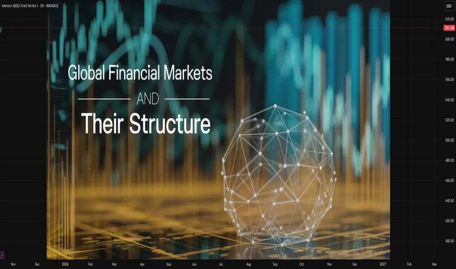
How the Metals Market Works in the Global MarketIntroduction
Metals are among the most fundamental commodities driving global economic development. From steel used in infrastructure to copper in electronics and gold in finance, metals form the backbone of modern civilization. The global metals market is a vast and interconnected network that facilitates the extraction, processing, trading, and consumption of metallic resources. It is influenced by multiple forces—economic cycles, industrial demand, geopolitical dynamics, technology, and environmental regulations. Understanding how the metals market works is essential for policymakers, investors, manufacturers, and consumers alike, as metal prices often serve as barometers for economic health and industrial activity worldwide.
1. Classification of Metals in the Global Market
The global metals market is broadly divided into three main categories:
Precious Metals:
These include gold, silver, platinum, and palladium. They are rare, have high economic value, and are used as investment assets and in luxury goods. Gold is a global safe-haven asset, often rising during periods of market uncertainty.
Base Metals:
These include copper, aluminum, nickel, zinc, lead, and tin. They are essential for industrial use — particularly in construction, manufacturing, and energy sectors. Base metals are more abundant and less expensive than precious metals but are critical indicators of industrial health.
Ferrous Metals:
Iron and steel dominate this category. They are used heavily in construction, transportation, machinery, and manufacturing. The steel industry, in particular, is a key driver of economic development, especially in emerging markets.
2. Structure of the Global Metals Market
The metals market operates through a complex chain involving:
Mining and Extraction:
This is the first stage, where raw metal ores are extracted from the earth. Countries such as China, Australia, Brazil, Russia, and South Africa are among the largest producers of metal ores.
Refining and Processing:
The extracted ores are refined and processed into usable forms such as bars, ingots, or sheets. For example, bauxite is refined into alumina, which is then smelted into aluminum.
Distribution and Manufacturing:
The refined metals are sold to industries such as automotive, construction, electronics, aerospace, and renewable energy sectors.
Trading and Investment:
Metals are traded on global commodity exchanges such as the London Metal Exchange (LME), New York Mercantile Exchange (NYMEX), and Shanghai Futures Exchange (SHFE). Investors and producers use these markets for hedging, speculation, and price discovery.
Recycling and Circular Economy:
The metals market is increasingly focusing on recycling due to environmental concerns. Recycled metals significantly reduce production costs and carbon emissions compared to mining raw ores.
3. Major Global Metal Exchanges
The key platforms for global metal trading are:
London Metal Exchange (LME):
The world’s largest and most influential metal exchange, LME sets benchmark prices for base metals like copper, aluminum, nickel, zinc, lead, and tin. It operates through futures and options contracts, allowing participants to hedge against price volatility.
New York Mercantile Exchange (NYMEX):
A division of CME Group, NYMEX deals in precious metals such as gold and silver, as well as energy products. It is crucial for North American markets.
Shanghai Futures Exchange (SHFE):
China, being the largest consumer of metals, established SHFE to provide price discovery and risk management domestically. It trades metals like copper, aluminum, and zinc.
Tokyo Commodity Exchange (TOCOM):
It handles trading in gold, silver, platinum, and palladium, serving the Asian region’s financial and industrial sectors.
These exchanges not only facilitate physical delivery of metals but also serve as global pricing benchmarks, influencing spot and contract prices across the world.
4. Price Formation in the Metals Market
Metal prices are determined by the interplay of supply, demand, and speculative forces. Several key factors influence price movements:
Supply-Side Factors:
Mining output: Disruptions such as strikes, natural disasters, or political instability in mining countries can reduce supply.
Production costs: Energy prices, labor costs, and technology affect the cost of metal production.
Inventory levels: Stockpiles held by producers or governments can affect perceived scarcity.
Recycling rates: Increased recycling can reduce demand for newly mined metals.
Demand-Side Factors:
Industrial demand: Metals are crucial for construction, manufacturing, and technology sectors.
Economic growth: Expanding economies, particularly in developing countries, drive demand for metals.
Technological innovation: The rise of electric vehicles, renewable energy, and digital electronics has boosted demand for metals like lithium, nickel, and copper.
Financial and Speculative Factors:
Currency movements: Metals are typically priced in U.S. dollars. A weaker dollar makes metals cheaper for holders of other currencies, boosting demand.
Interest rates and inflation: Metals like gold serve as inflation hedges, attracting investment when inflation rises.
Market speculation: Hedge funds and institutional investors influence short-term price volatility through futures trading.
5. Key Players in the Metals Market
The global metals market involves a wide array of participants:
Mining Companies:
These include major global producers like BHP Group, Rio Tinto, Vale, Glencore, and Anglo American. They control significant portions of global supply and influence market dynamics.
Smelters and Refiners:
Companies like Norsk Hydro (aluminum), Jinchuan Group (nickel), and Aurubis (copper) process raw ores into refined metals.
Industrial Consumers:
Manufacturers in construction, automotive, aerospace, and electronics sectors form the demand side of the market.
Traders and Brokers:
Commodity trading houses like Trafigura, Glencore, and Vitol connect producers and consumers, managing logistics, hedging, and financing.
Investors and Speculators:
Institutional investors, hedge funds, and retail traders participate through futures, ETFs, and options, adding liquidity to the market.
Governments and Regulatory Bodies:
Governments influence the market through mining policies, export controls, tariffs, and environmental regulations. For example, China’s restrictions on rare earth exports have major implications for global industries.
6. Role of Metals in the Global Economy
Metals serve multiple economic roles beyond their industrial value:
Economic Indicator:
Prices of base metals like copper are often viewed as leading indicators of global economic health. When industrial demand rises, metal prices usually follow.
Store of Value:
Precious metals like gold act as safe-haven assets during financial instability, providing a hedge against inflation and currency depreciation.
Strategic Resources:
Metals like lithium, cobalt, and rare earth elements are essential for modern technologies, including electric vehicles, batteries, and renewable energy systems. This makes them strategic assets in global geopolitics.
Trade and Investment:
Metals contribute significantly to export revenues for resource-rich countries such as Australia, Chile, Peru, and Russia. They are also major inputs in global investment portfolios and commodity indexes.
7. Technological and Environmental Influences
The metals market is evolving under the influence of technology and environmental priorities:
Digital Transformation:
Digital trading platforms, algorithmic trading, and blockchain are improving transparency and efficiency in metal transactions.
Green Transition:
The global shift toward renewable energy and electric mobility is reshaping metal demand. Copper, lithium, nickel, and cobalt have become “green metals” due to their essential role in batteries, electric grids, and solar technologies.
Sustainability and ESG:
Investors are prioritizing environmental, social, and governance (ESG) criteria. Mining companies are under pressure to reduce carbon emissions, manage waste responsibly, and ensure ethical sourcing.
Recycling Revolution:
Secondary production, or recycling, now accounts for a growing share of global metal supply. For example, recycled aluminum uses 95% less energy than producing new metal from ore.
8. Challenges in the Global Metals Market
The metals market faces numerous challenges:
Price Volatility:
Rapid changes in demand, speculative trading, and geopolitical tensions lead to frequent price swings.
Geopolitical Risks:
Trade wars, sanctions, and export restrictions disrupt supply chains. For instance, Russia’s invasion of Ukraine affected global supplies of aluminum, nickel, and palladium.
Environmental Regulations:
Stricter emission norms and land-use policies increase production costs and reduce mining profitability.
Resource Nationalism:
Countries with rich mineral resources sometimes impose higher royalties or nationalize operations, affecting global supply stability.
Supply Chain Disruptions:
Events like the COVID-19 pandemic revealed vulnerabilities in global logistics and mining operations.
Technological Shifts:
While green technologies increase demand for some metals, they may reduce demand for others—for example, less steel may be needed in lightweight electric vehicles.
9. The Future of the Metals Market
The coming decades will see the metals market transform in response to industrial, environmental, and geopolitical shifts:
Decarbonization and Energy Transition:
Global climate goals will drive massive demand for metals used in renewable energy and electric vehicles. The International Energy Agency predicts that by 2040, demand for lithium could increase by over 400%, and for copper by 40%.
Technological Innovation:
Advances in mining automation, AI, and material science will enhance efficiency and reduce costs.
Regional Shifts:
Asia, particularly China and India, will continue to dominate consumption, while Africa may emerge as a new hub for mining investment.
Financialization:
Metals will continue to be attractive investment assets, integrated into ETFs, commodity funds, and central bank reserves.
Circular Economy:
Recycling and urban mining (recovering metals from electronic waste) will become key to ensuring resource sustainability.
Conclusion
The global metals market is a dynamic ecosystem that links natural resources with industrial growth, financial systems, and geopolitical power. It functions through complex interactions among miners, traders, consumers, and investors—each shaping prices, supply, and demand. As the world transitions toward cleaner energy, sustainable production, and digital economies, metals will remain indispensable. Understanding how this market operates not only provides insight into global trade mechanisms but also highlights the fundamental relationship between natural resources and the progress of human civilization.

Sovereign Debt Explained in the Global MarketIntroduction
Sovereign debt, also known as government debt or public debt, represents the money that a national government borrows to finance its expenditures and obligations. It is one of the most significant pillars of the global financial system, influencing everything from international trade and exchange rates to global market stability and development. Governments borrow to cover budget deficits, fund infrastructure, respond to crises, or stimulate economic growth. The management, structure, and sustainability of sovereign debt play a crucial role in determining a country's economic credibility and its integration into the global market.
In today’s interconnected world, sovereign debt is not an isolated national issue—it has far-reaching implications across borders. When a country defaults or faces a debt crisis, the ripple effects can be felt throughout the international financial system. Therefore, understanding sovereign debt in the context of the global market is essential to comprehend global economic dynamics, investor confidence, and long-term growth prospects.
1. Concept and Nature of Sovereign Debt
Sovereign debt is the total amount of money a government owes to external and internal creditors. It can take the form of bonds, loans, or other financial instruments issued by the government to domestic investors or foreign entities. Governments typically issue sovereign bonds—long-term or short-term securities that promise repayment of principal plus interest—to finance their fiscal needs.
There are two main categories of sovereign debt:
Domestic Debt:
Borrowed in the country’s own currency and often from local financial institutions or citizens. Domestic debt reduces exposure to foreign exchange risks but can crowd out private investment if excessive.
External Debt:
Borrowed from foreign creditors, including international organizations, foreign governments, and investors. It is often denominated in foreign currencies such as the U.S. dollar, euro, or yen. External debt exposes a country to exchange rate risks and global financial fluctuations.
Sovereign debt differs from corporate or personal debt because governments have unique powers—they can print money, tax citizens, and control monetary policy. However, these powers are not limitless, and excessive borrowing can lead to inflation, devaluation, or default.
2. Importance of Sovereign Debt in the Global Market
Sovereign debt plays several crucial roles in the global financial system:
Financing Government Expenditure:
Governments use debt to fund projects that stimulate economic growth—such as infrastructure, education, defense, and social welfare. This borrowing supports public services and long-term development.
Macroeconomic Stability and Fiscal Policy:
Borrowing helps smooth economic cycles. During recessions, governments may borrow more to stimulate demand and reduce unemployment. During booms, they may pay down debt to avoid overheating the economy.
Benchmark for Global Financial Markets:
Sovereign bonds, especially those issued by stable economies (like U.S. Treasury bonds), act as benchmarks for global interest rates. Investors worldwide use these as reference points to assess risk premiums on other assets.
Investment and Safe Haven Asset:
Many institutional investors, including central banks and pension funds, hold sovereign bonds as low-risk investments. U.S., Japanese, and German government bonds are considered “safe haven” assets during global uncertainty.
Indicator of Economic Health:
The level and sustainability of sovereign debt indicate a country’s fiscal health. A high debt-to-GDP ratio may raise concerns about solvency, while moderate debt can signal sound economic management.
3. Globalization and the Expansion of Sovereign Debt Markets
The globalization of finance has transformed sovereign debt markets dramatically. In the 20th and 21st centuries, capital mobility increased, allowing investors to buy foreign government bonds easily. Emerging markets also gained access to international borrowing, leading to a global expansion of sovereign debt.
Some key drivers of this trend include:
Financial Liberalization: Many developing countries opened their capital markets, allowing foreign investors to purchase local government bonds.
Technological Advancements: Digital trading platforms and global financial networks facilitated cross-border investment.
Global Savings Glut: High savings in developed nations, such as Japan and China, increased the demand for sovereign debt from other countries.
Monetary Policy in Advanced Economies: Low interest rates in developed countries pushed investors to seek higher yields in emerging markets, expanding their sovereign bond markets.
As a result, sovereign debt has become deeply intertwined with global capital flows. Investors in one country routinely hold the debt of others, linking their financial fortunes. This interdependence strengthens global economic cooperation but also amplifies systemic risks.
4. Determinants of Sovereign Debt Sustainability
The sustainability of sovereign debt depends on whether a government can service its obligations without resorting to excessive borrowing or risking default. Key determinants include:
Debt-to-GDP Ratio:
A widely used measure of a country’s debt burden. A high ratio may indicate financial strain, but the threshold varies across countries depending on growth rates and interest costs.
Interest Rate and Growth Differential:
If economic growth exceeds the interest rate on debt, the debt ratio tends to stabilize or decline over time. Conversely, if interest rates rise faster than growth, debt can become unsustainable.
Fiscal Balance:
Governments with persistent fiscal deficits (spending exceeding revenue) may accumulate unsustainable debt levels.
Exchange Rate Stability:
For countries with large external debt denominated in foreign currencies, exchange rate depreciation can inflate the debt burden.
Investor Confidence:
Global investors’ perception of a country’s economic management directly affects borrowing costs. Confidence can be influenced by political stability, monetary policy, and institutional credibility.
Debt Structure and Maturity Profile:
Short-term or variable-rate debt poses higher rollover and interest rate risks than long-term, fixed-rate debt.
5. Sovereign Debt Crises: Causes and Consequences
Sovereign debt crises occur when governments cannot meet their debt obligations, either through repayment or servicing interest. Such crises can arise due to poor fiscal management, external shocks, or global financial contagion.
Major Causes:
Excessive borrowing during boom periods followed by economic downturns.
Currency mismatches between debt and revenue.
Sudden stops in capital inflows or rising global interest rates.
Political instability and policy mismanagement.
Consequences:
Default and Restructuring: Governments may renegotiate terms with creditors or suspend payments temporarily.
Economic Recession: Austerity measures to reduce debt often suppress growth and increase unemployment.
Inflation and Currency Collapse: If debt is monetized (financed by printing money), it can lead to hyperinflation.
Loss of Credibility: A country’s access to international markets diminishes, raising borrowing costs for years.
Historical Examples:
Latin American Debt Crisis (1980s): Triggered by rising U.S. interest rates and oil price shocks.
Asian Financial Crisis (1997): Currency collapses led to debt defaults in several Asian economies.
Greek Debt Crisis (2010s): Excessive government spending and structural inefficiencies led to massive bailouts from the EU and IMF.
Argentina (multiple defaults): Chronic fiscal mismanagement and political instability have caused repeated sovereign defaults.
6. Role of International Institutions in Sovereign Debt Management
Institutions such as the International Monetary Fund (IMF), World Bank, and regional development banks play vital roles in managing sovereign debt crises and promoting fiscal stability.
IMF: Provides financial assistance and policy advice to countries facing balance-of-payments or debt crises. Its programs often come with fiscal and structural reform conditions.
World Bank: Focuses on long-term development financing and helps countries design sustainable debt management strategies.
Paris Club and London Club: Groups of official and private creditors that coordinate debt restructuring efforts for distressed sovereign borrowers.
Credit Rating Agencies (CRAs): Agencies like Moody’s, S&P, and Fitch assess sovereign creditworthiness, influencing borrowing costs in the global market.
These institutions aim to ensure that countries maintain fiscal discipline while providing relief during crises. However, critics argue that their policies sometimes prioritize creditor interests over social welfare, especially through austerity measures.
7. Sovereign Debt and Emerging Markets
Emerging markets have become significant participants in the global sovereign debt landscape. Countries like India, Brazil, Indonesia, and South Africa issue bonds in both domestic and international markets. While this enhances their access to capital, it also exposes them to global volatility.
Challenges Faced by Emerging Economies:
Currency risk due to foreign-denominated debt.
Limited investor confidence compared to developed nations.
Higher borrowing costs and vulnerability to global interest rate changes.
Political and policy uncertainties affecting credit ratings.
Despite these challenges, emerging market sovereign bonds attract global investors seeking higher yields, contributing to portfolio diversification.
8. The Future of Sovereign Debt in the Global Market
As the global economy evolves, the nature of sovereign debt is also transforming. Several trends are shaping its future:
Rising Global Debt Levels:
The COVID-19 pandemic and subsequent fiscal stimulus programs have driven global public debt to record highs, surpassing 100% of global GDP in many advanced economies.
Green and Sustainable Bonds:
Many governments now issue green bonds to finance environmentally sustainable projects. These instruments align debt issuance with climate goals and attract ESG-focused investors.
Digitalization and Transparency:
Blockchain technology and digital platforms are enhancing debt transparency, improving trust and efficiency in bond markets.
Geopolitical Shifts:
Rivalries among major economies, such as the U.S. and China, are influencing global debt markets through changes in capital flows and currency alignments.
Debt Relief and Restructuring Mechanisms:
Post-pandemic, international cooperation has increased to support low-income countries through debt relief initiatives like the G20 Common Framework.
Conclusion
Sovereign debt is both a tool of economic development and a potential source of financial instability. In the global market, it functions as a key instrument for investment, fiscal policy, and international cooperation. Properly managed, it enables nations to build infrastructure, stimulate growth, and enhance welfare. Mismanaged, it can trigger crises that ripple across the world economy.
The challenge for policymakers is to maintain a balance—borrowing enough to foster development while ensuring sustainability and market confidence. As the global financial landscape evolves, transparency, innovation, and prudent fiscal governance will determine how effectively sovereign debt continues to serve as a cornerstone of the global economy.

Global Trade ImbalanceIntroduction
Global trade imbalance refers to the persistent and significant differences between the value of goods and services a country exports and the value it imports. In simpler terms, when a nation consistently sells more to the world than it buys, it runs a trade surplus; when it buys more than it sells, it runs a trade deficit. These imbalances, while normal in the short term, can become problematic when they persist for long periods, leading to financial strain, currency distortions, and geopolitical tensions. The global economy thrives on trade interdependence, but when trade becomes unbalanced, it can trigger systemic vulnerabilities affecting growth, employment, and global financial stability.
The issue of global trade imbalance has been a central concern for economists and policymakers, especially since the late 20th century when globalization accelerated. Imbalances between major economies—such as the United States, China, Germany, and Japan—have influenced exchange rates, monetary policy, and even global political relationships. Understanding the roots, consequences, and possible solutions to global trade imbalance is essential for ensuring a more equitable and sustainable international economic system.
Concept of Global Trade Imbalance
Trade imbalance occurs when a nation’s imports and exports of goods and services are not equal. This is reflected in a country’s current account balance, a key component of the balance of payments.
A trade surplus means the country exports more than it imports, indicating that it earns foreign currency and increases reserves.
A trade deficit means the country imports more than it exports, leading to borrowing or depletion of reserves to pay for the difference.
In theory, trade imbalances are not inherently harmful. They can arise from differences in saving and investment behaviors, production capabilities, or consumption preferences. However, when these imbalances are large and persistent, they can lead to unsustainable debt levels or distortions in global demand and supply patterns. For example, if one country continually accumulates surpluses while another accumulates deficits, the result can be a dangerous buildup of global financial risk.
Historical Background
Trade imbalances have existed since the early days of international commerce. During the mercantilist period (16th–18th centuries), European powers sought to achieve trade surpluses to accumulate precious metals, which were viewed as the source of national wealth. This philosophy led to colonization, trade monopolies, and conflicts among nations.
In the post–World War II era, under the Bretton Woods system, global trade imbalances were moderated by fixed exchange rates and international coordination. However, after the collapse of Bretton Woods in the early 1970s, flexible exchange rates led to renewed volatility and imbalances.
The late 20th century witnessed the rise of the U.S. trade deficit and China’s trade surplus. As globalization deepened, manufacturing shifted to Asia, while consumption and financial markets concentrated in the United States and Europe. This created a pattern where developing countries became exporters of goods and savings, while developed nations became consumers and debtors.
Causes of Global Trade Imbalance
Global trade imbalances arise from a complex interaction of structural, economic, and policy factors. Some of the most important causes include:
1. Differences in Savings and Investment Rates
A fundamental driver of trade imbalance is the difference between national savings and investment. Economies that save more than they invest (like China and Germany) tend to run trade surpluses, while those that invest more than they save (like the United States) run trade deficits. The U.S., with its consumption-driven economy, borrows from global markets to finance its deficit, while surplus countries lend to it through foreign investments.
2. Exchange Rate Policies
Exchange rate manipulation or misalignment is another major factor. Some countries, particularly export-driven economies, maintain undervalued currencies to make their exports cheaper and imports more expensive, thereby ensuring persistent surpluses. For example, China was often accused of keeping the yuan artificially low during the 2000s to boost its exports.
3. Globalization and Production Shifts
The global redistribution of manufacturing due to globalization has widened trade gaps. As multinational corporations relocated production to low-cost countries, developing nations became export hubs, while advanced economies turned into consumption centers. This structural shift contributed to chronic trade surpluses in Asia and deficits in the West.
4. Oil Prices and Resource Dependence
Oil-exporting countries often run large surpluses when oil prices are high, while oil-importing nations face widening deficits. The cyclical nature of commodity prices thus influences the global trade balance and contributes to imbalances between resource-rich and resource-poor economies.
5. Fiscal and Monetary Policies
Expansionary fiscal policies, such as government spending and tax cuts, tend to increase domestic consumption and imports, thereby worsening the trade balance. Similarly, loose monetary policies that lower interest rates can weaken a country’s currency, stimulating exports but increasing inflationary pressure. In contrast, tight fiscal policies can generate surpluses by reducing domestic demand.
6. Structural Economic Differences
Countries at different stages of development naturally exhibit trade imbalances. Developing economies often import capital goods and technology for industrialization, leading to temporary deficits, while mature economies export high-value goods and services.
7. Protectionism and Trade Barriers
Tariffs, subsidies, and non-tariff barriers can distort the natural flow of trade. For instance, when a nation imposes tariffs on imports, it reduces demand for foreign goods, potentially leading to retaliatory measures and global imbalances.
Major Examples of Global Trade Imbalance
1. United States
The U.S. has run persistent trade deficits since the 1980s. Its economy depends heavily on imported consumer goods, energy, and technology, while the dollar’s reserve currency status allows it to finance deficits easily. The deficit peaked at over $900 billion in recent years, with China, Mexico, and the European Union being its largest trading partners. The U.S. deficit reflects both domestic overconsumption and global confidence in the dollar.
2. China
China’s rapid industrialization and export-led growth model have resulted in massive trade surpluses. From the early 2000s onward, China became the “factory of the world,” exporting manufactured goods globally. Although its surplus has moderated in recent years due to rising domestic demand, it remains a key contributor to global imbalance.
3. Germany and Eurozone
Germany’s strong industrial base and restrained domestic consumption have led to sustained surpluses. Within the Eurozone, southern economies like Greece, Italy, and Spain have faced chronic deficits, creating intra-European trade imbalances that contributed to the Eurozone debt crisis.
4. Oil Exporting Countries
Middle Eastern nations such as Saudi Arabia and the UAE often enjoy large trade surpluses during periods of high oil prices. However, when oil prices decline, these surpluses can rapidly turn into deficits, revealing the volatility of resource-dependent economies.
Consequences of Global Trade Imbalance
1. Financial Instability
Large and persistent trade imbalances can trigger global financial crises. For example, the 2008 Global Financial Crisis was partly fueled by excessive capital inflows from surplus countries to deficit economies, creating asset bubbles and unsustainable debt.
2. Currency Volatility
Trade imbalances exert pressure on exchange rates. Deficit countries often see their currencies depreciate, increasing import costs and inflation, while surplus nations face appreciation pressures, which may reduce export competitiveness.
3. Employment and Industrial Shifts
Trade deficits can lead to deindustrialization and job losses in manufacturing sectors, as witnessed in the U.S. and parts of Europe. Conversely, surplus countries experience industrial expansion but may suffer from domestic demand stagnation.
4. Geopolitical Tensions
Persistent trade imbalances can escalate into political conflicts. The U.S.-China trade war, initiated in 2018, was largely driven by America’s frustration with its widening deficit and perceived unfair trade practices by China.
5. Global Inequality
Trade imbalances often reflect and reinforce economic inequalities. Surplus nations accumulate wealth and foreign reserves, while deficit countries face debt accumulation and slower growth. This asymmetry undermines global economic stability and fairness.
Efforts to Correct Trade Imbalances
Addressing global trade imbalances requires coordinated international action and sound domestic policies. Several strategies have been attempted or proposed:
1. Exchange Rate Adjustments
Allowing currencies to adjust freely can help correct imbalances naturally. A stronger currency in surplus countries makes their exports more expensive and imports cheaper, reducing surpluses, while a weaker currency in deficit countries can boost exports.
2. Structural Reforms
Rebalancing domestic economies is crucial. Surplus nations like China and Germany need to boost domestic consumption and reduce dependence on exports, while deficit countries like the U.S. should promote savings and production.
3. Fiscal and Monetary Discipline
Responsible fiscal management can help reduce deficits. Limiting excessive government borrowing, encouraging investment in productive sectors, and maintaining moderate interest rates can support a healthier trade balance.
4. Trade Agreements and Cooperation
International organizations such as the World Trade Organization (WTO), IMF, and G20 play vital roles in promoting balanced trade. Through cooperation, they aim to reduce protectionism, ensure fair competition, and facilitate dispute resolution.
5. Promoting Innovation and Competitiveness
Enhancing technological capabilities, infrastructure, and human capital can help deficit countries produce higher-value goods and reduce reliance on imports.
The Future of Global Trade Imbalances
The global trade landscape is rapidly changing due to digitalization, automation, and shifting supply chains. The COVID-19 pandemic and geopolitical realignments have prompted many nations to rethink dependence on global trade. Decoupling trends between the U.S. and China, regional trade agreements, and nearshoring strategies may alter traditional imbalance patterns.
Moreover, green transitions and the shift toward renewable energy will reduce oil-related trade surpluses while creating new ones in critical minerals and clean technologies. As global financial systems evolve, addressing imbalances will require integrating sustainability, digital finance, and inclusive growth into trade policy.
Conclusion
Global trade imbalance remains one of the most pressing economic challenges of the 21st century. While some degree of imbalance is natural and reflects comparative advantage, persistent and extreme disparities can threaten economic stability, fuel political tensions, and distort global growth. Addressing these issues demands a coordinated international response focused on fairness, transparency, and sustainability.
A balanced global trade system not only promotes shared prosperity but also strengthens the resilience of the international economy against future crises. Ultimately, achieving equilibrium in global trade is not merely about balancing numbers—it is about building a more stable, equitable, and cooperative world economy.

Global Market Shifting: Changing Dynamics of the World EconomyIntroduction
The global market is not static—it is an ever-evolving ecosystem influenced by a combination of economic, technological, political, and environmental factors. Over the past few decades, globalization, digital transformation, trade liberalization, and geopolitical realignments have drastically reshaped how countries, corporations, and consumers interact. However, recent developments—ranging from supply chain disruptions to shifts in trade alliances—indicate that the global market is undergoing one of the most significant transformations in modern history.
The term “global market shifting” refers to these dynamic changes in global trade patterns, production structures, capital flows, and investment priorities. These shifts redefine global competitiveness, redistribute economic power, and create new winners and losers on the world stage. Understanding these trends is crucial for policymakers, investors, and businesses aiming to adapt to this new economic landscape.
1. The Evolution of the Global Market
The global market has gone through several distinct phases of transformation:
Post-World War II Era (1945–1970s):
This period was dominated by Western economies—particularly the United States—and characterized by industrial expansion, reconstruction in Europe and Japan, and the creation of global institutions like the International Monetary Fund (IMF), the World Bank, and the General Agreement on Tariffs and Trade (GATT), which later evolved into the World Trade Organization (WTO).
Globalization Era (1980s–2000s):
The fall of the Soviet Union, China’s economic opening, and the spread of neoliberal policies marked the rise of global capitalism. Supply chains became international, capital flowed freely, and developing nations began integrating into global markets.
Digital and Knowledge Economy Era (2000s–2010s):
The rise of the internet and digital technology transformed production and consumption patterns. E-commerce, automation, and data-driven decision-making became central to market growth.
Current Transformation Era (2020s–present):
The world is now experiencing a shift from globalization to “regionalization” and “strategic competition.” Global trade is being redefined by geopolitics, sustainability, and technological sovereignty.
2. Drivers of Global Market Shifts
The global market does not shift randomly. It evolves in response to powerful structural forces. The major drivers include:
a. Technological Disruption
Artificial intelligence, automation, blockchain, and advanced manufacturing are revolutionizing industries. These technologies are not just improving productivity—they are redefining competitive advantage.
AI and machine learning have automated decision-making in finance, logistics, and marketing.
Robotics and 3D printing are reshoring production back to developed economies, reducing dependence on low-cost labor markets.
Blockchain is enhancing transparency in supply chains and global trade settlements.
The result is a shift from labor-intensive globalization to technology-intensive globalization.
b. Geopolitical Realignments
Rising tensions between major powers—especially between the United States and China—are fragmenting global markets. Trade wars, sanctions, and the race for technological dominance have led to “decoupling” in critical sectors like semiconductors, energy, and telecommunications.
Countries are now diversifying supply chains to reduce dependency on single regions. For example, the “China+1” strategy encourages manufacturers to expand into India, Vietnam, and Indonesia.
c. Supply Chain Reconfiguration
The COVID-19 pandemic exposed vulnerabilities in global supply chains. Lockdowns, border closures, and shipping delays revealed the risks of overreliance on centralized manufacturing hubs.
Post-pandemic, many companies are moving towards “nearshoring” (bringing production closer to home) and “friend-shoring” (partnering with politically aligned countries). This marks a departure from the hyper-globalized supply chain model of the 1990s and 2000s.
d. Energy Transition and Climate Policy
The global push for green energy and decarbonization is reshaping investment priorities. Fossil fuel industries are declining, while renewable energy, electric vehicles, and carbon markets are expanding rapidly.
Countries rich in rare earth elements and critical minerals—such as lithium, cobalt, and nickel—are gaining new economic importance. This transition is not just about environmental policy; it represents a structural reorientation of global capital.
e. Shifting Consumer Demographics and Preferences
Emerging markets, particularly in Asia and Africa, are becoming major consumer bases. The global middle class is expected to exceed 5 billion people by 2030, most of whom will live in developing countries.
At the same time, consumers in advanced economies are prioritizing sustainability, digital convenience, and ethical production, forcing companies to adapt their strategies accordingly.
3. Regional Dynamics of the Shift
a. The Rise of Asia
Asia has become the epicenter of global economic growth.
China remains a manufacturing powerhouse but is now transitioning toward innovation-driven and service-oriented industries.
India is emerging as a global hub for digital services, clean energy, and manufacturing diversification.
Southeast Asia benefits from investment diversification, especially as companies move supply chains out of China.
Collectively, Asian economies are projected to contribute over 60% of global GDP growth by 2030.
b. North America’s Resurgence
The United States, Canada, and Mexico are revitalizing regional trade through agreements like the USMCA. The U.S. is also investing heavily in semiconductor manufacturing, renewable energy, and AI technologies to maintain its leadership.
Reshoring and nearshoring initiatives are restoring industrial capacity in North America, particularly in strategic sectors like defense, energy, and technology.
c. Europe’s Green and Digital Transition
Europe is leading the world in sustainable policy frameworks such as the European Green Deal and Carbon Border Adjustment Mechanism (CBAM). However, Europe faces challenges from energy dependence and slow economic growth.
To stay competitive, the EU is focusing on digital sovereignty, reducing reliance on U.S. and Chinese tech giants, and investing in green infrastructure.
d. Africa and Latin America: Emerging Frontiers
Africa and Latin America are gaining attention as new centers of growth. Africa’s population boom, natural resource wealth, and improving digital connectivity position it as a future manufacturing and consumer hub.
Latin America, with countries like Brazil and Chile leading in renewable energy and agriculture, is becoming vital in global sustainability chains.
4. The Role of Digitalization
Digitalization is at the core of market transformation.
E-commerce, fintech, digital currencies, and remote work have globalized economic participation in unprecedented ways. Platforms such as Amazon, Alibaba, and MercadoLibre have reshaped retail, while financial technology has expanded access to credit and payment systems.
Moreover, the data economy is now a key source of value creation. Nations are competing for control over data infrastructure, cybersecurity, and cloud computing. The emergence of digital currencies, including central bank digital currencies (CBDCs), may redefine how global payments and trade settlements operate.
5. Shifting Trade and Investment Patterns
Trade flows are no longer dominated by the same old players. Several trends are noteworthy:
Regional trade blocs are becoming stronger. For instance, the Regional Comprehensive Economic Partnership (RCEP) and the African Continental Free Trade Area (AfCFTA) are integrating regional economies.
South-South trade—commerce among developing countries—is expanding rapidly, reducing dependence on Western markets.
Foreign Direct Investment (FDI) is moving toward technology, renewable energy, and infrastructure sectors, away from traditional manufacturing.
Investors are also focusing on Environmental, Social, and Governance (ESG) factors, influencing how capital is allocated globally.
6. Challenges in the Global Market Shift
The transformation of the global market is not without challenges:
Economic Inequality:
The benefits of globalization have not been evenly distributed. Advanced economies have reaped most technological gains, while developing countries struggle with skill gaps and infrastructure deficits.
Protectionism and Trade Barriers:
Many countries are adopting protectionist measures to safeguard domestic industries, potentially fragmenting the global economy.
Technological Divide:
Access to digital infrastructure varies widely, especially between developed and developing countries, creating a new kind of inequality.
Geopolitical Risks:
Conflicts, sanctions, and trade wars can destabilize international cooperation, increasing uncertainty for businesses and investors.
Environmental Constraints:
As climate change accelerates, resource scarcity and extreme weather events may disrupt supply chains and threaten food and energy security.
7. Opportunities Emerging from the Shift
Despite the challenges, the global market shift presents vast opportunities:
Innovation in Technology:
AI, green tech, and biotechnology are creating entirely new industries and employment opportunities.
Regional Collaboration:
Regional trade blocs allow smaller economies to enhance their competitiveness and reduce vulnerability to global shocks.
Sustainable Finance:
Investments in renewable energy and ESG initiatives are expected to exceed trillions of dollars in the coming decade.
Digital Inclusion:
Expanding internet access in developing regions is creating new consumer markets and entrepreneurial opportunities.
8. The Future of the Global Market
Looking ahead, the global market will likely be defined by multipolarity—a system where no single country dominates. Instead, regional power centers like the U.S., China, the EU, India, and ASEAN will coexist, each with distinct economic models and technological strengths.
Trade will become more regional and digital, with sustainability and resilience as guiding principles. Automation and AI will continue to drive productivity, but governments will need to manage their social impacts through education and inclusive policies.
Furthermore, the green transition will become the new engine of growth. The competition for clean energy leadership—especially in hydrogen, solar, and electric vehicles—will shape the economic hierarchy of the 21st century.
Conclusion
The shifting global market marks the beginning of a new economic era—one defined by technological innovation, environmental consciousness, and geopolitical complexity. While globalization is not ending, it is being redefined. The new paradigm emphasizes resilience over efficiency, regional balance over concentration, and sustainability over short-term profit.
Adapting to these shifts requires foresight, flexibility, and collaboration among governments, businesses, and individuals. Those who understand and anticipate these global changes will not only survive but thrive in the evolving marketplace.
In essence, the global market shift is not merely a challenge—it is a transformative opportunity to rebuild a more inclusive, sustainable, and technologically advanced world economy.
Globalization and DeglobalizationIntroduction
Globalization has been one of the most defining forces of the modern era. It refers to the process by which businesses, cultures, technologies, and governments across the world become interconnected and interdependent. From the late 20th century onwards, globalization accelerated rapidly due to advances in communication, transportation, and digital technologies. This process transformed the global economy into an integrated system, allowing for free trade, capital flows, and cultural exchange on an unprecedented scale.
However, the 21st century has also witnessed the emergence of an opposite trend — deglobalization. This refers to the gradual slowing down, reversal, or reconfiguration of globalization. Rising nationalism, trade wars, pandemics like COVID-19, and geopolitical tensions have encouraged countries to reconsider global interdependence. Understanding both globalization and deglobalization is crucial to comprehend how today’s world economy and politics are evolving.
Concept of Globalization
Globalization can be defined as the increasing integration and interdependence of national economies and societies through the cross-border flow of goods, services, technology, capital, and information. It breaks down barriers between countries, fostering economic cooperation and cultural exchange.
The phenomenon of globalization is not new — it began centuries ago with trade routes such as the Silk Road, connecting Asia and Europe. However, the modern wave of globalization began in the late 20th century, following the end of World War II, the creation of international institutions like the IMF, World Bank, and WTO, and the liberalization of markets worldwide.
Drivers of Globalization
Technological Advancements
Innovations in communication (like the internet, smartphones, and social media) and transportation (such as air travel and container shipping) have dramatically reduced costs and time barriers, making the world more connected.
Trade Liberalization
Free trade agreements (FTAs), the reduction of tariffs, and the establishment of the World Trade Organization (WTO) have encouraged global trade, allowing goods and services to move freely across borders.
Foreign Direct Investment (FDI)
Multinational corporations (MNCs) have expanded operations across countries, investing in developing nations and creating global production chains.
Outsourcing and Offshoring
Companies increasingly locate production in countries with cheaper labor or better resources. For example, manufacturing moved to China and India became a hub for IT services.
Financial Integration
Capital markets have become interconnected, enabling investments and capital to move globally with ease.
Cultural Exchange
The spread of media, tourism, and migration has led to a blending of cultures, making the world more cosmopolitan.
Dimensions of Globalization
Globalization has multiple dimensions:
Economic Globalization – Integration of national economies through trade, investment, and capital flow.
Political Globalization – Growing influence of international organizations and global governance structures such as the UN, WTO, IMF, and World Bank.
Cultural Globalization – The spread of ideas, languages, and lifestyles, often leading to cultural homogenization.
Technological Globalization – Rapid global diffusion of technologies, especially in communication and automation.
Environmental Globalization – Global cooperation in addressing issues like climate change and sustainability.
Positive Impacts of Globalization
Economic Growth
Globalization has led to rapid growth in many developing countries. By opening markets, nations like China, India, and Vietnam have lifted millions out of poverty.
Access to Technology and Knowledge
It allows developing nations to access advanced technologies and global expertise.
Employment Opportunities
New industries and global supply chains create millions of jobs, especially in emerging markets.
Cultural Exchange and Diversity
Globalization promotes multiculturalism, allowing people to experience different cuisines, fashions, and entertainment.
Global Cooperation
It enhances international cooperation in tackling global issues like pandemics, climate change, and terrorism.
Negative Impacts of Globalization
Economic Inequality
While globalization increases wealth, it often benefits the rich more than the poor, widening the gap between developed and developing nations.
Exploitation of Labor and Resources
Multinational companies may exploit cheap labor in developing countries, leading to poor working conditions and environmental degradation.
Cultural Homogenization
Local cultures and traditions are overshadowed by Western consumer culture.
Job Losses in Developed Nations
Outsourcing and relocation of industries to low-cost regions lead to unemployment in advanced economies.
Environmental Challenges
Increased industrial activity and global transportation contribute to pollution and climate change.
The Emergence of Deglobalization
After decades of rapid integration, the world is now witnessing a phase of deglobalization. Deglobalization refers to the process of reducing interdependence and integration between nations. It does not mean the end of globalization but rather a reconfiguration or slowdown of global integration.
The early 21st century saw signs of this shift, with trade tensions, supply chain disruptions, and rising nationalism. Events like the 2008 global financial crisis, Brexit, the U.S.-China trade war, and the COVID-19 pandemic intensified the trend.
Causes of Deglobalization
Geopolitical Tensions
Rivalries between major powers like the United States and China have disrupted global trade and technology partnerships.
Economic Protectionism
Many countries are adopting protectionist measures to safeguard domestic industries, reversing decades of trade liberalization.
Pandemic Disruptions
COVID-19 exposed vulnerabilities in global supply chains, prompting companies to adopt “localization” or “nearshoring” strategies.
Technological Nationalism
Nations are increasingly prioritizing self-sufficiency in critical technologies like semiconductors, defense, and energy.
Environmental Concerns
Global supply chains are criticized for their carbon footprint, leading to policies encouraging local production.
Populist and Nationalist Movements
Political leaders in several countries emphasize nationalism, sovereignty, and “self-reliance,” often at the expense of global cooperation.
Characteristics of Deglobalization
Shift from global to regional supply chains.
Rising tariffs and trade barriers.
Greater emphasis on domestic manufacturing (e.g., “Make in India,” “America First,” “China’s Dual Circulation”).
Increased scrutiny of foreign investments for national security reasons.
Slower global trade growth compared to GDP growth.
Reassessment of global dependencies, especially in energy, food, and pharmaceuticals.
Impact of Deglobalization
Economic Impact
Deglobalization may slow global growth and reduce trade efficiency. However, it can strengthen domestic industries and reduce external vulnerabilities.
Supply Chain Restructuring
Companies are diversifying or relocating supply chains to minimize risks — a shift from “just-in-time” to “just-in-case” production models.
Shift in Investment Patterns
FDI flows are becoming more regional, and investment in strategic sectors is prioritized over global expansion.
Technological Decoupling
The U.S. and China are developing separate ecosystems in technology, telecommunications, and AI, creating a fragmented digital world.
Social and Political Impact
Rising nationalism can lead to social polarization, xenophobia, and less international cooperation.
Environmental Outcomes
While local production reduces transport emissions, duplication of industries globally may increase overall resource consumption.
Globalization vs. Deglobalization
Aspect Globalization Deglobalization
Economic Focus Free trade, open markets Protectionism, self-reliance
Supply Chain Global, interconnected Regional, localized
Cultural Impact Cultural exchange, hybridization Preservation of local culture
Political Approach Global cooperation National sovereignty
Growth Model Efficiency-driven Resilience-driven
Technology Flow Shared innovations Restricted technology access
Examples from Around the World
United States
The U.S. has shifted toward protectionism with policies like “America First” and reshoring manufacturing from China.
China
China’s “Dual Circulation Strategy” emphasizes domestic consumption while reducing reliance on exports.
European Union
The EU promotes “strategic autonomy,” aiming to be less dependent on external suppliers for energy and defense.
India
India’s “Atmanirbhar Bharat” (self-reliant India) initiative encourages local manufacturing and innovation while maintaining global engagement.
Global South
Many developing nations are balancing between globalization’s benefits and the need for self-sufficiency in food, energy, and technology.
Future of Globalization and Deglobalization
The world is unlikely to witness a complete end to globalization. Instead, the future will likely involve “selective globalization” — a hybrid model that balances global efficiency with local resilience.
Digital globalization will continue to grow through online services, data flows, and virtual collaboration.
Regional trade blocs (like RCEP, ASEAN, and EU) may replace full-scale global integration.
Nations will cooperate in areas like climate change, health, and technology, while competing in strategic sectors.
This evolving structure may lead to a multipolar world — with multiple centers of power and influence instead of a single dominant global order.
Conclusion
Globalization has been a transformative force shaping the modern world, driving economic growth, technological innovation, and cultural exchange. Yet, it has also produced inequalities, environmental stress, and geopolitical vulnerabilities. Deglobalization, in contrast, represents a corrective phase — a rethinking of excessive interdependence and a move toward resilience and regionalism.
The challenge for the future is to strike a balance between the efficiency of globalization and the security of deglobalization. The goal should not be to isolate nations but to build a sustainable, inclusive, and resilient global order that benefits all. In the decades to come, the world’s prosperity will depend not on retreating from globalization but on redefining it to serve humanity in a fairer, more balanced way.
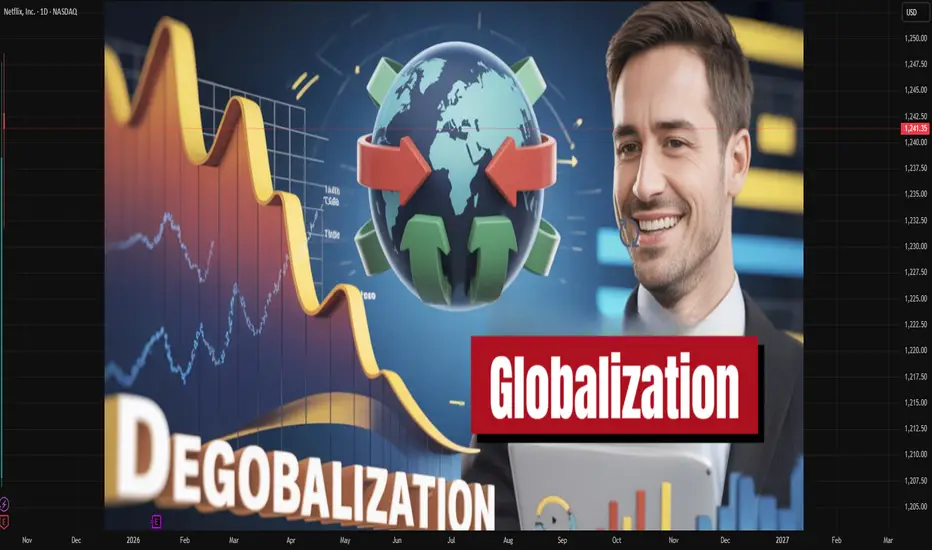
WTO’s Role in Global TradeIntroduction
The World Trade Organization (WTO) is one of the most important institutions in the global economic order. It serves as the cornerstone of international trade governance, regulating trade rules among nations and ensuring that global commerce flows as smoothly, predictably, and freely as possible. Since its establishment in 1995, the WTO has played a crucial role in fostering globalization, promoting trade liberalization, and resolving trade disputes among member countries. By providing a structured framework for negotiations and dispute resolution, it helps reduce uncertainty and build trust in international economic relations.
Global trade is essential for economic growth, development, and innovation. However, without a common set of rules, trade can easily become chaotic and dominated by protectionism. The WTO prevents such disorder by setting binding trade rules and providing mechanisms for countries to discuss trade issues cooperatively. It functions not just as a rule-setter but as a mediator, facilitator, and promoter of fair global trade.
Historical Background
The WTO emerged as a result of post-World War II efforts to create a stable and open global economic system. The foundation was laid in 1947 with the General Agreement on Tariffs and Trade (GATT), which aimed to reduce tariffs and eliminate trade barriers. GATT was initially intended as a temporary framework until a full-fledged International Trade Organization (ITO) could be established. However, the ITO never materialized due to political resistance, especially from the U.S. Congress.
Over the next five decades, GATT guided international trade through multiple “rounds” of negotiations that progressively lowered trade barriers. The most notable of these was the Uruguay Round (1986–1994), which led to the formation of the WTO on January 1, 1995. The WTO absorbed GATT’s legal structure but expanded its scope to include trade in services, intellectual property rights, and agricultural goods, marking a major evolution in global trade governance.
Structure and Membership
The WTO currently has 164 member countries, representing over 98% of global trade. Its structure is hierarchical and inclusive, with decisions made collectively by members.
Ministerial Conference: The top decision-making body that meets every two years to set broad trade policy directions.
General Council: Handles daily operations and acts on behalf of the Ministerial Conference between sessions.
Dispute Settlement Body (DSB): Oversees the resolution of trade disputes.
Secretariat: Based in Geneva, Switzerland, it provides administrative and technical support to members.
Each country, regardless of its economic size, has one vote, ensuring equality in decision-making — though in practice, negotiations often reflect the relative power of major economies.
Core Principles of the WTO
The WTO is guided by several foundational principles designed to make international trade fair and efficient:
Non-Discrimination
Most-Favored Nation (MFN) Principle: A country must treat all trading partners equally. If a member offers a benefit (like a tariff cut) to one country, it must extend the same to all others.
National Treatment Principle: Imported goods must be treated the same as domestically produced goods once they enter the market.
Free Trade through Negotiation
The WTO promotes gradual trade liberalization through negotiations, reducing tariffs and other barriers.
Predictability and Transparency
Trade policies must be stable and transparent, ensuring that businesses and investors can make informed decisions.
Fair Competition
The WTO discourages practices like dumping and subsidies that distort market competition.
Development and Economic Reform
Special provisions allow developing and least-developed countries (LDCs) more time and flexibility to implement trade agreements.
Functions of the WTO
The WTO performs multiple interrelated functions that shape the global trading system:
1. Administering Trade Agreements
The WTO oversees the implementation of its many agreements covering goods, services, and intellectual property. These include:
GATT (for goods),
GATS (General Agreement on Trade in Services),
TRIPS (Trade-Related Aspects of Intellectual Property Rights).
Each agreement lays out specific rights and obligations for members, ensuring consistency in global trade practices.
2. Trade Negotiations
The WTO serves as a platform for member countries to negotiate new trade rules and further liberalize markets. The Doha Development Round, launched in 2001, aimed to address the concerns of developing countries, though progress has been slow due to disagreements over agricultural subsidies and market access.
3. Dispute Settlement
The Dispute Settlement Mechanism (DSM) is one of the WTO’s most significant achievements. It provides a structured and legal way to resolve conflicts between member countries. When a member believes another has violated trade rules, it can file a complaint. If consultations fail, the case is reviewed by a panel, and the decision can be appealed. The process is legally binding, making the WTO one of the few international organizations with enforcement power.
4. Monitoring and Transparency
The WTO conducts periodic reviews of members’ trade policies through the Trade Policy Review Mechanism (TPRM). This ensures transparency and allows members to assess each other’s adherence to WTO rules.
5. Technical Assistance and Training
For developing countries, the WTO provides capacity-building programs to help them understand and implement trade rules effectively. This promotes inclusiveness and ensures smaller economies can participate in global trade on fair terms.
6. Cooperation with Other International Institutions
The WTO collaborates with the International Monetary Fund (IMF) and World Bank to ensure coherence in global economic policymaking, particularly regarding trade finance and development aid.
WTO’s Impact on Global Trade
Since its inception, the WTO has had a profound impact on the global economy:
1. Expansion of Global Trade
The WTO’s rule-based system has significantly boosted trade volumes. World merchandise trade has grown exponentially since 1995, with developing nations becoming more integrated into the global market.
2. Encouragement of Economic Growth
By reducing trade barriers, the WTO has facilitated economic growth, improved efficiency, and allowed countries to specialize in sectors where they have a comparative advantage.
3. Integration of Developing Countries
Many developing nations, especially in Asia and Latin America, have benefited from WTO membership. Access to global markets has encouraged investment, industrialization, and employment.
4. Promotion of Fair Competition
The WTO’s dispute resolution system has curtailed unfair practices such as dumping and protectionism, promoting fairer competition among nations.
5. Stability and Predictability
With a common set of rules and enforcement mechanisms, the WTO provides predictability, which attracts global investment and fosters business confidence.
Challenges and Criticisms
Despite its achievements, the WTO faces numerous criticisms and challenges in the 21st century:
1. Stalled Negotiations
The Doha Round has faced deadlock due to differences between developed and developing countries over issues like agricultural subsidies, industrial tariffs, and services liberalization.
2. Dominance of Developed Nations
Critics argue that the WTO disproportionately serves the interests of wealthy nations and multinational corporations, sidelining poorer countries.
3. Dispute Settlement Crisis
Since 2019, the Appellate Body, a critical part of the dispute mechanism, has been paralyzed due to the U.S. blocking new appointments. This has weakened the enforcement of trade rules.
4. Global Inequality
While the WTO has helped expand trade, it has not evenly distributed the benefits. Many developing countries remain dependent on low-value exports and vulnerable to external shocks.
5. Environmental and Labor Concerns
The WTO’s emphasis on free trade has been criticized for ignoring environmental sustainability and labor rights. Trade liberalization can sometimes encourage practices harmful to the environment or exploit workers in developing nations.
6. Rise of Protectionism and Trade Wars
Recent years have seen a resurgence of protectionist policies, particularly between major economies like the U.S. and China, challenging the WTO’s authority.
7. Digital Trade and E-Commerce
The WTO has been slow to adapt to emerging issues such as digital trade, e-commerce, and data sovereignty — key areas in the modern global economy.
WTO and the Future of Global Trade
The global trade landscape is evolving rapidly, and the WTO must adapt to remain relevant. Several areas define its future trajectory:
1. Reform of the Dispute Settlement System
Restoring the functionality of the Appellate Body is critical. Without effective enforcement, WTO rules risk losing credibility.
2. Incorporation of Digital Trade Rules
As global commerce increasingly shifts online, the WTO must establish clear rules governing e-commerce, data flows, and digital taxation.
3. Sustainability and Climate Change
The WTO is expected to integrate sustainable trade practices, including carbon border taxes, green subsidies, and eco-friendly production standards, aligning trade with climate goals.
4. Empowering Developing Nations
Reforms should focus on enhancing the participation of developing countries in decision-making and ensuring fair access to markets and technologies.
5. Dealing with Geopolitical Fragmentation
Amid rising economic nationalism, the WTO must rebuild trust and promote multilateral cooperation to prevent fragmentation into regional or bilateral trade blocs.
Conclusion
The World Trade Organization stands as a pillar of the global economic system. Its creation marked a turning point in international relations, institutionalizing the principles of open, fair, and rules-based trade. Over the past three decades, it has facilitated unprecedented growth in global trade, lifted millions out of poverty, and reduced trade-related conflicts.
However, the WTO faces mounting challenges in a rapidly changing world marked by digital transformation, climate change, and geopolitical rivalry. To remain effective, it must undergo meaningful reforms — strengthening its dispute settlement system, addressing digital and environmental trade issues, and ensuring inclusivity for developing nations.
In essence, the WTO’s continued relevance depends on its ability to evolve. If it can adapt to the complexities of modern globalization, it will continue to serve as a guardian of global economic cooperation, ensuring that trade remains a force for prosperity, stability, and peace in the 21st century.

Market Seasonality: Finding Statistical Edges in Price Patterns🟢 Overview
Market seasonality refers to recurring, quantifiable patterns in asset price movements that appear consistently across different time periods. Rather than mystical predictions, these patterns reflect systematic behavioral trends, institutional flows, and market structures that have persisted across years, and in some cases, centuries, of trading history.
🟢 How Seasonality Works
Seasonality analysis examines historical price data to identify months or periods when specific assets have historically shown strength or weakness. The approach replaces emotion-driven decision-making with probabilistic insights based on historical performance across complete market cycles, including bull markets, bear markets, and periods of consolidation. By quantifying these patterns, traders and investors can identify potential statistical edges in their execution timing.
🟢 Evidence Across Asset Classes
1. Bitcoin INDEX:BTCUSD
Since the development of futures markets and institutional participation, Bitcoin has demonstrated notable seasonal patterns with measurable statistical significance. September has averaged -1.92% returns, establishing it as the weakest month. In contrast, October has emerged as the strongest performer with average returns of +21.59% and a 90% positive occurrence. This level of consistency suggests a robust statistical edge rather than random variation.
Day-of-week patterns in modern Bitcoin are relatively tight, with differences ranging from 0.07% to 0.50%. Monday edges out as the optimal day for selling positions. However, these daily patterns offer considerably less statistical significance than the monthly seasonality effects, as the weekly variations have smoothed out compared to Bitcoin's earlier history.
2. Ethereum INDEX:ETHUSD
Ethereum displays even more pronounced seasonal variations with stronger directional bias. September has been particularly challenging, averaging -10.04% returns and showing negative performance in eight out of ten years, representing an 80% probability of decline. June also demonstrates weakness at -7.20% average returns. Conversely, May stands out as the strongest month with average returns of +34.97%, positive 70% of the time across the dataset. May has delivered positive returns in seven out of ten years, providing a statistically meaningful edge.
Day-of-week analysis reveals differences of 0.2% to 0.6%, with Wednesday edging out slightly for selling and Tuesday showing marginally better performance for buying. However, these daily variations lack statistical significance when compared to the dramatic monthly patterns, representing more noise than actionable alpha for systematic strategies.
3. S&P 500 SP:SPX
With over 50 years of data dating back to 1971, the S&P 500 demonstrates the famous "September Effect." September averages -0.90% returns and has been negative with notable consistency, establishing statistical significance through sheer sample size. November, capturing typical year-end institutional positioning, averages +1.73% with positive performance 70% of the time. April comes in second at +1.44% average returns. The persistence of these patterns across five decades provides robust evidence of systematic seasonal effects even in highly efficient markets.
Day-of-week effects in the S&P 500 are minimal, ranging from just 0.01% to 0.07%. Monday shows a slight negative drift at -0.01%, while Wednesday edges up 0.07%. These intraday variations fall well within normal variance and lack statistical significance for execution timing. For this index, monthly patterns provide the primary source of seasonal alpha.
4. Gold OANDA:XAUUSD
Perhaps most compelling is gold's seasonal data spanning nearly 200 years since 1832, offering an extraordinarily large sample size for statistical validation. January shows the strongest average returns at +0.99% and has been positive 80% of the time, representing a highly reliable statistical edge. June represents the weakest period at -0.18% average returns, with October also serving as a potential entry point at just 0.05% average returns. July comes in as the second-best month at +0.79%. The consistency of these patterns across multiple centuries, world events, and monetary system changes indicates deeply embedded structural inefficiencies in market dynamics.
Day-of-week patterns in gold are similarly minimal. Thursday edges out at 0.09% for optimal selling, while Sunday shows 0.01% for buying opportunities. Like the S&P 500, gold trades predominantly on monthly patterns rather than daily variations, with intraweek effects lacking statistical significance.
🟢 TL;DR
1. Bitcoin INDEX:BTCUSD : Accumulate during September weakness (-1.92%), sell into October strength (+21.59%). October has been positive 9 out of 10 years since 2015, representing a 90% positive occurrence. Day of week: Sunday dips for buying, Monday for selling.
2. Ethereum INDEX:ETHUSD : Summer pain is real. September (-10.04%) and June (-7.20%) are buying opportunities. May (+34.97%) is the monster month historically, positive 7 out of 10 years (70% positive frequency). Day of week: Tuesday buying, Wednesday selling, but minimal statistical significance.
3. S&P 500 SP:SPX : The September Effect demonstrates statistical significance (-0.90% average over 50+ years). November (+1.73%) captures the year-end rally with 70% positive occurrence. Day of week effects are negligible (0.01-0.07%) and lack statistical significance.
4. Gold OANDA:XAUUSD : January strength (+0.99%, 80% positive frequency) after June weakness (-0.18%). Nearly 200 years of data backing these patterns provides exceptional statistical validation. Day of week: Sunday buying, Thursday selling, but minimal differences.
🟢 Final thoughts
Ultimately, seasonality analysis does not guarantee future results, but it provides a framework for probabilistic decision-making with quantifiable statistical edges. Rather than attempting to time markets based on sentiment or short-term price movements, systematic traders and investors can align decisions with periods that have historically shown consistent strength or weakness with statistical significance. This approach is particularly valuable for planning entry and exit points, portfolio rebalancing, and managing position sizing within a rules-based framework.
Notably, while day-of-week patterns exist in some assets, monthly seasonality tends to provide more significant and statistically reliable edges across most markets. The data suggests that seasonal patterns persist even in highly efficient markets, driven by recurring institutional behaviors, tax considerations, and structural market dynamics that create exploitable inefficiencies.
Market seasonality should be viewed as one analytical tool within a comprehensive quantitative framework, not a guarantee of performance, but a method to incorporate historical probabilities and statistical edges into systematic investment decisions.
This isn't about perfect timing either. It's about leveraging statistical edges based on historical probabilities instead of emotion. You'll still be wrong sometimes, but less often when operating with decades of data and quantifiable patterns rather than sentiment alone.
👉 Try the Seasonality Heatmap indicator yourself on TradingView to explore these patterns across different assets and timeframes.
*This analysis is for educational purposes only and is not financial advice. Past performance does not guarantee future results. Always do your own research and consult with a qualified financial advisor before making investment decisions.
Start Thinking Like a Trader – Not a Gambler.Most people don’t lose in trading because they lack knowledge — they lose because they think the wrong way.
They chase signals, follow the noise, and react emotionally to every candle. They trade out of fear when the market drops, and out of greed when it rises. They believe the next trade will finally make everything right.
But real trading doesn’t work like that.
A real trader knows: the market owes you nothing. Every trade carries uncertainty. You can’t control outcomes — only your decisions.
That’s why traders think in probabilities, not certainties. They understand that a single trade means nothing, but consistent execution over time means everything.
Professional traders don’t rely on luck.
They plan every move before entering:
-> They define their entry and exit.
-> They set a stop-loss to protect their capital.
-> They accept that losses are part of the business, not a reflection of their skill.
Risk control is the foundation — without it, even the best strategy will fail.
Because the goal is not to win every trade. The goal is to stay in the game long enough for your edge to play out.
Think like a trader:
-> Focus on the process, not just the result.
-> React to what you see, not what you feel.
-> Stay calm, even when the market tests your patience.
-> Be consistent, even when emotions push you off balance.
-> Keep learning — the best traders are lifelong students of the market.
Trading isn’t gambling. It’s a business built on discipline, strategy, and mindset.
And once you truly start thinking like a trader, you’ll realize: you don’t need to predict the market — you just need to prepare for it.
Thanks for reading, and have a great start to your trading week!
Let us know in the comments if you found this post valuable - and we might create a full series on applied trading psychology.
Jonas Lumpp
Speechless Trading
Disclaimer: This tutorial is for educational purposes only and does not constitute financial advice. Its goal is to help traders develop a professional mindset, improve risk management, and make more structured trading decisions.
The Tension Between Trust and ControlNOTE – This is a post on mindset and emotion . It is not a trade idea or system designed to make you money. My aim is to help you protect your capital, energy, and composure, so you can trade your own system with clarity and confidence. This is a shorter post than normal with a challenge embedded. If you choose to follow, let me know how you get on.
Imagine the scenario
BTCUSD - you’re in.
The trade has moved your way and you KNOW you ought to trail
Afterall...
You’ve built the system and you have rules to follow
You’ve tested them.
They have an edge. You know you ought to trust the edge
And yet… in the middle of a live trade, your hand drifts toward the mouse.
You want to tweak the stop.
Take profit early.
Do something .
You tell yourself it’s prudence.
But what’s really happening is a tug-of-war between trust and control .
Your system says: Stay put. Let it play out.
Your instinct says: Take it and run.
The more you interfere, the more you teach your brain one thing:
“I can’t trust myself.”
That interference doesn’t protect you.
It keeps you trapped in a loop of doubt and micromanagement
In reality, it erodes self-trust, trade by trade.
So here’s your challenge:
Sit through 30 trades, a statistically significant data set. Follow your rules with a position size that is big enough so you pay attention but not so big to cause you to interfere. Once you’ve entered - follow your rules to a T. No adjusting. No tinkering. By all means, makes notes in a journal.
When the urge to step in comes up for you, pause and ask:
💭 What emotion is this?
Notice it.
Name it.
Then let the system do its job, while you practice doing yours: staying disciplined.
