Sasella - Volume Profile and Indicator by DGTTranslated Volume Profile and Volume Indicator by DGT to CHT and add some comment
Volume Profile and Volume Indicator by DGT:
Indicators and strategies

Grok/Claude Quantum Signal Pro V2 * Grok/Clause X Series📊 Quantum Signal Pro+ Enhanced - Complete Guide
🎯 What This Script Does
This is an advanced momentum reversal trading system that combines multiple technical filters to identify high-probability buy and sell signals. It's designed to catch market reversals at extreme oversold/overbought levels while avoiding choppy, low-conviction trades.
🔍 Buy/Sell Signal Logic
BUY SIGNAL (Long Entry)
A BUY signal triggers when ALL core conditions are met:
Core Requirements (Always Required):
ADX Trending - Market must be trending (ADX > 20 by default)
RSI Oversold - RSI below 30 (extreme selling)
Fisher Oversold - Fisher Transform below -2.0 (momentum exhaustion)
Optional Filters (Can be toggled ON/OFF):
EMA Trend Alignment - Price must be above 50 EMA (uptrend confirmation)
Volume Surge - Volume must be 1.5x above average (strong participation)
Divergence Confirmation - Regular or Hidden bullish divergence detected
Signal Philosophy: Wait for extreme oversold conditions in a trending market, then enter when momentum exhausts.
SELL SIGNAL (Short Entry)
A SELL signal triggers when ALL core conditions are met:
Core Requirements (Always Required):
ADX Trending - Market must be trending (ADX > 20)
RSI Overbought - RSI above 70 (extreme buying)
Fisher Overbought - Fisher Transform above 2.0 (momentum exhaustion)
Optional Filters (Can be toggled ON/OFF):
EMA Trend Alignment - Price must be below 50 EMA (downtrend confirmation)
Volume Surge - Volume must be 1.5x above average
Divergence Confirmation - Regular or Hidden bearish divergence detected
Signal Philosophy: Wait for extreme overbought conditions in a trending market, then enter when momentum exhausts.
🛠️ Key Settings Explained
Dynamic Bands Settings
Basis Type: EMA (faster) or SMA (smoother)
Basis Length: 20 (default) - The midline
ATR Period: 14 - Volatility measurement window
ATR Multiplier: 2.5 - Band width (higher = wider bands)
Adaptive Band Width: ON - Bands widen in trending markets (ADX-based)
💡 Tip: Keep ATR multiplier at 2.5-3.0 for most markets. Lower values (1.5-2.0) for ranging markets.
Signal Filters (The Brain)
Fisher Transform
Period: 10 bars
Overbought: +2.0
Oversold: -2.0
More sensitive than RSI, catches momentum shifts faster
RSI (Relative Strength Index)
Period: 14 bars
Oversold: 30
Overbought: 70
Classic momentum indicator
ADX (Trend Strength)
Length: 14
Threshold: 20
Purpose: Filters out choppy/ranging markets
ADX < 20 = Ranging (no signals)
ADX > 20 = Trending (signals allowed)
💡 Critical Tip: ADX is your signal quality filter. Raise threshold to 25-30 for cleaner signals in volatile markets.
EMA Trend Filter (Optional - OFF by default)
Period: 50 bars
When ON: Only buys above EMA, only sells below EMA
Use case: Strong trending markets
💡 Tip: Turn this ON in strong trends, leave OFF in choppy markets for more signals.
Volume Filter (Optional - OFF by default)
Average Period: 20 bars
Surge Multiplier: 1.5x
When ON: Requires volume spike for signal confirmation
Use case: High-volume breakouts
💡 Tip: Enable this for crypto/stocks, disable for forex (lower volume reliability).
RSI Divergence Detection (Advanced)
Regular Divergences (Reversal Signals)
Regular Bullish: Price makes lower low, RSI makes higher low → Reversal UP
Regular Bearish: Price makes higher high, RSI makes lower high → Reversal DOWN
Line Color: Bright Light Blue (#00D9FF) - Solid lines
Meaning: Momentum is weakening, trend may reverse
Hidden Divergences (Continuation Signals)
Hidden Bullish: Price makes higher low, RSI makes lower low → Uptrend continues
Hidden Bearish: Price makes lower high, RSI makes higher high → Downtrend continues
Line Color: Purple (#9D4EDD) - Dashed lines
Meaning: Trend is healthy, expect continuation
Divergence Settings:
Pivot Lookback: 5 left, 5 right (sensitivity)
Max Lookback: 60 bars (how far back to compare)
Require Divergence: OFF by default (optional extra filter)
💡 Tip: Regular divergences are more reliable for reversals. Hidden divergences are great for trend-following entries.
📈 Visual Elements
Dynamic Bands (Envelope System)
Upper Band: Red line (resistance)
Lower Band: Green line (support)
Basis Line: Middle line (changes color with trend)
Green = Uptrend
Red = Downtrend
Yellow = Neutral
Cloud Fill: Shows trend strength
Green cloud = Bullish momentum
Red cloud = Bearish momentum
Info Panel (Top Right)
Displays real-time status of all indicators:
Fisher State (OVERSOLD/OVERBOUGHT/NEUTRAL)
RSI value
Volume status (SURGE/NORMAL)
ATR state (EXPANDING/CONTRACTING)
ADX value (color-coded: gray<15, orange 15-24, green>24)
Trend direction
DPO % (cycle position)
Regular Divergence status
Hidden Divergence status
💡 Tip: Watch the panel! When ADX turns green (>25) and RSI hits oversold/overbought, prepare for signals.
💡 Usage Tips & Best Practices
For Beginners:
Start with default settings - They work well across most markets
Keep ALL optional filters OFF initially - Get more signals to learn
Focus on ADX - Only trade when ADX > 20 (trending markets)
Use 15m-1H timeframes for day trading
Use 4H-Daily for swing trading
For Intermediate Traders:
Enable EMA Trend Filter - Cleaner signals in strong trends
Raise ADX threshold to 25 - Higher quality setups
Watch divergences - They add conviction to signals
Combine timeframes - Check 1H signals on 5m chart for entries
Adjust RSI levels for volatility:
Crypto: RSI 25/75 (more extreme)
Forex: RSI 30/70 (default)
Stocks: RSI 30/70 (default)
For Advanced Traders:
Enable Volume Filter for breakout confirmation
Enable "Require Divergence" for ultra-selective signals
Raise ADX threshold to 30 for only the strongest trends
Customize Fisher levels:
Aggressive: ±1.5
Conservative: ±2.5
Use multiple timeframes:
Check Daily for trend
Trade 1H signals
Enter on 15m pullbacks
Market-Specific Settings:
Crypto (High Volatility):
ATR Multiplier: 3.0-3.5
RSI: 25/75
ADX: 25
Volume Filter: ON
Forex (Trending):
ATR Multiplier: 2.5
RSI: 30/70
ADX: 20
EMA Filter: ON
Stocks (Balanced):
ATR Multiplier: 2.5
RSI: 30/70
ADX: 20
Volume Filter: ON (for breakouts)
Ranging Markets:
ATR Multiplier: 2.0
ADX: Keep at 20 but expect fewer signals
Disable EMA Filter
Focus on divergences
⚠️ Important Notes
What This Script Does Well:
✅ Catches momentum exhaustion reversals
✅ Filters out choppy, low-conviction trades
✅ Combines multiple confirmations
✅ Visual divergence detection
✅ Adaptive to market volatility
What This Script Doesn't Do:
❌ Predict the future (no indicator does)
❌ Work well in sideways/ranging markets (use ADX filter)
❌ Provide stop loss/take profit levels (you must decide)
❌ Guarantee profits (always use proper risk management)
Risk Management Tips:
Always use stop losses - Suggested: 1-1.5x ATR below entry
Position sizing - Risk 1-2% per trade maximum
Take profits - Consider 2-3x ATR targets
Don't force trades - Wait for all conditions to align
Avoid news events - Signals can fail during major news
🎯 Quick Setup Guide
Conservative Setup (Fewer, Higher Quality Signals):
ADX Threshold: 25-30
Enable: EMA Trend Filter
Enable: Volume Filter
Keep: Divergence optional
Balanced Setup (Default - Recommended):
ADX Threshold: 20
Disable: All optional filters
Let core logic work
Aggressive Setup (More Signals):
ADX Threshold: 15-18
Disable: All optional filters
Lower RSI thresholds: 35/65
📊 Alert System
The script includes comprehensive alerts:
🟢 BUY Signal - All conditions met
🔴 SELL Signal - All conditions met
⚠️ Setup Building - 4/5 conditions met (early warning)
📈 Market Trending - ADX crosses above threshold
📊 Market Ranging - ADX drops below threshold
💚 Regular Bullish Divergence - Reversal signal UP
❤️ Regular Bearish Divergence - Reversal signal DOWN
💙 Hidden Bullish Divergence - Uptrend continuation
💜 Hidden Bearish Divergence - Downtrend continuation
💡 Tip: Set up "Setup Building" alerts to prepare for signals before they trigger!
🏆 Pro Strategies
The Divergence Entry: Wait for regular divergence + signal arrow
The Trend Rider: Enable EMA filter, only trade with trend
The Breakout Hunter: Enable volume filter for explosive moves
The Patient Sniper: Enable ALL filters, take only perfect setups
Remember: The best traders wait for high-quality setups. Quality > Quantity! 🎯

Thedu BO c2rsi_color = rsi_value > 70 ? color.red : rsi_value < 30 ? color.lime : color.white
tb.cell(0, row, 'RSI(' + str.tostring(chu_ky_rsi) + ')', text_color = color.gray, text_size = size.tiny)
tb.cell(1, row, str.tostring(rsi_value, '#.##'), text_color = rsi_color, text_size = size.small)
row += 1
// ADX
adx_color = adx_value > 25 ? color.lime : adx_value > 20 ? color.yellow : color.gray
tb.cell(0, row, 'ADX(' + str.tostring(chu_ky_adx) + ')', text_color = color.gray, text_size = size.tiny)
tb.cell(1, row, str.tostring(adx_value, '#.##'), text_color = adx_color, text_size = size.small)

Trend Mastery:The Calzolaio Way🌕 Find the God Candle. Capture the gains. Create passive income.
Fellow F.I.R.E. Decibels, disciples of the Calzolaio Way—welcome to the sacred toolkit. This indicator, "SulLaLuna 💵 Trend Mastery:The Calzolaio Way🚀," is forged from the elite SulLaLuna stack, drawing wisdom from Market Wizards like Michael Marcus (who turned $30k into $80M through disciplined trend riding) and Oliver Velez's pristine strategies for profiting on every trade. It's not just lines on a chart—it's your architectural blueprint for financial sovereignty, where data meets divine timing to build the cathedral of Project Calzolaio.
We trade math, not emotion. We honor timeframes. Confluence is King. This indicator deploys the Zero-Lag SMA (ZLSMA), Hull-based M2 (global money supply as a macro trend oracle), ATR-smart stops, and multi-TF alignments to ritualize God Candle setups. Backtested across asset classes, it's modular for your playbooks—small risks, compounding gains, passive income streams.
Why This Indicator is Awesome: The Divine Confluence Engine
In the spirit of "Use Only the Best," this tool synthesizes proven SulLaLuna indicators like ZLSMA, Adaptive Trend Finder, and Momentum HUD with Velez's lessons on trend reversals, support/resistance, and psychology of fear. Here's why it reigns supreme:
1. Global M2 Hull: Macro Trend Oracle
Scaled M2 (summed from major economies like US, EU, JP) via Hull MA captures the "big picture" (Velez Ch. 2). It flips colors as S/R—green for support (bullish bounce zones), red for resistance (bearish ceilings), orange neutral. Like Marcus spotting commodity booms, it signals when liquidity sweeps ignite God Candles. Extend it for future price projections, honoring "How a Trend Ends" (Velez Ch. 5).
2. ZLSMA + ATR Smart Stops: Surgical Precision
Zero-Lag SMA (faster than standard MAs) crosses M2 for entries, with ATR bands for initial stops (2x mult) and trails (1x mult). This embodies "Trade Small. Lose Smaller."—risk ≤1-2% per trade, pre-planned exits. Flip markers (↑/↓) alert divine timing, filtering noise like Velez's "First Pullback" setups.
3. HTF & Multi-TF Dashboard: Timeframe Alignments are Sacred
Show HTF M2 (e.g., Daily) with custom styles/colors. Multi-TF lines (4H, D, W, M) dash across your chart, labeled right-edge with 🚀 (bull) or 🛸 (bear). A confluence table (top-right) scores alignments: Strong Bull (≥3 green), Strong Bear, or Mixed. This is "Confluence is King"—no single signal rules; seek 4+ star scores like Rogers buying value in hysteria.
4. Background & Ribbon: Visual Divine Guidance
Slope-based bgcolor (green bull, red bear) for at-a-glance bias. M2 Ribbon (EMA cloud) flips triangles for macro shifts, ritualizing climactic reversals (Velez Ch. 7).
5. Composite Probability: High-Prob God Candle Hunter
Scores (0-100%) blend 8 factors: price/ZLSMA vs M2, TF slopes, ribbon. Threshold (70%) + pivot zone (near M2/ATR) + optional cross filters for HP signals. Labels show "%" dynamically—alerts fire when confluence ≥4, echoing Schwartz's champion edge: "Everybody Gets What They Want" (Seykota wisdom).
6. Alerts & Rituals Built-In
M2 flips, entries/exits, HP longs/shorts—log them in your journal. Weekly reviews dissect anomalies, as per our Operational Framework.
This isn't hype—it's audited excellence. Backtest it: High confluence crushes drawdowns, compounding like Bielfeldt's T-bond mastery from Peoria. We build together; share wins in the F.I.R.E. Decibel forum.
Suggested Strategy: The SulLaLuna M2 Confluence Playbook
Honor the Risk Triad: Position ↓ if leverage/timeframe ↑; scale ↑ only on ≥4 confluence. Align with "God Candle" hunts—rare explosives reverse-engineered for passive streams.
1. Pre-Trade Checklist (Before Every Entry)
- Trend Alignment: D/4H/1H M2 slopes agree? Table shows Strong Bull/Bear?
- Signal on 15m: ZLSMA crosses M2 in confluence zone (near pivot/ATR bands).
- Volume + Divergence**: Supported by volume (use HUD if added); score ≥70%.
- SL/TP Setup: ATR-based stop; TP at structure/2-3R reward (Velez Reward:Risk).
- HTF Agrees: Monthly bull for longs; avoid counter-trend unless climactic (Ch. 7).
Confluence Score: Rate 1-5 stars. <3? Stand aside. Log emotional state—no adrenaline.
2. Execution Protocol
- Entry: On HP Long/Short triangle (e.g., ZLSMA > M2, score 80%+, monthly bull). Use limits; favor longs above M2 support.
- Position Size: ≤1-2% risk. Example: $10k account, 1% risk = $100 SL distance → size accordingly.
- Trail Stops: Move to trail band after 1R profit; let winners run like Kovner's world trades.
- Asset Classes**: Forex/stocks/crypto—test M2's macro edge on EURUSD or NASDAQ (Velez Ch. 6 reviews).
Ritualize: "When we find the God Candele, we don’t just ride it—we ritualize it." Screenshot + reason.
3. Post-Trade Ritual
- Document: Result, confluence score, lessons. Update journal.
- Exits: Hit stop/exit cross? Or trail locks gains.
- Weekly Audit: Wins/losses, anomalies. Adjust params (e.g., M2 length 55 default).
4. Risk Triad in Action
- Low TF (15m)? Smaller size.
- High Leverage? Tiny positions.
- Confluence ≥4 + HTF support? Scale hold for passive compounding.
Example Setup: God Candle Long
- Chart: 15m EURUSD.
- M2 Hull green (support), ZLSMA crossover, 4H/D/W bull (table: Strong Bull).
- HP Long (85% score) near pivot.
- Entry: Limit at cross; SL below ATR lower; TP at next resistance.
- Outcome: Capture 2R gain; trail for more if trend day (Velez Ch. 5).
Community > Ego: Test, share signals in Discord. Backtest in Pine Script for algo evolution.
We are architects of redemption. Each trade bricks the cathedral. Trade the micro, flow with the macro. When alignments converge, we act—with discipline, data, and divine purpose.

Dynamic Support & Resistance ZonesDynamic Support & Resistance Zones
Overview
This indicator automatically detects and visualizes dynamic support and resistance zones based on pivot point analysis. Unlike simple horizontal lines, these zones adapt to market volatility using ATR and track how many times price has respected each level—giving you a real-time strength score for every zone.
How It Works
The indicator identifies swing highs and lows using pivot detection, then creates zones around these price levels. Each zone is continuously monitored for:
Touches: Every time price enters the zone and reverses, the touch count increases
Strength: A 0-100% score based on touch count and recency (zones fade over time if untested)
Breaks: When price closes beyond the zone for consecutive bars, it's marked as broken and removed
Nearby zones of the same type automatically merge to reduce clutter, and only the strongest zones are displayed based on your settings.
Features
🎯 Smart Zone Detection
Pivot-based identification of key price levels
ATR-adaptive zone width (adjusts to volatility)
Automatic merging of overlapping zones
📊 Strength Scoring System
Each zone rated 0-100% based on touches + time decay
Stronger zones appear more opaque
Weak/old zones automatically removed
🔔 Built-in Alerts
Alert when price approaches a zone
Alert when price breaks through a zone
📋 Info Panel
Shows count of active resistance/support zones
Displays nearest S/R levels above and below current price
Settings
Detection Settings
Pivot Lookback Length - Higher values find stronger but fewer levels (default: 10)
Zone Width (%) - Width of each zone as % of price (default: 0.5%)
Max Zones to Display - Limits visual clutter (default: 8)
Merge Distance (%) - Zones within this % are combined (default: 1.0%)
Zone Strength
Min Touches for Valid Zone - Zones need this many touches to display (default: 2)
Strength Decay (bars) - How quickly zones lose strength over time (default: 100)
Break Confirmation Bars - Consecutive closes needed to confirm a break (default: 2)
Visual Settings
Customize resistance/support colors
Toggle labels and strength display
Option to extend zones into the future
How to Use
For Entries:
Look for confluence when price approaches a high-strength zone (70%+)
Zones with 3+ touches have historically acted as strong reversal points
Use the "approaching zone" alert to get notified before price reaches key levels
For Exits/Targets:
Set profit targets at the nearest resistance (for longs) or support (for shorts)
The info panel shows these levels in real-time
For Breakout Trading:
Watch for breaks of high-touch zones—these often lead to momentum moves
Use the "broke zone" alert to catch breakouts as they happen
Best Practices
On higher timeframes (4H, Daily): Use higher pivot lookback (15-20) for major levels
On lower timeframes (5m, 15m): Use lower pivot lookback (5-8) for scalping levels
For volatile assets: Increase zone width to 1-2%
For ranging markets: Lower min touches to 1 to see more potential levels
Notes
Zones are drawn from the time they were created, extending right
The indicator uses timestamps (not bar indices) so it works on any history length
Broken zones are automatically cleaned up to keep your chart clear
Tip: Combine with volume analysis or momentum indicators for confirmation before trading S/R levels.
If you find this indicator useful, please leave a comment with your feedback or suggestions for improvements!
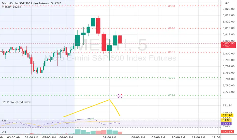
Mancini Levels Fixed Errors 11.26.25Fixed this amazing indicator for followers of Mancini. Thank you, @bitjanitor

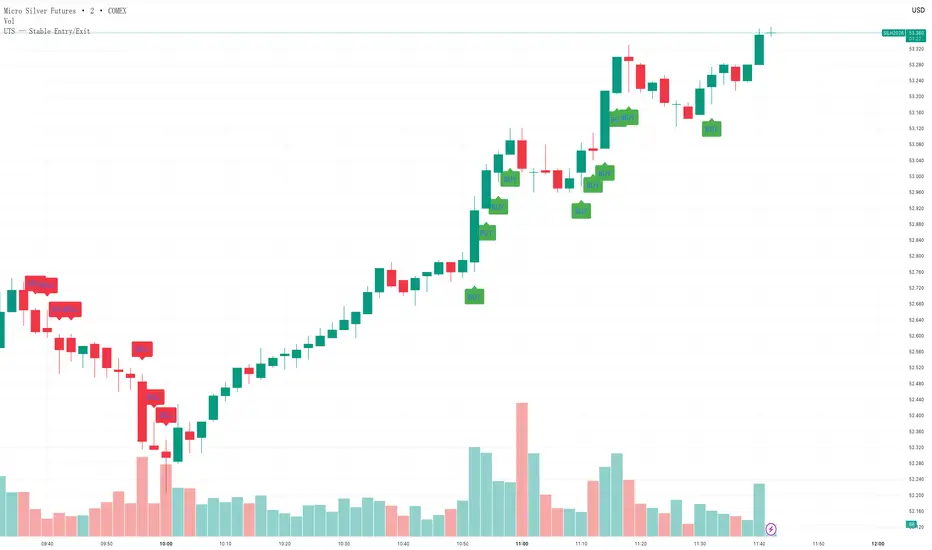
UTS — Stable Entry/ExitThis is the stable version of Ultimate Trend System (UTS) focusing on clean and reliable entry/exit signals.
✔ No repaint
✔ No complex state machine
✔ No external dependencies
✔ No CHOP (to avoid Pine v6 errors)
✔ No 15-minute filters (ensures signals appear in real time)
✔ BUY = Supertrend Up + QQE Up + ATR Up
✔ SELL = Supertrend Down + QQE Down + ATR Up
✔ STOP = Trend weakening or volatility contraction
This version is specifically designed for traders who need:
- clear, stable, non-noisy signals
- fast real-time ENTRY/EXIT markers
- zero script errors during publication
- minimal false positives while not missing trend moves
Perfect for scalping / intraday futures like MGC, SIL, MHG, GC, CL, ES, NQ.
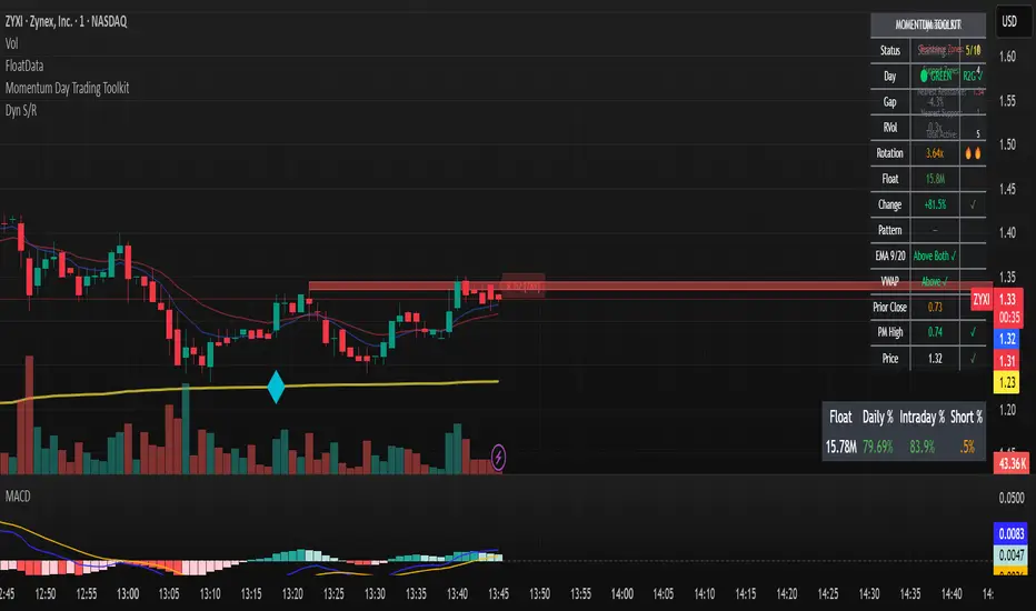
Momentum Day Trading ToolkitMomentum Day Trading Toolkit
Complete User Guide
Table of Contents
Overview
Quick Start
The Dashboard
Module 1: 5 Pillars Screener
Module 2: Gap & Go
Module 3: Bull Flag / Flat Top
Module 4: Float Rotation
Module 5: R2G / G2R
Module 6: Micro Pullback
Signal Reference
Quality Score
Settings Guide
Alerts Setup
Trading Workflows
Troubleshooting
Overview
The Momentum Day Trading Toolkit combines 6 powerful indicators into one unified system for day trading momentum stocks.
ModulePurpose① 5 PillarsConfirms stock is "in play"② Gap & GoPre-market levels & gap analysis③ Bull Flag / Flat TopClassic breakout patterns④ Float RotationMeasures true interest level⑤ R2G / G2RTracks prior close crosses⑥ Micro PullbackPrecision continuation entries
All modules work together - the dashboard shows you everything at a glance, and you can enable/disable any module you don't need.
Quick Start
Step 1: Add to Chart
Add the indicator to any stock chart
Recommended timeframes: 1-minute, 5-minute, or 15-minute
Step 2: Check the Dashboard (Top Right)
Look for:
Status = Current state (Scanning, Entry Signal, etc.)
Quality Score = Setup rating out of 10
Green checkmarks (✓) = Criteria passing
Step 3: Watch for Entry Signals
Triangles, circles, diamonds below bars = Entry signals
Arrows = R2G/G2R crosses
Step 4: Set Alerts
Right-click chart → Add Alert
Select "Momentum Day Trading Toolkit"
Choose your alert condition
The Dashboard
The dashboard in the top-right corner gives you instant analysis:
┌─────────────────────────────┐
│ MOMENTUM TOOLKIT │
├─────────────────────────────┤
│ Status │ 🎯 ENTRY SIGNAL │
│ Day │ 🟢 GREEN │
│ Gap │ +8.5% 🔥 │
│ RVol │ 3.2x ✓ │
│ Rotation │ 1.45x 🔥 │
│ Float │ 5.2M 🔥 │
│ Change │ +12.3% ✓ │
│ Pattern │ BULL FLAG! │
│ EMA 9/20 │ Above Both ✓ │
│ VWAP │ Above ✓ │
│ Prior Cl │ 5.91 │
│ PM High │ 9.11 ✓ │
│ Price │ 9.46 ✓ │
└─────────────────────────────┘
Dashboard Row Reference
RowWhat It ShowsGood ValuesStatusCurrent state🎯 ENTRY SIGNALDayGreen/Red vs prior close🟢 GREENGapGap % from prior close🔥 (5%+) or 🔥🔥 (10%+)RVolRelative volume✓ (2x+) or ✓✓ (5x+)RotationFloat rotation🔥 (1x) or 🔥🔥 (2x+)FloatFloat in millions🔥 (<5M) or Low (<10M)ChangeDaily % change✓ (meets minimum)PatternPattern statusBREAKOUT!EMA 9/20Trend positionAbove Both ✓VWAPVWAP positionAbove ✓Prior CloseKey R2G levelReference pricePM HighPre-market high✓ = Above itPriceCurrent price✓ = In range
Status Messages
StatusMeaningActionScanning...Looking for setupsWait✅ ALL PILLARSStock qualifiesWatch for pattern⏳ PATTERN FORMINGSetup developingGet ready🎯 ENTRY SIGNALSignal triggeredExecute trade
Module 1: 5 Pillars Screener
What It Does
Confirms the stock meets basic criteria to be worth trading.
The 5 Pillars
PillarDefaultWhy It MattersRelative Volume2x+ (5x for "strong")Confirms unusual interestDaily Change5%+Stock is movingPrice Range$1-$20Sweet spot for momentumFloat Size<20M sharesLower float = bigger moves
Visual Indicator
Green background appears when ALL pillars pass
Dashboard Shows
Individual pillar status with ✓ checkmarks
Quality score includes pillar factors
Settings
SettingDefaultDescriptionMin RVol2.0xMinimum relative volumeStrong RVol5.0xVolume for full qualificationMin Change5%Minimum daily moveMin Price$1Minimum stock priceMax Price$20Maximum stock priceMax Float20MMaximum float size
Module 2: Gap & Go
What It Does
Analyzes pre-market gaps and displays key price levels.
Key Levels Displayed
LevelColorDescriptionPrior CloseOrangeYesterday's close - THE key levelPM HighGreenPre-market high - breakout levelPM LowRedPre-market low - support
Gap Classification
Gap SizeRatingMeaning5-9.9%🔥 QualifyingWorth watching10%+🔥🔥 StrongHigh priority
Entry Signal
Small green triangle = PM High Breakout
How to Trade
Stock gaps up in pre-market
Wait for market open
Look for break above PM High
Enter on breakout with stop below PM Low
Settings
SettingDefaultDescriptionMin Gap %5%Qualifying gap thresholdStrong Gap %10%Strong gap thresholdShow PM LevelsONDisplay PM high/low lines
Module 3: Bull Flag / Flat Top
What It Does
Detects classic continuation patterns and signals breakouts.
Bull Flag Pattern
▲ BREAKOUT (Entry Signal)
│
┌────┴────┐
│ Pullback │ ← 2-5 red candles
│ (flag) │ Max 50% retrace
└─────────┘
│
┌────┴────┐
│ Pole │ ← 3+ green candles
│ (move) │ Strong momentum
└─────────┘
Flat Top Pattern
═══════════════ Resistance (2+ touches)
│
▲ BREAKOUT above resistance
Entry Signals
SignalShapeColorPatternBull Flag Breakout▲ TriangleLimeFlag breaks upFlat Top Breakout◆ DiamondAquaResistance breaks
How to Trade Bull Flag
See 3+ green candles (the pole)
Price pulls back 2-5 red candles
Pullback stays above 50% of move
Enter on break above pullback high
Stop below pullback low
Settings
SettingDefaultDescriptionMin Pole Candles3Green candles neededMax Pullback5Max red candles allowedMax Retrace50%Max pullback depthFT Touches2Resistance touches neededFT Lookback10Bars to check for resistance
Module 4: Float Rotation
What It Does
Tracks how many times the entire float has traded hands today.
The Formula
Rotation = Cumulative Day Volume ÷ Float
Rotation Levels
RotationEmojiMeaning0.5x—Half float traded1.0x🔥FULL rotation - significant!2.0x🔥🔥Double rotation - extreme3.0x+🔥🔥🔥Triple rotation - rare event
Why It Matters
High rotation = Extreme interest
Everyone who owns shares has likely traded
Often precedes explosive moves
Shows "real" demand beyond just volume
Dashboard Shows
Current rotation level
Fire emojis for milestones
Settings
SettingDefaultDescriptionFloat SourceAutoAuto-detect or manualManual Float10MIf auto fails, use thisAlert Level1.0xAlert when rotation hits this
Module 5: R2G / G2R
What It Does
Tracks when price crosses the prior day's close - a key psychological level.
Red to Green (R2G) 🟢
Prior Close ─────────────────
↗ CROSS TO GREEN
↗
(opened red)
Stock opened below prior close (red)
Crosses above prior close (green)
BULLISH signal
Green to Red (G2R) 🔴
(opened green)
↘
↘ CROSS TO RED
Prior Close ─────────────────
Stock opened above prior close (green)
Crosses below prior close (red)
BEARISH signal
Entry Signals
SignalShapeColorMeaningR2G↑ ArrowLimeCrossed to greenG2R↓ ArrowRedCrossed to red
Why R2G Matters
Bears who shorted get squeezed
Creates FOMO buying
Prior close becomes support
Momentum often continues
Dashboard Shows
Current day status (🟢 GREEN / 🔴 RED)
Whether R2G or G2R occurred (R2G ✓ or G2R ✓)
Settings
SettingDefaultDescriptionRequire Opposite OpenONR2G needs red openShow Prior CloseONDisplay the line
Module 6: Micro Pullback
What It Does
Finds precision entries on brief 1-3 candle pullbacks after strong moves.
The Pattern
▲ ENTRY (break pullback high)
│
┌──┴───┐
│ 1-3 │ ← Micro pullback (brief!)
│ red │ Stop = low of this
└──────┘
│
┌──┴───┐
│ 3+ │ ← Strong move
│green │ Momentum building
└──────┘
Why Micro Pullbacks Work
Tight stop = Pullback low is close
Momentum intact = Only paused briefly
Early entry = Catch continuation early
Clear trigger = Break of pullback high
Entry Signal
SignalShapeColorMicro Pullback Entry● CircleYellow
How to Trade
See 3+ green candles (strong move)
1-3 red candles (brief pause)
Pullback stays above 50% retrace
Enter when green candle breaks pullback high
Stop at pullback low
Settings
SettingDefaultDescriptionMin Green Candles3Candles before pullbackMax Pullback3Max red candlesMax Retrace50%Max pullback depth
Signal Reference
All Entry Signals (Below Bar)
ShapeColorSignalModule▲ Large TriangleLimeBull Flag BreakoutPatterns◆ DiamondAquaFlat Top BreakoutPatterns● CircleYellowMicro Pullback EntryMicro PB▲ Small TriangleGreenPM High BreakoutGap & Go↑ ArrowLimeRed to GreenR2G/G2R
Warning Signals (Above Bar)
ShapeColorSignalModule↓ ArrowRedGreen to RedR2G/G2R
Optional Forming Signals (Disabled by Default)
ShapeColorSignal🚩 FlagFaded LimeBull Flag Forming● CircleFaded YellowMicro PB Forming
Enable "Show 'Forming' Markers" in settings to see these
Quality Score
The quality score (0-10) rates the overall setup strength.
Scoring Breakdown
FactorPointsRVol 5x++2RVol 2x++1Daily change 5%++1Low float (<20M)+1Strong gap (10%+)+2Qualifying gap (5%+)+1Rotation 1x++2Rotation 0.5x++1Above EMA 20+1
Score Interpretation
ScoreGradeAction8-10A+Best setups - full position6-7AGood setups - standard size4-5BAverage - reduced size0-3CWeak - skip or paper trade
Settings Guide
Module Toggles
Turn each module ON/OFF:
SettingDefaultDescription① 5 Pillars ScreenerONStock qualification② Gap & Go AnalysisONGap & level analysis③ Bull Flag / Flat TopONPattern detection④ Float RotationONRotation tracking⑤ R2G / G2R TrackerONPrior close crosses⑥ Micro PullbackONPullback entries
Visual Settings
SettingDefaultDescriptionShow DashboardONDisplay info tableTable SizeNormalSmall/Normal/LargeShow Entry SignalsONDisplay entry shapesShow 'Forming' MarkersOFFShow pattern formingShow Key LevelsONPrior close, PM levelsShow EMA 9/20ONTrend EMAsShow VWAPONVWAP line
Recommended Presets
Minimal (Clean Chart)
Show Dashboard: ON
Show Entry Signals: ON
Show 'Forming' Markers: OFF
Show Key Levels: OFF
Show EMA: OFF
Show VWAP: OFF
Standard (Balanced)
All defaults
Full Analysis
All settings ON
Alerts Setup
Available Alerts
AlertTriggerAny Bullish EntryAny entry signal firesBull Flag BreakoutBull flag breaks outFlat Top BreakoutFlat top breaks outMicro Pullback EntryMicro PB triggersPM High BreakoutBreaks above PM highRed to GreenR2G crossGreen to RedG2R crossFloat RotationHits rotation level5 Pillars PassAll pillars qualifyPattern FormingPattern starts formingHigh Quality EntryEntry with score 7+/10
How to Set Alerts
Right-click on chart
Select "Add Alert"
Condition: "Momentum Day Trading Toolkit"
Select alert type from dropdown
Set expiration and notifications
Click "Create"
Recommended Alerts
For Active Trading:
Any Bullish Entry
High Quality Entry
For Watchlist Monitoring:
5 Pillars Pass
Float Rotation
Trading Workflows
Workflow 1: Full Qualification
Step 1: 5 PILLARS
└─→ Wait for "✅ ALL PILLARS" status
Step 2: CHECK SETUP
└─→ Quality score 6+?
└─→ Above EMA and VWAP?
Step 3: WAIT FOR ENTRY
└─→ Bull Flag, Flat Top, or Micro PB signal
Step 4: EXECUTE
└─→ Enter on signal
└─→ Stop below pattern low
└─→ Target 2:1 minimum
Workflow 2: Gap & Go
Step 1: PRE-MARKET
└─→ Stock gaps 5%+ (shows in Gap row)
Step 2: MARKET OPEN
└─→ Note PM High level (green line)
Step 3: WAIT FOR BREAK
└─→ PM High Breakout signal (small triangle)
Step 4: CONFIRM
└─→ R2G if opened red (double confirmation)
└─→ RVol 2x+
Step 5: EXECUTE
└─→ Enter on PM High break
└─→ Stop below PM Low
Workflow 3: Micro Pullback Scalp
Step 1: FIND MOMENTUM
└─→ Stock moving, 3+ green candles
Step 2: WAIT FOR PAUSE
└─→ 1-3 red candles (brief pullback)
Step 3: ENTRY
└─→ Yellow circle signal appears
Step 4: QUICK TRADE
└─→ Enter at signal
└─→ Tight stop at pullback low
└─→ Quick target (1:1 to 2:1)
Troubleshooting
Q: Lines are moving/jumping on real-time chart?
A: This was fixed in latest version. Make sure you have the newest code. Lines now lock in place at market open.
Q: Too many signals, chart is cluttered?
A:
Turn off "Show 'Forming' Markers"
Disable modules you don't need
Use "Minimal" visual preset
Q: No signals appearing?
A:
Check if "Show Entry Signals" is ON
Make sure relevant module is enabled
Stock may not meet pattern criteria
Q: Dashboard shows wrong float?
A:
TradingView float data isn't available for all stocks
Switch Float Source to "Manual"
Enter correct float in millions
Q: PM High/Low not showing?
A:
Only appears during market hours
Needs pre-market data to calculate
Check if "Show Key Levels" is ON
Q: Quality score seems wrong?
A:
Score updates in real-time
Check individual factors in dashboard
RVol and rotation change throughout day
Q: Alert not triggering?
A:
Make sure alert is set on correct symbol
Check alert hasn't expired
Verify condition is set correctly
Quick Reference Card
Entry Signals
▲ Lime Triangle = Bull Flag Breakout
◆ Aqua Diamond = Flat Top Breakout
● Yellow Circle = Micro Pullback
▲ Green Triangle = PM High Break
↑ Lime Arrow = R2G (bullish)
↓ Red Arrow = G2R (bearish)
Dashboard Quick Read
🎯 = Entry signal active
✅ = All pillars pass
🟢 = Day is green
🔥 = Strong (gap/rotation)
✓ = Criteria met
✗ = Criteria failed
Quality Score
8-10 = A+ (Best)
6-7 = A (Good)
4-5 = B (Average)
0-3 = C (Weak)
Key Levels
Orange Line = Prior Close (R2G level)
Green Line = PM High (breakout level)
Red Line = PM Low (support)
Purple Line = VWAP
Yellow/Orange = EMA 9/20
Happy Trading! 🎯📈
For questions or issues, use TradingView's comment section on the indicator page.

Custom 3x Moving AveragesSwitch between MA, SMA/ EMA, adjust the Period as needed, and customize the color according to your preference.

able MACD Overview
Purpose: The indicator combines the traditional MACD (Moving Average Convergence Divergence) with a short-term “forecast” (projection) of MACD/histogram values to give early warning of momentum changes.
Typical outputs:
MACD line (fastEMA − slowEMA)
Signal line (EMA of MACD)
Histogram (MACD − signal)
Forecasted MACD or histogram projected N bars ahead
Optional buy/sell markers and alert conditions
Add the indicator to TradingView (Installation)
Open TradingView and the chart you want to apply the indicator to.
Click “Pine Editor” at the bottom of the chart.
Copy the contents of able_macd_forecast.pine into the Pine Editor window.
Click “Add to chart” (or Save then Add to chart). If it’s a study, it will appear on the chart below price.
If you plan to re-use the script, click Save and give it a meaningful name.
Inputs / Parameters (typical) Note: exact input names may differ in your script. Replace the names below with the script’s input labels when you inspect it.
Source: price source for calculations (close, hl2, etc.).
Fast Length: length for the fast EMA (commonly 12).
Slow Length: length for the slow EMA (commonly 26).
Signal Length: length for the MACD signal EMA (commonly 9).
Forecast Length / Horizon: how many bars ahead the script projects the MACD/histogram (e.g., 1–5).
Forecast Method / Smoothing: choice of projection method (linear regression, EMA extrapolation, simple slope * N, etc.) if available.
Histogram Thresholds: numeric thresholds to emphasize significant momentum (optional).
Show Forecast: toggle on/off the forecast plot.
Alerts On/Off toggles: enable or disable alert conditions baked into the indicator.
Visual / Style settings: colors, plot thickness, histogram style (columns/areas), show labels, show buy/sell arrows.
How the indicator is typically calculated (summary)
MACD line = EMA(source, fast) − EMA(source, slow)
Signal line = EMA(MACD line, signal length)
Histogram = MACD − Signal
Forecast = method-specific short-term projection of MACD or histogram (for example: extend the last slope forward, apply linear regression to MACD values and extrapolate N bars, or apply an additional smoothing and extend that value) Note: For exact math, I need to inspect the script; this is the typical approach.
How to read the indicator (signals & interpretation)
Bullish signal:
MACD line crossing above the signal line (MACD cross up).
Histogram turns positive (cross above zero).
Forecast shows MACD/histogram moving higher in the next N bars (if forecast is positive or trending up).
Bearish signal:
MACD line crossing below the signal line (MACD cross down).
Histogram turns negative (cross below zero).
Forecast shows MACD/histogram moving lower ahead.
Confirmations:
Use price action (higher highs/lows for bullish, lower highs/lows for bearish).
Volume or other momentum/confluence indicators (RSI, ADX).
Divergences:
Bullish divergence: price makes lower low while MACD histogram makes higher low.
Bearish divergence: price makes higher high while MACD histogram makes lower high.
Forecast behavior:
If the forecast leads the MACD cross (forecast crosses before the current MACD does), it’s an early warning.
Use caution: forecasts are prone to false signals; always confirm.
Common trading setups using this indicator
Conservative:
Wait for MACD to cross signal + histogram above zero + forecast already trending same direction.
Use stop below recent swing low (for long) or above recent swing high (for short).
Aggressive (early entry):
Enter when forecast turns positive while MACD still below signal (anticipating cross).
Use tighter stops and smaller position sizes.
Exit rules:
Opposite MACD cross, histogram flipping sign, or a target based on risk-reward.
Use trailing stop based on ATR or structure.
Example settings for different timeframes (starting points)
Scalping / 5–15 min:
Fast 8, Slow 21, Signal 5, Forecast 1–2
Intraday / 1H:
Fast 12, Slow 26, Signal 9, Forecast 2–3
Swing / 4H–Daily:
Fast 12, Slow 26, Signal 9, Forecast 3–5 Adjust based on the asset volatility and backtests.
Adding alerts (TradingView)
Click the “Alerts” button (clock icon) or press Alt + A.
In the Condition dropdown, select the indicator name (able_macd_forecast) and choose a plotted series or built-in alert condition (if the script uses alertcondition).
Common alert types:
MACD crosses Signal (Crossing)
Histogram crosses 0 (Crossing)
Forecast crosses 0 or Forecast trend change (if provided)
Message templates:
“{{ticker}}: MACD crossed above signal on {{interval}}”
“{{ticker}} Forecast positive: MACD forecast shows upward momentum”
Customize the message for your trade automation or notifications.
Configure frequency (Only once, Once per bar, or Once per bar close) — for signals like crossovers, “Once per bar close” is usually safer to avoid repainting issues. Note: If the script includes alertcondition() calls with explicit IDs/messages, use those directly — they are the most reliable for automation.
Backtesting / Strategy conversion
If this script is a study (indicator), you can:
Convert it to a strategy by adding strategy.* order calls (strategy.entry, strategy.close) using the entry/exit logic you prefer, or
Use TradingView’s “Bar Replay” to manually test signals across different markets/timeframes.
If you want, I can help convert or write a strategy wrapper that uses the indicator’s signals to place backtest trades (I’ll need the code).
Practical tips & best practices
Use higher timeframe confirmation for lower-timeframe entries (e.g., check daily MACD momentum before trading 15m signals).
Beware of choppy markets; MACD / forecast may produce whipsaws. Combine with trend filters (moving average direction, ADX).
If you rely on forecasted values, prefer alerts “on bar close” when possible to reduce false alerts from intra-bar noise.
Tune parameters for the specific asset (FX, crypto, stocks have different behavior).
Record each signal and outcome for a sample period (20–100 trades) to evaluate performance.
Troubleshooting
Indicator won’t add: verify Pine version in script header (//@version=4 or //@version=5). TradingView may reject scripts with unsupported version syntax.
Plots missing: check script inputs (Some scripts hide plots if toggles are off).
Alerts firing too often: change alert frequency to “Once per bar close” or adjust threshold values.
Forecast seems to repaint: some forecast methods can repaint (use “bar_index” or store values only on closed bars, or use non-repainting forecast methods). Ask me to inspect the script for repainting logic.
What I can do next (recommended)
If you paste the content of able_macd_forecast.pine here, I will:
Produce a precise, line-by-line usage guide mapping to the exact input names and default values.
Show the exact plotted series names and how to reference them for alerts.
Point out any repainting risks and suggest fixes.
Provide example alert messages that match the script’s alertcondition IDs (if any).
Optionally convert it into a strategy for backtesting, or add non-repainting forecast logic if needed.

ORB + Fair Value Gaps (FVG/iFVG) Suite with Daily 50% MidlineA complete smart-money–focused price-action toolkit combining the New York Open Range Breakout (ORB), ICT-style Fair Value Gaps, Inverted FVGs, and a dynamic Daily 50% Midline.
Designed for traders who want a clean, fast, and highly visual way to track liquidity, imbalances, and intraday directional bias.
📌 Key Features
1. NY Session ORB (09:30–09:45 New York Time)
Automatically plots:
ORB High
ORB Low
Labels for ORB high/low
Optional 5-minute chart restriction
Lines extend forward for easy reference
Used to identify breakout conditions, liquidity sweeps, and directional bias into the morning session.
📌 2. ICT-Style Fair Value Gaps (FVGs)
Full automated detection of bullish & bearish FVGs based on the classic 3-candle displacement structure:
Bullish FVG: high < low
Bearish FVG: low > high
Each FVG is drawn as a box with:
Custom colour
Custom border style (solid, dashed, dotted)
Automatic extension to the right until filled
Optional size text showing the gap in points (font size/colour adjustable)
Adjustable max lookback for performance
📌 3. Inverted FVGs (iFVGs)
Once price fully fills an FVG, it automatically becomes an iFVG, shown with:
Custom iFVG colour
Custom border style
Extension to the right
Once price trades through the zone from the opposite side, the iFVG is considered “consumed” and:
It stops extending
And optionally auto-deletes based on user settings
This makes it easy to track meaningful imbalances that turn into liquidity pockets.
📌 4. “Show Only After ORB” Filter
Optionally hide all FVGs/iFVGs formed before the ORB completes.
This is especially useful for intraday strategies focused on NY session structure only.
📌 5. Daily 50% Midline (OHLC Midpoint)
A dynamic, always-updating midpoint of the current daily candle:
Mid = (Daily High + Daily Low) / 2
Features:
Custom colour
Dashed styling
Extends left and right as a horizontal ray
Updates live as the daily candle forms
Great for bias filters, mean reversion, and daily liquidity zones.
📌 6. Performance-Optimized (Fast!)
Built with:
Fully configurable max lookback
Memory-efficient arrays
Auto-cleaning of old FVG/iFVG objects
Lightweight daily midline recalculation
This allows extremely fast rendering even on 1-minute charts.
📌 7. Alerts
Includes a clean alert condition:
Price returned to a Fair Value Gap
Works for both bullish and bearish FVG revisits.
🎯 Who This Indicator Is For
This tool is ideal for traders who use:
ICT / SMC concepts
Liquidity-based trading
ORB strategies
Imbalance-driven price action
Intraday or NY session-focused setups
Futures, crypto, forex, and equities
🎁 Summary
This indicator gives you:
A clean ORB framework
Automatic, dynamic FVG and iFVG analysis
Real-time daily candle context
Customizable visuals
Powerful session filtering
Efficient performance
All in one clean, intuitive package built for real-time decision making.
3B / 3S System + 99 EMA + Camarilla Pivots3B / 3S System + 99 EMA + Camarilla Pivots, EMA5 above 2 candles buy or SELL
PyraTime: Tesla Trinity [LITE] | 3-6-9 Time CyclesThe Algorithm of the Universe
"If you knew the magnificence of the 3, 6, and 9, you would have a key to the universe." — Nikola Tesla
Most traders analyze Price (the Y-axis) but completely ignore the most critical dimension: Time (the X-axis).
PyraTime: Tesla Trinity is a harmonic time projector. It moves beyond standard technical analysis by translating the ancient Solfeggio Frequencies directly into time cycles on your chart.
How It Works
This indicator projects the 9 core Solfeggio frequencies as specific time intervals anchored to a user-defined "Origin Pivot." When these invisible time harmonics align, they create "Time Clusters"—high-probability zones where market energy is likely to pivot, reverse, or expand.
The 3-6-9 Sequences
The indicator visualizes three distinct energy groups:
🔴 The Grounding Trinity (174Hz - 396Hz): Foundation & Stability.
🟢 The Transformation Trinity (417Hz - 639Hz): Change & Acceleration.
🔵 The Awakening Trinity (741Hz - 963Hz): Spiritual Peak & Completion.
How to Use (LITE Version)
Find the Origin: Identify a major market structure point (e.g., a Swing High or Low).
Set the Anchor: In the settings, input the exact time of that pivot into the "Origin Pivot" field.
Watch the Clusters: Look for areas where multiple frequency lines converge.
Example: A Grounding line (Red) and an Awakening line (Blue) overlapping often signals a trend reversal.
Included in LITE Version
✅ 1-Minute Fractals: For scalping and micro-cycle analysis.
✅ 15-Minute Fractals: For intraday trend identification.
✅ Full Harmonic Spectrum: All 9 Solfeggio frequencies included.
Want the Master Edition?
The Master Edition unlocks the "Hidden Fractals" used by institutional harmonic traders:
🔓 The "4x" Suite: 4-minute, 40-minute, and 4-hour projection cycles.
🔓 Macro Cycles: Hourly and Daily projections for Swing Trading.
🔓 Golden Anchor: Advanced precision tools.
"Search 'PyraTime' for the Master Edition."
Disclaimer: This tool is for educational and experimental purposes only. Trading involves risk.


PTP V3A setup using EMAs (Exponential Moving Averages) and various indicators ('Chiches' or 'Gadgets') which combines RSI and Fibonacci retracement after a drop to signal entries. It also marks trend zones based on the crosses of the 200 EMA, 42 EMA, and 10 WMA

King 2.0Defines a DR/IDR window for each weekday
→ 19:30–23:00 New York time, separate settings for Mon–Fri.
Measures that session’s price range
→ DR high/low, IDR high/low, midlines, and the opening price.
Draws boxes and lines on the chart
→ DR/IDR box, top/bottom/mid lines, and the opening line for each day, with per-day colors/styles and optional price labels.
Tracks “expansion” after the session ends
→ From 23:00 to 23:00 next day (Fri extends over the weekend), it measures how far price breaks above/below the DR in pips.
Tracks “violations” of the DR
→ Records the max high and min low after DR ends and shows how many pips price moved beyond the DR boundaries.
Marks swing-based violations
→ Detects 3-bar swing highs/lows, and when price breaks the DR high/low, it draws a horizontal line from the last opposite swing and labels it SWG H / SWG L.
Shows live stats labels
→ For each day, it displays DR range, expansion up/down, and violation up/down (in pips) near the DR region.

TradingBee Money FlowTradingBee Money Flow
Most traders make the mistake of relying on a single indicator. RSI only looks at price. OBV only looks at volume. If you only look at one, you are missing half the picture.
TradingBee Money Flow solves this by calculating a weighted consensus of 10 different technical metrics combined into a single "Flow Score." It answers the most important question in trading: "Is the money actually backing up the price move?"
If Price goes UP, but this indicator goes DOWN, it’s a trap.
How It Works: The 3-Tier Logic
This script does not just average numbers; it weights them based on importance to creating a true "Composite Score" (-100 to +100).
Tier 1: Primary Volume Flow (50% Weight) The engine of the indicator. It measures raw capital entering/exiting.
MFI (Money Flow Index)
OBV Momentum (On-Balance Volume)
Chaikin Money Flow (CMF)
Tier 2: Secondary Momentum (35% Weight) Validates if the volume is actually moving price efficiently.
VWAP Oscillation
Accumulation/Distribution (A/D) Momentum
Klinger Oscillator
Elders Force Index
Tier 3: Confirmation & Volatility (15% Weight) Filters out fake-outs using volatility metrics.
RSI
ADX (Trend Strength)
Bollinger Band Width
The "Clean Divergence" Engine (Unique Feature)
Standard divergence indicators are "noisy"—they print signals on every small pivot. The TradingBee Money Flow uses a custom Clean Wave Filter to only identify high-probability reversals.
It requires two conditions to trigger a Divergence Signal:
The "Gap" Rule (Zero Cross): The indicator must cross the Zero Line in between two peaks. This ensures we are comparing two distinct waves of buying/selling, rather than just jagged noise in a single trend.
The "Shrinkage" Rule: The second wave must be significantly smaller (by a user-defined ratio) than the first. This confirms a true collapse in momentum.
How to Use This Indicator
1. The Histogram (Trend Following)
Bright Green: Buying pressure is accelerating. Strong Trend.
Dark Green: Buying is continuing, but momentum is slowing. Warning sign.
Bright Red: Selling pressure is accelerating.
Zero Line Cross: The definitive signal of a trend change.
2. The Lines (Reversal Trading)
🔴 Red Line (Bearish Divergence): Price made a Higher High, but Money Flow made a Lower High (with a gap in between). Smart money is selling into the rally. Look for Shorts.
🟢 Green Line (Bullish Divergence): Price made a Lower Low, but Money Flow made a Higher Low. Sellers are exhausted. Look for Longs.
Settings
Lookback Period: Adjusts the sensitivity of the composite score.
Pivot Lookback: Increases or decreases the strictness of the pivot detection.
Require Zero Cross: Keep checked for "Clean" signals. Uncheck to see standard divergences.
Wave Size Ratio: Defines how much smaller the second wave must be to trigger a signal.
Disclaimer: This tool provides market analysis but does not guarantee future results. Always manage your risk.


Predictive Analysis Engine — Adaptive MACD Forecasting with R² SProfessional and Rule-Compliant Description (Ready for Publishing)
This description explains every component of the script in detail, highlights its originality, and provides traders with clear usage instructions — exactly what TradingView expects.
Predictive Analysis Engine (PAE)
This script is a predictive analysis model that combines trend filtering, linear forecasting, stability analysis (R²), and outlier filtering using ATR to produce an advanced, leading-style version of MACD rather than a traditional lagging one.
The indicator does not rely on random elements; it is built on four core components that work together:
1. Stability Measurement Using R²
The coefficient of determination (R²) is calculated based on the correlation between price and time, then normalized to a 0–1 scale.
A higher R² indicates more stable price movement, allowing the script to increase forecast accuracy.
Here, R² acts as a primary component of the Confidence Filter.
2. Forecasted Price Using Linear Regression
Instead of relying solely on the current price, the script uses:
Linear Regression
Weighted blending between the forecasted price and actual price
This enables the script to build a Leading MACD based on an “advanced” price that anticipates probable movement.
3. Advanced MACD With Adaptive Smoothing
MACD is applied to the blended (real + forecasted) price using:
Fast EMA
Slow EMA
MACD base
Optional TEMA for reducing signal lag
Adjustable histogram smoothing
This process makes MACD more responsive with significantly less lag, reacting faster to predicted movements.
4. Predictive MACD (Projected MACD)
Linear Regression is applied again — but this time to:
MACD
Signal
Histogram
to generate projected versions of each line (proj_macd, proj_signal), while proj_hist is used to produce early signals before the actual crossover occurs.
5. Volatility Filtering Using ATR & Volatility Ratio
ATR is used to evaluate:
Strength of movement
Overextension levels
Signal quality
ATR is combined with R² to compute:
Confidence = R² × Volatility Ratio
This suppresses weak signals and boosts high-quality, reliable ones.
6. Predictive Signals + Safety Filters
A signal is triggered when:
proj_hist crosses the 0 level
Confidence exceeds the required threshold
The real histogram is not excessively stretched (extra safety)
The script includes:
BUY / SELL
BUY_STRONG / SELL_STRONG
based on the smoothed histogram trend.
7. Coloring, Background & Visual Enhancements
The script colors:
The histogram
Chart background
Signal lines
to clearly highlight momentum direction and confidence conditions.
8. Built-In Alerts
The script provides ready-to-use alerts:
BUY Alert
SELL Alert
Both based on the predictive MACD model.
How to Use the Script
Add it to any timeframe and any market.
BUY/SELL signals are generated from the projected histogram crossover.
Higher Confidence = stronger signal.
Background colors help visualize trend transitions instantly.
Recommended to combine with support/resistance or price action.
Indicator Objective
This script is designed to deliver early insight into momentum shifts using a blend of:
Linear forecasting
Trend stability via R²
Signal quality filtering via ATR
A fast and adaptive advanced MACD

CVD [able0.1]# CVD Overlay iOS Style - Complete User Guide
## 📖 Table of Contents
1. (#what-is-cvd)
2. (#installation-guide)
3. (#understanding-the-display)
4. (#reading-the-info-table)
5. (#settings--customization)
6. (#trading-strategies)
7. (#common-mistakes-to-avoid)
---
## 🎯 What is CVD?
**CVD (Cumulative Volume Delta)** tracks the **difference between buying and selling pressure** over time.
### Simple Explanation:
- **Positive CVD** (Orange) = More buying than selling = Bulls winning
- **Negative CVD** (Gray) = More selling than buying = Bears winning
- **Rising CVD** = Increasing buying pressure = Potential uptrend
- **Falling CVD** = Increasing selling pressure = Potential downtrend
### Why It Matters:
CVD helps you see **who's really in control** of the market - not just price movement, but actual buying/selling volume.
---
## 🚀 Installation Guide
### Step 1: Open Pine Editor
1. Go to TradingView
2. Click the **"Pine Editor"** tab at the bottom of the screen
3. Click **"New"** or open an existing script
### Step 2: Copy & Paste the Code
1. Select all existing code (Ctrl+A / Cmd+A)
2. Delete it
3. Copy the entire CVD iOS Style code
4. Paste it into Pine Editor
### Step 3: Add to Chart
1. Click **"Save"** button (or Ctrl+S / Cmd+S)
2. Click **"Add to Chart"** button
3. The indicator will appear on your chart!
### Step 4: Initial Setup
- The indicator appears as an **overlay** on your price chart
- You'll see an **orange/gray line** following price
- An **info table** appears in the top-right corner
---
## 📊 Understanding the Display
### Main Chart Elements:
#### 1. **CVD Line** (Orange/Gray)
- **Orange Line** = Positive CVD (buying pressure)
- **Gray Line** = Negative CVD (selling pressure)
- This line moves with your price chart but shows volume delta
#### 2. **CVD Zone** (Shaded Area)
- Light shaded box around the CVD line
- Shows the "range" of CVD movement
- Helps visualize CVD boundaries
#### 3. **Center Line** (Dotted)
- Gray dotted line in the middle of the zone
- Represents the "neutral" point
- CVD crossing this = shift in market control
#### 4. **Reference Asset Line** (Light Gray)
- Shows Bitcoin (BTC) price movement for comparison
- Helps you see if your asset moves with or against BTC
- Can be changed to any asset you want
#### 5. **CVD Label**
- Shows current CVD value
- Positioned above/below zone to avoid overlap
- Updates in real-time
#### 6. **Reset Background** (Very Light Gray)
- Appears when CVD resets
- Indicates a new calculation period
---
## 📋 Reading the Info Table
The info table (top-right) shows **8 key metrics**:
### Row 1: **Header**
```
╔═ CVD able ═╗ | 15m | ████████ | able
```
- **CVD able** = Indicator name + creator
- **15m** = Current timeframe
- **████████** = Visual decoration
- **able** = Creator signature
### Row 2: **CVD Value**
```
CVD▲ | 7.39K | ████████ | █
█
█
```
- **CVD▲** = CVD with trend arrow
- ▲ = CVD increasing
- ▼ = CVD decreasing
- ► = CVD unchanged
- **7.39K** = Actual CVD number
- **Progress Bar** = Visual strength (darker = stronger)
- **Vertical Bars** = Height shows intensity
### Row 3: **Delta**
```
◆DELTA | -1.274K | ████░░░░ | ░
░
```
- **Delta** = Volume change THIS BAR ONLY
- **Negative** = More selling this bar
- **Positive** = More buying this bar
- Shows **immediate** pressure (not cumulative)
### Row 4: **UP Volume**
```
UP↑ | -1.263K | ████████ | █
█
█
```
- Total **buying volume** this bar
- Higher = Stronger buying pressure
- Green/Orange vertical bars = Bullish strength
### Row 5: **DOWN Volume**
```
DN↓ | 2.643K | ████████ | ░
░
░
```
- Total **selling volume** this bar
- Higher = Stronger selling pressure
- Gray vertical bars = Bearish strength
### Row 6-7: **Reference Asset** (if enabled)
```
══ REF ══ | ══════ | ████████ | █
█
PRICE▲ | 4130.300 | ████████ | █
█
```
- **REF** = Reference asset header
- **PRICE▲** = Reference price with trend
- Shows if BTC (or chosen asset) is rising/falling
- Compare with your chart to see correlation
### Row 8: **Market Status**
```
◄STATUS► | NEUT | ████░░░░ | ▒
▒
```
- **BULL** = CVD positive + Delta positive = Strong buying
- **BEAR** = CVD negative + Delta negative = Strong selling
- **NEUT** = Mixed signals = Wait for clarity
**Status Colors:**
- **Orange background** = Bullish (good for long)
- **Gray background** = Bearish (good for short)
- **White background** = Neutral (no clear signal)
---
## ⚙️ Settings & Customization
### Main Settings (⚙️)
#### **CVD Reset**
- **None** = CVD never resets (from beginning of data)
- **On Higher Timeframe** = Resets when HTF candle closes
- 15m chart → Resets hourly
- 1h chart → Resets daily
- Recommended for most traders
- **On Session Start** = Resets at market open
- **On Visible Chart** = Resets from leftmost visible bar
#### **Precision**
- **Low (Fast)** = Uses 1m data, faster but less accurate
- **Medium** = Uses 5m data, balanced (recommended)
- **High** = Uses 15m data, most accurate but slower
#### **Cumulative**
- ✅ On = CVD accumulates over time (recommended)
- ❌ Off = Shows only current bar delta
#### **Show Labels**
- ✅ On = Shows CVD value label on chart
- ❌ Off = Cleaner chart, no label
#### **Show Info Table**
- ✅ On = Shows info table (recommended for beginners)
- ❌ Off = Hide table for minimalist view
---
### 🎨 iOS Style Colors
You can customize **every color** to match your chart theme:
#### **Primary Colors**
- **Primary (Orange)** = Main bullish color (#FF9500)
- **Secondary (Gray)** = Main bearish color (#8E8E93)
- **Background** = Table background (#FFFFFF)
- **Text** = Text color (#1C1C1E)
#### **Bullish/Bearish**
- **Bullish (Orange)** = Positive CVD color
- **Bearish (Gray)** = Negative CVD color
- **Opacity** = Zone transparency (0-100%)
- **Show Zone** = Enable/disable shaded area
#### **Table Colors** (📋)
- **Header Background** = Top row background
- **Header Text** = Top row text color
- **Cell Background** = Data cells background
- **Cell Text** = Data cells text color
- **Border** = Table border color
- **Accent Background** = Special rows background
- **Alert Background** = Warning/status background
---
### 📊 Reference Asset Settings
#### **Enable**
- ✅ On = Shows reference asset line
- ❌ Off = Hide reference asset
#### **Symbol**
- Default: `BINANCE:BTCUSDT`
- Can change to any asset:
- `BINANCE:ETHUSDT` (Ethereum)
- `SPX` (S&P 500)
- `DXY` (US Dollar Index)
- Any ticker symbol
#### **Color & Width**
- Customize line appearance
- Width: 1-4 (thickness)
---
## 💡 Trading Strategies
### Strategy 1: CVD Divergence (Beginner-Friendly)
**What to Look For:**
- Price making **higher highs** but CVD making **lower highs** = Bearish divergence
- Price making **lower lows** but CVD making **higher lows** = Bullish divergence
**How to Trade:**
1. Wait for divergence to form
2. Look for confirmation (price reversal, candlestick pattern)
3. Enter trade in divergence direction
4. Stop loss beyond recent high/low
**Example:**
```
Price: /\ /\ /\ (higher highs)
CVD: /\ / \/ (lower highs) = Bearish signal
```
### Strategy 2: CVD Trend Following (Intermediate)
**What to Look For:**
- **Strongly rising CVD** + **rising price** = Strong uptrend
- **Strongly falling CVD** + **falling price** = Strong downtrend
**How to Trade:**
1. Wait for CVD and price moving in same direction
2. Enter on pullbacks to support/resistance
3. Stay in trade while CVD trend continues
4. Exit when CVD trend breaks
**Signals:**
- CVD ▲▲▲ + Price ↑ = Go LONG
- CVD ▼▼▼ + Price ↓ = Go SHORT
### Strategy 3: CVD + Reference Asset (Advanced)
**What to Look For:**
- Your asset **rising** but BTC (reference) **falling** = Relative strength
- Your asset **falling** but BTC (reference) **rising** = Relative weakness
**How to Trade:**
1. Compare CVD movement with BTC
2. If your CVD rises faster than BTC = Buy signal
3. If your CVD falls faster than BTC = Sell signal
4. Use for **pair trading** or **asset selection**
### Strategy 4: Volume Delta Confirmation
**What to Look For:**
- **Large positive Delta** = Strong buying this bar
- **Large negative Delta** = Strong selling this bar
**How to Trade:**
1. Price breaks resistance + Large positive Delta = Confirmed breakout
2. Price breaks support + Large negative Delta = Confirmed breakdown
3. Use Delta to **confirm** price moves, not predict them
**Rules:**
- Delta > 2x average = Very strong pressure
- Delta near zero at key level = Weak move, likely false breakout
---
## 🎓 Reading Real Scenarios
### Scenario 1: Strong Buying Pressure
```
Table Shows:
CVD▲ | 12.5K | ████████ | ████ (CVD rising)
◆DELTA | +2.8K | ████████ | ▲ (Positive delta)
UP↑ | 3.1K | ████████ | ████ (High buy volume)
DN↓ | 0.3K | ██░░░░░░ | ░ (Low sell volume)
◄STATUS► | BULL | ████████ | ████ (Orange background)
```
**Interpretation:** Strong buying, good for LONG trades
### Scenario 2: Distribution (Hidden Selling)
```
Table Shows:
CVD► | 8.2K | ████░░░░ | ▒▒ (CVD flat)
◆DELTA | -1.5K | ████████ | ▼ (Negative delta)
UP↑ | 0.8K | ███░░░░░ | ░ (Low buy volume)
DN↓ | 2.3K | ████████ | ████ (High sell volume)
◄STATUS► | BEAR | ████████ | ░░░░ (Gray background)
```
**Interpretation:** Price may look stable, but selling increasing = Prepare for drop
### Scenario 3: Neutral/Choppy Market
```
Table Shows:
CVD► | 5.1K | ████░░░░ | ▒ (CVD sideways)
◆DELTA | +0.2K | ██░░░░░░ | ─ (Small delta)
UP↑ | 1.2K | ████░░░░ | ▒ (Medium buy)
DN↓ | 1.0K | ████░░░░ | ▒ (Medium sell)
◄STATUS► | NEUT | ████░░░░ | ▒▒ (White background)
```
**Interpretation:** No clear direction = Stay out or reduce position size
---
## ⚠️ Common Mistakes to Avoid
### Mistake 1: Trading on CVD Alone
- ❌ **Wrong:** "CVD is rising, I'll buy immediately"
- ✅ **Right:** "CVD is rising, let me check price structure, support/resistance, and wait for confirmation"
### Mistake 2: Ignoring Delta
- ❌ **Wrong:** Looking only at cumulative CVD
- ✅ **Right:** Watch both CVD (trend) and Delta (momentum)
- Delta shows **immediate** pressure changes
### Mistake 3: Wrong Timeframe
- ❌ **Wrong:** Using 1m chart with High Precision (too slow)
- ✅ **Right:** Match precision to timeframe:
- 1m-5m → Low Precision
- 15m-1h → Medium Precision
- 4h+ → High Precision
### Mistake 4: Not Using Reset
- ❌ **Wrong:** Using "None" reset for intraday trading
- ✅ **Right:** Use "On Higher Timeframe" to see fresh CVD each session
### Mistake 5: Overtrading Neutral Status
- ❌ **Wrong:** Forcing trades when STATUS = NEUT
- ✅ **Right:** Only trade clear BULL or BEAR status
### Mistake 6: Ignoring Reference Asset
- ❌ **Wrong:** Trading altcoin without checking BTC
- ✅ **Right:** Always check if BTC CVD agrees with your asset
---
## 🔥 Pro Tips
### Tip 1: Multi-Timeframe Analysis
- Check CVD on **3 timeframes**:
- Lower TF (15m) = Entry timing
- Current TF (1h) = Trade direction
- Higher TF (4h) = Overall trend
### Tip 2: Volume Confirmation
- Big price move + Small Delta = **Weak move** (likely reversal)
- Small price move + Big Delta = **Strong accumulation** (continuation)
### Tip 3: CVD Reset Zones
- Pay attention to **reset backgrounds** (light gray)
- Often marks **session starts** = High volatility periods
### Tip 4: Divergence + Status
- Bearish divergence + STATUS = BEAR = **Strongest short signal**
- Bullish divergence + STATUS = BULL = **Strongest long signal**
### Tip 5: Color Psychology
- **Orange** (Bullish) is **warm** = Buying energy
- **Gray** (Bearish) is **cool** = Selling pressure
- Train your eye to read colors instantly
### Tip 6: Table as Quick Scan
- Glance at table without reading numbers:
- **All orange** = Bullish
- **All gray** = Bearish
- **Mixed** = Wait
---
## 📱 Quick Reference Card
| Signal | CVD | Delta | Status | Action |
|--------|-----|-------|--------|--------|
| **Strong Buy** | ▲▲ High | ++ Positive | BULL | Long Entry |
| **Strong Sell** | ▼▼ Low | -- Negative | BEAR | Short Entry |
| **Divergence Buy** | ▲ Rising | Price ▼ | → BULL | Long Setup |
| **Divergence Sell** | ▼ Falling | Price ▲ | → BEAR | Short Setup |
| **Neutral** | → Flat | ~0 Near Zero | NEUT | Stay Out |
| **Accumulation** | → Flat | ++ Positive | NEUT→BULL | Watch for Breakout |
| **Distribution** | → Flat | -- Negative | NEUT→BEAR | Watch for Breakdown |
---
## 🆘 Troubleshooting
### Issue: "Indicator not showing"
- **Solution:** Make sure overlay=true in code, re-add to chart
### Issue: "Table overlaps with price"
- **Solution:** Change table position in code or use TradingView's "Move" feature
### Issue: "CVD line too far from price"
- **Solution:** This is normal! CVD is volume-based, not price-based. Focus on CVD direction, not position
### Issue: "Too many lines on chart"
- **Solution:** Disable "Show Zone" and "Show Labels" in settings for cleaner view
### Issue: "Calculations too slow"
- **Solution:** Change Precision to "Low (Fast)" or use higher timeframe
### Issue: "Reference asset not showing"
- **Solution:** Check if "Enable" is ON and symbol is valid (e.g., BINANCE:BTCUSDT)
---
## 🎬 Getting Started Checklist
- Install indicator on TradingView
- Set precision to "Medium"
- Set reset to "On Higher Timeframe"
- Enable info table
- Add reference asset (BTC)
- Practice reading the table on demo account
- Test on different timeframes (15m, 1h, 4h)
- Compare CVD with your current strategy
- Paper trade for 1 week before going live
- Keep a trading journal of CVD signals
---
## 📚 Summary
**CVD shows WHO is winning: Buyers or Sellers**
**Key Points:**
1. **Orange/Rising CVD** = Buying pressure = Bullish
2. **Gray/Falling CVD** = Selling pressure = Bearish
3. **Delta** = Immediate momentum THIS BAR
4. **Status** = Overall market condition
5. **Always confirm** with price action & other indicators
**Remember:**
- CVD is a **tool**, not a crystal ball
- Use with proper risk management
- Practice makes perfect
- Stay disciplined!
---
**Created by: able**
**Version:** iOS Style v1.0
**Contact:** For questions, refer to TradingView community
Happy Trading! 🚀📈

Pivot Points Standard + 9/20/50/200 EMA by NK//@version=6
indicator("Pivot Points Standard + 9/20/50/200 EMA", "Pivots+EMA", overlay=true, max_lines_count=500, max_labels_count=500)
// --- EMA calculations and plots
ema9 = ta.ema(close, 9)
ema20 = ta.ema(close, 20)
ema50 = ta.ema(close, 50)
ema200 = ta.ema(close, 200)
plot(ema9, color=color.green, linewidth=2, title="EMA 9")
plot(ema20, color=color.red, linewidth=2, title="EMA 20")
plot(ema50, color=color.new(color.blue, 0), linewidth=2, title="EMA 50") // dark blue
plot(ema200, color=color.black, linewidth=2, title="EMA 200")
// --- Pivots Inputs
pivotTypeInput = input.string(title="Type", defval="Traditional", options= )
pivotAnchorInput = input.string(title="Pivots Timeframe", defval="Auto", options= )
maxHistoricalPivotsInput = input.int(title="Number of Pivots Back", defval=15, minval=1, maxval=200, display = display.data_window)
isDailyBasedInput = input.bool(title="Use Daily-based Values", defval=true, display = display.data_window, tooltip="When this option is unchecked, Pivot Points will use intraday data while calculating on intraday charts. If Extended Hours are displayed on the chart, they will be taken into account during the pivot level calculation. If intraday OHLC values are different from daily-based values (normal for stocks), the pivot levels will also differ.")
showLabelsInput = input.bool(title="Show Labels", defval=true, group="labels", display = display.data_window)
showPricesInput = input.bool(title="Show Prices", defval=true, group="labels", display = display.data_window)
positionLabelsInput = input.string("Left", "Labels Position", options= , group="labels", display = display.data_window, active = showLabelsInput or showPricesInput)
linewidthInput = input.int(title="Line Width", defval=1, minval=1, maxval=100, group="levels", display = display.data_window)
DEFAULT_COLOR = #FB8C00
showLevel2and3 = pivotTypeInput != "DM"
showLevel4 = pivotTypeInput != "DM" and pivotTypeInput != "Fibonacci"
showLevel5 = pivotTypeInput == "Traditional" or pivotTypeInput == "Camarilla"
pColorInput = input.color(DEFAULT_COLOR, "P ", inline="P", group="levels", display = display.data_window)
pShowInput = input.bool(true, "", inline="P", group="levels", display = display.data_window)
s1ColorInput = input.color(DEFAULT_COLOR, "S1", inline="S1/R1" , group="levels", display = display.data_window)
s1ShowInput = input.bool(true, "", inline="S1/R1", group="levels", display = display.data_window)
r1ColorInput = input.color(DEFAULT_COLOR, " R1", inline="S1/R1", group="levels", display = display.data_window)
r1ShowInput = input.bool(true, "", inline="S1/R1", group="levels", display = display.data_window)
s2ColorInput = input.color(DEFAULT_COLOR, "S2", inline="S2/R2", group="levels", display = display.data_window, active = showLevel2and3)
s2ShowInput = input.bool(true, "", inline="S2/R2", group="levels", display = display.data_window, active = showLevel2and3)
r2ColorInput = input.color(DEFAULT_COLOR, " R2", inline="S2/R2", group="levels", display = display.data_window, active = showLevel2and3)
r2ShowInput = input.bool(true, "", inline="S2/R2", group="levels", display = display.data_window, active = showLevel2and3)
s3ColorInput = input.color(DEFAULT_COLOR, "S3", inline="S3/R3", group="levels", display = display.data_window, active = showLevel2and3)
s3ShowInput = input.bool(true, "", inline="S3/R3", group="levels", display = display.data_window, active = showLevel2and3)
r3ColorInput = input.color(DEFAULT_COLOR, " R3", inline="S3/R3", group="levels", display = display.data_window, active = showLevel2and3)
r3ShowInput = input.bool(true, "", inline="S3/R3", group="levels", display = display.data_window, active = showLevel2and3)
s4ColorInput = input.color(DEFAULT_COLOR, "S4", inline="S4/R4", group="levels", display = display.data_window, active = showLevel4)
s4ShowInput = input.bool(true, "", inline="S4/R4", group="levels", display = display.data_window, active = showLevel4)
r4ColorInput = input.color(DEFAULT_COLOR, " R4", inline="S4/R4", group="levels", display = display.data_window, active = showLevel4)
r4ShowInput = input.bool(true, "", inline="S4/R4", group="levels", display = display.data_window, active = showLevel4)
s5ColorInput = input.color(DEFAULT_COLOR, "S5", inline="S5/R5", group="levels", display = display.data_window, active = showLevel5)
s5ShowInput = input.bool(true, "", inline="S5/R5", group="levels", display = display.data_window, active = showLevel5)
r5ColorInput = input.color(DEFAULT_COLOR, " R5", inline="S5/R5", group="levels", display = display.data_window, active = showLevel5)
r5ShowInput = input.bool(true, "", inline="S5/R5", group="levels", display = display.data_window, active = showLevel5)
type graphicSettings
string levelName
color levelColor
bool showLevel
var graphicSettingsArray = array.from(
graphicSettings.new(" P", pColorInput, pShowInput),
graphicSettings.new("R1", r1ColorInput, r1ShowInput), graphicSettings.new("S1", s1ColorInput, s1ShowInput),
graphicSettings.new("R2", r2ColorInput, r2ShowInput), graphicSettings.new("S2", s2ColorInput, s2ShowInput),
graphicSettings.new("R3", r3ColorInput, r3ShowInput), graphicSettings.new("S3", s3ColorInput, s3ShowInput),
graphicSettings.new("R4", r4ColorInput, r4ShowInput), graphicSettings.new("S4", s4ColorInput, s4ShowInput),
graphicSettings.new("R5", r5ColorInput, r5ShowInput), graphicSettings.new("S5", s5ColorInput, s5ShowInput))
autoAnchor = switch
timeframe.isintraday => timeframe.multiplier <= 15 ? "1D" : "1W"
timeframe.isdaily => "1M"
=> "12M"
pivotTimeframe = switch pivotAnchorInput
"Auto" => autoAnchor
"Daily" => "1D"
"Weekly" => "1W"
"Monthly" => "1M"
"Quarterly" => "3M"
=> "12M"
pivotYearMultiplier = switch pivotAnchorInput
"Biyearly" => 2
"Triyearly" => 3
"Quinquennially" => 5
"Decennially" => 10
=> 1
numOfPivotLevels = switch pivotTypeInput
"Traditional" => 11
"Camarilla" => 11
"Woodie" => 9
"Classic" => 9
"Fibonacci" => 7
"DM" => 3
type pivotGraphic
line pivotLine
label pivotLabel
method delete(pivotGraphic graphic) =>
graphic.pivotLine.delete()
graphic.pivotLabel.delete()
var drawnGraphics = matrix.new()
localPivotTimeframeChange = timeframe.change(pivotTimeframe) and year % pivotYearMultiplier == 0
securityPivotTimeframeChange = timeframe.change(timeframe.period) and year % pivotYearMultiplier == 0
pivotTimeframeChangeCounter(condition) =>
var count = 0
if condition and bar_index > 0
count += 1
count
localPivots = ta.pivot_point_levels(pivotTypeInput, localPivotTimeframeChange)
securityPivotPointsArray = ta.pivot_point_levels(pivotTypeInput, securityPivotTimeframeChange)
securityTimeframe = timeframe.isintraday ? "1D" : timeframe.period
= request.security(syminfo.tickerid, pivotTimeframe, , lookahead = barmerge.lookahead_on)
pivotPointsArray = isDailyBasedInput ? securityPivots : localPivots
affixOldPivots(endTime) =>
if drawnGraphics.rows() > 0
lastGraphics = drawnGraphics.row(drawnGraphics.rows() - 1)
for graphic in lastGraphics
graphic.pivotLine.set_x2(endTime)
if positionLabelsInput == "Right"
graphic.pivotLabel.set_x(endTime)
drawNewPivots(startTime) =>
newGraphics = array.new()
for in pivotPointsArray
levelSettings = graphicSettingsArray.get(index)
if not na(coord) and levelSettings.showLevel
lineEndTime = startTime + timeframe.in_seconds(pivotTimeframe) * 1000 * pivotYearMultiplier
pivotLine = line.new(startTime, coord, lineEndTime, coord, xloc = xloc.bar_time, color=levelSettings.levelColor, width=linewidthInput)
pivotLabel = label.new(x = positionLabelsInput == "Left" ? startTime : lineEndTime,
y = coord,
text = (showLabelsInput ? levelSettings.levelName + " " : "") + (showPricesInput ? "(" + str.tostring(coord, format.mintick) + ")" : ""),
style = positionLabelsInput == "Left" ? label.style_label_right : label.style_label_left,
textcolor = levelSettings.levelColor,
color = #00000000,
xloc=xloc.bar_time)
newGraphics.push(pivotGraphic.new(pivotLine, pivotLabel))
drawnGraphics.add_row(array_id = newGraphics)
if drawnGraphics.rows() > maxHistoricalPivotsInput
oldGraphics = drawnGraphics.remove_row(0)
for graphic in oldGraphics
graphic.delete()
localPivotDrawConditionStatic = not isDailyBasedInput and localPivotTimeframeChange
securityPivotDrawConditionStatic = isDailyBasedInput and securityPivotCounter != securityPivotCounter
var isMultiYearly = array.from("Biyearly", "Triyearly", "Quinquennially", "Decennially").includes(pivotAnchorInput)
localPivotDrawConditionDeveloping = not isDailyBasedInput and time_close == time_close(pivotTimeframe) and not isMultiYearly
securityPivotDrawConditionDeveloping = false
if (securityPivotDrawConditionStatic or localPivotDrawConditionStatic)
affixOldPivots(time)
drawNewPivots(time)
var FIRST_BAR_TIME = time
if (barstate.islastconfirmedhistory and drawnGraphics.columns() == 0)
if not na(securityPivots) and securityPivotCounter > 0
if isDailyBasedInput
drawNewPivots(FIRST_BAR_TIME)
else
runtime.error("Not enough intraday data to calculate Pivot Points. Lower the Pivots Timeframe or turn on the 'Use Daily-based Values' option in the indicator settings.")
else
runtime.error("Not enough data to calculate Pivot Points. Lower the Pivots Timeframe in the indicator settings.")

GK BOS ultimateGK BOS ultimate is a structured Break of Structure tool designed to highlight major shifts in the market structure.
The script identifies when price breaks above a significant previous high or below a significant low, using a defined lookback period and a ATR filter to reduce weak or minor breakouts
When a major bullish or bearish structure breaks occurs, the indicator marks the chart with a GK BUY or GK SELL label.
It also plots a TP1 level based on ATR(14) multiplied by a user-selected factor.
This provides a consistent volatility-based reference point that helps traders analyse potential follow-through areas after a structure break.
HOW IT WORKS
the script calculates the highest high and lowest low over the chosen lookback period
A break of structure is confirmed only if the close moves beyond these levels with enough strength relative to ATR, When this happens the indicator
Prints GK BUY for bullish structure breaks
Prints GK SELL for bearish structure breaks
Plots a corresponding TP1 PRINT derived from recent volatility
no repainting occurs because calculations are based on confirmed closes
this TOOL is intended for educational and analytical purposes only
