Thirdeyechart Global Gold – Version 3 (Safe)The XAU Global Trend Table – Version 3 is the latest enhanced TradingView indicator, designed exclusively for monitoring gold (XAU) and its related pairs. This version introduces a Total Average Calculation, allowing traders to quickly detect strong or weak trends across multiple timeframes. With this addition, Version 3 not only shows percentage changes but also provides a consolidated view of gold’s overall market strength.
Users can track gold across Daily (D), 1-Hour (H1), 4-Hour (H4), and Weekly (W) timeframes. Positive percentage changes are highlighted in blue, negative changes in red, while the Total Average helps identify whether the trend is gaining strength or losing momentum. This makes it easier to assess market direction and potential entry or exit zones without manually comparing multiple charts.
The indicator is coded personally, using custom formulas to calculate percentage changes and the Total Average, giving a unique, precise view of XAU movements. It works for XAU/USD, XAU/JPY, and USD/JPY, capturing gold’s global behavior and its correlation with major currencies. The table is positioned at the top-right corner and dynamically adjusts to the number of symbols entered.
Version 3 is specifically tailored for gold traders who want a quick, clear understanding of market strength and trend direction. It’s ideal for swing trading, intraday analysis, or long-term planning, providing an all-in-one visual tool to stay informed on gold’s global movement.
This script is purely informational and educational. It does not provide buy or sell signals, nor does it guarantee profits. Users should perform their own analysis and apply proper risk management before making trading decisions.
Disclaimer / Copyright:
© 2025 Thirdeyechart. All rights reserved. Redistribution, copying, or commercial use of this code without permission is strictly prohibited. The author is not responsible for any trading losses or financial decisions made based on this script.
Indicators and strategies

Momentum + Volume Percentile
This advanced momentum indicator combines smoothed momentum analysis with percentile-based volume filtering to identify high-quality trading opportunities backed by significant market participation.
How It Works:
The indicator calculates momentum (rate of change) over a customizable period and applies multiple smoothing techniques to reduce noise. It then filters price action by highlighting only periods where volume exceeds a specified percentile threshold.
The algorithm:
Calculates raw momentum based on price changes over the specified period
Applies customizable smoothing (SMA, EMA, WMA, or HMA) to the momentum values
Computes a moving average of the smoothed momentum as a trend reference
Analyzes volume over a lookback period to establish percentile rankings
Highlights candles where volume exceeds the percentile threshold with color-coded backgrounds
Distinguishes between bullish (green) and bearish (red) high-volume events

Pso VP 2.0This indicator provides an advanced volume analysis tool that visualizes trading activity across different price levels and automatically identifies key support and resistance zones.
How It Works:
The Volume Profile analyzes historical price and volume data within a specified lookback period, distributing volume across horizontal price levels. Unlike traditional volume indicators that show volume over time, this tool displays volume at price, revealing where the most significant trading activity has occurred.
The algorithm:
Divides the price range into customizable horizontal bars (bins)
Calculates and accumulates volume for each price level
Identifies high-volume nodes that often act as support or resistance levels
Uses percentile filtering to highlight the most significant trading areas
Key Features:
Automatic S/R Detection: Uses volume percentile filtering to identify the most significant price levels
Dynamic Support/Resistance Lines: Automatically draws horizontal black lines at high-volume areas that typically act as price magnets or barriers
Customizable Parameters: Full control over lookback period, number of price bars, percentile thresholds, profile width, opacity, and line projections
Clean Aesthetic: Monochrome design for professional chart presentation

WPR Dot PlotterWPR = williams percent range dot plotter.
I put my settings at tiny and yellow dot when WPR is between -20 and 0.
Red dot on top when WPR is -80 to -100
Entertainment purposes only.

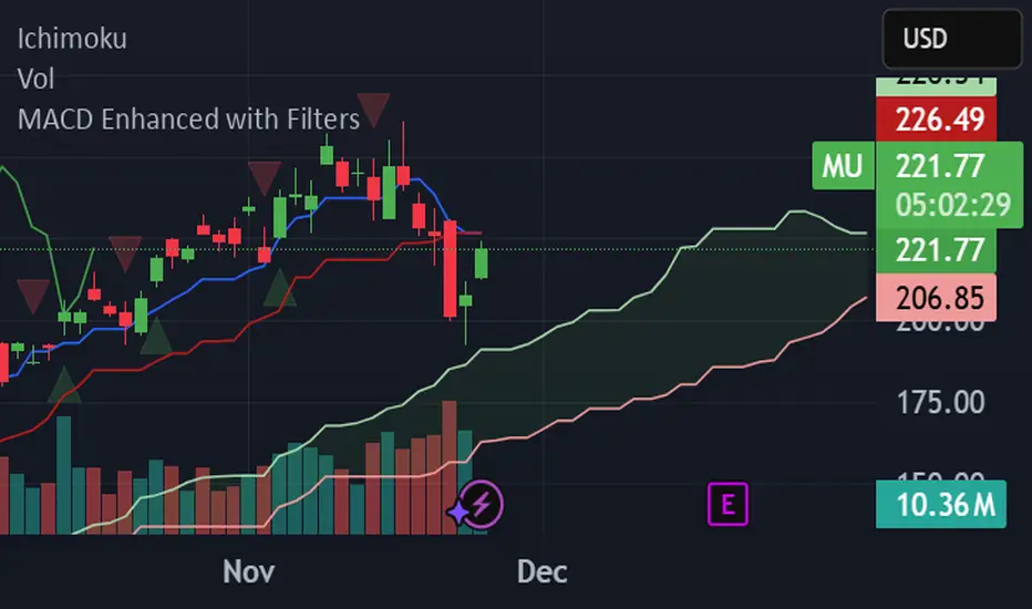
MACD Enhanced with FiltersProfessional MACD indicator with buy/sell signals and real-time alerts. Features: ✅ MACD crossover signals with triangles ✅ Green buy triangles (below bars) ✅ Red sell triangles (above bars) ✅ Real-time browser/email/Slack alerts ✅ Signal strength analysis ✅ Customizable parameters Perfect for active traders managing multiple accounts. Supports Webull, Interactive Brokers, and other platforms.
DeltaFlow Volume Dr.Ryan [Beluga Port]This is a delta volume profile copy I have made for tracking volume flow.
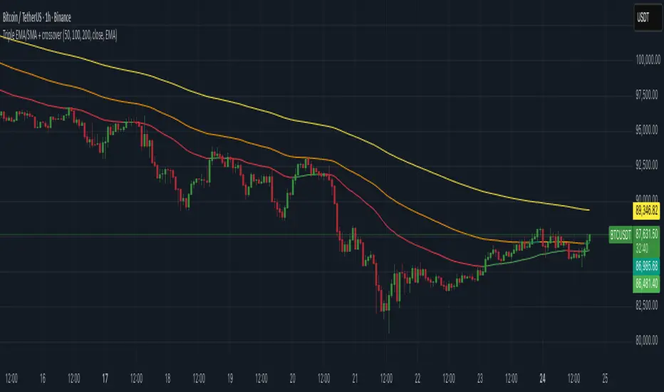
Triple EMA/SMA + crossoverA powerful 3-in-1 Moving Average system — clean, customizable, and built for real-time clarity.
This indicator combines three fully customizable moving averages into a single tool, giving you a complete view of trend behavior, momentum strength, and market structure — all in one compact and intuitive display.
Whether you prefer EMA or SMA, this script lets you switch seamlessly and adapt instantly to any trading style.
⸻
✅ Key Features
🔹 Three Moving Averages, One Indicator
Instead of cluttering your chart with multiple separate MAs, this script intelligently groups:
• MA1
• MA2
• MA3
…into a single, elegant indicator with unified settings and consistent visuals.
Each MA has its own:
• Length
• Rising/Falling/Flat dynamic color system
• Customizable colors
• Trend-based logic
This makes your chart cleaner, faster to read, and much more powerful.
⸻
🔹 Select Your MA Type
Switch all three MAs at once:
• EMA
• SMA
Perfect for testing different interpretations of trend behavior.
⸻
🔹 Advanced Trend Coloring
Each MA automatically adapts its color based on whether it is:
• Rising (uptrend)
• Falling (downtrend)
• Flat (consolidation / low momentum)
You decide the colors for each state — and for each MA individually.
⸻
🔹 MA Crossover Bar Highlights
When MA1 crosses MA2, the script highlights the exact bar with:
• White for bullish crossovers
• Purple for bearish crossovers
This makes trend shifts and potential reversals instantly visible, directly on price bars.
⸻
🔹 Source Flexibility
All three MAs can use any source series:
• Close, Open, HL2, HLC3, OHLC4, etc.
• Or any other series available on your chart
This gives you much more flexibility than standard MA indicators.
⸻
🔹 Beautiful, Clean & Fully Customizable
Every color — rising, falling, flat, crossover — can be changed.
All plots are clearly named (MA1, MA2, MA3) for easier control in the Style panel.
This script brings together:
• clarity
• flexibility
• and clean design
…into a compact, professional-grade indicator.
⸻
🎯 Why this Indicator Helps
You get the full power of three trend tools at once — but without the chart clutter.
Use it to:
• Spot early trend reversals
• Track short/mid/long-term structure simultaneously
• Identify momentum shifts in real time
• Visualize crossovers instantly
• Keep your chart clean and readable
It’s ideal for scalpers, day traders, swing traders, and anyone who wants a powerful yet simple way to read market conditions.
⸻
⚠️ Disclaimer
This script is for educational purposes only and does not constitute financial advice. Always do your own research before trading.
⸻
sumeth.com EntryExit ProA professional multi-filter trading tool combining price action, pattern detection, dynamic trend filters, RSI/MACD confirmations, and breakout logic. Designed for precise entry & exit in any market.
ATR Trailing Stop + HL2 VWAP + EMAsmain atr/ema script
use this to guage immediate trend on the 2m
use this to guage long term trend on thr 6h and one day charts.
Typicallly most accurate with futures.

Thirdeyechart Version 2 Global GoldThe XAU Global Direction Table – Version 2 is an enhanced TradingView indicator specifically designed for tracking gold (XAU) and related currency pairs. This version adds a Weekly (W) timeframe alongside Daily (D), 1-Hour (H1), and 4-Hour (H4) timeframes, providing a more complete overview of gold’s short-term, medium-term, and long-term market direction.
This indicator is coded personally, with custom formulas to calculate the percentage change of each symbol across all selected timeframes. Positive movements are highlighted in blue, and negative movements in red, giving traders a clear visual indication of gold’s direction. The table is optimized for monitoring XAU/USD, XAU/JPY, and USD/JPY, reflecting gold’s global behavior and its correlation with the US Dollar and Japanese Yen.
Users can add their preferred XAU-related pairs as a comma-separated list in the settings. The table is dynamically sized based on the number of symbols, positioned conveniently at the top-right corner of the chart for quick reference. This setup allows traders to see multiple timeframes simultaneously, aiding decision-making for swing trades, intraday trades, or long-term gold analysis.
Version 2 emphasizes gold only, making it a specialized tool for traders who want precise and concise data on XAU movements. It’s ideal for analyzing global gold trends, spotting potential entry or exit zones, or simply staying informed on market shifts.
This script is purely informational and educational. It does not provide buy or sell signals, nor guarantee profits. Users should conduct their own analysis and apply proper risk management before making trading decisions.
Disclaimer / Copyright:
© 2025 Ajik Boy. All rights reserved. This indicator is for educational and informational purposes only. The author is not responsible for any trading losses or financial decisions made based on this script. Redistribution, copying, or commercial use of this code without permission is strictly prohibited.

EMA Position AlertDescription
EMA Position Alert is a comprehensive trend analysis tool designed to help traders instantly identify the market's direction and strength relative to key Exponential Moving Averages (EMAs). By combining visual trend lines with a real-time data dashboard, this indicator provides a clear snapshot of the current price action across short, medium, and long-term horizons.
Whether you are a scalper looking for short-term momentum or a swing trader identifying major trend reversals, this tool simplifies the complex relationship between price and moving averages.
Key Features
1. Multi-EMA System The indicator plots four essential EMAs commonly used by institutional and retail traders:
EMA 21: Short-term trend/momentum.
EMA 55: Medium-term trend.
EMA 100: Major support/resistance level.
EMA 200: Long-term trend filter.
Visual Aid: The EMA lines change transparency automatically. They appear brighter/solid when the price is above them (bullish) and more transparent/faded when the price is below them (bearish).
2. Real-Time Information Dashboard A customizable table (displayed in the top-right corner) provides live data for the current bar:
Status: Clearly indicates if the price is "Above ▲" (Bullish) or "Below ▼" (Bearish) for each specific EMA.
Distance (%): Calculates the percentage distance between the current closing price and each EMA. This is crucial for identifying overextended moves (mean reversion opportunities) or tight consolidation.
Overall Trend Summary:
Strong ★★: Price is above all EMAs (21, 55, 100, 200).
Building ★: Price is above the long-term EMAs (55, 100, 200) but may be testing the short-term trend.
Weak ▼: Price is below all EMAs.
Ranging: Mixed signals (price is sandwiched between EMAs).
3. Custom Alerts Never miss a move. The script comes with built-in alert conditions compatible with TradingView's alert system:
Breakout Alerts: Trigger an alert when price crosses above specific EMAs (21, 55, 100, or 200).
Strong Trend Alert: Trigger an alert when the price successfully holds above all EMAs, signaling a strong bullish phase.
Settings
Show Status Table: Toggle the dashboard on or off.
Table Transparency: Adjust the background opacity of the dashboard to fit your chart theme.
Line Width: Adjust the thickness of the EMA lines for better visibility.
How to Use
Trend Following: Look for the "Strong ★★" status in the dashboard. When the price is above all EMAs and the EMAs are fanning out, it indicates a strong uptrend.
Pullbacks: If the trend is "Strong" but the price drops to test the EMA 21 or EMA 55, look for support bounces.
Mean Reversion: Watch the Distance %. If the distance becomes historically large, the price may be overextended and due for a correction back to the mean.
Consolidation: When the status shows "Ranging" and the Distance % is very low (near 0.00%), a breakout move is likely imminent.

Today Range Calculator1. Indicator Name
Today (Today’s Volatility)
2. One-line Introduction
Displays real-time 30-day historical volatility (HV30) as a compact table on the chart, helping traders instantly assess market risk levels.
3. General Overview
Today ↑↓ is a lightweight informational widget that calculates and displays the 30-day Historical Volatility (HV30) of the asset in real time.
Using logarithmic returns over the past 30 periods, the script computes variance and then annualizes it to express volatility as a percentage (%) per year.
The result is shown in a clean 1x1 table cell, which can be positioned anywhere on the chart—top/bottom, left/right—depending on your preference.
This makes it easy to quickly evaluate whether the current market is high-risk (volatile) or stable, without cluttering the chart.
It’s especially useful for position sizing, risk management, volatility-based entry/exit decisions, and as a filter for breakout strategies.
Built with performance in mind, the script uses minimal system resources and can be used alongside any indicator or strategy without interference.
4. Key Advantages
📈 Real-time HV30 Display
Calculates and displays 30-day historical volatility using annualized log return variance.
📍 Custom Table Positioning
Place the volatility display in any corner of the chart for optimal visibility.
🧮 Accurate Log Return Calculation
Uses logarithmic returns to ensure precise volatility representation over time.
🎯 Quick Market Sentiment Read
Helps you determine at a glance whether the asset is in a calm or volatile environment.
🧼 Minimalist Design
Clean 1-cell table format keeps your chart readable and organized.
🚀 Ultra-Lightweight Script
Runs efficiently with negligible impact on chart performance.
📘 Indicator User Guide
📌 Basic Concept
Today ↑↓ calculates 30-day Historical Volatility (HV30) by analyzing the asset’s log returns over the past 30 bars.
The result is annualized and shown as a percentage to reflect volatility in standardized terms.
Useful for gauging risk levels and strategy suitability in current market conditions.
⚙️ Settings Explained
Table Position: Choose where the volatility table appears:
Top Left / Top Right / Bottom Left / Bottom Right
📈 High Volatility Example
HV30 > 50% indicates a volatile environment
Suggests wider stop-losses, cautious position sizing, or favoring breakout strategies
📉 Low Volatility Example
HV30 < 15% suggests a calm market or range-bound behavior
Useful as a signal for upcoming volatility expansions or breakout preparations
🧪 Recommended Use Cases
Position Sizing: Scale position size based on HV30 readings
Strategy Filter: Activate certain systems only when volatility meets predefined conditions
Breakout Timing: Identify low-volatility zones as potential breakout opportunities
🔒 Precautions
This indicator does not generate buy/sell signals; it is a volatility reference tool
HV thresholds vary across asset classes—adjust interpretation accordingly
Since HV30 is historical, it may lag during rapid market changes

(CRT) MTF Candle Range Theory Model# 🚀 **CASH Pro MTF – Candle Range Theory (CRT) Indicator**
**The Smart Money ICT Setup Detector** 🔥
Hey Traders!
Here is the **ultimate Pine Script indicator** that automatically detects one of the most powerful Smart Money / ICT setups: **Candle Range Theory (CRT)**
---
### What is Candle Range Theory – CRT?
**CRT** is a high-probability price action model based on **liquidity grabs** and **range expansion**.
Price loves to:
1️⃣ Raid the low/high of the previous candle (take stop-losses)
2️⃣ Then reverse and run to the opposite side of the range (or beyond)
When this happens near a **key higher-timeframe level**, magic happens!
### Bullish CRT Model
- Price touches a **strong HTF support**
- Previous candle closes near that support
- Next candle **sweeps the low** (grabs liquidity)
- Current candle **closes above the raided low AND breaks the high** of the sweep candle
**Result → Aggressive bullish move expected!**
**Entry:** On close above the high (or on retest + MSS)
**Stop Loss:** Below the swept low
**Take Profit:** CRT High or next liquidity pool
### Bearish CRT Model
- Price touches a **strong HTF resistance**
- Previous candle closes near resistance
- Next candle **sweeps the high** (grabs buy stops)
- Current candle **closes below the raided high AND breaks the low** of the sweep candle
**Result → Strong bearish expansion!**
**Entry:** On close below the low
**Stop Loss:** Above the swept high
**Take Profit:** CRT Low or next downside liquidity
This whole setup can form in **just 3 candles**… or sometimes more if price consolidates after the sweep.
---
### Why This Indicator is Special
This is **NOT** a simple 3-candle pattern scanner!
This is a **true CRT + MTF confluence beast** with:
- **Multi-Timeframe Confirmation** (default 4H – fully customizable)
- **Built-in RSI Filter** (avoid fake moves in overbought/oversold)
- **Day-2 High/Low Levels** automatically drawn (the exact CRT range!)
- **Clean “LONG” / “SHORT” labels** right on the candle (no ugly arrows or offset)
- **Background highlight** on signal
- **Fully grouped inputs** – super clean settings panel
---
### Features at a Glance
| Feature | Included |
|--------------------------------|----------|
| Higher Timeframe Confirmation | Yes |
| RSI Overbought/Oversold Filter | Yes |
| Day-2 High/Low Lines + Labels | Yes |
| Clean Text Signals (no offset) | Yes |
| Background Highlight | Yes |
| Fully Customizable Colors & Text| Yes |
| Works on All Markets & TFs | Yes |
---
### How to Use
1. Add the indicator to your chart
2. Wait for a **LONG** or **SHORT** label to appear
3. Confirm price is near a **key HTF level** (order block, FVG, etc.)
4. Enter on close or retest (your choice)
5. Manage risk with the drawn Day-2 levels
**Pro Tip:** Combine with ICT Market Structure Shift (MSS) or Fair Value Gaps for even higher accuracy!

deKoder | HTF3 - Multi-Timeframe Candle DisplaydeKoder | HTF3 - Multi-Timeframe Candle Display
Overview
HTF3 is a powerful multi-timeframe analysis tool that displays higher timeframe candles directly on your current lower timeframe chart. When trading lower timeframes it is sometimes easy to lose sight of the higher timeframe context. HTF3 enables better trading decisions by keeping your analysis aligned with the dominant trend.
Key Features
• Multi-Timeframe Support : Display daily, weekly, or any custom higher timeframe candles
• Visual Candle Representation : Clear OHLC candles with customizable colors
• Range Display : Show previous candle ranges with dotted center lines
• Trading Signals : Automatic breakout and rejection signals with arrow markers
• Flexible Positioning : Adjustable horizontal offset for optimal placement
• Real-time Updates : Current higher timeframe candle builds in real-time
Use Cases
• Swing Traders : Maintain daily/weekly context on intraday charts
• Position Traders : Align entries with higher timeframe structure
• Breakout Traders : Identify key levels from previous candle ranges
• Market Analysis : Quickly assess multi-timeframe alignment
Configuration
• Timeframe : Select higher timeframe to display (default: D)
• X-Offset : Adjust horizontal positioning (-4 to 50)
• Show Candles : Toggle candle display
• Show Range : Toggle previous candle high/low ranges
• Signals : Display breakout/rejection signals
• Customize bull/bear colors and text appearance
How to Use
1. Select your desired higher timeframe in the settings
2. Adjust offset for optimal positioning
3. Use the range lines to identify potential liquidity zones
4. Watch for signal arrows indicating breakouts/rejections
5. Combine with your existing strategy for confirmation
Pro Tips
• Use daily candles on 1H/4H charts for swing trading context
• The signals are not intended as standalone buy/sell triggers. They should only be used as confluence for your main trade idea

Triple 9 Bias filter Triple 9 Bias – Precision Multi-Timeframe Directional Filter
Technical Overview
The Triple 9 Bias is a precision multi-timeframe directional filter built exclusively for 5-minute (and lower) trading.
It stacks three EMA-9 trend directions (4H + 1H + 15m) as Primary confluence and uses only the 4H RSI-14 as Secondary confirmation.
Integrity Check: Zero repaint · Zero lookahead · Works identically on any chart timeframe.
The Trading Rule (Simple)
Long Trades: Only trade longs when all three EMA-9s are UP + 4H RSI > 50
Short Trades: Only trade shorts when all three EMA-9s are DOWN + 4H RSI < 50
Otherwise — stand aside.
Display Components
A. Plotted Higher-Timeframe EMAs (No Repainting)
All values are pulled from closed higher-timeframe bars.
4H EMA 9 (Red step-line)
1H EMA 9 (Purple step-line)
15m EMA 9 (Orange step-line)
B. Locked Dashboard (Bottom-Right)
Clean table split into Primary and Secondary sections for instant bias reading.
Colour Logic:
🟢 Lime = UP / BUY
🔴 Red = DOWN / SELL
Background Logic:
Full Green: Only when all three EMA-9s are UP
Full Red: Only when all three EMA-9s are DOWN
Gray: Otherwise = no trade
Indicator Breakdown
3.1. Primary Confluence – EMA 9 Slope
4H EMA 9 direction (compared 10 bars back)
1H EMA 9 direction (compared 6 bars back)
15m EMA 9 direction (compared 6 bars back)
3.2. Secondary Confluence
4H RSI-14 vs 50 level (BUY if >50, SELL if <50)
High-Probability Signal: When Primary = all three “UP” and Secondary = “BUY” → highest-probability bullish bias (and vice-versa for bearish).

MACD Divergence auto displayed on chart, with alertsMACD Pivot Divergence Detector
This tool identifies MACD histogram divergences based on confirmed pivot highs and lows.
Instead of comparing swing points on the MACD line, this script focuses specifically on the histogram, which measures momentum shifts between MACD and Signal.
How it works
The script detects confirmed pivots using a two-bar swing structure.
When price breaks above a previous pivot high, the script compares the MACD histogram value at that pivot to the current histogram value:
• If price makes a higher high while the histogram makes a lower high, a potential bearish divergence is marked.
The reverse logic is applied for bullish divergence when price breaks below a pivot low.
What makes this script unique
It uses pivot-confirmed histogram values, not lookback-based divergence.
It evaluates divergence only at actual highs/lows, reducing false positives.
It marks divergence directly on the candles for visual clarity.
Alert conditions are included for automated detection.
How to use
Bullish signals may highlight potential momentum loss in downtrends; bearish signals may highlight momentum loss near highs. Divergence does not guarantee reversal and should be combined with broader context, structure, or trend analysis.

Decision zone This indicator helps me determine market direction.
It's simple to use: if the middle line of the square is below the price, we're looking for buys; otherwise, we're looking for sells.
Hours may vary.
7 Am, 9 am, 11 am, 11 pm, 1 pm
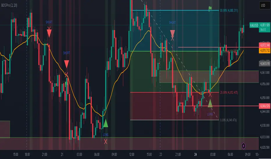
Professional BOS IndicatorThis is a trend following indicator that focuses on BOS, pullback and entry
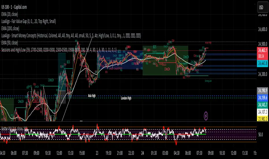
Sessions and High/LowCan be used to mark highs and lows of any sessions you desire can do 4 sessions
Grok/Claude AI Neural Fusion ProGrok GXS Pure Technical Indicator - Simple Guide
What It Does
The GXS indicator is like having 5 expert traders looking at your chart at the same time, each focusing on a different aspect of the market. It combines all their opinions into one easy-to-read score that tells you when conditions are good for buying or selling.
The Five "Experts" Inside
Trend Expert (30%) - Watches if the market is moving strongly in one direction or just bouncing around aimlessly
Momentum Expert (25%) - Checks if the price movement has energy behind it, like detecting if a ball is speeding up or slowing down
Volume Expert (20%) - Makes sure real money is flowing behind price moves (not just fake movements with no conviction)
Price Structure Expert (15%) - Sees where price is relative to normal ranges and if volatility is extreme
Price Action Expert (10%) - Counts whether buyers or sellers have been winning lately
How It Helps Traders
The Main Score: The indicator gives you a number between -1 and +1:
Positive numbers (green) = Bullish conditions, market favors buyers
Negative numbers (red) = Bearish conditions, market favors sellers
Numbers near zero (gray) = Neutral, unclear direction
Visual Signals:
Green arrows pointing up = Strong buy opportunity detected
Red arrows pointing down = Strong sell opportunity detected
Green/red clouds = Shows when you're in a favorable zone for buying/selling
Background colors = Quick glance at overall market mood (green = bullish regime, red = bearish regime, white = neutral/choppy)
The Blue Line and Red/Green Bands: Think of these like guardrails on a highway. When price touches the lower green band, it's potentially oversold (cheap). When it touches the upper red band, it's potentially overbought (expensive).
Tips for Using It
For Beginners:
Wait for arrows - Don't trade unless you see a green (buy) or red (sell) arrow appear
Check the score table (top right) - Make sure the GXS score matches the arrow direction
Look at "Market" row - Only trade when it says "Trending" (ignore signals during "Ranging")
For Intermediate Traders:
Use the clouds as zones - Green cloud = look for buy setups, Red cloud = look for sell setups
Watch the volatility percentage - Green (low) = safer conditions, Red (high) = riskier conditions
Combine with higher timeframes - Check if the score is positive on both 1-hour and 4-hour charts for stronger confirmation
For Advanced Traders:
Turn on Debug Panel - See which of the 5 components is driving the score (helps understand WHY you're getting a signal)
Adjust the thresholds - Default is 0.15 for buy and -0.15 for sell. Make them stricter (0.25/-0.25) for fewer but higher quality signals
Watch for divergences - The indicator automatically detects when price makes new highs but momentum doesn't (warning sign of reversal)
What Makes This Different
Unlike simple indicators that just look at one thing (like RSI or MACD), this combines multiple perspectives into one score. It's like getting a medical diagnosis from 5 specialists instead of just one doctor.
The dynamic bands also expand and contract based on market conditions - they get wider when volatility is high (giving you more room) and tighter when markets are calm.
Common Mistakes to Avoid
❌ Trading every small score change - Wait for the score to clearly cross your threshold (default 0.15 or -0.15)
❌ Ignoring the "Market" indicator - Signals work best in trending markets, not choppy sideways markets
❌ Fighting the regime - If background is red (bearish regime), don't force buy signals. If background is green (bullish regime), be careful with sell signals.
❌ Using it alone - Always consider the bigger picture: news, overall market direction, and your risk management rules
Quick Start Checklist
✅ GXS Score crosses above 0.15 = Consider buying
✅ Price touches or crosses below lower band = Extra confirmation
✅ Green arrow appears = Entry signal
✅ "Market" says "Trending" = Good conditions
✅ RSI below 30 = Even better (oversold)
The opposite applies for selling (score below -0.15, upper band touch, red arrow, etc.)
Bottom Line: This indicator does the heavy lifting of analyzing multiple technical factors so you can focus on timing your entries and managing your trades. It's not magic - no indicator is - but it's a comprehensive tool that gives you an edge by combining many proven technical analysis methods into one clear signal.


Ellipse Price Action Indicator v2 (Upgraded)
This upgraded Ellipse Price Action Indicator (EPAI v2) to take high-accuracy trades.
I am explaining it as if you are looking at the chart step by step, so you will understand exactly:
-When to buy
-When to
-When to avoid
-How to read Strength Meter
-How Ellipse zones work
⭐ 1. THE BASICS — What This Indicator Actually Does
This indicator tracks:
✔ The “Elliptical Path” of price
Like a planet revolving around the Sun, price “oscillates” around a center.
The indicator detects this hidden mathematical path using:
Two Focus Points (Fast MA & Slow MA)
Curved Ellipse boundaries
Compression of price
Momentum of trend
Breakout zones
⭐ 2. UNDERSTANDING THE 3 ZONES
🔴 UPPER ZONE = Sell Zone
Price is near the upper ellipse boundary → overbought space.
🟢 LOWER ZONE = Buy Zone
Price near lower ellipse boundary → oversold space.
🔵 CENTRAL ZONE = No Trade Zone
Price swinging inside the ellipse center → noise.
Only trade in UPPER or LOWER zones.
Never in the central zone.
⭐ 3. THE MOST IMPORTANT PART — Strength Meter v2
Strength Meter v2 (0 to 100%) is the core filter.
✔ Above 70% → High winning probability (take trade)
✔ 60–70% → Medium probability (trade if confident)
❌ Below 60% → Avoid trade
Strength combines:
Ellipse compression
Momentum slope
Price position curve
Eccentricity
Trend direction
This alone removes 70% bad trades.
⭐ 4. BUY SETUP (Exact Rules)
You get a BUY only if all conditions match:
① Price goes to lower ellipse zone
② Compression is ON (ellipse is tight)
③ Momentum slope direction = UP
④ Focus Lines Cross Bullish (Fast > Slow)
⑤ Strength v2 ≥ your threshold (default 60%)
⑥ A BUY signal prints (triangle UP)
When these align →
🟢 BUY with high accuracy
Best Accuracy Buy is:
Price in lower zone
Strength ≥ 0.75
Slope UP
Ellipse compressed
⭐ 5. SELL SETUP (Exact Rules)
Same logic reversed:
① Price in upper ellipse zone
② Compression ON
③ Momentum slope DOWN
④ Focus Lines cross bearish (Fast < Slow)
⑤ Strength v2 ≥ threshold
⑥ SELL signal prints (triangle DOWN)
This means:
🔴 SELL with high accuracy
Best Accuracy Sell is:
Price in upper zone
Strength ≥ 0.75
Slope DOWN
Ellipse compressed
⭐ 6. BREAKOUT TRADES (Optional but powerful)
When price breaks above/below ellipse:
🔸 Upper Breakout → SELL (if strength strong)
🔸 Lower Breakout → BUY (if strength strong)
Breakout signals are marked by orange arrows.
Breakouts are taken only if:
Strength v2 > 50%
Slope supports breakout
Compression exists before breakout
Breakout trades catch trend continuation.
⭐ 7. HOW TO CONFIRM A STRONG TRADE
Look at the table on the chart:
✔ Strength v2 ≥ 70% (GREEN)
✔ Compression = GREEN
✔ Slope direction = UP (for buy) or DOWN (for sell)
✔ Zone = LOWER or UPPER
✔ Eccentricity = LOW (<0.5 means smooth trend)
If these line up →
⭐ High-probability entry.
⭐ 8. WHEN YOU SHOULD NOT TRADE
❌ If price is in Central Zone
❌ Strength < 60
❌ No compression detected
❌ Slope is flat or against direction
❌ Only one condition is matching
❌ Eccentricity is too large
(Big ellipse = unpredictable swings)
⭐ 9. What Is the Accuracy Level?
In trending markets → 75% to 85% accuracy
In ranging markets → 50% (use compression filter to avoid)
The indicator is designed to avoid bad market conditions automatically.
⭐ 10. BEST TIMEFRAMES
✔ 5m, 15m, 1H → Intraday
✔ 4H, 1D → Swing Trading
✔ NOT recommended below 1m timeframe
⭐ SUMMARY (EASY VERSION)
🟢 BUY:
Lower zone + compression + bullish slope + strong focus cross + strength ≥ 60
🔴 SELL:
Upper zone + compression + bearish slope + strong focus cross + strength ≥ 60
🟠 Breakout:
Upper/lower breakout + strength ≥ 50
🔵 Avoid:
Central zone or weak strength

Distância Preço vs VWAPIt calculates the distance from the price to the VWAP. The idea is to make it easier to observe when the price might return to the VWAP.
