RSI Trend Pro v1.3RSI Engine Pro v1.0 is a refined take on the classic Relative Strength Index, built to give traders a cleaner, more customizable view of momentum. At its core, it plots RSI with adjustable line thickness and opacity controls, letting you tailor the visuals to fit your chart style. The indicator also includes dynamic overbought (70) and oversold (30) bands, a neutral middle line (50), and a subtle gradient system that highlights when price action starts pushing into reversal zones. Traders can fine-tune the band levels, opacity of reference lines, and even the starting points of the top/bottom gradients to better match their personal strategy. By blending precision with flexibility, RSI Engine Pro transforms the standard RSI into a more intuitive, visually adaptive momentum tool—helping traders spot exhaustion, strength, and potential reversals at a glance.
Indicators and strategies

Emas cryptosmart## General Summary
The Emas cryptosmart indicator is a technical analysis tool designed to provide a clear and comprehensive view of the market trend. It combines a long-term Hull Moving Average (HMA) to establish the overall trend with a faster, more responsive Triple Hull Moving Average (THMA) to identify short-term momentum.
Its primary feature is the dynamic candle coloring, which offers immediate visual cues about price direction, simplifying trading decisions.
## Indicator Components
This indicator is composed of two main lines:
Hull 200 (HMA): The Long-Term Trend Anchor
This line (dynamic lime/red by default) acts as a filter for the main market trend. Due to its 200-period setting, it moves smoothly and establishes the general context.
Uptrend: When the Hull 200 is rising (lime color), it indicates the macro trend is bullish.
Downtrend: When it is falling (red color), the macro trend is bearish.
THMA 55: The Short-Term Momentum Line
This line (dynamic aqua/orange by default) is a Triple Hull Moving Average. It is extremely fast and sensitive to recent price changes, designed to capture immediate momentum.
This is the key line for the candle coloring and for identifying potential entry or exit points.
## How to Interpret It
The primary strategy is to use the Hull 200 to define the direction for your trades and the THMA 55 to fine-tune your timing.
Candle Coloring (Main Signal):
Bullish Candles (default: aqua): When the price closes above the THMA 55, the candles turn to a bullish color. This signals that immediate momentum is positive and can be considered a buy signal or confirmation to stay in a long position.
Bearish Candles (default: orange): When the price closes below the THMA 55, the candles turn to a bearish color. This indicates that immediate momentum is negative, suggesting a potential sell or an exit from a long position.
Confluence Strategy:
The highest-probability signals occur when both moving averages are aligned.
Strong Buy Example: Look for a situation where the Hull 200 is rising (lime color) and wait for the candles to turn bullish as the price crosses above the THMA 55.
Strong Sell Example: Look for a situation where the Hull 200 is falling (red color) and wait for the candles to turn bearish as the price crosses below the THMA 55.
## Key Features
Visual Clarity: Automatic candle coloring eliminates the need to constantly interpret crosses, allowing for a quick read of the market's state.
Dual Perspective: Offers a balanced view by combining a slow trend indicator with a fast momentum indicator.
Reduced Lag: The use of Hull variants minimizes the delay typical of conventional moving averages (SMAs/EMAs).
Fully Customizable: All colors, for both the lines and the candles, can be adjusted in the settings menu to fit your visual style.

Fed Rate Change Impact📊 Fed Rate Change Impact — Macro Event-Driven Indicator
Fed Rate Change Impact is an advanced indicator designed to analyze the impact of Federal Reserve interest rate changes on financial markets. It integrates event-driven logic with dynamic visualization, percentage diagnostics, and multi-asset selection, offering a clear and customizable view of post-event effects.
🔍 Key Features 📅 Preloaded Fed Events : Includes over 30 historical rate cut (↓) and hike (↑) dates from 2008 to 2024.
📈 Post-Event Analysis : Calculates the percentage change of the selected asset 5, 10, and 30 days after each event.
📌 Vertical Chart Lines : Visually highlights each event directly on the chart, with dynamic coloring (red for hikes, green for cuts).
📋 Diagnostic Table : Displays real-time impact for each event, with color-coded values and a compact layout.
🧠 Interactive Filter: Choose to display only hikes, only cuts, or both.
🧭 Flexible Asset Selection : Analyze the current chart asset, pick from a predefined list, or manually input any ticker via input.symbol().
🎯 Contextual Highlighting : The table highlights the analyzed asset if it matches the active chart symbol.
⚙️ Customizable Parameters lookahead5, lookahead10, lookahead30: Define the time horizon for measuring post-event impact.
eventFilter : Choose which type of events to display.
presetAsset / customAsset : Select or input the asset to analyze.
🧪 Recommended Use Cases Macroeconomic analysis on indices, commodities, crypto, and forex
Studying delayed effects of rate changes on sensitive assets
Building event-driven strategies or diagnostic overlays
Visual backtesting and cross-asset comparison
🧠 Technical Notes The indicator is compatible with overlay=true and works best on Daily timeframe.
The table automatically adapts to the number of events and includes visual padding for improved readability.
All calculations are performed in real time and require no external data.

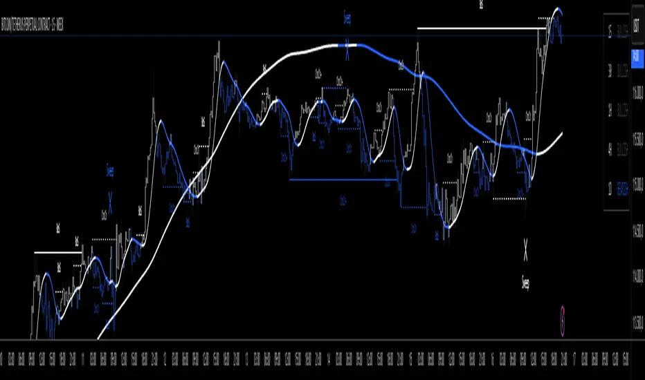
Мой LSMA(200) + Nadaraya–Watson Envelope | 1m (v6)The intersection of the moving average with a period of 5 minutes with the boundaries of the Nadar channel.

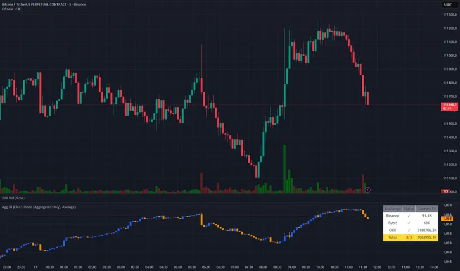
Aggregated OI by MalexThis indicator aggregates Open Interest data from multiple major exchanges (Binance, Bybit, OKX) to provide a comprehensive view of market positioning across platforms.
Original idea by Alex Nikulin.
FEATURES:
Multi-exchange OI aggregation with customizable exchange selection
Choose between Sum or Average aggregation methods
Individual exchange OI display (optional)
Clean mode - show only aggregated data
Real-time status monitoring for each exchange
Candlestick visualization matching standard OI indicators
Information panel showing current values and active exchanges
USAGE:
Enable/disable specific exchanges in settings
Choose aggregation method (Average recommended for balanced view)
Toggle individual exchange display or use clean mode
Monitor the info panel for data availability status
COMPATIBILITY:
Works with any symbol that has Open Interest data available on the selected exchanges.
Best used on perpetual futures contracts (e.g., BTCUSDT, ETHUSDT, etc.)
ICT Macros All hours - credit to luxalgoICT Macros custom original one from LuxAlgo
default indicator does not enabled for all hours
this one have options to enable all hours

MTF Stochastic Range FinderThis indicator compares Stochastic RSI from 2 timeframes to signal possible reversals. Default 5 minute and 2 minute. Both Stochastic RSIs are customizable.
Allows for 6 support/resistance lines and allows a tolerance to filter proximity to levels for entry.
Can filter price level by manual support/resistance levels and/or VWAP

Fieolouis - RSI - Signals v2.6.1 (Symbols)Fieolouis - RSI - Signals v2.6.1 (Symbols)
An advanced upgrade of the classic RSI, combining divergence, re-entry, and trend continuation signals with clean symbol-based visualization.
🔹 Key Features
RSI Core: Standard RSI with flexible moving averages (EMA, SMA, WMA, VWMA, SMMA, Bollinger Bands).
Divergence:
Regular & Hidden divergence detection.
Flexible pivot search (5–25 bars).
Max bars between pivots filter to reduce noise.
Re-entry Signals:
Detects RSI returning from Overbought/Oversold zones.
Optional confirmation: RSI crossing MA within last 3 bars.
Continuation Signals:
RSI crossing 50 aligned with trend direction.
Trend Filter (optional):
Only Long if RSI > MA1, only Short if RSI < MA1.
🔹 Visualization
RSI + MA + optional Bollinger Bands directly on the panel.
OB/OS zones with gradient shading, adjustable 75/25 or 80/20.
Symbols instead of text for clarity:
🔼 Re-Long = green arrow up
🔽 Re-Short = red arrow down
▲ Trend+ = teal triangle up
▼ Trend- = maroon triangle down
Divergence labels (Bull/Bear) can be toggled on/off.
🔹 Alerts
Ready-to-use alerts for all signal types:
Bullish / Bearish Divergence
Re-entry Long / Short
Continuation Bull / Bear
👉 Designed for both scalping & swing trading:
Divergence helps spot reversals.
Re-entry catches failed OB/OS breaks.
Continuation confirms ongoing trends.

ICT ob by AyushThis indicator highlights potential order blocks on the chart.
It can be used to spot institutional footprints in price.
Not financial advice — use it only as a learning tool.

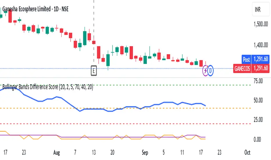
Bollinger Bands Difference Score
Bollinger Bands Difference Score (TradingView – Pine Script v6)
The **Bollinger Bands Difference Score** is a volatility-based scoring system designed to help traders quickly assess whether a stock is in a **strong trend, neutral zone, or weak setup**. It transforms the raw **Bollinger Band Width (BB-Diff)** into a **normalized score (0–100)** and classifies conditions with intuitive thresholds.
---
### 🔹 What is Bollinger Bands Difference (BB-Diff)?
* **Bollinger Bands** are built from a moving average with upper and lower bands set by standard deviations.
* The **difference (or width)** between the bands reflects market volatility.
* A **high difference** = wide bands = strong volatility (breakout/trend).
* A **low difference** = narrow bands = low volatility (consolidation).
This indicator standardizes BB-Diff into a score and smooths it for cleaner signals.
---
### 🔹 Key Features
1. **BB-Diff Scoring System**
* Converts Bollinger Band width into a **0–100 normalized score**.
* Higher score → higher volatility/trend strength.
* Lower score → consolidation or weaker momentum.
2. **Signal Levels**
* **Strong Zone (≥ 70):** Indicates strong trend strength or expansion in volatility.
* **Neutral Zone (40–70):** Sideways or undecided price action.
* **Weak Zone (≤ 20):** Suggests very low volatility, potential upcoming squeeze.
3. **Score Smoothing**
* Applies a moving average to reduce noise.
* Helps avoid false signals during choppy markets.
4. **Visual Enhancements**
* Plots the score as a line (0–100 scale).
* Adds horizontal reference lines for **Strong**, **Neutral**, and **Weak** levels.
* Background colors automatically highlight **bullish strength (green)** or **weakness (red)**.
---
### 🔹 How to Use
* **Trend Confirmation:**
Look for scores **above 70** → suggests trend continuation or volatility breakout.
* **Consolidation Watch:**
Scores in the **20 or below** zone may precede volatility squeezes → breakout setups.
* **Neutral Zone:**
Scores between **40–70** suggest sideways price action; avoid aggressive trades.
* **Combine with Price Action:**
Use with support/resistance, candlestick patterns, or momentum indicators for confirmation.
---
### 🔹 Best Practices
* Great as a **volatility filter** before entries.
* Use in combination with **RSI, MACD, or OBV** for directional bias.
* Works well for **breakout trading** (when score rises from low levels).
* Monitor on multiple timeframes for alignment.
---
✅ **In summary:** The **Bollinger Bands Difference Score** is a simple yet powerful tool that quantifies volatility strength into an actionable score, making it easier to spot strong trends, consolidation phases, and potential breakout opportunities.
Dual EMA (EMA Average)Simple EMA visual with 2 EMAs + Average
Includes:
2 EMAs with timeframe settings
EMA Midline - an average of EMAs
shaded space between EMA lines

EMA 50 & 200 (TF-specific)This script plots EMA 50 and EMA 200 only on the timeframes where they matter most:
EMA 50 (gray): visible on 1H, 4H, and 12H charts – often used by intraday traders.
EMA 200 (black): visible on Daily and Weekly charts – a classic long-term trend indicator.
🔹 Why use it?
Avoids clutter by showing each EMA only on the relevant timeframe.
Helps align intraday trading with higher timeframe trends.
Simple, clean, and effective for both swing and day trading.

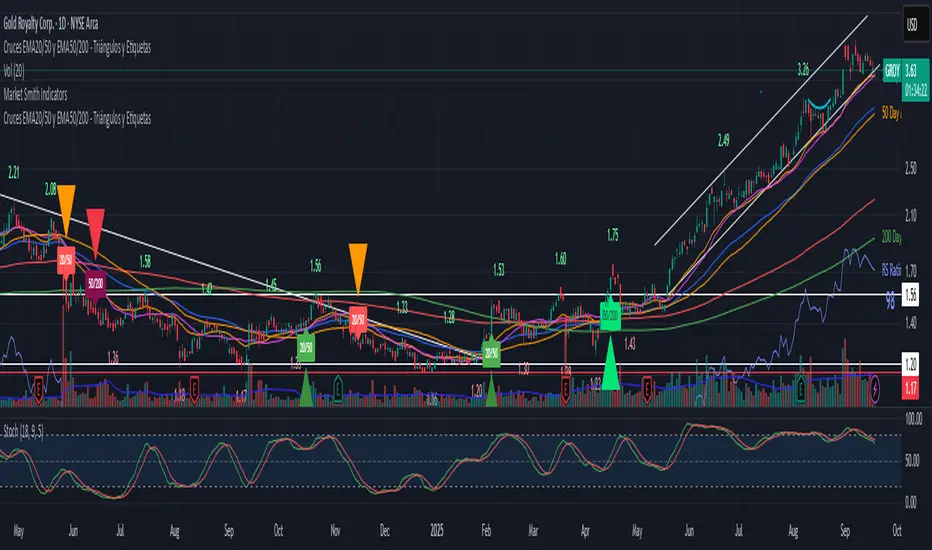
Cruces EMA5/20 y EMA20/50 - Triángulos y Etiquetasdescribe los cruces alcistas o bajistas de la EMA5 y EMA20 asi como de la EMA20 y EMA50
Close Outside BB Without Touching//@version=5
indicator("Close Outside BB Without Touching", overlay=true)
// Input parameters
length = input.int(20, title="BB Length")
mult = input.float(2.0, title="BB Standard Deviation")
src = input(close, title="Source")
// Calculate Bollinger Bands
basis = ta.sma(src, length)
dev = mult * ta.stdev(src, length)
upper = basis + dev
lower = basis - dev
// Check if candle closed outside BB
closedAbove = close > upper
closedBelow = close < lower
// Check if candle didn't touch the BB during its formation
// For a candle closing above: low must be greater than upper band
// For a candle closing below: high must be less than lower band
noTouchAbove = low > upper
noTouchBelow = high < lower
// Final conditions
validAbove = closedAbove and noTouchAbove
validBelow = closedBelow and noTouchBelow
// Plot Bollinger Bands
plot(basis, "Basis", color=color.orange)
u = plot(upper, "Upper", color=color.blue)
l = plot(lower, "Lower", color=color.blue)
// Fill between Bollinger Bands
fill(u, l, color=color.new(color.blue, 95), title="Background")
// Highlight valid candles
barcolor(validAbove ? color.green : validBelow ? color.red : na)
// Plot markers for valid signals
plotshape(validAbove, title="Valid Above BB", color=color.green,
style=shape.triangleup, location=location.belowbar, size=size.small)
plotshape(validBelow, title="Valid Below BB", color=color.red,
style=shape.triangledown, location=location.abovebar, size=size.small)
// Alert conditions
alertcondition(validAbove, title="Valid Close Above BB",
message="Candle closed above BB without touching")
alertcondition(validBelow, title="Valid Close Below BB",
message="Candle closed below BB without touching")

CARDIC2.0
Cardic Heat 2.0 – The Beginning of It All
Cardic Heat 2.0 was the very first release that introduced the **Cardic Heat concept** to traders worldwide. It was designed to cut through chart noise and give traders something clean, simple, and effective — a tool that actually highlights where the market heat really is.
Key Features:
* First-ever Heat Zones – Liquidity and reaction zones made visible for the first time.
* Simple Range Mapping – Early DR/IDR levels to guide intraday moves.
* Scalping Ready – Focused on the 5M and 15M timeframes for fast setups.
* Beginner Friendly – Straightforward visuals anyone could follow.
* Foundation Build – Created the structure for future Cardic Heat upgrades.
Why Cardic Heat 2.0?
Because this was the origin the version that started the journey. It gave traders their first taste of institutional precision in a simplified way, proving that smart trading doesn’t need to be complicated.
From this point, the vision was clear: Cardic Heat 2.0 lit the spark that grew into the Cardic Nexus movement.

Candle Base Highs/Low LevelsThis script uses the zig zag indicator to mark out highs and lows using the candle base. Or lowest/highest open/close. Levels extend until being tapped. Variability can be toggled within options menu

Swing Cross NotifierThis indicator identifies swing highs and lows on the chart and draws horizontal lines at these levels.
It is designed to send an alert when the price first crosses a swing level and then closes with a reversal candle within a user-defined number of bars.
**How to Use for Alerts:**
1. Add the indicator to your chart.
2. Create an Alert.
3. In the "Condition" dropdown, select this script's name.
4. Choose "Any alert() function call".
5. Set the trigger to "Once Per Bar Close".

1300 BarThe "1300 Bar" indicator is a simple yet effective tool designed to highlight the 1:00 PM EDT (New York time) bar on your chart with a yellow background. This helps traders and analysts easily identify this key intraday mark for strategic analysis or decision-making.
Key Features:
Time-Specific Highlighting: Targets the 13:00 EDT bar using the America/New_York timezone, ensuring accuracy regardless of your chart's display timezone. Focuses solely on coloring the bar yellow, providing a clear visual cue without additional overlays. Works on any symbol and timeframe, though best viewed on 1-minute to 30-minute charts for precise 13:00 EDT alignment.
How to Use:
Add the "1300 Bar" indicator to your chart. The 13:00 EDT bar will be highlighted yellow automatically. Scroll to historical data (e.g., 1:00 PM EDT on prior trading days) to see the highlighted bar.
Notes:
The indicator uses the America/New_York timezone, automatically adjusting for Daylight Saving Time (e.g., UTC-4 in EDT as of now). For best results, apply to a low timeframe (e.g., 1-min to 30-min) to ensure a bar exists at 13:00 EDT. No additional customization options are included, keeping the focus on the yellow bar highlight. Ideal for day traders or analysts who need a straightforward way to mark the 1:00 PM EDT period on their charts!

LSMA(200) + Nadaraya–Watson Envelope | 1m (v6)The intersection of the moving average with a period of 1 minutes with the boundaries of the Nadar channel.


ICT - Line IncrementA simple, customizable line increment indicator.
Add your desired price range
Customize your line style.
Thanks!

Session Based ADXThis is an ADX indicator that allows you to focus on specific time frames. it also has a feature to put a 20 or a 25 line so you can see when the moving average crosses above it.
