Structural Liquidity Signals [BullByte]Structural Liquidity Signals (SFP, FVG, BOS, AVWAP)
Short description
Detects liquidity sweeps (SFPs) at pivots and PD/W levels, highlights the latest FVG, tracks AVWAP stretch, arms percentile extremes, and triggers after confirmed micro BOS.
Full description
What this tool does
Structural Liquidity Signals shows where price likely tapped liquidity (stop clusters), then waits for structure to actually change before it prints a trigger. It spots:
Liquidity sweeps (SFPs) at recent pivots and at prior day/week highs/lows.
The latest Fair Value Gap (FVG) that often “pulls” price or serves as a reaction zone.
How far price is stretched from two VWAP anchors (one from the latest impulse, one from today’s session), scaled by ATR so it adapts to volatility.
A “percentile” extreme of an internal score. At extremes the script “arms” a setup; it only triggers after a small break of structure (BOS) on a closed bar.
Originality and design rationale, why it’s not “just a mashup”
This is not a mashup for its own sake. It’s a purpose-built flow that links where liquidity is likely to rest with how structure actually changes:
- Liquidity location: We focus on areas where stops commonly cluster—recent pivots and prior day/week highs/lows—then detect sweeps (SFPs) when price wicks beyond and closes back inside.
- Displacement context: We track the last Fair Value Gap (FVG) to account for recent inefficiency that often acts as a magnet or reaction zone.
- Stretch measurement: We anchor VWAP to the latest N-bar impulse and to the Daily session, then normalize stretch by ATR to assess dislocation consistently across assets/timeframes.
- Composite exhaustion: We combine stretch, wick skew, and volume surprise, then bend the result with a tanh transform so extremes are bounded and comparable.
- Dynamic extremes and discipline: Rather than triggering on every sweep, we “arm” at statistical extremes via percent-rank and only fire after a confirmed micro Break of Structure (BOS). This separates “interesting” from “actionable.”
Key concepts
SFP (liquidity sweep): A candle briefly trades beyond a level (where stops sit) and closes back inside. We detect these at:
Pivots (recent swing highs/lows confirmed by “left/right” bars).
Prior Day/Week High/Low (PDH/PDL/PWH/PWL).
FVG (Fair Value Gap): A small 3‑bar gap (bar2 high vs bar1 low, or vice versa). The latest gap often acts like a magnet or reaction zone. We track the most recent Up/Down gap and whether price is inside it.
AVWAP stretch: Distance from an Anchored VWAP divided by ATR (volatility). We use:
Impulse AVWAP: resets on each new N‑bar high/low.
Daily AVWAP: resets each new session.
PR (Percentile Rank): Where the current internal score sits versus its own recent history (0..100). We arm shorts at high PR, longs at low PR.
Micro BOS: A small break of the recent high (for longs) or low (for shorts). This is the “go/no‑go” confirmation.
How the parts work together
Find likely liquidity grabs (SFPs) at pivots and PD/W levels.
Add context from the latest FVG and AVWAP stretch (how far price is from “fair”).
Build a bounded score (so different markets/timeframes are comparable) and compute its percentile (PR).
Arm at extremes (high PR → short candidate; low PR → long candidate).
Only print a trigger after a micro BOS, on a closed bar, with spacing/cooldown rules.
What you see on the chart (legend)
Lines:
Teal line = Impulse AVWAP (resets on new N‑bar extreme).
Aqua line = Daily AVWAP (resets each session).
PDH/PDL/PWH/PWL = prior day/week levels (toggle on/off).
Zones:
Greenish box = latest Up FVG; Reddish box = latest Down FVG.
The shading/border changes after price trades back through it.
SFP labels:
SFP‑P = SFP at Pivot (dotted line marks that pivot’s price).
SFP‑L = SFP at Level (at PDH/PDL/PWH/PWL).
Throttle: To reduce clutter, SFPs are rate‑limited per direction.
Triggers:
Triangle up = long trigger after BOS; triangle down = short trigger after BOS.
Optional badge shows direction and PR at the moment of trigger.
Optional Trigger Zone is an ATR‑sized box around the trigger bar’s close (for visualization only).
Background:
Light green/red shading = a long/short setup is “armed” (not a trigger).
Dashboard (Mini/Pro) — what each item means
PR: Percentile of the internal score (0..100). Near 0 = bullish extreme, near 100 = bearish extreme.
Gauge: Text bar that mirrors PR.
State: Idle, Armed Long (with a countdown), or Armed Short.
Cooldown: Bars remaining before a new setup can arm after a trigger.
Bars Since / Last Px: How long since last trigger and its price.
FVG: Whether price is in the latest Up/Down FVG.
Imp/Day VWAP Dist, PD Dist(ATR): Distance from those references in ATR units.
ATR% (Gate), Trend(HTF): Status of optional regime filters (volatility/trend).
How to use it (step‑by‑step)
Keep the Safety toggles ON (default): triggers/visuals on bar‑close, optional confirmed HTF for trend slope.
Choose timeframe:
Intraday (5m–1h) or Swing (1h–4h). On very fast/thin charts, enable Performance mode and raise spacing/cooldown.
Watch the dashboard:
When PR reaches an extreme and an SFP context is present, the background shades (armed).
Wait for the trigger triangle:
It prints only after a micro BOS on a closed bar and after spacing/cooldown checks.
Use the Trigger Zone box as a visual reference only:
This script never tells you to buy/sell. Apply your own plan for entry, stop, and sizing.
Example:
Bullish: Sweep under PDL (SFP‑L) and reclaim; PR in lower tail arms long; BOS up confirms → long trigger on bar close (ATR-sized trigger zone shown).
Bearish: Sweep above PDH/pivot (SFP‑L/P) and reject; PR in upper tail arms short; BOS down confirms → short trigger on bar close (ATR-sized trigger zone shown).
Settings guide (with “when to adjust”)
Safety & Stability (defaults ON)
Confirm triggers at bar close, Draw visuals at bar close: Keep ON for clean, stable prints.
Use confirmed HTF values: Applies to HTF trend slope only; keeps it from changing until the HTF bar closes.
Performance mode: Turn ON if your chart is busy or laggy.
Core & Context
ATR Length: Bigger = smoother distances; smaller = more reactive.
Impulse AVWAP Anchor: Larger = fewer resets; smaller = resets more often.
Show Daily AVWAP: ON if you want session context.
Use last FVG in logic: ON to include FVG context in arming/score.
Show PDH/PDL/PWH/PWL: ON to see prior day/week levels that often attract sweeps.
Liquidity & Microstructure
Pivot Left/Right: Higher values = stronger/rarer pivots.
Min Wick Ratio (0..1): Higher = only more pronounced SFP wicks qualify.
BOS length: Larger = stricter BOS; smaller = quicker confirmations.
Signal persistence: Keeps SFP context alive for a few bars to avoid flicker.
Signal Gating
Percent‑Rank Lookback: Larger = more stable extremes; smaller = more reactive extremes.
Arm thresholds (qHi/qLo): Move closer to 0.5 to see more arms; move toward 0/1 to see fewer arms.
TTL, Cooldown, Min bars and Min ATR distance: Space out triggers so you’re not reacting to minor noise.
Regime Filters (optional)
ATR percentile gate: Only allow triggers when volatility is at/above a set percentile.
HTF trend gate: Only allow longs when the HTF slope is up (and shorts when it’s down), above a minimum slope.
Visuals & UX
Only show “important” SFPs: Filters pivot SFPs by Volume Z and |Impulse stretch|.
Trigger badges/history and Max badge count: Control label clutter.
Compact labels: Toggle SFP‑P/L vs full names.
Dashboard mode and position; Dark theme.
Reading PR (the built‑in “oscillator”)
PR ~ 0–10: Potential bullish extreme (long side can arm).
PR ~ 90–100: Potential bearish extreme (short side can arm).
Important: “Armed” ≠ “Enter.” A trigger still needs a micro BOS on a closed bar and spacing/cooldown to pass.
Repainting, confirmations, and HTF notes
By default, prints wait for the bar to close; this reduces repaint‑like effects.
Pivot SFPs only appear after the pivot confirms (after the chosen “right” bars).
PD/W levels come from the prior completed candles and do not change intraday.
If you enable confirmed HTF values, the HTF slope will not change until its higher‑timeframe bar completes (safer but slightly delayed).
Performance tips
If labels/zones clutter or the chart lags:
Turn ON Performance mode.
Hide FVG or the Trigger Zone.
Reduce badge history or turn badge history off.
If price scaling looks compressed:
Keep optional “score”/“PR” plots OFF (they overlay price and can affect scaling).
Alerts (neutral)
Structural Liquidity: LONG TRIGGER
Structural Liquidity: SHORT TRIGGER
These fire when a trigger condition is met on a confirmed bar (with defaults).
Limitations and risk
Not every sweep/extreme reverses; false triggers occur, especially on thin markets and low timeframes.
This indicator does not provide entries, exits, or position sizing—use your own plan and risk control.
Educational/informational only; no financial advice.
License and credits
© BullByte - MPL 2.0. Open‑source for learning and research.
Built from repeated observations of how liquidity runs, imbalance (FVG), and distance from “fair” (AVWAPs) combine, and how a small BOS often marks the moment structure actually shifts.
Indicators and strategies

Fixed Asset TurnoverFixed Asset Turnover (FAT) measures how efficiently a company uses its fixed assets (Property, Plant & Equipment – PPE) to generate revenue. It shows how many times the company “turns over” its fixed assets in a period relative to revenue.
High FAT: Assets are used efficiently; the company generates more revenue per unit of fixed assets.
Low FAT: Fixed assets are underutilized; the company may have invested too much in assets that don’t produce sufficient revenue.
Formula:
Fixed Asset Turnover=Total Revenue/Average Net Fixed Assets
What it tells you:
Indicates asset efficiency in generating sales.
Useful to compare companies within the same industry (because asset intensity varies by sector).
Helps identify whether a company is over-invested in fixed assets or underutilizing them.
How to use it:
Trend Analysis:
Track FAT over time for the same company to see if asset utilization is improving.
Benchmarking:
Compare FAT against competitors or industry averages.
Investment Decisions:
Higher FAT usually suggests more efficient operations, but context matters (e.g., heavy-capital industries naturally have lower FAT).

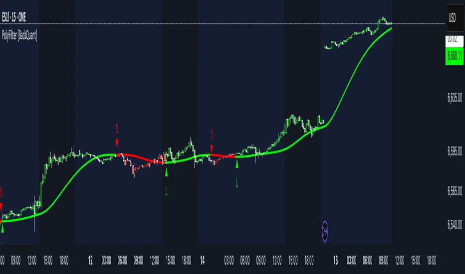
PolyFilter [BackQuant]PolyFilter
A flexible, low-lag trend filter with three smoothing engines—optimized for clean bias, fewer whipsaws, and clear alerting.
What it does
PolyFilter draws a single “intelligent” baseline that adapts to price while suppressing noise. You choose the engine— Fractional MA , Ehlers 2-Pole Super Smoother , or a Multi-Kernel blend . The line can color itself by slope (trend) or by position vs price (above/below), and you get four ready-made alerts for flips and crosses.
What it plots
PolyFilter line — your smoothed trend baseline (width set by “Line Width”).
Optional candle & background coloring — choose: color by trend slope or by whether price is above/below the filter.
Signal markers — Arrows with L/S when the slope flips or when price crosses the line (if you enable shapes/alerts).
How the three engines differ
Fractional MA (experimental) — A power-law weighting of past bars (heavier focus on the most recent samples without throwing away history). The Adaptation Speed acts like the “fraction” exponent (default 0.618). Lower values lean more on recent bars; higher values spread weight further back.
Ehlers 2-Pole Super Smoother — Classic low-lag IIR smoother that aggressively reduces high-frequency noise while preserving turns. Great default when you want a steady, responsive baseline with minimal parameter fuss.
Multi-Kernel — A 70/30 blend of a Gaussian window and an exponential kernel. The Gaussian contributes smooth structure; the exponential adds a hint of responsiveness. Useful for assets that oscillate but still trend.
Reading the colors
Trend mode (default) — Line & candles turn green while the filter is rising (signal > signal ) and red while it’s falling.
Above/Below mode — Line & candles reflect price’s position relative to the filter: green when price > filter, red when price < filter. This is handy if you treat the filter like a dynamic “fair value” or bias line.
Inputs you’ll actually use
Calculation Settings
Price Source — Default HLC/3. Switch to Close for stricter trend, or HLC3/HL2 to soften single-print spikes.
Filter Length — Window/period for all engines. Shorter = snappier turns; longer = smoother line.
Adaptation Speed — Only affects Fractional MA . Lower it for faster, more local weighting; raise it for smoother, more global weighting.
Filter Type — Pick one of: Fractional MA, Ehlers 2-Pole, Multi-Kernel.
UI & Plotting
Color based off… — Choose Trend (slope) or > or < Close (position vs price).
Long/Short Colors — Customize bull/bear hues to your theme.
Show Filter Line / Paint candles / Color background — Visual toggles for the line, bars, and backdrop.
Line Width — Make the filter stand out (2–3 works well on most charts).
Signals & Alerts
PolyFilter Trend Up — Slope flips upward (the filter crosses above its prior value). Good for early continuation entries or stop-tightening on shorts.
PolyFilter Trend Down — Slope flips downward. Often used to scale out longs or rotate bias.
PolyFilter Above Price — The filter line crosses up through price (filter > price). This can confirm that mean has “caught up” after a pullback.
PolyFilter Below Price — The filter line crosses down through price (filter < price). Useful to confirm momentum loss on bounces.
Quick starts (suggested presets)
Intraday (5–15m, crypto or indices) — Ehlers 2-Pole, Length 55–80. Trend coloring ON, candle paint ON. Look for pullbacks to a rising filter; avoid fading a falling one.
Swing (1H–4H) — Multi-Kernel, Length 80–120. Background color OFF (cleaner), candle paint ON. Add a higher-TF confirmation (e.g., 4H filter rising when you trade 1H).
Range-prone FX — Fractional MA, Length 70–100, Adaptation ~0.55–0.70. Consider Above/Below mode to trade mean reversion to the line with a strict risk cap.
How to use it in practice
Bias line — Trade in the direction of the filter slope; stand aside when it flattens and color chops back and forth.
Dynamic support/resistance — Treat the line as a moving value area. In trends, entries often appear on shallow tags of the line with structure confluence.
Regime switch — When the filter flips and holds color for several bars, tighten stops on the opposing side and look for first pullback in the new color.
Stacking filters — Many users run PolyFilter on the active chart and a slower instance (longer length) on a higher timeframe as a “macro bias” guardrail.
Tuning tips
If you see too many flips, lengthen the filter or switch to Multi-Kernel.
If turns feel late, shorten the filter or try Ehlers 2-Pole for lower lag.
On thin or very noisy symbols, prefer HLC3 as the source and longer lengths.
Performance note: very large lengths increase computation time for the Multi-Kernel and Fractional engines. Start moderate and scale up only if needed.
Summary
PolyFilter gives you a single, trustworthy baseline that you can read at a glance—either as a pure trend line (slope coloring) or as a dynamic “above/below fair value” reference. Pick the engine that matches your market’s personality, set a sensible length, and let the color and alerts guide bias, entries on pullbacks, and risk on reversals.
Dynamic FIB Retracement Dynamic FIB Retracement.
Description:
This indicator automatically plots dynamic Fibonacci retracement levels (0.382, 0.5, 0.618) based on the highest high and lowest low of the selected lookback period on the current timeframe. It also provides Buy Above / Sell Below signals at the 0.5 Fibonacci level with trend confirmation, making it easier to spot high-probability trade setups.
Key Features:
Dynamic Fibonacci Levels – Automatically calculates 0.382, 0.5, and 0.618 retracements based on recent price action.
Trend Filter Confirmation – Signals only trigger in the direction of the trend using an EMA-based trend filter (user-adjustable).
Customizable Lookback – Choose how many bars the script should use to detect the high and low for Fibonacci levels.
Visual Alerts – Signals are displayed directly on the chart with triangles, and alerts can be configured for both Buy and Sell events.
Easy to Use – Works on any timeframe and updates automatically as price moves.
Inputs:
Lookback Bars: Determines the number of bars to calculate high and low for Fibonacci levels.
EMA Length: Sets the period for EMA used in trend filtering signals.
Use Cases:
Identify potential retracement zones for entries and exits.
Filter trades in the direction of the trend for higher accuracy.
Quick visualization of key Fibonacci levels for swing or intraday trading.
How to Use:
Apply the indicator to your chart.
Adjust the lookback period and EMA length to match your trading style.
Watch for Buy Above / Sell Below signals near the 0.5 Fibonacci level aligned with the trend.
Optionally, set alerts for automatic notifications when signals occur.
Advanced CRSI with Buy/Sell SignalsThis is a custom indicator based on the Connor's RSI (CRSI) concept. It's designed to identify overbought and oversold conditions to generate potential buy and sell signals.
How it works: The indicator is a composite of three components:
RSI of Price: A standard RSI calculation on the closing price.
RSI of Up/Down Streaks: An RSI on consecutive up or down closes, which helps measure momentum.
Percentage Rank of ROC: This component measures the rate of change and is used to identify strong moves.
Features:
Plots the combined CRSI value.
Visualizes buy and sell signals directly on the chart using colored triangles.
Includes adjustable oversold and overbought levels for customization.
Provides alerts for potential trading signals.
Ideal for: Swing traders and day traders looking for an oscillator to confirm entry and exit points.

VB Bots Watchlist 2025 — RangesOf course. Here is a complete Pine Script v6 indicator for TradingView that displays the On-Balance Volume (OBV) for a selectable list of the top 50 Binance coins by market capitalization.
You can copy and paste this code directly into your Pine Editor in TradingView.
Key Features:
Pine Script Version 6: Written in the latest version of Pine Script.
Dropdown Menu: Easily select which of the top 50 coins you want to see the OBV for from the indicator's settings.
Independent Data: The OBV is calculated for the selected coin, regardless of the chart you are currently viewing.
Clear Plot: Displays the OBV in a separate pane for easy analysis.

Black DragonUse the RSI bands; when the price touches the upper band, it tends to go down, and when the price touches the lower band, it tends to go up. Pay attention to enter a trade only when a reversal candle appears; suitable for scalping on the M15 timeframe.

SMA-CrossOver This indicator is dedicated to the "Trader Overseas" channel.
It's a pullback trading strategy that the channel owner shares for free on YouTube.
Filter 1: Use the 200 SMA as an "Uptrend" or "Downtrend" filter.
Filter 2: When all SMAs line up,
to confirm "Uptrend" or "Downtrend."
Short-term MA = SMA14
Medium-term MA = SMA50 (with a buffer channel).
The example image shows an "Uptrend."
When all SMAs line up, there's a "Bull" signal.
(SMA21 crosses above SMA50.)
Strategy: Wait for an "ENTRY" when the price pulls back into the zone.
1. Short Pullback Zone = SMA14 - SMA50
2. Deep Pullback Zone = SMA50 + Buffer Channel
May be used in conjunction with Price Action as an additional filter.
Additional Explanation: "CrossOver" signals
"Bull" or "Bear" Signals indicate an "up" or "down" crossover of SMA21 and SMA50.
"Bull" or "Bear" signal may be used as "Exit" for the position trade.
But beware of false signals if the trend is sideways.
Each of the SMA can adjust value.

Probability Density Function (rus)KZ Indicator (Probability Density Function)
KZ estimates price move probabilities using a normal distribution model. It automatically detects trend direction, volatility level, and strength, then visualizes the likelihood of reaching an upside or downside target.
✅ Auto-adjusts for different timeframes
✅ Plots green (long) and red (short) probability zones
✅ Shows suggested target, stop-loss, and limit order
✅ Ideal for identifying high-probability entry zones
Advanced Version Available
An advanced version of the KZ script is available with:
🎯 Precise entry/exit signals
🕵️ Liquidity zone detection
🔄 Multi-timeframe signal confirmation
🛑 Dynamic stop-loss based on volatility
🔔 Built-in alerts for signal triggers
📩 DM me to get access to the advanced script version.
✅ Автоматически адаптируется под таймфрейм
✅ Показывает зелёную (лонг) и красную (шорт) области вероятности
✅ Отображает рекомендуемые цель, стоп-лосс и лимитный ордер
✅ Отлично подходит для поиска точек входа с высокой вероятностью
Доступна продвинутая версия скрипта KZ, включающая:
🎯 Точные сигналы входа/выхода
🕵️ Обнаружение зон ликвидности
🔄 Подтверждение сигналов с других таймфреймов
🛑 Динамический стоп-лосс на основе волатильности
🔔 Алерты на сигналы

EMA+HHV-ATR Trail By SrinuGreen “BUY: ” below bars.
Red “SELL: ” above bars.
Alerts also include the triggered close price.

Combined Signal EMA + HHV-ATR Trail (Srinu)Green “BUY: ” below bars.
Red “SELL: ” above bars.
Alerts also include the triggered close price.

MACD Split (Top/Bottom)📘 Script Explanation – MACD Split (Top/Bottom)
Purpose
Splits MACD into two separate panels for better visibility:
Top panel → MACD line (orange) & Signal line (black)
Bottom panel → Histogram (colored line) & Histogram EMA (black)
Color Rules for Histogram
Above 0 & Rising → Light Green
Above 0 & Falling → Dark Green
Below 0 & Falling → Dark Red
Below 0 & Rising → Light Red
Histogram EMA → Black
Zero Line
A gray dashed baseline is drawn at 0 for reference.
How to Use
Add the indicator twice.
Set the first one’s Mode = Top.
Set the second one’s Mode = Bottom.
Save as a template → next time, both panels load together.

MACD Split (Top/Bottom)MACD Split Indicator Explanation
This script separates the MACD into two clean panels:
Top Panel (Mode = Top)
Plots the MACD line and the Signal line.
Used to analyze crossovers and trend direction.
Bottom Panel (Mode = Bottom)
Plots the Histogram (MACD – Signal) and its EMA smoothing.
Used to analyze momentum strength and early shifts.
You can load the same indicator twice:
Set one to Top mode → shows only MACD & Signal lines.
Set the other to Bottom mode → shows only Histogram & EMA.
This way, you get a clear split view without overlapping everything in one chart.

EMA+RSI Buy/Sell with Fibonacci GuideSingle-Instance EUR/USD & GBP/USD Trend+MACD ATR EA
Purpose:
This EA is designed for automated Forex trading on EUR/USD and GBP/USD. It identifies trend-based trading opportunities, dynamically calculates position sizes based on your available capital and risk percentage, and manages trades with ATR-based stop-loss and take-profit levels, including optional trailing stops.
Key Features:
Auto Pair Selection:
Compares the trend strength of EUR/USD vs GBP/USD using a combination of EMA slopes and MACD direction.
Automatically trades the stronger trending pair.
Trend & Signal Detection:
Uses Fast EMA / Slow EMA crossover for trend direction.
Confirms trend with MACD line vs signal line.
Generates long and short signals only when trend and MACD align.
Dynamic SL/TP:
Stop-loss and take-profit are calculated based on ATR (Average True Range).
Supports optional trailing stops to lock in profits.
Position Sizing:
Automatically calculates micro-lot sizes based on your capital and risk percentage.
Ensures risk per trade does not exceed the defined % of your account equity.
Chart Visualization:
Plots Fast EMA / Slow EMA.
Displays SL and TP levels on the chart.
Shows a label indicating the active pair currently being traded.
Alerts:
Generates alerts for long and short signals.
Can be used with TradingView alerts to notify or trigger webhooks.
Single Strategy Instance:
Fully compatible with Pine Script v6.
Only one strategy instance runs on the chart to prevent “too many strategies” errors.

DEV (%)Deviation from MMA5 (%)
- MMA = (High + Low) / 2
- Calculates 5-day SMA of MMA (MMA5)
- Plots deviation (%) of current Mid Price from MMA5
- Above 0% → price above MMA5
- Below 0% → price below MMA5

Piano Frequency LevelsPiano Frequency Levels
This indicator applies the mathematical principles of musical harmony to market analysis, creating support and resistance levels based on authentic piano frequency ratios. Drawing from centuries-old musical theory, it maps the precise mathematical relationships between piano keys to price levels.
How It Works: The indicator uses the exact frequency ratios from equal temperament tuning - the same mathematical system that makes pianos sound harmonious. Each level represents an actual piano key frequency, scaled proportionally to your chosen anchor price.
Key Features:
• Piano-Based Ratios: Uses authentic 12-tone equal temperament frequency relationships (1.05946 ratio between semitones)
• Directional Intelligence: Automatically creates ascending levels from lows (resistance) or descending levels from highs (support)
• Musical Note Labels: Optional display of actual piano key names (C4, D#5, F6, etc.) alongside price levels
• Black Key Subdivisions: Toggle authentic sharp/flat keys between natural notes for additional precision
• Octave Color Coding: Each musical octave displays in a different color for easy visual identification
• Anchor Reference: Bright green line clearly marks your C-note reference point
Musical Foundation: Every level corresponds to an actual piano key. The anchor point represents "C" (the musical root), with levels progressing through the natural musical sequence: C, D, E, F, G, A, B, then repeating in higher octaves. This creates proportional spacing that mirrors the harmonic relationships musicians have used for centuries.
Usage:
1. Set your anchor to a significant market high or low
2. Choose your desired number of levels (typically 12-24 for 1-2 octaves)
3. Enable "Add Black Keys" for additional intermediate levels
4. Enable "Show Note Names" to see which piano key each level represents
The Theory: Musical harmony is based on precise mathematical ratios that create pleasing relationships between frequencies. These same mathematical principles may manifest in market movements, as price action often exhibits proportional relationships similar to musical intervals.
Unique Advantages:
• Based on established mathematical principles rather than arbitrary ratios
• Provides both major levels (white keys) and intermediate levels (black keys)
• Automatically adapts direction based on anchor type (high vs low)
• Maintains authentic musical relationships across all timeframes and price ranges
Important Note: This indicator presents a theoretical framework for market analysis. Like all technical analysis tools, it should be used in conjunction with other forms of analysis and proper risk management. The musical ratios provide a unique perspective on potential support and resistance levels, but past performance does not guarantee future results.
Transform your charts into a musical instrument and discover the hidden harmonies in market movements.

MMAMMA (Midpoint Moving Average)
Similar to SMA but calculated using (High + Low) / 2 instead of Close.
Helps reduce noise by smoothing out candlestick wicks.
Useful for identifying trend direction, support/resistance, and combining with other indicators.
Moving averages applied: 5, 10, 20, 50, 100, 200
Short-term: 5, 10, 20 → captures quick price action
Mid-term: 50, 100 → identifies medium trend
Long-term: 200 → widely used global trend benchmark
Color Scheme (Red → Orange → Yellow → Green → Blue → Navy)
Red: 5 / Orange: 10 / Yellow: 20 / Green: 50 / Blue: 100 / Navy: 200
Transparency: 50% → keeps chart clean when lines overlap
Line Thickness: 1 → minimal, non-intrusive visual

Expected Value Monte CarloI created this indicator after noticing that there was no Expected Value indicator here on TradingView.
The EVMC provides statistical Expected Value to what might happen in the future regarding the asset you are analyzing.
It uses 2 quantitative methods:
Historical Backtest to ground your analysis in long-term, factual data.
Monte Carlo Simulation to project a cone of probable future outcomes based on recent market behavior.
This gives you a data-driven edge to quantify risk, and make more informed trading decisions.
The indicator includes:
Dual analysis: Combines historical probability with forward-looking simulation.
Quantified projections: Provides the Expected Value ($ and %), Win Rate, and Sharpe Ratio for both methods.
Asset-aware: Automatically adjusts its calculations for Stocks (252 trading days) and Crypto (365 days) for mathematical accuracy.
The projection cone shows the mean expected path and the +/- 1 standard deviation range of outcomes.
No repainting
Calculation:
1. Historical Expected Value:
This is a systematic backtest over thousands of bars. It calculates the return Rᵢ for N past trades (buy-and-hold). The Historical EV is the simple average of these returns, giving a baseline performance measure.
Historical EV % = (Σ Rᵢ) / N
2. Monte Carlo Projection:
This projection uses the Geometric Brownian Motion (GBM) model to simulate thousands of future price paths based on the market's recent behavior.
It first measures the drift (μ), or recent trend, and volatility (σ), or recent risk, from the Projection Lookback period. It then projects a final return for each simulation using the core GBM formula:
Projected Return = exp( (μ - σ²/2)T + σ√T * Z ) - 1
(Where T is the time horizon and Z is a random variable for the simulation.)
The purple line on the chart is the average of all simulated outcomes (the Monte Carlo EV). The cone represents one standard deviation of those outcomes.
The dashed lines represent one standard deviation (+/- 1σ) from the average, forming a cone of probable outcomes. Roughly 68% of the simulated paths ended within this cone.
This projection answers the question: "If the recent trend and volatility continue, where is the price most likely to go?"
Here's how to read the indicator
Expected Value ($/%): Is my average trade profitable?
Win Rate: How often can I expect to be right?
Sharpe Ratio: Am I being adequately compensated for the risk I'm taking?
User Guide
Max trade duration (bars): This is your analysis timeframe. Are you interested in the probable outcome over the next month (21 bars), quarter (63 bars), or year (252 bars)?
Position size ($): Set this to your typical trade size to see the Expected Value in real dollar terms.
Projection lookback (bars): This is the most important input for the Monte Carlo model. A short lookback (e.g., 50) makes the projection highly sensitive to recent momentum. Use this to identify potential recency bias. A long lookback (e.g., 252) provides a more stable, long-term projection of trend and volatility.
Historical Lookback (bars): For the historical backtest, more data is always better. Use the maximum that your TradingView plan allows for the most statistically significant results.
Use TP/SL for Historical EV: Check this box to see how the historical performance would have changed if you had used a simple Take Profit and Stop Loss, rather than just holding for the full duration.
I hope you find this indicator useful and please let me know if you have any suggestions. 😊

Volume Profile Auto POC📌 Overview
Volume Profile Auto POC is a trend-following strategy that uses the automatically calculated Point of Control (POC) from the volume profile, combined with ATR zones, to capture reversals and breakouts.
By basing decisions on volume concentration, it dynamically visualizes the price levels most watched by market participants.
⚠️ This strategy is provided for educational and research purposes only.
Past performance does not guarantee future results.
🎯 Strategy Objectives
Automatically detect the volume concentration area (POC) to improve entry accuracy
Optimize risk management through ATR-based volatility adjustment
Provide early and consistent signals when trends emerge
✨ Key Features
Automatic POC Detection : Updates the volume profile over a defined lookback window in real time
ATR Zone Integration : Defines a POC ± 0.5 ATR zone to clarify potential reversals/breakouts
Visual Support : Plots the POC line and zones on the chart for intuitive decision-making
📊 Trading Rules
Long Entry:
Price breaks above the POC + 0.5 ATR zone
Volume is above average to support the breakout
Short Entry:
Price breaks below the POC - 0.5 ATR zone
Volume is above average to support the downside move
Exit (or Reverse Position):
Price returns to the POC area
Or touches the ATR band
⚙️ Trading Parameters & Considerations
Indicator Name: Volume Profile Auto POC
Parameters:
Lookback Bars: 50
Bins for Volume Profile: 24
ATR Length: 14
ATR Multiplier: 2.0
🖼 Visual Support
POC line plotted in red
POC ± 0.5 ATR zone displayed as a semi-transparent box
ATR bands plotted in blue for confirmation
🔧 Strategy Improvements & Uniqueness
This strategy is inspired by traditional Volume Profile + ATR analysis,
while adding the improvement of a sliding-window mechanism for automatic POC updates.
Compared with conventional trend-following approaches,
its strength lies in combining both price and volume perspectives for decision-making.
✅ Summary
Volume Profile Auto POC automatically extracts key market levels (POC) and combines them with ATR-based zones,
providing a responsive trend-following method.
It balances clarity with practicality, aiming for both usability and reproducibility.
⚠️ This strategy is based on historical data and does not guarantee future profits.
Always use proper risk management when applying it.


USD vs USDT Perp PremiumPerp Premiu. An indicator that analyzes the differences betweenvarious crypto price oracles


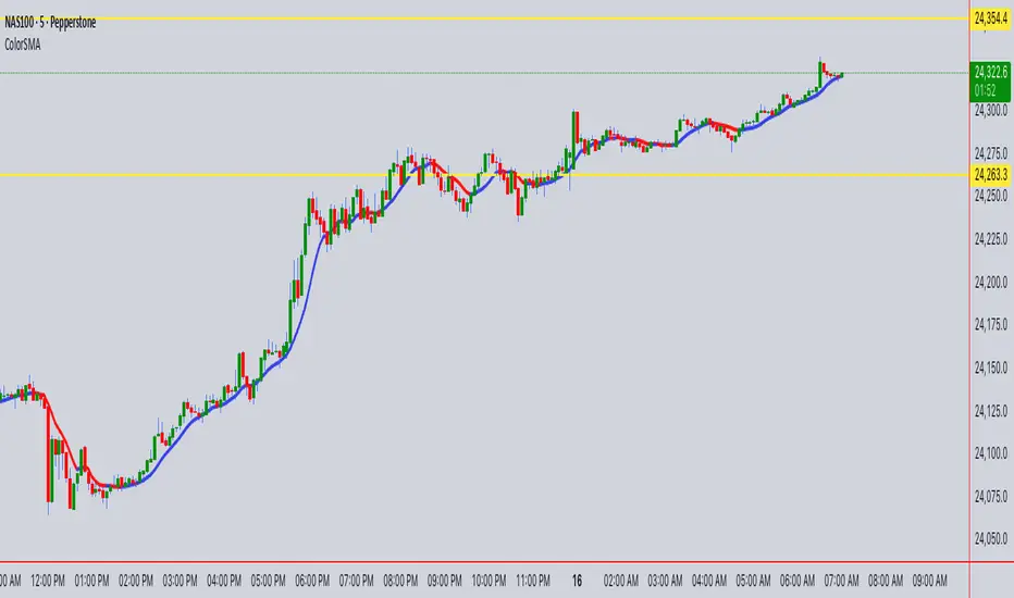
ColorSMAColorSMA Indicator – Description & Usage Guide
Overview
The ColorSMA indicator is a dynamic trend-following moving average designed to adapt to volatility and provide clearer visual cues for traders. Unlike a standard simple moving average (SMA), this tool applies a volatility filter using a standard deviation channel and then smooths the price before calculating the moving average.
The result is a single line on the chart that changes color depending on its trend direction:
Blue (Uptrend) – The moving average is rising compared to the previous bar.
Red (Downtrend) – The moving average is falling compared to the previous bar.
This visual coloring makes it easier to spot the trend direction at a glance.
How It Works
Baseline SMA
The script first calculates a classic SMA based on the selected Length (default = 9).
This baseline acts as the foundation of the indicator.
Volatility Filter (SD Channel)
A standard deviation multiplier is applied to create an upper and lower channel around the SMA.
If price moves outside this channel, it gets “clamped” back within the channel range.
This reduces noise and prevents false signals in highly volatile conditions.
Smoothed Price (Extra Smooth)
The filtered price is then smoothed with another SMA (default = 3).
This step makes the line cleaner and easier to interpret.
Trend Coloring
If the current smoothed SMA is higher than its previous value → the line is Blue.
If it is lower → the line is Red .
This simple but effective color-coding highlights trend shifts without cluttering the chart.
Inputs & Settings
Source: The price source used in the calculation (default = close).
Length: The SMA period length (default = 9).
Extra Smooth : Additional smoothing for the final line (default = 3). Lower values make it more responsive, higher values make it smoother.
Width (Volatility Filter – SD Channel): The multiplier applied to the standard deviation. Controls how wide the channel is (default = 0.3).
Length (Volatility Filter – SD Channel): The period for calculating standard deviation (default = 1).
What You See on the Chart
A single moving average line that changes color:
Blue (Up) = trend strength or bullish direction.
Red (Down) = trend weakness or bearish direction.
The line itself is already filtered through a volatility channel and smoothing, so it reacts to market conditions while reducing noise.
How to Use It
Trend Identification
Use the color changes (Blue/Red) to quickly identify short-term trend shifts.
Blue phases suggest bullish bias, Red phases suggest bearish bias.
Entry/Exit Guidance
Traders can align entries with the trend color (e.g., buy when it turns Blue, sell/short when it turns Red).
Combine with price action or other indicators for confirmation.
Volatility Filtering
Adjust the Width and SD Length parameters to tune how sensitive the indicator is to price fluctuations. Narrower channels give more signals; wider channels filter out more noise.
Smoothing Control
If you prefer faster reactions, lower the smoothing value.
If you want steadier signals, increase smoothing.
Summary
The ColorSMA is a visually enhanced moving average that adapts to volatility and simplifies trend detection. It is especially useful for traders who prefer:
Clean charts with minimal clutter.
Clear, color-coded signals for trend direction.
Flexibility to adjust responsiveness via smoothing and channel width.
This indicator is best used as a trend confirmation tool or combined with other strategies such as support/resistance, candlestick patterns, or oscillators for robust trade setups.