CB Charts - GEX NQ/MNQ
Last Updated: 2025-10-14 12:59:34 PST
*DISCLAIMER: Only intended for NQZ2025/MNQZ2025 charts.
This indicator plots horizontal levels based on batched GEX levels for NQZ2025/MNQZ2025. The batched data is derived from contracts expiring: 0DTE, 1DTE, EoW, EoM, Next Week, Next Month and 3-months out. Labels are available for a high-level view of which levels are which. Hovering (or long-pressing on mobile TV) over the labels will display the nominal values and Rank. This script is manually updated and may not be always updated.
When and what to use:
- Most respected levels come from 1DTE, EoW and EoM.
- 0DTE is included for when this script becomes intraday updated. (CURRENTLY NOT UPDATED INTRADAY)
- Next Week setting is best used only for Friday and Sunday trading
- Next Month setting is best for weeks close to the end of the current month
Powered by the Camels of Wallstreet
Indicators and strategies

Williams x Briese Hybrid CoT Index
After studying the below CoT (Commitments of Traders) books from ICT's recommended library, I learned that both Larry Williams and Stephen Briese use the same formula for their CoT Index:
COT Index = ((Current Net Position - Lowest Net Position) / (Highest Net Position - Lowest Net Position)) * 100 using a 3-Year lookback period.
Books:
Trade Stocks and Commodities with the Insiders: Secrets of the COT Report by Larry Williams
The Commitments of Traders Bible: How To Profit from Insider Market Intelligence by Stephen Briese
Williams and Briese differ in their plotting of the CoT Index formula in the following ways:
Williams uses a line plot, with thresholds at 25% & 75%
Briese uses a histogram plot, with thresholds at 5% & 90%
I decided to make a "hybrid" indicator of their CoT Index by using Larry Williams' classic line plot instead of a histogram, but with Briese's stricter thresholds of 5% and 95%.
The code is a bit of a remix of the "ICT Commitment of Traders°" indicator by " toodegrees " and is meant for use in a new pane below a Weekly Chart.
You can complement your usage of this indicator with another indicator I've published as shown in the chart above: Briese CoT Movement Index, which you can find on my scripts page. For proper usage, refer to The Commitments of Traders Bible and Trade Stocks and Commodities with the Insiders
As it is, this indicator incorporates the ±40 point "surge" from the Briese CoT Movement Index indicator in the form of labels that are visible above a below the 100% and 0% levels. The green labels at the top indicate buying surges >=40 while the black labels at the bottom indicate selling surges <=-40. If you hover over these labels, you'll see the tooltip for the value of the Movement Index. Again, if you complement this Williams x Briese Hybrid CoT Index with the Briese CoT Movement Index, you'll see the labels from the index align with the points on the histogram which exceed the ±40 levels.
NOTE: This indicator only works with futures contracts, such as on the symbols/codes for:
DX1
6E1
6A1
6B1
6N1
6C1
6S1
6J1
6M1
6Z1
SI1
GC1
PA1
PL1
HG1
BTC1
ETH1
ES1
NQ1
NIY1
CL1
NG1
HO1
RB1
ZB1
ZS1
LE1
HE1
Usage:
Open this indicator in a new pane on a Weekly chart which has one of the listed futures contracts open. It provides insight on the net commercial CoT position, indexed from 0-100%, based on Briese's or Williams' standard 3-year lookback period. Can be used in conjunction with the "Briese CoT Movement Index" which I've published separately. Refer to the books listed above for detailed insight on the theory behind these indicators.
Additional Note, October 14, 2025: Back when I published this indicator originally in July 2025, PineCoders delisted it because my description was in violation of the house rules. Fans of my "Briese CoT Movement Index" have been reaching out, and thus I've decided to republish this indicator, refining the description as much as possible.
Also, please be aware that the CFTC has posted a special announcement on their website: "October 1, 2025: During the shutdown of the federal government, Commitments of Traders Reports will not be published. When the federal government operations return to normal, CFTC will resume publication of the Commitments of Traders in chronological order."
Until the CFTC begins publishing the CoT reports again, the indicator will display data only up to late September 2025.
Multi-Stochastic Alert Indicator - INSTANTits amazing to read charts with this
you can ue it
to read
stochastic
timeframe
difference models
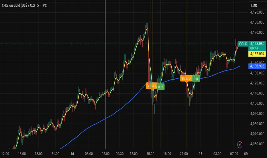
Billionaire Gold ClubBillionaire Gold Club — Long-Term Gold Trend Follower
Overview
The Billionaire Gold Club indicator is designed for traders who follow the long-term bullish bias of Gold (XAU/USD).
It focuses only on BUY opportunities and encourages patience during market pullbacks.
The goal is to trade with the main trend, not against it.
Instructions
1. The script automatically plots 7MA (fast) and 200MA (slow).
2. When 7MA crosses above 200MA, a BUY signal appears.
3. When 7MA crosses below 200MA, a Standby signal appears — do not sell, just wait for the next BUY.
Usage Rules
• Recommended timeframe: 15-minute or higher.
• If used below 15 minutes, treat it as day trading — close trades within the same day.
• Focus on long-term holding and small lot sizes to protect your capital.
Signal Guide
🟢 BUY → Enter the trend direction.
🟠 Standby → Pause new entries and wait patiently.
Alerts
Set alerts to "Once per bar close":
• BUY Signal → Golden Cross confirmed.
• Standby Signal → Death Cross confirmed.
Philosophy
"Obey the rules, and your probability of success increases."
This system rewards patience, discipline, and long-term trend following.
Follow me for more TradingView scripts and updates.
Billionaire Gold Clubは、ゴールド(XAU/USD)の長期上昇トレンドに沿って取引するためのインジケーターです。
基本的にBUYのみを狙い、デッドクロス時はStandby(待機)状態として次のBUYを待ちます。
推奨時間軸:15分足以上。
15分未満で使用する場合はデイトレードとして同日中にクローズすることを推奨します。
ロットを小さく保ち、長期保有で安定した運用を目指してください。
PD Break Behavior AnalysisThe PD Break Behavior Analysis indicator tracks and classifies daily price action relative to the previous day's high (PDH) and low (PDL). It evaluates how often price:
Breaks only the PDH (single upper breakout)
Breaks only the PDL (single lower breakdown)
Breaks both PDH and PDL (double breakout)
Remains inside the previous day’s range (no break)
Gaps and stays entirely above the previous day’s high (strong bullish gap)
The indicator maintains rolling counts for the past:
50 trading days
100 trading days
300 trading days
These statistics are displayed in a clear on-chart table, providing insight into market behavior over multiple timeframes.

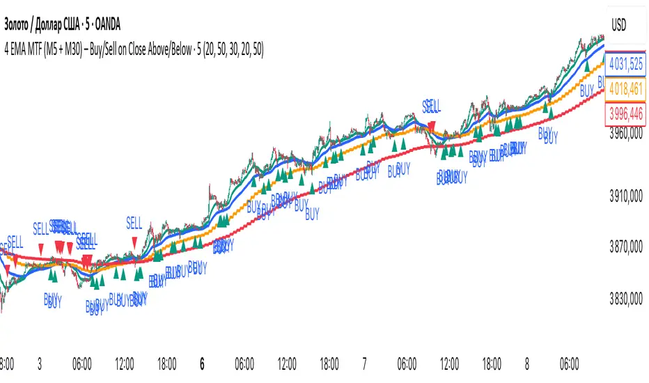
Andrei Marin4 EMA MTF (M5 + M30) – Buy/Sell on Close Above/Below🚀 4 EMA MTF (M5 + M30) — Trend Power Confirmation System
Catch the trend before it takes off.
This indicator fuses multi-timeframe momentum and precision trend alignment using 4 EMAs (2 from M5 + 2 from M30). When short- and mid-term trends lock in the same direction, you get clean, high-probability Buy and Sell signals — confirmed only on bar close, no repainting.
💡 The Concept
In trending markets, real consistency comes from multi-timeframe confluence.
This tool reads both your local M5 chart and the higher-timeframe M30 to detect moments when price breaks above or below all four EMAs — meaning both intraday and swing flows are aligned.
When the M5 and M30 EMAs agree, it’s not noise — it’s momentum.
✅ BUY → Price closes above all 4 EMAs
❌ SELL → Price closes below all 4 EMAs
🔒 No repaint: All conditions confirmed after bar close.
🔍 Features
🧭 4 EMA Fusion: EMA 20 & 50 on both M5 and M30 for double-layer confirmation.
⚡ Instant Visuals: Arrows mark fresh buy/sell signals only when trend alignment occurs.
🎨 Dynamic Background: Teal = bullish control, Red = bearish momentum.
🔔 Built-in Alerts: Receive instant notifications when new signals trigger.
🧩 Customizable: Change EMA lengths, higher-timeframe (HTF), or turn visuals on/off.
🧠 How It Works
Local EMAs (M5): Fast/Slow smoothing of short-term trend.
Higher-TF EMAs (M30): Pulled securely with request.security() and no repaint settings (lookahead_off).
Signals appear only once, when a new alignment is confirmed on close — eliminating fake flips.
⚙️ Inputs
Category Parameter Default Description
M5 Settings EMA rapide / EMA lente 20 / 50 Short-term trend layer
M30 Settings Timeframe HTF 30 Medium-term confirmation
M30 EMAs EMA rapide / EMA lente 20 / 50 Higher-timeframe trend filter
Display Show Labels / Background ON / ON Optional visuals
🧭 Why Traders Love It
🔹 Crystal-clear direction — no second guessing trend bias
🔹 No laggy repainting tricks — only confirmed data
🔹 Adaptable for all assets — Forex, Indices, Crypto, Metals
🔹 Perfect companion for scalpers and intraday swing traders
This is your trend alignment radar — simple, visual, and powerful.
🔔 Alerts
BUY ALERT: “Close above EMA20/50 (M5 + M30)”
SELL ALERT: “Close below EMA20/50 (M5 + M30)”
You can connect these alerts to bots, webhooks, or notifications — stay synced with every confirmed breakout.
⚠️ Notes
This is a confirmation tool, not a standalone entry system. Combine it with:
Structure breaks or liquidity sweeps
ATR-based stop losses
Volume or session filters
🌍 Summary
4 EMA MTF (M5 + M30) delivers multi-timeframe precision with clean, non-repainting signals that align your short-term and mid-term trends.
Designed for traders who demand clarity, momentum, and discipline.
💬 “When M5 and M30 agree — the trend just got serious.”
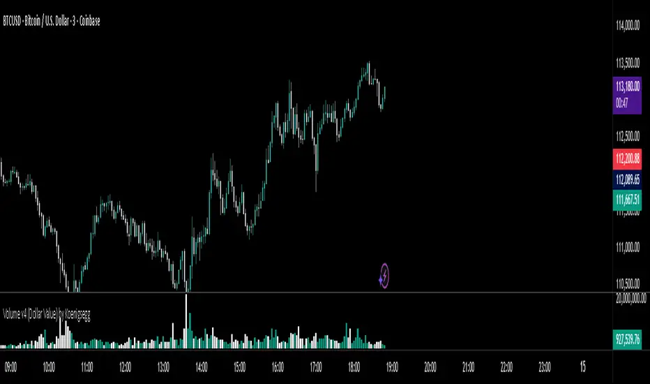
Volume v4 (Dollar Value) by Koenigsegg📊 Volume v3 (Dollar Value) by Koenigsegg
🎯 Purpose:
Volume v3 (Dollar Value) by Koenigsegg transforms traditional raw-unit volume into dollar-denominated volume, revealing how much money actually flows through each candle.
Instead of measuring how many coins or contracts were traded, this version calculates the total traded value = volume × average price (hlc3), allowing traders to visually assess capital intensity and market participation within each move.
⚙️ Core Features
- Converts raw volume into USD-based traded value for each candle.
- Color-coded bars show bullish (green/teal) vs. bearish (red) activity.
- Built-in SMA and SMMA overlays highlight sustained shifts in value flow.
- Designed for visual clarity to support momentum, exhaustion, and divergence studies.
📖 How to Read It
Rising Dollar Volume — indicates growing market participation and strong capital flow, often aligning with impulsive waves in trend direction.
Falling Dollar Volume — signals waning interest or reduced participation, potentially hinting at correction or exhaustion phases.
Comparing Legs — when price makes new highs/lows but dollar volume weakens, it can reveal divergences between price movement and actual capital commitment.
SMA / SMMA Lines — use them to identify longer-term accumulation or depletion of market activity, separating short bursts from sustained inflows or outflows.
The goal is to visualize the strength of market moves in terms of capital energy, not just tick activity. This distinction helps traders interpret whether a trend is being driven by genuine money flow or low-liquidity drift.
⚠️ Disclaimer
This script is provided for research and educational purposes only.
It does not constitute financial advice, investment recommendations, or trading signals.
Always conduct your own analysis and manage your own risk when trading live markets.
The author accepts no liability for financial losses incurred from use of this tool.
🧠 Credits
Developed and published by Koenigsegg.
Written in Pine Script® v6, fully compliant with TradingView’s House Rules for Pine Scripts.
Licensed under the Mozilla Public License 2.0.

Trend Flow Trend Flow — by Volume Hub
A clean momentum-based trend map built around EMA 21, EMA 50, and EMA 200.
TrendFlow helps you instantly see whether price is flowing with the trend or fighting against it.
When price trades above the short-term EMAs, momentum is bullish — when it falls below, the flow reverses.
🟢 How to use
Buy bias: when price is above EMA 21 & EMA 50 and both are aligned above the EMA 200.
The green zone between 21 & 50 acts as a dynamic support channel — ideal for pullback entries.
Sell bias: when price is below EMA 21 & EMA 50 and both are under the EMA 200.
The red zone highlights a resistance channel — look for rejection or continuation setups.
Neutral zone: when EMAs are tangled or flat — stay patient until structure expands again.
⚙️ Features
Soft, low-opacity EMA 21 & 50 for clear channel view
Dynamic EMA 200 color shift (green = bullish / red = bearish / gray = neutral)
Automatic color fill between EMA 21 & 50 for instant trend-strength feedback
🎯 Purpose
Designed for traders who prefer clean price structure and disciplined trend confirmation.
Use TrendFlow as your core directional filter — pair it with your own entry logic, liquidity zones, or volume confirmations.
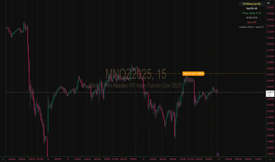
📈 Created by: Volume Hub

CRT Efficiency Backtester (Romeo Style)30 day look back period CRT Efficiency Backtester (Romeo Style)
Moving Averages PowerMoving Averages Power — Trend + Normalized Strength
Lightweight indicator that plots up to 15 SMAs (5 → 4320) and shows a compact table with each MA’s:
Slope % (per-bar)
Trend (Bullish/Bearish/Neutral)
Normalized “Strength” bars comparable across MA lengths and, optionally, across timeframes via ATR%
Not financial advice. For research/education only.
What it does
Plots 15 SMA lines on the price chart
Colors match trend: Bullish (green), Bearish (red), Neutral (gray)
Bottom-right table: MA, Slope %, Trend, Strength bars
Strength normalization modes:
None: raw |slope%|
Length: scales by length relative to a reference length
ATR%: scales by volatility (ATR as % of price)
Length+ATR%: combines both for better cross-timeframe comparability
How it works (concepts)
Slope % per bar: 100 × (MA − MA ) / MA
Normalization:
None: S = |slope%|
Length: S = |slope%| × (length / normRefLen)
ATR%: S = |slope%| / ATR%, where ATR% = 100 × ATR(atrLen) / close
Length+ATR%: S = (|slope%| × (length / normRefLen)) / ATR%
Bars: floor(S / strengthStep), clamped to Max bars (default 10)
Notes:
normRefLen (default 240) keeps Length scaling stable across very short and very long MAs
In ATR modes, Strength shows blank until there’s enough history for ATR
How to use
Add the indicator to your chart (Indicators → search this title → Add).
Open Settings:
Show/hide any of the 15 SMAs
Choose Strength normalization mode
Tune Strength step, Max bars, Reference length, and ATR Length
Read the table:
MA: period
Slope %: per-bar percent change of the MA
Trend: green (bullish), red (bearish), gray (neutral)
Strength: more bars = stronger trend under the chosen normalization
Inputs (quick reference)
Display:
15 toggles: Show SMA 5 … Show SMA 4320
Strength Settings:
Strength normalization: None | Length | ATR% | Length+ATR%
Strength step (normalized units): sensitivity of bar count
Max bars: clamp for the bar count (default 10)
Normalization reference length: baseline for Length scaling (default 240)
ATR Length (for ATR%): ATR lookback used for ATR%
Text:
Label font size, Table font size
Line + label colors
Bullish (slope > 0): green
Bearish (slope < 0): red
Neutral (otherwise): gray
The MA lines, end-of-series labels, and table trend cell use the same colors
Recommended presets (examples)
Intraday (e.g., BTCUSD, 1h):
Strength normalization: Length+ATR%
normRefLen: 240
Strength step: 0.02–0.05
Max bars: 10
ATR Length: 14
Daily (e.g., AAPL, 1D):
Strength normalization: Length
normRefLen: 240–480
Strength step: 0.01–0.03
Max bars: 10
Calibration tips
Bars often at max (pegged)?
Increase Strength step (e.g., 0.01 → 0.03 → 0.05)
Or increase normRefLen (e.g., 240 → 480 → 720)
Bars too few?
Decrease Strength step (e.g., 0.02 → 0.01 → 0.005)
Or decrease normRefLen (e.g., 240 → 120)
Cross-timeframe comparability:
Prefer Length+ATR%; start with Strength step ≈ 0.02–0.05 and tune
Limitations
SMA only (no EMA/WMA/etc.)
Per-bar slope is inherently timeframe-sensitive; use ATR% or Length+ATR% for better cross-timeframe comparisons
ATR modes require atrLen bars; Strength shows blank until ready
The longest SMA (4320) needs sufficient chart history
Troubleshooting
Strength always looks maxed:
You might be on Length mode with a very small step; increase Strength step and/or use Length+ATR%; review normRefLen
Strength blank cells:
In ATR modes, wait for enough history (atrLen) or switch to Length mode
Table bounds:
The script manages rows internally; if you customize periods, ensure the total rows fit the 4×16 table
Compatibility
Pine Script v6
Works on most symbols/timeframes with adequate history
If you find this useful, consider leaving feedback with your preferred defaults (symbol/timeframe) so I can provide better presets.

Pin Bar chạm ema34 - kidumonPin Bar touches EMA34 - kidumon
pin bar candlestick reaction at ema34 shows strong rejection force, can catch reversal trend.

Market sessions and Volume Delta profile - By Leviathanvisual/cosmetic edit by Deepseek, example the session box has extensive options to fit into any template harmonically
ORB Multi-Range (5,10,15 min plain)Simple, accurate ORB lines for 5, 10, and 15-minute opening ranges — no clutter, just clean breakout levels.

5EMAs,2SMAs,BB, and VWAPIncludes 5 EMAs, 2 SMAs, BollingerBands and VWAP.
All-in-one indicator so you can use additional custom indicators out there.

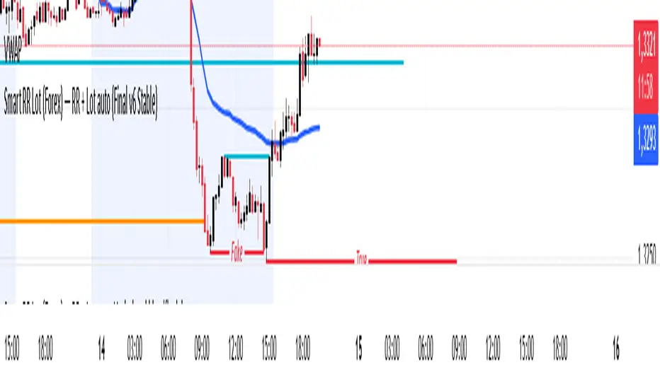
Smart RR Lot (Forex) — RR + Lot auto (Final v6 Stable)//@version=6
indicator("Smart RR Lot (Forex) — RR + Lot auto (Final v6 Stable)", overlay=true, max_lines_count=12, max_labels_count=12)
// ===== Paramètres du compte =====
acc_currency = input.string("EUR", "Devise du compte", options= )
account_balance = input.float(6037.0, "Solde du compte", step=1.0)
risk_pct = input.float(1.0, "Risque par trade (%)", step=0.1, minval=0.01)
// ===== Niveaux à placer sur le graphique =====
entry_price = input.price(1.1000, "Entry (cliquer la pipette)")
sl_price = input.price(1.0990, "Stop Loss (cliquer la pipette)")
tp_price = input.price(1.1010, "Take Profit (cliquer la pipette)")
// ===== Taille du pip (Forex) =====
isJPYpair = str.contains(syminfo.ticker, "JPY")
pip_size = isJPYpair ? 0.01 : 0.0001
// ===== Valeur du pip (1 lot = 100 000 unités) =====
pip_value_quote = 100000.0 * pip_size
quote_ccy = syminfo.currency
// ===== Conversion QUOTE → devise du compte =====
f_rate(sym) =>
request.security(sym, "D", close, ignore_invalid_symbol=true)
f_conv_to_account(quote, acc) =>
acc_equals = quote == acc
if acc_equals
1.0
else
r1 = f_rate(acc + quote)
r2 = f_rate(quote + acc)
float res = na
if not na(r1)
res := 1.0 / r1
else if not na(r2)
res := r2
else
res := 1.0
res
quote_to_account = f_conv_to_account(quote_ccy, acc_currency)
pip_value_account = pip_value_quote * quote_to_account
// ===== Calcul RR & taille de lot =====
stop_dist_points = math.abs(entry_price - sl_price)
tp_dist_points = math.abs(tp_price - entry_price)
distance_pips = stop_dist_points / pip_size
rr = tp_dist_points / stop_dist_points
risk_amount = account_balance * (risk_pct * 0.01)
lot_size = distance_pips > 0 ? (risk_amount / (distance_pips * pip_value_account)) : na
lot_size_clamped = na(lot_size) ? na : math.max(lot_size, 0)
// ====== Lignes horizontales ======
var line lEntry = na
var line lSL = na
var line lTP = na
f_hline(line_id, float y, color colr) =>
var line newLine = na
if na(line_id)
newLine := line.new(bar_index - 1, y, bar_index, y, xloc=xloc.bar_index, extend=extend.right, color=colr, width=2)
else
line.set_xy1(line_id, bar_index - 1, y)
line.set_xy2(line_id, bar_index, y)
line.set_color(line_id, colr)
line.set_extend(line_id, extend.right)
newLine := line_id
newLine
colEntry = color.new(color.gray, 0)
colSL = color.new(color.red, 0)
colTP = color.new(color.teal, 0)
lEntry := f_hline(lEntry, entry_price, colEntry)
lSL := f_hline(lSL, sl_price, colSL)
lTP := f_hline(lTP, tp_price, colTP)
// ===== Labels d’informations =====
var label infoLbl = na
var label lblEntry = na
var label lblSL = na
var label lblTP = na
txtInfo = "RR = " + (na(rr) ? "—" : str.tostring(rr, "#.##")) +
" | Lot = " + (na(lot_size_clamped) ? "—" : str.tostring(lot_size_clamped, "#.##")) +
" (" + acc_currency + ") " +
"Risque " + str.tostring(risk_pct, "#.##") + "% = " + str.tostring(risk_amount, "#.##") + " " + acc_currency
midY = (entry_price + tp_price) * 0.5
if na(infoLbl)
infoLbl := label.new(bar_index, midY, txtInfo, xloc=xloc.bar_index, style=label.style_label_right, textcolor=color.white, color=color.new(color.black, 0))
else
label.set_x(infoLbl, bar_index)
label.set_y(infoLbl, midY)
label.set_text(infoLbl, txtInfo)
entryTxt = "ENTRY " + str.tostring(entry_price, format.price)
slTxt = "SL " + str.tostring(sl_price, format.price)
tpTxt = "TP " + str.tostring(tp_price, format.price)
if na(lblEntry)
lblEntry := label.new(bar_index, entry_price, entryTxt, xloc=xloc.bar_index, style=label.style_label_down, textcolor=color.white, color=color.new(colEntry, 0))
else
label.set_x(lblEntry, bar_index)
label.set_y(lblEntry, entry_price)
label.set_text(lblEntry, entryTxt)
if na(lblSL)
lblSL := label.new(bar_index, sl_price, slTxt, xloc=xloc.bar_index, style=label.style_label_down, textcolor=color.white, color=color.new(colSL, 0))
else
label.set_x(lblSL, bar_index)
label.set_y(lblSL, sl_price)
label.set_text(lblSL, slTxt)
if na(lblTP)
lblTP := label.new(bar_index, tp_price, tpTxt, xloc=xloc.bar_index, style=label.style_label_down, textcolor=color.white, color=color.new(colTP, 0))
else
label.set_x(lblTP, bar_index)
label.set_y(lblTP, tp_price)
label.set_text(lblTP, tpTxt)
Risk sizing toolHelps you manage risk per trade accurately.
Automatically adjusts position size if the stop-loss or account constraints are exceeded.
Gives a clear visual summary directly on your stock chart.
Prevents taking trades that are too large relative to your account.
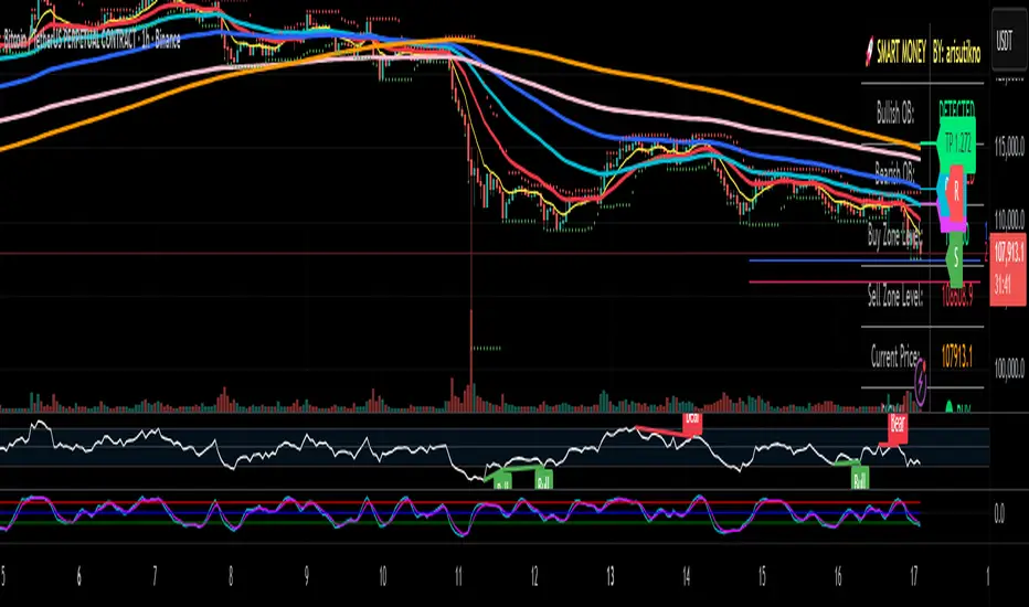
Smart Money Panel By: arisutiknoKEY FEATURES:
✅ Smart Money Detection - Automatic Order Blocks Detection
✅ Full Customization - All colors can be customized
✅ Clean Panel Design - Professional and informative look
✅ Real-time Signals - Actionable trading signals
✅ Multiple Signal Types - BUY/SELL AT OB, NEAR ZONE, WAITING
✅ Custom Signal Colors - Signal colors can be set separately
Makes it easier to make decisions. Good Luck Brooo
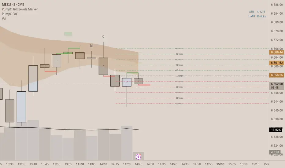
PumpC Tick Levels Marker🧾 Description
PumpC Tick Levels Marker
A precision price-level visualization tool designed for futures and tick-based traders.
Easily mark a single reference price and automatically plot symmetrical tick levels above and below it.
🔍 How It Works
Select your Anchor Price — this acts as the central reference point.
The script automatically plots upward and downward tick levels spaced by your chosen tick multiple.
Labels display tick distance (+/- ticks) and can be offset to the right by a set number of bars for clean alignment near the price scale.
⚙️ Key Features
One-click anchor control — define a single reference price.
Custom tick spacing — choose your tick multiple and number of levels to show (up to 10 in each direction).
Independent Up/Down toggles — display only the levels you need.
Label offset control — move labels closer or farther from the price scale.
Fully customizable styling — line color, width, and style (solid, dashed, dotted).
Efficient cleanup logic — lines and labels refresh dynamically on update.
🧩 Perfect For
Futures and index traders tracking tick increments (e.g., ES, NQ, CL).
Measuring quick scalp targets or ATR-based micro-ranges.
Visualizing equidistant price steps from a key breakout or reversal point.
Created by: PumpC Trading Tools
Version: 1.0 (Pine Script v6)
License: Open for personal use — please credit “PumpC Tick Levels Marker” if reused or modified.
Time Line Indicator - by LMTime Line Indicator – by LM
Description:
The Time Line Indicator is a simple, clean, and customizable tool designed to visualize specific time periods within each hour directly in a dedicated indicator pane. It allows traders to mark important intraday minute ranges across multiple past hours, providing a clear visual reference for time-based analysis. This indicator is perfect for identifying recurring hourly windows, session patterns, or custom time-based events in your charts.
Unlike traditional overlays, this indicator does not interfere with price candles and draws its lines in a separate pane at the bottom of your chart for clarity.
Key Features:
Custom Hourly Lines:
Draw horizontal lines for a specific minute range within each hour, e.g., from the 45th minute to the 15th minute of the next hour.
Multi-Hour Support:
Choose how many past hours to display. The indicator will replicate the line for each selected hourly period, following the same minute logic.
Automatic Start/End Logic:
If your chosen start minute is in the previous hour, the line correctly begins at that time.
The end minute can cross into the next hour when applicable.
If the selected end minute does not yet exist in the current chart data, the line will extend to the latest available bar.
Dedicated Indicator Pane:
Lines appear in a fixed, non-intrusive y-axis within the indicator pane (overlay=false), keeping your price chart clean.
Customizable Appearance:
Line Color: Choose any color to match your chart theme.
Line Thickness: Adjust the width of the lines for better visibility.
Inputs:
Input Name Type Default Description
Line Color Color Orange The color of the horizontal lines.
Line Thickness Integer 2 The thickness of each line (1–5).
Start Minute Integer 5 The minute within the hour where the line begins (0–59).
End Minute Integer 25 The minute within the hour where the line ends (0–59).
Hours Back Integer 3 Number of past hours to display lines for.
Use Cases:
Intraday Analysis: Quickly visualize recurring minute ranges across multiple hours.
Session Tracking: Mark critical time windows for trading sessions or market events.
Pattern Recognition: Easily identify time-based patterns or setups without cluttering the price chart.
How It Works:
The indicator calculates the nearest bars corresponding to your start and end minutes.
It draws horizontal lines at a fixed y-axis value within the indicator pane.
Lines are drawn for each selected past hour, replicating the chosen minute span.
All logic respects the actual chart data; lines never extend into the future beyond the most recent bar.
Notes:
Overlay is set to false, so lines appear in a dedicated pane below the price chart.
The indicator is fully compatible with any timeframe. Lines adjust automatically to match the chart’s bar spacing.
You can change the number of hours displayed at any time without affecting existing lines.
If you want, I can also draft a shorter “TradingView Store / Public Library description” version under 500 characters for the “Short Description” field — concise and punchy for users scrolling through indicators.

BH Ergodic (TSI-style) [v5]The BG Ergodic script is a custom momentum and trend-confirmation tool that builds on the classic True Strength Index (TSI) and Ergodic Oscillator concepts. It smooths price momentum over multiple exponential averages to identify underlying trend direction, exhaustion, and potential reversals with reduced noise.
Unlike a standard TSI, the BG Ergodic combines:
Dual-smoothing filters for both momentum and signal lines, giving a cleaner response in choppy markets.
Dynamic color transitions that highlight bullish and bearish phases based on crossovers and slope changes.
Optional histogram plotting to visualize the spread between the Ergodic line and its signal line for early trend-shift detection.
This indicator works best on swing or trend-following timeframes (e.g., 1H–1D) and can be used to:
Confirm trend direction before entries,
Filter false breakouts, or
Spot momentum divergence near key support/resistance zones.

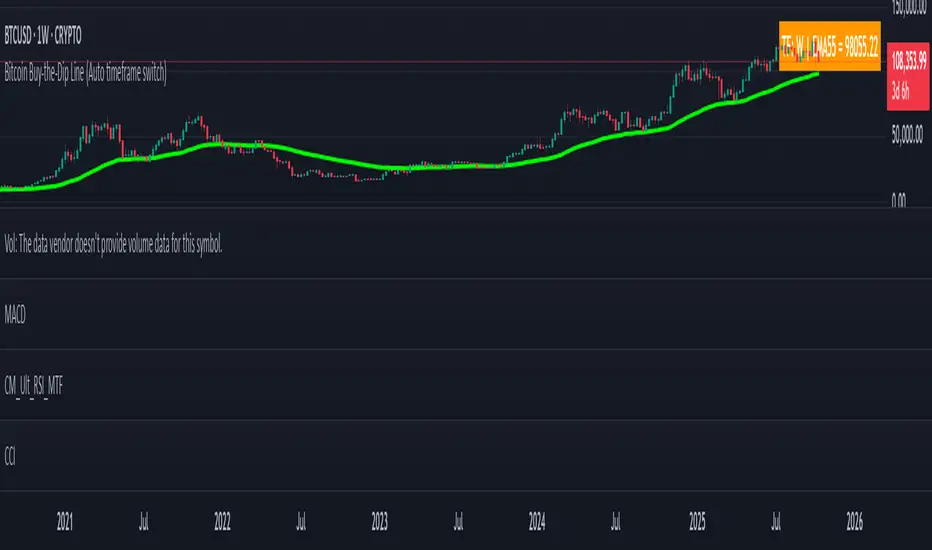
Bitcoin Buy-the-Dip Line (Auto timeframe switch)Many people ask me when is the right time to buy Bitcoin. However, most of them have little trading experience and no time to study technical strategies or tools.
That’s why I created a simple and intuitive indicator — easy enough for anyone to use.
Usage 1 – Buy the Dip
This indicator works only on 4H, 1D, 1W, and 1M timeframes.
On each timeframe, you will see a single EMA line.
During a bull market, whenever the price dips below this EMA, it usually represents a good opportunity to buy the dip .
Usage 2 – Bull to Bear Transition
On the daily timeframe, if the price stays below the EMA and continues to make lower lows , it often signals that the market is transitioning into a bearish phase .