Session Open Candle Colors// Session times in EST
// NY Open: 9:30 AM EST
// Asia Open (Tokyo): 7:00 PM EST (previous day)
// Europe Open (London): 3:00 AM EST
color codes the bar based when each market opens
Indicators and strategies

3x SMA with Fixed TimeframesYou can adjust colors and thickness.
Also can adjust to a fixed timeframe no matter what timeframe you're viewing chart.

Prestijlo X v2 Scalp ✅ Prestijlo X v2 – Description (TradingView-Safe)
Prestijlo X v2 is a visual market-analysis tool designed to help traders observe trend direction and momentum changes more clearly.
It includes EMA 9, 21, and 50, directional arrows, and optional visual markers to highlight shifts in price behavior.
This indicator is intended for:
Trend observation
Identifying momentum shifts
Highlighting potential reaction zones
Improving chart readability
Prestijlo X v2 does not provide financial advice, does not guarantee results, and is not an automated trading system. All signals are visual aids only, and users should apply their own analysis and risk management.
Timeframe usage is flexible and based on personal preference. Short-term intervals such as 1m, 5m, and 15m may display more frequent visual changes, while higher timeframes can be used for broader trend context.

SPY/QQQ Customizable Price ConverterThis is a minimalist utility tool designed for Index traders (SPX, NDX, RUT). It allows you to monitor the price of a reference asset (like SPY, QQQ) directly on your main chart without cluttering your screen.
Key Features:
1.🖱️ Crosshair Sync for Historical Data (Highlight): Unlike simple info tables that only show the latest price, this script allows for historical inspection.
· How it works: Simply move your mouse crosshair over ANY historical candle on your chart.
· The script will instantly display the closing price of the reference asset (e.g., SPY) for that specific time in the Status Line (top-left) or the Data Window. Perfect for backtesting and reviewing price action.
2.🔄 Fully Customizable Ticker: Default is set to SPY, but you can change it to anything in the settings.
e.g.
· Trading NDX Change it to QQQ.
· Trading RUT Change it to IWM.
3.📊 Clean Real-Time Dashboard:
· A floating table displays the current real-time price of your reference asset.
· Color-coded text (Green/Red) indicates price movement.
· Fully customizable size, position, and colors to fit your layout.

Blackscrum Adaptive Momentum Line (BAML)Overview
The BlackScrum Adaptive Momentum Line (BAML) is a dynamic trend-confirmation tool designed to keep traders aligned with the dominant market direction while filtering out short-term noise.
It adapts automatically to market volatility and candle structure, giving clear visual cues for momentum shifts, trend reversals, and entry confirmation.
🔍 How It Works
BAML tracks price strength relative to its adaptive moving average and volatility envelope.
When momentum turns decisively bullish, the line flips gold, signalling a potential uptrend.
When momentum breaks down, it flips blue, showing trend exhaustion or a developing downtrend.
In sideways or transitional conditions, the line fades to neutral grey, helping traders avoid false entries.
The line uses:
An adaptive EMA core (to stay close to price during fast markets).
A volatility-weighted filter (to delay signals during chop).
Optional smoothing to fine-tune responsiveness.
🎯 How to Use It
Trend Direction:
Gold Line → Uptrend confirmed. Consider long bias, pullback entries, or trend continuation setups.
Blue Line → Downtrend confirmed. Consider short bias or defensive management on longs.
Grey/Flat Line → Neutral/transition phase. Wait for confirmation.
Entry Timing:
Combine BAML with your breakout or swing confirmation rules. For example:
Entry when the line turns gold and price closes above it.
Exit when it flips blue or price breaks back below.
Multi-Timeframe Usage:
Works effectively on any timeframe from 15-minute to 1-day charts.
Aligning higher-timeframe BAML with lower-timeframe triggers offers confluence for trend trades.
⚙️ Key Advantages
✅ Adaptive to volatility and candle structure — fewer fake flips.
✅ Visually clear color coding for fast trend reading.
✅ Compatible with other BlackScrum indicators (Fear & Greed, FOMO Finder, Swing Boxes).
✅ Ideal for swing, position, or momentum traders seeking clarity in volatile crypto or stock markets.
⚠️ Tips
Use alongside volume or sentiment indicators for confirmation.
Avoid counter-trend setups when both higher and lower timeframe BAML lines agree.
Works best in trending environments; during consolidation it acts as a stay-out filter.
🧠 In Summary
The BlackScrum Adaptive Momentum Line turns raw price data into a smooth, trustworthy trend signal.
It’s built to help you stay in strong moves longer, avoid fakeouts, and visually track the transition between fear, neutrality, and euphoria in real time.

Crypto Weekly Levels + One-Shot AlertsThis is for paper trading purpose only. This is my 7 years work and i am giving away it to the world. please practice it well / back test it. remember all you need only one strategy and one script.
Weekly camarilla and cpr levels. fires alerts when ever the price touches the levels. forms an triangle symbol at the touch.
after long time use the alerts at the opening are flooding so need to fix it. please remove the indicator once per week and add freshly.


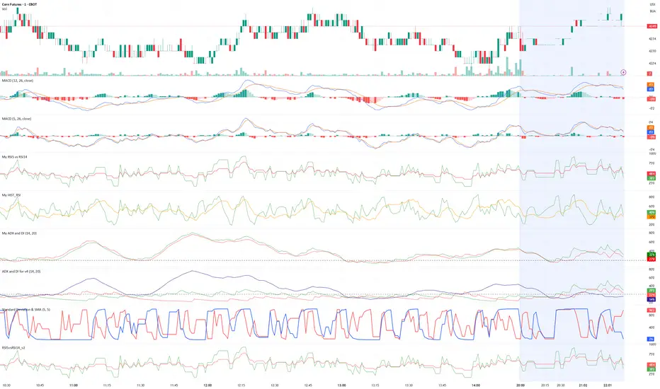
RSI5vsRSI14_v2//@version=5
indicator("RSI5vsRSI14_v2", shorttitle="RSI5vsRSI14_v2", overlay=false)
plot(ta.rsi(close, 14), title="RSI14", color=color.red)
plot(ta.rsi(close, 5), title="RSI5", color=color.green)
RSI Rate of Change (ROC of RSI)The RSI Rate of Change (ROC of RSI) indicator measures the speed and momentum of changes in the RSI, helping traders identify early trend shifts, strength of price moves, and potential reversals before they appear on the standard RSI.
While RSI shows overbought and oversold conditions, the ROC of RSI reveals how fast RSI itself is rising or falling, offering a deeper view of market momentum.
How the Indicator Works
1. RSI Calculation
The indicator first calculates the classic Relative Strength Index (RSI) using the selected length (default 14). This measures the strength of recent price movements.
2. Rate of Change (ROC) of RSI
Next, it computes the Rate of Change (ROC) of the RSI over a user-defined period.
This shows:
Positive ROC → RSI increasing quickly → strong bullish momentum
Negative ROC → RSI decreasing quickly → strong bearish momentum
ROC crossing above/below 0 → potential early trend shift
What You See on the Chart
Blue Line: RSI
Red Line: ROC of RSI
Grey dotted Zero Line: Momentum reference
Why Traders Use It
The RSI ROC helps you:
Detect momentum reversals early
Spot bullish and bearish accelerations not visible on RSI alone
Identify exhaustion points before RSI reaches extremes
Improve entry/exit precision in trend and swing trading
Validate price breakouts or breakdowns with momentum confirmation
Best For
Swing traders
Momentum traders
Reversal traders
Trend-following systems needing early confirmation signals
EMV// This Pine Script® code is subject to the terms of the Mozilla Public License 2.0 at mozilla.org
//@version=5
indicator("EMV", overlay=false)
N = input.int(14, "N")
M = input.int(9, "M")
// ==== VOLUME ====
maVol = ta.sma(volume, N)
VOLUME = maVol / volume
// ==== MID ====
hl = high + low
MID = 100 * (hl - hl ) / hl
// ==== HL_RANGE ====
HL_RANGE = ta.sma(high - low, N)
// ==== EMV ====
EMV_raw = MID * VOLUME * (high - low) / HL_RANGE
EMV = ta.sma(EMV_raw, N)
// ==== MAEMV ====
MAEMV = ta.sma(EMV, M)
plot(EMV, color=color.blue, title="EMV")
plot(MAEMV, color=color.orange, title="MAEMV")
RSI5vsRSI14indicator("RSI5vsRSI14")
plot(ta.rsi(close, 14), color=color.red)
plot(ta.rsi(close, 5), color=color.green)
// plot(ta.rsi(close, 2), color=color.blue)

Thirdeyechart Gold Simulation)The 8 XAU Global Trend Simulation Version is designed for gold traders who need a fast and accurate way to read overall market pressure across all major XAU pairs. This version monitors 8 different gold pairs at the same time and generates a clean, unified simulation that reflects the dominant directional force of gold in the global market.
By observing how all XAU pairs move collectively, the script produces a simplified trend simulation that highlights whether the market environment is showing strong momentum, weakening pressure, or shifting conditions. The goal is not to provide signals, but to offer a macro-level visual model of gold behaviour across multiple international markets.
Combined with enhanced total-average logic, this version provides a clearer representation of global strength versus weakness. Traders can quickly identify whether gold is experiencing broad alignment or mixed sentiment across the 8 pairs. Everything is displayed in a clean, boxed layout for maximum clarity and rapid decision-support.
This version is built for speed, simplicity, and accuracy—ideal for traders who rely on multi-pair confirmation to understand the true state of gold’s global trend.
Disclaimer
This tool is for educational and analytical purposes only. It does not provide trading signals or financial advice. Markets carry risk and all decisions remain the responsibility of the user.

Debt-Cycle vs Bitcoin-CycleDebt-Cycle vs Bitcoin-Cycle Indicator
The Debt-Cycle vs Bitcoin-Cycle indicator is a macro-economic analysis tool that compares traditional financial market cycles (debt/credit cycles) against Bitcoin market cycles. It uses Z-score normalization to track the relative positioning of global financial conditions versus cryptocurrency market sentiment, helping identify potential turning points and divergences between traditional finance and digital assets.
Key Features
Dual-Cycle Analysis: Simultaneously tracks traditional financial cycles and Bitcoin-specific cycles
Z-Score Normalization: Standardizes diverse data sources for meaningful comparison
Multi-Asset Coverage: Analyzes currencies, commodities, bonds, monetary aggregates, and on-chain metrics
Divergence Detection: Identifies when Bitcoin cycles move independently from traditional finance
21-Day Timeframe: Optimized for Long-term cycle analysis
What It Measures
Finance-Cycle (White Line)
Tracks traditional financial market health through:
Currencies: USD strength (DXY), global currency weights (USDWCU, EURWCU)
Commodities: Oil, gold, natural gas, agricultural products, and Bitcoin price
Corporate Bonds: Investment-grade spreads, high-yield spreads, credit conditions
Monetary Aggregates: M2 money supply, foreign exchange reserves (weighted by currency)
Treasury Bonds: Yield curve (2Y/10Y, 3M/10Y), term premiums, long-term rates
Bitcoin-Cycle (Orange Line)
Tracks Bitcoin market positioning through:
On-Chain Metrics:
MVRV Ratio (Market Value to Realized Value)
NUPL (Net Unrealized Profit/Loss)
Profit/Loss Address Distribution
Technical Indicators:
Bitcoin price Z-score
Moving average deviation
Relative Strength:
ETH/BTC ratio (altcoin strength indicator)
Visual Elements
White Line: Finance-Cycle indicator (positive = expansionary conditions, negative = contractionary)
Orange Line: Bitcoin-Cycle indicator (positive = bullish positioning, negative = bearish)
Zero Line: Neutral reference point
Interpretation
Cycle Alignment
Both positive: Risk-on environment, favorable for crypto
Both negative: Risk-off environment, caution warranted
Divergence: Potential opportunities or warning signals
Divergence Signals
Finance positive, Bitcoin negative: Bitcoin may be undervalued relative to macro conditions
Finance negative, Bitcoin positive: Bitcoin may be overextended or decoupling from traditional finance
Important Limitations
This indicator uses some technical and macro data but still has significant gaps:
⚠️ Limited monetary data - missing:
Funding rates (repo, overnight markets)
Comprehensive bond spread analysis
Collateral velocity and quality metrics
Central bank balance sheet details
⚠️ Basic economic coverage - missing:
GDP growth rates
Inflation expectations
Employment data
Manufacturing indices
Consumer confidence
⚠️ Simplified on-chain analysis - missing:
Exchange flow data
Whale wallet movements
Mining difficulty adjustments
Hash rate trends
Network fee dynamics
⚠️ No sentiment data - missing:
Fear & Greed Index
Options positioning
Futures open interest
Social media sentiment
The indicator provides a high-level cycle comparison but should be combined with comprehensive fundamental analysis, detailed on-chain research, and proper risk management.
Settings
Offset: Adjust the horizontal positioning of the indicators (default: 0)
Timeframe: Fixed at 21 days for optimal cycle detection
Use Cases
Macro-crypto correlation analysis: Understand when Bitcoin moves with or against traditional markets
Cycle timing: Identify potential tops and bottoms in both cycles
Risk assessment: Gauge overall market conditions across asset classes
Divergence trading: Spot opportunities when cycles diverge significantly
Portfolio allocation: Balance traditional and crypto assets based on cycle positioning
Technical Notes
Uses Z-score normalization with varying lookback periods (40-60 bars)
Applies HMA (Hull Moving Average) smoothing to reduce noise
Asymmetric multipliers for upside/downside movements in certain metrics
Requires access to FRED economic data, Glassnode, CoinMetrics, and IntoTheBlock feeds
21-day timeframe optimized for cycle analysis
Strategy Applications
This indicator is particularly useful for:
Cross-asset allocation - Decide between traditional finance and crypto exposure
Cycle positioning - Identify where we are in credit/debt cycles vs. Bitcoin cycles
Regime changes - Detect shifts in market leadership and correlation patterns
Risk management - Reduce exposure when both cycles turn negative
Disclaimer: This indicator is a cycle analysis tool and should not be used as the sole basis for investment decisions. It has limited coverage of monetary conditions, economic fundamentals, and on-chain metrics. The indicator provides directional insight but cannot predict exact timing or magnitude of market moves. Always conduct thorough research, consider multiple data sources, and maintain proper risk management in all investment decisions.

Technology Stocks RSPSTechnology Stocks RSPS Indicator - TradingView Description
Overview
The Technology Stocks RSPS (Relative Strength Portfolio System) indicator is a sophisticated portfolio allocation tool designed specifically for technology sector stocks. It calculates relative strength positions and provides dynamic allocation recommendations based on technical price momentum analysis.
Key Features
- Relative Strength Analysis: Compares 15 major technology stocks and the XLK sector ETF
against each other and gold as a baseline
- Dynamic Portfolio Allocation: Automatically calculates optimal position sizes based on relative
performance
- Visual Portfolio Performance: Tracks cumulative portfolio returns with color-coded
performance indicators
- Customizable Table Display: Shows real-time allocation percentages and optional cash values
for each position
- Technical Momentum Filtering: Uses normalized indicators to identify strength and filter out
weak positions
Included Assets
Sector ETF: XLK
Major Tech Stocks: AAPL, MSFT, NVDA, AVGO, CRM, ORCL, CSCO, ADBE, ACN, AMD, IBM, INTC, NOW, TXN
Benchmark: Gold (TVC:GOLD)
How It Works
The indicator calculates a relative strength score for each asset by comparing it against:
Gold (baseline commodity)
All other technology stocks in the pool
The XLK sector ETF
Assets with positive relative strength receive portfolio allocations proportional to their strength scores. Weak or negative performers are automatically filtered out (allocated 0%).
Visual Elements
Red Area: Aggregate strength of major technology stocks
Navy Blue Area: Overall technical positioning index (TPI)
Performance Line: Cumulative portfolio return (blue = cash-heavy, red = equity-heavy)
Allocation Table: Bottom-left display showing current recommended positions
Important Limitations
This indicator primarily uses technical data and has significant limitations:
❌ No fundamental economic data (ISM, CLI, etc.)
❌ Limited monetary data - missing critical components:
comprehensive monetary data
Funding rates
Detailed bond spreads analysis
Collateral data
❌ No sentiment indicators
❌ No options flow or derivatives data
❌ No earnings or valuation metrics
The indicator focuses purely on price-based relative strength and technical momentum. Users should combine this tool with fundamental analysis, economic data, and proper risk management for complete investment decisions.
Settings
Plot Table: Toggle allocation table visibility
Use Cash: Enable to display dollar amounts based on portfolio size
Cash Amount: Set your total portfolio value for cash allocation calculations
Use Cases
Sector rotation within technology stocks
Relative strength-based portfolio rebalancing
Technical momentum screening for tech sector
Dynamic position sizing based on price trends
Technical Notes
The script avoids for-loops to reduce calculation errors and noise
Uses semi-individual calculations for each asset
Requires the Unicorpus/NormalizedIndicators/1 library for normalized momentum calculations
Maximum lookback: 100 bars
Disclaimer: This indicator is a technical tool only and should not be used as the sole basis for investment decisions. It does not incorporate fundamental, economic, or comprehensive monetary data. Always conduct thorough research and consider your risk tolerance before making investment decisions.


KeeblerTradesPineScriptshows name/date/asset/timeframe on chart. center aligned the the bottom center. this way, you do not have to use a watermark on the canvas to figure out what asset and timeframe that you are currently viewing.

Multi EMA/SMA LinesMulti EMA/SMA Lines is a highly customizable moving average indicator that provides traders with up to 12 individual moving averages—6 Exponential Moving Averages (EMAs) and 6 Simple Moving Averages (SMAs). Each moving average can be independently toggled on or off, allowing you to display only the MAs relevant to your trading strategy. Default period lengths include the most commonly used values (5, 10, 20, 50, 100, and 200), but all lengths are fully adjustable to suit any timeframe or trading style. Personalize your chart with individual color settings for each line, adjustable line widths, and three line style options (Solid, Dashed, or Dotted) to clearly distinguish between EMAs and SMAs. Whether you're identifying dynamic support and resistance levels, tracking trend direction, or spotting potential crossover signals, this all-in-one indicator eliminates the need for multiple separate MA indicators on your chart. SMAs are enabled by default for immediate use, while EMAs can be activated as needed for more responsive price tracking.

Multi-Asset: Complete AnalysisDescription:
Comprehensive performance analysis tool for comparing multiple assets or custom weighted portfolios against benchmarks. Calculates Sharpe ratios across multiple timeframes (30d, 90d, 180d, 252d), total returns, CAGR, and normalized values starting from $100.
Key Features:
Build custom weighted portfolios (default: 50/30/20 allocation)
Compare against SPY, QQQ, and other benchmarks
Dynamic risk-free rate from ^IRX or manual input
Multi-period Sharpe ratio analysis to validate strategy consistency
Total return and annualized return (CAGR) metrics
All assets normalized to common start date for accurate comparison
Toggle individual assets on/off for cleaner chart viewing
Use Case:
Perfect for evaluating whether your custom portfolio allocation justifies its complexity versus simply buying SPY/QQQ. If your risk-adjusted returns (Sharpe) and absolute returns aren't beating the benchmarks, you're overcomplicating your strategy.
Ideal for: Portfolio managers, factor investors, and anyone building custom allocations who need proof their strategy actually works.

Stablecoin Total Index V4**Stablecoin Total Index V4 - Full History + Full Coverage**
This indicator provides the **best of both worlds**: long historical data AND complete stablecoin coverage.
**How it works:**
- **Before May 2025:** Manual sum of 35 major stablecoins (~90% coverage)
- **After May 2025:** Switches to STABLE.C index (100 stablecoins, 100% coverage)
**Why this approach?**
TradingView's official STABLE.C index was only created on May 19, 2025. This indicator gives you **years of historical data** going back to 2017-2018, then seamlessly transitions to the official index for complete accuracy.
**Note:** There is a ~$30B jump at the May 2025 transition point. This is NOT an error - it represents the ~65 smaller stablecoins that are included in STABLE.C but don't have individual CRYPTOCAP symbols for manual tracking.
**Pre-May 2025 Coverage (35 stablecoins):**
- **Tier 1:** USDT, USDC
- **Tier 2:** DAI, USDe, USDS, FDUSD
- **Tier 3:** TUSD, USDP, GUSD, FRAX, PYUSD, LUSD, BUSD
- **Tier 4 (2024-2025):** USD1, RLUSD, GHO, crvUSD, sUSDe, USDY, USDM
- **Tier 5 (Euro):** EURC, EURT, EURS
- **Tier 6 (DeFi):** USDD, MIM, DOLA, OUSD, alUSD, sUSD, cUSD
- **Tier 7:** HUSD, USDX, USTC
- **Gold-Backed:** PAXG, XAUT
**Post-May 2025:** Full STABLE.C (100 stablecoins)
**Features:**
- Green/Red color based on direction
- 20-period SMA
- Reference lines at $100B, $200B, $300B
**Best used on Daily timeframe or higher.**

Smart RSI MTF [DotGain]Summary
Are you tired of constantly switching between timeframes to check the RSI, only to miss the bigger picture?
The Smart RSI MTF (Multi-Timeframe) is designed to solve this exact problem. It is a streamlined chart overlay that monitors RSI conditions across up to 10 different timeframes simultaneously —from the 1-minute chart all the way up to the Monthly view.
This indicator removes the need for multiple open tabs and declutters your analysis by plotting signals directly on your main chart using a smart "visual hierarchy" system based on transparency.
⚙️ Core Components and Logic
The Smart RSI MTF relies on a sophisticated 3-layer logic to deliver clear, actionable context:
Multi-Timeframe Engine: The script runs 10 independent RSI calculations in the background. It checks standard intervals (5m, 15m, 1h, 4h, Daily, Weekly, Monthly) to ensure you never miss a momentum extreme on any scale.
Classic RSI Thresholds:
Overbought (> 70): Indicates price may be extended to the upside.
Oversold (< 30): Indicates price may be extended to the downside.
Smart Visibility System (The "Secret Sauce"): Not all signals are equal. A 5-minute Overbought signal is "noise" compared to a Weekly Overbought signal. This indicator automatically applies Transparency to differentiate importance:
Minutes = High Transparency (Faint).
Hours = Medium Transparency.
Days/Weeks/Months = No Transparency (Solid/Bold).
🚦 How to Read the Indicator
The indicator plots shapes (Labels by default) directly above or below the candles. The appearance tells you the direction and the timeframe significance:
🟥 RED SIGNALS (Overbought Condition)
Trigger: RSI is above 70 on a specific timeframe.
Location: Placed above the candle bar.
Meaning: Potential bearish reversal or pullback.
🟩 GREEN SIGNALS (Oversold Condition)
Trigger: RSI is below 30 on a specific timeframe.
Location: Placed below the candle bar.
Meaning: Potential bullish reversal or bounce.
👻 TRANSPARENCY (Signal Strength)
Faint/Ghostly: The signal comes from a lower timeframe (e.g., 5m, 15m). Use for scalping or entry timing.
Solid/Bright: The signal comes from a major timeframe (e.g., Daily, Weekly). Use for swing trading and identifying major market turns.
Visual Elements
Symbol Shapes: Fully customizable (Label, Diamond, Circle, Triangle, etc.) via settings.
Stacking: If multiple timeframes trigger at once, symbols will overlay, creating a visually denser and darker color, indicating Confluence .
Key Benefit
The goal of the Smart RSI MTF is to help traders instantly spot Confluence . When you see a faint short-term signal align with a solid long-term signal, you have identified a high-probability reversal zone without leaving your chart.
Have fun :)
Disclaimer
This "Smart RSI MTF" indicator is provided for informational and educational purposes only. It does not, and should not be construed as, financial, investment, or trading advice.
The signals generated by this tool (both "Buy" and "Sell" indications) are the result of a specific set of algorithmic conditions. They are not a direct recommendation to buy or sell any asset. All trading and investing in financial markets involves substantial risk of loss. You can lose all of your invested capital.
Past performance is not indicative of future results. The signals generated may produce false or losing trades. The creator (© DotGain) assumes no liability for any financial losses or damages you may incur as a result of using this indicator.
You are solely responsible for your own trading and investment decisions. Always conduct your own research (DYOR) and consider your personal risk tolerance before making any trades.
Dashboard Principales sectores🔍 What This Dashboard Shows
Performance of the top 20 U.S. market sectors and ETFs (e.g., Technology, Energy, Financials, Biotechnology, Semiconductors, etc.).
Percentage change based on the selected chart timeframe:
Daily timeframe → daily change
Weekly timeframe → weekly change
Monthly timeframe → monthly change
Ticker symbol displayed next to each sector name.
Color-coded performance for quick interpretation:
🟩 Positive
🟥 Negative
🟨 Neutral

Stablecoin Total Index V3**Stablecoin Total Index V4 - Full History + Full Coverage**
This indicator provides the **best of both worlds**: long historical data AND complete stablecoin coverage.
**How it works:**
- **Before May 2025:** Manual sum of 35 major stablecoins (~90% coverage)
- **After May 2025:** Switches to STABLE.C index (100 stablecoins, 100% coverage)
**Why this approach?**
TradingView's official STABLE.C index was only created on May 19, 2025. This indicator gives you **years of historical data** going back to 2017-2018, then seamlessly transitions to the official index for complete accuracy.
**Note:** There is a ~$30B jump at the May 2025 transition point. This is NOT an error - it represents the ~65 smaller stablecoins that are included in STABLE.C but don't have individual CRYPTOCAP symbols for manual tracking.
**Pre-May 2025 Coverage (35 stablecoins):**
- **Tier 1:** USDT, USDC
- **Tier 2:** DAI, USDe, USDS, FDUSD
- **Tier 3:** TUSD, USDP, GUSD, FRAX, PYUSD, LUSD, BUSD
- **Tier 4 (2024-2025):** USD1, RLUSD, GHO, crvUSD, sUSDe, USDY, USDM
- **Tier 5 (Euro):** EURC, EURT, EURS
- **Tier 6 (DeFi):** USDD, MIM, DOLA, OUSD, alUSD, sUSD, cUSD
- **Tier 7:** HUSD, USDX, USTC
- **Gold-Backed:** PAXG, XAUT
**Post-May 2025:** Full STABLE.C (100 stablecoins)
**Features:**
- Green/Red color based on direction
- 20-period SMA
- Reference lines at $100B, $200B, $300B
**Best used on Daily timeframe or higher.**

Second chartThis is a trend-following momentum confirmation indicator designed to filter trades in the direction of the dominant trend while timing entries using RSI momentum shifts.
Best suited for:
✅ Forex & Crypto
✅ 5m – 1H timeframes
✅ Trend continuation strategies
⚙ Inputs Explained
▸ Trend MA Length
Controls the EMA trend filter
Lower value (20–30) → faster, more signals
Higher value (50–100) → slower, stronger trend filter
▸ RSI Length
Controls responsiveness of momentum
Standard setting: 14
Lower → aggressive entries
Higher → conservative entries
▸ Show Buy/Sell Signals
ON → Displays BUY/SELL labels
OFF → Hides all trade signals
▸ Trend Background
ON → Green = Bullish / Red = Bearish
OFF → Clean chart mode
🧠 Signal Logic Breakdown
