ATR STRUCTURE
So I can produce this
🟡 START = 662.63 ✳️ ATR ≈ 8.30 pts (0.5 ATR ≈ 4.15 • 1 ATR ≈ 8.30) 🙂📏
ATR bands (numeric)
🔼 START + 0.5 ATR = 662.63 + 4.15 = 666.78 (upper buffer / shelf)
🔼 START + 1 ATR = 662.63 + 8.30 = 670.93 (breakout band)
🔽 START − 0.5 ATR = 662.63 − 4.15 = 658.48 (near support)
🔽 START − 1 ATR = 662.63 − 8.30 = 654.33 (deeper stop zone)
— Priority level ladder (footprint‑first & ATR alignment) — (emoji = confidence • 🔥 = high • ✅ = footprint confirmed • 🟡 = medium)
🔥🟢 PM_LOW / D1 — ~659.95 → 660.50 ✅ (FOOTPRINT CONFIRMED)
Why: repeated 30m+1h absorption (sold‑into then bought up). DEEP confidence. 🧯🔁
🔥🔴 ORBH / U2 cluster — ~663.98 → 665.87 ✅ (FOOTPRINT SUPPLY)
Why: repeated rejections / sell MaxDelta rows on 30m & 1h. Treat as overhead supply / shelf. 🪓📉
🔥🟦 D3 / ORBL corridor — ~658.64 ✅ (TF confluence: 1h+4h MaxDelta)
Why: single‑row institutional sells map here; structural LVN / open‑range low. 🛡️📌
🟡⭐ START / U1 pivot zone — ~662.63 – 662.70 ✅ (session pivot, 1h absorption)
Why: session magnet—use for intraday bias pivot / quick confirms. 👀⚖️
🟡🔥 U4 / U5 upper HVN band — ~666.7 → 669.3 (ATR UPPER)
Why: strong HVN / stop‑run evidence on higher TFs — needs large buy MaxDelta to flip. 🚧🚀
⚪ D5 lower expansion support — ~654.3–656.7 (deeper target if sellers run)
Why: longer‑TF expansion area; lower immediate probability but high impact if hit. ⚠️📉
Indicators and strategies

Vince/Williams Selling Climax SignalThis indicator identifies moments of ultimate market capitulation based on the "Selling Climax" research by Ralph Vince and Larry Williams. It monitors the ratio of New Lows to total traded issues to detect when selling pressure has reached an unsustainable, panic-driven extreme (defaulting to 20% of the entire market hitting new lows).
The script visualizes this process in two stages. First, it marks the actual days of panic with red diamonds, showing you where the "washout" is occurring. Second, and most importantly, it generates a green diamond buy signal on the very first day the panic subsides. This allows you to enter a position immediately after the supply of desperate sellers has been exhausted, often catching the absolute bottom of a sharp correction.

Vince/Williams Bloodbath Sidestepping RuleThis is a defensive risk management tool designed to keep you on the sidelines during devastating market crashes. Drawing on the "Bloodbath" criteria outlined by Vince and Williams, this script highlights periods where market internals have structurally broken down, specifically when the percentage of New Lows exceeds a "danger" threshold (default 4%).
Unlike the Climax signal which looks for the end of a drop, this rule is designed to spot the acceleration phase of a decline. When the background turns red, it indicates that the market is in a liquidating phase where support levels are likely to fail. You should use this as a strict filter to avoid opening new long positions or to tighten stops on existing ones until the background color clears, signaling that the internal bleeding has stopped.

Vince/Williams Extreme Volatility VulnerabilityDescription: This indicator implements the "Period of Extreme Vulnerability" concept developed by Ralph Vince and Larry Williams. The theory posits that a healthy market must regularly see the number of New Lows "dry up" (drop to near zero). When the percentage of New Lows fails to drop below a minimal threshold (default 0.15%) for a prolonged period (default 65 days), it indicates that internal market structure is rotting even if prices are rising, leaving the market fragile and prone to sudden volatility shocks.
I have programmed this script to track that exact condition—the extended absence of a "low" New Lows reading. It applies a 50-day Moving Average filter to contextually categorize the signal:
Red Dot (Crash Warning): Triggers when the vulnerability period begins while the price is above the 50 SMA. This is the classic warning signal, indicating that an uptrend is unsupported by market internals and a sharp correction may be imminent.
Green Dot (Contrarian Buy): Triggers when the vulnerability period begins while the price is below the 50 SMA. The script identifies this as a potential capitulation or value point where the persistent internal weakness is likely already priced in.
Note: This indicator requires exchange-wide data (New Lows, Advancers, Decliners) to function. It is best used on daily timeframes.

VIX Fix Indicator (Hestla 2015)This script provides a streamlined version of the VIX Fix, referencing the foundational work of Larry Williams and the strategies of Amber Hestla. It serves as a synthetic volatility gauge for assets that lack a dedicated VIX index. The math works by measuring the percentage drop from the highest recent close to the current low, essentially quantifying fear in the market without needing options data.
This specific script is designed to be purely visual. I have removed all the buy and sell labels found in other versions to leave a clean pane that plots only the oscillator and its moving average. You can use this to identify potential market bottoms when the black line spikes significantly, signaling that selling pressure is reaching a mathematical extreme relative to the recent trend.

Diodato 'All Stars Align' Signal (Trend Filtered)This indicator implements the Diodato "All Stars Align" strategy, a breadth-based system designed to identify high-probability reversal points by analyzing internal market strength rather than just price action. It works by monitoring Advancing versus Declining issues and volume across the exchange to detect moments of extreme market panic. When these internal breadth metrics hit specific oversold thresholds and align simultaneously with a standard Stochastic oscillator, the script signals a potential bottom.
I have modified this version to strictly enforce trend alignment. The signals are now filtered so that they will only appear if the 50 SMA is trading above the 200 SMA. This ensures that the indicator only highlights buying opportunities during established uptrends while completely filtering out signals during bearish market regimes.
You should use this tool to time entries during market pullbacks. A green cross indicates that one of the major breadth components has aligned with oversold Stochastics, while a purple cross indicates a stronger signal where both volume and issue-based breadth metrics have triggered together.

Volatility Tsunami RegimeVolatility Tsunami Regime
This indicator identifies periods of extreme volatility compression to help anticipate upcoming market expansions. It detects when volatility is unusually quiet, which historically precedes violent price moves.
The script pulls data from the CBOE VIX and VVIX indices regardless of the chart you are viewing. It calculates the standard deviation of both indices over a user-defined lookback period (default is 20). If the standard deviation drops below specific thresholds, the script flags the market regime as compressed.
The background color changes based on the severity of the compression. A red background signals a Double Compression, meaning both the VIX and VVIX are below their volatility thresholds. An orange background signals a Single Compression, meaning only one of the two indices has dropped below its threshold.
Use this tool to spot the "calm before the storm." When the background is red, volatility is statistically suppressed, making it a prime time to look for breakouts or buy options while premiums are cheap. Conversely, it serves as a warning to tighten stops if you are short volatility.

FxAST Ichi ProSeries Enhanced Full Market Regime EngineFxAST Ichi ProSeries v1.x is a modernized Ichimoku engine that keeps the classic logic but adds a full market regime engine for any market and instrument.”
Multi-timeframe cloud overlay
Oracle long-term baseline
Trend regime classifier (Bull / Bear / Transition / Range)
Chikou & Cloud breakout signals
HTF + Oracle + Trend dashboard
Alert-ready structure for automation
No repainting: all HTF calls use lookahead_off.
1. Core Ichimoku Engine
Code sections:
Input group: Core Ichimoku
Function: ichiCalc()
Variables: tenkan, kijun, spanA, spanB, chikou
What it does
Calculates the classic Ichimoku components:
Tenkan (Conversion Line) – fast Donchian average (convLen)
Kijun (Base Line) – slower Donchian average (baseLen)
Senkou Span A (Span A / Lead1) – (Tenkan + Kijun)/2
Senkou Span B (Span B / Lead2) – Donchian over spanBLen
Chikou – current close shifted back in time (displace)
Everything else in the indicator builds on this engine.
How to use it (trading)
Tenkan vs Kijun = short-term vs medium-term balance.
Tenkan above Kijun = short-term bullish control; below = bearish control.
Span A / B defines the cloud, which represents equilibrium and support/resistance.
Price above cloud = bullish bias; price below cloud = bearish bias.
Graphic
2. Display & Cloud Styling
Code sections:
Input groups: Display Options, Cloud Styling, Lagging Span & Signals
Variables: showTenkan, showKijun, showChikou, showCloud, bullCloudColor, bearCloudColor, cloudLineWidth, laggingColor
Plots: plot(tenkan), plot(kijun), plot(chikou), p1, p2, fill(p1, p2, ...)
What it does
Lets you toggle individual components:
Show/hide Tenkan, Kijun, Chikou, and the cloud.
Customize cloud colors & opacity:
bullCloudColor when Span A > Span B
bearCloudColor when Span A < Span B
Adjust cloud line width for clarity.
How to use it
Turn off components you don’t use (e.g., hide Chikou if you only want cloud + Tenkan/Kijun).
For higher-timeframe or noisy charts, use thicker Kijun & cloud so structure is easier to see.
Graphic
Before
After
3. HTF Cloud Overlay (Multi-Timeframe)
Code sections:
Input group: HTF Cloud Overlay
Vars: showHTFCloud, htfTf, htfAlpha
Logic: request.security(..., ichiCalc(...)) → htfSpanA, htfSpanB
Plots: pHTF1, pHTF2, fill(pHTF1, pHTF2, ...)
What it does
Pulls higher-timeframe Ichimoku cloud (e.g., 1H, 4H, Daily) onto your current chart.
Uses the same Ichimoku settings but aggregates on htfTf.
Plots an extra, semi-transparent cloud ahead of price:
Greenish when HTF Span A > Span B
Reddish when HTF Span B > Span A
How to use it
Trade LTF (e.g., 5m/15m) only in alignment with HTF trend:
HTF cloud bullish + LTF Ichi bullish → look for longs
HTF cloud bearish + LTF Ichi bearish → look for shorts
Treat HTF cloud boundaries as major S/R zones.
Graphic
4. Oracle Module
Code sections:
Input group: Oracle Module
Vars: useOracle, oracleLen, oracleColor, oracleWidth, oracleSlopeLen
Logic: oracleLine = donchian(oracleLen); slope check vs oracleLine
Plot: plot(useOracle ? oracleLine : na, "Oracle", ...)
What it does
Creates a long-term Donchian baseline (default 208 bars).
Uses a simple slope check:
Current Oracle > Oracle oracleSlopeLen bars ago → Oracle Bull
Current Oracle < Oracle oracleSlopeLen bars ago → Oracle Bear
Slope state is also shown in the dashboard (“Bull / Bear / Flat”).
How to use it
Think of Oracle as your macro anchor :
Only take longs when Oracle is sloping up or flat.
Only take shorts when Oracle is sloping down or flat.
Works well combined with HTF cloud:
HTF cloud bullish + Oracle Bull = higher conviction long bias.
Ideal for Gold / Indices swing trades as a trend filter.
Graphic idea
5. Trend Regime Classifier
Code sections:
Input group: Trend Regime Logic
Vars: useTrendRegime, bgTrendOpacity, minTrendScore
Logic:
priceAboveCloud, priceBelowCloud, priceInsideCloud
Tenkan vs Kijun alignment
Cloud bullish/bearish
bullScore / bearScore (0–3)
regime + regimeLabel + regimeColor
Visuals: bgcolor(regimeColor) and optional barcolor() in priceColoring mode.
What it does
Scores the market in three dimensions :
Price vs Cloud
Tenkan vs Kijun
Cloud Direction (Span A vs Span B)
Each condition contributes +1 to either bullScore or bearScore .
Then:
Bull regime when:
bullScore >= minTrendScore and bullScore > bearScore
Price in cloud → “Range”
Everything else → “Transition”
These regimes are shown as:
Background colors:
Teal = Bull
Maroon = Bear
Orange = Range
Silver = Transition
Optional candle recoloring when priceColoring = true.
How to use it
Filters:
Only buy when regime = Bull or Transition and Oracle/HTF agree.
Only sell when regime = Bear or Transition and Oracle/HTF agree.
No trade zone:
When regime = Range (price inside cloud), avoid new entries; wait for break.
Aggressiveness:
Adjust minTrendScore to be stricter (3) or looser (1).
Graphic
6. Signals: Chikou & Cloud Breakout
Code sections :
Logic:
chikouBuySignal = ta.crossover(chikou, close)
chikouSellSignal = ta.crossunder(chikou, close)
cloudBreakUp = priceInsideCloud and priceAboveCloud
cloudBreakDown = priceInsideCloud and priceBelowCloud
What it does
1. Two key signal groups:
Chikou Cross Signals
Buy when Chikou crosses up through price.
Sell when Chikou crosses down through price.
Classic Ichi confirmation idea: Chikou breaking free of price cluster.
2. Cloud Breakout Signals
Long trigger: yesterday inside cloud → today price breaks above cloud.
Short trigger: yesterday inside cloud → today price breaks below cloud.
Captures “equilibrium → expansion” moves.
These are conditions only in this version (no chart shapes yet) but are fully wired for alerts. (Future Updates)
How to use it
Use Chikou signals as confirmation, not standalone entries:
Eg., Bull regime + Oracle Bull + cloud breakout + Chikou Buy.
Use Cloud Breakouts to catch the first impulsive leg after consolidation.
Graphic
7. Alerts (Automation Ready)
[
b]Code sections:
Input group: Alerts
Vars: useAlertTrend, useAlertChikou, useAlertCloudBO
Alert lines like: "FxAST Ichi Bull Trend", "FxAST Ichi Bull Trend", "FxAST Ichi Cloud Break Up"
What it does
Provides ready-made alert hooks for:
Trend regime (Bull / Bear)
Chikou cross buy/sell
Cloud breakout up/down
Each type can be globally toggled on/off via the inputs (helpful if a user only wants one kind).
How to use it
In TradingView: set alerts using “Any alert() function call” on this indicator.
Then filter which ones fire by:
Turning specific alert toggles on/off in input panel, or
Filtering text in your external bot / webhook side.
Example simple workflow ---> Indicator ---> TV Alert ---> Webhook ---> Bot/Broker
8. FxAST Dashboard
Code sections:
Input group: Dashboard
Vars: showDashboard, dashPos, dash, dashInit
Helper: getDashPos() → position.*
Table cells (updated on barstate.islast):
Row 0: Regime + label
Row 1: Oracle status (Bull / Bear / Flat / Off)
Row 2: HTF Cloud (On + TF / Off)
Row 3: Scores (BullScore / BearScore)
What it does
Displays a compact panel with the state of the whole system :
Current Trend Regime (Bull / Bear / Transition / Range)
Oracle slope state
Whether HTF Cloud is active + which timeframe
Raw Bull / Bear scores (0–3 each)
Position can be set: Top Right, Top Left, Bottom Right, Bottom Left.
How to use it
Treat it like a pilot instrument cluster :
Quick glance: “Are my trend, oracle and HTF all aligned?”
Great for streaming / screenshots: everything important is visible in one place without reading the code.
Graphic (lower right of chart )

Trend Line Methods (TLM)Trend Line Methods (TLM)
Overview
Trend Line Methods (TLM) is a visual study designed to help traders explore trend structure using two complementary, auto-drawn trend channels. The script focuses on how price interacts with rising or falling boundaries over time. It does not generate trade signals or manage risk; its purpose is to support discretionary chart analysis.
Method 1 – Pivot Span Trendline
The Pivot Span Trendline method builds a dynamic channel from major swing points detected by pivot highs and pivot lows.
• The script tracks a configurable number of recent pivot highs and lows.
• From the oldest and most recent stored pivot highs, it draws an upper trend line.
• From the oldest and most recent stored pivot lows, it draws a lower trend line.
• An optional filled area can be drawn between the two lines to highlight the active trend span.
As new pivots form, the lines are recalculated so that the channel evolves with market structure. This method is useful for visualising how price respects a trend corridor defined directly by swing points.
Method 2 – 5-Point Straight Channel
The 5-Point Straight Channel method approximates a straight trend channel using five key points extracted from a fixed lookback window.
Within the selected window:
• The window is divided into five segments of similar length.
• In each segment, the highest high is used as a representative high point.
• In each segment, the lowest low is used as a representative low point.
• A straight regression-style line is fitted through the five high points to form the upper boundary.
• A second straight line is fitted through the five low points to form the lower boundary.
The result is a pair of straight lines that describe the overall directional channel of price over the chosen window. Compared to Method 1, this approach is less focused on the very latest swings and more on the broader slope of the market.
Inputs & Menus
Pivot Span Trendline group (Method 1)
• Enable Pivot Span Trendline – Turns Method 1 on or off.
• High trend line color / Low trend line color – Colors of the upper and lower trend lines.
• Fill color between trend lines – Base color used to shade the area between the two lines. Transparency is controlled internally.
• Trend line thickness – Line width for both high and low trend lines.
• Trend line style – Line style (solid, dashed, or dotted).
• Pivot Left / Pivot Right – Number of bars to the left and right used to confirm pivot highs and lows. Larger values produce fewer but more significant swing points.
• Pivot Count – How many historical pivot points are kept for constructing the trend lines.
• Lookback Length – Number of bars used to keep pivots in range and to extend the trend lines across the chart.
5-Point Straight Channel group (Method 2)
• Enable 5-Point Straight Channel – Turns Method 2 on or off.
• High channel line color / Low channel line color – Colors of the upper and lower channel lines.
• Channel line thickness – Line width for both channel lines.
• Channel line style – Line style (solid, dashed, or dotted).
• Channel Length (bars) – Lookback window used to divide price into five segments and build the straight high/low channel.
Using Both Methods Together
Both methods are designed to visualise the same underlying idea: price tends to move inside rising or falling channels. Method 1 emphasises the most recent swing structure via pivot points, while Method 2 summarises the broader channel over a fixed window.
When the Pivot Span Trendline corridor and the 5-Point Straight Channel boundaries align or intersect, they can highlight zones where multiple ways of drawing trend lines point to similar support or resistance areas. Traders can use these confluence zones as a visual reference when planning their own entries, exits, or risk levels, according to their personal trading plan.
Notes
• This script is meant as an educational and analytical tool for studying trend lines and channels.
• It does not generate trading signals and does not replace independent analysis or risk management.
• The behaviour of both methods is timeframe- and symbol-agnostic; they will adapt to whichever chart you apply them to.

Nifty50 Sector Weightage PerformanceNifty50 Sector Weightage Performance is a comprehensive market analysis indicator that visualizes the composition and daily performance of all 15 sectors in the Nifty 50 index. This powerful tool provides real-time insights into sector movements, helping traders and investors identify market trends, understand sector rotation, and make informed trading decisions.
The indicator combines sector weightage data with daily percentage changes to calculate a weighted market sentiment score, displayed through an intuitive visual progress bar that indicates whether the market is moving towards bullish or bearish territory.
Comprehensive Sector Coverage
- Tracks all 15 sectors of the Nifty 50 index. Some broad indices because of request limit on Tradingview.
- Displays real-time sector weights and daily percentage changes
- Color-coded visualization for quick performance assessment
Complete Sector Breakdown
1. Financial Services (36.76%)
- Symbol: NSE:BANKNIFTY
- Largest sector in Nifty 50
- Uses Bank Nifty index for comprehensive financial sector representation
2. Oil, Gas & Consumable Fuels (10.26%)
- Individual Stocks(weighted average):
- RELIANCE (8.71%)
- ONGC (0.81%)
- COALINDIA (0.74%)
3. Information Technology (9.98%)
- Symbol: NSE:CNXIT
- Represents IT sector performance through CNX IT index
4. Automobile & Auto Components (6.83%)
- Individual Stocks (weighted average):
- M&M (Mahindra & Mahindra) - 2.77%
- BAJAJ_AUTO (Bajaj Auto) - 0.84%
- EICHERMOT (Eicher Motors) - 0.79%
- MARUTI (Maruti Suzuki) - 1.77%
- TATAMOTORS (Tata Motors) - 0.66%
5. Fast Moving Consumer Goods (6.52%)
- Symbol: NSE:CNXFMCG
- Uses CNX FMCG index for consumer goods sector
6. Telecommunication (4.96%)
- Symbol: NSE:BHARTIARTL
- Uses Bharti Airtel as representative stock
7. Healthcare (4.27%)
- Symbol: NSE:CNXPHARMA
- Pharmaceutical sector represented by CNX Pharma index
8. Construction (3.98%)
- Symbol: NSE:LT
- Uses Larsen & Toubro as representative stock
9. Metals & Mining (3.64%)
- Symbol: NSE:CNXMETAL
- Metals sector through CNX Metal index
10. Consumer Services (2.63%)
- Individual Stocks (weighted average):
- ETERNAL (Eternal) - 1.8%
- TRENT (Trent) - 0.82%
11. Consumer Durables (2.47%)
- Individual Stocks (weighted average):
- TITAN (Titan Company) - 1.36%
- ASIANPAINT (Asian Paints) - 1.11%
12. Power (2.37%)
- Individual Stocks (weighted average):
- NTPC (NTPC Limited) - 1.32%
- POWERGRID (Power Grid Corporation) - 1.05%
13. Construction Materials (2.07%)
- Individual Stocks (weighted average):
- ULTRACEMCO (UltraTech Cement) - 1.18%
- GRASIM (Grasim Industries) - 0.89%
14. Services (2.00%)
- Individual Stocks (weighted average):
- INDIGO (Interglobe Aviation) - 1.06%
- ADANIPORTS (Adani Ports) - 0.93%
15. Capital Goods (1.28%)
- Individual Stock:
- BEL (Bharat Electronics) - 1.28%
Sector Performance Calculation
- Single Index Sectors: Uses direct index/symbol percentage change
- Multi-Stock Sectors: Calculates weighted average based on individual stock weights and their percentage changes
- Formula: Weighted Average = Σ(Stock Weight × Stock % Change) / Total Sector Weight
Data Source
Nifty 50 Index: www.niftyindices.com

Trend Following Volatility Trail*Script was previously removed by Moderators at 1.8k boosts* - This was out of my control. This script was very popular and seemed to help a lot of traders. I am re uploading to help the community!
Trend Following Volatility Trail
The Trend Following Volatility Trail is a dynamic trend-following tool that adapts its stop, bias, and zones to real-time volatility and trend strength. Instead of using static ATR multiples like a normal Supertrend or Chandelier Stop, it continuously adjusts itself based on how stretched the market is and how persistent the trend has been. This indicator is based on volatility weighted EMAC
This makes the system far more reactive during momentum phases and more conservative during consolidation, helping avoid fake flips and late entries.
How It Works
The indicator builds an adaptive trail around a smoothed price basis:
– It starts with a short EMA as the “core trend line.”
– It measures volatility expansion versus normal volatility.
– It measures trend persistence by reading whether price has been rising or falling consistently.
– These two components combine to adjust the ATR multiplier dynamically.
As volatility expands or the trend becomes more persistent, the bands widen.
When volatility compresses or the trend weakens, the bands tighten.
These adaptive bands form the foundation of the trailing system.
Bull & Bear State Logic
The tool constantly tracks whether price is above or below the adaptive trail:
Price above the upper trail → Bullish regime
Price below the lower trail → Bearish regime
But instead of flipping immediately, it waits for confirmation bars to avoid noise.
This greatly reduces whipsaws and keeps the focus on sustained moves.
Once a new regime is confirmed:
– A coloured cloud appears (bull or bear)
– A label marks the flip point
– Alerts can be triggered automatically
Best Uses
Identifying regime shifts early
Riding sustained trends with confidence
Avoiding choppy markets by requiring confirmation
Using the adaptive cloud as a directional bias layer

CRT / ORB Signals [Yosiet]What is the CRT Pattern?
The Counter-Retracement Pattern is a classic three-candle setup that reveals moments of market structure weakness and potential reversal. It occurs when a strong move is temporarily rejected, signaling a possible continuation.
Several names for the same candlestick pattern: CRT, ORB, Morning Star, Evening Star, and others, but I'm not going to talk about it.
Here’s the anatomy of a Bullish CRT:
Candle 1 (C1: The Signal Candle): A significant momentum candle in a downtrend.
Candle 2 (C2: The Retracement/Sweep Candle): This is the critical candle. It must sweep the low of C1 (liquidity grab / sweep) but then close with its body inside the range of C1 .
Candle 3 (C3: The Confirmation/Entry Candle): A bullish candle that closes above C2's close, confirming the pattern.
Here’s the anatomy of a Bearish CRT:
The bearish pattern is the exact inverse, sweeping the high of Candle 1.
Why This Indicator?
Clarity and Precision. This script is built for accuracy and minimalism.
No Repainting: The logic is calculated on the closed historical bars. The signal is only plotted on the entry candle (Candle 3) after it has closed.
Clean Visuals: Instead of cluttering every candle, it shows you only what you need:
Green Up Arrow: Signals a confirmed Bullish CRT, suggesting a Long entry.
Red Down Arrow: Signals a confirmed Bearish CRT, suggesting a Short entry.
Faint Circles: Subtle white circles mark the high/low of Candle 1 and Candle 2, helping you visually trace the pattern structure without obstruction.

Percentage Distance from 200-Week SMA200-Week SMA % Distance Oscillator (Clean & Simple)
This lightweight, no-nonsense indicator shows how far the current price is from the classic 200-week Simple Moving Average, expressed as a percentage.
Key features:
• True percentage distance: (Price − 200w SMA) / 200w SMA × 100
• Auto-scaling oscillator (no forced ±100% range → the line actually moves and looks alive)
• Clean zero line
• +10% overbought and −10% oversold levels with subtle background shading
• Real-time table showing the exact current percentage
• Small label on the last bar for instant reading
• Alert conditions when price moves >10% above or below the 200-week SMA
Why 200-week SMA?
Many legendary investors and hedge funds (Stan Druckenmiller, Paul Tudor Jones, etc.) use the 200-week SMA as their ultimate long-term trend anchor. Being +10% or more above it has historically signaled extreme optimism, while −10% or lower has marked deep pessimism and generational buying opportunities.
Perfect for Bitcoin, SPX, gold, individual stocks – works on any timeframe (looks especially good on daily and weekly charts).
Open-source • No repainting • Minimalist & fast
Enjoy and trade well!

Nifty Sector Weightage MatrixSector-weighted view of the Nifty 50 index. This script highlights how much each sector contributes to the index along with real-time sector trend. Essential for index traders looking to understand sector impact, rotations, and leadership.

Distribution Day Grading [Blk0ut]Distribution Day Grading
This script is designed to give traders and investors a fast, objective, and modern read on market health by analyzing distribution days, and stall days, two forms of institutional selling that often begin to appear before trend weakness, failed breakouts, and sharp corrections.
The goal of this script isn’t to predict tops or bottoms, but instead, it measures the character of the tape in a way that’s simple, visual, and immediately actionable.
While distribution analysis has existed for decades, my implementation is, I think, a little more adaptive. Traditional rules for identifying distribution days, coming from CANSLIM methodology, were built for markets which had lower volatility, different liquidity profiles, and slower institutional rotation. This script updates the traditional method with modernized thresholds, recency-weighted decay, stall-day logic, and dynamic presets tuned uniquely for the personality of each major U.S. index (you can change the values yourself as well).
The results are displayed as a compact letter-grade that quantitatively reflects a measure of how much institutional supply has been hitting the market, as well as how recently. This helps determine whether conditions are supportive of breakouts, mean reversion trades, aggressive trend trades, or whether caution and lighter sizing are warranted.
__________________________________________________________________________________
How It Works
The script evaluates each bar for two conditions:
1. Distribution Day
A bar qualifies as distribution when:
- Price closes down beyond a threshold (default 0.30%, adjustable)
- Volume is higher than the prior session (optional toggle)
Distribution days typically represent active institutional selling .
2. Stall Day
A softer form of supply:
-Price remains flat to slightly negative within a small threshold
-Close < open
-Volume higher than prior day
Stall days represent a passive distribution or hidden supply .
Each distribution day is counted as 1 unit by the script, each stall day as 0.5 units.
Recency Weighting
The script applies an optional half-life decay so that fresh distribution matters more than old distribution. This mimics the “aging out” effect that professional traders use, but does it in a smoother, more mathematically consistent way.
The script then produces:
A weighted distribution score
A raw distribution + stall count
A letter grade from A → F
Let's talk about the letters...
_________________________________________________________________________________
Letter Grade Meaning
A — Very Healthy Tape
Minimal institutional selling.
Breakouts behave better, momentum holds, pullbacks are shallow, upside targets are hit more consistently.
B — Healthy / Slight Caution
Some isolated supply but nothing structural.
Conditions remain favorable for trend trades, pullbacks, and breakout continuation.
C — Mixed / Caution Warranted
Distribution is building.
Breakouts begin to fail faster, candles widen, rotation becomes unstable, and risk/reward compresses.
D — Weak / Risk Elevated
Institutional selling is becoming persistent.
Failed breakouts, sharp reversals, and failed rallies become more common. Position sizing should tighten.
F — Clear Deterioration
Broad, repeated institutional distribution.
This is where major tops, deeper pullbacks, and corrections often begin to form underneath the surface.
_________________________________________________________________________________
Index-Tuned Presets (Auto Mode)
Market structure varies dramatically across indices.
To address this, the script includes auto-detect presets for:
SPY / SPX equivalents
QQQ / NASDAQ-100 equivalents
IWM / Russell 2000 equivalents
DIA / Dow 30 equivalents
Each preset contains optimized values based on volatility, liquidity, noise, and institutional behavior:
SPY / SPX
Low noise, deep liquidity → classic thresholds work well.
Distribution thresholds remain conservative.
QQQ
Higher volatility → requires a slightly larger down-percentage filter to avoid false signals.
IWM
Noisiest of the major indices → requires much stricter thresholds to filter out junk signals.
DIA
Slowest-moving index → tighter conditions catch real distribution earlier.
The script automatically detects which symbol family you’re viewing and loads the appropriate preset unless manual overrides are enabled.
__________________________________________________________________________________
How to Interpret This Indicator
Grade A–B:
Breakouts have higher odds of clean continuation
Mean reversion is smoother
Position sizing can be more assertive
Grade C:
Start tightening risk
Focus on A- setups, not B- or C- risk ideas
Grade D–F:
Expect lower win rates
Expect breakout failures
Favor countertrend plays or reduced exposure
Take faster profits
____________________________
This indicator should help traders prevent themselves from fighting the tape or sizing aggressively when the underlying environment is deteriorating through:
- Modernized distribution logic, not the 1990s thresholds
- Recency-weighted decay instead of the old 5-week “aging out”
- Stall-day detection for subtle institutional supply
- Auto-presets tuned per index, adjusting thresholds to match volatility and liquidity
- Unified letter-grade scoring for visual clarity
- Independent application for any trading style, it helps with trend, momentum, mean reversion, and options
_________________________________________________________________________________
Keep in mind: This script is provided strictly for educational and informational purposes.
Nothing in this indicator constitutes financial advice, trading advice, investment guidance, or a recommendation to buy or sell any security, option, cryptocurrency, or financial instrument.
No indicator should ever be used as the sole basis for a trading or investment decision.
Markets carry risk. Past performance does not predict future results.
Always perform your own analysis, use proper risk management, and consult a licensed professional if you need advice specific to your financial situation.
Happy Trading!
Blk0uts

Relative Performance Areas [LuxAlgo]The Relative Performance Areas tool enables traders to analyze the relative performance of any asset against a user-selected benchmark directly on the chart, session by session.
The tool features three display modes for rescaled benchmark prices, as well as a statistics panel providing relevant information about overperforming and underperforming streaks.
🔶 USAGE
Usage is straightforward. Each session is highlighted with an area displaying the asset price range. By default, a green background is displayed when the asset outperforms the benchmark for the session. A red background is displayed if the asset underperforms the benchmark.
The benchmark is displayed as a green or red line. An extended price area is displayed when the benchmark exceeds the asset price and is set to SPX by default, but traders can choose any ticker from the settings panel.
Using benchmarks to compare performance is a common practice in trading and investing. Using indexes such as the S&P 500 (SPX) or the NASDAQ 100 (NDX) to measure our portfolio's performance provides a clear indication of whether our returns are above or below the broad market.
As the previous chart shows, if we have a long position in the NASDAQ 100 and buy an ETF like QQQ, we can clearly see how this position performs against BTSUSD and GOLD in each session.
Over the last 15 sessions, the NASDAQ 100 outperformed the BTSUSD in eight sessions and the GOLD in six sessions. Conversely, it underperformed the BTCUSD in seven sessions and the GOLD in nine sessions.
🔹 Display Mode
The display mode options in the Settings panel determine how benchmark performance is calculated. There are three display modes for the benchmark:
Net Returns: Uses the raw net returns of the benchmark from the start of the session.
Rescaled Returns: Uses the benchmark net returns multiplied by the ratio of the benchmark net returns standard deviation to the asset net returns standard deviation.
Standardized Returns: Uses the z-score of the benchmark returns multiplied by the standard deviation of the asset returns.
Comparing net returns between an asset and a benchmark provides traders with a broad view of relative performance and is straightforward.
When traders want a better comparison, they can use rescaled returns. This option scales the benchmark performance using the asset's volatility, providing a fairer comparison.
Standardized returns are the most sophisticated approach. They calculate the z-score of the benchmark returns to determine how many standard deviations they are from the mean. Then, they scale that number using the asset volatility, which is measured by the asset returns standard deviation.
As the chart above shows, different display modes produce different results. All of these methods are useful for making comparisons and accounting for different factors.
🔹 Dashboard
The statistics dashboard is a great addition that allows traders to gain a deep understanding of the relationship between assets and benchmarks.
First, we have raw data on overperforming and underperforming sessions. This shows how many sessions the asset performance at the end of the session was above or below the benchmark.
Next, we have the streaks statistics. We define a streak as two or more consecutive sessions where the asset overperformed or underperformed the benchmark.
Here, we have the number of winning and losing streaks (winning means overperforming and losing means underperforming), the median duration of each streak in sessions, the mode (the number of sessions that occurs most frequently), and the percentages of streaks with durations equal to or greater than three, four, five, and six sessions.
As the image shows, these statistics are useful for traders to better understand the relative behavior of different assets.
🔶 SETTINGS
Benchmark: Benchmark for comparison
Display Mode: Choose how to display the benchmark; Net Returns: Uses the raw net returns of the benchmark. Rescaled Returns: Uses the benchmark net returns multiplied by the ratio of the benchmark and asset standard deviations. Standardized Returns: Uses the benchmark z-score multiplied by the asset standard deviation.
🔹 Dashboard
Dashboard: Enable or disable the dashboard.
Position: Select the location of the dashboard.
Size: Select the dashboard size.
🔹 Style
Overperforming: Enable or disable displaying overperforming sessions and choose a color.
Underperforming: Enable or disable displaying underperforming sessions and choose a color.
Benchmark: Enable or disable displaying the benchmark and choose colors.

Bitcoin vs M2 Global Liquidity (Lead 3M) - Table Ticker═══════════════════════════════════════════════════════════════
Bitcoin vs M2 Global Liquidity - Regression Indicator
═══════════════════════════════════════════════════════════════
TECHNICAL SPECS
• Pine Script v6
• Overlay: false (separate pane)
• Data sources: 5 M2 series + 4 FX pairs (request.security)
• Calculation: Rolling OLS linear regression with configurable lead
• Output: Regression line + ±1σ/±2σ confidence bands + R² ticker
CORE FUNCTIONALITY
Aggregates M2 money supply from 5 central banks (CN, US, EU, JP, GB),
converts to USD, applies time-lead, runs rolling linear regression
vs Bitcoin price, plots predicted value with confidence intervals.
CONFIGURABLE PARAMETERS
Input Controls:
• Lead Period: 0-365 days (default: 90)
• Lookback Window: 50-2000 bars (default: 750)
• Bands: Toggle ±1σ and ±2σ visibility
• Colors: BTC, M2, regression line, confidence zones
• Ticker: Position, size, colors, transparency
Advanced Settings:
• Table display: R², lead, M2 total, country breakdown (%)
• Ticker customization: 9 position options, 6 text sizes
• Border: Width 0-10px, color, outline-only mode
DATA AGGREGATION
Sources (via request.security):
• ECONOMICS:CNM2, USM2, EUM2, JPM2, GBM2
• FX_IDC:CNYUSD, JPYUSD (others: FX:EURUSD, GBPUSD)
• Conversion: All M2 → USD → Sum / 1e12 (trillions)
REGRESSION ENGINE
• Arrays: m2Array, btcArray (dynamic sizing, auto-trim)
• Window: Rolling (lookbackPeriod bars)
• Lead: Time-shift via array indexing (i + leadPeriodDays)
• Calc: Manual OLS (covariance/variance), no built-in ta functions
• Outputs: slope, intercept, r2, stdResiduals
CONFIDENCE BANDS
±1σ and ±2σ calculated from standard deviation of residuals.
Fill zones between upper/lower bounds with configurable transparency.
ALERTS
5 pre-configured alertcondition():
• Divergence > 15%
• Price crosses ±1σ bands (up/down)
• Price crosses ±2σ bands (up/down)
TICKER TABLE
Dynamic table.new() with 9 rows:
• R² value (4 decimals)
• Lead period (days + months)
• M2 Global total (trillions USD)
• Country breakdown: CN, US, EU, JP, GB (absolute + %)
• Optional: Hide/show M2 details
VISUAL CUSTOMIZATION
All plot() elements support:
• Color picker inputs (group="Couleurs")
• Line width: 1-3px
• Transparency: 0-100% for zones
• Offset: M2 plot has +leadPeriodDays offset option
PERFORMANCE
• Max arrays size: lookbackPeriod + leadPeriodDays + 200
• Calculations: Only when array.size >= lookbackPeriod + leadPeriodDays
• Table update: barstate.islast (once per bar)
• Request.security: gaps_off mode
CODE STRUCTURE
1. Inputs (lines 7-54)
2. Data fetch (lines 56-76)
3. M2 aggregation (line 78)
4. Array management (lines 84-95)
5. Regression calc (lines 97-172)
6. Prediction + bands (lines 174-183)
7. Plots (lines 185-199)
8. Ticker table (lines 201-236)
9. Alerts (lines 238-246)
DEPENDENCIES
None. Pure Pine Script v6. No external libraries.
LIMITATIONS
• Daily timeframe recommended (1D)
• Requires 750+ bars history for optimal calculation
• M2 data availability: TradingView ECONOMICS feed
• Max lines: 500 (declared in indicator())
CUSTOMIZATION EXAMPLES
• Shorter lookback (200d): More reactive, lower R²
• Longer lookback (1500d): More stable, regime mixing
• No bands: Set showBands=false for clean view
• Different lead: Test 60d, 120d for sensitivity analysis
TECHNICAL NOTES
• Manual OLS implementation (no ta.linreg)
• Array-based lead application (not plot offset)
• M2 values stored in trillions (/ 1e12) for readability
• Residuals array cleared/rebuilt each calculation
OPEN SOURCE
Code fully visible. Modify, fork, analyze freely.
No hidden calculations. No proprietary data.
VERSION
1.0 | November 2025 | Pine Script v6
═══════════════════════════════════════════════════════════════

Aspects of Mars-Saturn by BTThis script displays the most commonly used aspects between Mars and Saturn. It uses a +/-2 degree orb (deviation), meaning the script shows the dates when the calculated distance between Mars and Saturn is within a 2 degree deviation of a major aspect.
Most of the astrological applications uses 3 degree or more for orb however this will cause chart overload. So please keep in mind to consider a couple of dates before or after if you want to use bigger orb.
The script includes an option to plot only the start date of sequential aspect events to reduce visual clutter and improve chart clarity. It currently covers dates from 2020 to 2030, but more will be added soon.
Currently available aspects:
Conjunction - 0 Degree
Opposition - 180 Degree
Trine - 120 Degree
Square - 90 Degree
Sextile - 60 Degree
Inconjunction - 150 Degree
Semi-Sextile - 30 Degree
Semi-Square - 45 Degree
Sesquiquadrate - 135 Degree

High Volume Bars (Advanced)High Volume Bars (Advanced)
High Volume Bars (Advanced) is a Pine Script v6 indicator for TradingView that highlights bars with unusually high volume, with several ways to define “unusual”:
Classic: volume > moving average + N × standard deviation
Change-based: large change in volume vs previous bar
Z-score: statistically extreme volume values
Robust mode (optional): median + MAD, less sensitive to outliers
It can:
Recolor candles when volume is high
Optionally highlight the background
Optionally plot volume bands (center ± spread × multiplier)
⸻
1. How it works
At each bar the script:
Picks the volume source:
If Use Volume Change vs Previous Bar? is off → uses raw volume
If on → uses abs(volume - volume )
Computes baseline statistics over the chosen source:
Lookback bars
Moving average (SMA or EMA)
Standard deviation
Optionally replaces mean/std with robust stats:
Center = median (50th percentile)
Spread = MAD (median absolute deviation, scaled to approx σ)
Builds bands:
upper = center + spread * multiplier
lower = max(center - spread * multiplier, 0)
Flags a bar as “high volume” if:
It passes the mode logic:
Classic abs: volume > upper
Change mode: abs(volume - volume ) > upper
Z-score mode: z-score ≥ multiplier
AND the relative filter (optional): volume > average_volume * Min Volume vs Avg
AND it is past the first Skip First N Bars from the start of the chart
Colors the bar and (optionally) the background accordingly.
⸻
2. Inputs
2.1. Statistics
Lookback (len)
Number of bars used to compute the baseline stats (mean / median, std / MAD).
Typical values: 50–200.
StdDev / Z-Score Multiplier (mult)
How far from the baseline a bar must be to count as “high volume”.
In classic mode: volume > mean + mult × std
In z-score mode: z ≥ mult
Typical values: 1.0–2.5.
Use EMA Instead of SMA? (smooth_with_ema)
Off → uses SMA (slower but smoother).
On → uses EMA (reacts faster to recent changes).
Use Robust Stats (Median & MAD)? (use_robust)
Off → mean + standard deviation
On → median + MAD (less sensitive to a few insane spikes)
Useful for assets with occasional volume blow-ups.
⸻
2.2. Detection Mode
These inputs control how “unusual” is defined.
• Use Volume Change vs Previous Bar? (mode_change)
• Off (default) → uses absolute volume.
• On → uses abs(volume - volume ).
You then detect jumps in volume rather than absolute size.
Note: This is ignored if Z-Score mode is switched on (see below).
• Use Z-Score on Volume? (Overrides change) (mode_zscore)
• Off → high volume when raw value exceeds the upper band.
• On → computes z-score = (value − center) / spread and flags a bar as high when z ≥ multiplier.
Z-score mode can be combined with robust stats for more stable thresholds.
• Min Volume vs Avg (Filter) (min_rel_mult)
An extra filter to ignore tiny-volume bars that are statistically “weird” but not meaningful.
• 0.0 → no filter (all stats-based candidates allowed).
• 1.0 → high-volume bar must also be at least equal to average volume.
• 1.5 → bar must be ≥ 1.5 × average volume.
• Skip First N Bars (from start of chart) (skip_open_bars)
Skips the first N bars of the chart when evaluating high-volume conditions.
This is mostly a safety / cosmetic option to avoid weird behavior on very early bars or backfill.
⸻
2.3. Visuals
• Show Volume Bands? (show_bands)
• If on, plots:
• Upper band (upper)
• Lower band (lower)
• Center line (vol_center)
These are plotted on the same pane as the script (usually the price chart).
• Also Highlight Background? (use_bg)
• If on, fills the background on high-volume bars with High-Vol Background.
• High-Vol Bar Transparency (0–100) (bar_transp)
Controls the opacity of the high-volume bar colors (up / down).
• 0 → fully opaque
• 100 → fully transparent (no visible effect)
• Up Color (upColor) / Down Color (dnColor)
• Regular bar colors (non high-volume) for up and down bars.
• Up High-Vol Base Color (upHighVolBase) / Down High-Vol Base Color (dnHighVolBase)
Base colors used for high-volume up/down bars. Transparency is applied on top of these via bar_transp.
• High-Vol Background (bgHighVolColor)
Background color used when Also Highlight Background? is enabled.
⸻
3. What gets colored and how
• Bar color (barcolor)
• Up bar:
• High volume → Up High-Vol Color
• Normal volume → Up Color
• Down bar:
• High volume → Down High-Vol Color
• Normal volume → Down Color
• Flat bar → neutral gray
• Background color (bgcolor)
• If Also Highlight Background? is on, high-volume bars get High-Vol Background.
• Otherwise, background is unchanged.
⸻
4. Alerts
The indicator exposes three alert conditions:
• High Volume Bar
Triggers whenever is_high is true (up or down).
• High Volume Up Bar
Triggers only when is_high is true and the bar closed up (close > open).
• High Volume Down Bar
Triggers only when is_high is true and the bar closed down (close < open).
You can use these in TradingView’s “Create Alert” dialog to:
• Get notified of potential breakout / exhaustion bars.
• Trigger webhook events for bots / custom infra.
⸻
5. Recommended presets
5.1. “Classic” high-volume detector (closest to original)
• Lookback: 150–200
• StdDev / Z-Score Multiplier: 1.0–1.5
• Use EMA Instead of SMA?: off
• Use Robust Stats?: off
• Use Volume Change vs Previous Bar?: off
• Use Z-Score on Volume?: off
• Min Volume vs Avg (Filter): 0.0–1.0
Behavior: Flags bars whose volume is notably above the recent average (plus a bit of noise filtering), same spirit as your initial implementation.
⸻
5.2. Volatility-aware (Z-score) mode
• Lookback: 100–200
• StdDev / Z-Score Multiplier: 1.5–2.0
• Use EMA Instead of SMA?: on
• Use Robust Stats?: on (if asset has huge spikes)
• Use Volume Change vs Previous Bar?: off (ignored anyway in z-score mode)
• Use Z-Score on Volume?: on
• Min Volume vs Avg (Filter): 0.5–1.0
Behavior: Flags bars that are “statistically extreme” relative to recent volume behavior, not just absolutely large. Good for assets where baseline volume drifts over time.
⸻
5.3. “Wake-up bar” (volume acceleration)
• Lookback: 50–100
• StdDev / Z-Score Multiplier: 1.0–1.5
• Use EMA Instead of SMA?: on
• Use Robust Stats?: optional
• Use Volume Change vs Previous Bar?: on
• Use Z-Score on Volume?: off
• Min Volume vs Avg (Filter): 0.5–1.0
Behavior: Emphasis on sudden increases in volume rather than absolute size – useful to catch “first active bar” after a quiet period.
⸻
6. Limitations / notes
• Time-of-day effects
The script currently treats the entire chart as one continuous “session”. On 24/7 markets (crypto) this is fine. For regular-session assets (equities, futures), volume naturally spikes at open/close; you may want to:
• Use a shorter Lookback, or
• Add a session-aware filter in a future iteration.
• Illiquid symbols
On very low-liquidity symbols, robust stats (Use Robust Stats) and a non-zero Min Volume vs Avg can help avoid “everything looks extreme” problems.
• Overlay behavior
overlay = true means:
• Bars are recolored on the price pane.
• Volume bands are also drawn on the price pane if enabled.
If you want a dedicated panel for the bands, duplicate the logic in a separate script with overlay = false.

Dresteghamat-Multi timeframe Regime & Exhaustion**Dresteghamat-Multi timeframe Regime & Exhaustion**
This script is a custom decision-support dashboard that aggregates volatility, momentum, and structural data across multiple timeframes to filter market noise. It addresses the problem of "Analysis Paralysis" by automating the correlation between lower timeframe momentum and higher timeframe structure using a weighted scoring algorithm.
### 🔧 Methodology & Calculation Logic
The core engine does not simply overlay indicators; it normalizes their outputs into a unified score (-100 to +100). The logic is hidden (Protected) to preserve the proprietary weighting algorithm, but the underlying concepts are as follows:
**1. Adaptive Timeframe Selection (Context Engine)**
Instead of static monitoring, the script detects the user's current chart timeframe (`timeframe.multiplier`) and dynamically assigns two relevant Higher Timeframes (HTF) as anchors.
* *Logic:* If Current TF < 5min, the script analyzes 15m and 1H data. If Current TF < 1H, it shifts to 4H and Daily data. This ensures the analysis is contextually relevant.
**2. Regime & Volatility Filter (ATR Based)**
We use the Average True Range (ATR) to determine the market regime (Trend vs. Range).
* **Calculation:** We compare the current Swing Range (High-Low lookback) against a smoothed ATR. A high Ratio (> 2.0) indicates a Trend Regime, activating Trend-Following logic. A low ratio dampens the signals.
**3. Directional Bias (Structure + Flow)**
Direction is not determined by a single crossover. It is a fusion of:
* **Swing Structure:** Using `ta.pivothigh/low` to identify Higher Highs/Lower Lows.
* **Volume Flow:** Calculating the cumulative delta of candle bodies over a lookback period.
* **Micro-Bias:** A short-term (default 5-bar) momentum filter to detect immediate order flow changes.
**4. Exhaustion Logic (Mean Reversion Warning)**
To prevent buying at tops, the script calculates an "Exhaustion Score" based on:
* **RSI Divergence:** Detecting discrepancies between price peaks and momentum.
* **Volatility Extension:** Identifying when price has deviated significantly from its volatility mean (VRSD logic).
* **Volume Anomalies:** Detecting low volume on new highs (Supply absorption).
### 📊 How to Read the Dashboard
The table displays the raw status of each timeframe. The **"MODE"** row is the output of the algorithmic decision tree:
* **BUY/SELL ONLY:** Generated when the Current TF momentum aligns with the dynamically selected HTF structure AND the Exhaustion Score is below the threshold (default 70).
* **PULLBACK:** Triggered when the HTF Structure is bullish, but Current Momentum is bearish (indicating a corrective phase).
* **HTF EXHAUST:** A safety warning triggered when the HTF Volatility or RSI metrics hit extreme levels, overriding any entry signals.
* **WAIT:** Default state when volatility is low (Range Regime) or signals conflict.
### ⚠️ Disclaimer
This tool provides algorithmic analysis based on historical price action and volatility metrics. It does not guarantee future results.

Screener: Multi-Timeframe CRT / ORB [Yosiet]Are you tired of manually scanning dozens of charts across different timeframes, searching for that perfect reversal setup? What if you could have a system that does the heavy lifting for you, pinpointing high-probability reversal patterns across the entire market in real-time?
Several names for the same candlestick pattern: CRT, ORB, Morning Star, Evening Star, and others, but I'm not going to talk about it.
What is a Candle Retracement (CRT) Pattern?
For those who may be unfamiliar, the Candle Retracement pattern is a robust 3-candle setup that signals the potential exhaustion of a trend and the start of a reversal.
Bullish CRT:
Candle 1 (Signal): A significant bearish candle.
Candle 2 (Retracement): A candle that sweeps the lows of Candle 1 but closes within its body. This shows the sellers are overextended and losing momentum.
Candle 3 (Confirmation): A bullish candle that closes above Candle 2's close, confirming the reversal.
Bearish CRT:
Candle 1 (Signal): A significant bullish candle.
Candle 2 (Retracement): A candle that sweeps the highs of Candle 1 but closes within its body.
Candle 3 (Confirmation): A bearish candle that closes below Candle 2's close.
How This Screener Supercharges Your Trading
Manually finding these setups is time-consuming. This indicator automates the entire process, scanning up to four symbols across nine different timeframes—from the fast-paced 5-minute chart to the strategic weekly view.
Key Features:
Multi-Symbol, Multi-Timeframe Matrix: Get an instant, bird's-eye view of all CRT signals in a clean, easy-to-read table.
Customizable Logic: Fine-tune the pattern detection to your liking:
Lookback Period: How many bars back to search for patterns.
Min Candle %: The minimum body size of Candle 1, ensuring you only get significant signals.
Sweep %: The minimum required wick sweep of Candle 2, filtering for meaningful false breaks.
Visual & Alert System:
Clear Visuals: Green circles (🟢) for Bullish CRT and red circles (🔴) for Bearish CRT.
Proactive Alerts: Receive real-time pop-up and push notifications the moment a new pattern is confirmed on any timeframe.
Final Thoughts & Risk Management
The Multi-Timeframe CRT Screener is designed to be a cornerstone of your trading strategy, helping you find high-quality setups with efficiency. However, no indicator is infallible.
Always use confluence: Use the signals from this screener in conjunction with other factors like key support/resistance levels, volume, or momentum indicators.
Manage your risk: Always use a stop-loss. A good initial stop for a CRT pattern can be placed just beyond the extreme of Candle 1 (the low for bullish, high for bearish).
I hope you find this tool as invaluable in your trading as I have. I'm constantly working on improvements, so please feel free to leave your suggestions, comments, and questions below. If you find it useful, give it a like and share it with your trading community!
Happy Trading,
Yosiet

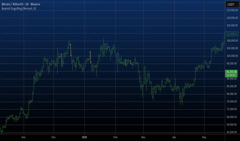
Bearish Engulfing Automatic Finding Script This is a bearish pattern formed by three candlesticks.
The pattern is based on the fact that the last candlestick must
completely engulf the previous two and be downward. The two preceding
candlesticks must also be upward. Candlestick wicks are not taken
into account.
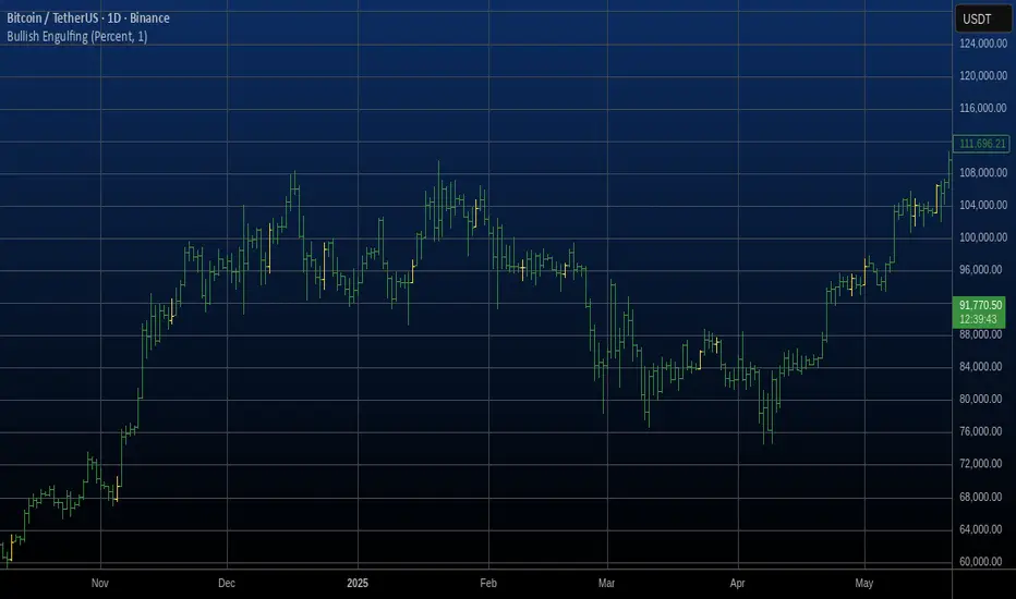
Bullish Engulfing Automatic Finding Script This is a bullish pattern formed by three candlesticks.
The pattern is based on the fact that the last candlestick must
completely engulf the previous two and be upward. The two preceding
candlesticks must also be downward. Candlestick wicks are not taken
into account.